Blurbs are one of the most popular and versatile modules in Divi. They’re often used for links to pages, descriptions for services, call to action, food menu categories, links to team member pages, links to events, a weekly schedule, links to store categories, portfolios, and much more. A third-party plugin called Material Blurb for Divi takes the blurb design a step further by giving you the tools to create material cards.
Material Blurb for Divi adds a new module to the Divi Builder that creates material design cards which includes features such as images or icons, text, and call to action buttons. Effects includes 6 levels of elevation, hover effects, and 4 hover animations. Add background colors, gradients, or background photos, display them with or without borders, and create your own layouts using the rich text editor.
Images in these examples were taken from the free Interior Designer Layout Pack.
Material Blurb Module Settings
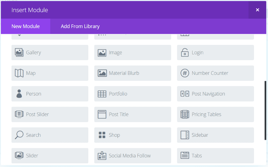
Material Blurb for Divi adds a new module to the Divi Builder called Material Blurb.
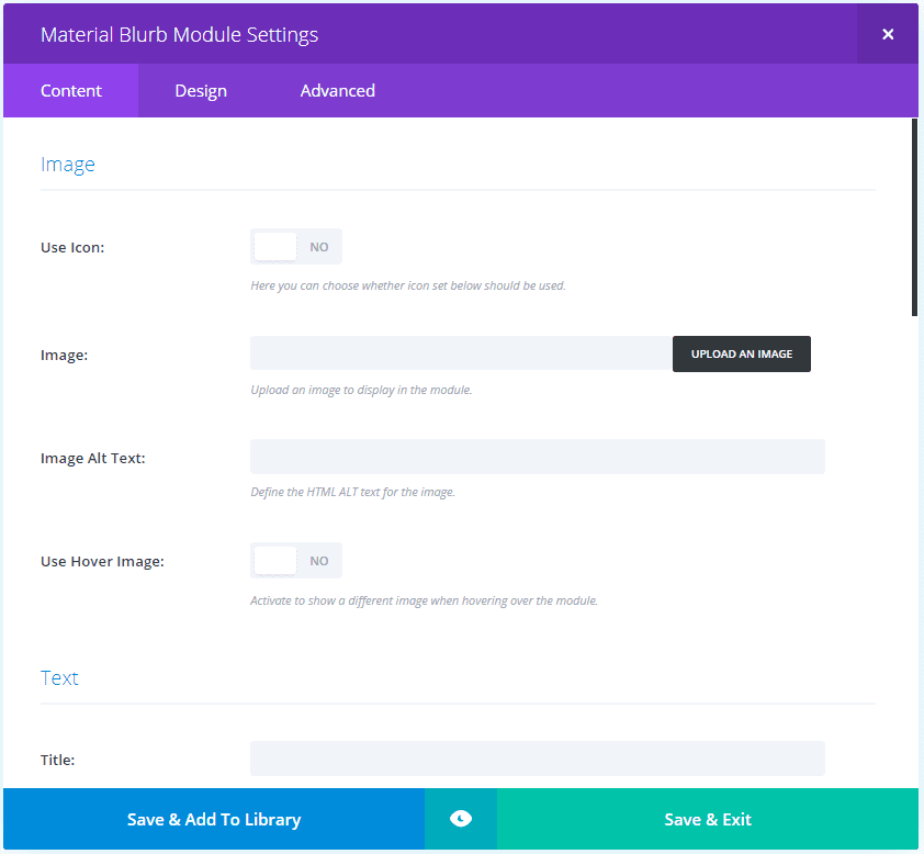
The Content tab includes image, text, link, background settings, and admin label. For the image you can select to use an icon or use hover image, which displays a new image when you hover.
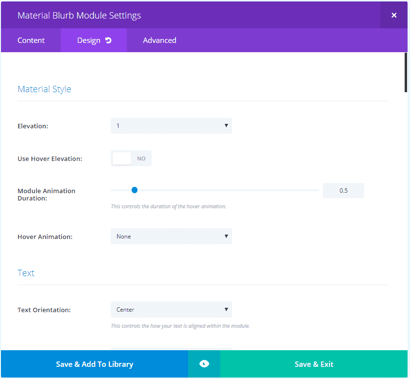
The Design tab includes settings for material style, text, title text, body text, button, second button, spacing, border, box shadow, and animation. The material settings include elevation, hover elevation, animation duration, and hover animation.
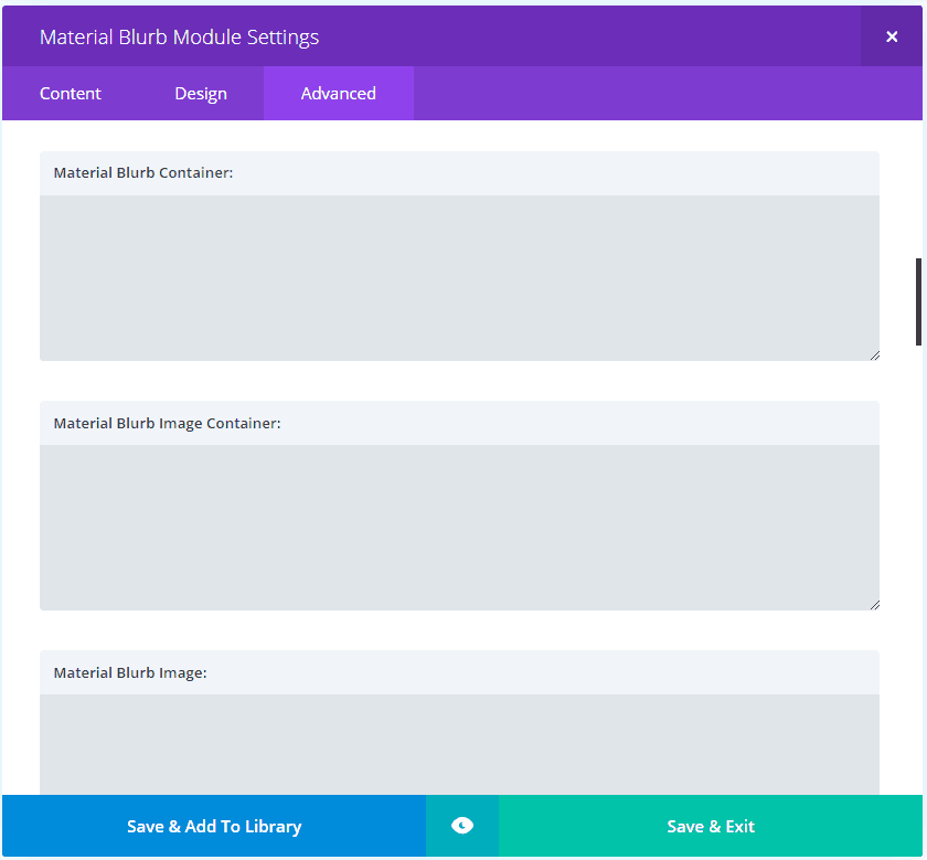
The Advanced tab gives you the standard fields and adds fields for the blurb container, image container, image, hover image, text container, text content, title, body, button container, button, second button, icon, and hover icon. It also adds attributes selections for button relationship and second button relationship.
Examples – Default Divi Blurb Module and Material Blurb Comparisons
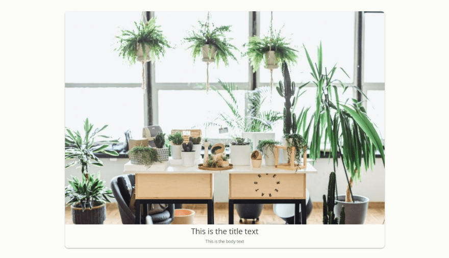
Here’s an example that uses an image, title, and text. It displays the image in full size. The default settings places a border around the blurb to create a card and places the title and body text at the bottom center within the card.

For comparison here’s the default Divi blurb module using the same image and text with its default settings.
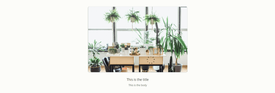
Of course you can place a border around the standard Divi blurb and center the text if you want, but it’s still a different look than what you get from the Material Blurb.

These material blurbs display icons. This is the default settings for Material Blurb module.

For comparison here’s the default Divi module with its default settings.
Examples – Material Blurb for Divi

The text area automatically takes on the background color. You can change this if you want.

I’ve added a different background color for each material blurb.

Elevation settings add shadow. So far I’ve used 1 (the default setting) for elevation. This example, from left to right, uses 2, 3, and 4.

These have elevation turned off but have a hover elevation of 5. I’m hovering over the center material blurb.
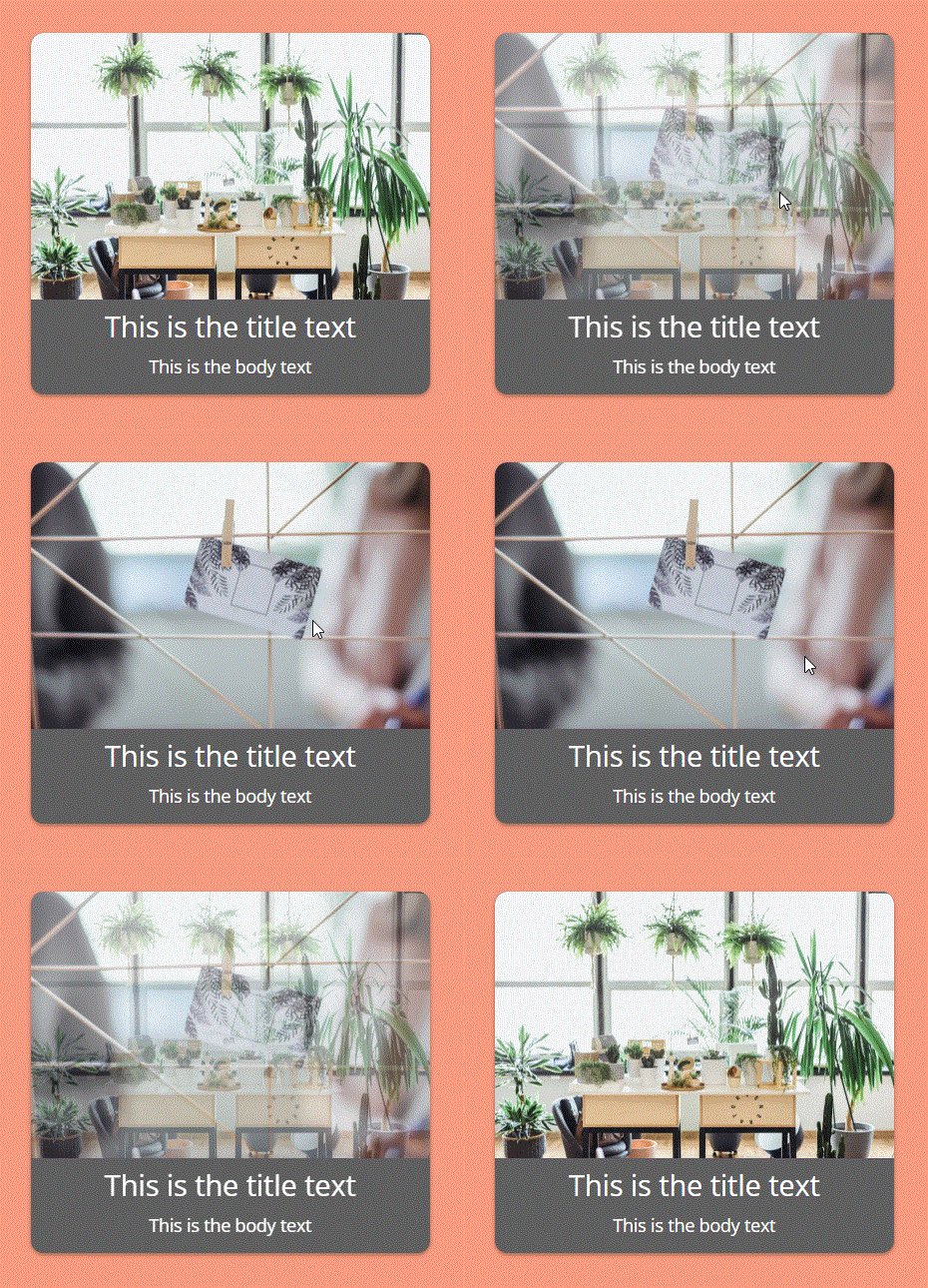
I’ve added a hover image, which changes to a new image as you mouse over any area of the material blurb, including buttons.

In this one I’ve changed the elevation, border radius, and changed the title and body text styling and positioning. For the far left the elevation is set to 3 and the border radius to 100. For the one in the middle I’ve disable the border and background color so it will blend with the background. The one on the right has a border radius of 20.
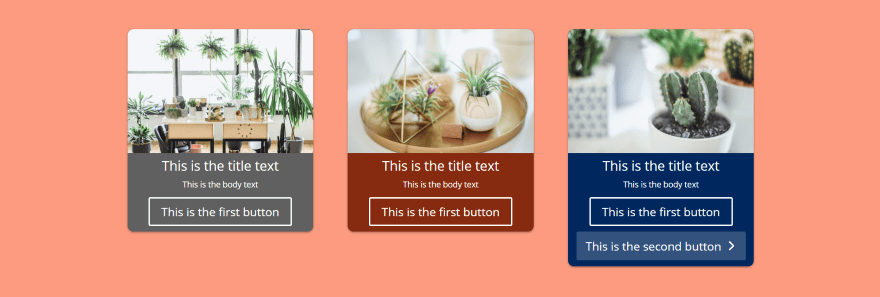
I’ve added buttons to the material blurbs. You can add either one or two and stack them or set them side-by-side. You can select the button orientation (choose from right, left, or center), button mode (choose from wrap or fill), set the button distance, and use custom styling.

Here are a few different styles for the buttons. All of the settings you’d expect are here.

These examples use icons. I’ve included circles, removed the border, changed the border radius, changed the elevation, etc.

Here’s a look at the animations. The material blurb can move up, down, left, or right on hover and you can set the distance in pixels.

You can use gradients, images, and video for the backgrounds. The material blurb on the left is using a gradient background with a border. The one on the right uses an image with an icon that has 60% transparency for its background. I’ve given it a box shadow for the border and a body and header text shadow to make the text more readable. I’ve made the heading smaller and the body text larger. The background image can use parallax, overlays, etc.
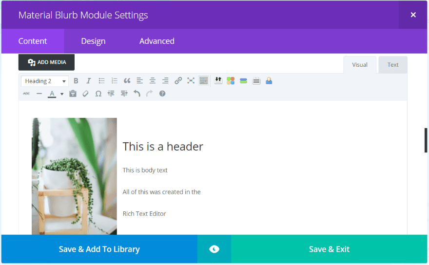
The body text uses a rich text editor. You can create your material blurb just from content you place here.
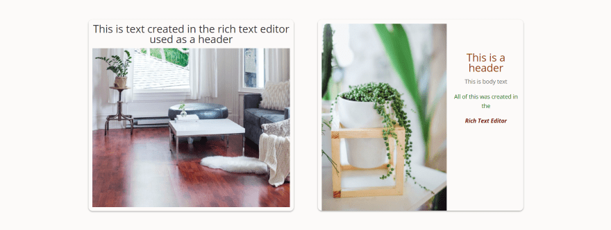
Both of these material blurbs were created using only the rich text editor. The first one placed the header text above the image while the second resized the image, placed it to the left, and text placed on the right.
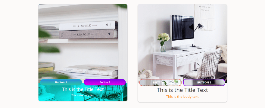
In these examples I’ve placed the buttons above the title. This is done by adding CSS. Fortunately the code is provided on the developer’s website complete with instructions on where to add it.
I’ve added gradients to the buttons on the left and placed an image within the text area with an overlay. The buttons on the right have background images. I’ve increased the font sizes, adjusted the border radius, and styled the title and body text.
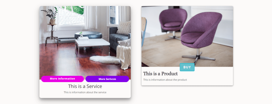
In these examples I’ve place a blurb on the left to show services with a button for more information and a button to see more services. The blurb on the right links to a product page and includes a single buy button. The one on the left has an elevation of 5 while the one on the right is set to 2. I’ve also adjusted the border and button radius to 5 for the right blurb.

These examples show the buttons without an icon or image. The two on the left include a background for the card while the three on the right do not. Those on the left don’t include a border for the card. I’ve given each button a background color or gradient.
Two on the right have the buttons connected. This is accomplished by adding CSS to remove the border on the side you want the buttons to connect. The CSS is available in the demo that you can download from the developer’s website and in the documentation.
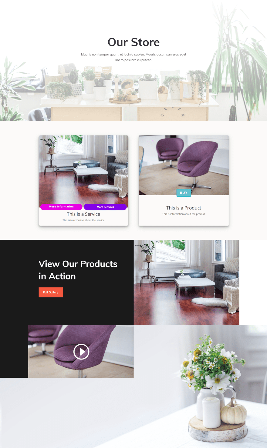
Here’s how the material blurb looks within a layout. This is the Shop page from the free Interior Layout Pack. It’s using the same material Blurb as the product example from above, but I’ve made a few changes. I’ve added the CSS from the documentation to make the material blurbs the same size and the center the text. The CSS was easy to add and I didn’t have to modify it.
Using Material Blurb for Divi with Extra
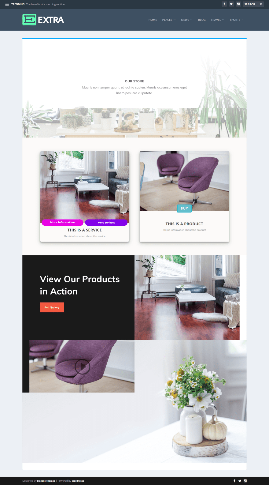
Material Blurb for Divi worked fine with Extra. Here’s the same layout from the Interior Layout Pack. I’ve replaced the Shop module with the Material Blurb module.
License, Documentation, Sample Layout Download
You can purchase Material Blurb for Divi through the link at the developer’s website. Material Blurb for Divi has 2 licenses to choose from:
- Single site – $12.99
- Unlimited sites – $49.99
This page also includes the documentation. It includes several tips on how to accomplish the designs in the demo including some CSS with step-by-step instructions on how to implement the code.
The documentation also includes a downloadable JSON file for the sample page. This gives you 43 examples that you can copy and customize and works as a demonstration of how to accomplish specific designs from the demo page.
I used the documentation to add the code to equalize the heights. I used the sample layout to figure out how to place the button above the text. This was the only time I needed the demo or any documentation.
Ending Thoughts
Material Blurb for Divi creates a nice-looking and versatile material card. I found it easy to use and it was able to do everything I wanted it to. The settings are self-explanatory and the CSS on the developer’s website that you can copy and paste give you even more features.
The only thing that seemed a little different from what I’m used to was the image overlay feature. Rather than having standard overlays it has a hover image. This is great for replacing the image on hover with a new image, but if you want it to display text in an overlay you’d have to create the overlay as an image to use as the hover image.
Between the rich text editor, elevation, borders, buttons, images, and icons you can create practically any type of material card you want. If you’re interested in using material blurbs with Divi, Material Blurb for Divi might be the plugin you need.
We want to hear from you. Have you tried Material Blurb for Divi? Let us know what you think about it in the comments below.
Featured Image via Sammby / shutterstock.com
The post Divi Plugin Highlight: Material Blurb for Divi appeared first on Elegant Themes Blog.
