Web design trends change all the time. By the time you find a designer you can work with, decide on a look everyone can agree with, get the work done, and finally go live, what’s cool and fresh and trendy has changed. Enter brutalist websites.
What’s that, you ask? It’s when you buck the trends and purposefully design your website to be ugly. And if it’s not straight-up ugly, it’s at least free of frivolous/superfluous design elements.
Brutalist websites are a relatively new thing among purposeful designs, but a lot of them draw inspiration from the early days of the internet. The days when Angelfire and Geocities were the pinnacle of awesomeness. The days when the only HTML you needed to know were a href and img src.
The web has moved on since then, but good (or maybe good-bad?) design hasn’t. On one hand, brutalism is about function over form. If it works, let it work. On the other, it’s about being punk af and making the user work for whatever they get out of your site.
No matter which way you wanna go with it, I’m sure you can find a way to brutalize your next design project after you’ve checked out these glorious monstrosities.
1. craigslist.org
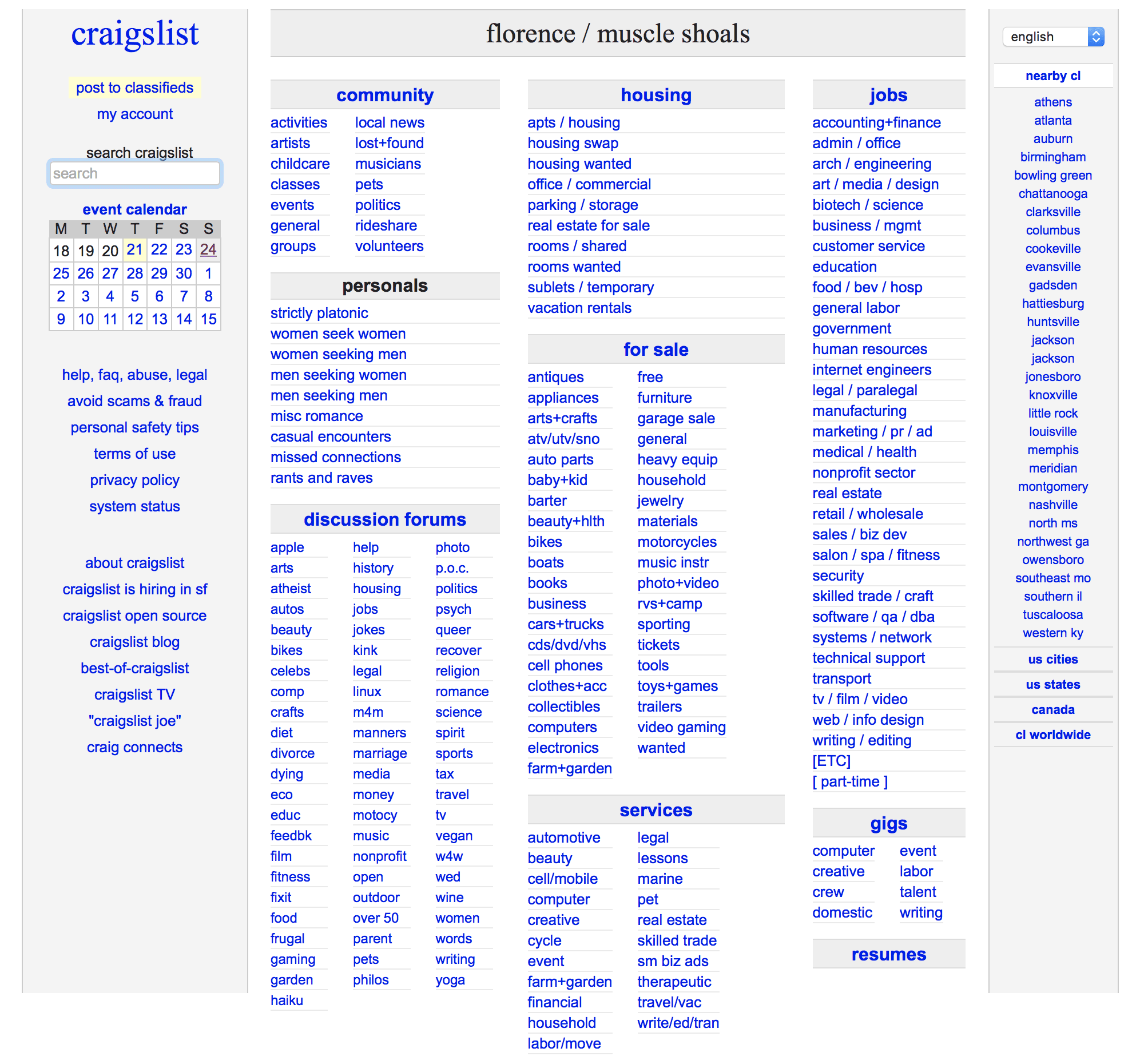
Y’all, Craigslist is ugly. No, don’t defend it. It’s a monster. Black text, blue links, white background. It’s not pretty. But it doesn’t have to be.
Because it works. That’s what is important. Part of brutalism is UX, and CL has that down. You can find what you need to buy or sell without any fuss or muss or extraneous moving parts.
2. Konsept83.com
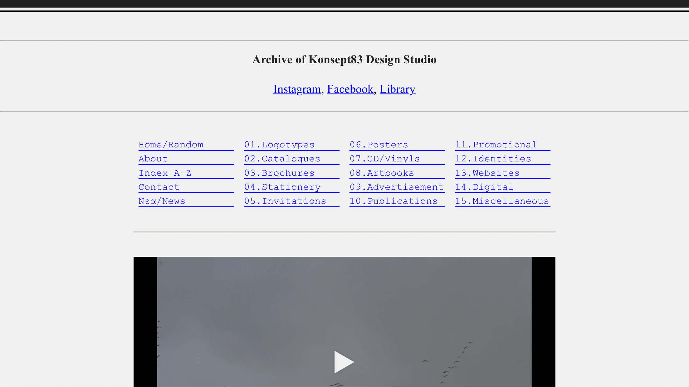
Like Craigslist, Konsept83 looks to the early days of the internet for inspiration. Grey background, typewriter font (a brutalist website staple), and all the links that spell out precisely what you’re clicking into.
The interior pages are just as spare–they just have images embedded.
3. pictureshow.tv

Pictureshow.tv only works in landscape mode on mobile (or on desktops). It’s a video series designed to look and feel like an old VHS tape. You even click into the other pages, and they act like they are VCR setup menus.
But you know what? The site works, you know what to do, and you’re not lost for a moment.
But man. It’s ugly. And beautiful at the time time. And the best part is that you have no question about how to use it.
4. chris.bolin.co
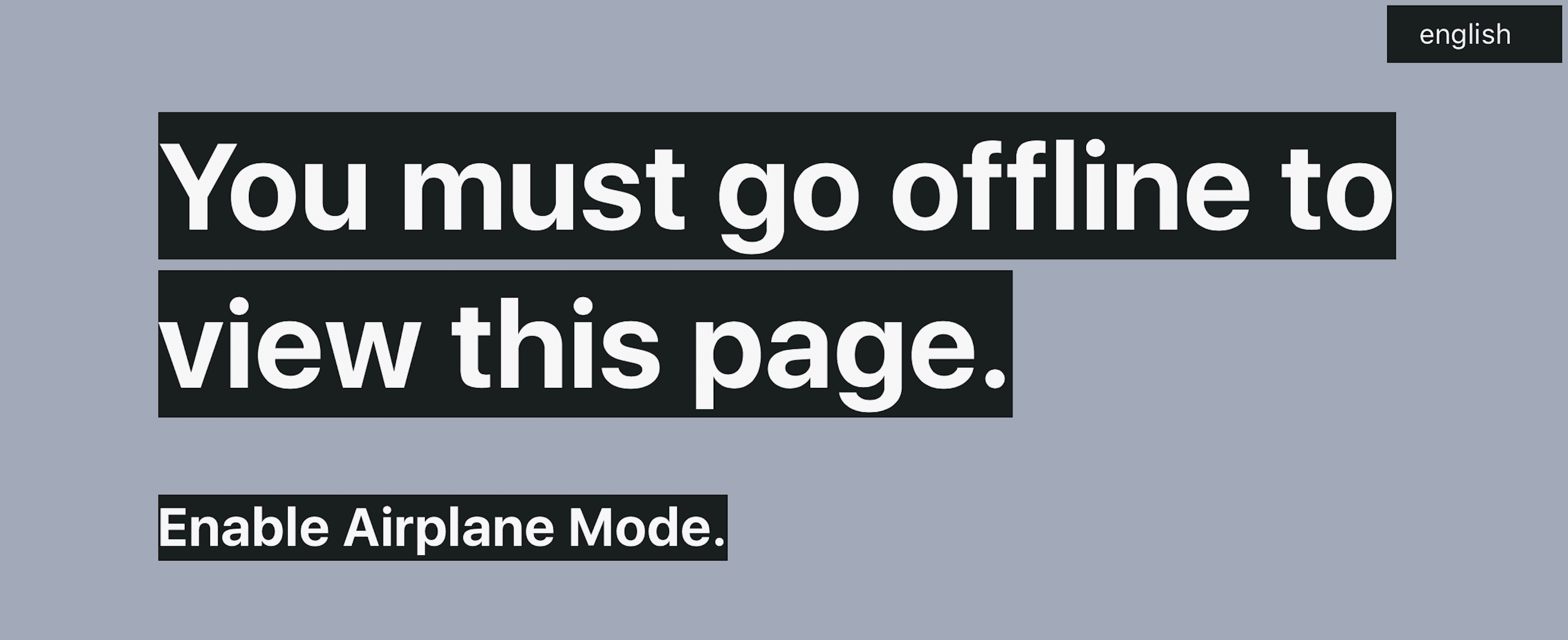
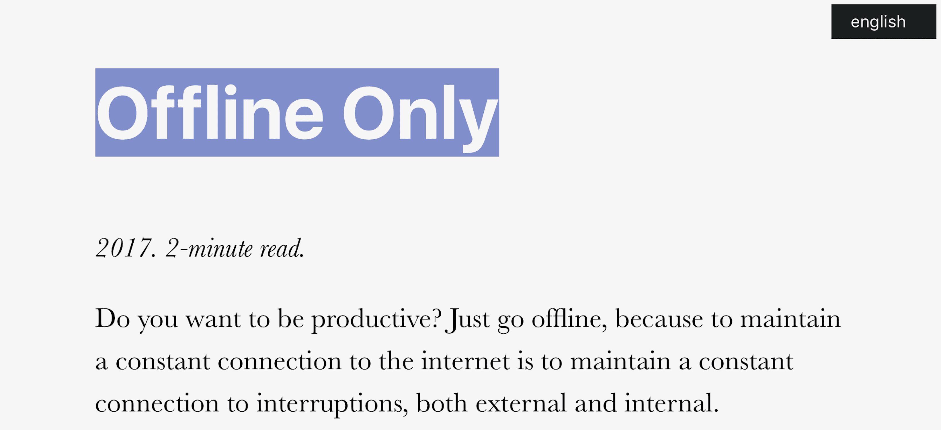
Have you ever seen an offline website? No? Me, either. And then I found this beauty.
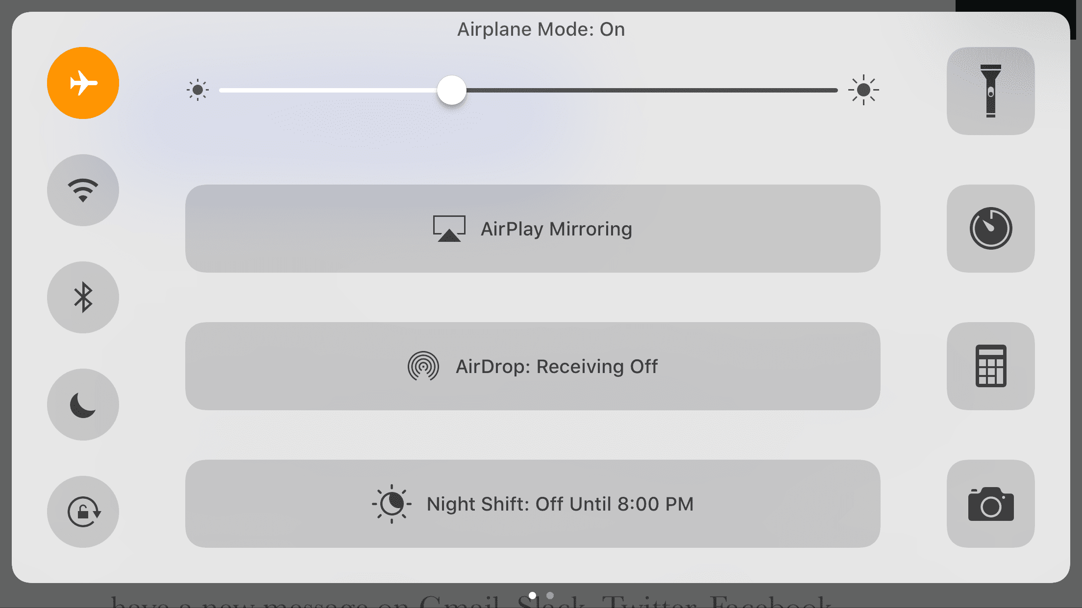
Chris Bolin designed this site to be as brutal to web users as possible: you gotta disconnect to connect. Automagically, the content appears, and you see a simple message about simplicity presented simply.
Brutalism, man.
4. stephaniemarx.com/talks
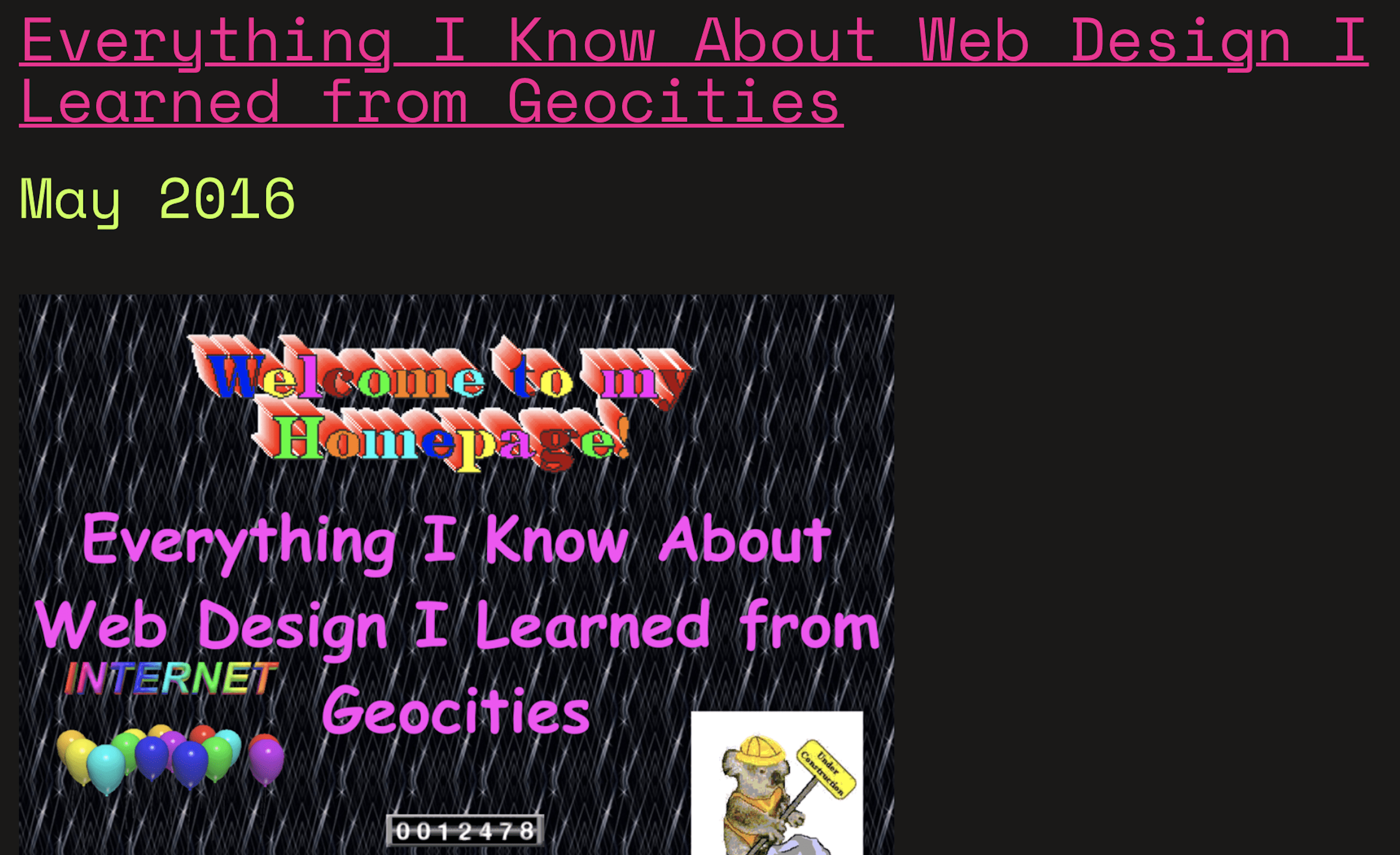
One of her talks (and the way I became acquainted with her work) is called Everything I Learned about Web Design, I Learned from Geocities.
I don’t think I need to say anything else.
5. wolftonechambers.com
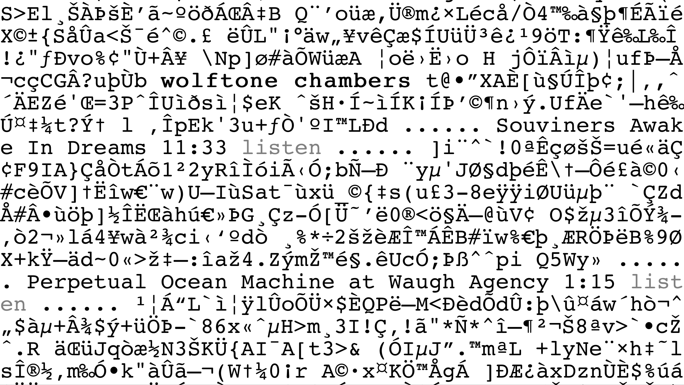
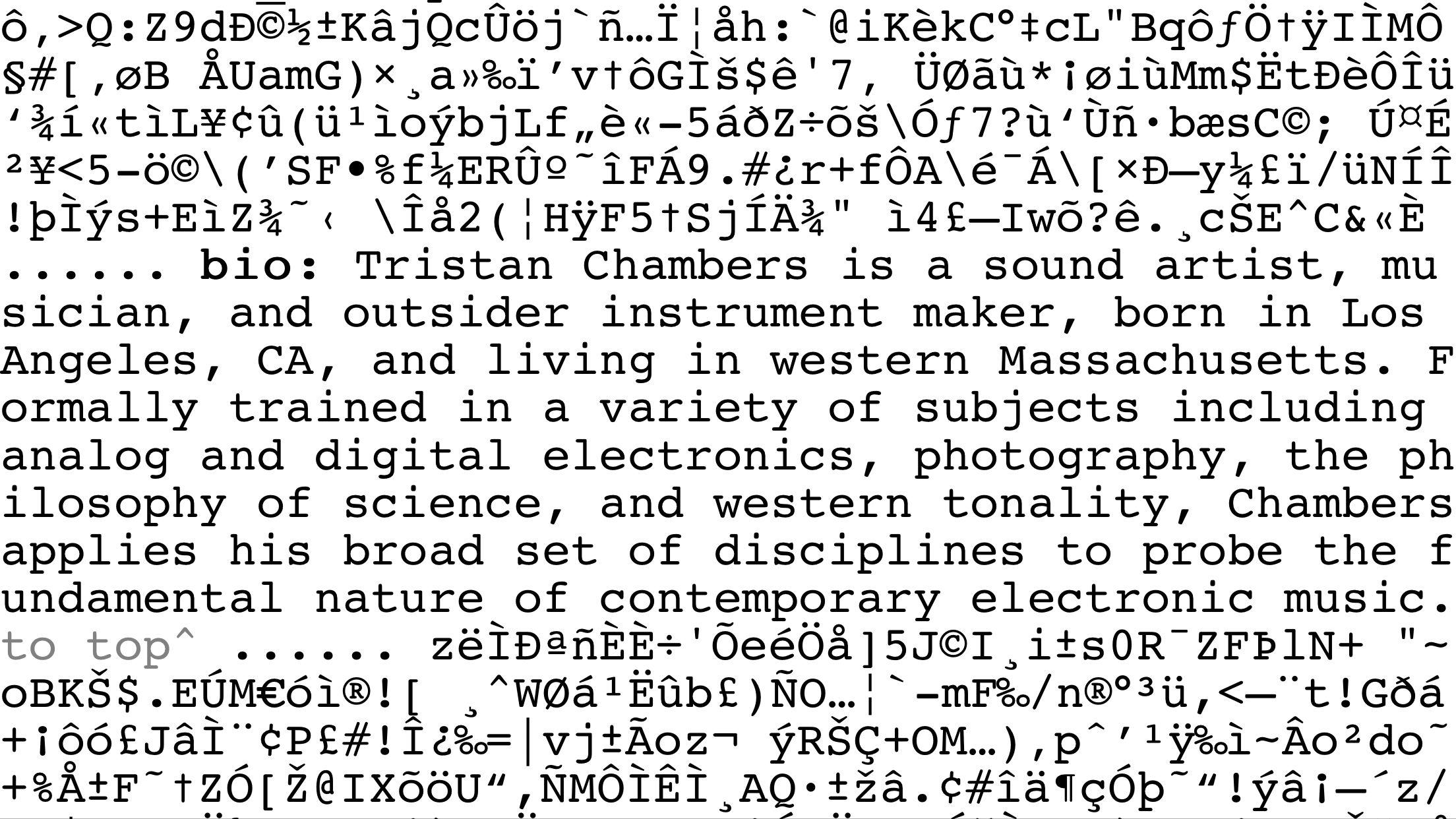
Talk about brutal. There is content here. Lots of it. Good info that’s well written. But it’s all but hidden from us by a sea of ASCII.
You can’t say this is visually appealing, nor is it terribly functional. But it’s memorable. It’s strangely clean despite all the clutter, and the weirdest part is that after you scroll a bit, you do see how it works and how to find info with no directions. Which means that, again weirdly, this is how UX should work.
#shrugemoji
6. allanyu.nyc
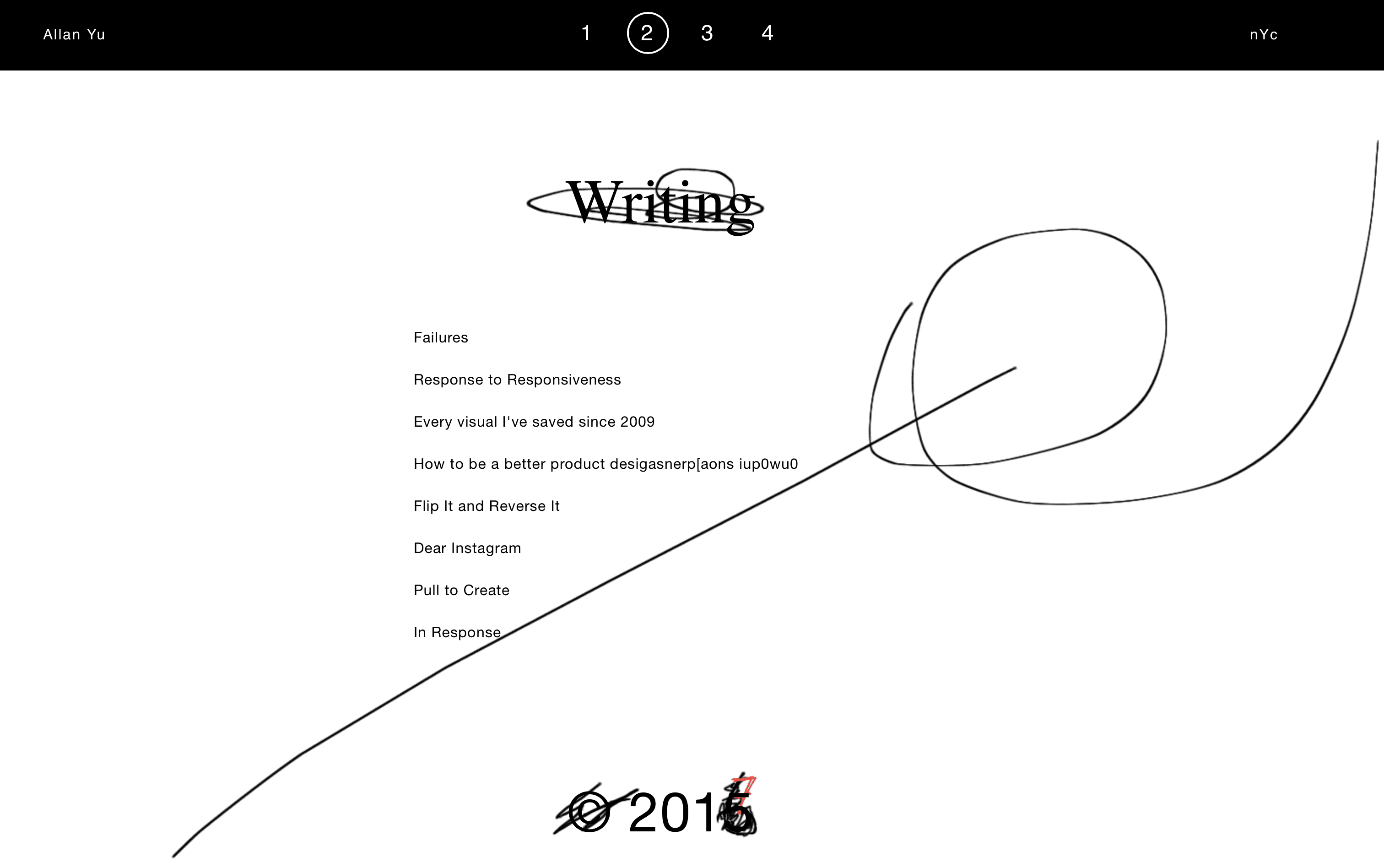
Part of the beauty of writing and publishing on the web is that your users don’t see the revisions and changes you make to your stuff. You can put new content out there or adjust old content, and no one will be the wiser (unless they check Wayback Machine archives).
Allan Yu, though, uses brutalism to show the revisions he makes to his site as though they’re physical revisions in a notebook. It makes the overall experience less clean overall, but the messiness adds to the user experience so everyone is aware that he not only grows in style, but ability and creativity.
Not a design you’d find on a major news outlet (wouldn’t it just be fun to see editorial marks on CNN?), but for a designer or agency who has relatively slow updates, this style would probably work well.
7. Brutalist Redesigns
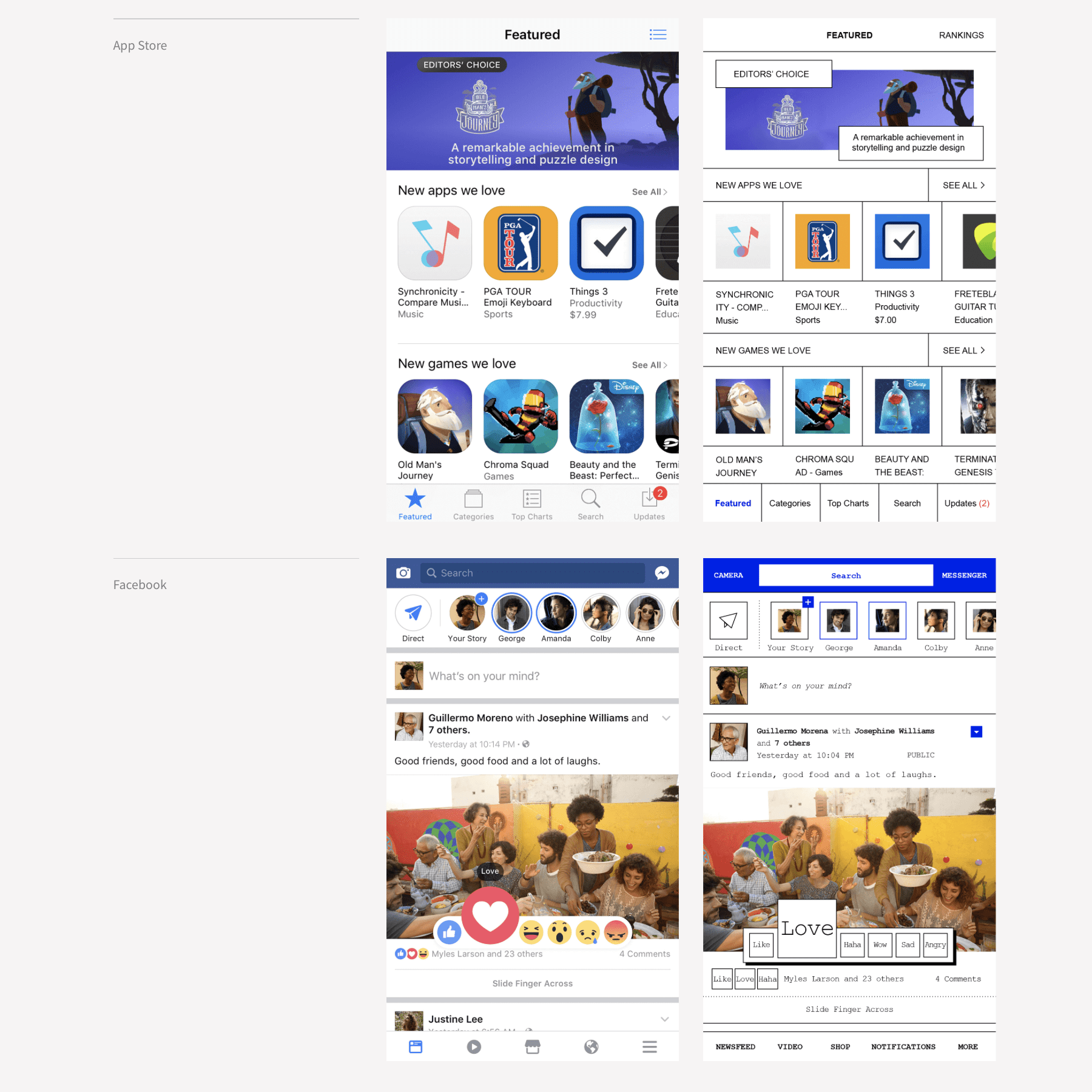
Making brutalist websites is far, far harder than you’d think. Because it’s easy to make a website ugly. It’s also easy to make a website simple. And it’s easy to make a website look dated.
But it’s hard to do all of those at once. So Pierre Buttin took some of the cleanest, most popular apps (like Facebook and Instagram and Snapchat) and redesigned them as examples of how you can maintain form and function while removing superfluous flash that adds nothing to the experience.
8. morgane.com/pixel- lab
https://morgane.com/pixel-lab
(Maybe new pics on laptop of whole page.)
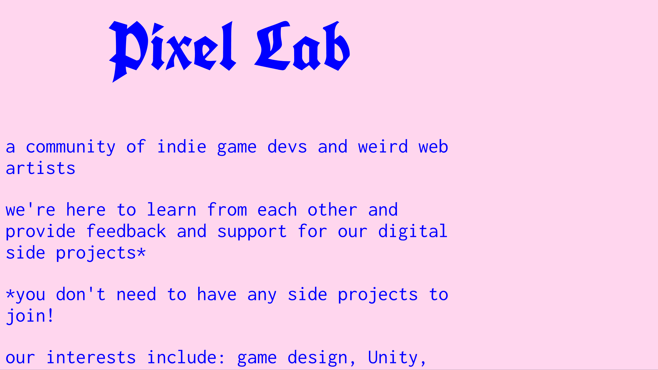
Indie video game developers are a quirky bunch. The folks at Pixel Labs don’t stray from that description. Their website is a single page that looks like it was written in the early ’90s, and the color palette probably was.
That said, they know what they’re doing. They have a showcase of their work, an invite to their Slack server, and a desire to help other people.
Their use of web design removes any obstacles between them and their audience.
9. wekflatm.kr

I think this may be the perfect website. Seriously. I’m seriously considering making the page showcasing my novels work like this.
It’s ecommerce at its most fundamental and perfect: Here’s a chair. Buy it. Want a sofa? Okay. You can buy them over there.
No wish lists, no searches, no variations or user reviews. Just item, price, buy.
It ain’t pretty, but it ain’t ugly, either. It’s simple. And it has personality. It’s everything you need in a website and nothing you don’t.
10. keyaar.in
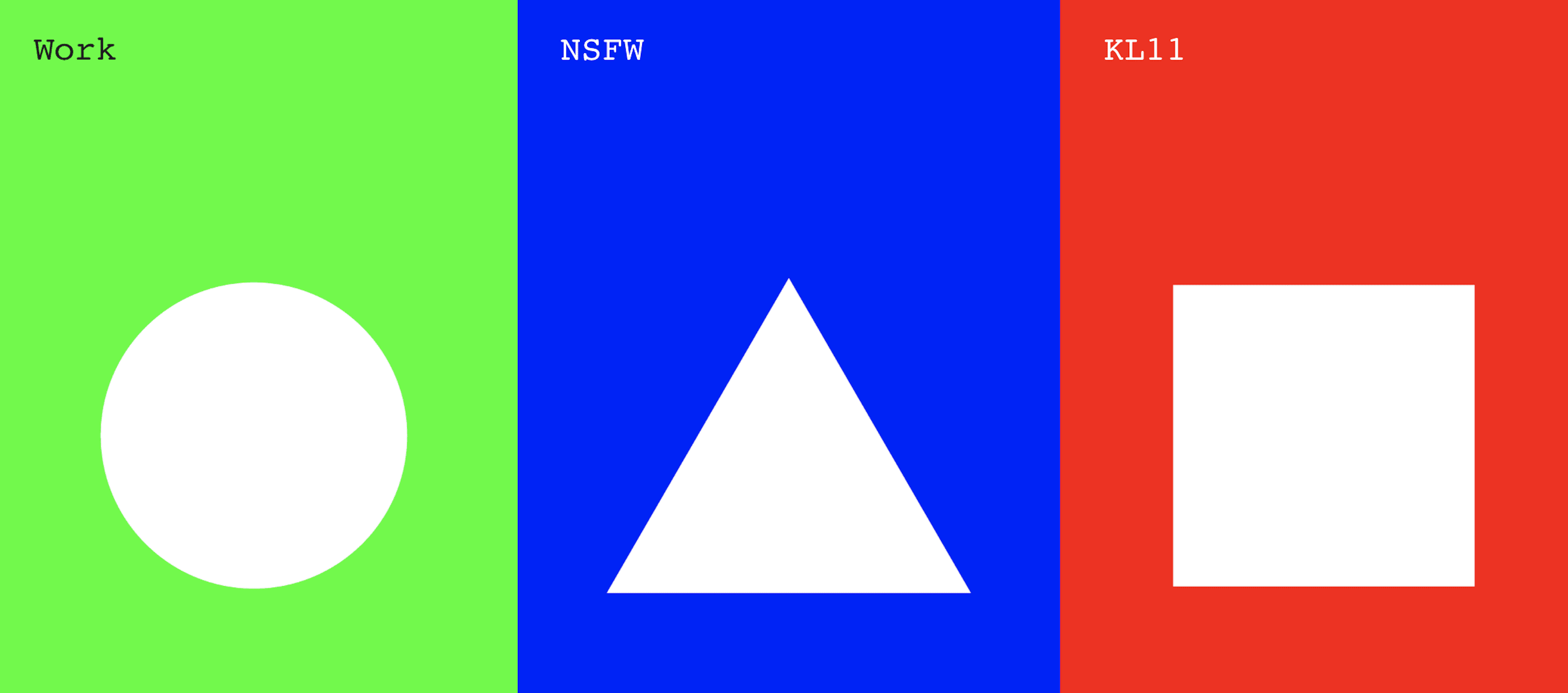
I bet the first thing you’d do on this site is click a shape. Because shapes. Then you’ll read the labels–which don’t really tell you much.
Thing is, though, you know pretty much what each one is when you click it. Work is a gallery of, you guessed it, work. NSFW is a blog, but even before that, you know you’re getting into something personal, if not intimate. And KL11? The design agency themselves. All the info you need is there.
What more do you people want out of a website?
Brutal, shmutal
You may not want a suite of brutalist websites in your portfolio. That’s fine. This design scheme is absolutely not for everyone, and some clients are sure to balk when you pitch an ugly site.
But there are lots of design lessons you can learn from these sites.
I do challenge you, though, to try to make a brutalist site. Boiling the whole thing all the way down to the essentials will make you confront your preconceptions, as well as your strengths and weaknesses. Sure, it’ll be brutal, but you’ll come out of it a stronger designer.
And maybe a stronger person, too.
What do you think about brutalist websites? Let us know your thoughts on this trend in the comments
Article thumbnail by Kaleo / shutterstock.com
The post 10 Brutalist Websites to Inspire Your Next Web Design Project appeared first on Elegant Themes Blog.
