There are lots of financial institutions online and they all need amazing websites to show their services and benefits. Divi is an excellent theme to build websites for financial institutions. Fortunately, you don’t have to build from the ground up. Instead, you can start with a layout. In this article, we’ll look at 10 Divi layouts for financial institutions to help you get a head start on your next Divi project.
10 Divi Layouts for Financial Institutions
Whether you’re building websites for banks, accountants, tax services, angel investors, financial coaches, and consultants, Divi has a layout to get you started. Let’s get to the layouts, which are in no particular order. Well, actually, they’re in the order that I found them.
1. Endeavor

Endeavor is a one-page layout that’s made with entrepreneurs and financial service providers in mind. It includes a full-screen hero section with a title, tagline, and buttons to learn more or schedule an appointment. Blurbs show the services, with specialized services in their own section and styled differently. A full-width CTA links to pricing options. A full-width testimonial section shows testimonials as styled text over a background image. Other sections include styled number counters, pricing tables, person modules, and a contact form in a full-width section with a background image. The layout uses lots of bold yellow as highlights. It includes CSS.
Price: $8 | More Information
2. Pursuit

Pursuit is a one-page layout that’s made for entrepreneurs, accountants, and advisors. The layout includes a full-width hero image with a title, tagline, and button. Services are described in a large section with text on one side and overlapping images on the other. A section about what to expect places the text with icons in a large box that overlaps an image to one side. Several of these sections are used to provide information throughout the layout. A slim CTA is used to book consultations. Services are described in styled blurbs. I like the testimonial section that uses a full-screen image and shows testimonials to one side in a slider. A styled contact form completes the layout.
Price: $8 | More Information
3. Ekewaka
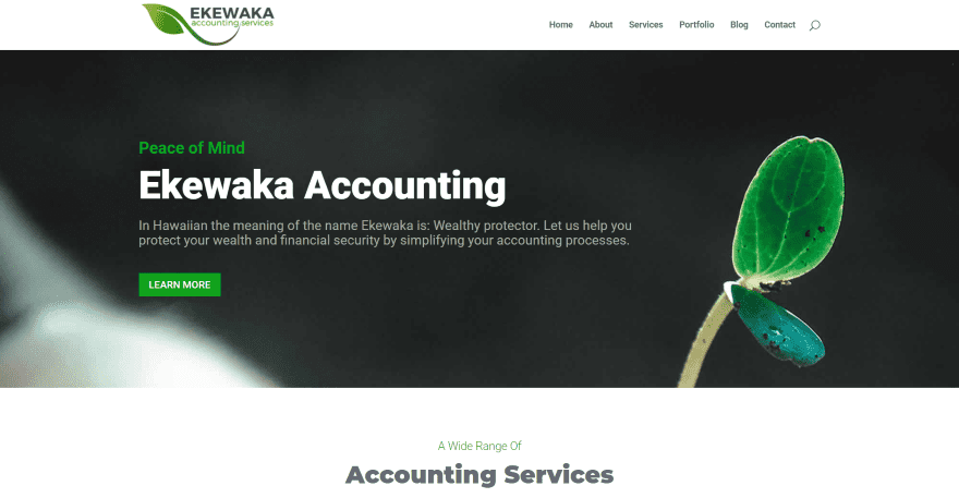
Ekewaka is a 4-page layout kit that was designed specifically for accounting firms and bookkeeping service providers. Pages include home, about, services, and contact. It includes a full-wide image and a CTA with large text. A section of blurbs shows the various services and displays green icons to match the design. A similar section breaks down one of the topics and displays information about the topic to one side with the blurbs on the other. Several full-width CTAs display an image to one side and the CTA in the other. It also includes testimonials and a contact section. Files for Divi Options and Theme Customizer are provided.
Price: Free | More Information
4. Accountant and Tax Layout

Accountant and Tax Layout was designed for accountants and accounting firms. It’s a one-page design with a full-screen background image in the hero section with large title text and a tagline in the overlay. An angled divider brings the image to the next section where it overlaps large blurbs of text. Another section displays text in a box over an image in parallax. Large text that spans the screen follows this and has a low enough opacity to allow the background to show through. Services are shown in blurbs in a full-width section. It also includes styled pricing tables, a team section, and a footer with a testimonial, contact form, and contact info over a background image. It has lots of angled dividers.
Price: Free | More Information
5. Financial Advisor Layout Pack
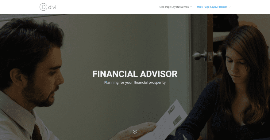
Financial Advisor Layout Pack is a 5-page kit for financial advisors and business and tax consultants. It includes pages for home, about, services, testimonials, and contact. The home page displays a full-screen image with the title and tagline in the overlay. Scrolling reveals a section of blurbs to show the services and a button to see the services page. A full-width section with a testimonial slider includes a link to the testimonials page. It also includes a full-width section for client logos and a full-width CTA over a background image.
Price: Free | More Information
6. Bank Layout Pack
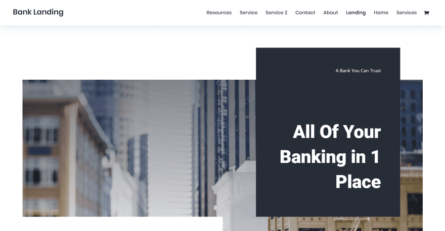
Bank Layout Pack is an 8-page layout designed specifically for banks. Pages include one for resources and several for services. It includes free images to use in your projects. The landing page displays an image with several blocks of text and blurbs overlapping it. Services are shown as blurbs with a button to see more. Several two-column CTAs alternate from left to right with graphics on one side and text of the other. Several large CTAs display a block of text to one side and text on the other in an overlay with a centered button at the bottom. It also includes embedded video connected to a styled testimonial slider, a section of social buttons, and a blog.
Price: Free | More Information
7. Investment Company Layout Pack
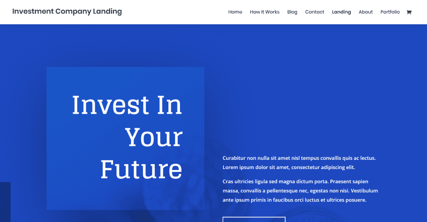
Investment Company Layout Pack is a 7-page pack for any type of investment firm or agency. It includes a How it Works page and a portfolio. The landing page displays a large CTA over a background image in a blue overlay. Smaller blocks of color or images fill in the sides as you scroll. The next section provides information followed by a section of blurbs for benefits and a CTA. Number counters provide financial stats. Services are shown with text and a button to learn more. A testimonial slider displays text in full-screen. The blog section shows a post with an image for about half the screen and posts with just text next to it. It also includes a styled contact form and a section of contact information. Free images are provided.
Price: Free | More Information
8. Beta
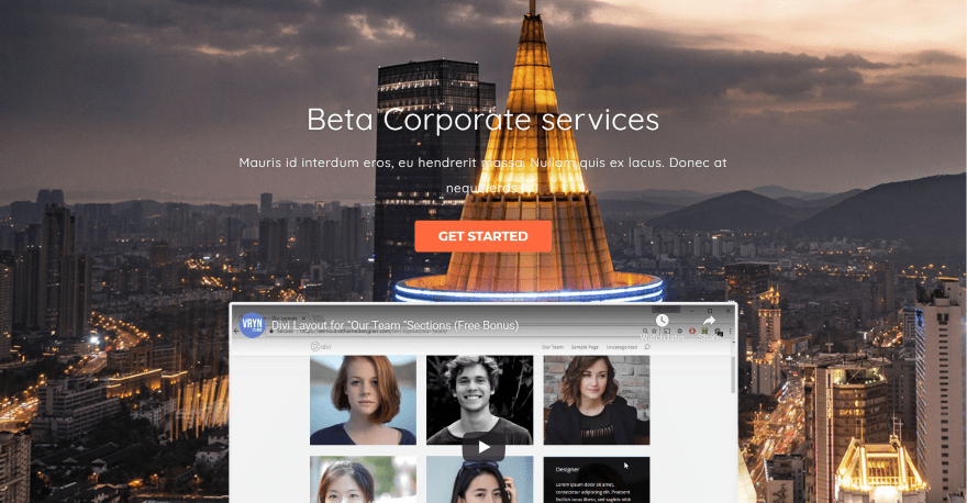
Beta is a one-page layout for corporate agencies and angel investors. The hero section displays the title with tagline and a button, followed by an embedded video in a full-screen slider. A section of blurbs with icons shows the benefits and another section shows the services with buttons to see more about each one. It also includes a full-width section of projects, a testimonial slider, multiple sections of person modules with hover effects, circle counters, pricing tables, a blog section with alternating layouts, contact form, embedded map, and more. Contact information is provided within blurbs. Information is shown using blubs as bullet points.
Price: $14 | More Information
9. Divi Business
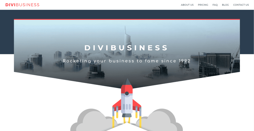
Divi Business is a one-page layout with a minimalistic design that’s perfect for financial consults and accountants. The hero section shows a background image with the title and tagline in the overlay and an angled divider to create a down arrow. A rocket graphic overlaps this and the next section which shows an upward arrow that leads into an About section with buttons. Information is shown within blurbs and includes hover effects. Another angled divider creates a graph and is overlapped by an embedded video. It also includes styled pricing tables, toggles for FAQs, circle counters, blog, and a contact form. Blurbs show benefits while an overlapping text module provides contact information.
Price: $19 | More Information
10. Divi Consultant
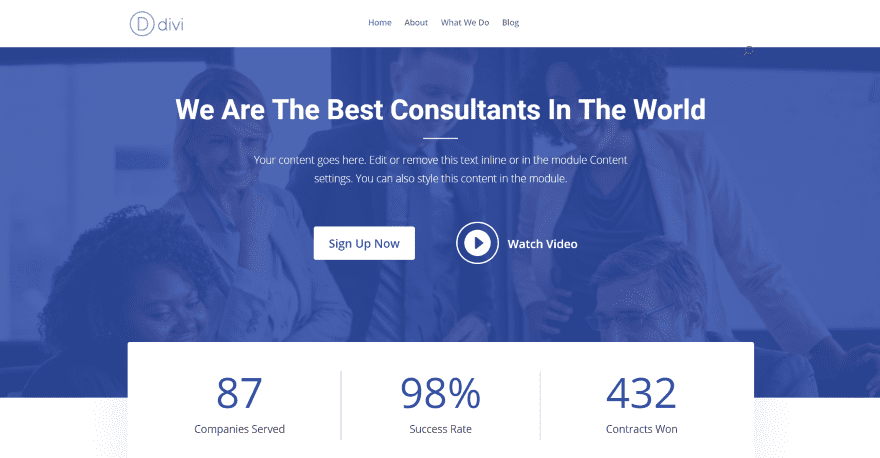
Divi Consultant is a one-page layout that’s perfect for financial consultants. The hero section displays a full-width image behind a blue overlay. The foreground includes a CTA with a tagline, button, and an icon that links to an embedded video. Number counters overlap this. Styled blurbs are offset from each other and show text over images with the same blue overlay while sitting next to a CTA with a patterned background. Another CTA displays an image within a styled bubble. It also includes testimonials, a section for client logos, an accordion for FAQs, and a styled footer with an overlapping email form. It includes theme options, customizer settings, images, and CSS.
Price: Free | More Information
Ending Thoughts
That’s our look at 10 Divi child themes for financial institutions. The layouts are designed well and help provide a great start on a website for an accountant, bank, consultant, angel investor, etc. No matter what type of financial website you’re building, there’s sure to be something here to get you started.
We want to hear from you. Have you tried any of the 10 Divi child themes for financial institutions? Let us know what you think about them in the comments.
Featured Image via hvostik / shutterstock.com
The post 10 Divi Layouts for Financial Institutions appeared first on Elegant Themes Blog.

