Designing for children can be a lot of fun. You’ll get to play with a lot of whimsical elements that are otherwise out of bounds on more ‘serious’ projects. In other words, the scope for opening up your mind to some more informal possibilities is high. Kids fonts are a quick, great way of livening things up.
Fortunately, there are plenty of child-friendly fonts online. In this article, we’ve carried out some research to curate 12 of our favorite kid fonts you can use on your next design project. We’ll also talk about what makes them special and when to use them, so let’s dive right in!
12 Best Kids Fonts for Children’s Websites & Design Projects
Kids fonts should be all about fun, which is the main criteria we looked for when compiling this list. Of course, a poor option is no good, so we’ve also looked at reviews and ratings too.
If you’re working on a design for children, you’ll likely find what you need somewhere within this list!
1. Frosty (Free for Personal Use)
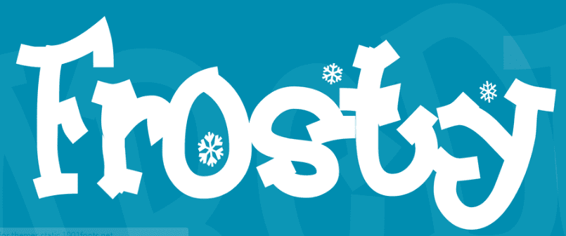
First up, Frosty doubles as both an excellent pick for Christmas and a fantastic kids font. Even though its design is simple, it’s still fun due to the unique shape of each letter.
The included snowflake alternates make a great addition, although you’ll want to only incorporate them into holiday-based designs. However, the font itself is going to be great for highly-informal sites and applications.
2. Bubblegum Sans (Free)

Next, Bubblegum Sans isn’t flashy, which only makes it all the more versatile. It’s highly readable and subtle, but still offers a greater degree of whimsy than the usual fonts you see online.
We think this would be great for e-book covers, headers, logos, and pretty much any prominent element you can think of. You may even get away with using Bubblegum Sans as body text in very small doses.
3. Delius Swash Caps (Free)

Delius Swash Caps manages to be both fun and classical at the same time. It’s cursive, which does impact readability a little, but used prominently it can easily meet your needs.
Given the above, we’d say large, prominent, and impactful text will benefit the most from this font. It could even be used on more formal websites, although you may not want to stray far from its ‘fantasy-esque’ leanings.
4. Mistery Quest (Free)

Mistery Quest is an excellent example of how much charm you can add to a font by using only a few subtle elements. The font itself is quite simple from a design standpoint, and invokes old informal 90s system fonts. However, it also features intricate loops to certain letters that make it look very charming.
Much like many other fonts on this list, it’s going to outstay its welcome when used as body text, but you’ll find plenty of use when designing headings or logos.
5. 3Dumb (Free)

As far as names go, 3Dumb is downright childish, which is right up our alley! The name comes from the font’s 3D design, which is bold, transparent, and stands out from the rest of your page’s content.
We think this would suit an education website, and peripheral subjects such as ‘make and do’ focuses, engineering, and general hands-on topics. It’s got a ‘blueprint’ feel that is just screaming for a dedicated background to set the scene!
6. Londrina Sketch (Free)

Londrina Sketch’s style is hard to pin down. At first glance, it looks like the type of font you’d see used as ‘formal graffiti’, yet has a simple design ideal for bold headings.
For this particular typeface, we recommend sticking to all caps and black-and-white designs, so it stands out even more. However, Londrina Sketch is flexible enough that you could get plenty of mileage out of its lower-case variant too.
7. Flavors (Free)

Flavors is a ‘splattery’ type of font. It looks smudged, almost as if it were written with ink and a few drops have fallen here and there. This only serves to highlight its charming style, though, and means there’s ‘movement’ to help with readability.
This font is a great option for headings, and fiction (or ‘Young Adult’) writers will likely gravitate to its stylings. We’d also suggest that informal education sites will get some use out of Flavors.
8. Good Unicorn (Free for Personal Use)
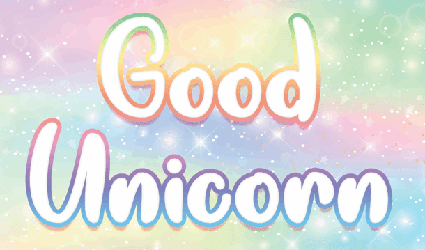
Unicorns are (of course) fantastic, so it stands to reason a Good Unicorn is about the best thing you can ask for. If the target crowd for your designs is young girls, this font’s chunky style will be ideal for catching their attention.
Color is going to be your friend when using this font, and we’d even say that busy backgrounds won’t affect readability given the overall design.
9. Sprinklescolors (Free for Personal Use)
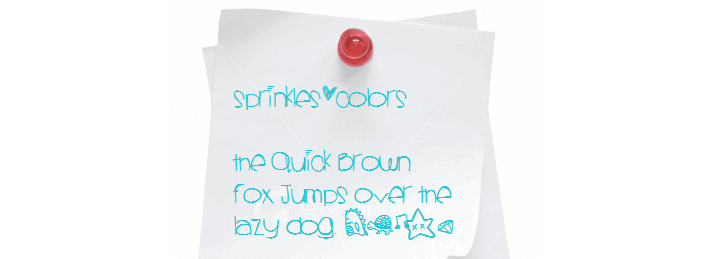
Sprinklescolors looks like just what you’d get if you asked a pre-teen girl to write you a letter with some hearts thrown in. It’s fun, casual, and it has a lot of charm thanks to all the extra characters and alternates.
Think about using this font for first-person narratives or viewpoints. If your text could benefit from using emojis, you’re in luck. Sprinklescolors also features cute dinosaurs, turtles, and much more.
10. Whale I Tried (Free for Personal Use)
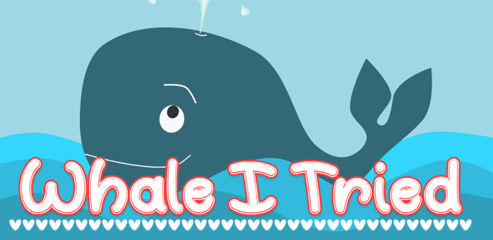
Whale I Tried has by far the coolest name we’ve come across when researching fonts. The overall style is a lot of fun, and is also effortless to read. We think it’s got a slight ‘Disney’ feel to it too, mainly because the curvature of the lettering is similar to that particular font.
Because of its readability, Whale I Tried can be used it for short paragraphs if needed. However, its main application is going to be games websites full of color and action.
11. Scribble Box (Free for Personal Use)

Scribble Box is a font with a unique texture, which is evident from the get-go. This particular typeface comes in both upper and lowercase styles, but we’re rather big fans of the former. On first glance, you may not think it’s very child-friendly, although given the right application it could easily slot into place.
The lowercase version will probably provide subjectively more fun, although whatever you choose will be a good fit for logos, titles, or headings due to its sans-serif design and immense readability.
12. Wonderbar (Free for Personal Use)
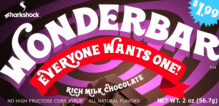
Finally, Willy Wonka fans will recognize the inspiration behind Wonderbar. It’s an uppercase font that’s fun and fluid, and definitely nails the candy-bar aesthetic. There are also a few different extras and alternates included, which will help create non-repetitive designs.
As you may imagine, logos will be a match made in heaven here. However, titles and main headings will also be within Wonderbar’s wheelhouse. In fact, non-web applications such as flyers could also be suitable, which gives immense value to this font in particular.
Conclusion
Designing for children provides its own set of challenges compared to adult-focused designs. However, there’s also a great opportunity to have some fun and let your imagination run wild, which is something more ‘grown-up’ projects often don’t afford.
Specific kids fonts will be in your toolbox here, although what constitutes child-friendly is hard to pin down. We’d suggest that a subjective ‘fun factor’ is the standout criteria, and fonts such as Wonderbar, Good Unicorn, and Whale I Tried have it in spades. However, other more subtle fonts (such as Bubblegum Sans) have this too, while Scribble Box can provide some cross-over to adult-focused designs depending on the specific need.
Do you think kids fonts are a requirement for designing for children? Let us know in the comments section below!
Article thumbnail image by Yuliia Bahniuk / shutterstock.com
The post 12 Best Kids Fonts for Children’s Websites and Design Projects appeared first on Elegant Themes Blog.
