With all of the powerful Divi features that have been released over the years, it is safe to say that some of them may have been overlooked (or ignored). Those of us who use Divi on a daily basis can occasionally get stuck in our Divi ways and need a little reminder of the new features available. And, those who are new to Divi may need someone to shed some light on those features “hiding” in plain site. Regardless, whether you are a Divi Master or Youngling, it never hurts to take a long hard look at ALL the features available in Divi. You may just learn something new!
For this post, I’m going to highlight 25 Divi features that are meant to boost productivity and design but which may have escaped the notice of many users. I understand that not all of these features will be new to you (some of them have been around since the beginning of Divi), but I’m pretty sure a few will surprise you.
Enjoy!
25 “Hidden” Divi Features to Boost Productivity and Design
Subscribe To Our Youtube Channel
#1 Search Options search bar
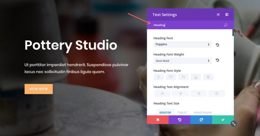
Okay, this one isn’t really that “hidden”, but I suspect that some of you aren’t in the habit of using this feature. I get it. Old habits die hard, but it is definitely worth incorporating this search bar into your workflow. If you need to add custom padding to your module, don’t settle for clicking the design tab, scrolling down, opening the size toggle, and then adding your custom margin. Simply type “margin” in the search option bar and you are there! Want to make sure all of you fonts match for a certain module? Simply type the word “font” in the search options bar and update the body font, header font, and button font all in one small list.
Tip: You don’t have to click on a specific tab before you search. The search results will pull from all the options from all three tabs no matter where you are in the text settings.
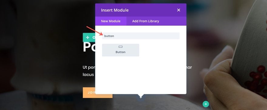
The Search bar can also be found when adding a new module. Just start typing the name of the module you want and your module will appear at the top of the list without having to scroll through to find it.
#2 Place Gradient Above Background Image
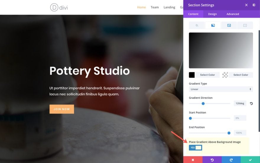
This is a great feature that improves the design process. Adding gradient overlays to images is a necessity in web design and this feature makes it easy to add those overlays right inside the Divi Builder. Simply add a background image to your module and then add a gradient background color combo. Under the gradient background options, select “place gradient above background image”. Just make sure you have a certain amount of opacity with your gradient colors so that you can see the image behind the gradient. And with the Visual Builder, you can easily adjust your gradient to the perfect opacity and color for your background image.
#3 Alternate Your Two Gradient Background Colors: There is a button for that.
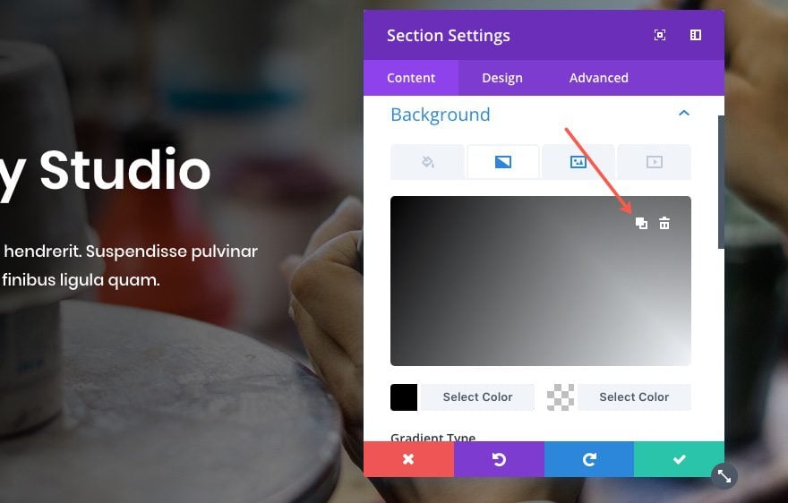
This is not a big feature, but I wanted to mention it because I would not be able to sleep at night knowing there are some of you out there still switching those color codes manually. Getting the right gradient background can be challenging at times, so it’s good to have options like this.
To alternate your colors, simply hover over the color picker and click the “color alternate” (not sure of the official term) icon. It is the one next too the delete icon.
#4 Keyboard Shortcuts
These are easy to miss and often forgotten. But they will speed up your workflow if you commit to using them. The time you save using shortkeys compare with the time you spend NOT using them can be considerable. I mean, there is a reason we learn to type instead of settle for handwriting (although I do enjoy handwriting). And the same goes with building websites.
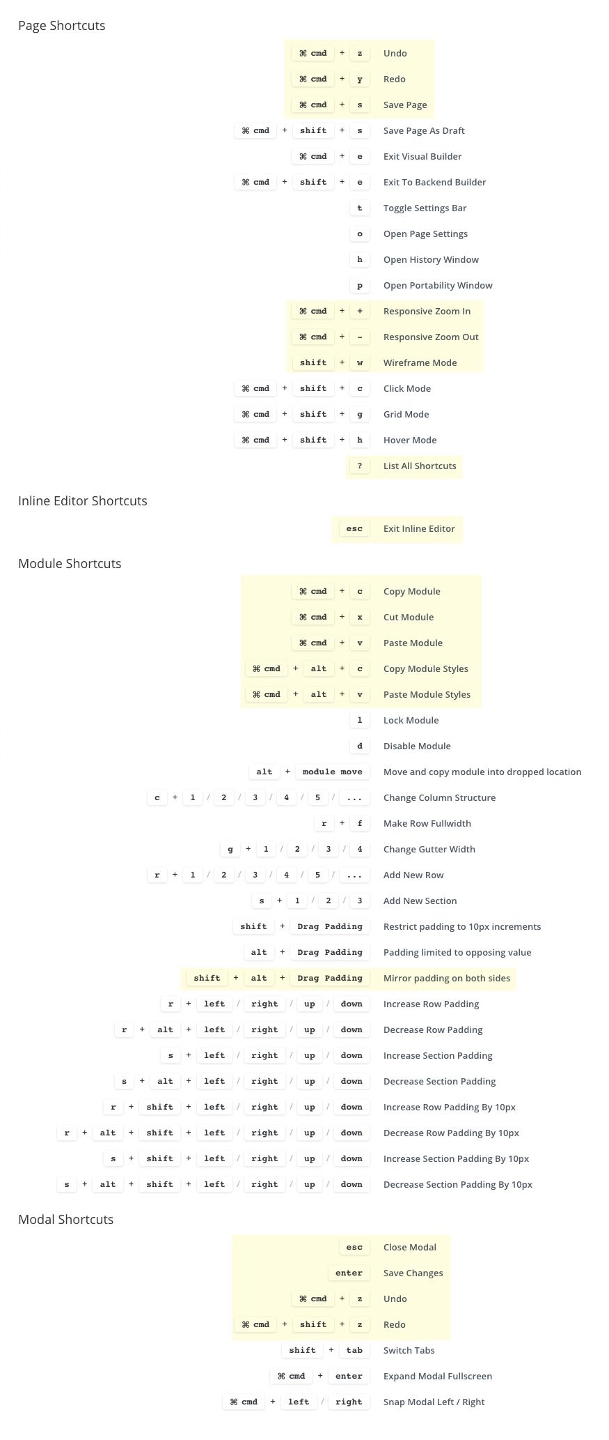
You can find a list of your keyboard shortcuts within the Divi Builder Helper modal. Simply type the question mark (shift + ?) on your keyboard from within the Visual Builder and click the shortkeys tab.
Oh yeah, the help documentation videos can be accessed the same way. Let’s not forget about those.
Here is a list of all the shortcut keys available. I’ve highlighted the ones I suggest starting off with (I personally use these all the time):
#5 Wireframe view
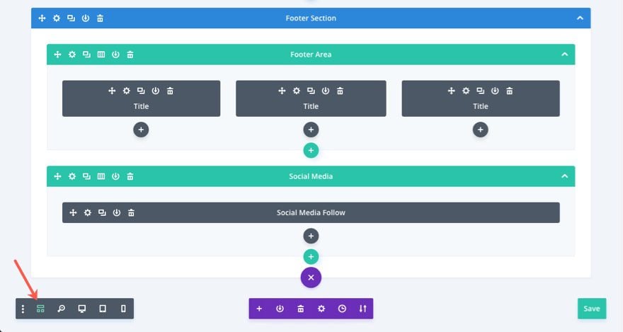
I mention this one because it fills the void of having to go to the backend build while you are designing with the visual builder. So for all of you backend builder die hards out there, you may consider taking the leap to the visual builder.
And don’t forget about the shortkey to open and close the wireframe view: shift + w
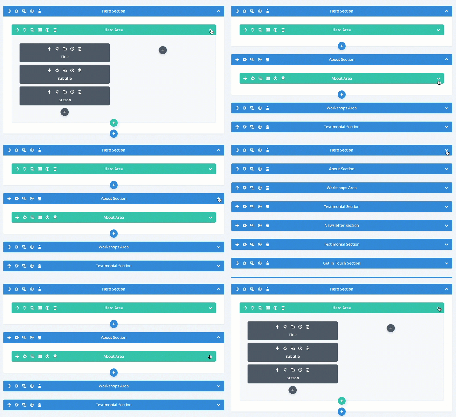
To get an even broader view of your layout within the wireview, you can select the toggle arrow icon on each of your sections or rows to collapse the entire section.
#6 Inline Editing
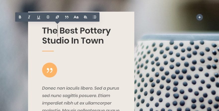
There are a few places where inline editing can be done. When you are using the Visual Builder and you want to edit the text within a certain module, you don’t have to click to edit the module settings to change the content. Simple click on the text and the inline editor will deploy, allowing you edit the text.
When you are using the wireframe view within the Visual Builder, you can also edit the labels inline. Want to change the name of a section label? You don’t have to do it from the row settings modal or from the right click options. Just click on the label and edit it right there.
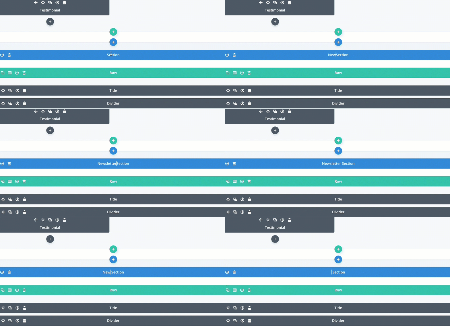
Tip: Exiting the inline editor can be confusing, but it doesn’t have to be. Simply press the esc key and you are out.
#7 Visual Builder Split Testing Using the Right Click Options
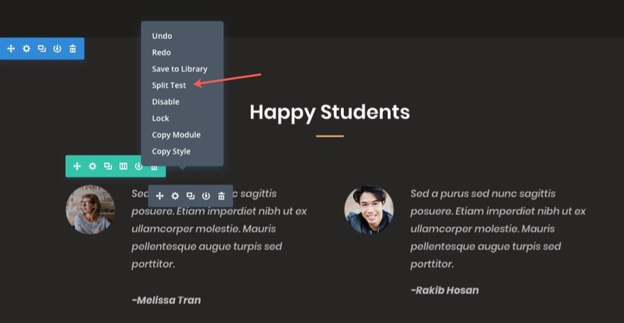
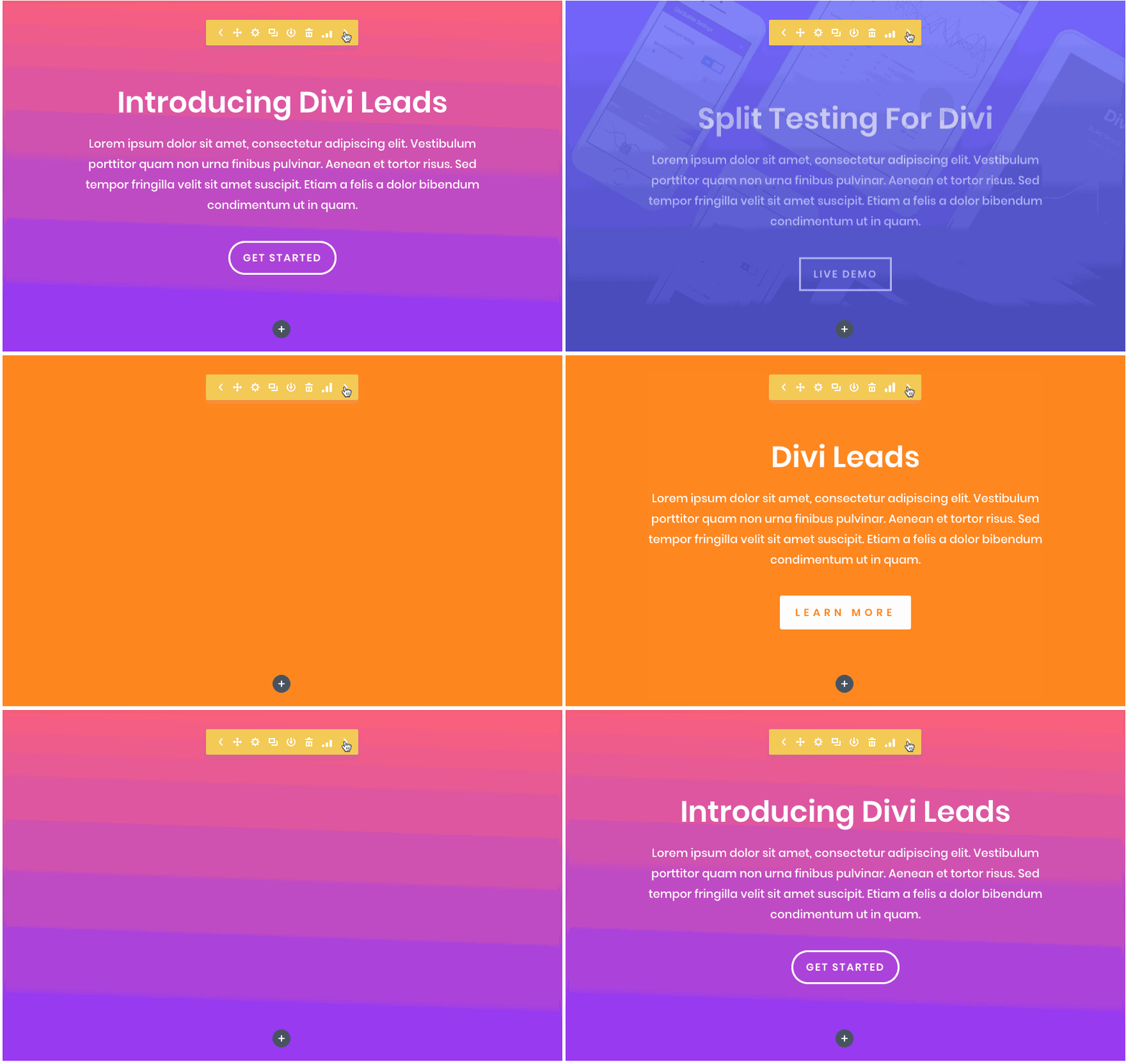
I’m always surprised just how easy it is to use the split testing feature within the Visual Builder. I’m not going to go into detail here because you can read the full feature release. But, here is the gist of how this works. Right click on the section, row, or module you want to test, and then select split test from the right click menu. Then select the goal of the test (contact form entry, button click, etc…). Divi will automatically create another version (split) the element you are testing so that you can create a new version. When first testing this feature, I didn’t understand how to see both versions of my split test from the visual builder so I opened the wireframe view to see both. But this isn’t necessary. Once you activate a split test goal, you will notice there are arrows in the settings menu appear that allow you to slide through the different versions of your split test.
#8 Customizable Builder Settings
If you haven’t explored the Builder Settings, it’s not too late. There are some helpful settings in here that can improve your daily interaction with the Visual Builder.
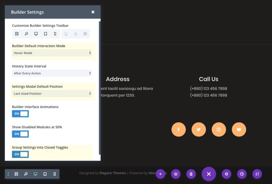
Here are three I want to highlight.
Settings Modal Default Position
I don’t know about you but I have a certain preference with how I like my Modals to popup when making edits on my large monitor (It’s the fixed left sidebar position in case you were wondering). But there are times when I need to break tradition and change the modal position (usually when I’m editing on a smaller screen like my laptop). So I set my default position to be fixed left sidebar. That way I don’t get suckered in to working with a modal position I’m not comfortable with before I realize the need to put it back the way I like it.
Group Settings into Closed Toggles
By default Divi will group your setting options into toggles. This means you will have to click to open those toggle to see the options within each one. You can disable that feature so that your settings are no longer grouped into toggles, allowing you to scroll through the settings without having to click to view more.
Builder Default Interaction Mode
Like many of the features listed in this article, this one is definitely personal preference. But I can see the benefits for each. The default hover interaction mode highlights and deploys the settings menu for any section, row, or module on hover.
The click mode can be useful as well. At times, it might not be clear what module you are editing or hovering over, especially if the module are closed together and/or have custom margins. The click mode takes the guesswork out if it entirely by highlighting and outlining the module content on hover before you click to edit the module.
The Grid mode will highlight and show the settings menu for all sections, rows, and modules at once. Although I don’t personally use this mode as a default, I do see the value of using the grid mode when ever I am moving/rearranging elements throughout my page.
#9 Link, Lists, and Blockquote design options with the Text Module
Don’t forget about the new tabbed interface for managing custom text styles within Divi’s Text Module. These tabs allow you to customize the design for your links, lists (undordered and ordered), and blockquotes. Making these changes using CSS can be a drag. Plus you may want to switch things up from module to module. These options allow you to do that easily.
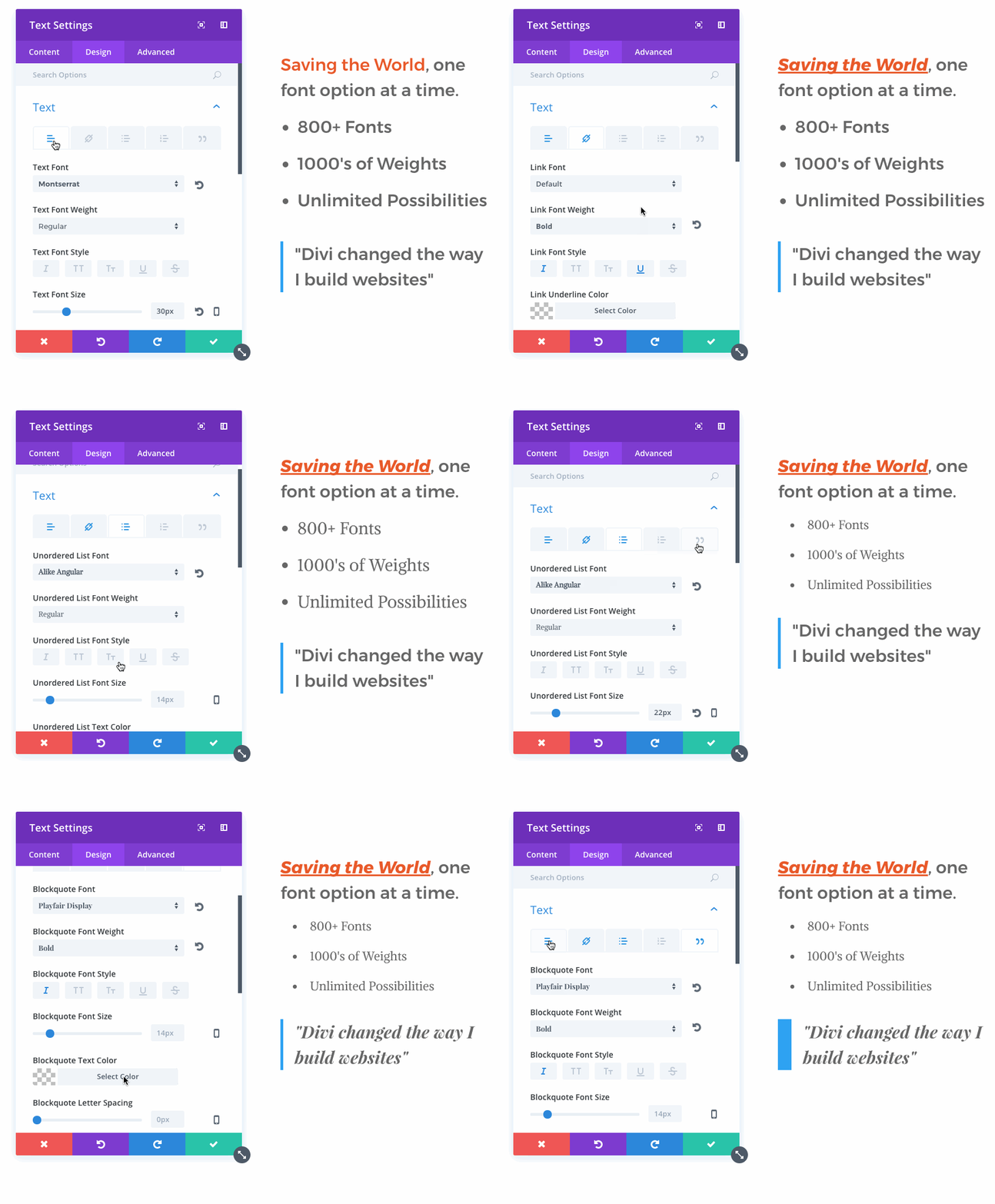
Here are two of my favorite options you may have overlooked.
List Style Options
Under the Unordered and Ordered Lists tabs, you can easily change the list style type or get rid of it all together.
You can also change the indent margin for the list items and the style position.
Blockquote Style Options
Under the Blockquote tab, you can change the border weight and color of the design element that sets the blockquote apart.
#10 Design options for all 6 Header levels
On the same note as #9 above, the new tabbed interface exists for text header levels as well. That mean if you have a module with multiple headers (h1, h2, h3, etc.), you can give each of those headers a unique style within the module design settings. Under the Design tab, toggle open the Title Heading or Header Text section and select the tab that controls the header type you want to customize.
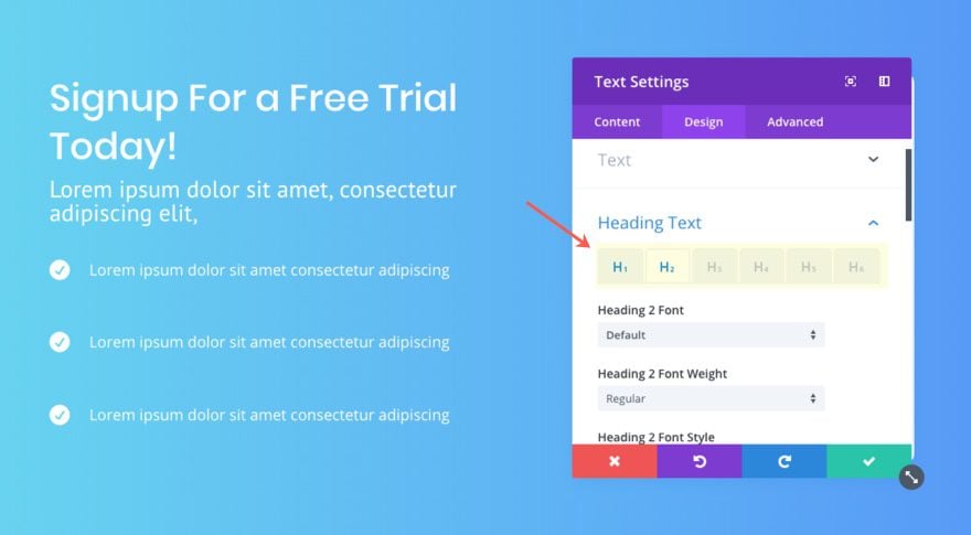
Tip: You will know what header levels have been customized by the blue label on the tab. If the label stays gray, the default settings are active for that header level.
#11 Upload Custom Fonts with Divi Modules
Who knows? Maybe that Upload button has remained hidden in plain site for some of you. If so, you should definitely take advantage of this convenient feature. Not only can you easily upload custom fonts in various file types (eot, woff2, woff, ttf, otf), Divi will store those custom fonts for you so that they become available for all modules throughout your site.
All you need to do is select to change the font of a text element and click the Upload button.
An Upload Font Modal will popup allowing to name and add your font file.
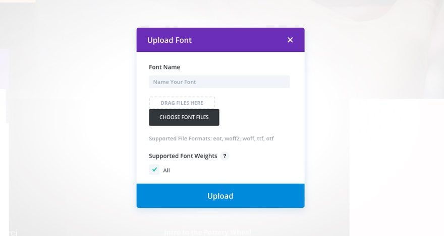
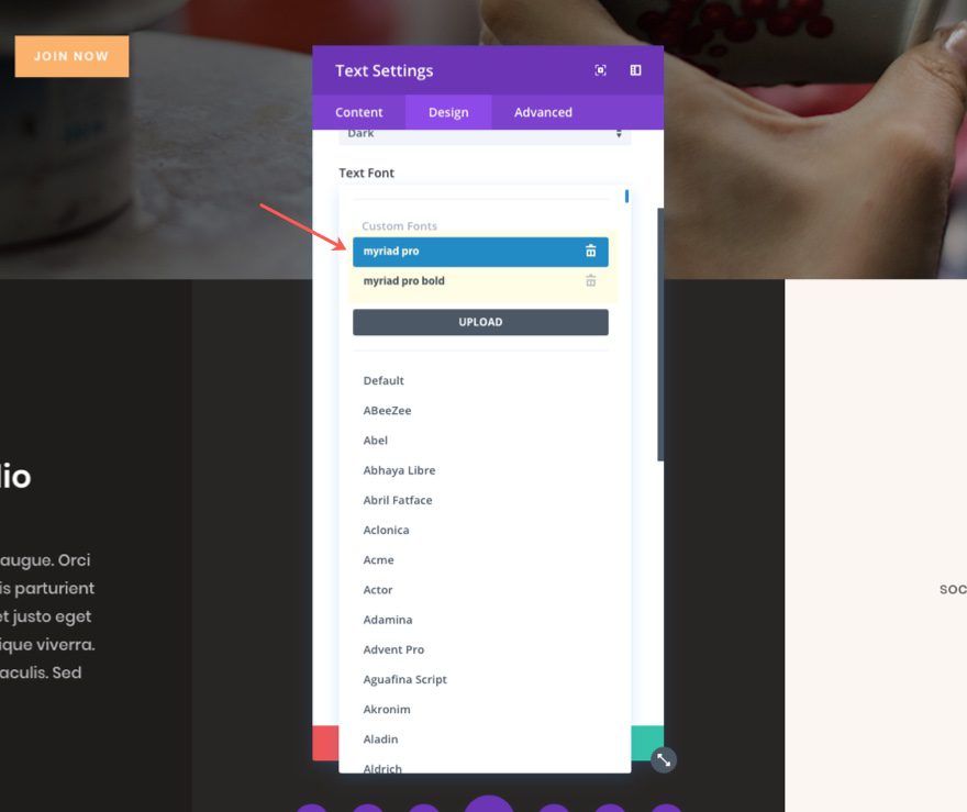
After your file has been selected, click the upload button. Then you will be able to access these custom fonts from the same list of fonts included in the Divi Builder.
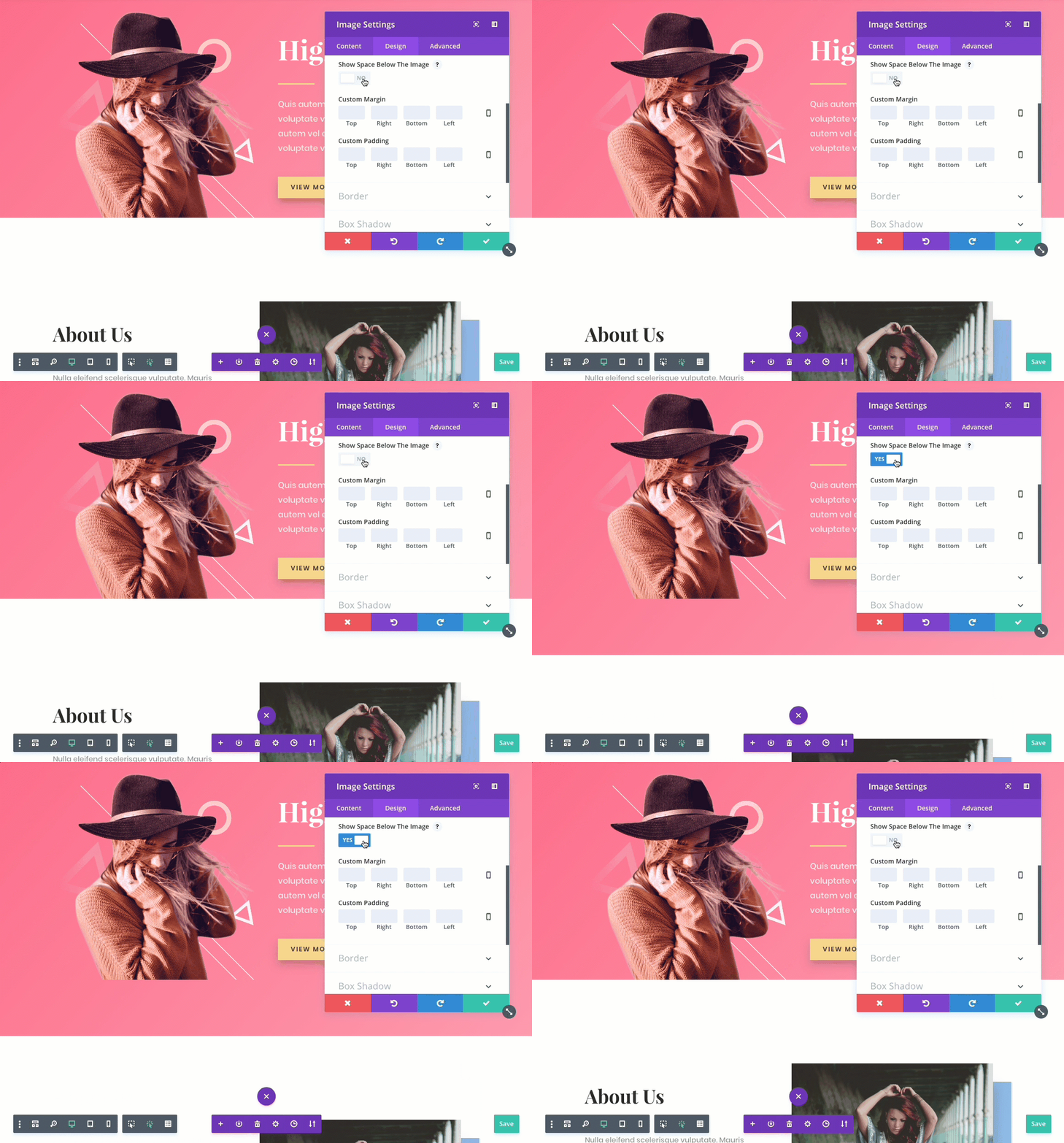
#12 Remove Space Below Image
This feature has been around for a while but there is a chance you may have missed it or you may not understand it’s significance.
This option only affects images when they are the last module in a column. When enabled, the distance between the bottom of the image and the following section is removed, allowing the image to border the top of the next section on the page.
One way to take advantage of this feature is to position your header images so that they border the section below.
#13 Add different units for different inputs
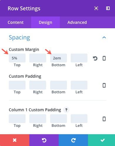
By default, when you enter a number for certain inputs throughout the Divi Builder Settings, Divi will treat it as a pixel unit. But you are not limited to entering pixel units for these input options. You can also enter other units including %, em, vh, and vw.
For example, percentages work really well for mobile. If you set a top margin at 5% (instead of something like 100px) on desktop, the margin will scale proportionally to 5% of the size of the section on mobile (instead of inheriting a large gap of 100px which would be too much space on mobile). This is a good technique for keeping a section above the fold on different browser sizes.
You can even use combinations of units. You may want to keep your height fixed by setting your top and bottom margins to a certain number of pixels and then set your left and right margins to a certain percentage.
All you need to do is type the unit suffix with your number when filling in the different inputs.
#14 History States
History states are kind of like a time machine for your edits within the Divi builder. Instead of using the undo and redo right click options or hotkeys, you can conveniently view the list of your edits by clicking the Editing History link from you settings menu.
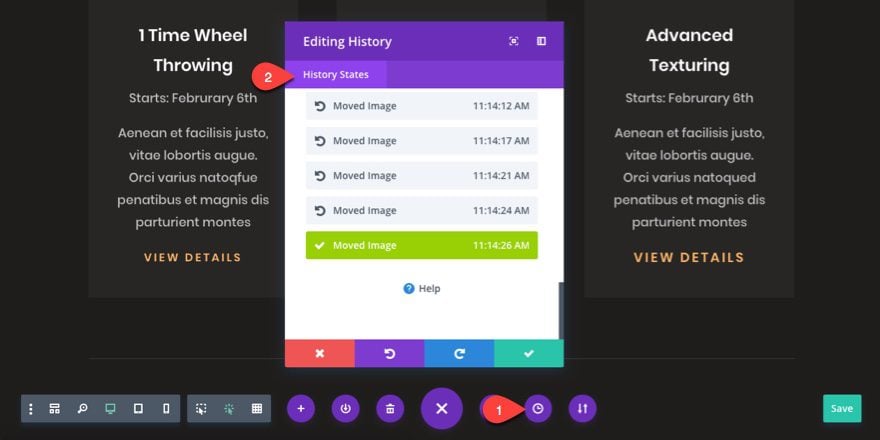
What is cool about this feature is it lists the time stamp and a small description for each edit within the history state list.
Also, if select a history state to go back to a past state, you can always revisit the list to go forward to the latest edit you made. Basically, it allow you go to backward and forward through your previous edits while seeing those changes in realtime with the Visual Builder.
Keep in mind that these history states are saved as a Backbone collection / Javascript object and are not saved to your database and will not bloat your database. Because of this, if you exit out the builder when editing the page, you will not be able to revist the history states you previously made. So make sure you keep the building open until you have finalized your design. The history states begin when you load the page/builder.
#15 Custom Gutter Width Option (great for grid layouts)
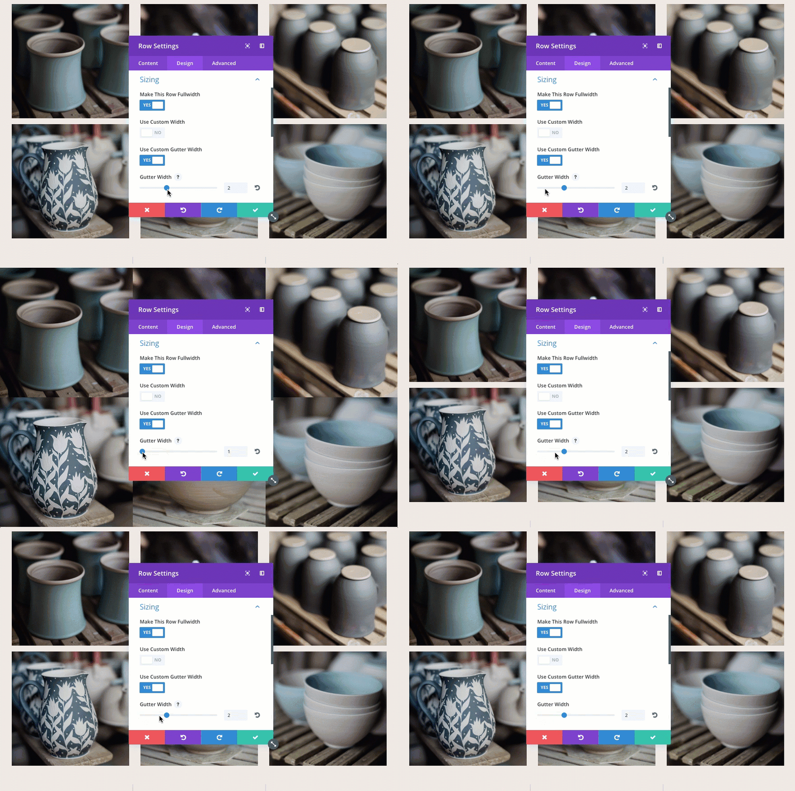
Gutter width corresponds to the amount of horizontal space (margin) between the columns in each row.
Optional values for gutter width range from 1 to 4.
1 represents zero margin between columns.
2 represents a 3% right margin between columns.
3 represents a 5.5% right margin between columns.
4 represents a 8% right margin between columns.
This definitely comes in handy designing grid layouts. Grid layouts can be creating manually using using column structures and modules, but you can also assign grid layouts automatically within certain modules like the portfolio module and blog module.
For example, let’s say you want to create a fullwidth grid layout to display images without any spacing between them. You can create a new row with three columns, add images to your columns, make the row fullwidth, and then give it a custom gutter width of 1.
#16 Right Click Options
Feature Location: Simply right click on any section from within the Divi Builder.
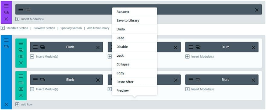
Although I’m not going over all of the right click options here, I would like to point out a couple of options that are only accessible when right clicking which are simply too convenient to overlook.
Lock
As an admin, you alone have the capability of locking certain items. This is a convenient way to keep your editors from changing content that you want unchanged. It also protects you from accidentally changing an important section.

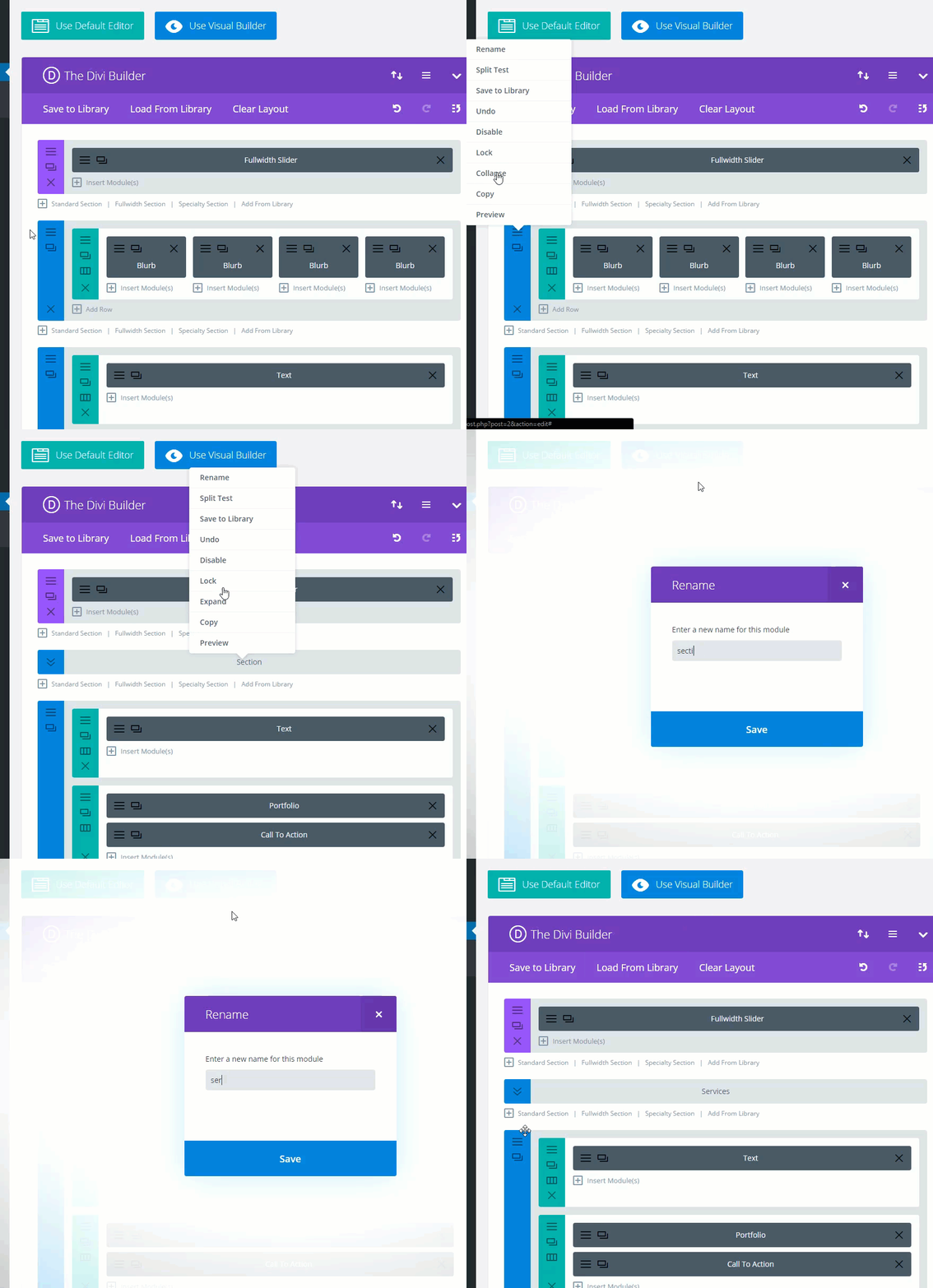
Collapse and Rename
I love to use these two options in combination as I build longer web pages. I don’t know about you, but I get really tired of scrolling up and down to find the sections I need to edit. That is why I use the right click collapse option to condense large sections of my webpage that have been completed. Once collapsed, I use the right click option to rename the section for a recognizable admin label.
#17 Disable Top Tier Dropdown Menu Links
Feature Location: Divi → Theme Options → Navigation → General Settings
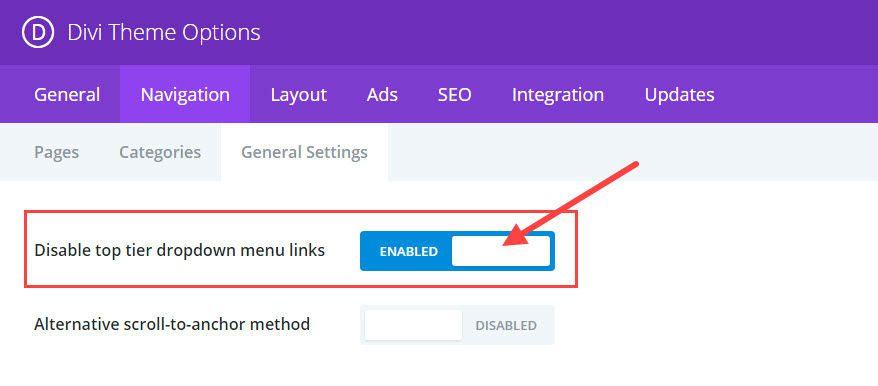
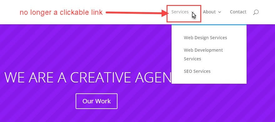
To be clear, top tier dropdown menu links are the main parent links that stay visible on the navigation menu. The sub tier links are those that show up after you hover over the top tier parent link.
By disabling the top tier dropdown menu links, the top tier parent links are no longer clickable links. Instead, they can serve as non-clickable placeholders that label and organize your sub links.
For example, let’s say you are building a site for a company that offers three main services and each of these services need their own page. A normal setup would be to have a top tier link called “services” with the three types of services as sub menu items. Instead of having to deal with linking to a general service page, you could disable the top tier “services” link and simply use it as an organizational label.
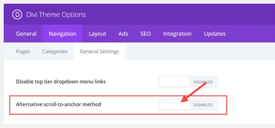
#18 Alternative Scroll-to-Anchor Method
Feature Location: Divi → Theme Options → Navigation → General Settings
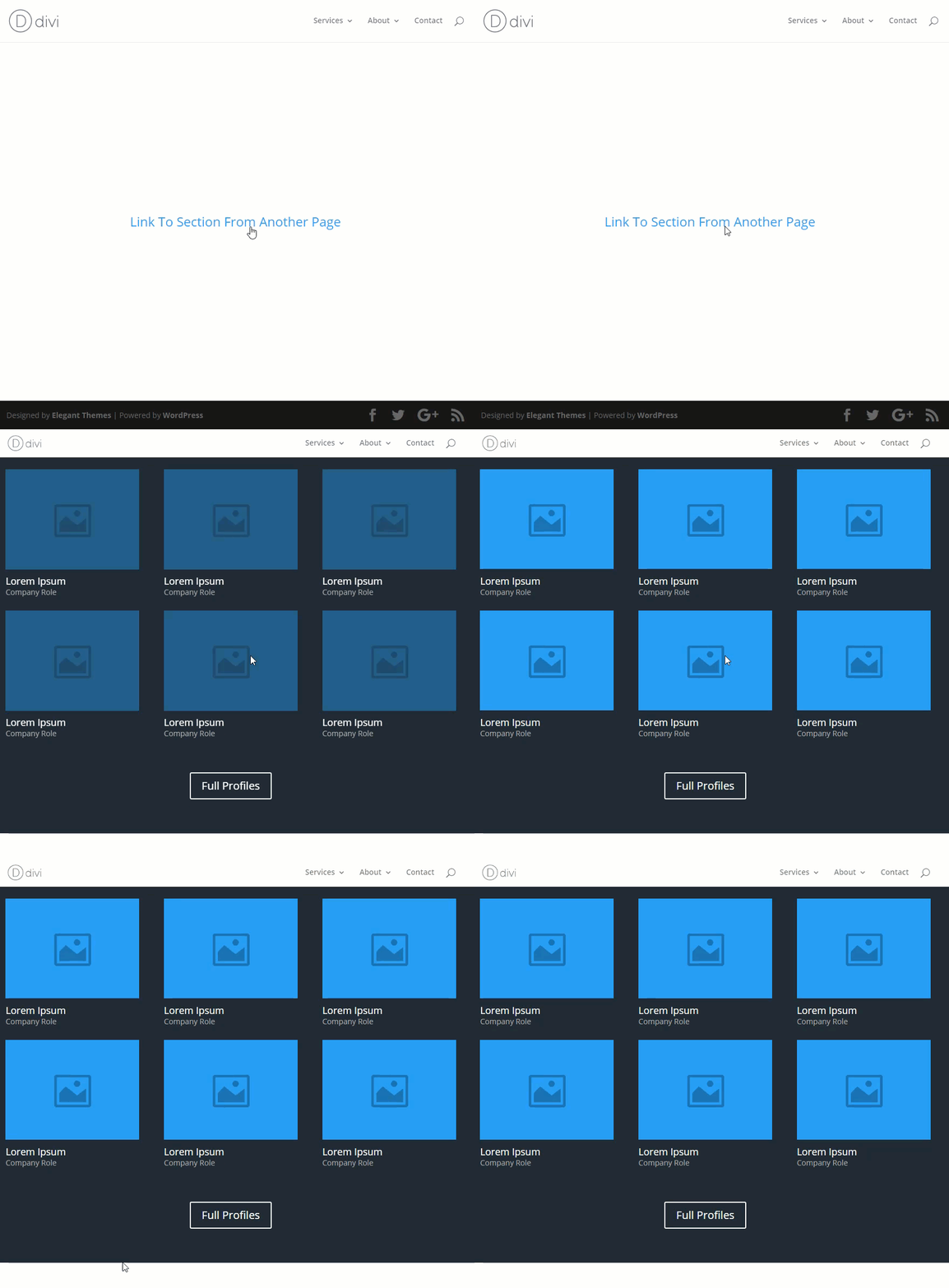
If you have ever tried to link directly to a CSS ID using an anchor link from an external page, you may have noticed that the final resting location of the page isn’t quite correct. Sometimes it is too low so that some of the content gets cut off at the top.
Here is what my screen looks like after linking to my CSS ID from an external page. You can’t see it but the title of the section has been cut off.
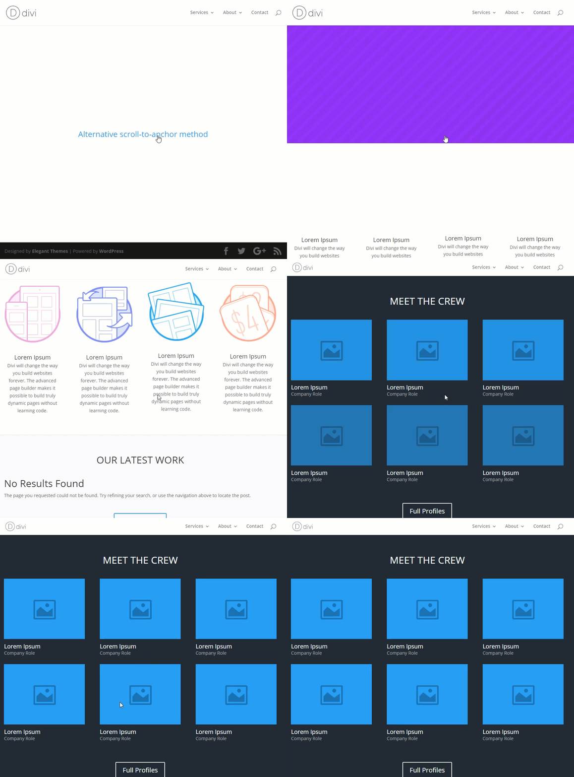
Enabling the Alternative scroll-to-anchor method corrects this problem. Not only does it put the user in the correct spot, the top of the page loads first before scrolling to the CSS ID. I find this helpful for users who may get confused and not realize initially that they are viewing a section of the page.
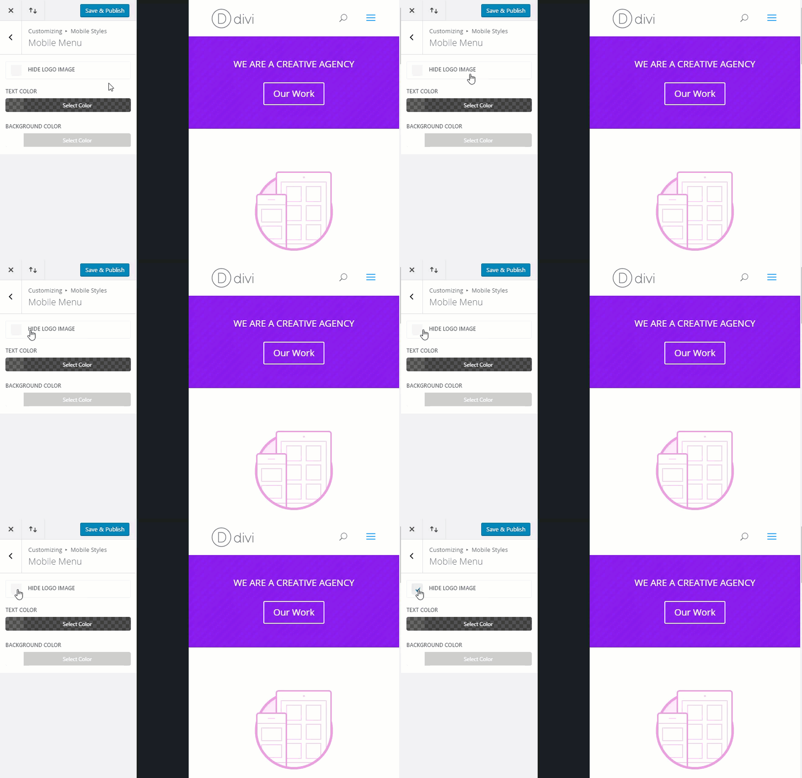
#19 Hide Logo on mobile
Feature Location: Divi → Theme Customizer → Mobile Styles → Mobile Menu
If you ever need to hide your logo on mobile, Divi makes this very easy. But it is one of those options that is easy to overlook. Save yourself some time and don’t worry about messing with additional CSS.
#20 Primary Menu and Secondary Menu Dropdown Animation
Primary Menu Feature Location: Divi → Theme Customizer → Header & Navigation → Primary Menu BAr Dropdown Menu Animation
Secondary Menu Feature Location: Divi → Theme Customizer → Header & Navigation → Secondary Menu Bar –> Dropdown Menu Animation
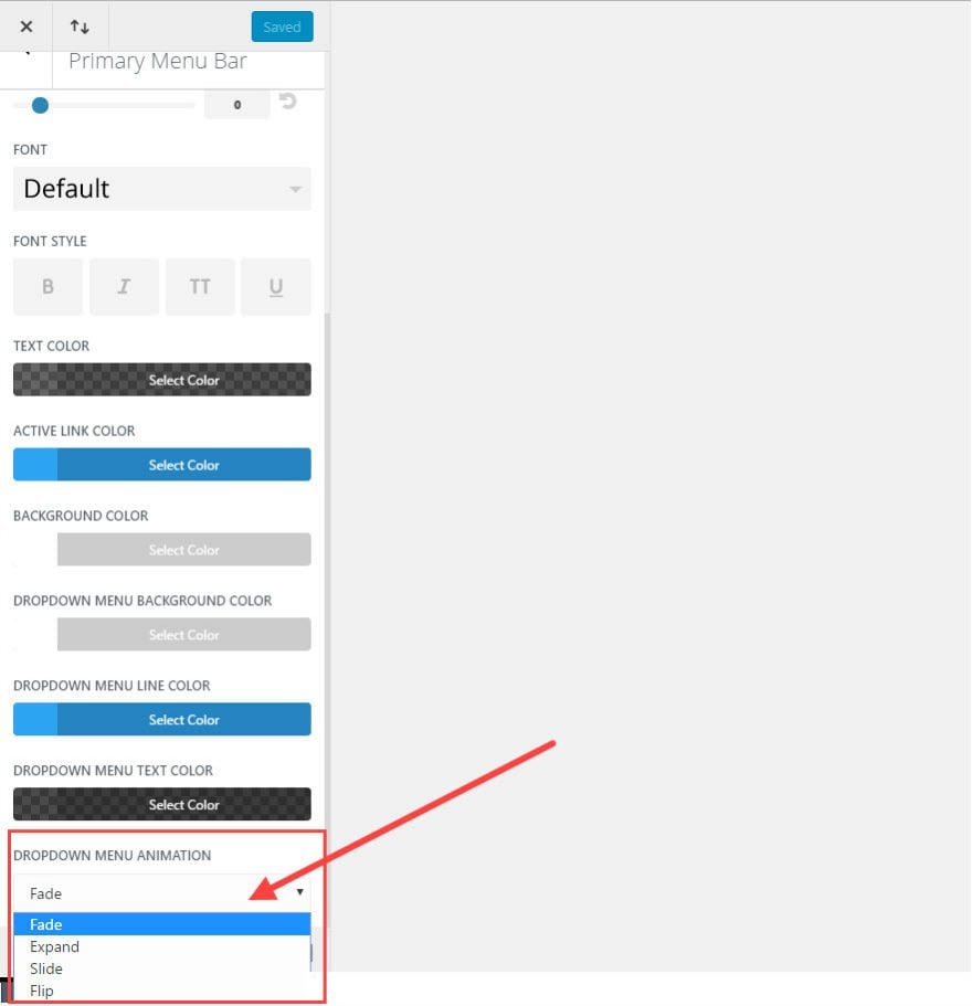
You don’t have to settle for the default fade animation for your dropdown menus. The Dropdown Menu Animation section includes four options:
1. Fade (the default)
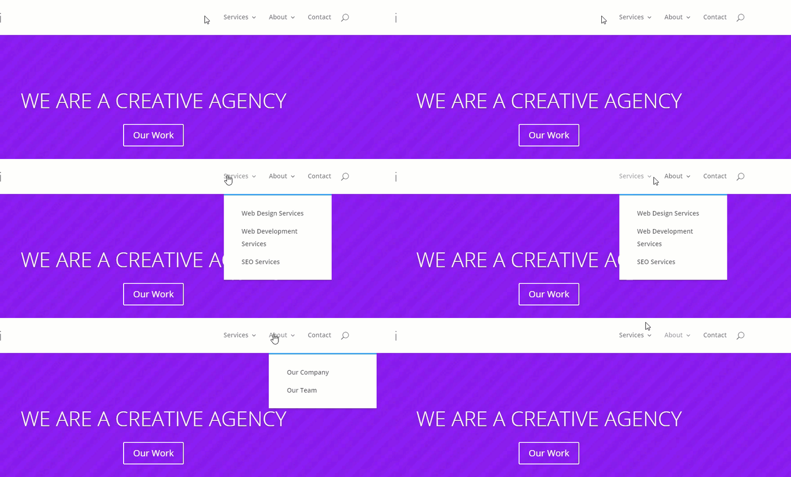
2. Expand
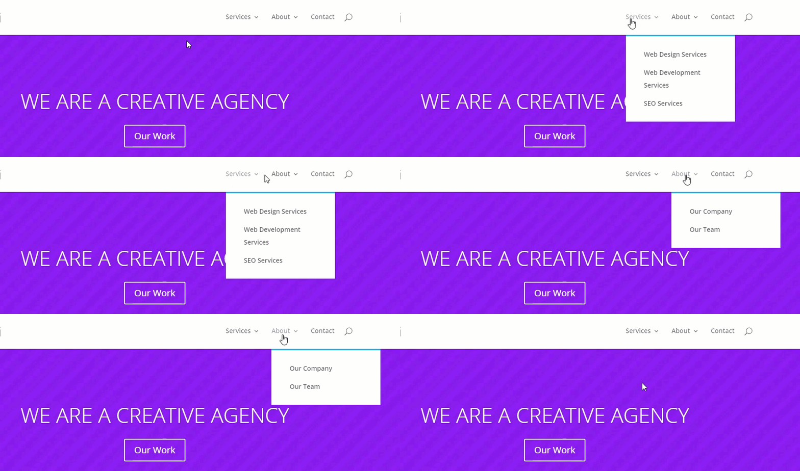
3. Slide
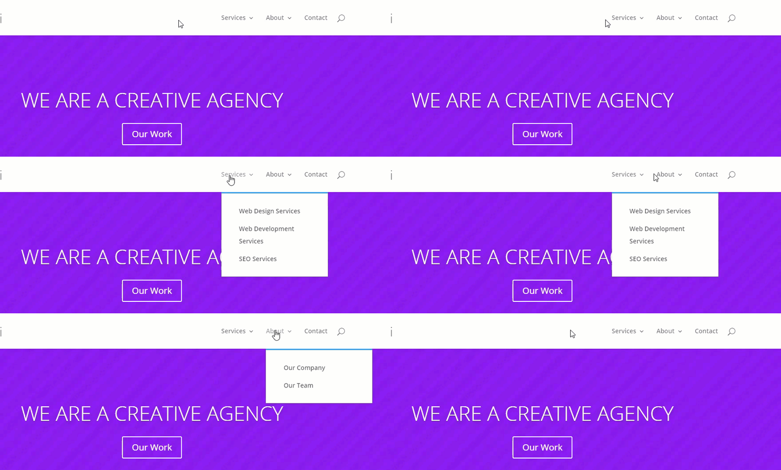
4. Flip
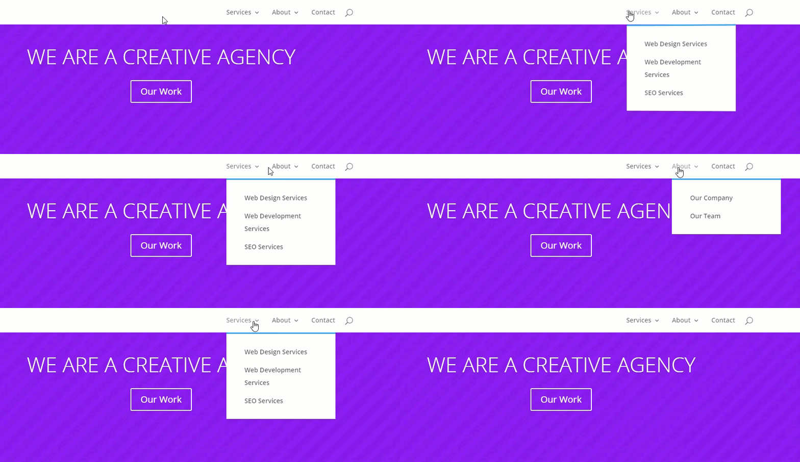
Sometimes microinteractions like this can really make your menu standout.
#21 Edit (or disable) Footer Credits
Feature Location: Divi → Theme Customizer → Footer → Bottom Bar → Disable Footer Credits / Edit Footer Credits
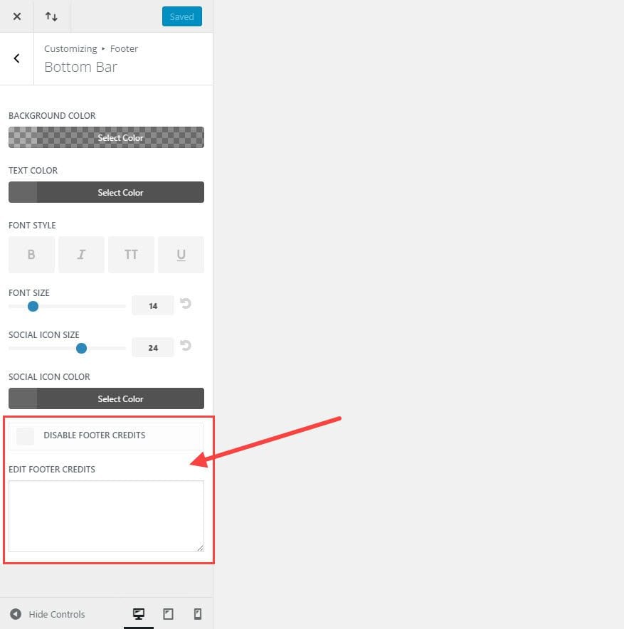
If you have been using Divi for a while, you may have gotten used to editing the bottom bar of your footer by editing the footer.php file in your child theme. This is no longer necessary.
You can easily disable the bottom bar altogether or you can insert your own footer credits by entering text or html inside the text box.

#22 Changing Divi’s Default Color Palette
Feature Location: Divi → Theme Options → General Tab → Color Pickers Default Palette
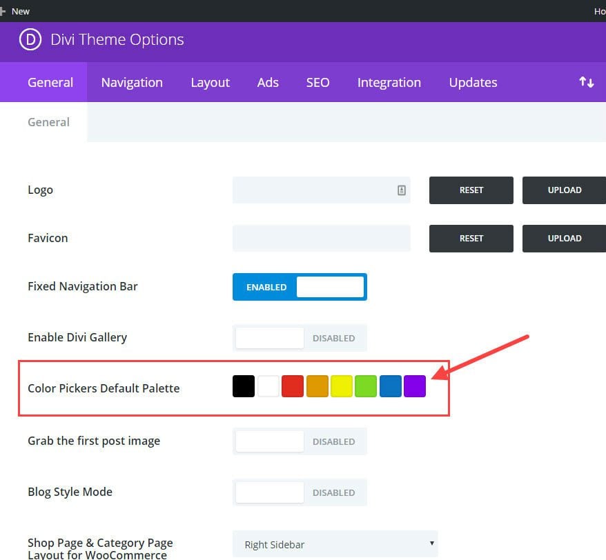
Give yourself a break from copying and pasting hex color codes.
The Color Pickers Default Palette is the color palette that will be used throughout the Divi Builder.
If you know the color theme of your website, simply update the default colors to include those colors needed for your design. This option can save you a lot of time in the long run since these colors will be accessible to you throughout all of the modules when building and editing your site.
#23 Divi’s Page Settings
Location: Gear Icon in the Settings Menu at the bottom of the Visual Builder.
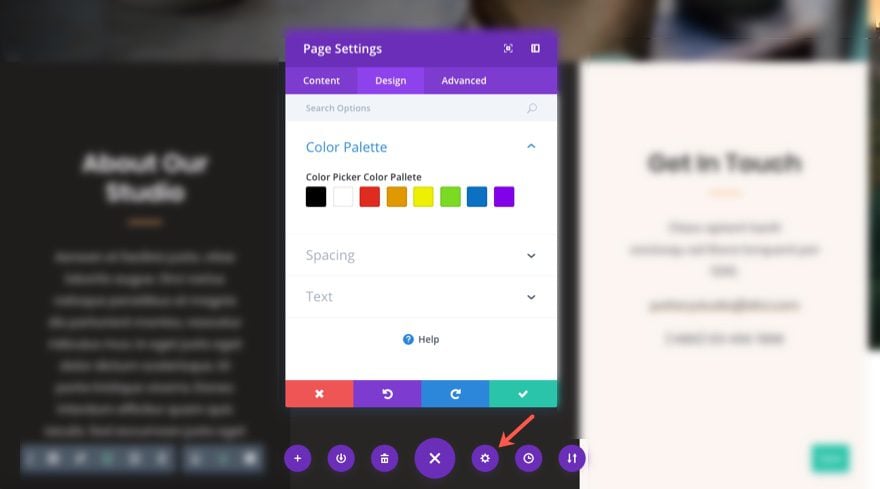
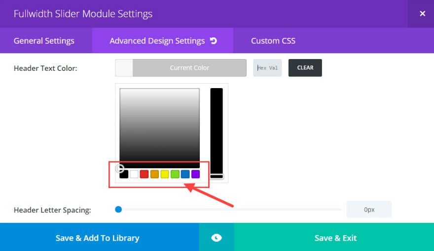
Ever since Divi 2.7, the Divi Builder Settings allows you to set default settings (and override the theme settings) for the specific page you are working on within the Divi Builder. This ability to set page specific settings is an extremely convenient time saver for building landing pages or other pages that need a specific design that deviates from the norm.
You can set a color palette for your page which will override the default palette in your Theme Options.
You can also add page specific custom CSS. Since the CSS will only get loaded on the specific page, you won’t need to go through the trouble of targeting specific post IDs or accessing your child theme style.css file.
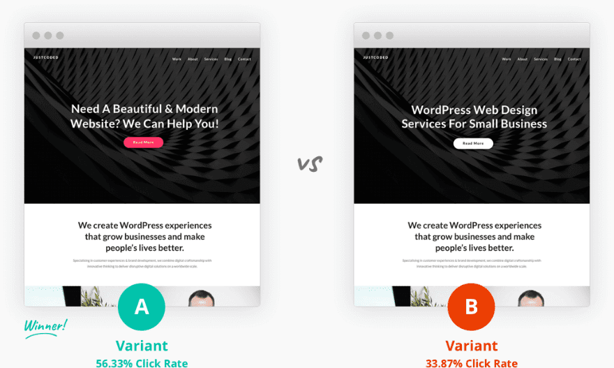
One unique feature of the Divi Builder Settings is the ability to enable the Divi Leads split testing system for your page. This powerful tool is simply too valuable to ignore. If you haven’t used it yet, take my advice and start your first test today!
#24 Choose What Meta Info to Display on Blog Posts
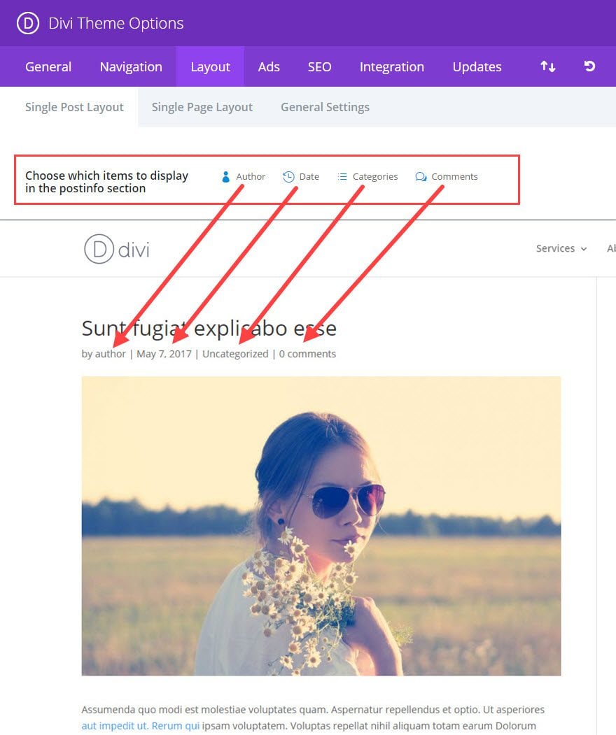
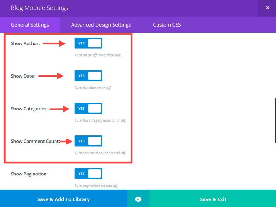
Although this Divi feature has been around since the beginning of Divi, it can easily be overlooked. Each of your blog posts has certain meta info that shows under the post title (author, category, date, comments). But, depending on how you are using your blog, you may not want this extra info distracting from the content you are providing. Divi makes it easy to customize this info for you.
Change Meta Info for Single Post Layout
Location: Divi → Theme Options → Layout (Tab) → Single Post Layout
You can easily click to disable or enable each of the four pieces of meta info for all of your single blog posts by clicking on each of them. Disabled meta info will show as being faded out.
Change Meta Info for Blog Page Post Excerpts
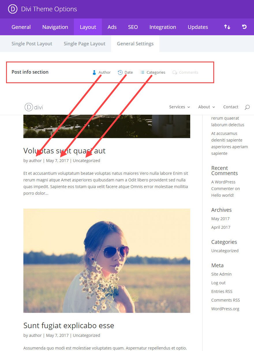
Location: Divi → Theme Options → Layout (Tab) → General Settings
To change the meta info displayed on your blog page post excerpts, simply click on each of the four meta items you want displayed or hidden.
If you are using the Divi Blog Module for your blog page, the above settings will not work. You will need to change what meta info you want displayed within the Blog Module General Settings.
#25 The Code Module
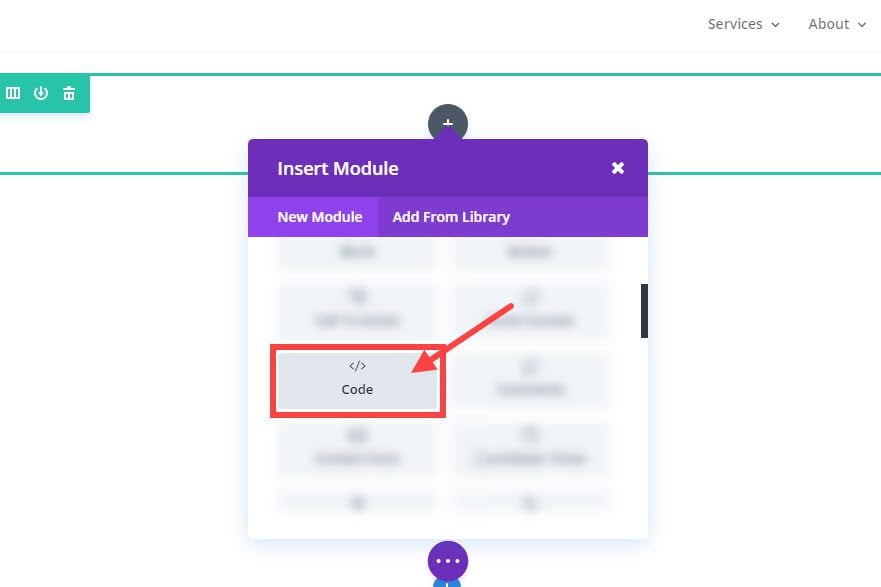
The Code Module is one of the best hidden features of Divi. It gives you the ability to add html to your page with no restrictions. The module also allows you to add html elements to certain pages without it affecting other pages. The capabilities of the Code Module are endless, but here are a few ways you can use it:
- Import external css files like Animate.css for only the page that you need animation.
- Add javascript code blocks or libraries that you only what applied to your page.
- Integrate third party plugins like the revolution slider.
- You can use the Fullwidth Code Module to embed a Typeform for more interactive questionnaires, contact forms, etc…
- Add a floating action menu
- Create a slide-in top bar ad.
- Add a floating action button.
In Closing
When learning something for the first time, it can sometimes feel like drinking from a fire hydrant, and there are things you will undoubtedly have missed and need to review. My goal with this post was to review some of those Divi features that I think are easy to miss and too useful to ignore.
Do you have any features you think should be on the list? Please share, I’m sure we will all benefit.
I’ll be looking forward to your comments.
The post 25 “Hidden” Divi Features to Boost Productivity and Design appeared first on Elegant Themes Blog.
