We often see blog cards with the author’s name, the post’s category, or the publish date. These are post elements that belong to the post itself. Divi gives you lots of control over post elements inside a Blog Module. However, it can sometimes be difficult to decide which elements you want to display (and which you don’t). To help you decide, this post will examine 8 blog post element display combinations for Divi’s blog module. We’ll also discuss the advantages of each.
Let’s get started.
Add Blog Module to New or Existing Page
You can add a Blog module to a new or existing page or make adjustments to an existing Blog module. For my examples, I’m adjusting the Blog modules on the Blog page for the Acai Bowl Layout Pack that’s available within Divi.
Here’s a look at the page with its default design settings. This page includes two Blog modules to create a hero section and a blog feed.
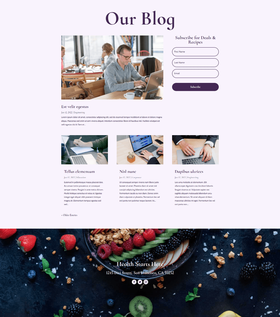
The Blog module in the hero section includes 1 post with a fullwidth layout. It displays the featured image, title, date, category, and excerpt.
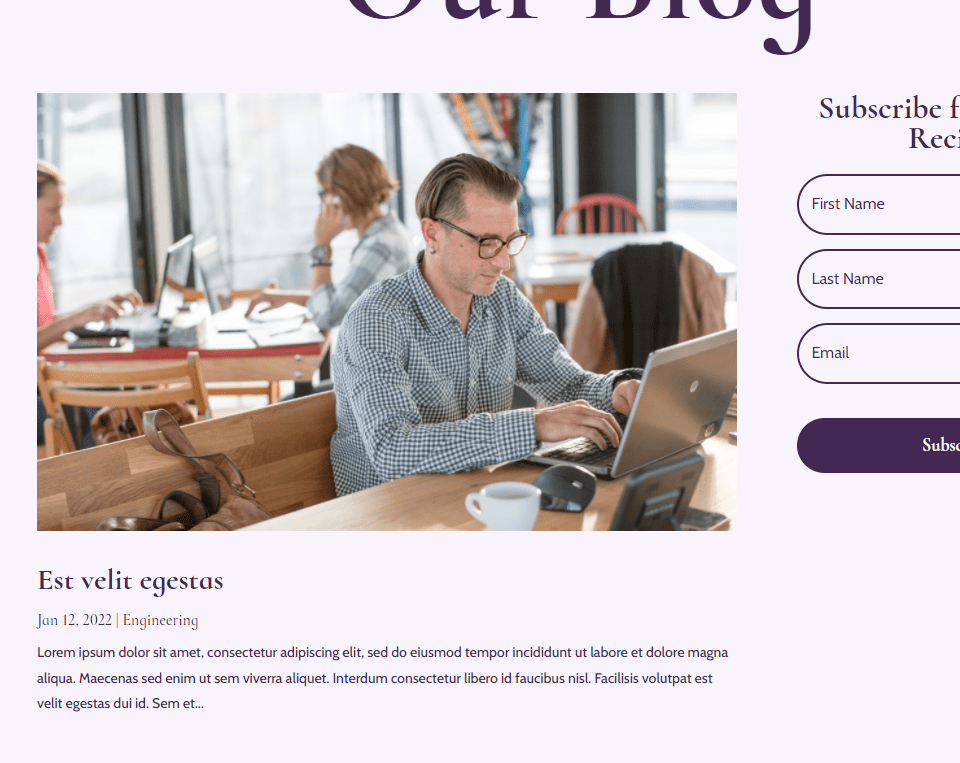
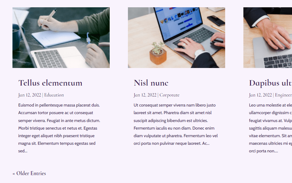
The blog feed offsets the posts by 1 so it doesn’t overlap with the hero section. It displays 3 posts in a grid layout. It includes the same elements as the hero section and adds pagination. We will mostly focus on the blog feed for our examples because the featured image is smaller, making the elements easier to see in my screenshots. I’ll also add a few with the featured post module to show how combinations can work together across the modules.
Go to Elements Tab
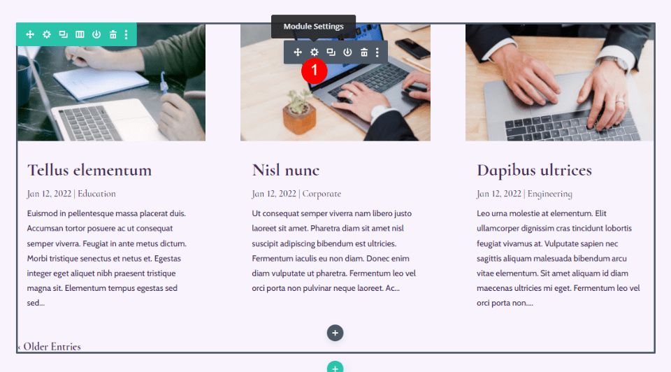
To find the Elements tab within the Divi Blog module, first, click the gray gear icon that appears when you hover over the Blog module.
This opens in the module’s settings to the Content tab. Scroll down to Elements. Here, you’ll see a list of options you can enable or disable by clicking their toggles. Each of these is an element you can use, and you can use them in any combination you want. Let’s look at each one individually.
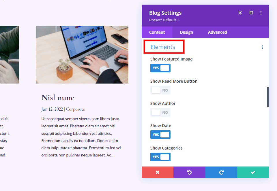
Overview of the Different Elements You Can Show/Hide in Your Blog Module
Here’s a look at each of the elements. The elements can be styled individually in the Design tab and each element has a custom CSS field in the Advanced tab that makes it easy to target them with CSS.
Featured Image
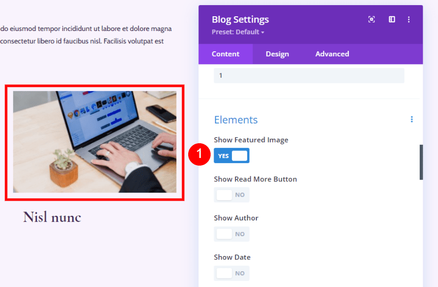
The first element is the Featured Image. This is the thumbnail image from the post. It draws attention to the post. It’s also a link, so clicking the image takes the reader to the post.
Read More Button
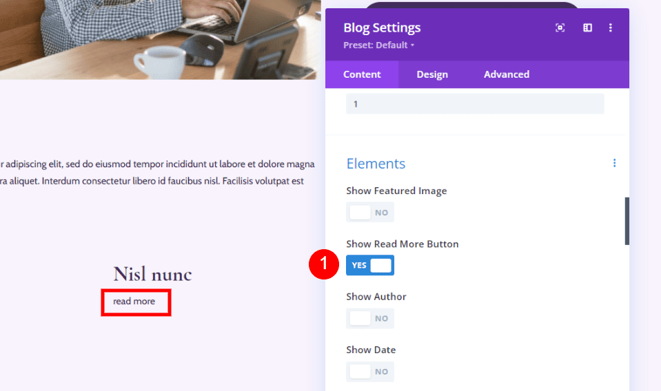
Next, we have the Read More Button. This is a link to the full blog post. It appears under the rest of the content.
Author
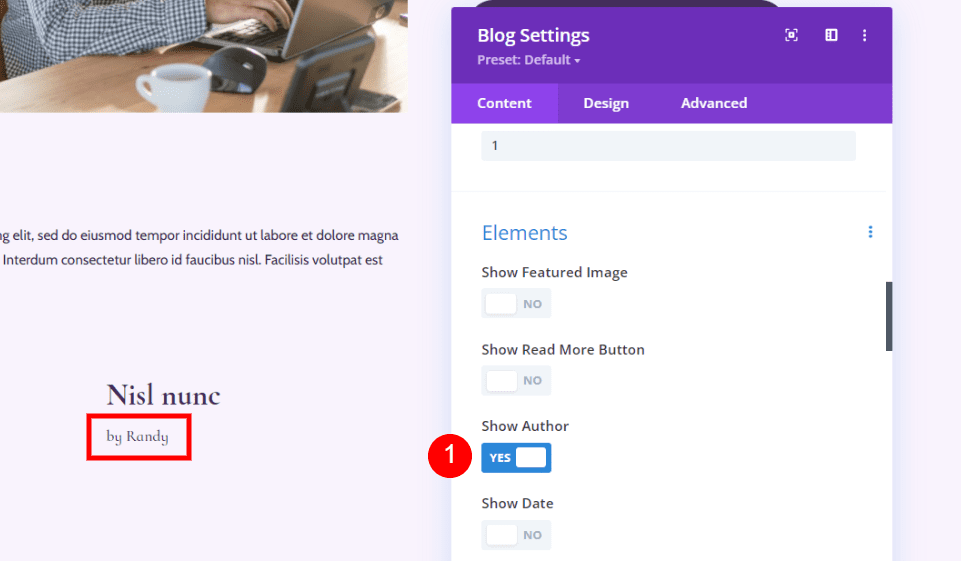
Author displays the name of the blog post author. It displays the name according to how it’s specified in the WordPress Users Settings. It’s clickable, so the reader can see the archive page for that author.
Date
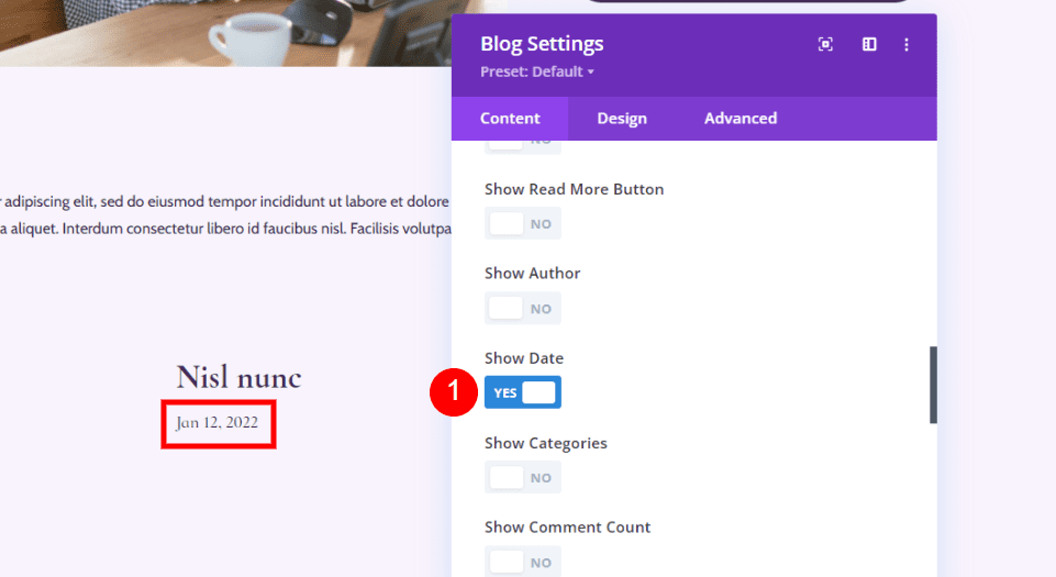
The Date element displays the date the post was published. It uses the date format that you’ve specified in the WordPress General Settings.
Categories
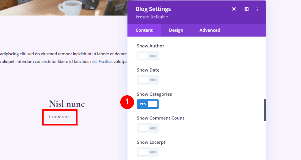
Categories displays the name of every category you’ve selected for the post. Each category name is clickable, so the reader can see the archive page for every category.
Comment Count
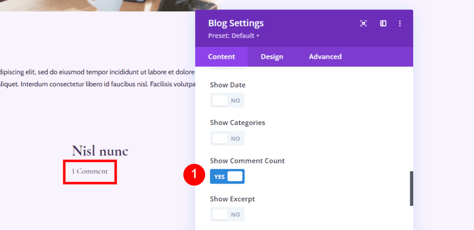
Comment Count displays the number of comments on the post. This informs readers if there are any comments, or any new comments, they can interact with.
Excerpt
Excerpt shows a small snippet of the post according to how you’ve set it up for the post. It can be used as a teaser or as a description of the post itself.
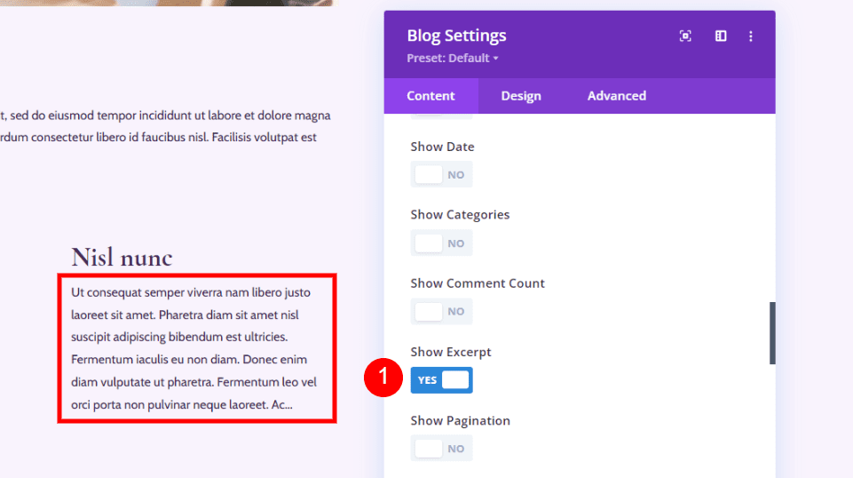
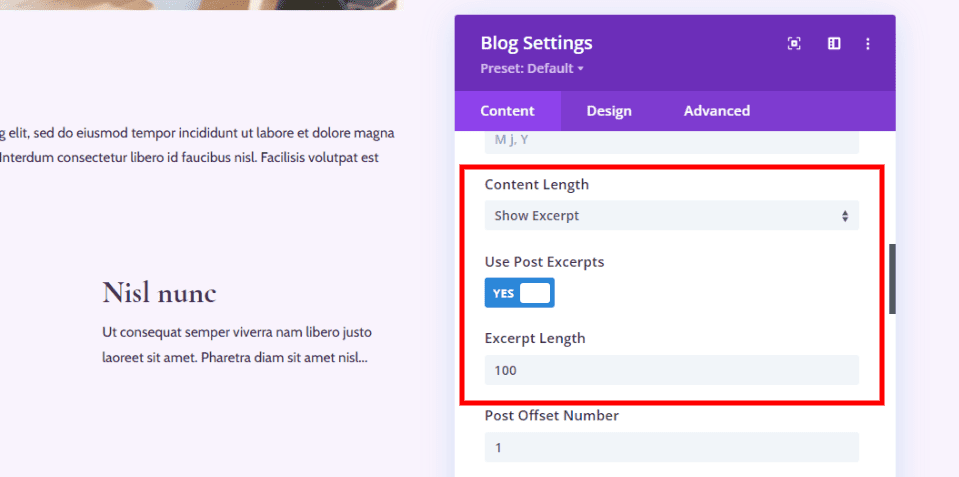
It also works with the settings that you’ve specified in the Content area of the Blog module’s settings, which appears above the Elements settings. You can set it to use the custom post excerpt if there is one and specify the number of characters it will display. I’ve set this one to show 100 characters.
Pagination
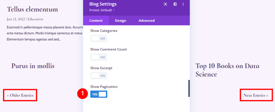
Pagination shows the links to see the older and newer posts. This keeps you from having to show every post on the page and users still have easy access to read them. They can see the previous or next posts by clicking the links, which is similar to turning a page.
Element Combinations & How They Look
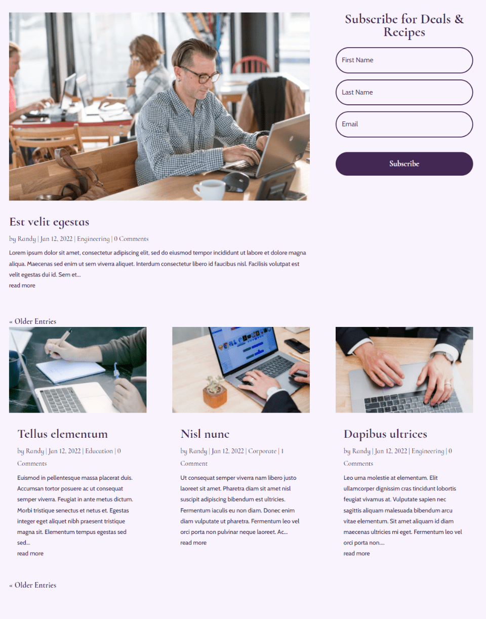
The elements can be used in combinations to create some interesting designs. It’s tempting to enable them all, as I’ve done in the image below, but this can clutter the page and provide information that the reader doesn’t need. Instead, it’s a good idea to choose those you want. By selecting them in certain combinations, we can be more strategic about the blog design. We can also use them in combination with other Blog modules, as we’ll see.
Element Combinations Option 1: Featured Image, Title & Description
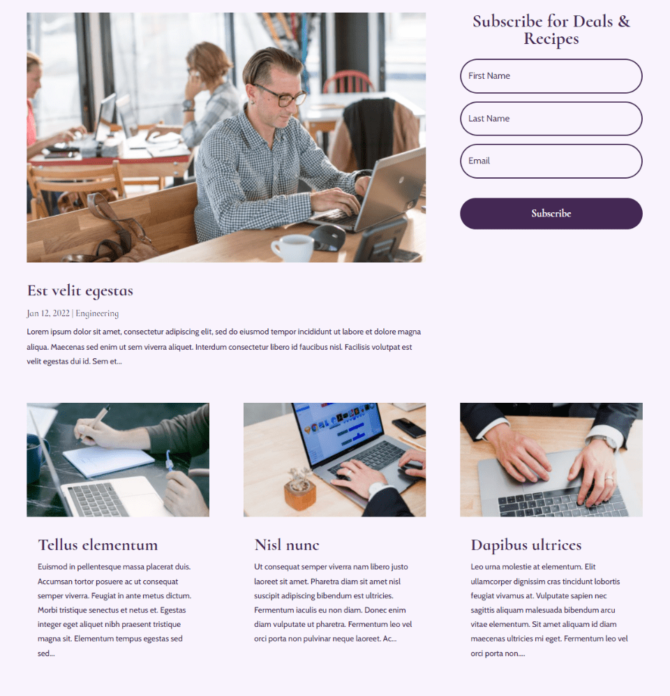
If you want to show the featured image, the post title, and the description, simply enable the Featured Image and Excerpt.
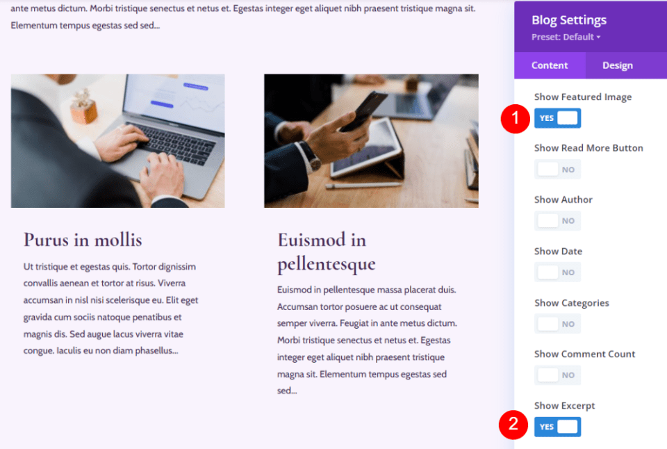
Here’s how it looks on the blog page. The hero section still shows the date and categories for emphasis. This minimalizes the blog feed and helps keep the page clean.
Element Combinations Option 2: Featured Image & Read More Button
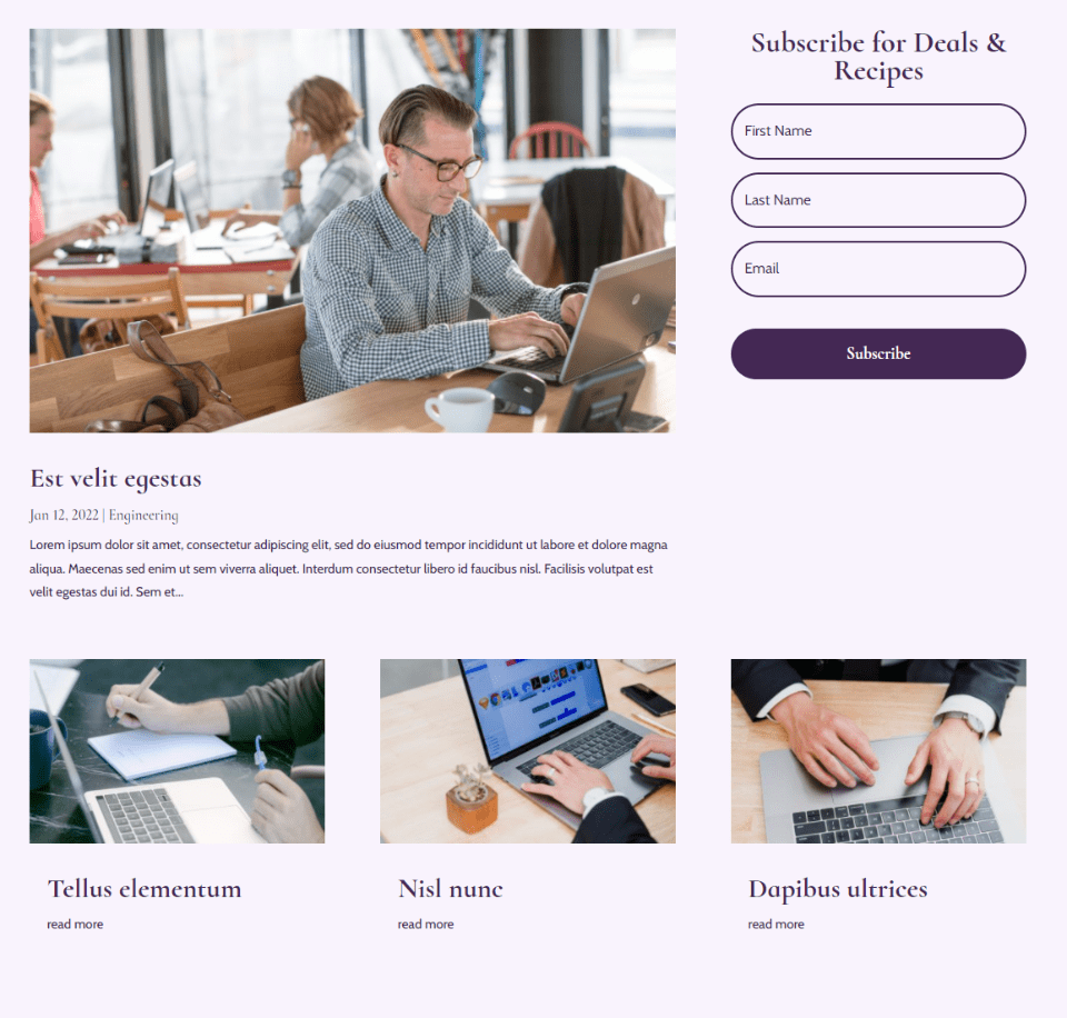
This option includes the Featured Image, Post Title, and Read More Button.
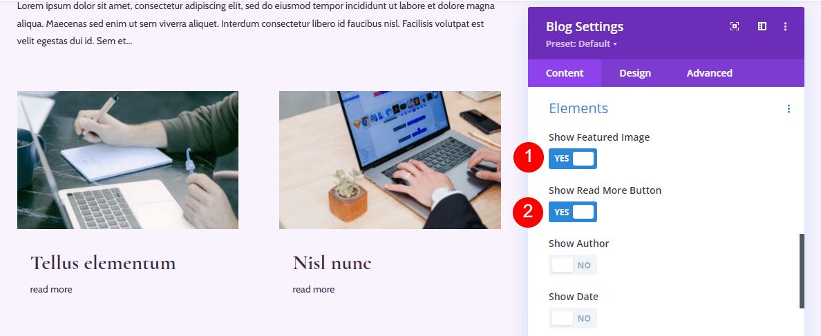
Here’s how it looks on the blog page. The blog feed is simplified even further. This one doesn’t provide much information, but it might work well if the titles and featured image are all you need. Descriptive titles would help a lot.
Element Combinations Option 3: Excerpt, Read More Button & Pagination
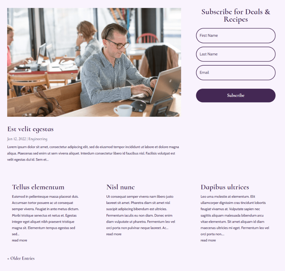
This combination includes the Read More Button, Excerpt, and Pagination.
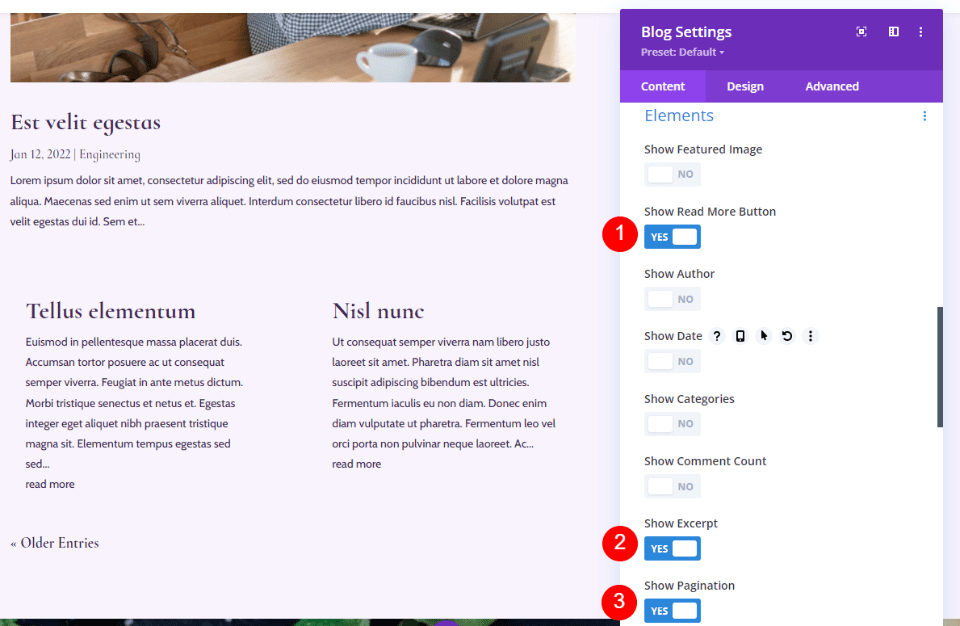
The blog page is clean and gives the reader the information they need about the posts without drawing a lot of attention to them.
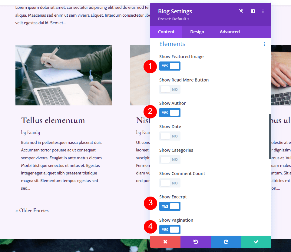
Element Combinations Option 4: Featured image, Author, Excerpt & Pagination
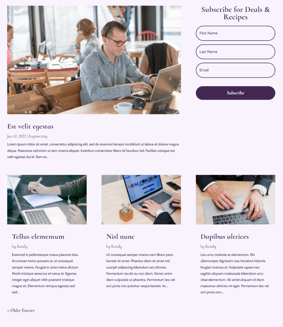
This option includes the Featured Image, Author, Excerpt, and Pagination.
Here’s how it looks on the blog page. Without the other elements, the author’s name stands out. This one is great if you have a lot of authors, and you want to draw attention to them.
Element Combinations Option 5: Featured image, Categories, Excerpt & Pagination
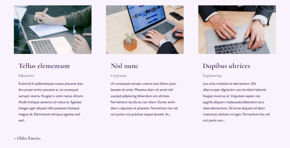
This option adds the Featured image, Categories, Excerpt, and Pagination.
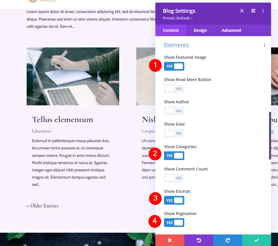
Here’s how it looks on the blog page. The category is more prominent within the blog card. Categories are great to show if you want to feature them or you have a lot of them. They can make navigation easier because the reader can easily select the category they want to see.
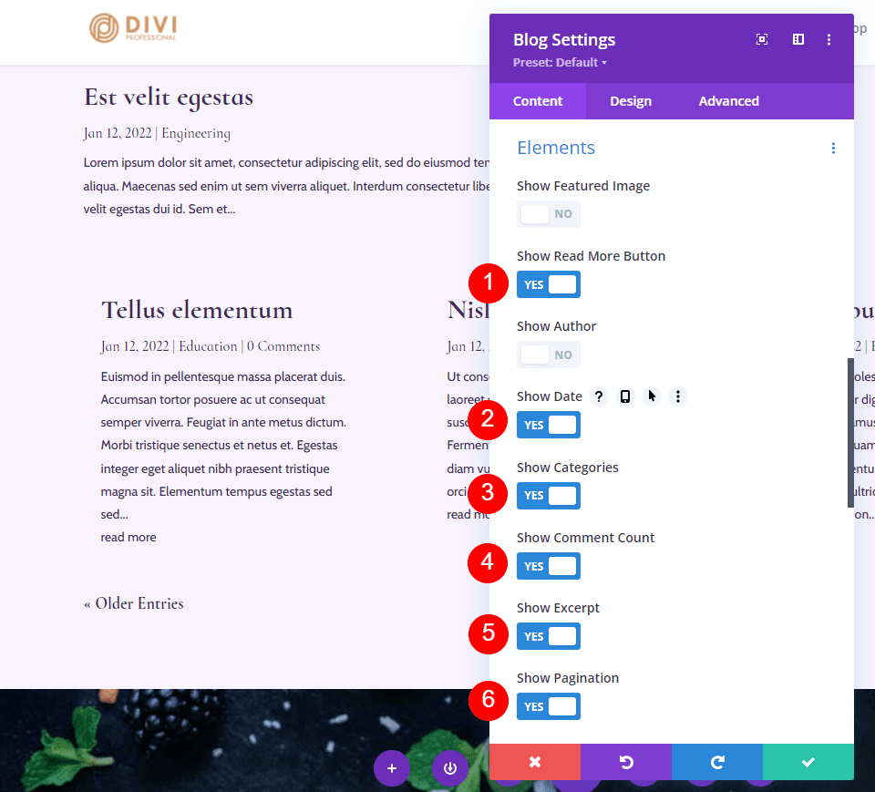
Element Combinations Option 6: Read More Button, Date, Categories, Comment Count, Excerpt & Pagination
This one includes the Read More Button, Date, Categories, Comment Count, Excerpt, Pagination. It sounds like a lot, and it is, but it works in a blog feed. Without the Featured Image, the blog cards take up less space. Also, since the Pagination is in a different location, it doesn’t intrude on the blog feed.
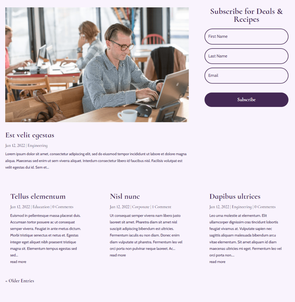
Here’s how it looks on the blog page. It works well for the blog feed and your eyes are still drawn to the featured post.
Element Combinations Option 7: Excerpt & Read More Button
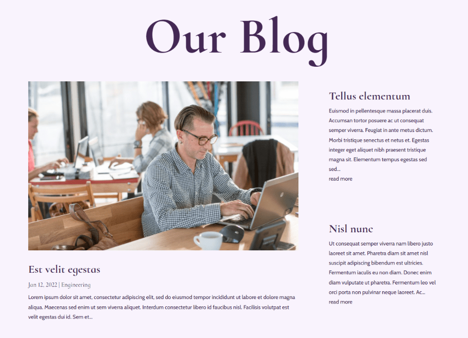
We can use multiple Blog modules together with different elements in each to create more combinations. This combination just uses the Expert and Read More Button, but the Blog module has been moved to the hero section next to the Blog module that shows the featured post. This gives the module a completely different feel and purpose.
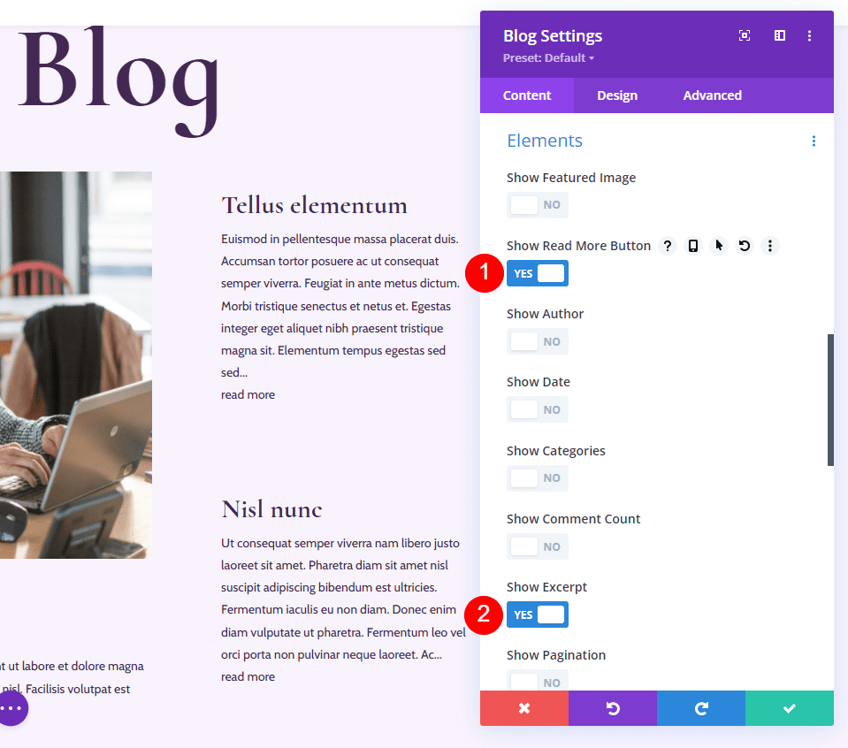
Here’s how it looks on the page. It highlights the latest post and then provides the next two posts without drawing attention away from the latest post. This is more like a magazine layout.
Element Combinations Option 8: Elements in Multiple Modules
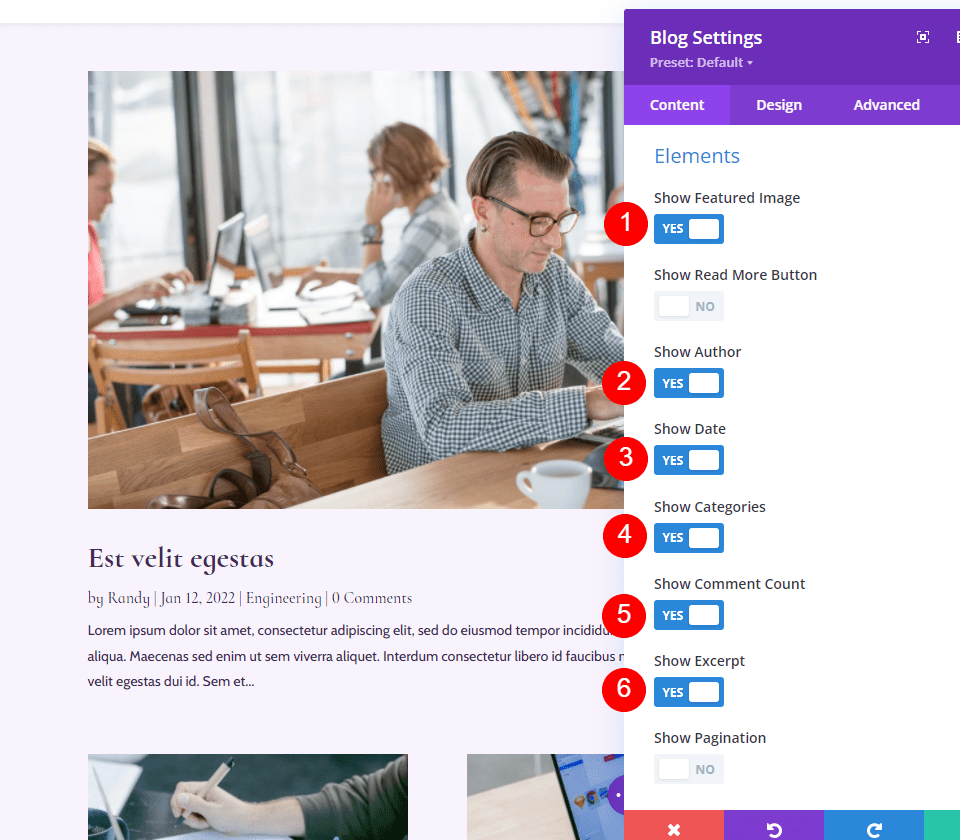
I’ve added the elements to the featured post and left the blog feed minimal for this option. For the featured post Blog module, I’ve enabled the Featured Image, Author, Date, Categories, Comment Count, and Excerpt.
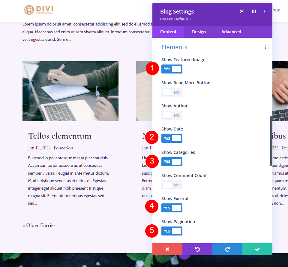
For the blog feed Blog module, I’ve enabled the Featured Image, Date, Categories, Excerpt, and Pagination.
Here’s how the Blog modules look on the blog page. Both modules work well together. The first one gets the attention and includes more information. This helps promote comments on the latest post.

Option 9: Multiple Blog Modules with Featured Images
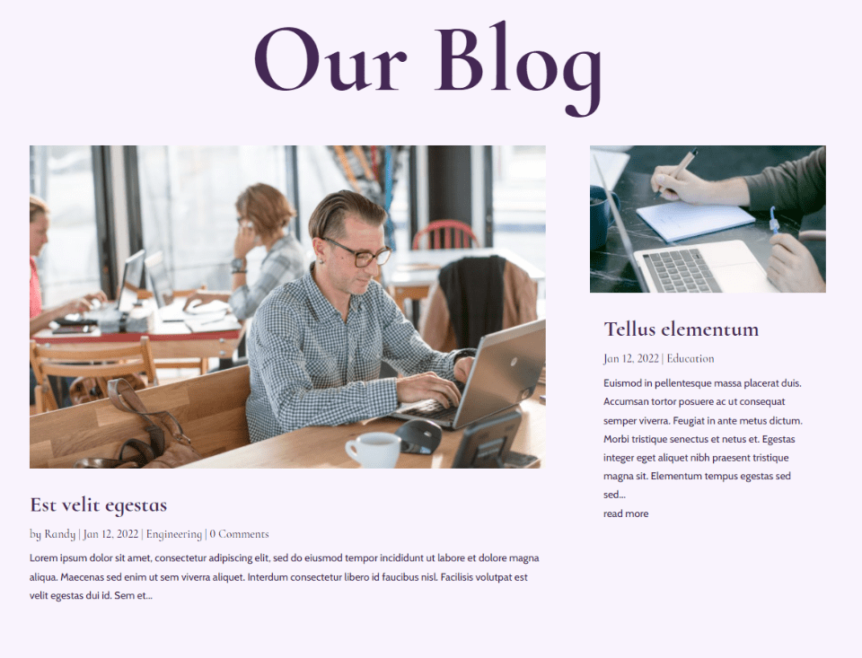
This option uses the element combinations from the featured post Blog module from the previous option and moves the blog feed to the column next to the featured post. This creates an interesting hero section. For the second Blog module, I’ve selected the Featured Image, Read More Button, Date, Categories, and Excerpt.
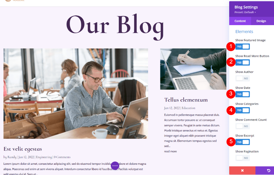
Here’s how it looks on the blog page. The featured image gets the attention, but the second post isn’t lost on the page. The reduced number of elements keeps the smaller blog card clean and easy to read.
Ending Thoughts
That’s our look at post element display combinations for Divi’s Blog module. Having the ability to enable them individually creates a lot of design options and using them in different combinations can change the look at feel of your blog page. Try different element combinations and see what works best for you. If you’re not sure, try an a/b split test and see which gets the response you’re looking for.
We want to hear from you. Do you use any of these post element display combinations in your Blog modules? Let us know about it in the comments.
The post 8 Post Element Display Combinations for Divi’s Blog Module appeared first on Elegant Themes Blog.

