Welcome to part 4 of this 4 part series on how to develop a product review site using Extra. If you are racking your brain on how to get started with developing a product review site, this series is for you. With its built-in review functionality and smart post categorization, Extra is specially equipped to create great looking reviews, product post templates, mega menus, and category layouts in minutes. Join me as we explore the power of Extra.
In part 1 we set our Theme Options and customizer settings. In part 2, we added our posts and built a post layout to display our product reviews. In part 3 of this series we created two category layouts for our product review site – one for our homepage and one for the “All Categories” page.
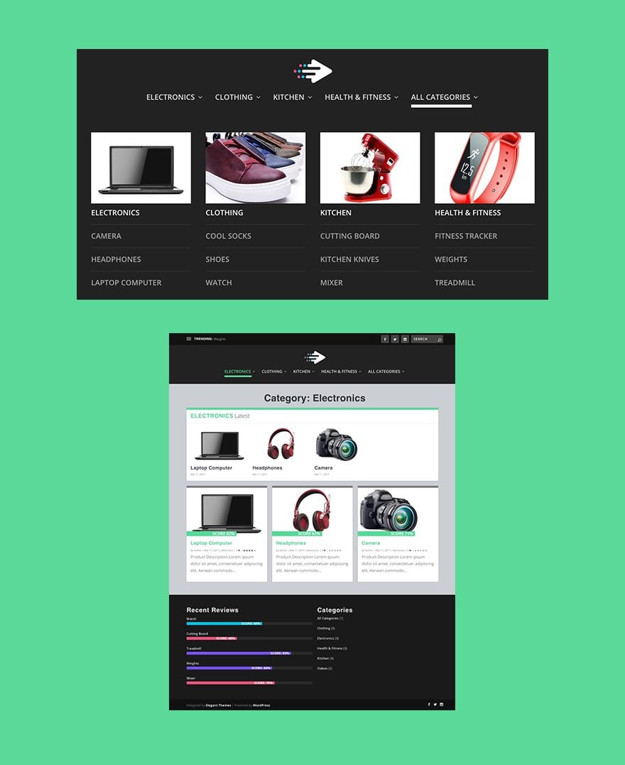
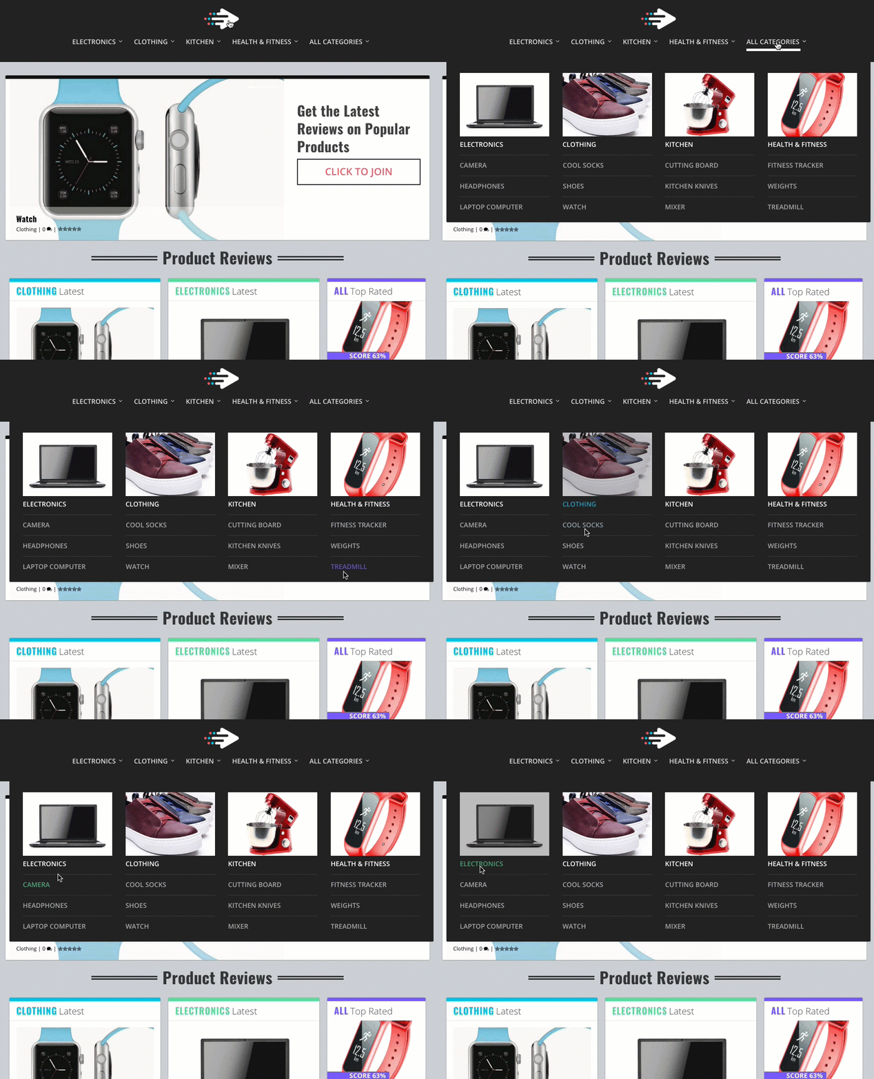
Today we are going to finish our product review site by building our default category layout, our menu, and our footer. The highlight of today’s post will be the custom menu which has menu links that match the color of their corresponding category pages. I will also show you how to deploy Extra’s built in mega menu options and add a few customizations of our own.
Here is a Sneak Peek of What we are going to build
Let’s get started.
Building the Default Category Page
Extra comes with a default category page already installed. The default category page is the layout that will be used when viewing a category page that doesn’t have a specific category layout selected. In part 3 of this series, we designated a category layout for our homepage and we assigned our “All Categories” page to the specific category “All Categories”. For the rest of our product review category pages, we will be using this default category layout.
To customize our default category layout, go to the wordpress dashboard and navigate to Extra > Category Builder. Then hover over the “Default Category” and click the edit link.

By default your default category has two modules stacked on top of each other inside a one-column row of a standard section. Before we make any changes to the layout, make sure you select the option “Use this layout as the default layout?” in the Layout Usage box on the right sidebar.
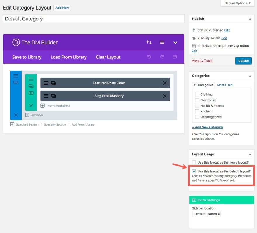
First, replace the top Featured Posts Slider with a Posts Carousel Module. Then update the module settings by checking “Current Category/Tag/Taxonomy” as the Category for this module. Now this posts carousel module will only display the products of the category page being visited. Pretty smart, huh?
Save & Exit
You can leave the Blog Feed Masonry Module to it’s default settings. Just make sure that whatever category module you add to this page in the future has the category “Current Category/Tag/Taxonomy” assigned to it.
Now in order to style your category page h1 title, you need to add the following Custom CSS to the Additional CSS in the Theme Customizer. Make sure to put it inside a the media query with a min-width of 980px.
.archive h1 {
text-align: center;
font-size: 48px;
line-height: 1.3em;
}
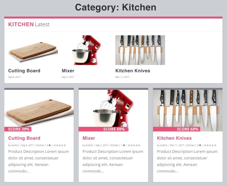
That’s it for the default category layout. Let’s check out what our default layout looks like on my kitchen category page.
Now that we have our default category layout in place, let’s bring our attention to one of the most important parts of our website – the navigation menu.
We already set up our basic header styling in part 1 of this series. But today we are going to create and style our primary navigation menu.
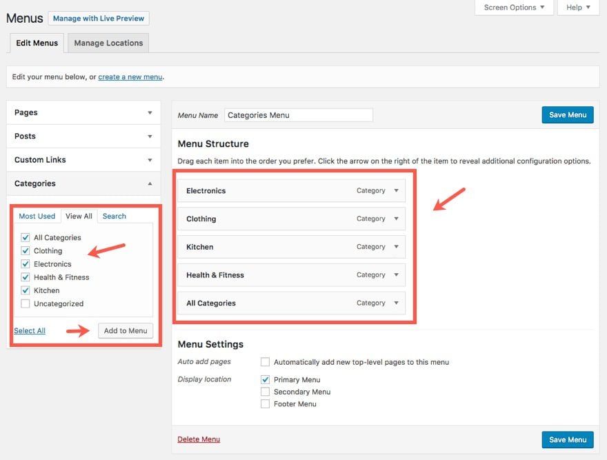
From your WordPress Dashboard, navigate to Appearance > Menus then select Menus. Select the “create a new menu” link at the top of the page and enter the name “Categories Menu” as the menu name. Then select “Primary Menu” as the display location under the Menu Settings section.

Now we can start add our menu items to our menu. Click on the Categories toggle on the left of the page. In the options that appear, select “view all” to make sure you can see all of your available categories. Check off all 5 categories you have created (not uncategorized) and click the Add to Menu button to add them to the menu structure section on the right of the page. Now you can click and drag each of the menu items to be displayed in the following order:
- Electronic
- Clothing
- Kitchen
- Health & Fitness
- All Categories
Before we edit the menu items, select the screen options link at the top of the page. In the advanced menu properties section that opens up, make sure you check the box next to “CSS Classes”. This will allow us to add a custom CSS Class to each of our menu items.

Go back to your menu. Starting with the Electronics Category menu item, click to toggle open the configuration options. In the CSS Classes box, add a class named “green”. And for the Extra Mega Menu option, select “Mega Menu 3 Featured”.
This is going to accomplish two things. First, the class “green” will be used to turn the menu item green on hover. Second, the mega menu 3 featured option will add three featured items as a mega menu when hovering over the menu item.
For the Clothing Category Menu item, add the class “blue” and select the “Mega Menu 3 Featured” option.
For the Kitchen Category Menu item, add the class “pink” and select the “Mega Menu 3 Featured” option.
For the Health & Fitness Category Menu item, add the class “purple” and select the “Mega Menu 3 Featured” option.

The “All Categories” menu item is going to be slightly different. Go ahead and leave the CSS Classes text box blank. And for the Mega Menu option, select “Mega Menu List”. This type of mega menu is a more traditional mega menu which creates a list of sub menu items. The goal for this mega menu link is to show all the categories with a list of their products underneath.
Go back and toggle open the categories box and select the same four categories (Electronics, Clothing, Kitchen, and Health & Fitness) and add them to the menu. Then drag each of the categories you just added one level under the “All Categories” mega menu item.
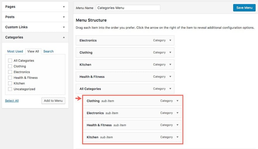
Toggle the configuration options for each of those category menu items and add the same CSS classes to each like you did previously. Here are the categories with the class you need to add:
Electronics – green
Clothing – blue
Kitchen – pink
Health & Fitness – purple
Next we are going to add our own custom image to serve as our featured category image for each category in the mega menu.
Use a photo editor to shrink and crop each image to have a width of 500px and a height of 300px.
Add/drag them to the WordPress Media library.
Now go back to the menus page in WordPress Admin.
In this example the top category link in my the mega menu is “Electronics”. Click the arrow on the right of the “Electronics” item. In the Navigation Label box add the image you want using the html img tag directly before the text “Electronics”. The image tag should look as follows:
<img src="Insert Image Url" width="100%" />
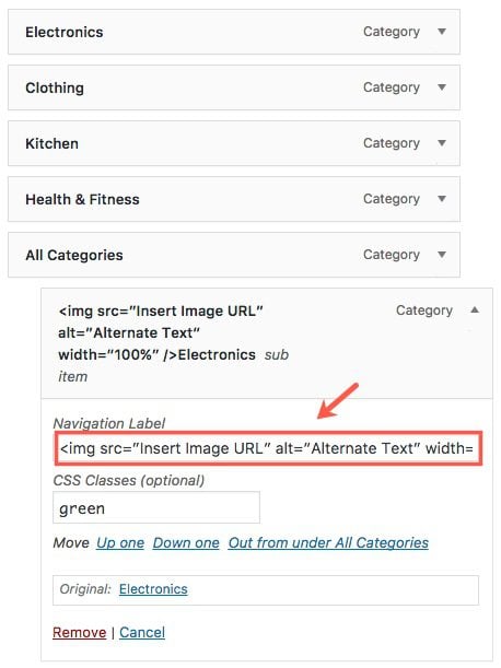
To find the url to the image, go to Media → Library. Click the image you want to add. In the Attachment Details popup screen find the url in the section to the right, highlight it, then use ctrl+c to copy it to your clipboard.
Now go back to the “Electronics” menu item configuration on the menu page and replace the text “Insert Image URL” by pasting the url of your image using ctrl+v.
Repeat the same process for the next 3 category menu items.
Once you have added all four image tags to each of your category menu items, its time to add your single posts menu items (links to your product reviews) under each of their respective categories.
Click to toggle open the Posts box on the left and select “view all” tab. Then select all 12 of your products and click Add to Menu. Then drag each of the post menu items one level under each of their categories.
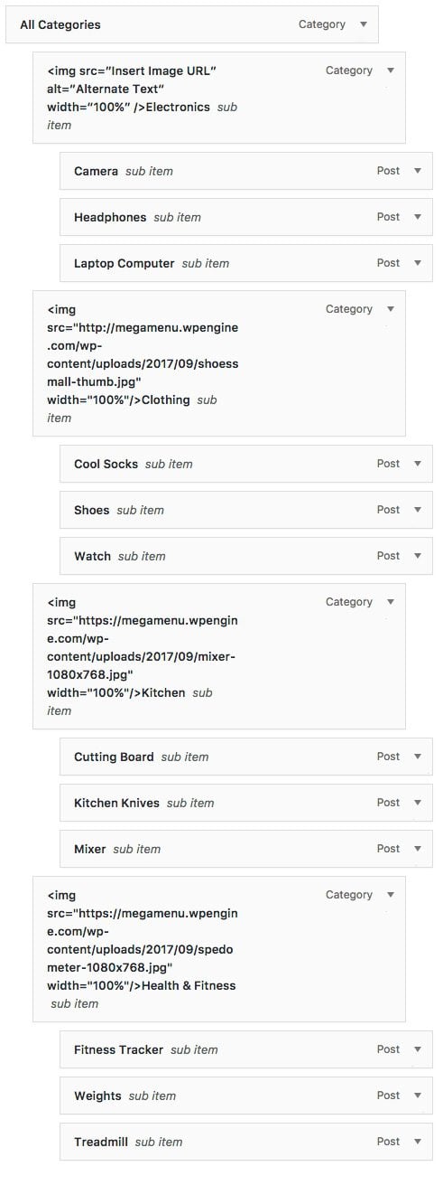 Save Menu
Before we go check out our new menu, we need to add some custom CSS to put the final touches on our menu.
Go to the Theme Customizer > Additional CSS and enter the following CSS:
/****************************
style menu
*****************************/
#et-menu li.green a:hover, #et-menu li.current-menu-item.green a {
color: #5bd999 !important;
}
li.green a:before {
background-color: #5bd999 !important;
}
#et-menu li.pink a:hover, #et-menu li.current-menu-item.pink a {
color: #e6567a !important;
}
li.pink a:before {
background-color: #e6567a !important;
}
#et-menu li.blue a:hover, #et-menu li.current-menu-item.blue a{
color: #00c0e4 !important;
}
li.blue a:before {
background-color: #00c0e4 !important;
}
#et-menu li.purple a:hover, #et-menu li.current-menu-item.purple a{
color: #7658f8 !important;
}
li.purple a:before {
background-color: #7658f8 !important;
}
/***************************
increase height of line under nav links on hover
****************************/
#et-navigation&amp;amp;gt;ul&amp;amp;gt;li&amp;amp;gt;a:before {
height: 8px;
}
Save and Publish your Settings.
Now let’s check out our new menu. Notice the colors of the menu items as you hover over them. The colors match their corresponding category color.
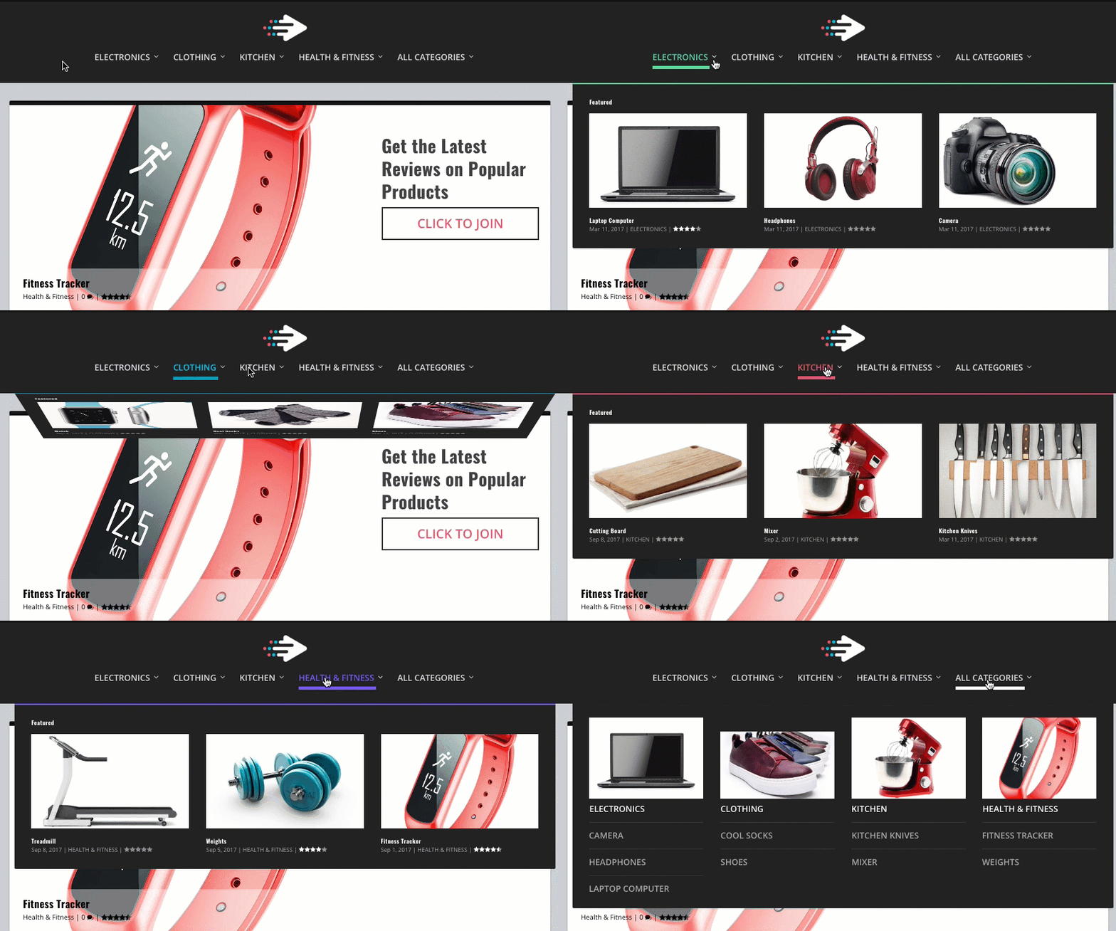
Building the Footer
To build the footer for our product review site, we are going to take advantage of Extra’s built-in widgets to display latest product reviews and a category list.
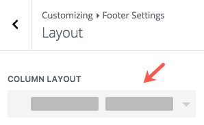
First we need to go to Theme Customizer > Footer Settings. Then click Layout and select a 2 column layout.
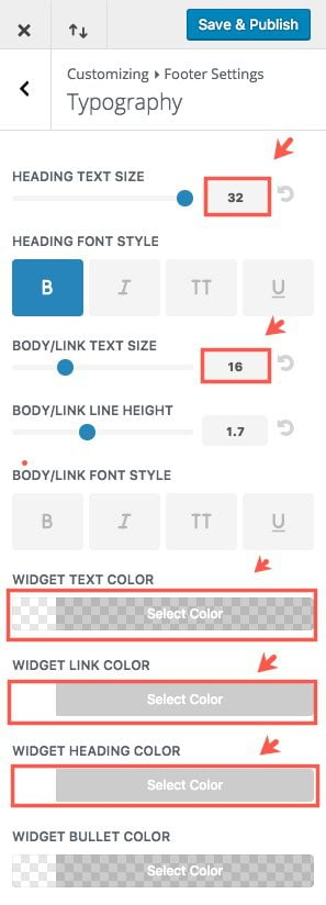
Go back and select Typography and update the following:
Heading Text Size: 32
Body/Link Text Size: 16
Widget Text Color: rgba(255,255,255,0.6)
Widget Link Color: #ffffff
Widget Heading Color: #ffffff
Save & Publish
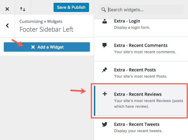
Go back to the main menu of the Theme Customizer and select Widgets. Then select Footer Sidebar Left and click the button to Add a Widget. Select the Extra – Recent Reviews widget
Go back to widgets menu and select Footer Sidebar Right and add the Categories widget.
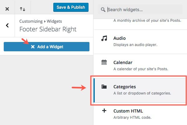
Go to the Additional CSS section and add the following Custom CSS for your footer.
/****************************
footer
*****************************/
#footer .et_pb_widget li {
border-bottom: none;
color: #fff;
}
.et_pb_widget.widget_et_recent_reviews .review-breakdowns .score-bar-bg {
background: rgba(255,255,255,.1);
}
Save & Publish the Theme Customizer settings and go check out your footer.
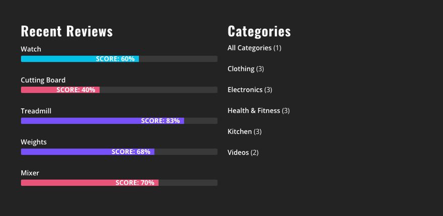
That’s it. You have successfully finished part 4 and completed the series on building a product review site using Extra.
Final CSS
Depending on where you came in on the series you may need to check your custom CSS to make sure you have everything entered correctly. Here is the final CSS code to be entered in the Theme Customizer.
.et_pb_extra_module, .posts-blog-feed-module.masonry .hentry {
box-shadow: -1px 0 2px 0 rgba(0,0,0,0.12), 1px 0 2px 0 rgba(0,0,0,0.12), 0 1px 1px 0 rgba(0,0,0,0.24);
border-top: 10px solid;
}

/****************************
style menu
*****************************/

#et-menu li.green a:hover, #et-menu li.current-menu-item.green a {
color: #5bd999 !important;
}

li.green a:before {
background-color: #5bd999 !important;
}

#et-menu li.pink a:hover, #et-menu li.current-menu-item.pink a {
color: #e6567a !important;
}

li.pink a:before {
background-color: #e6567a !important;
}

#et-menu li.blue a:hover, #et-menu li.current-menu-item.blue a{
color: #00c0e4 !important;
}

li.blue a:before {
background-color: #00c0e4 !important;
}

#et-menu li.purple a:hover, #et-menu li.current-menu-item.purple a{
color: #7658f8 !important;
}

li.purple a:before {
background-color: #7658f8 !important;
}

/***************************
increase height of line under nav links on hover
****************************/
#et-navigation>ul>li>a:before {
height: 8px;
}

/****************************
comment box background
*****************************/
#comment-wrap {
padding: 75px 40px;
background: #fff;
border-radius: 3px;
box-shadow: -1px 0 2px 0 rgba(0,0,0,0.12), 1px 0 2px 0 rgba(0,0,0,0.12), 0 1px 1px 0 rgba(0,0,0,0.24);
}
@media (min-width: 980px) {

.join-cta {
display: block;
text-align: center;
border: 3px solid #333;
color: #333;
padding: 20px 15px;
text-transform: uppercase;
font-weight: 600;
font-size: 30px;
}

/***************************
Post Header Size
****************************/
h1.entry-title {
font-size: 48px;
}

/***************************
Fancy Subtitle
****************************/
.subtitle {
margin: 1em 0 !important;
font-size: 48px;
}
.fancy {
text-align: center;
padding-bottom: 0px;
}
.fancy span {
display: inline-block;
position: relative;
line-height: 1.3em;
}
.fancy span:before,
.fancy span:after {
content: "";
position: absolute;
height: 5px;
border-bottom: 4px solid #333;
border-top: 4px solid #333;
top: 40%;
width: 100%;
max-width: 200px;
}
.fancy span:before {
right: 100%;
margin-right: 15px;
}
.fancy span:after {
left: 100%;
margin-left: 15px;
}

/***************************
Star Rating and Social Icons Style
****************************/
.post-footer .rating-stars .rating-star {
width: 50px;
height: 50px;
}

.et_extra_layout .et_pb_column .module-head h1, .module-head .module-filter {
font-size: 28px;
}

.post-footer .rating-stars #rate-title, .post-footer .social-icons .share-title {
display: block;
font-size: 20px;
}

.post-footer .rating-stars, .post-footer .social-icons {
width: 100%;
margin: 0 auto;
padding: 30px 0;
}

.post-footer .social-icons {
border-bottom: 4px solid #dddddd;
}
}

/****************************
footer
*****************************/
#footer .et_pb_widget li {
border-bottom: none;
color: #fff;
}

.et_pb_widget.widget_et_recent_reviews .review-breakdowns .score-bar-bg {
background: rgba(255,255,255,.1);
}

/***************************
Mobile Adjustments
****************************/
@media (max-width: 980px) {
.subtitle {
font-size: 30px;
text-align: center;
}
}
Wrapping Up
I hope you enjoyed exploring the power of Extra in building a Product Review site with me. If anything, I’m confident you will at least walk away with a new appreciation for this outstanding theme and a little inspiration to do more with it. The built in review system, smart category layouts, and the power of the Divi Builder make it a great fit for a product review site.
One topic I didn’t address (saving it for a future post) is how to handle affiliate links using Extra. After all, for most people the end goal for their product review site is to make money. Feel free to share your thoughts on this matter below in the comments.
I look forward to hearing from you.
The post Building a Product Review Site with Extra – Part 4 appeared first on Elegant Themes Blog.
