Resumes are a popular type of personal websites. They’re great for presenting your skills, education, and experience to potential clients and employers. Fortunately there are lots of resume websites made with Divi to help spark your imagination. In this article we’ll take a look at 10 examples of resume websites made with Divi.
Regardless of the industry, resume websites need to present the same type of information and need features. As these 10 websites will show – there’s more than one way to present the same type of information. They’re also great examples of web design elements such as layouts, colors, fonts, contact info, the type of information to include and how to present it, images, effects, navigation, etc. These websites are sure to spark your imagination with ideas for your next Divi resume website.
These 10 websites are placed within two categories. Within those categories they’re in no particular order. We even have a bonus at the end – a free resume layout to help you create your own resume website with Divi. Let’s take a look…
Resume Sites
For these websites, the sites themselves are resumes. Although some do have multiple pages, most are one-page sites with no other information.
1. Weldon Fultz
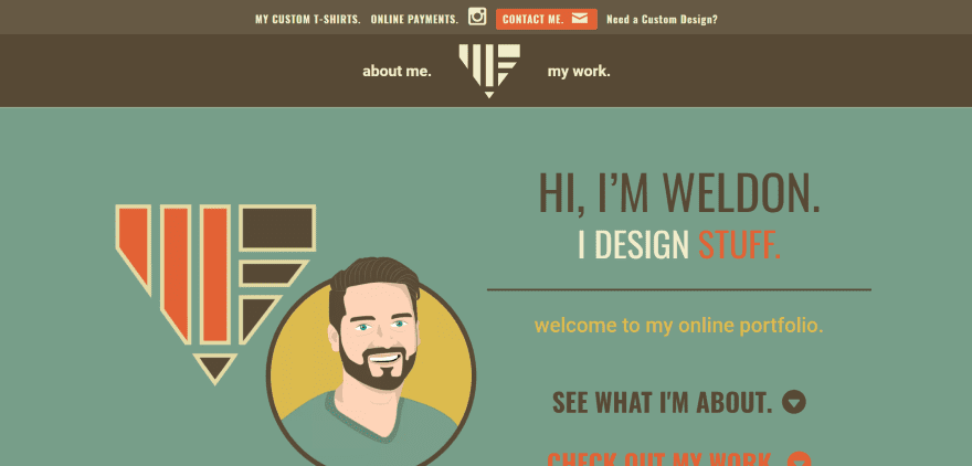
Weldon Fultz uses earth-tone colors throughout the site along with large typography and plenty of white-space. Clickable text becomes buttons with shadow effects on hover. Large text appears on scroll to display related keywords. Skills are displayed within bar charts with large blocks for icons. Awards are clickable and use hover effects. The site makes excellent use of color and typography.
2. Jack McDowell
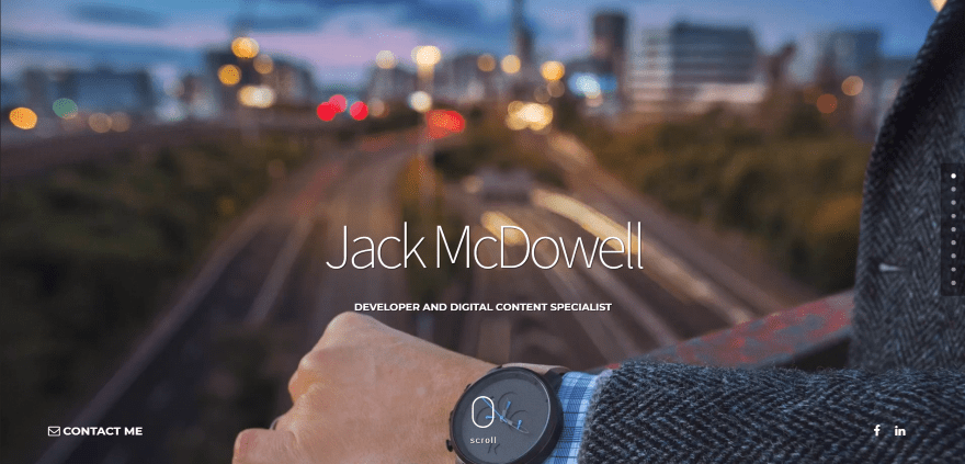
Jack McDowell uses the Hello child theme and displays a cinemagraph as the background header along with a contact CTA and social follow buttons. The About Me information is placed on the left third of the page within dark blue while the rest of the page displays the resume information within a timeline against a tan background. Sections are divided into jobs / skills, school / awards, and ends with a download CTA. Projects are displayed within full-width portfolio grids and a full-screen slider, and full-screen testimonial slider with section separator. The contact form uses the site’s branded colors.
3. Andre Costa
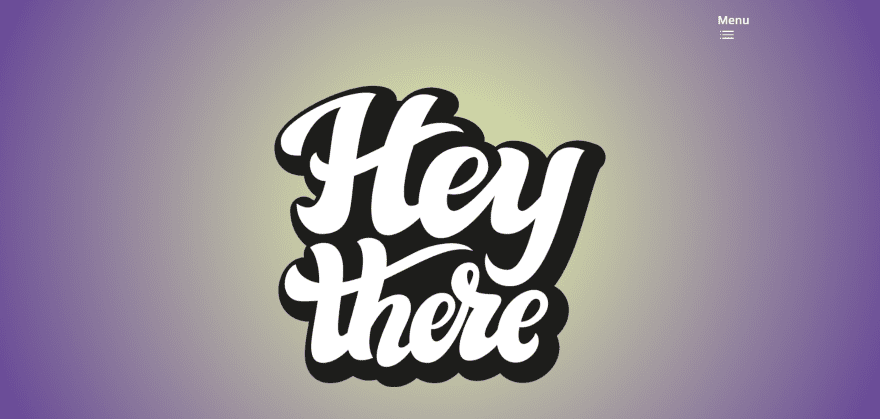
Andre Costa takes a multi-page approach to build the resume. The homepage displays a logo against a gradient background and a hamburger menu icon that opens a full-screen menu. Career and education information are displayed on their own pages as text within large sections that contain tan and light purple background colors to help them stand apart. Other information is provided within clickable popup modals. Education is shown with elegant bar charts. The Education page includes clickable cards for past, present, and future education.
4. Domonique Baul
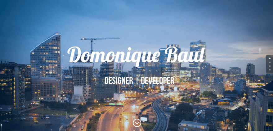
Domonique Baul uses the Hello child theme with a background image, name, and tagline. Projects are displayed within a filterable portfolio. Following this is a section with a photo in the left one third of the screen with about information and bar charts to display skills. Jobs, skills, school, and awards are displayed in the right two thirds leading to large icons for Git Hub, LinkedIn, and a downloadable resume link. The contact form is displayed over a background image.
5. David Somerfleck
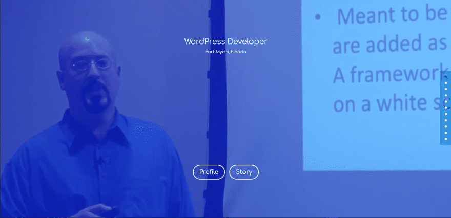
David Somerfleck displays a full-screen video behind a blue overlay with two CTA buttons. Scrolling reveals four large icons as navigation for the various sections of the site. Testimonials are shown with toggles and testimonial modules. Resume information is also displayed within toggles for About, Education, and Extracurricular, which are placed over a background video. Skills are displayed within circular charts. The site uses dot navigation rather than a menu. Companies are displayed as large icons, and projects are shown within a project slider. Larger projects appear within a two-column section at the bottom of the site as you scroll.
Sites with Resumes
These sites contain resumes as a single page within the website.
6. Amanda Broomell
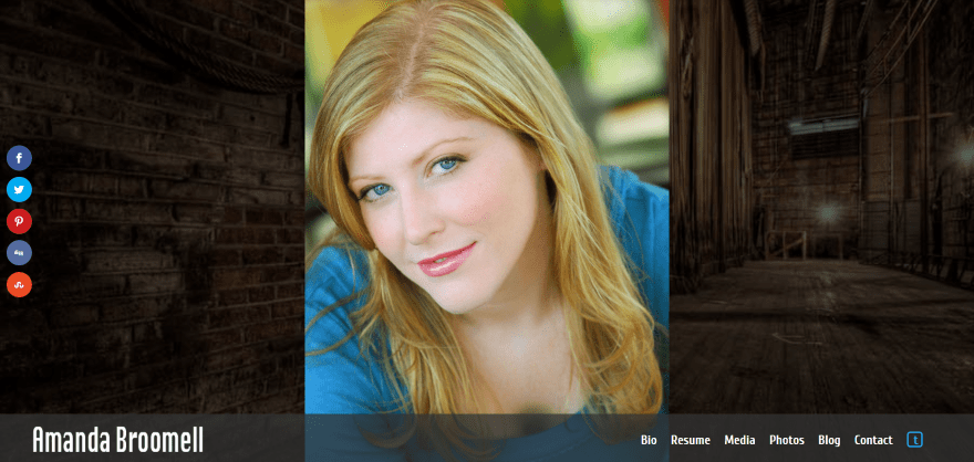
Amanda Broomell uses a full-screen image slider as the website. The menu is placed at the bottom of the screen. Clicking any of the menu items opens that information within a modal window. It also includes a Twitter icon within the menu, which as expected, takes you to her Twitter feed. The resume displays a table within tabs. The first set of tabs include theater, training, skills, and the icon to download the resume. The theater tab includes tabs on the tables for New York and International. The images continue to slide in the background.
7. Rolph Lieverse
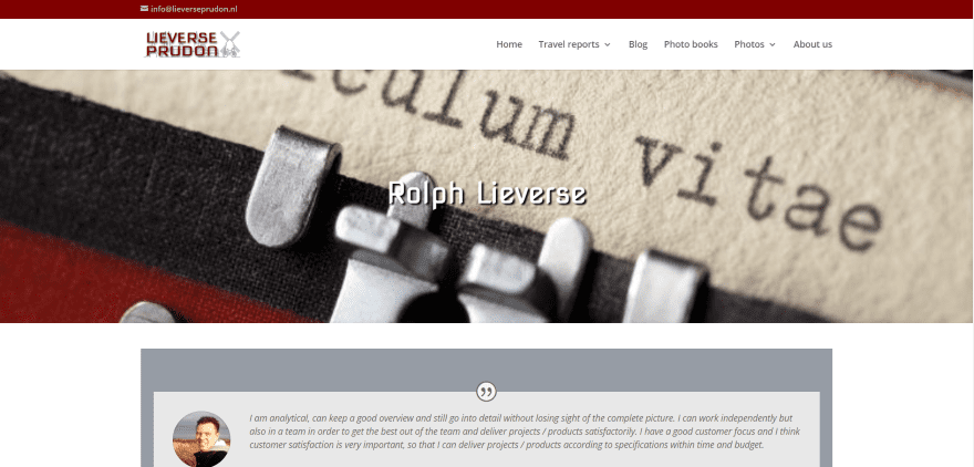
Rolph Lieverse displays each of the resume items within different sections using various modules and follows a resume structure. A summary is placed within a testimonial module. Work experience is presented within a tab module using vertical tabs with information displayed as bullets. Training and certifications are presented within toggles. Skills are displayed with bar charts over a background image followed by languages within circle charts over a background image with a section separator. Hobbies are listed within bullets at the bottom.
8. Haris Cizmic
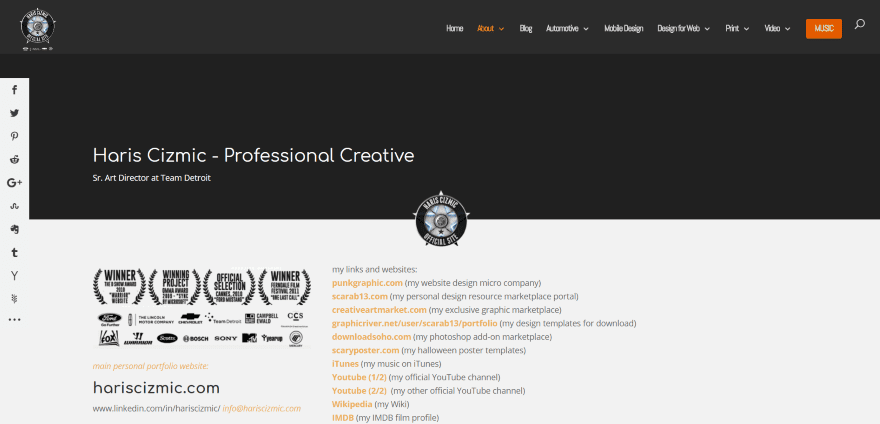
Haris Cizmic uses sections to build a resume structure. It displays awards and company icons to one side with links on the other. Following this is a summary, work experience with education and interests within boxes, and a section with honors and awards. Each of the sections are separated by full-width text boxes used as headers in black with white text. The information is presented in a simple yet readable list. Icons overlap several of the sections.
9. Marwan Salfiti
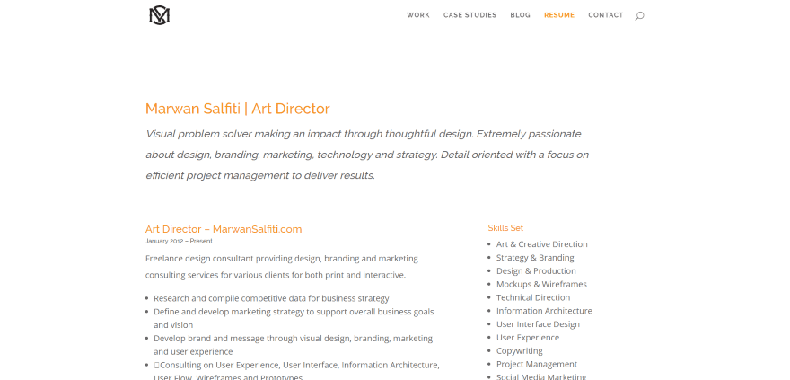
Marwan Salfiti lists the resume items within bullets under section titles in orange. The summary is displayed in a larger font and spans the full area of text. The next sections of text are divided into two columns: the left column displays bullets and long descriptions within a 2/3 column, while the right column displays simple bullets within a 1/3 column. It’s simple, clean, and easy to read.
10. Kellee Santiago
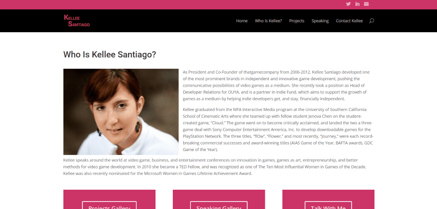
Kellee Santiago starts with an about section with photo and includes three CTA buttons with branded colors. The buttons link to projects, experience, and a contact form. Following this is an abridged CV with headings in bold and information that includes links in the same branded red. The resume is abridged, yet it’s clean and simple, and still retains enough information that potential employers can form a decision.
Make Your Own Resume Website with Divi
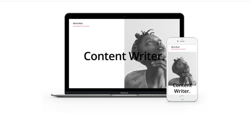
Elegant Themes has a free layout that you can use to create your very own resume website. It comes with three different layouts to create a single page site and provide your potential employers with a photo, an easy to read resume, and links to projects.
Ending Thoughts
These 10 Divi sites and 1 free layout are great examples of resume websites. Whether you need inspiration for layouts, colors, fonts, images, contact info, the type of information to include, how to present your resume, navigation, effects, etc., there’s sure to be something here to help with your next Divi design for resume websites.
We want to hear from you. Which of these resume designs is your favorite? Let us know in the comments.
Featured Image via hvostik / shutterstock.com
The post 10 Resume Websites Made With Divi appeared first on Elegant Themes Blog.
