![]()
The New And Improved
Visual Builder Interface
The Visual Builder interface has been updated with a fluid and responsive design that improves the building experience on mobile devices and large monitors.
The power of Divi lies in the usability, flexibility and customizability of the Visual Builder. It’s not just about what the builder can do, but how easy and enjoyable it is to get those things done as a designer. Today we are making the builder even more flexible by extending the fluidity of its interface and improving support for for mobile devices, large screen sizes and vertical monitors.
Test Out The New Fluid & Responsive Builder
![]()
A Fluid & Responsive Interface
With Improved Mobile Editing Support
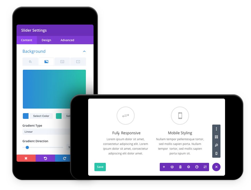
Editing your pages on smartphones and tablets is now a lot easier thanks to the builder’s new responsive design.
Built For Small Screens

The Visual Builder interface has been optimized for small screen sizes and mobile devices, improving the experience when editing a website on your smartphone or tablet. Interface elements will no longer become crowded and overlap each other and the builder will automatically adapt as the available screen space becomes smaller. If you need to make a quick change to your page, it’s now possible to make those adjustments while sitting on your couch with your iPad. We are still working to improve mobile editing overall, and to add support for things like drag & drop, but today’s update is a great starting point.
![]()
Improved Support For Large
Screens And Vertical Monitors
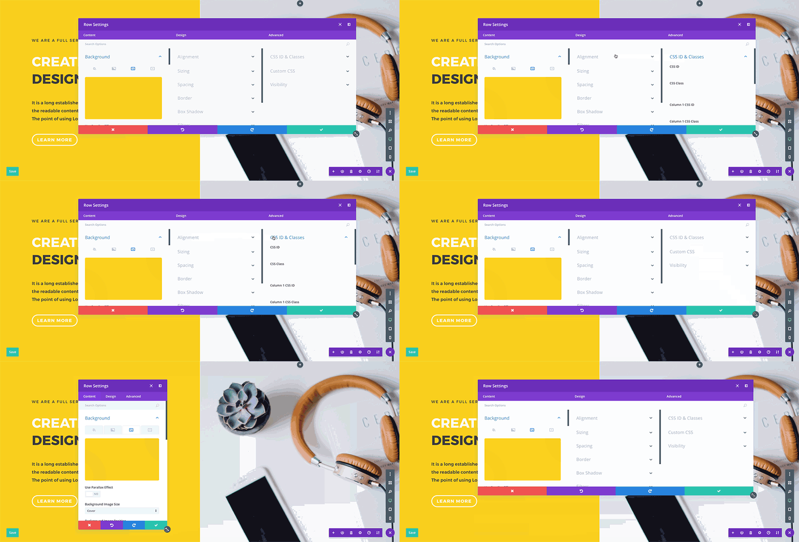
The building experience has been improved for large monitors too, enhancing the way interface elements can be expanded, snapped and arranged on your screen.
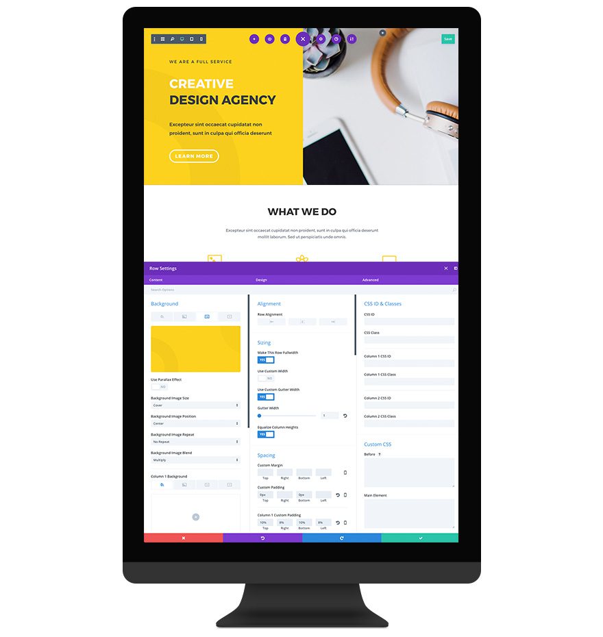
Three Column Option Expansion

In addition to improving support for mobile devices, we also optimized the Visual Builder interface for larger screens. When you extend the width of a settings window on a large monitor, all three option tabs will be revealed in a new three-column layout. This makes it easy to quickly access every option group. If you have the screen real estate to support it, this mode can save you time and reduce clicks.
New Modal Snapping Locations

We also added the ability to snap settings windows to the bottom of the screen. This, combined with the new three-column settings window makes for the perfect editing experience when used with a vertical monitor. In fact, this is probably the best way to design with Divi period! You get a full un-obstructed view of your page while at the same time being able to access every settings tab. Plus, when you have your settings window snapped to the bottom of the page it doesn’t reduce the width of your content and squish your design. Flip your monitor on its side and give it a try 
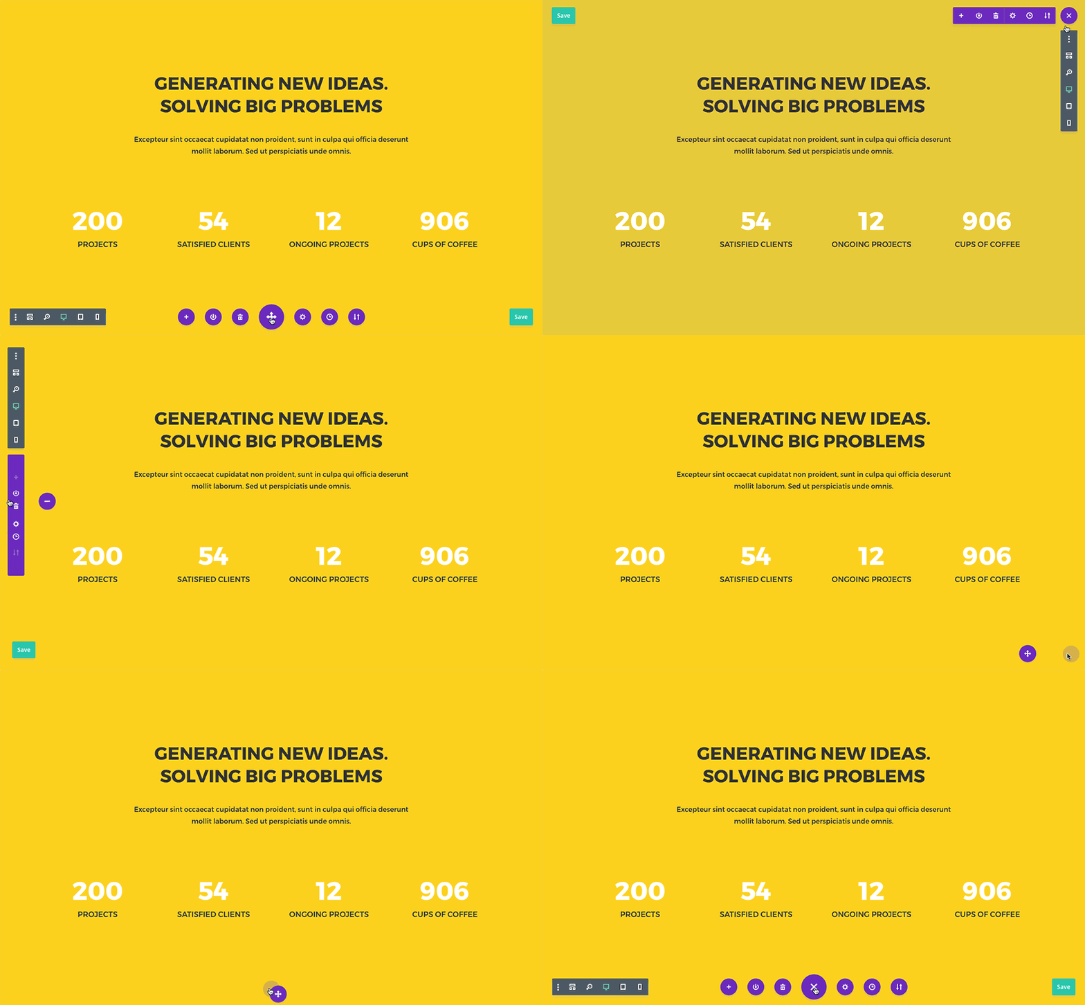
New Settings Bar Snapping Locations

We added more flexibility to the settings bar as well, which can now be snapped to various new locations including all for sides and all four corners of the screen. There are some great advantages to placing your settings bar on the side of your screen or in the corners of your screen since it will never overlap your page content or disrupt your editing experience. Just drag and drop the bar to your favorite location and Divi will remember your preference.
The new and improved Visual Builder interface is available today, so download Divi and take it for a spin. Let us know what you think in the comments and don’t forget to check back next week for even more great Divi features coming your way!
Join, Renew & Upgrade Today For 10% Off!
Join the most enthusiastic and loving WordPress theme community on the web and download Divi 3.0 today. Using the new Visual Builder, you can build websites faster than ever before with its incredibly fast and intuitive visual interface. You have to see it to believe it!
Join Today For 10% OFF!
Renew Your Account Today For 10% OFF!
Upgrade Your Account Today For 10% OFF!
The post The Responsive & Fluid Visual Builder Interface With Improved Support For Mobile Devices and Large Monitors appeared first on Elegant Themes Blog.
