The way you represent the written content on your website is a big part of how the message will be received by your visitors. Giving it special attention and trying to work out something unique is one of the things that can help you communicate in a memorable way. That’s why we’re going to show you some of the cool results you can create with Divi’s new font options on whatever kind of website you are creating. Of course, there are a lot more that’s possible with these new design settings than we’re going to show you in this post, but to kickstart your own process of discovery and design we’ve put together five cool design examples that demonstrate the power of Divi’s new font options. Enjoy!
Result
Before we dive into the tutorial, let’s take a look at the examples we’ll be showing you how to recreate, step by step. Each of these examples are made by using just a Text Module (with the right settings) that you can place wherever you want on your website.
Example #1
Example #2
Example #3
Example #4
Example #5

5 Cool Combinations of Divi’s New Font Options
Subscribe To Our Youtube Channel
Recreate Example #1
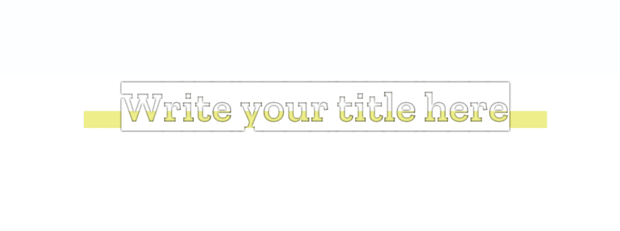
For the first example, we’re using a combination of a gradient background, an inverted font family and a text shadow that will give a border to the text we use within the Text Module.
Gradient Background
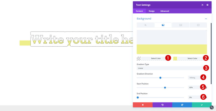
After having added a Text Module, the first you will need to do is add a gradient background. Although you can choose whichever gradient background you’d like to appear, for this example, we’ve used the following settings:
- First Color: rgba(255,255,255,0)
- Second Color: #eeef8b
- Gradient Type: Linear
- Gradient Direction: 180deg
- Start Position: 60%
- End Position: 0%
Text Settings
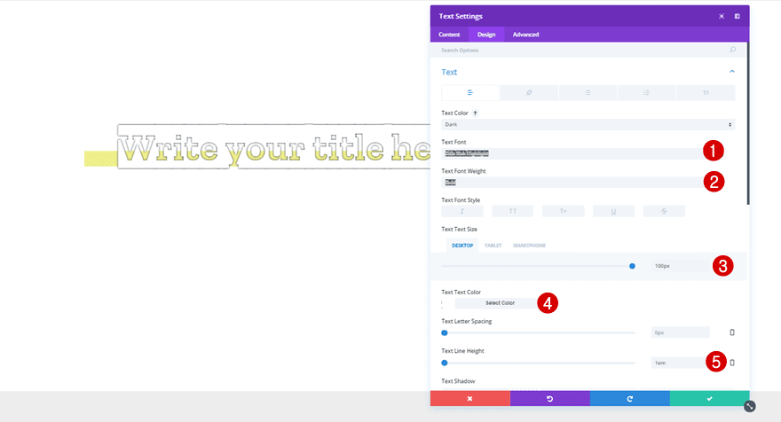
Then, move on to the Design tab and make the following changes to the Text subcategory:
- Text Font: Zilla Slab Highlight
- Text Font Weight: Bold
- Text Size: 100px (Desktop), 62px (Tablet), 38px (Phone)
- Text Color: #FFFFFF
- Text Line Height: 1em
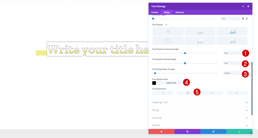
Within the Text subcategory, add the following Text Shadow as well:
- Text Shadow Horizontal Length: 0em
- Text Shadow Vertical Length: 0em
- Text Shadow Blur Strength: 0.06em
- Text Shadow Color: #000000
- Text Orientation: Center
Recreate Example #2
The most special thing about this second example is the use of the wavy underline in combination with a text shadow that will make it look like there is a double wavy underline to the text. On top of that, we’re also using a double border for the left and right side of the Text Module.
Text Settings
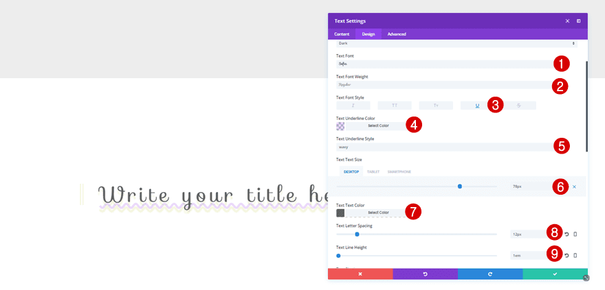
After adding a Text Module, you can start off by making the following changes to the Text subcategory within the Design tab:
- Text Font: Sofia
- Text Font Weight: Regular
- Text Font Style: Underline
- Text Underline Color: rgba(131,0,233,0.15)
- Text Underline Style: Wavy
- Text Size: 78px (Desktop), 36px (Tablet), 25px (Phone)
- Text Color: #606060
- Text Spacing: 12px
- Text Line Height: 1em
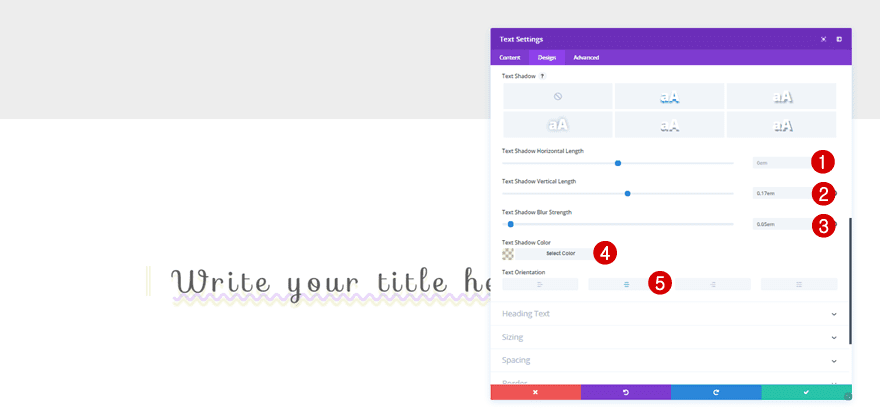
Add the following Text Shadow to the Text subcategory as well:
- Text Shadow Horizontal Length: 0em
- Text Shadow Vertical Length: 0.17em
- Text Shadow Blur Strength: 0.05em
- Text Shadow Color: rgba(162,181,0,0.13)
- Text Orientation: Center
Border
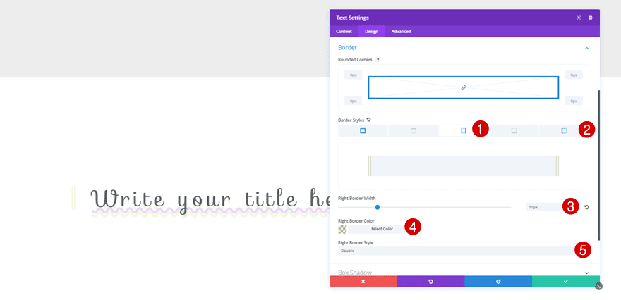
Continue by opening the Border subcategory and use the following settings for the left and right Border Styles:
- Border Width: 11px
- Border Color: rgba(162,181,0,0.18)
- Border Style: Double
Recreate Example #3
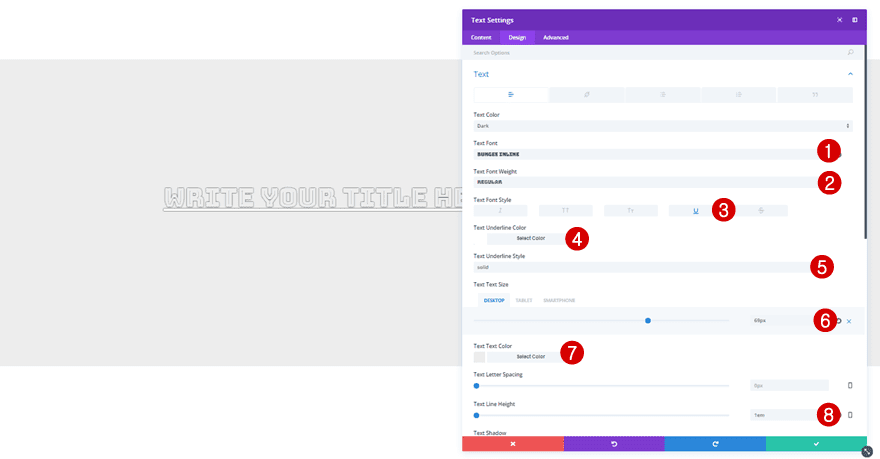
For the third example, we’re matching the color of our font with the section background color. If you’re using another background color, make sure you change the text color as well. We’ll also add a text shadow to create the borders for the text. On top of that, we’re also using an underline to the text to emphasize it.
Text Settings
For this example, you will need the following settings for the Text subcategory of the Text Module:
- Text Font: Bungee Inline
- Text Font Weight: Regular
- Text Font Style: Underline
- Text Underline Color: #FFFFFF
- Text Underline Style: Solid
- Text Size: 69px (Desktop), 45px (Tablet), 29px (Phone)
- Text Color: #ededed
- Text Line Height: 1em
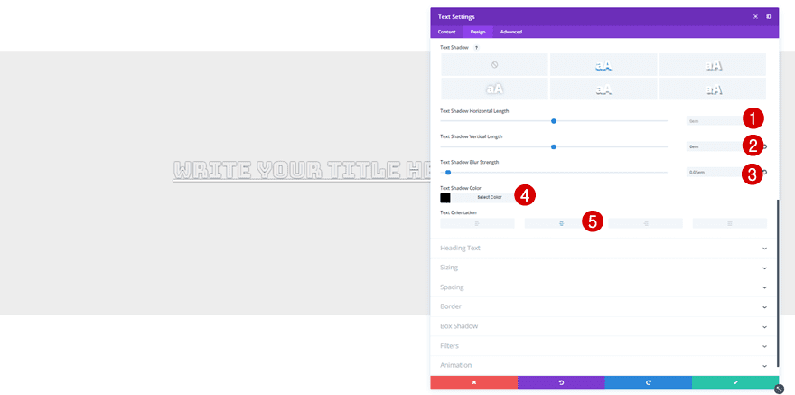
Lastly, use the following Text Shadow as well:
- Text Shadow Horizontal Length: 0em
- Text Shadow Vertical Length: 0em
- Text Shadow Blur Strength: 0.05em
- Text Shadow Color: #000000
- Text Orientation: Center
Recreate Example #4
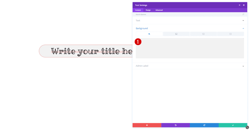
For the following example, we’re combining a background color with rounded corners and a border style. The color we’re using for the border style is the same as the one we’re using for the strikethrough font style. To make sure our text is still readable, we’re using a slightly transparent color.
Background Color
Start off by adding ‘#f2f2f2’ as the background color of your Text Module.
Text Settings
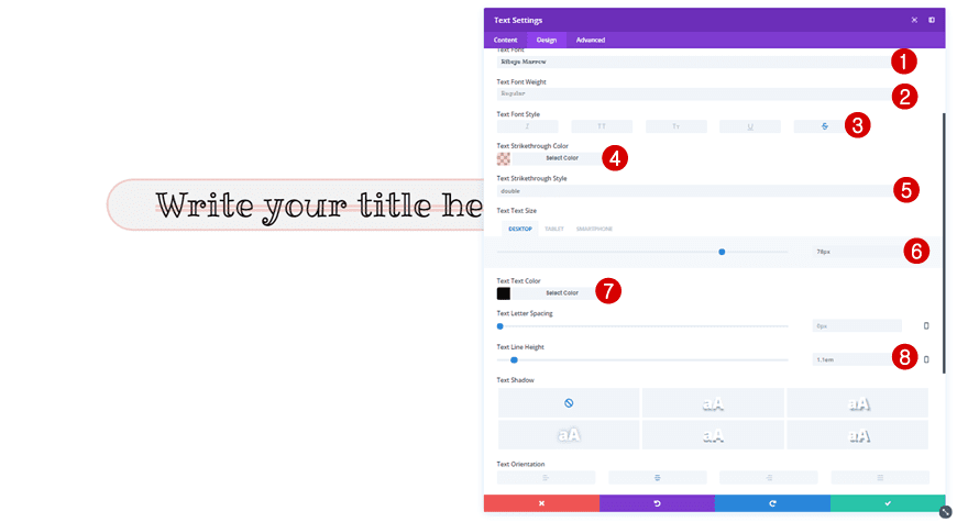
Then, move on to the Design subcategory and make the following changes to the Text subcategory:
- Text Font: Ribeye Marrow
- Text Font Weight: Regular
- Text Font Style: Strikethrough
- Text Strikethrough Color: rgba(224,43,32,0.18)
- Text Strikethrough Style: Double
- Text Size: 78px (Desktop), 46px (Tablet), 31px (Phone)
- Text Color: #000000
- Text Line Height: 1.1em
- Text Orientation: Center
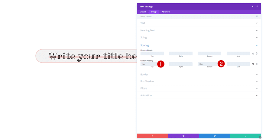
Spacing
Next, apply the following Custom Padding to the Spacing subcategory:
- Top: 15px
- Bottom: 15px
Border
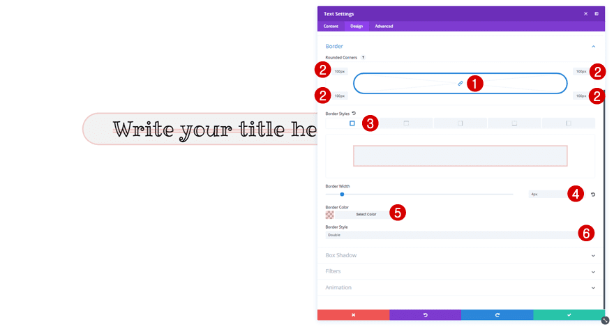
Lastly, make the following changes to the Border subcategory:
- Rounded Corners (All): 100px
- Border Style: All Sides
- Border Width: 4px
- Border Color: rgba(224,43,32,0.18)
- Border Style: Double
Recreate Example #5
In the last example, we’re combining a gradient background with a rounded corners, a top border style and a box shadow to add the final touch to our Text Module.

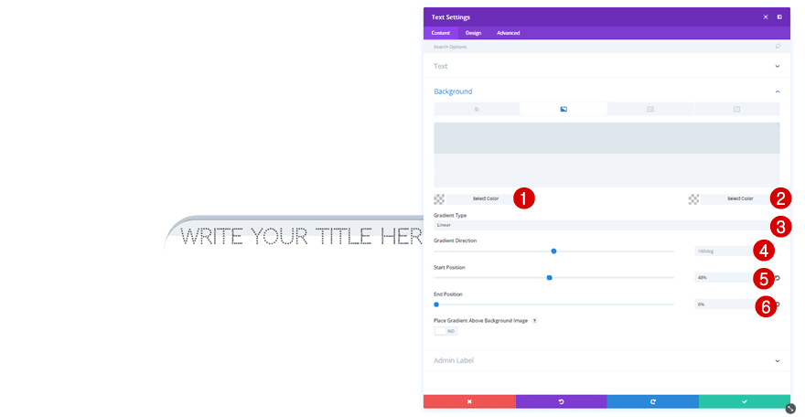
Gradient Background
Start by adding a gradient background to your Text Module:
- First Color: rgba(155,175,193,0.2)
- Second Color: rgba(244,244,244,0)
- Gradient Type: Linear
- Gradient Direction: 180deg
- Start Position: 48%
- End Position: 0%
Text Settings
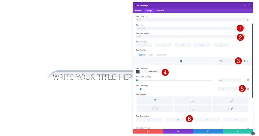
Then, move on to the Design tab and apply the following changes to the Text subcategory:
- Text Font: Codystar
- Text Font Weight: Bold
- Text Size: 60px (Desktop), 35px (Tablet), 22px (Phone)
- Text Color: #494949
- Text Line Height: 1.1em
- Text Orientation: Center
Sizing
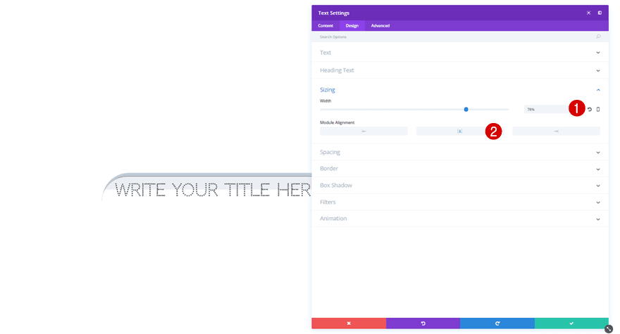
Next, go to the Sizing subcategory and make the following changes to it:
- Width: 78% (Desktop), 76% (Tablet), 86% (Phone)
- Module Alignment: Center
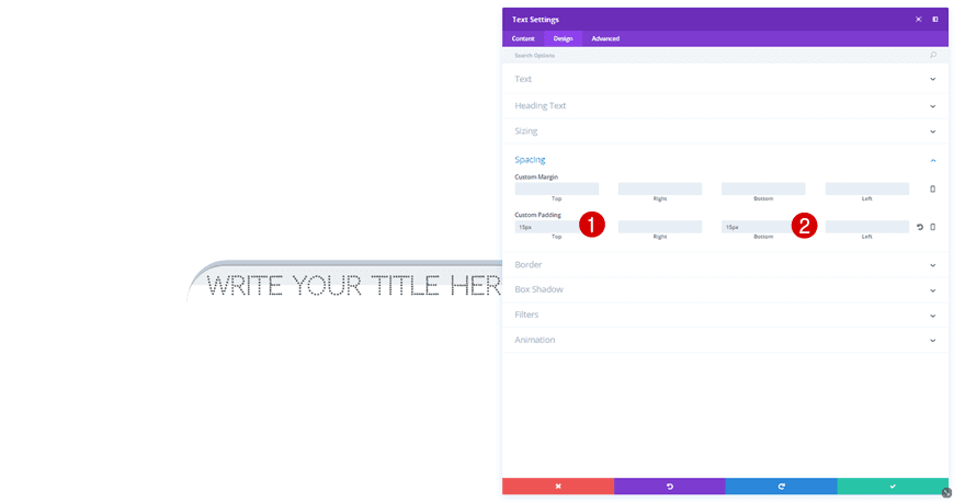
Spacing
We’ll also need to add the following padding to the Spacing subcategory:
- Top: 15px
- Bottom: 15px
Border
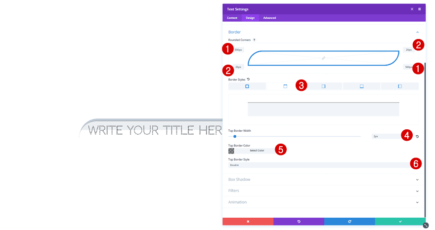
Then, open the Border subcategory and apply the following changes to it:
- Top Left & Bottom Right Corners: 500px
- Bottom Left & Top Right Corners: 20px
- Top Border Width: 2px
- Top Border Color: rgba(0,0,0,0.44)
- Top Border Style: Double
Box Shadow
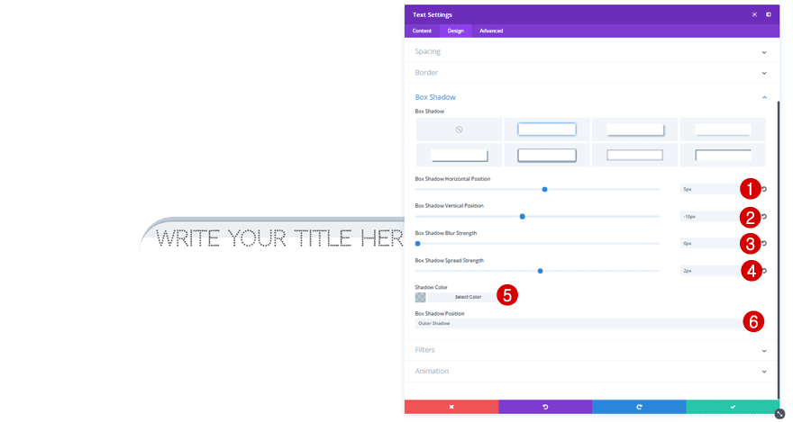
Last but not least, we’re also going to add a subtle Box Shadow to our Text Module:
- Box Shadow Horizontal Position: 5px
- Box Shadow Vertical Position: -10px
- Box Shadow Blur Strength: 0px
- Box Shadow Spread Strength: 2px
- Shadow Color: rgba(155,175,193,0.66)
- Box Shadow Position: Outer Shadow
Final Thoughts
In this post, we’ve shown you some cool ways to style the Text Modules on your website. Of course, there are a lot more possibilities out there but with these examples, you have a head start. If you have any questions or suggestions; make sure you leave a comment in the comment section below!
Featured Image by vladwel / shutterstock.com
The post 5 Cool Design Examples that Demonstrate the Power of Divi’s New Font Options appeared first on Elegant Themes Blog.

