It’s Finally Here!
Black Friday
This is something special. This is the one time each year that we offer our biggest discount of all time. But that’s just the beginning, because we are also giving away $500,000 in free prizes ! Everyone who takes advantage of our Black Friday Sale today will walk away with a free gift, some worth hundreds of dollars. But that’s not all…we are also giving away exclusive Divi Layout Packs built just for this occasion and only available to Black Friday customers and our current Lifetime members.
One of the exclusive landing pages we’re providing you with as Lifetime Members and new Black Friday customers this year is the stunning UI Kit Landing Page. This layout contains some of Divi’s finest built-in design combinations and high-quality mockups that’ll take your website to the next level. In this post we’ll show you how to get your hands on it and use it effectively.

Get the Exclusive Black Friday UI Kit Landing Page
Before getting into this use case, you will need to lay your hands on the exclusive Black Friday UI Kit Landing Page which you can get by becoming a new Elegant Themes Member, upgrading your existing account, or by already being a Lifetime Member with us. If you are indeed already a Lifetime Member you can log in to our members area and download all of our exclusive landing pages here. Everyone else will need to use the button below to buy or upgrade before they can follow along with the rest of our tutorial.
Claim The Deal Before It Disappears!
Using Divi’s Column Structures to List Products & Features Beautifully
For the remainder of this post, we’ll assume you’ve either taken advantage of our Black Friday deal or that you are already a Lifetime Member and have access to the Black Friday UI Kit Landing Page.
Once you’ve downloaded the new UI Kit Landing Page from our members area you can watch the video below to see just how easy it is to set up. We would also encourage you to follow along with this tutorial to get your site ready for further customization.
In this use case post, we’re going to show you how to stunningly list your features and/or products using Divi’s new column structures. The design we’ll handle looks great with the UI Kit Landing Page and allows you to use the space on your page in an effective and beautiful way.
Preview
Let’s take a look at the outcome on different screen sizes.

Hover & Animation
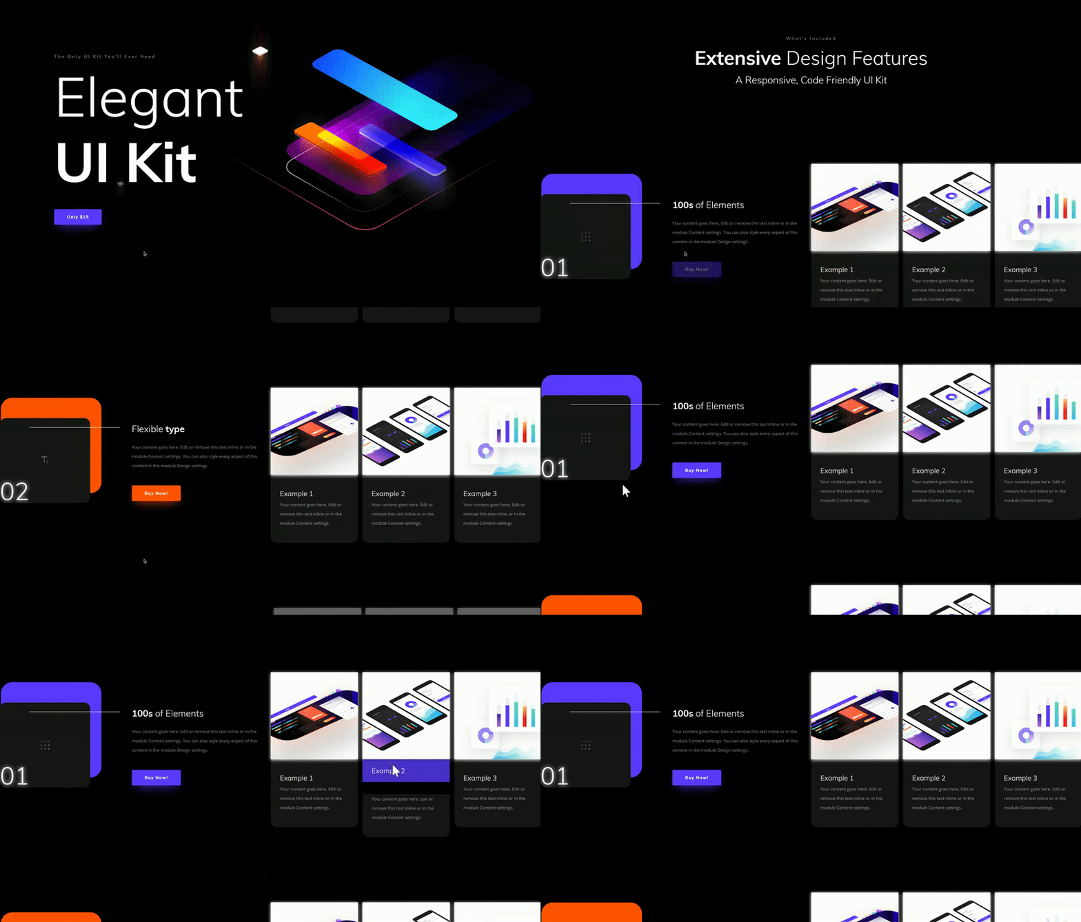
We’ll also add some subtle hover and animation settings to the various design elements. This will give the following interaction:
Let’s Get Started!
Add New Page Using UI Kit Landing Page
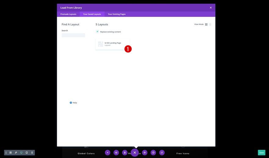
The first thing you will need to do is create a new page using the UI Kit Landing Page which you have downloaded and uploaded. If you’re not sure how to do that, make sure you check the video in the previous part of this post that will guide you there step by step.
Locate Features Section on Page
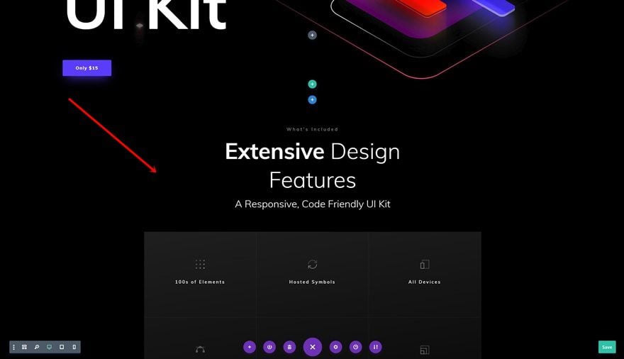
Once you’ve uploaded the layout, scroll down until you come across the features section on the page.
Remove Existing Rows
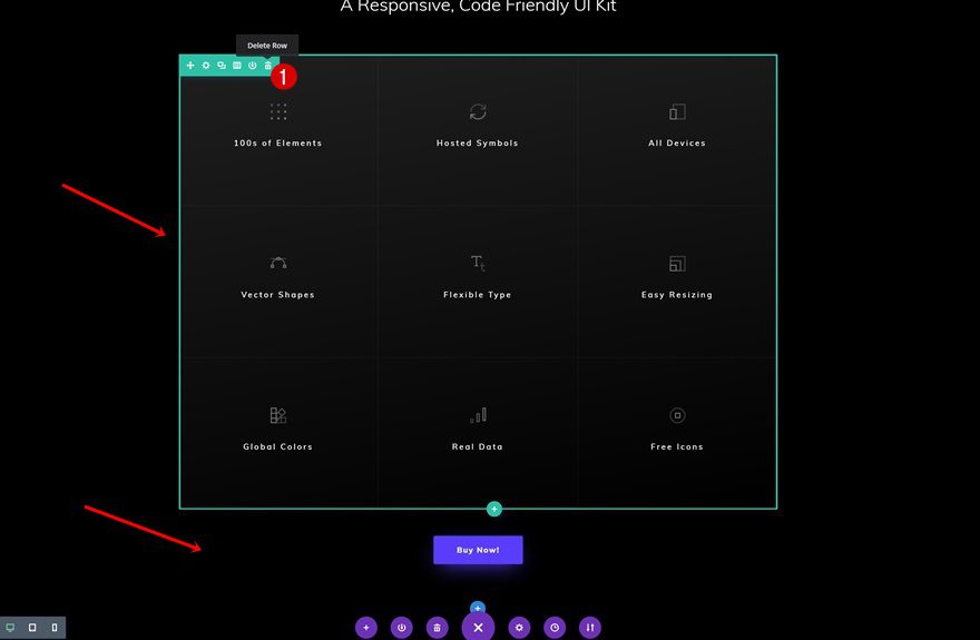
Remove the last two rows you can find in this section. We’ll replace the content of these rows with our feature/product list.
Add New Row Below Row Containing Row
Column Structure
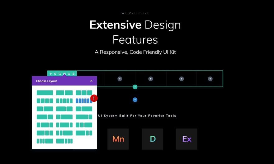
Add a new row to the section using the following column structure:
Sizing
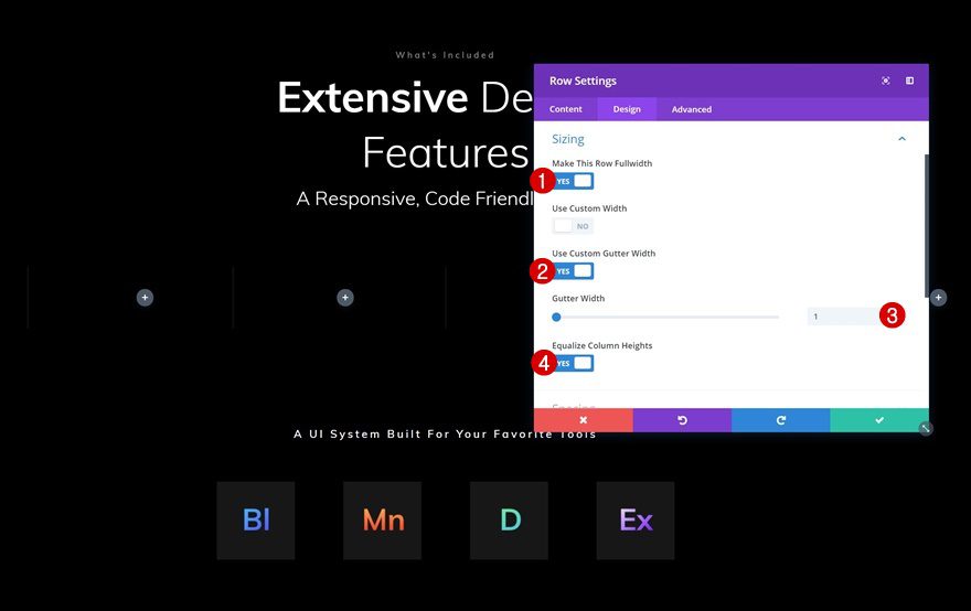
Without adding any modules yet, open the row settings and modify the sizing settings in the design tab.
- Make This Row Fullwidth: Yes
- Use Custom Gutter Width: Yes
- Gutter Width: Yes
- Equalize Column Heights: Yes
Spacing
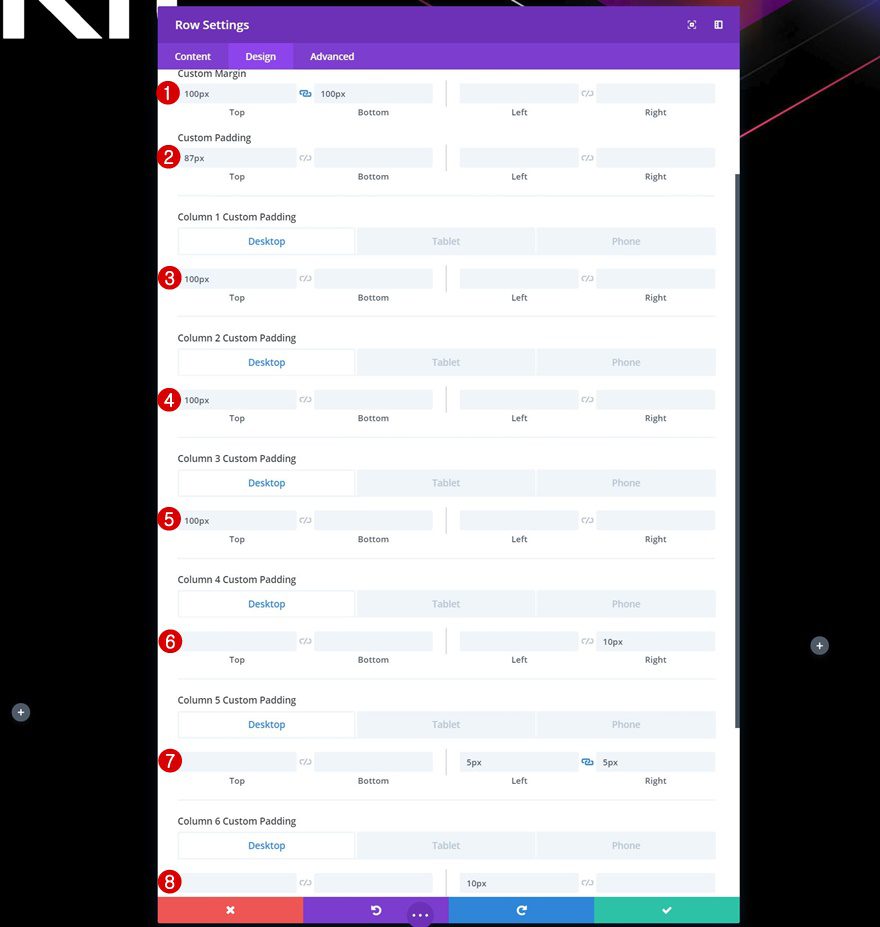
To make sure this design looks great across all screen sizes, we’re going to use different custom margin and padding values:
- Top Margin: 100px
- Bottom Margin: 100px
- Top Padding: 87px
- Column 1 Top Padding: 100px (Desktop), 0px (Tablet & Phone)
- Column 2 Top Padding: 100px (Desktop), 0px (Tablet & Phone)
- Column 3 Top Padding: 100px (Desktop). 0px (Tablet & Phone)
- Column 3 Bottom Padding: 50px (Tablet & Phone)
- Column 4 Left Padding: 10px (Phone Only)
- Column 4 Right Padding: 10px
- Column 5 Left Padding: 5px (Desktop & Tablet), 10px (Phone)
- Column 5 Right Padding: 5px (Desktop & Tablet), 10px (Phone)
- Column 6 Left Padding: 10px
- Column 6 Left Padding: 10px (Phone Only)
Add Text Module to Column 1
Add Content
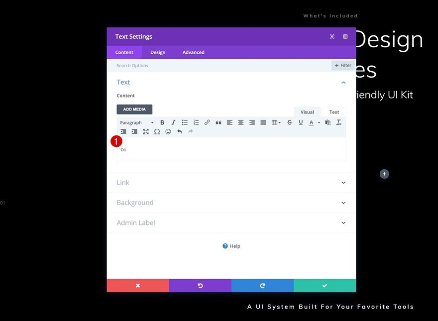
Time to start adding modules! Add a Text Module to the first column with a number.
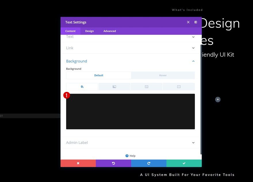
Default Background Color
Add a background color to this module.
- Background Color: #0f0f0f
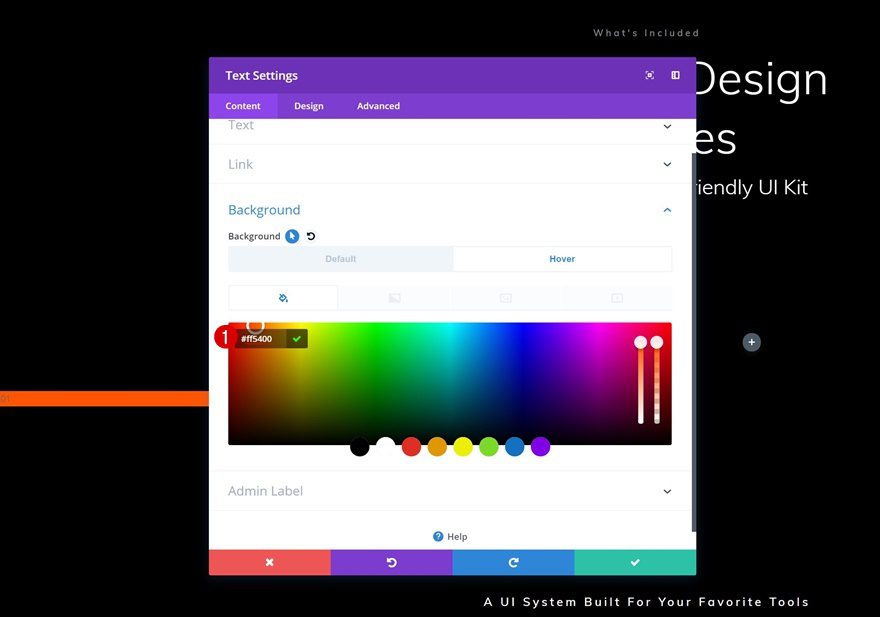
Hover Background Color
And change the background color on hover.
- Background Color: #ff5400
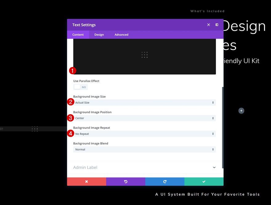
Background Image
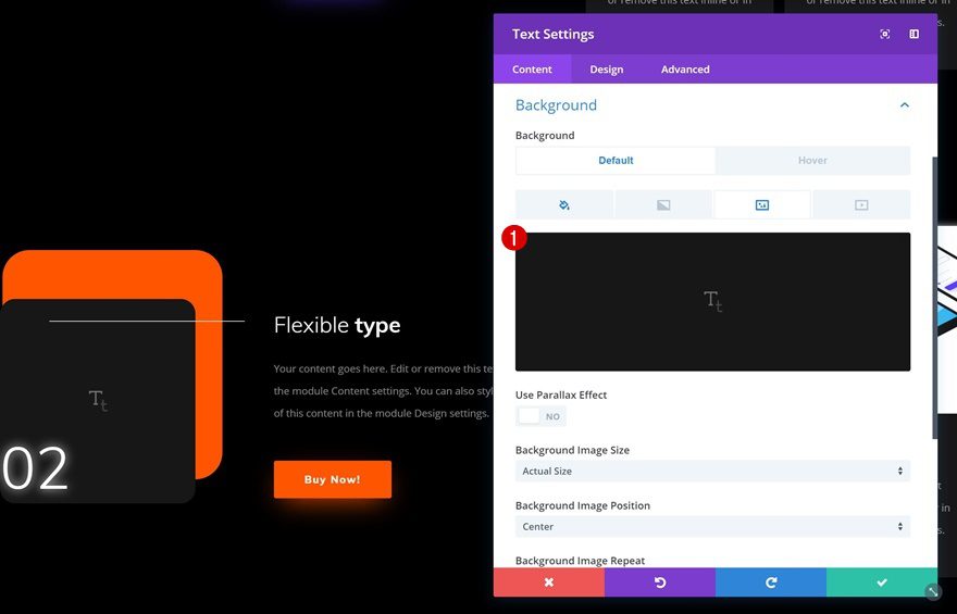
You can also add one of the icon images, which you can find in your Media Library, to the background:
- Background Image Size: Actual Size
- Background Image Position: Center
- Background Image Repeat: No Repeat
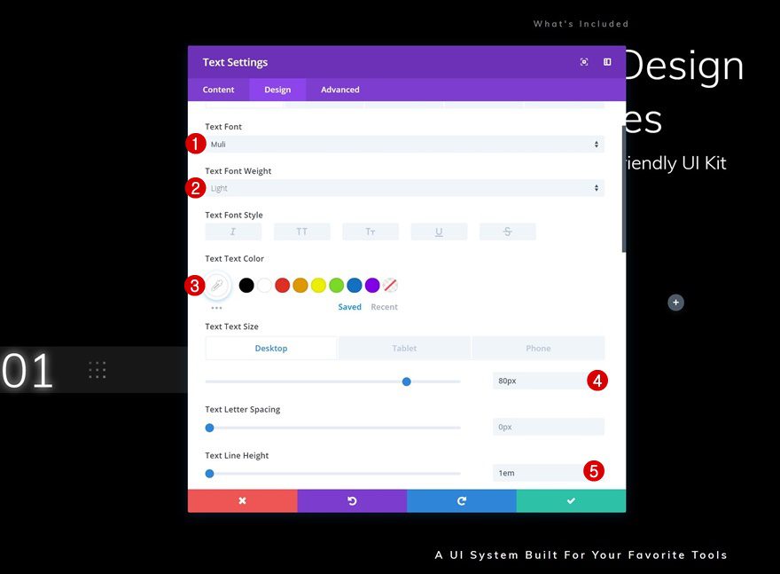
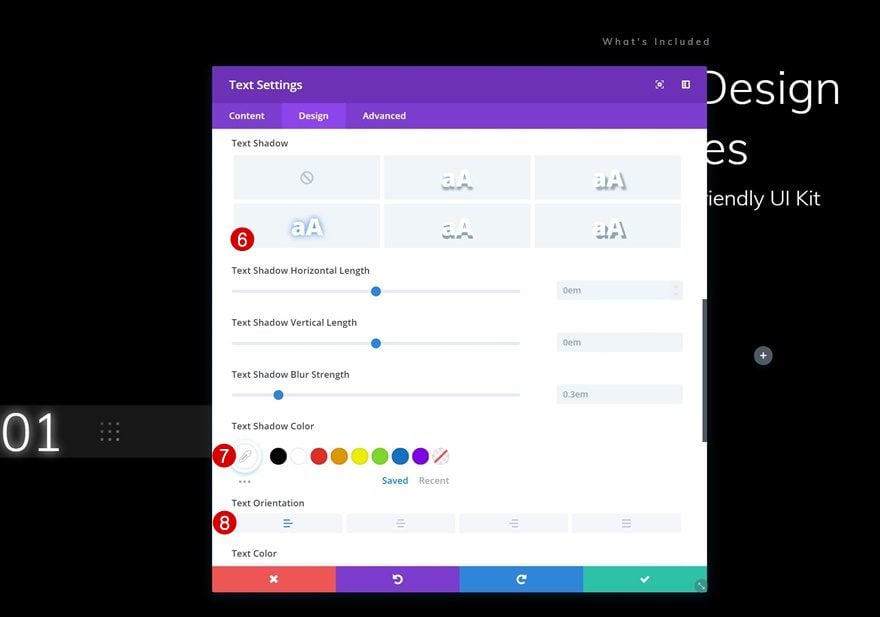
Default Text Settings
Continue by modifying the text settings.
- Text Font: Muli
- Text Font Weight: Light
- Text Color: #ffffff
- Text Size: 80px (Desktop & Phone), 40px (Phone)
- Text Line Height: 1em
- Text Shadow Color: ##ffffff
- Text Orientation: Left
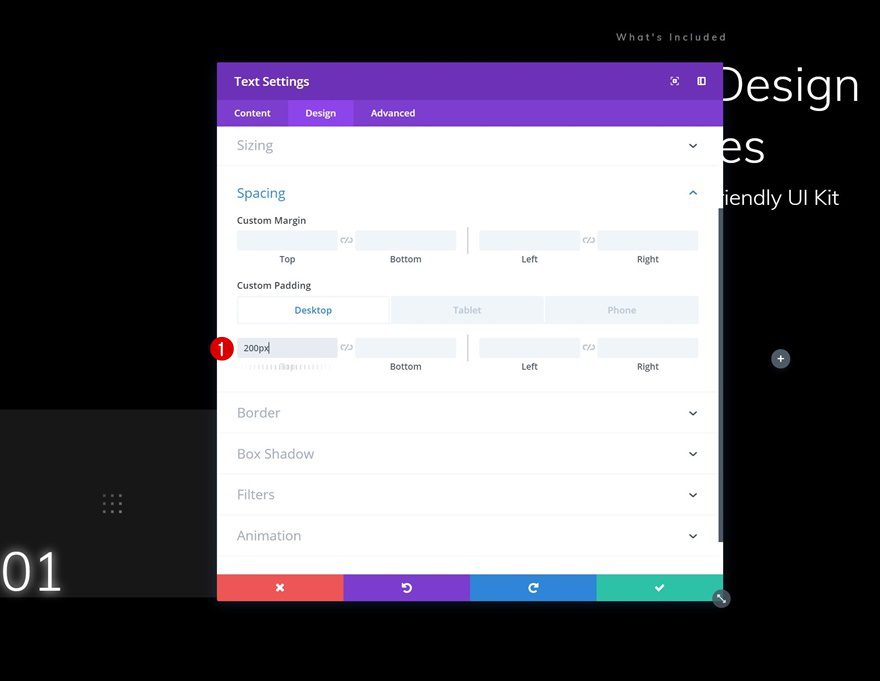
Default Spacing
Add some custom padding to create a square.
- Top Padding: 200px
- Left Padding: 50px (Phone Only)
- Right Padding: 50px (Phone Only)
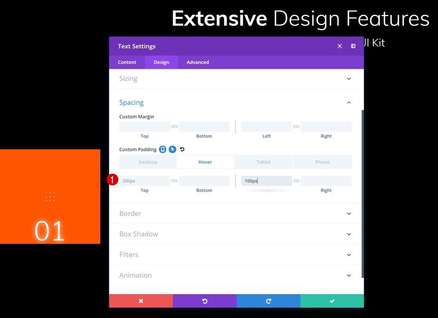
Hover Spacing
Modify the spacing settings on hover.
- Left Padding: 100px
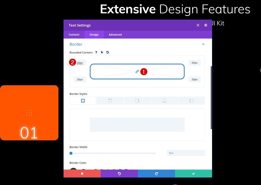
Border
To match the UI Kit Landing Page, we’re also adding some subtle rounded corners. Add ’20px’ to each one of the corners.
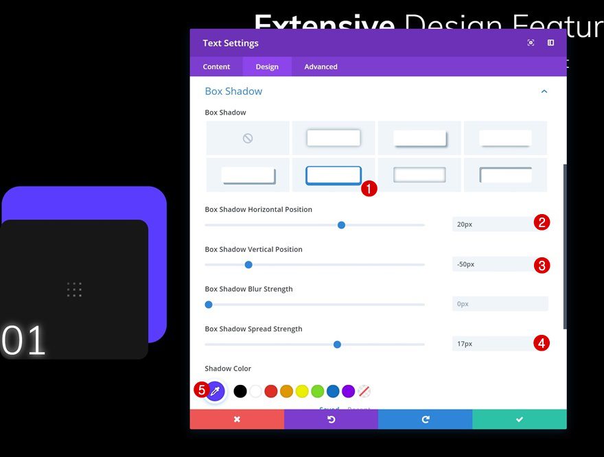
Box Shadow
Use the following box shadow to add some color the module as well:
- Box Shadow Horizontal Position: 20px
- Box Shadow Vertical Position: -50px
- Box Shadow Spread Strength: 17px
- Shadow Color: #593aff
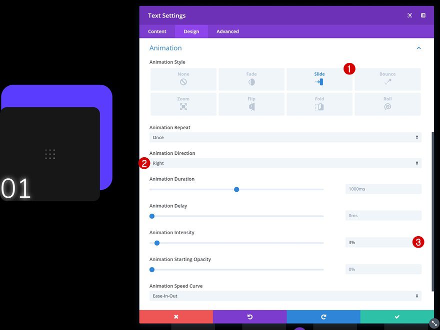
Animation
Last but not least, add a very subtle slide animation to the Text Module.
- Animation Style: Slide
- Animation Direction: Right
- Animation Intensity: 3%
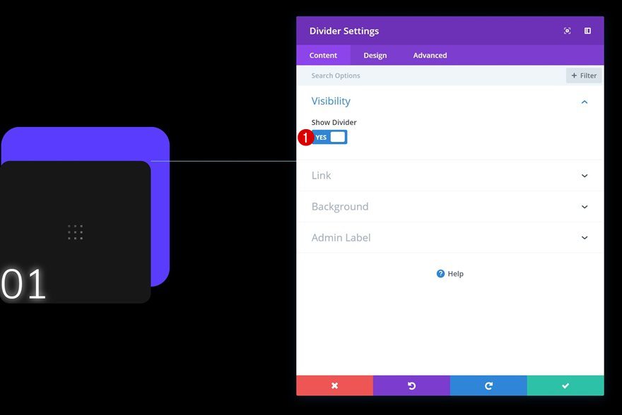
Add Divider Module to Column 2
Visibility
The next module we’ll need is a Divider Module. Go ahead and add one to the second column. Make sure the ‘Show Divider’ option is enabled.
- Show Divider: Yes
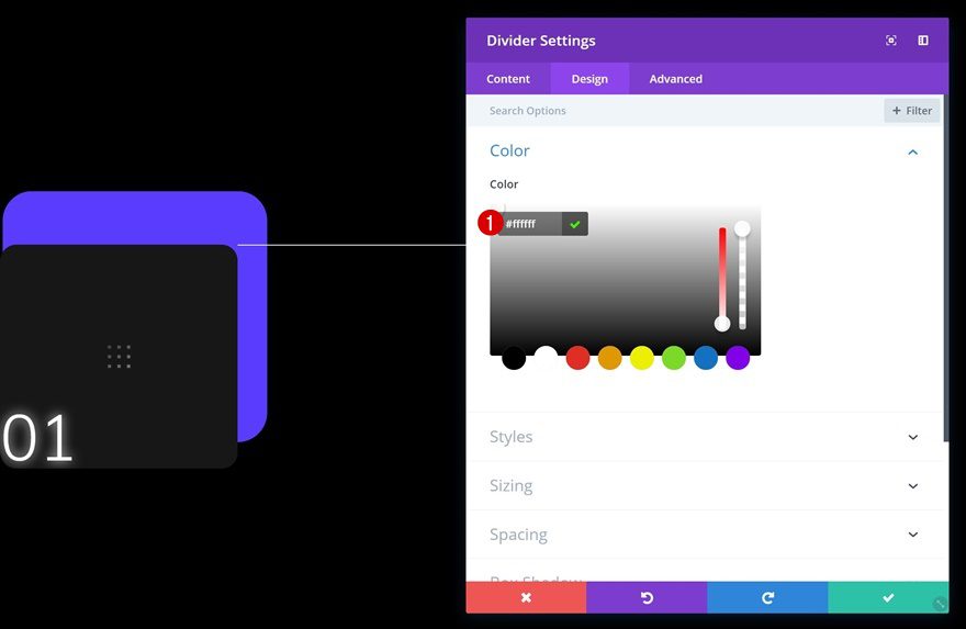
Color
Change the divider color next.
- Color: #ffffff
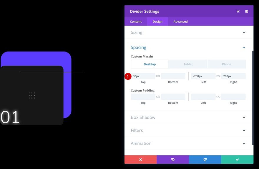
Spacing
To overlap the Text Module in the first column, we’re going to use some custom margin values which we’ll adjust according to the different screen sizes.
- Top Margin: 30px
- Left Margin: -200px (Desktop & Tablet), 0px (Phone)
- Right Margin: 200px (Desktop & Tablet), 0px (Phone)
Add Text Module #1 to Column 3
Add Content
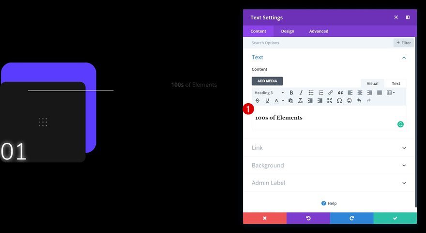
On to the next column! Here, the first module we’ll need is a title Text Module. Go ahead and add the title of your first feature or product.
Heading Text Settings
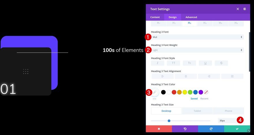
Then, go to the heading text settings and make some changes to match the UI Kit Layout Pack.
- Heading 3 Font: Muli
- Heading 3 Font Weight: Light
- Heading 3 Text Color: #ffffff
- Heading 3 Text Size: 30px (Desktop & Tablet), 18px (Phone)
Spacing
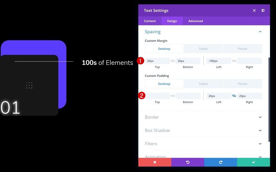
To push this module to the left, we’re going to use some custom spacing values.
- Top Margin: 20px
- Bottom Margin: 20px
- Left Margin: -180px (Desktop & Tablet), 0px (Phone)
- Left Padding: 20px (Desktop & Tablet), 50px (Phone)
- Right Padding: 20px (Desktop & Tablet), 50px (Phone)
Add Text Module #2 to Column 3
Add Content
The next module we’ll need is a description Text Module. Go ahead and enter the description of your feature or product.
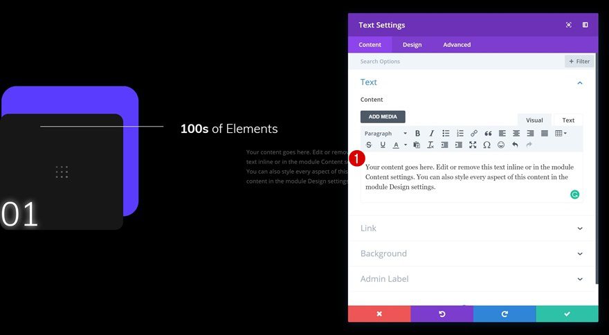
Text Settings
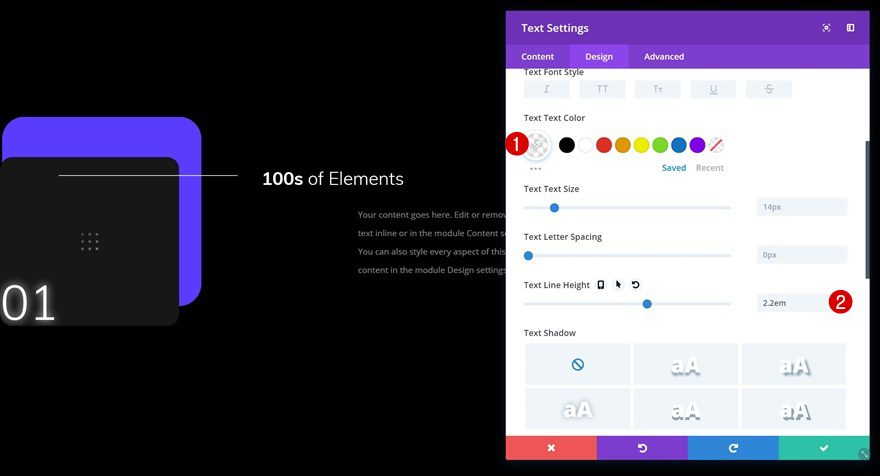
Change the text settings next.
- Text Color: rgba(255,255,255,0.5)
- Text Line Height: 2.2em
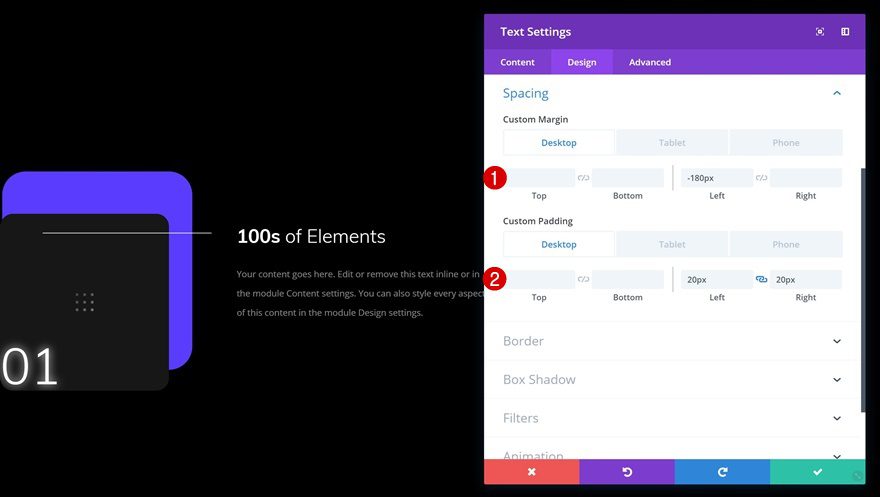
Spacing
Push this module to the left as well by using some custom spacing values.
- Left Margin: -180px (Desktop & Tablet), 0px (Phone)
- Left Padding: 20px (Desktop & Tablet), 50px (Phone)
- Right Padding: 20px (Desktop & Tablet), 50px (Phone)
Clone & Place Button Module in Column 3
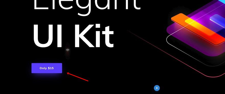
The last module we’ll need in column 3 is a Button Module. To save time, we’re going to clone an existing button on the page and place the duplicate right below the other two modules we’ve added.
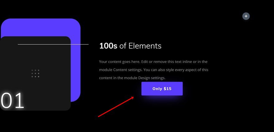
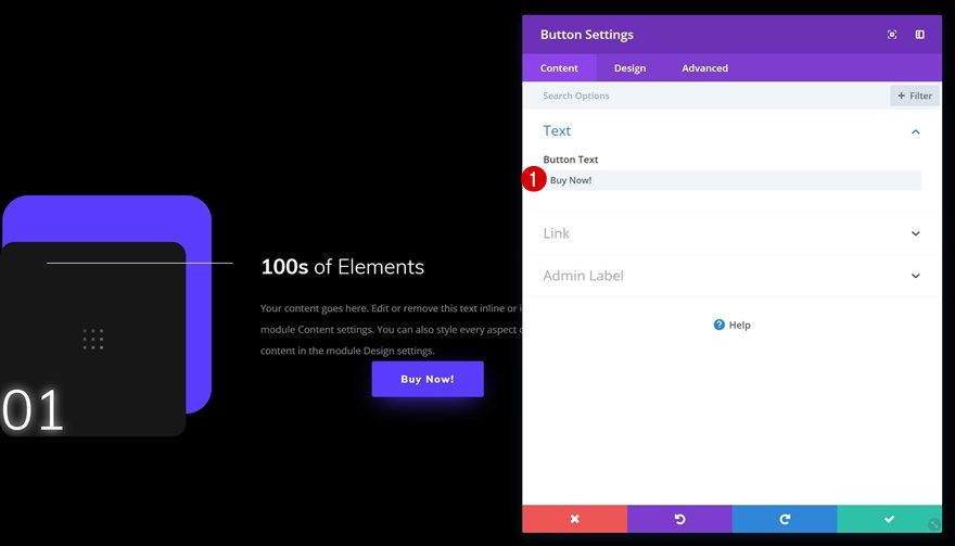
Change Content
Change the content of the button module.
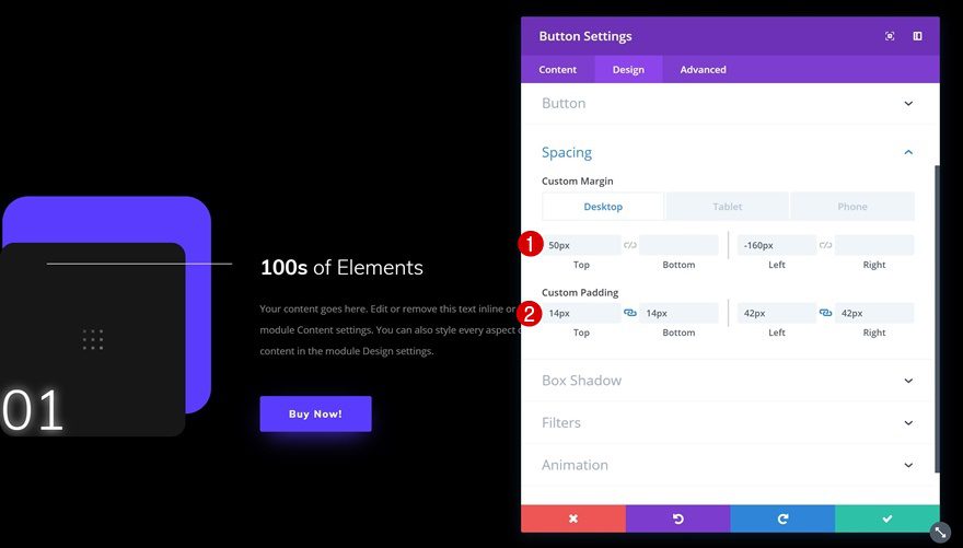
Change Spacing
We’re pushing this module to the left as well. As you can notice, all the modules in column 3 are taking up the space of two columns. This kind of approach allows us to create another column structure that matches the outcome we want.
- Top Margin: 50px
- Left Margin: -160px (Desktop & Tablet), 50px (Phone)
- Right Margin: 50px (Phone Only)
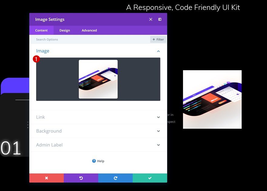
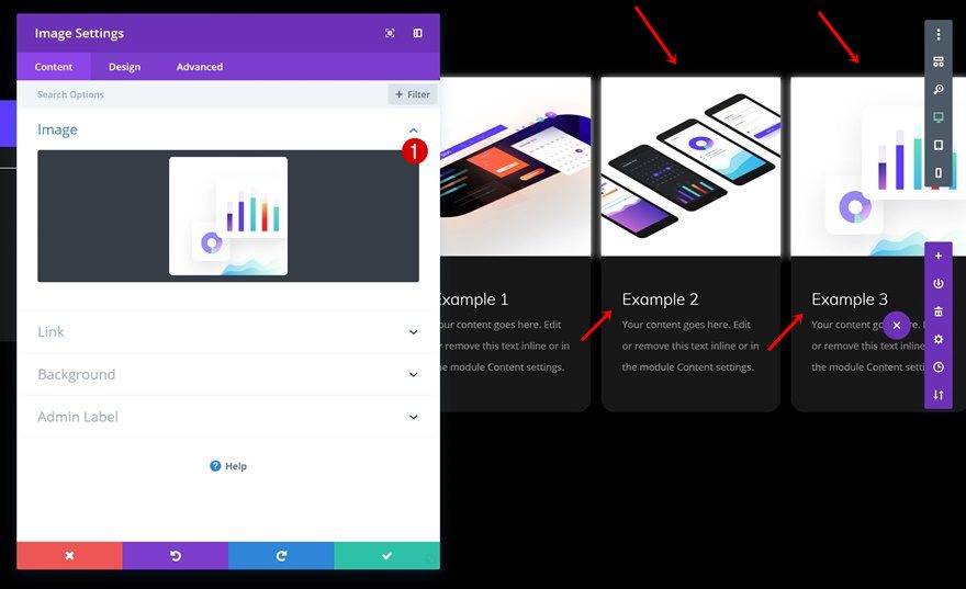
Add Image Module to Column 4
Upload Image
On to the next column! Add an Image Module to column 4 and upload an image of choice. For this example, we’ve used 500×500 image dimensions but feel free to play around with other image sizes as well.
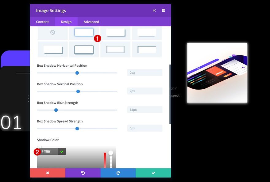
Box Shadow
Add a subtle box shadow to this module.
- Shadow Color: #ffffff
Animation
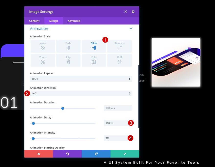
And to top it off, add a slide animation to the image as well.
- Animation Style: Slide
- Animation Direction: Left
- Animation Delay: 100ms
- Animation Intensity: 3%
Add Text Module #1 to Column 4
Add Content
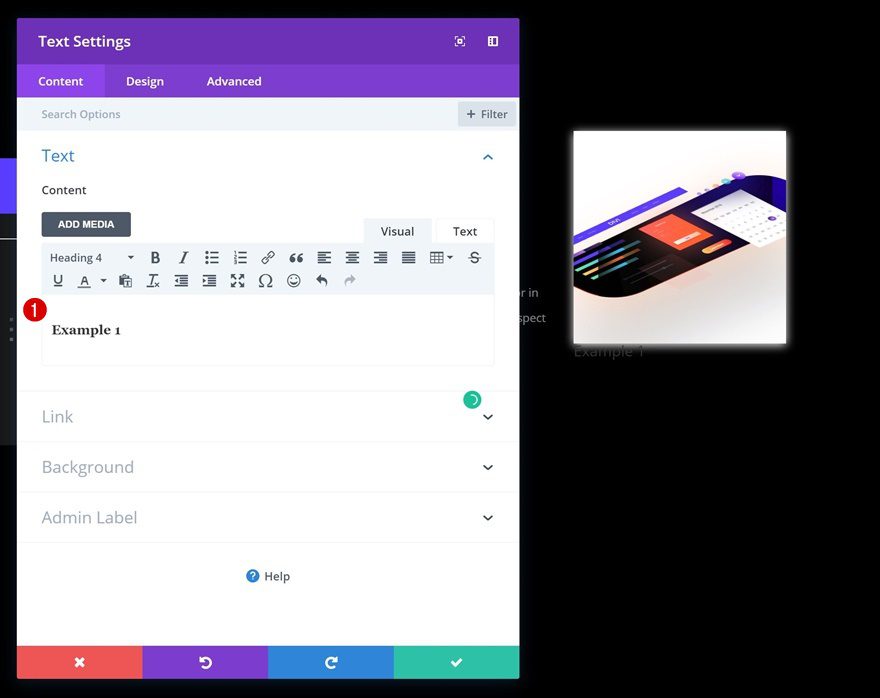
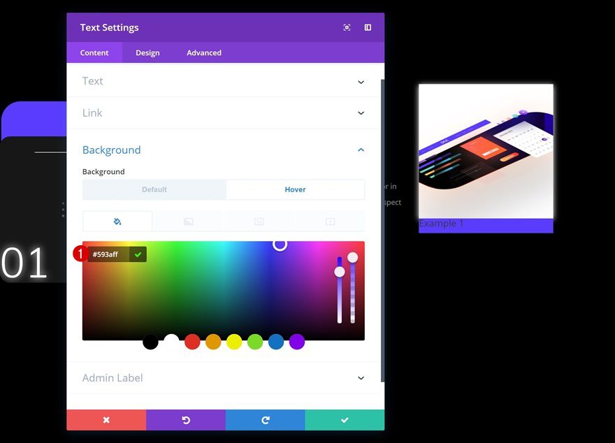
Right below the Image Module, go ahead and add a title Text Module with some content of choice.
Default Background Color
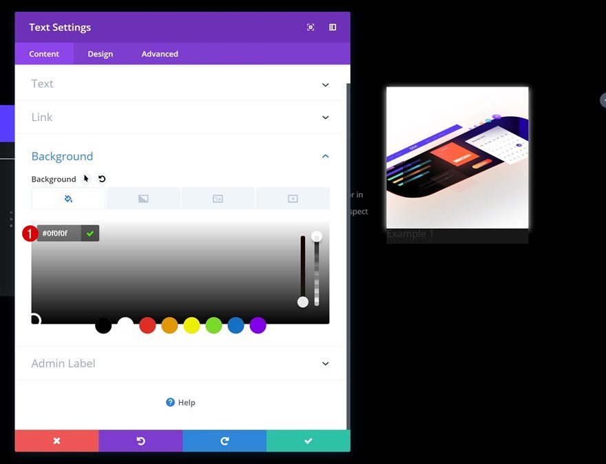
Change the background color of this module.
- Background Color: #0f0f0f
Hover Background Color
And use another background color on hover.
- Background Color: #593aff
Heading Text Settings
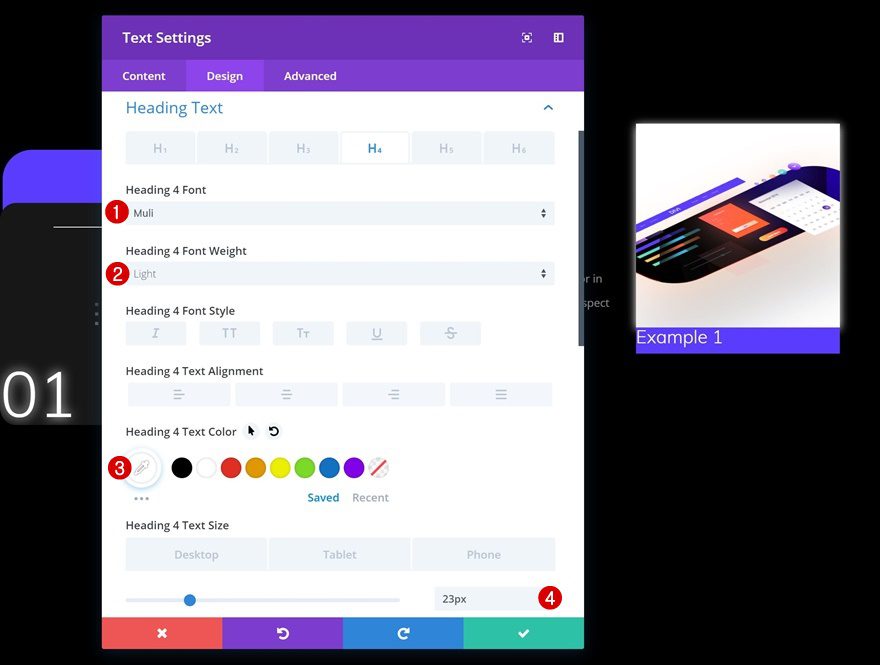
Continue by changing the heading text settings to match the UI Kit Landing Page.
- Heading 4 Font: Muli
- Heading 4 Font Weight: Light
- Heading 4 Text Color: #ffffff
- Heading 4 Text Size: 23px (Desktop & Tablet), 18px (Phone)
Default Spacing
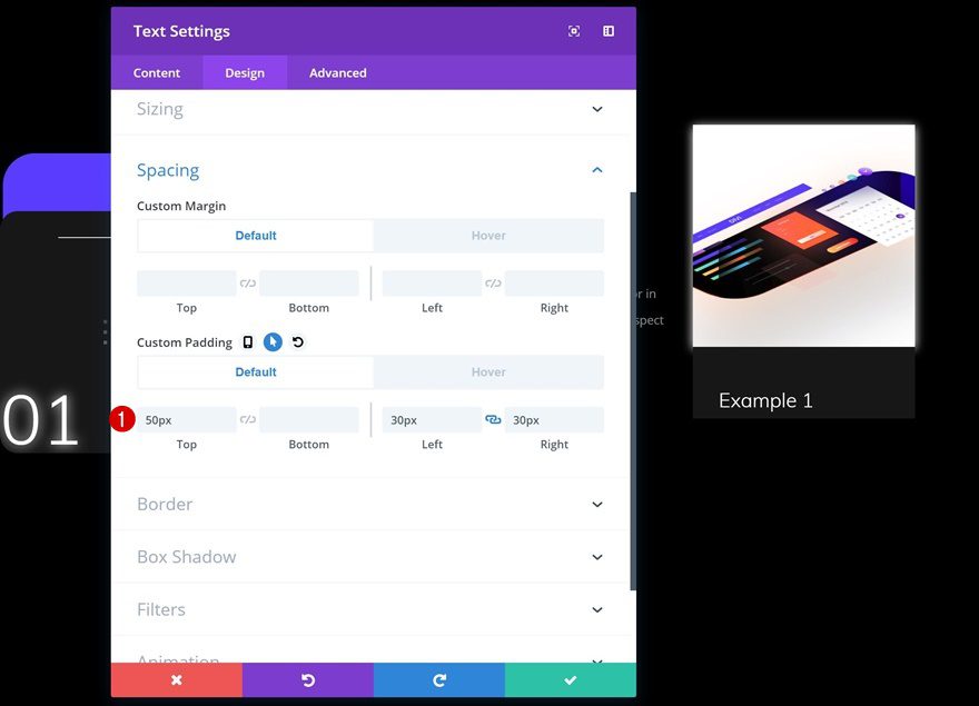
Add some custom spacing values next.
- Top Padding: 50px
- Left Padding: 30px
- Right Padding: 30px
Hover Spacing
And change these values on hover to create a nice transition.
- Bottom Marign: 50px
- Top Padding: 20px
- Bottom Padding: 20px

Add Text Module #2 to Column 4
Add Content
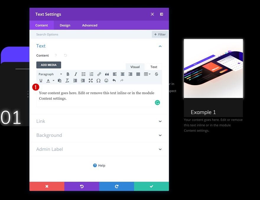
The second and last module we’ll need in column 4 is a description Text Module. Enter some content of choice.
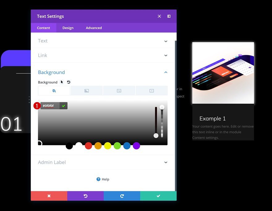
Background Color
Change the background color next.
- Background Color: #0f0f0f
Text Settings
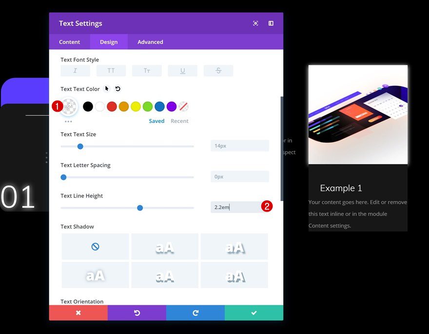
And modify the text settings.
- Text Color: rgba(255,255,255,0.5)
- Text Line Height: 2.2em
Spacing
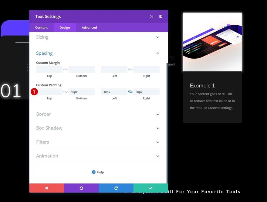
To create a clean look and feel, add some custom padding to this module.
- Bottom Padding: 50px
- Left Padding: 30px
- Right Padding: 30px
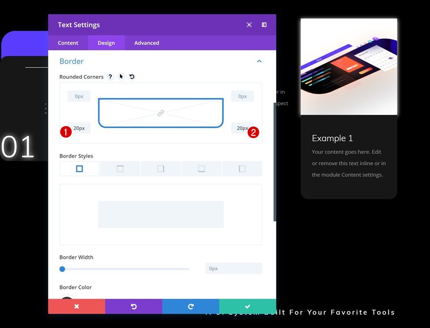
Border
Last but not least, add ’20px’ to the bottom two corners of the module.
Clone All Modules in Column 4 Twice & Place in Remaining Columns
Change Image & Content
Now that you have all the modules you need in column 4, you can go ahead and clone all of these modules twice and place the duplicates in the two remaining columns. Change the content and images to create variety.
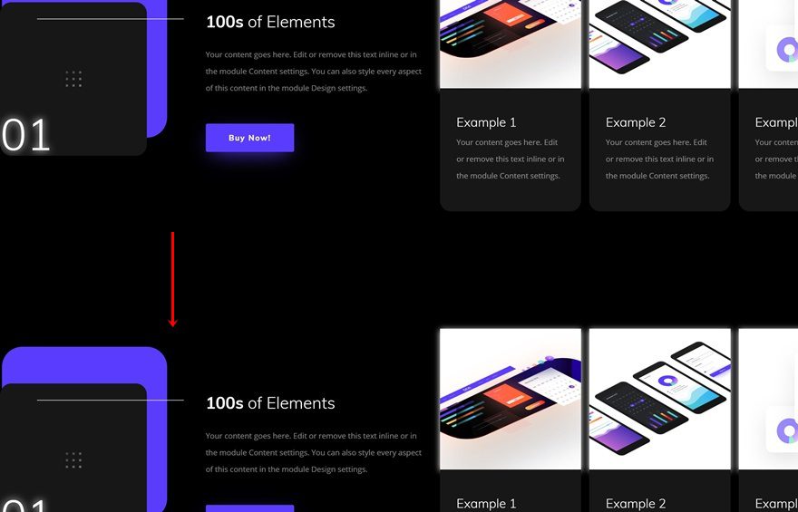
Clone Row as Many Time as Wanted (According to Number of List Items)
We finished our first list item! Now you can go ahead and clone this row as many times as you want, depending on the number of features and/or products you want to showcase.
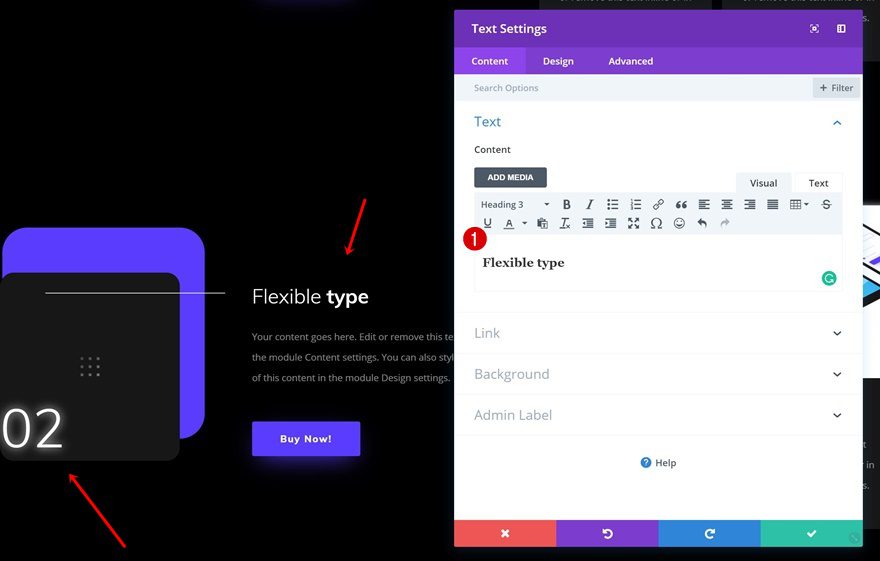
Change Content of Clone
For each one of the duplicates, you’ll need to change the content.
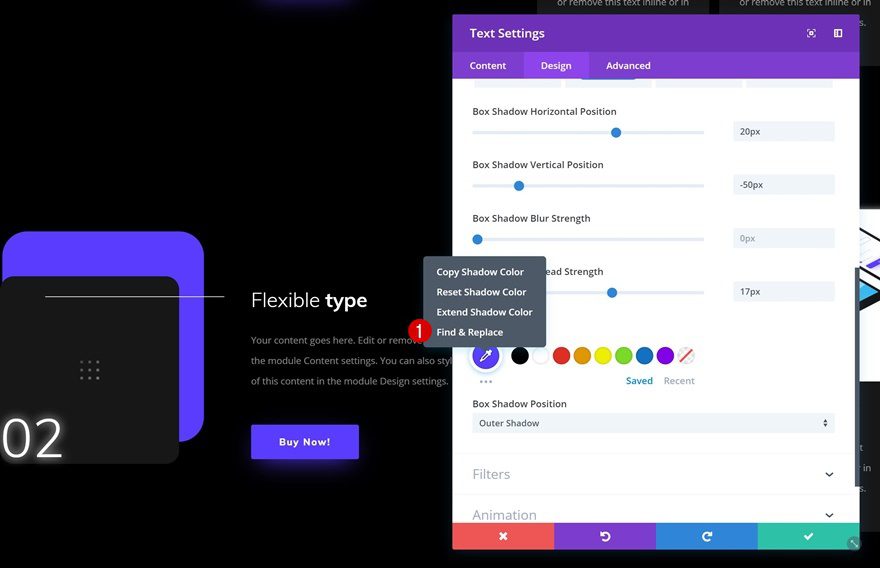
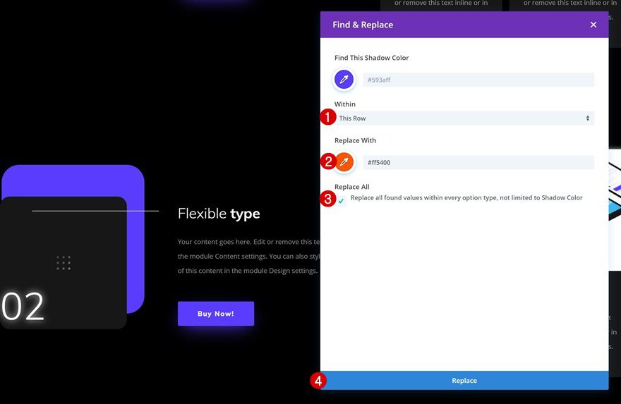
Find & Replace Color
You can also use Divi’s Find & Replace feature to quickly change the color palette of a list item.
Change Hover Background Color
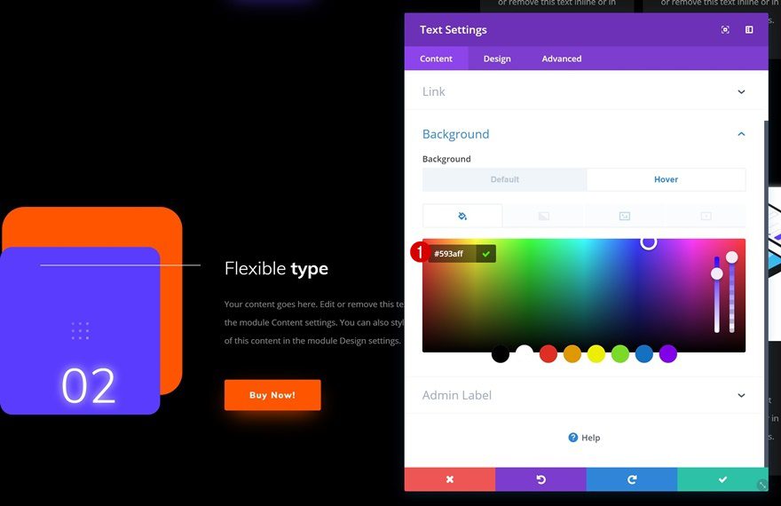
Make sure that once you change the color palette, you change the hover background color of the number Text Module as well.
- Background Color: #593aff
Change Background Image
Last but not least, you can also choose another icon in the list depending on the feature and/or product you’re allowing to show up.
Final Thoughts
This use case is part of our Black Friday Deal where we share 6 FREE limited edition landing pages with Black Friday customers and lifetime members. By joining our empowered community during these days and becoming a member, you’ll get:
- 25% OFF EVERYTHING
- All of the 6 landing pages for free
- Access to our awesome themes and plugins
- Bonus Prizes
Seize the opportunity and become a member today!
The post Using Divi’s Exclusive Black Friday UI Kit Layout to List Products & Features Beautifully appeared first on Elegant Themes Blog.
