It’s Finally Here!
Cyber Monday
Did you miss our Black Friday sale over the weekend? Don't worry! Our biggest discount of all time is being extended for a limited time for Cyber Monday. This is the biggest discount we have ever offered, and it's only something we offer during our Black Friday and Cyber Monday sales. Once the sale is over, this discount won't be available until next year. That's a long time to wait!
This App Launch Landing Page is one of the exclusive page layouts we’re providing you with as Lifetime Members and new Cyber Monday customers. The landing page layout and design is extremely versatile, making it easy to promote the launch of a any new App. The header features a strong call to action with a countdown timer to further incentivize email optins. And the different sections of the page educate visitors about app features, benefits, and functionality with a clean and elegant design.
In this article, I’ll show you how to use the App Launch Landing Page on your own website and I’ll also walk you through a tutorial on how to add informative icon animations to the layout with Divi.
Already a Lifetime Member? You can download the pack right now, no need to partake in our Cyber Monday sale!
The App Launch Landing Page Design
Get the Exclusive Cyber Monday App Launch Landing Page
Before getting into the use case tutorial, you will need to lay your hands on the Exclusive Cyber Monday App Launch Landing Page which you can get by becoming a new Elegant Themes Member, upgrading your existing account, or by already being a Lifetime Member with us. If you are indeed already a Lifetime Member you can log in to our members’ area and download all of our exclusive layout packs here. Everyone else will need to use the button below to buy or upgrade before they can follow along with the rest of the tutorial below.
Claim the Deal Before It Disappears!
Already a Lifetime Member? You can download the pack right now, no need to partake in our Cyber Monday sale!
Adding the App Launch Landing Page Layout to Your Website
For the remainder of this post we’ll assume you’ve either taken advantage of our Cyber Monday (or Black Friday) deal or that you are already a Lifetime Member and have access to the App Launch Landing Page Layout.
Once you’ve downloaded the new App Launch Landing Page Layout from our members area you can watch the video below to see just how easy it is to set up. We would also encourage you to follow along with this tutorial to get your site ready for further customization.
Once you have successfully downloaded the layout, imported it to the Divi Library, and added it to a new page, you are ready to start the use case tutorial below.
Use Case Tutorial: Adding Informative Icon Animations with Divi & the App Launch Landing Page
Adding informative animations to your landing page not only looks cool, but it it can also be an effective way to support page content by highlighting certain features or services. In this use case tutorial, I’m going to show you a few tricks to animate your Divi modules using icons and dividers in creative ways. As the user scrolls to down the page, these animations will capture the attention of visitors with a subtle and purposeful illustration that comes to life.
Importing Font Awesome to your layout
For this tutorial, I’m going to use a few font icons from font awesome to display certain apps like Mailchimp and Google Drive. But you can easily use an icon of your choice. To be able to use font awesome on your website, you can access Font Awesome’s Free CDN. Go to their website and copy the html code for the all the free webfonts.
Next, go to your WordPress Dashboard and navigate to Divi > Theme Options. Then select the Integration tab and paste the code to the head of your blog.
To display an icon on your website, just copy the html of a particular font from their collection on their website and paste it as html within your module.
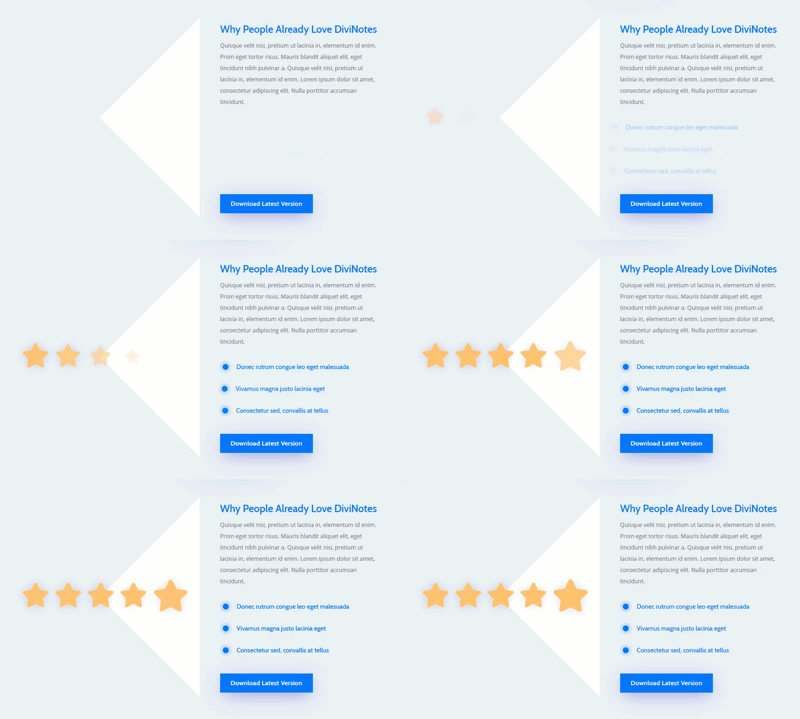
Adding a Five Star Animation to the App Launch Landing Page
Now that Font Awesome is ready, go the page where you imported the App Launch Landing Page and deploy the visual builder (see above for instructions on how to do this if needed).
In the first row of the third section of the layout, add a new text module to the empty first column (column 1). Then add the following Font Awesome html to the text content box in order to display a star icon.
<i class="fas fa-star"></i>
Next, go to the design tab and update the following:
Text Text Color: #ffbf6b
Text Text Size: 6vw
Text Line Height: 1em
Text Shadow: see screenshot
Text Shadow Blur Strength: 0.5em
Text Shadow Color: rgba(0,0,0,0.15)
Text Orientation: center
Width: 6vw
Custom Margin: 1vw Left, 1vw Right
Animation Style: Zoom
Save Settings.
Now duplicate the icon four times so that you have a total of five start icons in column 1.
Now we are going to update the animations for icons 2-5 so that are delayed to show up one after the other. Then for the last icon, we are going to change the animation style to bounce to emphasize the fifth star.
Open the text settings for the star icon #2 and update the animation delay to 200ms.
For star icon #3, update the animation delay to 400ms.
For star icon #4, update the animation delay to 600ms.
For start icon #5, change the animation style to bounce and update the animation delay to 1200ms.
Using Flex to Display the Star Icons in a horizontal row structure
At this point, you may have noticed that our icons are stacked vertically so we need to align our icons horizontally. Although it is possible to do this with custom spacing, I thought I would save us some time by showing you a snippet of custom CSS that will do this for us quickly.
Open your row settings. Under the advanced tab, add the following css to the Column 1 Main Element:
display: flex;
justify-content:center;
margin: auto;
As you can see, this short snippet of code converted the contents of column 1 into a horizontal row that is vertically centered. Pretty cool stuff!
But now our column background image is no longer displaying correctly. To fix this, we need add some padding to our column and give change the row background color as follows:
Background Color: #eaeef5
Column 1 Custom Padding: 21vw top, 21vw bottom
For a final touch, let’s increase the size of star icon #5 so that it further emphasizes the five star rating of the app.
Open the text settings for start icon #5 and update the following:
Text Text Size: 8vw
Custom Margin: -1vw top
Check out the final design and animation.
And because of the combination of custom CSS and the vw length unit used throughout the design, the icons will adjust perfectly on mobile as well.
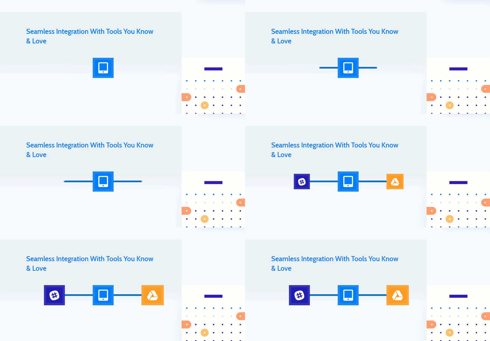
Illustrating Integration of Apps with Animation
For this next animation, we are going to illustrate how an app might integrate with other popular apps. To do this we are going to create app icons using a text module and font awesome icons. Then we are going to connect the icons with a line created with an empty text module. Then we will align our content horizontally using some custom css like we did in the previous example. And finally, we will add the animation styles and delay to illustrate the app connecting to two other apps.
For starters, make your way to the fourth row of the third section of the layout. Then delete the large image in column 1 and replace it with a text module. Then add the following Font Awesome code to the content box to display a Slack icon.
<i class="fab fa-slack"></i>
Then update the following:
Background Color: #2c2eb8
Text Text Color: #ffffff
Text Text Size: 5vw
Text Line Height: 1em
Text Orientation: Center
Width: 2em
Custom Padding: 0.2em top, 0.2em bottom, 0.2em left, 0.2em right
Border width: 0.2em
Border Color: rgba(255,255,255,0.09)
Then add the following animation:
Animation Style: Zoom
Animation Direction: Left
Animation Delay: 2500ms
Animation Intensity: 100%
Animation Starting Opacity: 100%
Animation Speed Curve: Linear
Save Settings.
Under the text module you just created, add another text module. This one we will use to create the line connecting the icons. I’m using a text module (instead of a divider module) because there are issues with displaying the divider module when using flex css. Go ahead and update the following text settings:
Background Color: #0c71c3
Custom Margin: 3.3vw top
Custom Padding: 5vw left, 5vw right
Animation Style: Fold
Animation Direction: Left
Animation Delay: 1500ms
Animation Intensity: 100%
Animation Starting Opacity: 100%
Animation Speed Curve: Linear
Then add the following custom css to the main element:
height: 0.6vw;
Save Settings.
Next, copy the slack icon text module and paste it under the line text module.
Replace the content with the following html:
<i class="fas fa-tablet-alt"></i>
Then update the Background Color to #1c7eff.
Then update the animation style to None.
Next, copy the line text module and paste it under the tablet icon text module and update the following:
Animation Direction: Right
Save Settings.
For the last icon, copy the Slack icon text module and paste it under the second line text module you just created.
Replace the content with the following html:
<i class="fab fa-google-drive"></i>
And change the Background Color to #ff9a01.
Then under the design tab, update the animation direction to Right.
Using Flex to Display the modules in a horizontal row structure
To finish the design, all we need to do is organize our text modules in a horizontal row. To do this, we add our little magical css snippet we used in the first example. To do this, open the settings for the row containing your modules and add the following CSS to the Column 1 Main Element:
display: flex;
justify-content:center;
margin: auto;
And just like that, everything works in perfect harmony. Check out the final design and animation.
Because of the vw length units used throughout the design, resizing the icons only requires changing the text size. And changing the length of the lines only requires changing the right and left padding values. It scales nice on mobile as well.
Final Thoughts
This use case is part of our Cyber Monday Deal where we share 6 FREE limited edition landing pages with Black Friday customers and lifetime members. By joining our empowered community during these days and becoming a member, you’ll get:
- 25% OFF EVERYTHING
- All of the 6 landing pages for free
- Access to our awesome themes and plugins
- Bonus Prizes
Seize the opportunity and become a member today!
The post Adding Informative Icon Animations with Divi & the Exclusive Cyber Monday App Launch Landing Page appeared first on Elegant Themes Blog.


