A category page can be extremely helpful to users by providing them with an entire page full of stuff they are interested in (or search for). But many times the category page can suffer when it comes to design. In Divi, before the days of the Divi Theme Builder, developers had to rely on manually customizing the php code on a category page template theme file and then styling the page template purely with external CSS. But now, with the Divi Theme Builder, this process has become easy and enjoyable!
In this tutorial, we will be showing you how to create a category page template for your blog completely from scratch using the Divi Theme Builder. We’ll show you how to quickly setup a new template assigned to post categories as well as how to design the template using the appropriate modules and dynamic content using the Divi Builder.
Let’s get started!
Sneak Peek
Here is a quick look at the category page template we will design together in this tutorial. In this image, it is being used to display all the posts with the “Business” category.

Download the Layout for FREE
To lay your hands on the designs from this tutorial, you will first need to download it using the button below. To gain access to the download you will need to subscribe to our Divi Daily email list by using the form below. As a new subscriber, you will receive even more Divi goodness and a free Divi Layout pack every Monday! If you’re already on the list, simply enter your email address below and click download. You will not be “resubscribed” or receive extra emails.
@media only screen and ( max-width: 767px ) {.et_bloom .et_bloom_optin_1 .carrot_edge.et_bloom_form_right .et_bloom_form_content:before, .et_bloom .et_bloom_optin_1 .carrot_edge.et_bloom_form_left .et_bloom_form_content:before { border-top-color: #ffffff !important; border-left-color: transparent !important; }
}.et_bloom .et_bloom_optin_1 .et_bloom_form_content button { background-color: #f92c8b !important; } .et_bloom .et_bloom_optin_1 .et_bloom_form_content .et_bloom_fields i { color: #f92c8b !important; } .et_bloom .et_bloom_optin_1 .et_bloom_form_content .et_bloom_custom_field_radio i:before { background: #f92c8b !important; } .et_bloom .et_bloom_optin_1 .et_bloom_border_solid { border-color: #f7f9fb !important } .et_bloom .et_bloom_optin_1 .et_bloom_form_content button { background-color: #f92c8b !important; } .et_bloom .et_bloom_optin_1 .et_bloom_form_container h2, .et_bloom .et_bloom_optin_1 .et_bloom_form_container h2 span, .et_bloom .et_bloom_optin_1 .et_bloom_form_container h2 strong { font-family: “Open Sans”, Helvetica, Arial, Lucida, sans-serif; }.et_bloom .et_bloom_optin_1 .et_bloom_form_container p, .et_bloom .et_bloom_optin_1 .et_bloom_form_container p span, .et_bloom .et_bloom_optin_1 .et_bloom_form_container p strong, .et_bloom .et_bloom_optin_1 .et_bloom_form_container form input, .et_bloom .et_bloom_optin_1 .et_bloom_form_container form button span { font-family: “Open Sans”, Helvetica, Arial, Lucida, sans-serif; } p.et_bloom_popup_input { padding-bottom: 0 !important;}

Download For Free
Join the Divi Newlsetter and we will email you a copy of the ultimate Divi Landing Page Layout Pack, plus tons of other amazing and free Divi resources, tips and tricks. Follow along and you will be a Divi master in no time. If you are already subscribed simply type in your email address below and click download to access the layout pack.
You have successfully subscribed. Please check your email address to confirm your subscription and get access to free weekly Divi layout packs!
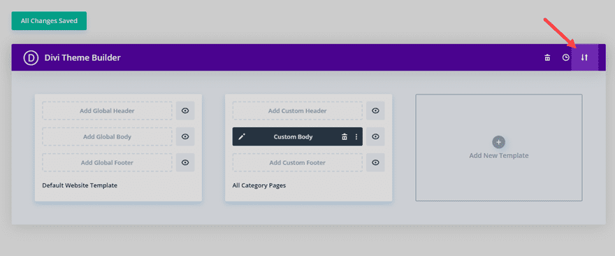
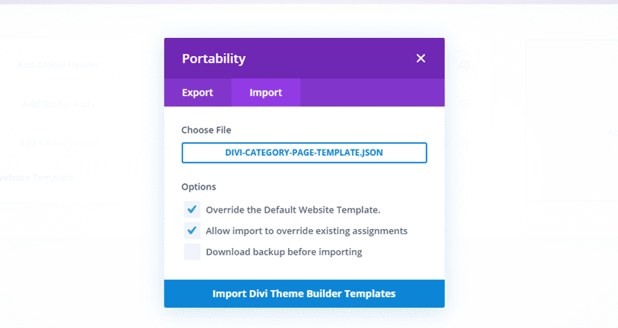
To import the template layout to your website, you will need to go to the Divi Theme Builder and use the portability option to import the .json file to the theme builder.
Let’s get to the tutorial shall we?
What You Need to Get Started
To get started, you will need to do the following:
- If you haven’t yet, install and activate the Divi Theme installed (or the Divi Builder Plugin if not using the Divi Theme).
- Since we will be creating a category page template for blog posts, you will need to have posts already created on your website with categories assigned to them.
After that, you are ready to go.
Modules and Dynamic Content Available for Category Page Templates
When building a Category Page template for a Divi blog, it is important to understand what tools are at your disposal so that you can effectively build a template that dynamically displays the correct information. For a category page template for blog posts, we are most interested in displaying posts by the current category whenever a user visits a category page. For example, if a user clicks the category link “Business”, they should see an archive page that displays all the posts with the category “Business”. Some Divi modules have built in options to make displaying dynamic content on a template pretty easily.
The Blog Module
The Blog Module is the primary module that should be used to display Category Page templates. This is because has the built in option to display Posts for Current Page.
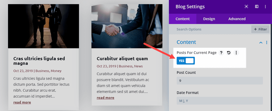
This is basically telling Divi to display the posts that are normally generated whenever a user visits the page. So with the option set to display “Posts for Current Page”, the user will be able to view a category page and have the posts by category correctly displayed.
Post Slider Module and Post Title Module
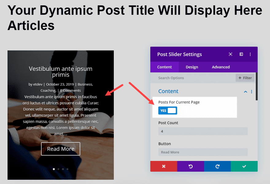
You can also use the Post Slider Module to display the Posts for Current Page. This is helpful for creating a dynamic post slider that displays the posts generated upon visiting a category page, much like the blog module can do.
The Post Title Module can also be used but it is pretty much limited to the capability of displaying the Title of the page dynamically. Most of the other elements available within the post title module aren’t applicable to an archive page, only specific post templates.
Post/Archive Title (Dynamic Content)
An easier way to display the Post/Archive Page Title is to use a regular Divi module and then pull in the Post/Archive Page Title using the dynamic content feature available within all Divi module.
For example, you can use a text module and then add the post/archive page title as dynamic content to the body content. Then you can style the title however you like.
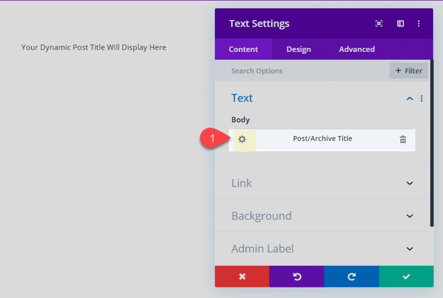
Now that you understand the tools needed to create a category page template, let’s jump in and create one together.
How to Create a Category Page Template for your Blog
For this category page template, the goal is to create a custom body area for a template that is assigned to all category pages for blog posts in Divi. We aren’t going to be creating a custom header or footer area for this template. But you can easily use this template on your own website with your own header and footer.
Creating and Assigning a Custom Template for Post Categories
To get started, go to your WordPress Dashboard and navigate to Divi > Theme Builder. Then click the empty gray box area to add a new template.
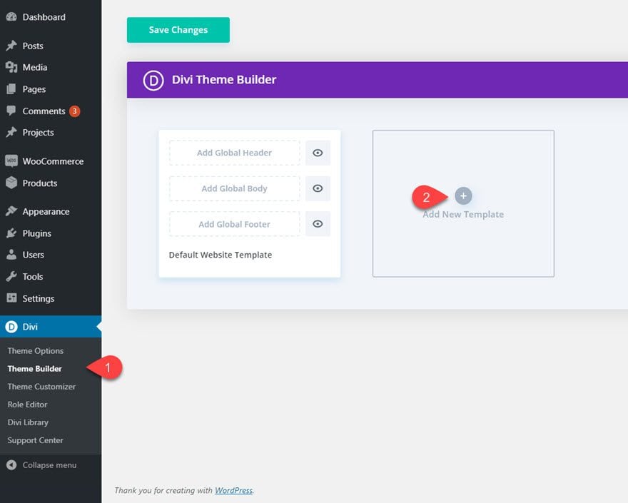
Next, assign the template to All Category Pages.
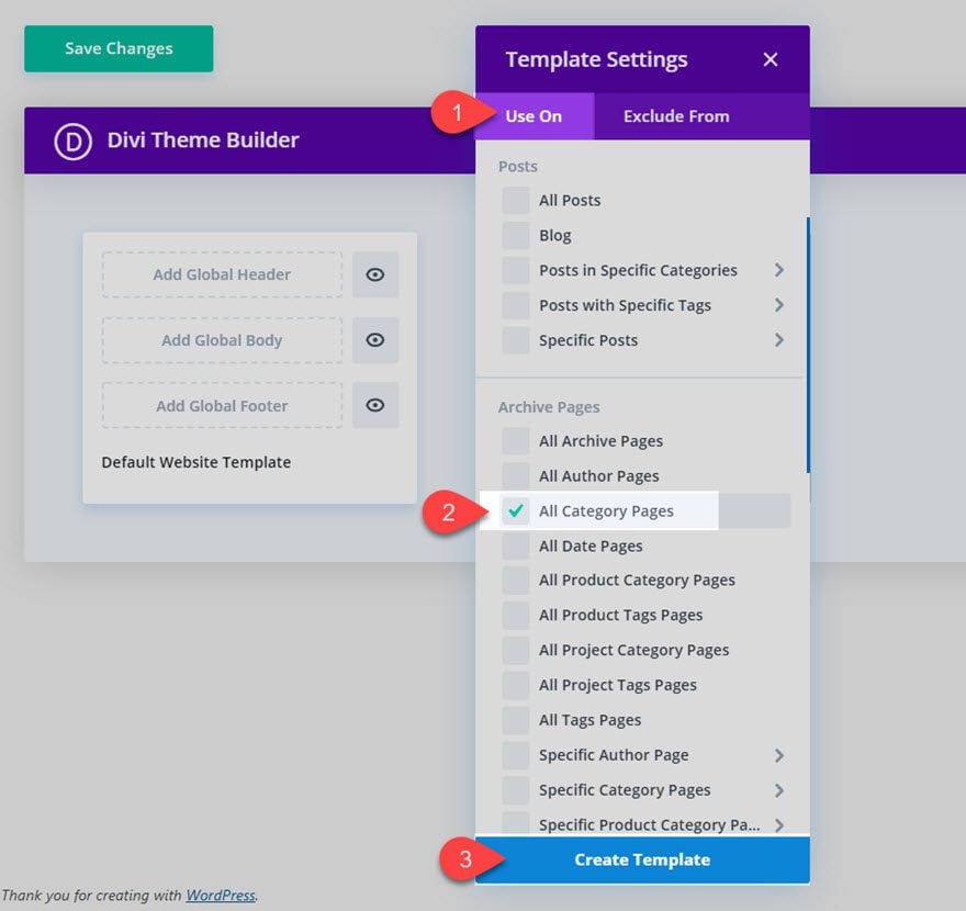
Adding New Custom Body Area to Template
To build the custom body for the template, click the Add Custom Body area and then select “Build Custom Body”.
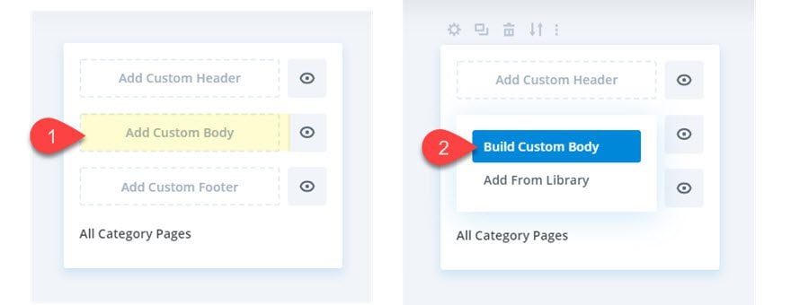
Then choose the option, “Build From Scratch”.
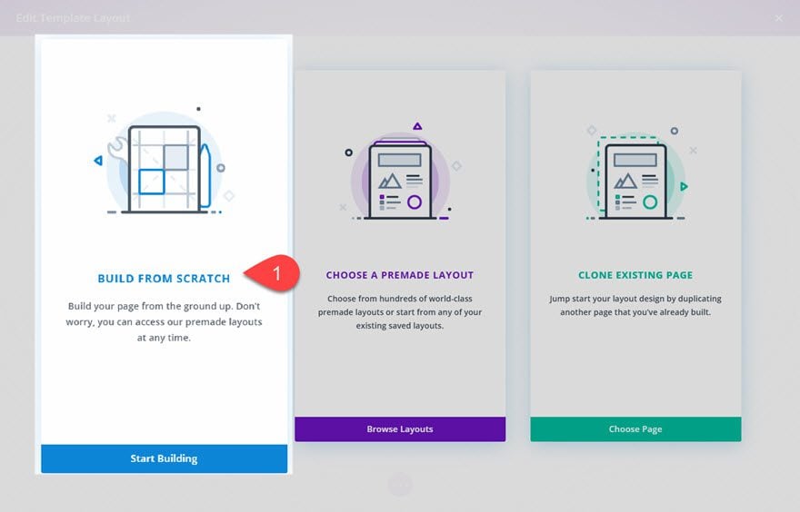
Add Dynamic Archive Title
In the Template Layout Editor, create a new one-column row inside the regular section.
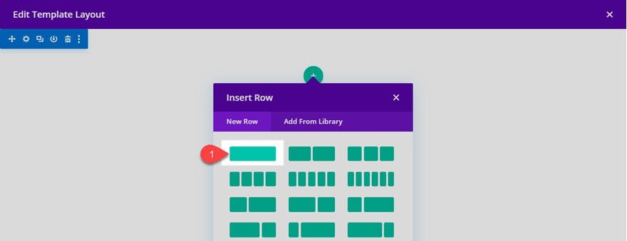
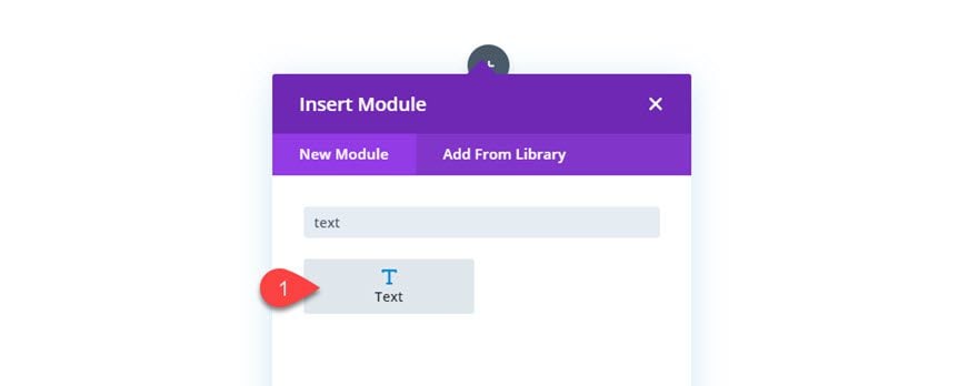
Then add a text module to the row.
Delete the default body content and click the “Use Dynamic Content” icon and select the option “Post/Archive Title.
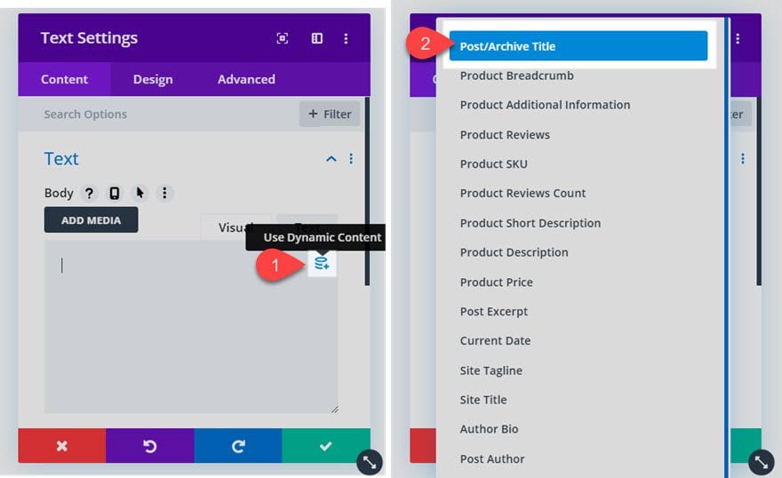
Once the Post/Archive Title element is in place, open the settings by clicking the gear icon.

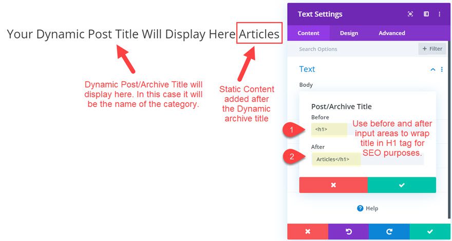
Then update the Before and After input areas to wrap the content in an H1 tag and add an additional piece of static content after the dynamic title as follows:
Before:
After:
Articles
We need to wrap the title in an H1 tag for SEO purposes. The static word “Articles” is added after the title so that if a user visits a “Business” category page, the title will read “Business Articles”.
Style Dynamic Archive Title
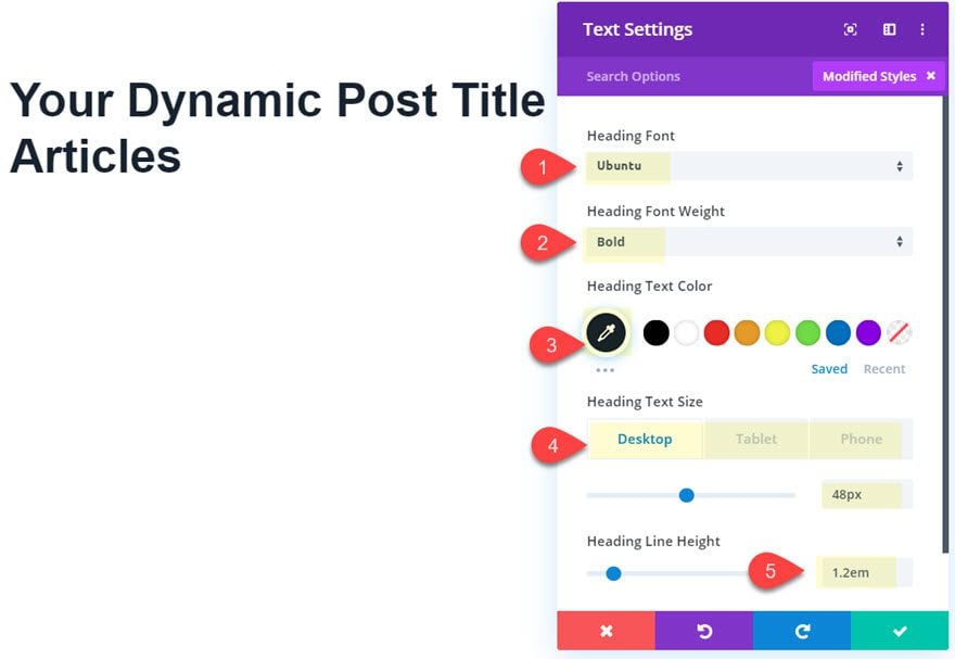
Once the dynamic content is in place, we can style it using the following:
- Heading Font: Ubuntu
- Heading Font: Weight: Bold
- Heading Text Color: #192231
- Heading Text Size: 48px (desktop), 38px (tablet), 28px (phone)
- Heading Line Height: 1.2em
Using the Blog Module to Display Posts for Current Category Dynamically
With the dynamic category page title in place, we need to add the blog module to display the posts for the current category page.
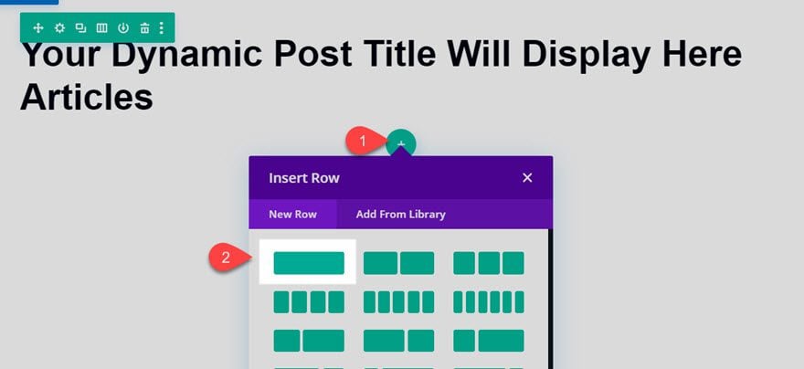
Add New Row
Add a new one-column row under the current top row.
Add Blog Module
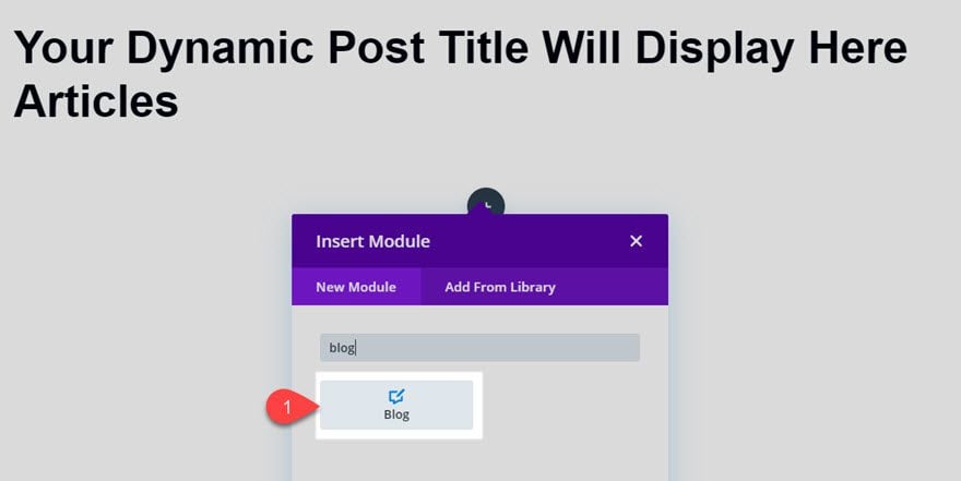
Then add a blog module to the row.
Update the Content options as follows:
- Posts for Current Page: YES
- Post Count: 9
- Show Read More Button: YES
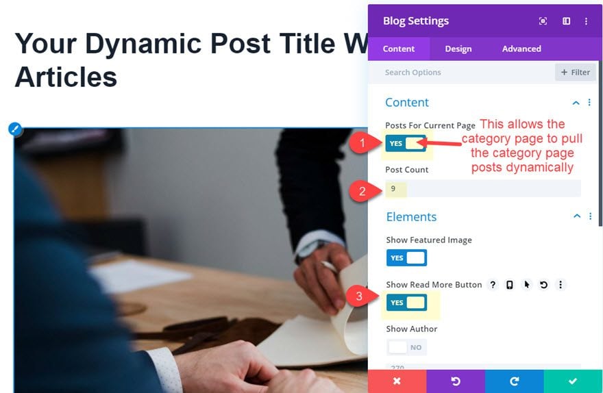
Remember, we must make sure the Posts for Current Page is enabled for the category page to pull the right post archive.
Design Blog Module
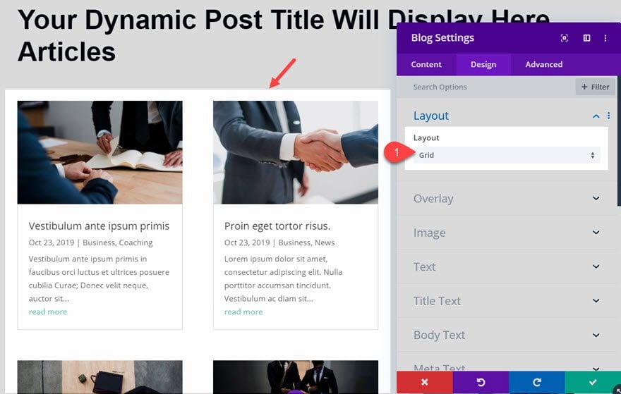
With the content settings in place, let’s make some changes to the design as follows:
- Layout: Grid
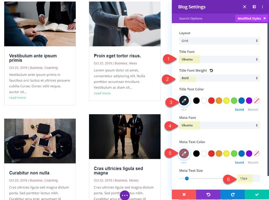
- Title Font: Ubuntu
- Title Font Weight: Bold
- Title Text Color: #192231
- Meta Font: Ubuntu
- Meta Text Color: #985e6d
- Meta Text Size: 13px
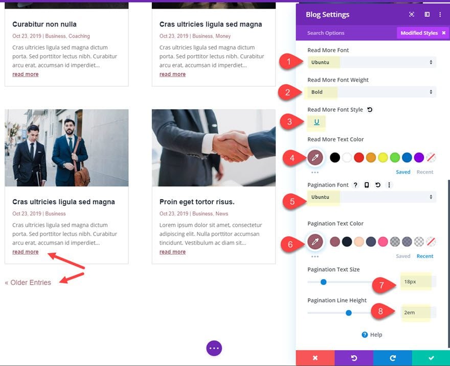
- Read More Font: Ubuntu
- Read More Font Weight: Bold
- Read More Font Style: Underline
- Read More Text Color: #985e6d
- Pagination Font: Ubuntu
- Pagination Text Color: #985e6d
- Pagination Text Size: 18px
- Pagination Line Height: 2em
- Grid Layout Border Width: 0px
- Box Shadow: see screenshot
- Box Shadow Blur Strength: 70px
- Box Shadow Spread Strength: -10px
- Shadow Color: rgba(25,34,49,0.3)
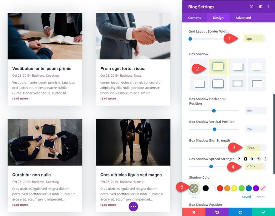
At this point we have a basic category page up and running complete with the page title and the blog posts which will display correctly according to the current category page. However, we can get more creative by adding additional module to display the post in creative ways.
Create a Post Slider to pull in the 4 most recent posts in the current category.
We can use a post slider module to display the category page posts dynamically as well. Here is how to do it.
Add New Row
First add a new row with a 1/3 2/3 column layout under the top row.
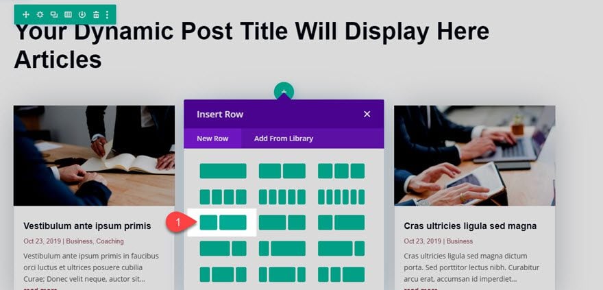
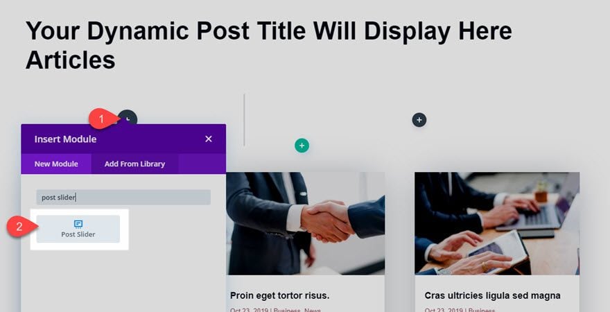
Add Post Slider Module
In the left column, add a post slider module.
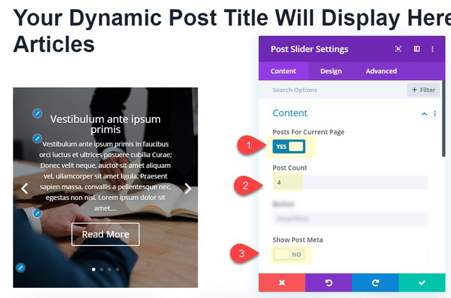
Then update the post slider content options as follows:
- Posts for Current Page: YES
- Post Count: 4
- Show Post Meta: NO
Design Post Slider Module
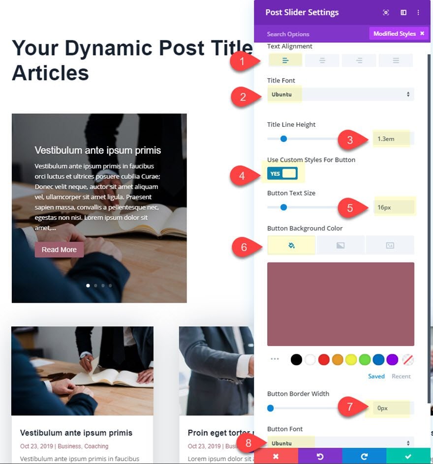
Now that the post slider content is in place, update the design settings as follows:
- Text Alignment: Left
- Title Font: Ubuntu
- Title Line Height: 1.3em
- Use Custom Styles for Button: YES
- Button Text Size: 16px
- Button Background Color: #985e6d
- Button Border Width: 0px
- Button Font: Ubuntu
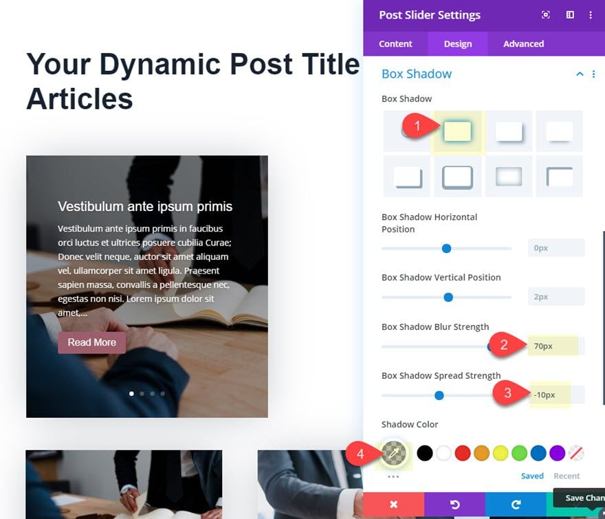
- Box Shadow: see screenshot
- Box Shadow blur Strength: 70px
- Box Shadow Spread Strength: -10px
- Shadow Color: rgba(25,34,49,0.3)
Create a Blog Module with fullwidth layout
In the right column, we can add another blog module with a fullwidth layout instead of a grid layout. This will allow us to provide another unique display area for our category posts.
Add Blog Module
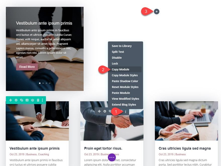
To save time, let’s copy the existing blog module in the bottom row and paste it in the right column next to the post slider.
Update the Duplicate Blog Module Settings
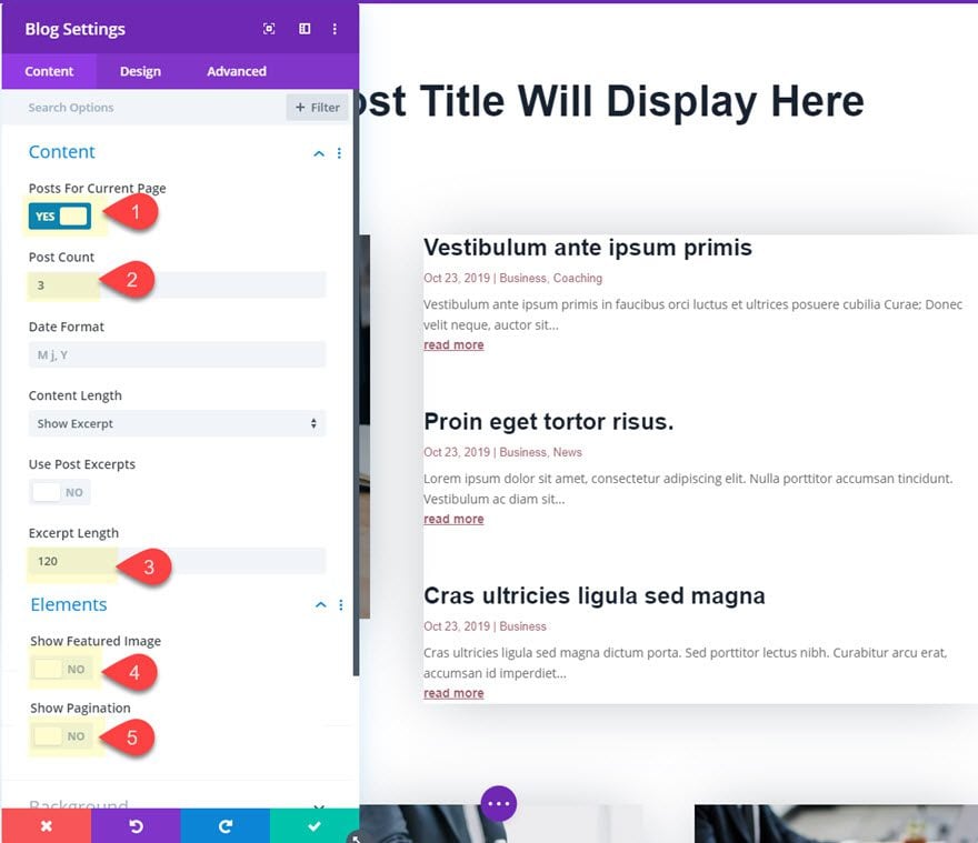
Open the duplicate Blog Module Settings and update the following:
- Posts for Current Page: YES
- Post Count: 3
- Excerpt Length: 120
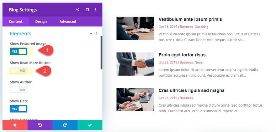
- Show Featured Image: NO (at least for now)
- Show Pagination: NO
- Layout: Fullwidth:
- Box Shadow: none
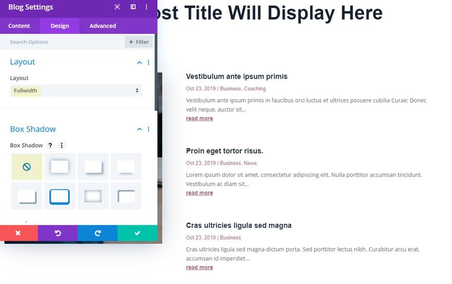
Result So Far
So far the result is minimal display of the three blog posts.
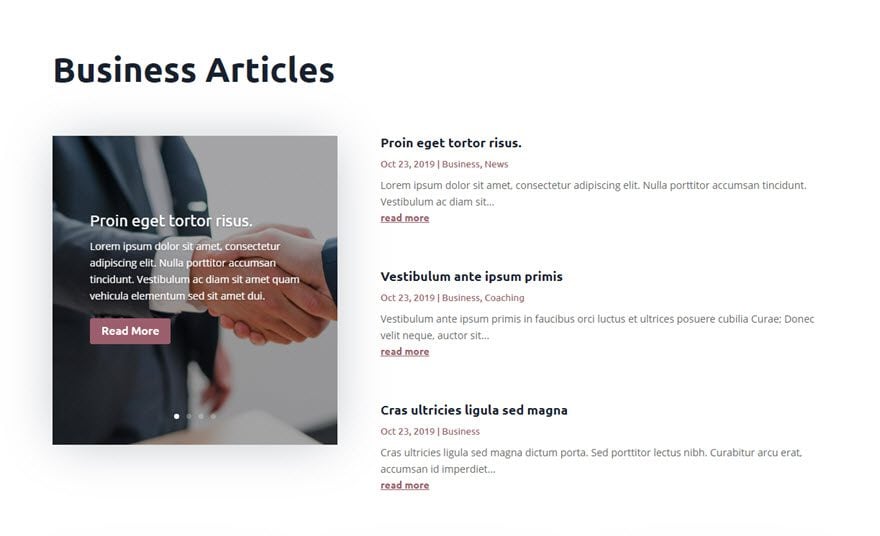
But if we want to take it one step further, we can add some small featured images to the left of each of the post excerpts.
Use custom CSS to create smaller featured images that float to the left of the post excerpt content.
To add some small featured images to the left of the blog post excerpts, we need to add some custom CSS.
Give Blog Module Custom CSS Class
For starters, we need to add a custom CSS class to the Blog module. Open the blog settings and, under the advanced tab, enter the following:
- CSS Class: left-blog-image
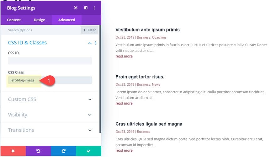
Add CSS Code with a Code Module
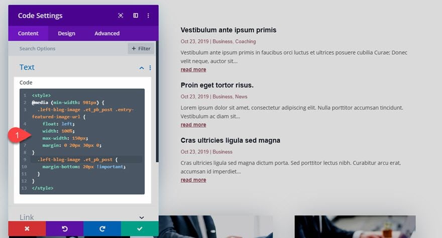
Since we are just adding a small CSS snippet to this template, we can use a code module. Add a code module under the blog module.
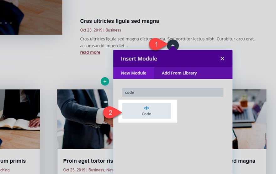
Insert CSS Code
Then enter the following CSS inside the code content area:
@media (min-width: 981px) {
.left-blog-image .et_pb_post .entry-featured-image-url {
float: left;
width: 100%;
max-width: 150px;
margin: 0 20px 30px 0;
}
.left-blog-image .et_pb_post {
margin-bottom: 20px !important;
}
}
Update Blog Module Settings to include Featured Image
Now, we can add the featured image back so that it is displayed in the new position on the left thanks to the CSS snippet.
Additional Styling to Template
Before we wrap things up, let’s make a few minor touch ups to the design.
Add and Style a Divider Under Archive Title
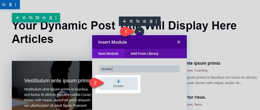
Add a divider module directly under the archive page title at the top of the template.
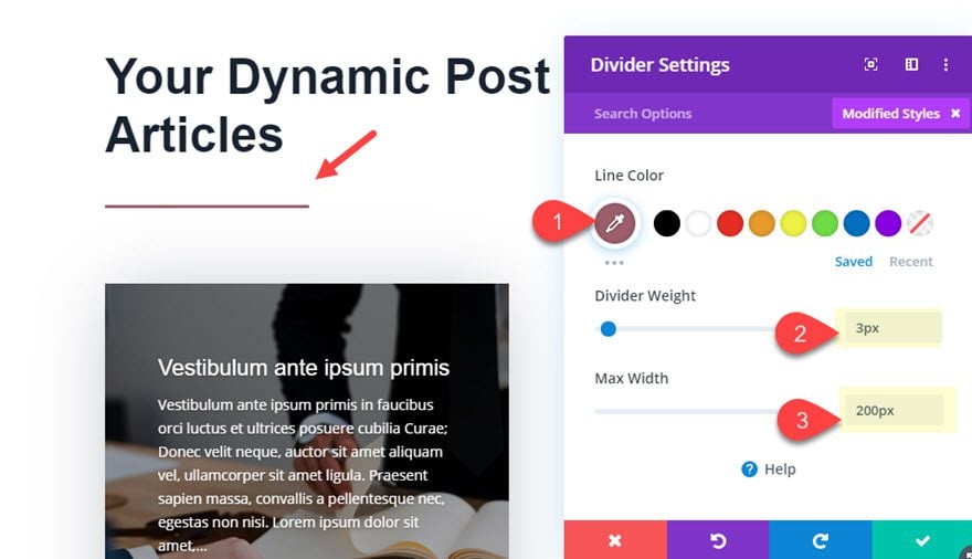
Then update the divider settings as follows:
- Line Color: #985e6d
- Divider Weight: 3px
- Max Width: 200px
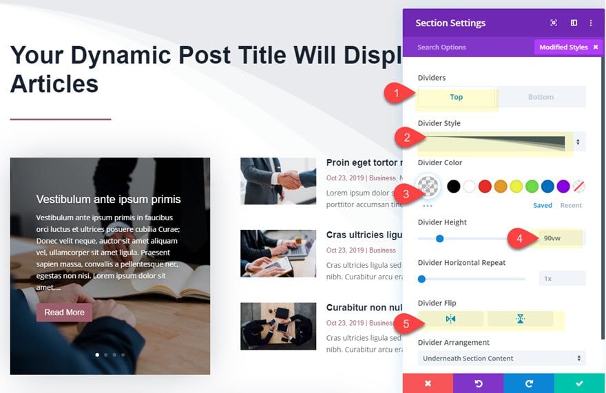
Add Section Divider to Layout
Open the section settings and add a section divider as follows:
- Top Divider Style: see screenshot
- Top Divider Color: rgba(73,78,107,0.07)
- Divider Height: 90vw
- Divider Flip: horizontal and vertical
Use Post Offset Number with each Module to avoid duplicate post Displays
Right now all of our modules are pulling the same post content for the current category page. In order to keep those module from displaying duplicates, we can use the Post Offset Number option to “skip” a certain number of posts displaying the post feed.
Fullwidth Blog Module Post Offset
Since our post slider is already displaying the first (most recent) post for the current category page, we can offset this post on the blog module adjacent to it. Open the settings for the blog module to the right of the post slider and update the post offset number as follows:
- Post Offset Number: 1
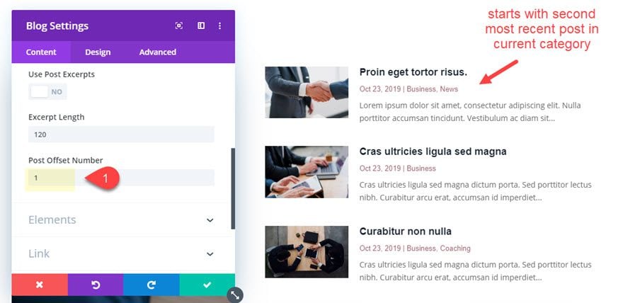
Now the module will start with the second most recent post for the current category page.
Grid Blog Module Post Offset
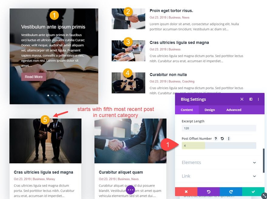
Once the first blog module post offset is in place, we need to offset the posts in the main blog module at the bottom of the template. Open that blog module and update the post offset number as follows:
- Post Offset Number: 4
We need to set the offset number to 4 to account for the 4 posts that are already being displayed above. The module will now pick up where the other modules left off and start with the fifth most recent post.
Final Results
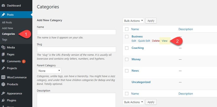
To view the final result, go to the WordPress dashboard and navigate to Posts > Categories. Then click to view one of the existing categories.
Here is the final result.

And here it is on tablet and phone display.

Final Thoughts
Hopefully this post will help you breathe a little easier when faced with the challenge of creating a category page design for your website. The Divi Theme Builder does make it extremely easy to do, especially with the blog module now having the option to display posts of the current page. And the post offset option allows you to combine multiple blog modules (or even post slider modules) without ever seeing duplicate posts on display.
How has the Divi Theme Builder helped you build category pages?
I look forward to hearing from you in the comments.
Cheers!
.inline-code{padding: 0px 4px; color: crimson; font-family: Monaco,consolas,bitstream vera sans mono,courier new,Courier,monospace!important}
The post How to Create a Category Page Template for your Blog Using the Divi Theme Builder appeared first on Elegant Themes Blog.

