Without a search field, your site’s navigation is going to suffer. You can have the most robust browsing experience on the internet, but if your users can’t search to find exactly what they’re looking for, you just might (and probably will) lose out on business. This tutorial will walk you through adding a search field to Divi’s secondary menu so that no matter what, your users will always be just a few clicks away from everything they need.
Divi Search Field Preview
Desktop

Mobile

Upload and/or Edit Global Header
For this article, we’re going to be using the free header/footer that goes along with our Grocery Delivery layout pack. You can simply download the .zip archive and extract the needed .json file to your computer.

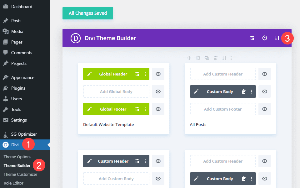
After that, go into your WordPress dashboard and navigate to Divi – Theme Builder. From there, you need to click the up-and-down arrows icon to open the Portability options.
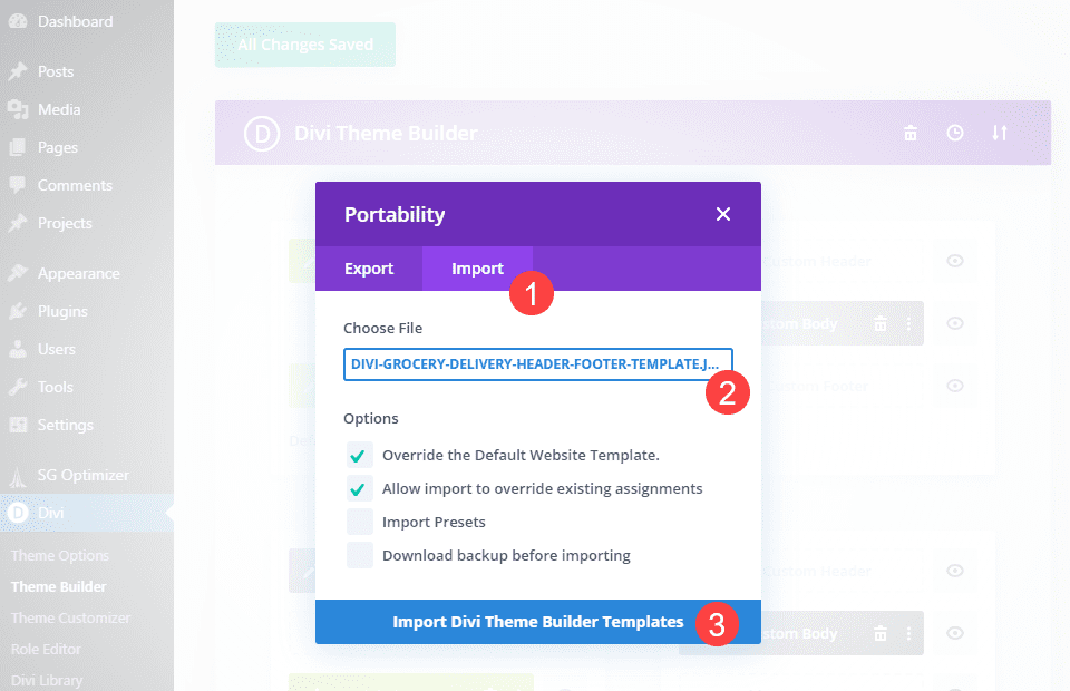
In the new modal, click the Import tab and find the .json file you downloaded. When you’re ready, select Import Divi Theme Builder Templates to begin the upload.
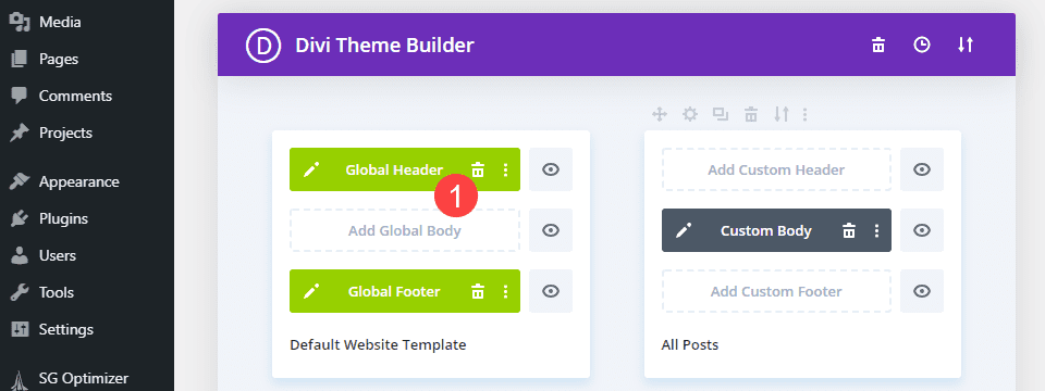
At this point, you’re ready to enter the Global Header section of the Default Website Template. Importing the .json file should have automatically applied the freebie as the site’s global header.
Add Search Field to the Secondary Menu Bar
Using the Divi Visual Builder, you should see something similar to this as your global header.

The first thing that we want to do is make a space for the search field. We want to make sure the search field is easily available to all visitors, so we’re going to add it to the secondary menu (above the Home/Contact row).
To start, we are going to add the search field using the Divi Search Module to the third column of the first row.
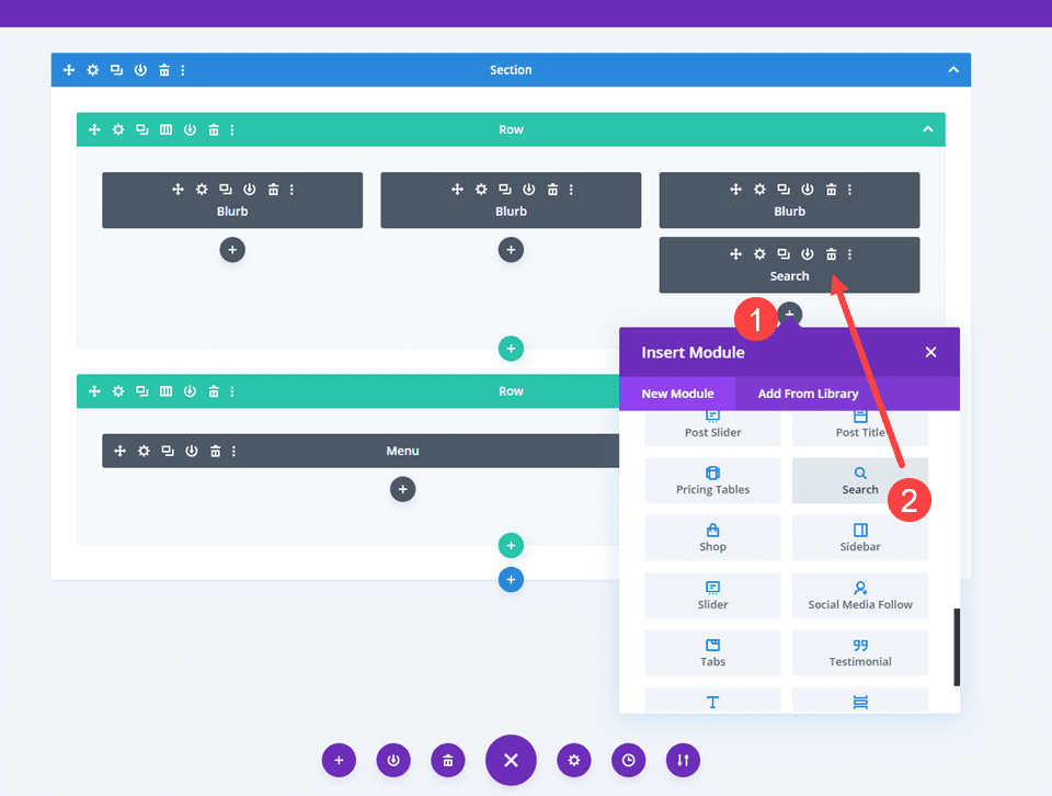
Placeholder text is important for search fields, so when your module is in place, go into Settings and set your Placeholder text to something that reminds the user of what they can search for. We are putting Find Items! as the placeholder so the user knows that’s what they can search for since we’re using the grocery delivery layout pack.
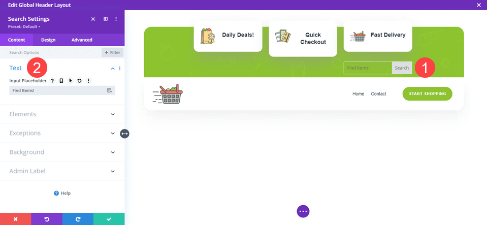
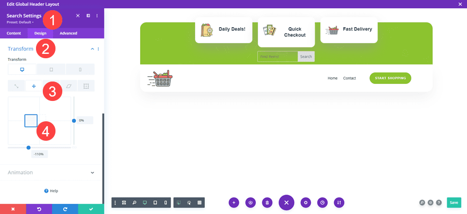
The search field being in the third column isn’t a good look. So we want to go into the Search module settings and go into the Design tab. Find the Transform options and then navigate to the Translate tab (the second one). You can then drag the search module into place, and Divi will handle all the CSS and spacing for it.
We are also using % for this value so that it stays relative regardless of the viewport on desktop. Using px can make it skew in some varying resolutions.
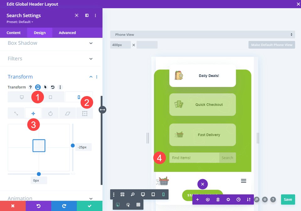
Divi’s Transform Translate options do need to be adjusted for mobile, too. If you don’t, the same So make sure that you go into the Responsiveness settings and set the Search module’s location under the secondary menu options. We just adjusted the vertical location for mobile because placing it in the third column of the row automatically displays it at the bottom of the row’s elements.
Style the Divi Search Module
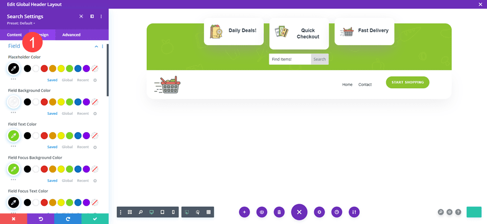
While you don’t have a lot of styling options for a search field, you do have a few. Namely the color of the text and field itself, both when it’s inactive and when a user has clicked into it. (And spacing and sizing and other standard Divi design options, of course.)
To find the color options, navigate to the Field menu in the Design tab. Once expanded, you have the option to change the Placeholder text color, the Field background color, and the Field text color (user-entered text, that is). Additionally the focus variants are when the user is specifically interacting with the search field.
When that is styled to your liking, click the save button.
Check The Visibility Settings
Some of our layout packs and freebie headers come with different display options for desktop and mobile enabled. If you see faded/greyed-out modules in the visual builder, that indicates the module is disabled on some devices.
For the grocery delivery header, the final two columns are disabled on mobile. We want to go into the Row settings and click into the settings for the columns you want to show on mobile. In this case, it’s the third one.
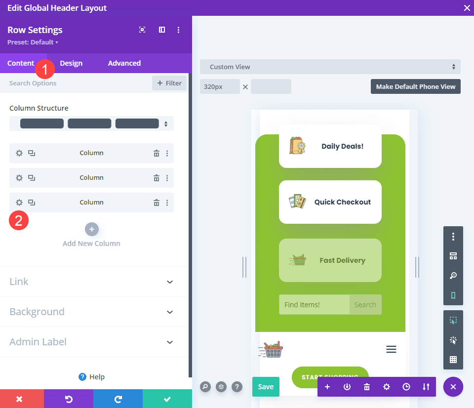
Then, go into the Advanced tab and navigate to the Visibility options. Here, make sure that all the options under Disable are unchecked for the column containing your the search box. Click the save button (green checkmark), and the modules should appear in full-color and no longer be faded.
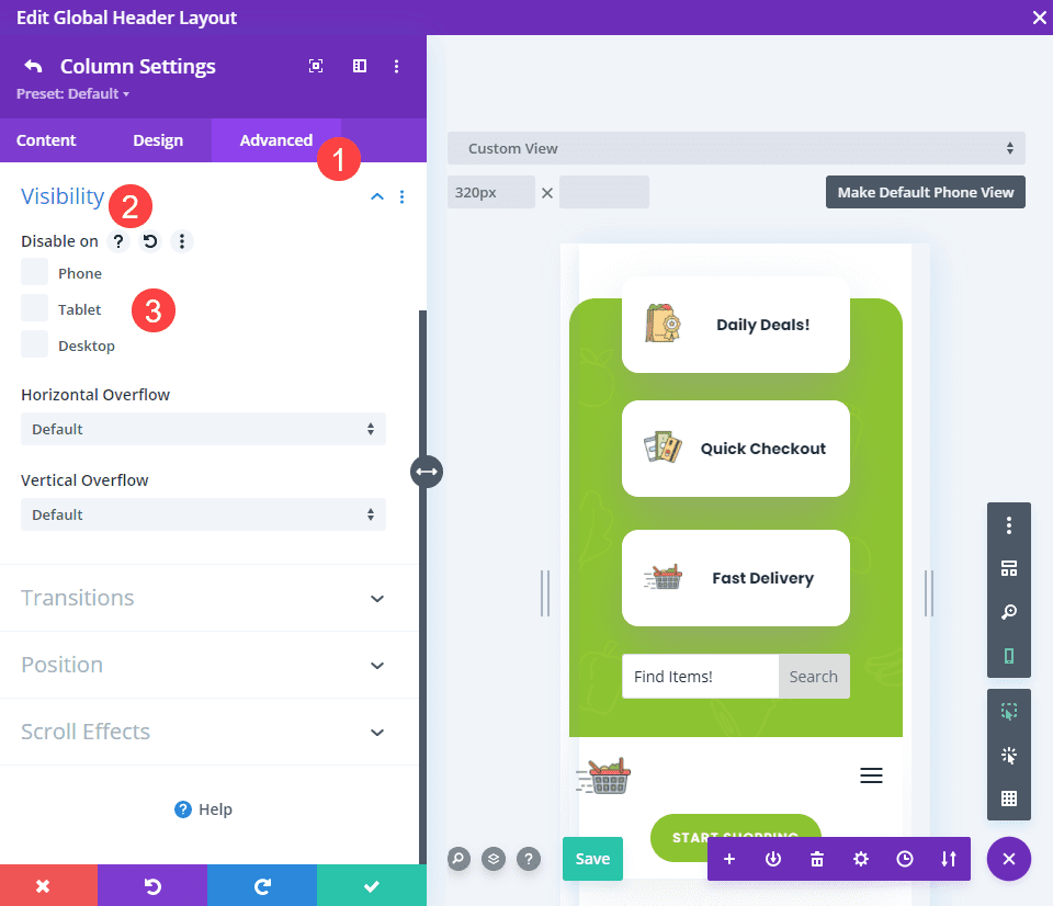
Once you’ve made sure everything is visible, you’re ready to get this thing live!
Save Your Work
Be sure that you click the green save button in the lower-right of the screen.
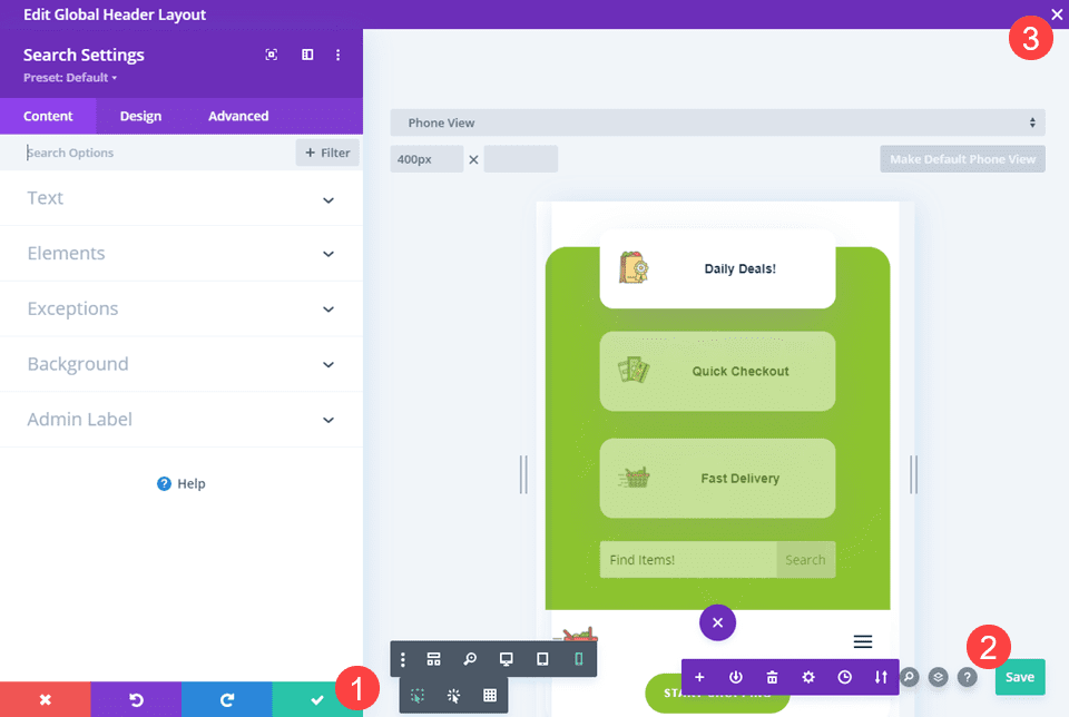
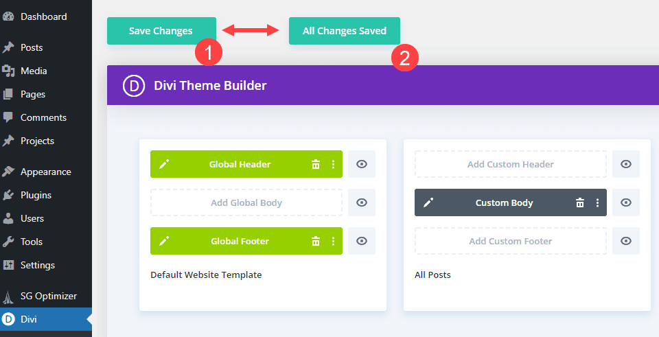
Now you’re ready to close out of the visual builder using the X in the upper-right corner. On the next screen, you will want to make sure the Divi Theme Builder has saved all of your options. If it says Save Changes, click the button. If it says All Changes Saved, then your search field is live in your Divi secondary menu already.
Final Results
The only thing now is to admire your handiwork on your site!
Desktop

Mobile

Wrapping Up with the Divi Search Field
Search fields are a fundamental part of having a good user-experience for your site. If you want to provide the best service you can for your visitors, then making sure that your content is searchable should be one of your top priorities. Hopefully, you can take this quick-and-easy method and apply it to your Divi site soon!
The post How to Add a Search Field to Divi’s Secondary Menu appeared first on Elegant Themes Blog.

