Dot navigation is one of the most common forms of navigation found within sliders. This is true regardless of the content of the slider. Dot navigation provides a simple and intuitive way for users to navigate through the slider’s content. Fortunately, Divi’s Video Slider module includes a dot navigation option. In this article, we’ll see how to enable dot navigation on your Divi’s Video Slider module. We’ll also explore a few combinations of options along the way.
Let’s get started.
Divi Video Slider Default Navigation
First, let’s look at how navigation works within the Video Slider module. By default, every slide is displayed as a thumbnail under the video player. The current slide is darkened with an overlay. In this example, the slide on the far left is the active slide.

Selecting a slide’s thumbnail navigates the video player to that slide. In this example, the third slide from the left is the active slide. The thumbnail is darker to show that it’s the active slide. All I’ve done is clicked its thumbnail.

We can also navigate with the arrows that appear when we hover over the active slide. These take us to the previous or next slide. These are helpful if you want to go forward or backward through the slides one slide at a time. This is ideal for navigating a few slides. If you have a lot of slides, it can take a while to find a certain video.

What is Dot Navigation?
Dot navigation is a small set of dots that appear at the bottom of the video slide. Each dot represents a video slide within the slider. Clicking on a dot reveals that slide in the video player. The dot for the active slide is brighter than the other dots. It’s a great way to see how many slides there are, where the slider is within the list of slides, and to navigate to a specific slide quickly.

Dot navigation is especially helpful when you have a lot of slides, or you want to conserve space. Navigation is improved, much like the thumbnail navigation, while using less space within the layout and reducing visual clutter.
When the user wants to see a certain slide, they don’t need to wait until the slider shows it to them again, or use the arrows to flip through the slides until they get to the one they want to see. They can simply select the slide they want to see by clicking on its dot.
Enabling Dot Navigation in the Video Slider
Thumbnails look great, but they do take extra space. Sometimes we want a smaller footprint for our Video Slider module or a less cluttered design. When it’s enabled, dot navigation replaces the thumbnail navigation, giving us that cleaner and less cluttered design. We can use it with or without the navigation arrows.
To enable dot navigation in the Video Slider module, first, enable the Visual Builder by clicking the link at the top of your page. Next, hover over the Video Slider module and click the gear icon to open its settings.

Scroll down to Elements. Here, you’ll see an option to enable or disable the arrows, and a dropdown box labeled Slider Controls.
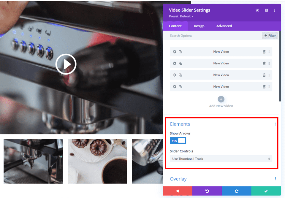
Click on the dropdown box to see your options.

Select Use Dot Navigation and you’ll see the thumbnails removed and dots added to the main slide.
- Slider Controls: Use Dot Navigation
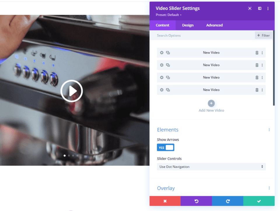
Your Video Slider now has a simpler look and takes less space. You’ll see a dot for each slide, so if you have a lot of slides it will be more noticeable.

Light or Dark Dot Navigation
The default dot navigation color is white. This works great for dark video images and overlays, but it can be hard to see if those images or overlays are light. Fortunately, you can change them to suit your needs with one simple control.
In the Design tab of the Video Slider settings, go to Slider Controls Color and select Dark from the dropdown box.
- Slider Controls Color: Dark
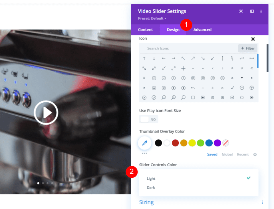
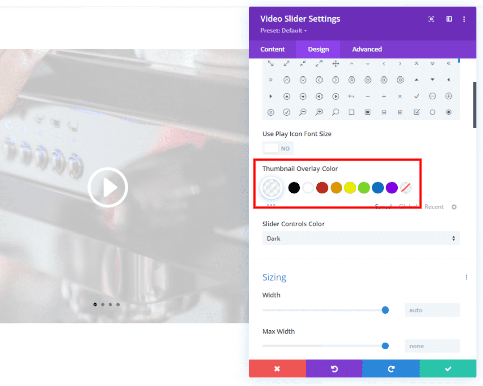
The dark Slider Controls Color works especially well with light images or a Thumbnail Overlay Color like the one in the example below. Be sure to test your dot navigation color options to see which works best with your image and overlay colors.
Video Slider Dot Navigation Without Arrow Navigation
Changing from thumbnail to dot navigation adds another set of navigation buttons to the slide itself. Both arrows and dots now appear when the user hovers over the slide, and the dots are always visible. Since the user will always see the dots, you might decide not to include the arrows.

Fortunately, you have the option to disable the arrows. In the Video Slider module’s Content settings, you’ll see a section called Elements. This section has a setting called Show Arrows. This is enabled by default. Simply click to disable it.
- Show Arrows: No
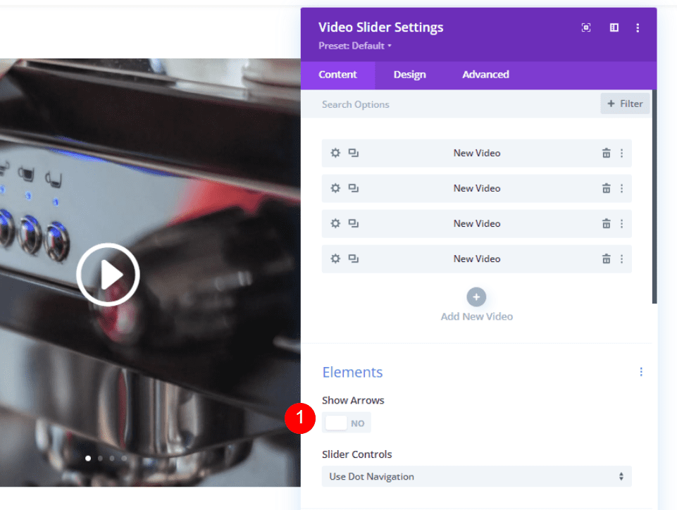
The video slider now shows the slides with only the dot navigation when I hover over them.

Video Slider Dot Navigation Examples
Let’s see how the Divi Video Slider module looks within a Divi layout using dot navigation. For my examples, I’m using the About page from the free Café Layout Pack that’s available within Divi. This page includes a Video module that’s placed over background images of coffee images for the café environment.
Here’s the About page layout:

Here’s a close-up view of the section I’m customizing. You can see the images in the background. If we’re not careful with the design, we can make it look cluttered easily.

Simplifying the Design
First, I replaced the Video module with a Video Slider module. Next, I created four slides and added image overlays to each slide. I’ve left default navigation enabled. It works, but the thumbnail navigation looks a little cluttered with this background. There are too many images within a small space and it becomes confusing very quickly. The original Video module looked cleaner. Dot navigation will fix this.

Here’s the Video Slider module with dot navigation enabled. It has the simpler and cleaner look of the Video module and it’s still usable as a video slider. Aside from the extra dots on the image, it looks the same as the original Video module.

Changing the Design on Mobile
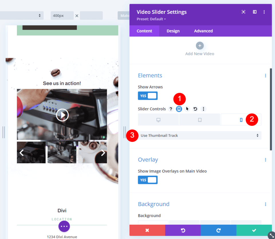
The dots might be too small or difficult to use on your video slider when used with smartphones. In this case, you can use thumbnail navigation just on phones and keep dot navigation on desktops and tablets.

In the Slider Controls settings, click on the tablet icon to open the screen size options. Select the phone icon and then choose Use Thumbnail Track. This activates the thumbnail navigation for phones, leaving desktops and tablets displaying dot navigation. Users now have an easy way of navigating through the slides regardless of the screen size of their device.
Ending Thoughts
That’s our look at how to enable dot navigation on your Divi’s Video Slider module. Dots provide a simple and clean design that works great for any layout. The dots are intuitive, so users already know how to navigate with them. Choosing between light and dark color options gives you some flexibility so they’ll work well with your images and overlays. Divi’s Video Slider dot navigation is an excellent choice if you want a clean and minimal look for your video sliders.
We want to hear from you. Do you use dot navigation within your Divi Video Slider module? Let us know about it in the comments below.
The post How to Enable Dot Navigation on Your Divi’s Video Slider Module appeared first on Elegant Themes Blog.

