Divi’s new background pattern and mask options make it easy to create eye-catching and unique call-to-action (CTA) sections on your website. You can combine images, gradients, patterns, and masks with lots of customization options to create one-of-a-kind background designs that will draw your visitor’s attention.
In this tutorial, we will show you how to create a unique CTA section with Divi’s new background pattern and mask options.
Let’s get started!
Sneak Peek
Here is a preview of the CTA section we will design in this tutorial.


What You Need to Get Started
Before we begin, install and activate the Divi Theme and make sure you have the latest version of Divi on your website.
Let’s jump in.
How to Create a Unique CTA with Divi’s Background Pattern and Mask Options
Create a New Page with a Premade Layout
For our tutorial, we will use a premade layout from the Divi library. For this design, we will use the Ice Cream Shop Landing Page from the Ice Cream Shop layout pack.
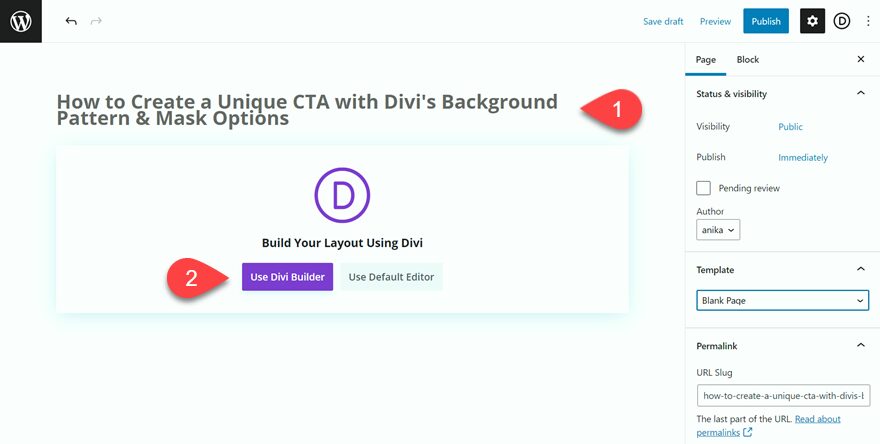
Create a new page, add a title, then select the option to Use Divi Builder.
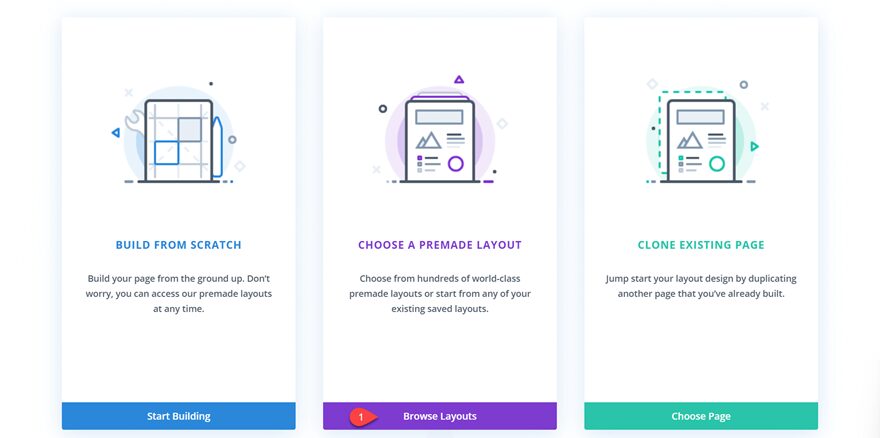
We will use a premade layout from the Divi library for this example, so select Browse Layouts.
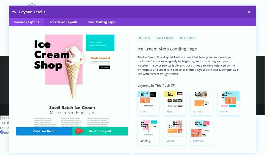
Search for and select the Ice Cream Shop Landing Page layout.

Select Use This Layout to add the layout to your page.
Now we are ready to build our design.
Modifying the Layout for the Background Pattern and Mask
We will be modifying the flavor of the month CTA section from this layout. Let’s make some changes to our layout for the background pattern and mask design.
Row Settings
Open Row Settings, then select Design.
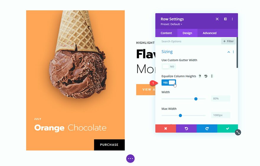
Under Sizing, equalize the column heights.
- Equalize Column Heights: Yes
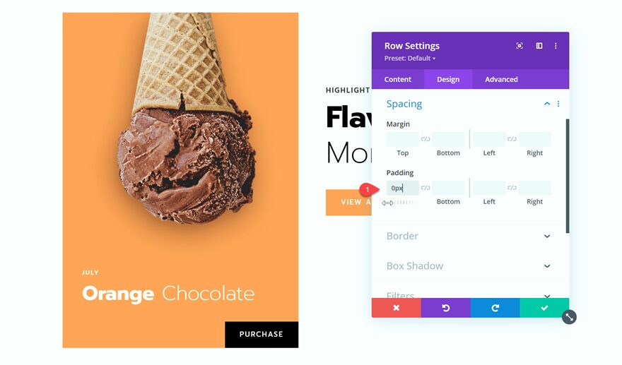
Under Spacing, remove the top padding to bring the cone to the top of the section.
- Top Padding: 0px
Column 1 Settings
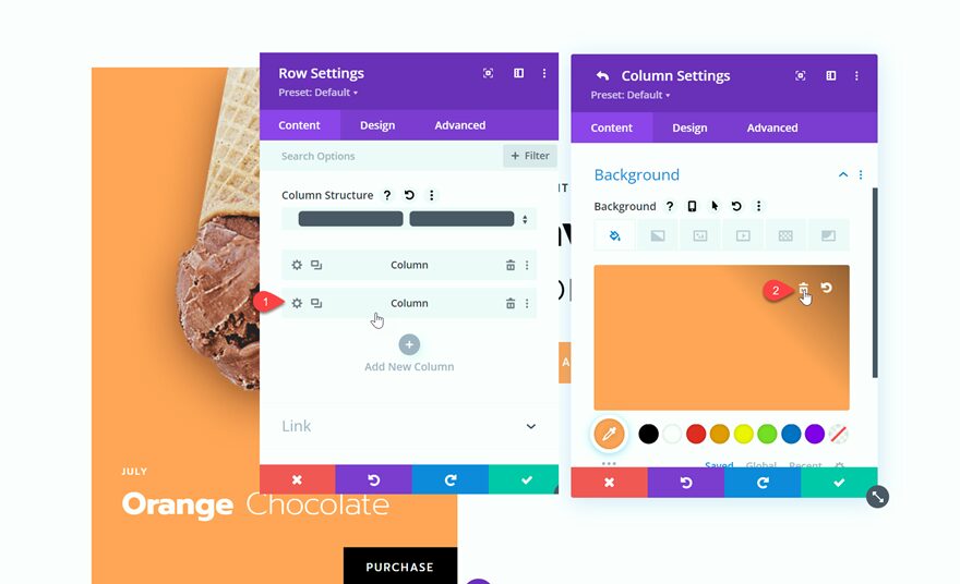
Under the Content tab for the row settings, select the Column 1 settings. Under Background, delete the orange background.
Column 2 Settings
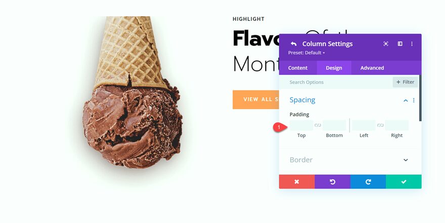
Now, select the Column 2 settings. The original design has some spacing we don’t need so let’s get rid of it. Under Design, navigate to Spacing and delete the top padding.
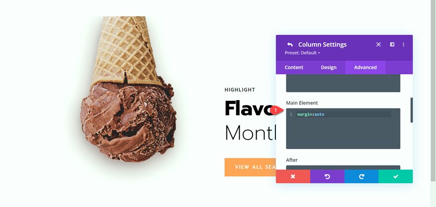
Then select Advanced and add the following custom CSS to the Main Element so that our “flavor of the month” text is vertically centered.
margin:auto;
Section Settings
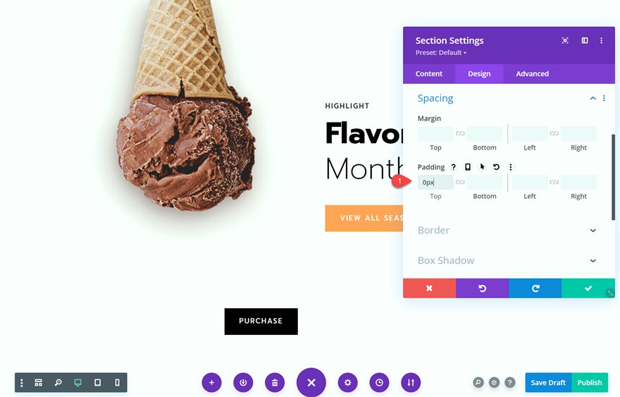
Open the Section Settings. Under Design, select Padding. Adjust the section padding so that the top cone aligns to the very top of the page.
- Padding: 0px
Adding a Background Pattern and Mask to the CTA Section
Now that our layout has been modified, we can add our background pattern and mask. There are endless options for background patterns and masks with Divi’s new options, which means you can create unique designs for your CTA section with just a few clicks. Follow along to learn how to design an eye-catching background with these settings.
Background Color, Pattern, and Mask Settings
Navigate to the Section Background settings.
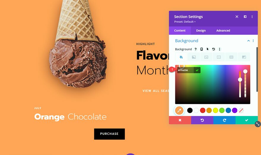
Under the color tab, add an orange background
- Color: #FFA256
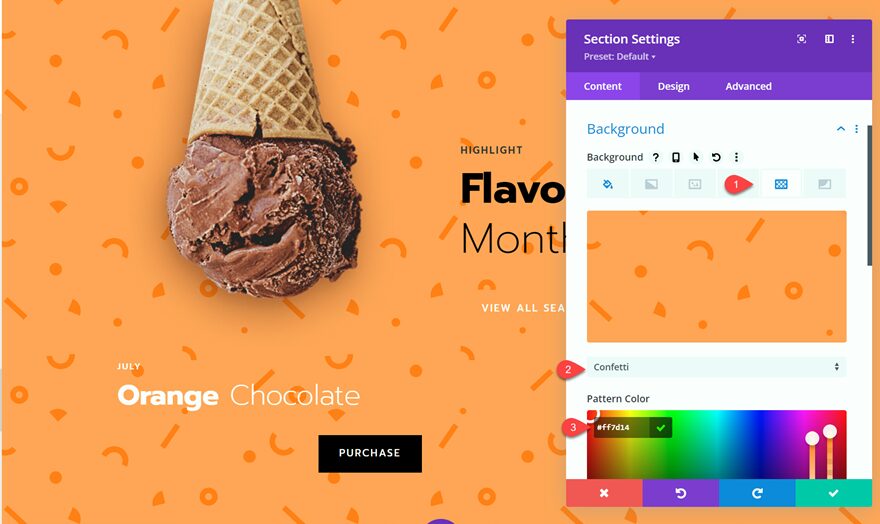
Under the Pattern tab, set the pattern shape and color.
- Shape: Confetti
- Color: #FF7D14
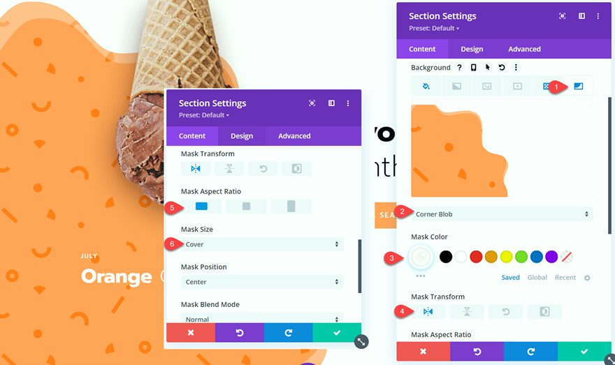
Now let’s add the mask. Select the mask tab, then add the settings as follows:
- Shape: Corner Blob
- Mask Color: #FFFFFF
- Mask Transform: Horizontal
- Mask Aspect Ratio: Landscape
- Mask Size: Cover
Design Adjustments
Now that our background is in place let’s make some final adjustments to the design.
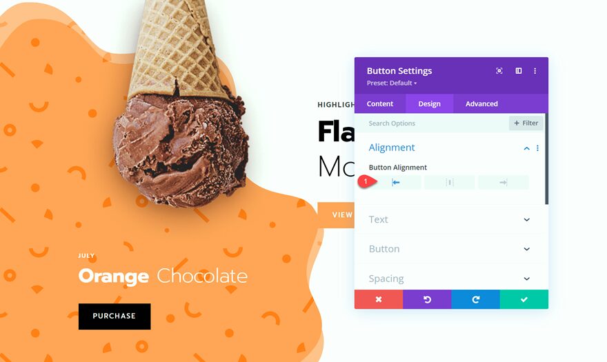
Open the “Purchase” button settings and change the alignment under the Design tab.
- Button Alignment: Left
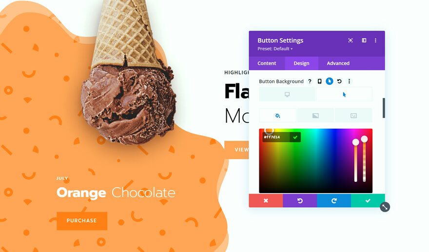
Change the hover state background color for the “Purchase” button so that it stands out against the orange background.
- Button Background on Hover: #FF7D14
We’ll also adjust the row layout to add some more space between the orange background and the “Flavor of the Month” section on the right. Change the layout from 1:1 to 3:2.

And now the desktop design is complete and you have learned how to create a unique CTA section with Divi’s background pattern and mask options!

Making the CTA Section Responsive
When our CTA section is viewed on a phone or tablet, the content in column 2 gets stacked beneath column 1. This can cause some readability issues with our design. Let’s make some adjustments to optimize our content and design for smaller screens using Divi’s built-in responsive settings.
Since we want the text to come before the buttons, copy the “Highlight Flavor of the Month” text to the “July Orange Chocolate” text module. Make sure you are only adding this text to the phone and tablet versions.
- Change the “Orange Chocolate” text to H3.
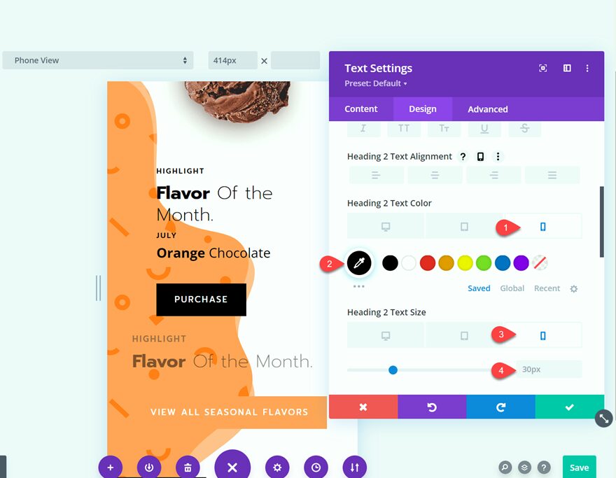
Next, we will make some changes to the text so that it stands out on this background. Go to the Design tab and make the following changes:
- H2 (Phone and Tablet) Text Color: #000000
- H2 (Phone and Tablet) Text Size: 30px
- H3 (Phone and Tablet) Text Color: #000000
- H4 (Phone and Tablet) Text Color: #000000

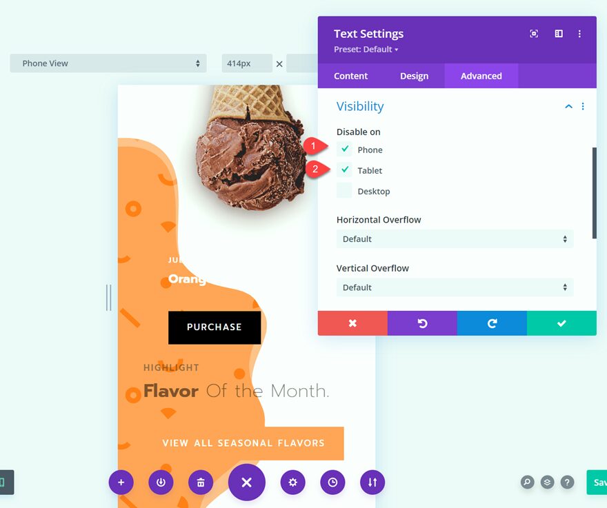
Now go to the settings of the original “Flavor of the Month” text module and change the visibility so that it will only be visible on desktop devices. This will make the original text module hide on smaller devices. The Flavor of the Month text will appear above the button, with the other text on the page.
- Disable on: Phone and Tablet
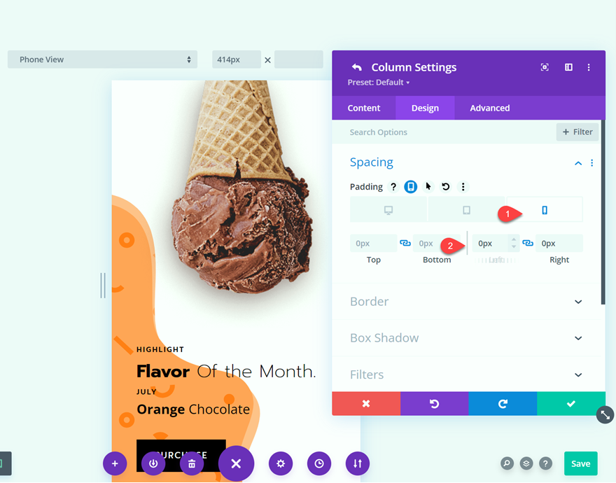
Next, open the row settings then open the column 1 settings. Remove the right and left padding.
- Right padding: 0px
- Left padding: 0px
Go to the section settings, then background, then edit the mask settings
- Mask Transform: Invert
- Mask Aspect Ratio: Portrait
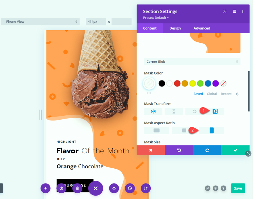
And now you have created a completely responsive CTA section with a unique background thanks to Divi’s Background Pattern and Mask options.
Final Result
Let’s take a look at the final result.


Final Thoughts
Designing a unique and eye-catching call-to-action section is very easy, thanks to Divi’s powerful background pattern and mask options. Unleash your creativity by experimenting with different colors, patterns, masks, and setting combinations. It’s easy to design, and you can adjust your settings until you find the perfect look with just a few clicks. Most importantly, it’s built right into Divi! No more need to design background graphics in another program. You can apply the background settings to other sections, rows, and modules for even more unique designs. If you want to learn more about Divi’s background pattern and mask features, check out our tutorial for a hero section with background masks and patterns and learn how to combine Divi’s gradient builder with background masks and patterns.
How have you used Divi’s background pattern and mask options on your website? Let us know what you’ve created in the comments below!
The post How to Create a Unique CTA with Divi’s Background Pattern & Mask Options appeared first on Elegant Themes Blog.
