The header is one of the most important elements of any website and is central to the user experience. The navigation menu gives your users an idea of what they can expect to find on your website and helps them locate the information they need. Additionally, a secondary menu bar can be a great space to highlight a call-to-action or to promote an offer. Not to mention, the header is one of the most prominent parts of your website because it typically appears on every single page. It is a great opportunity to showcase your branding and create a header that is cohesive with the design of the rest of your website.
Divi’s Theme Builder options allow you to create a custom global header and customize the look of your header and menu modules across your entire website. In this tutorial, we will show you how to build a global header using Divi’s fullwidth menu module.
Let’s get started!
Sneak Peek
Here is a preview of the global header we will design.
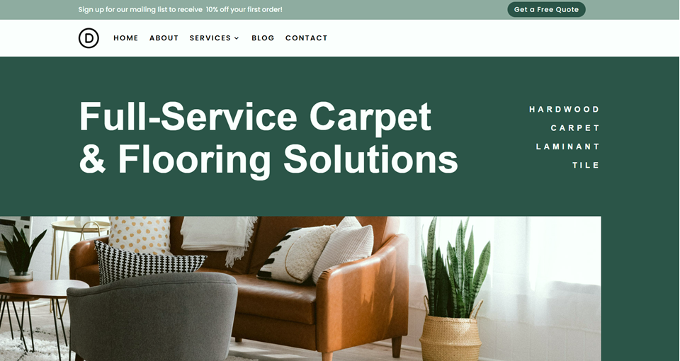

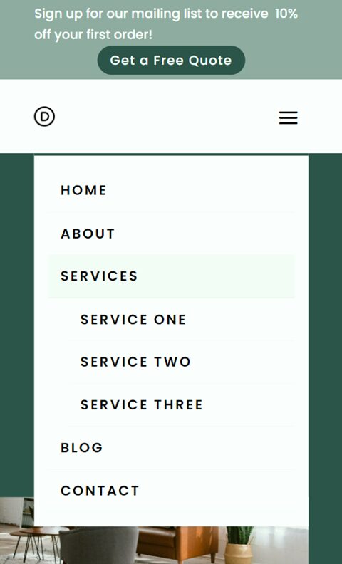
What You Need to Get Started
Before we begin, install and activate the Divi Theme and make sure you have the latest version of Divi on your website.
Now, you are ready to start!
How to Build a Global Header with Divi’s Fullwidth Menu Module
Open the Theme Builder
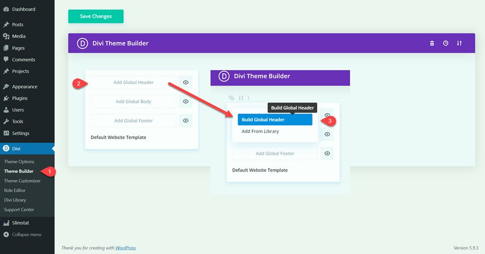
Since we are building a global header in this example, let’s navigate to the theme builder, which you can find under the Divi menu in WordPress. Select Add Global Header, then select Build Global Header.
Create the Secondary Menu Bar
When you first open the global header layout, it will come preloaded with a regular section. We will modify this to be our secondary menu bar, which will sit above our fullwidth menu and include some call-to-action text and a button.
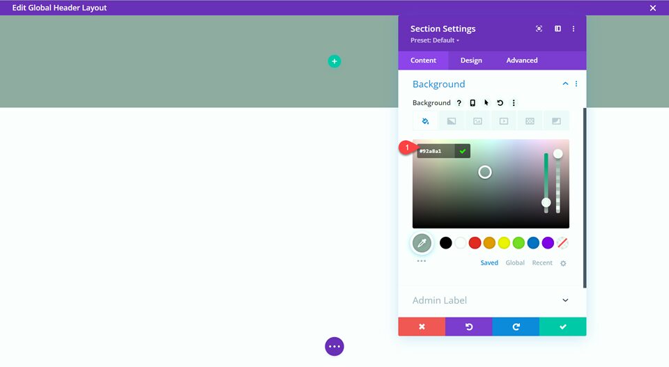
First, open the section settings and add the background color.
- Background: #92a8a1
Next, remove the padding from the section.
- Padding-top: 0px
- Padding-bottom: 0px
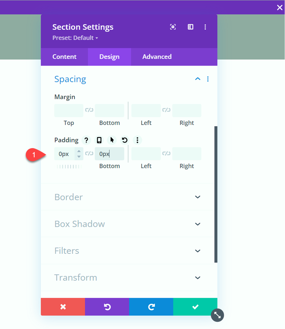
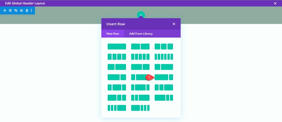
Now insert the row. For this design, we will use the row layout shown below.
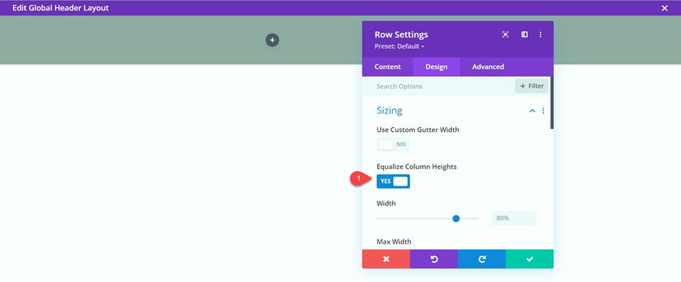
In the row settings under Sizing, equalize the column heights.
- Equalize Column Heights: Yes
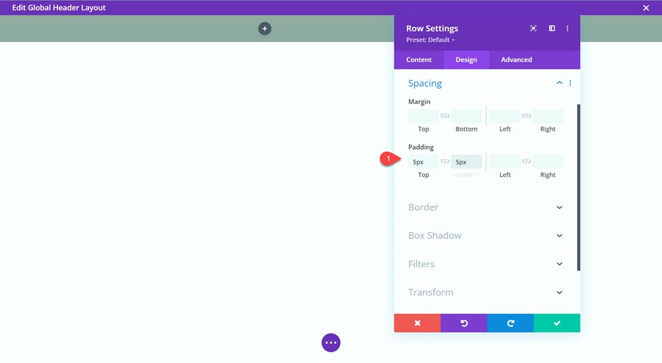
Next, set the top and bottom padding.
- Padding-top: 5px
- Padding-bottom: 5px
We want the items in our secondary header to be vertically aligned, so let’s add some custom CSS to the row’s main element.
align-items:center;
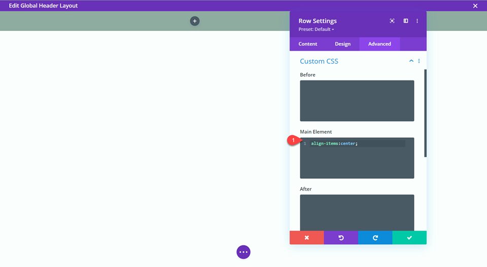
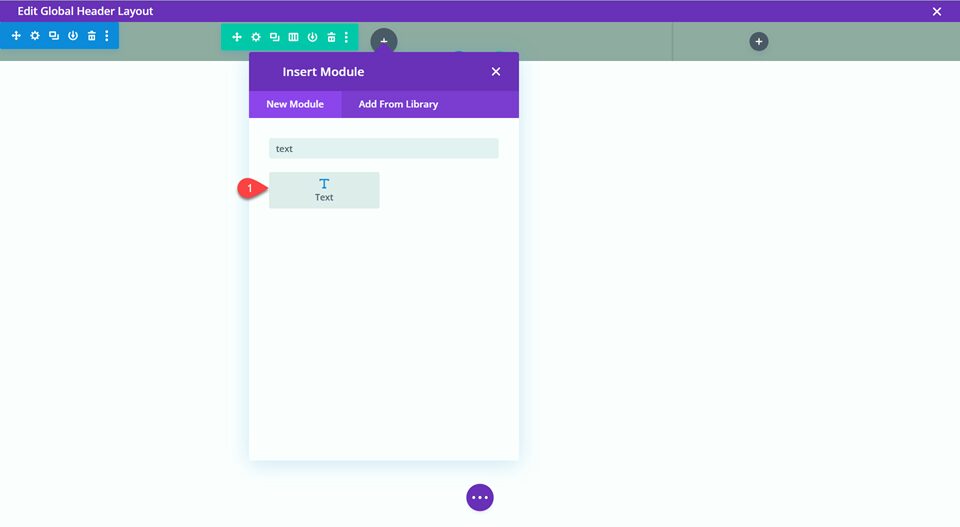
Now our row is set up and we can add the modules for our content. Insert a text module on the left side.
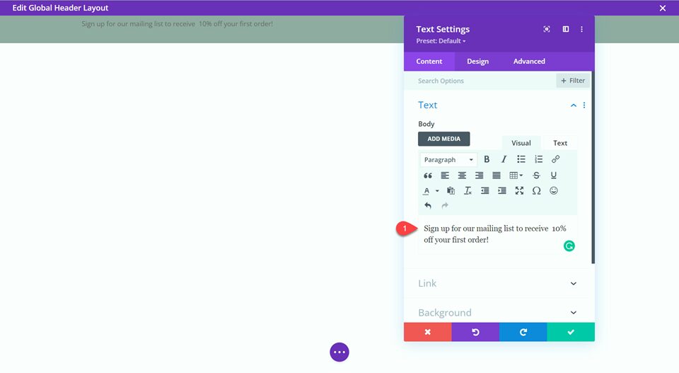
Modify the text content. This is a great place to include a CTA (call-to-action) or to promote an offer.
- Text: “Sign up for our mailing list to receive 10% off your order!”
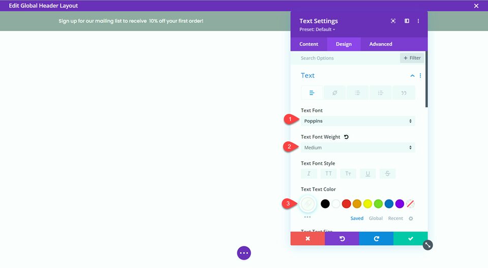
Navigate to the design tab of the text module and set the text font, weight, and color.
- Text Font: Poppins
- Text Font Weight: Medium
- Text Color: #FFFFFF
Next, add the button module to the right.
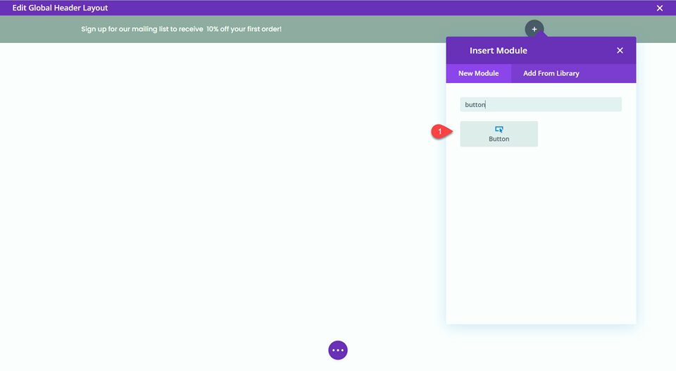
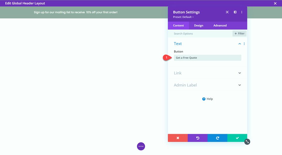
Add the button text,
- Text: “Get a Free Quote”
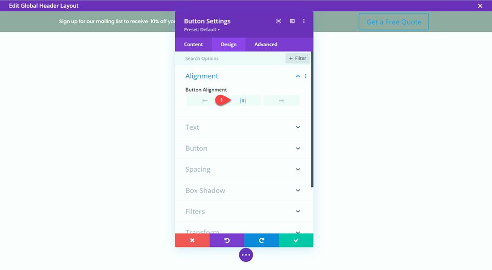
Under the design tab, set the button alignment to center.
- Button Alignment: Center
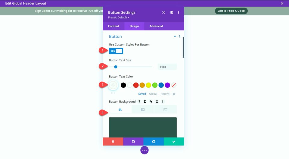
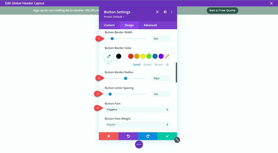
Now we can customize the look of the button.
- Custom Styles for Button: Yes
- Button Text Size: 14px
- Button Text Color: #FFFFFF
- Button Background: #2F5349
- Button Border Width: 0px
- Button Border Radius: 50px
- Button Letter Spacing: 1px
- Button Font: Poppins
Add the Fullwidth Menu Module
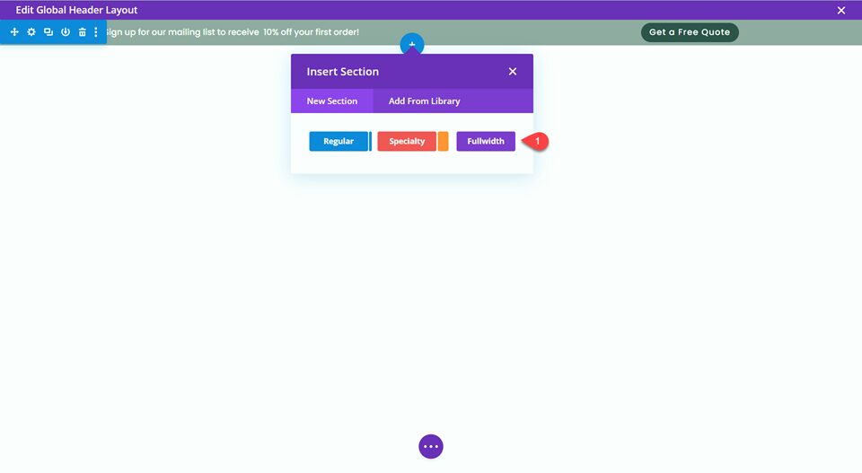
Now that the secondary menu is designed, we can move on to the primary menu. We will be building the menu using the fullwidth menu module. Add a new fullwidth section to the global header.
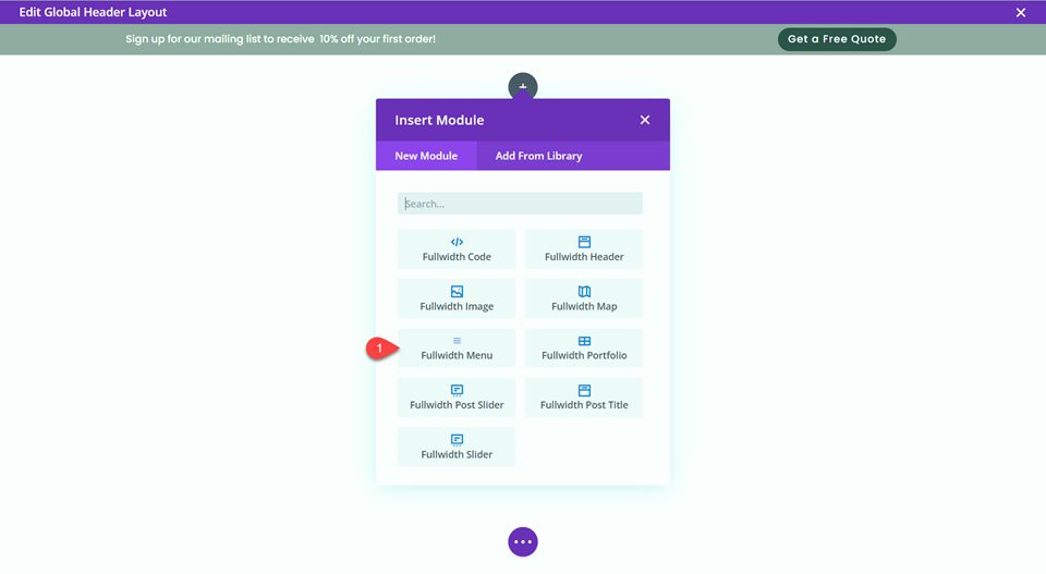
Select and insert the Fullwidth Menu module.
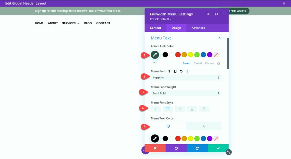
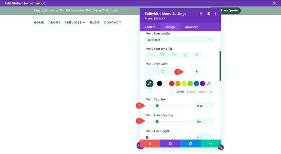
Next, we will customize the fullwidth menu settings.
- Active Link Color: #2f5349
- Menu Font: Poppins
- Menu Font Weight: Semi Bold
- Menu Font Style: Capitalized (TT)
- Menu Text Color: #000000
- Menu Text Color on Hover: #2f5349
- Menu Text Size: 15px
- Menu Letter Spacing: 2px
Next, edit the dropdown menu options.
- Dropdown Menu Line Color: #2f5349
- Dropdown Menu Active Link Color: #2f5349
- Mobile Menu Background Color: #FFFFFF
Change the hamburger menu icon color to black.
- Hamburger Menu Icon Color: #000000
![]()
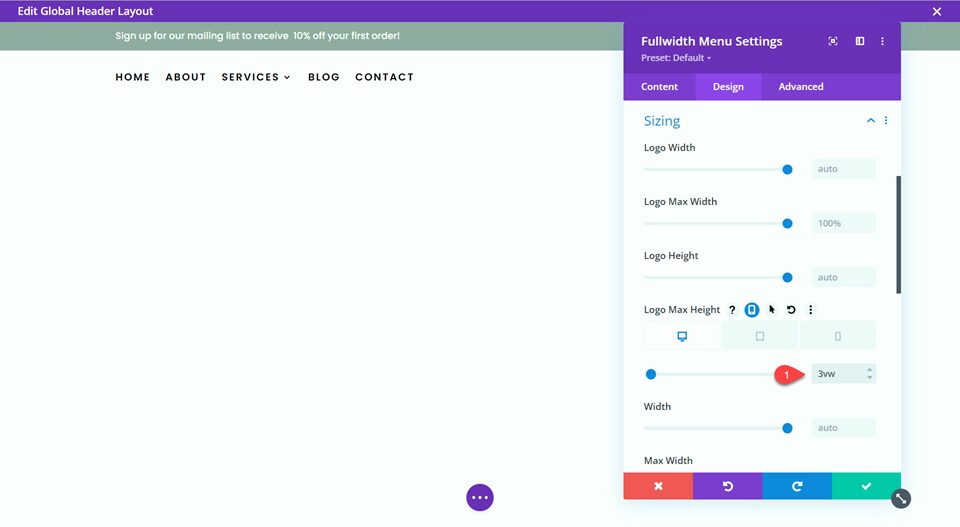
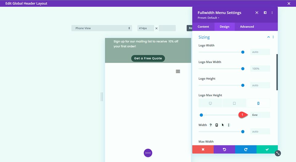
Before we add the logo to our menu, let’s modify the sizing options. We will use Divi’s built-in responsive options to set a different Max Height for desktop and mobile.
- Logo Max Height on Desktop: 3vw
- Logo Max Height on Mobile: 6vw
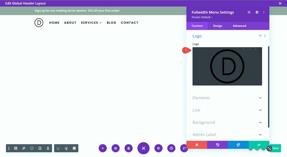
Now add your logo to the fullwidth menu.
Finally, we want the primary menu to stick to the top of the screen as the user scrolls through the website, so we’ll use Divi’s built-in sticky settings for this.
- Sticky Position: Stick to Top
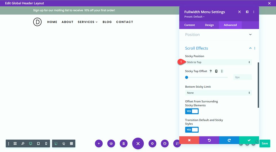
With that, the design of our global header is complete!
Create a New Page with a Premade Layout
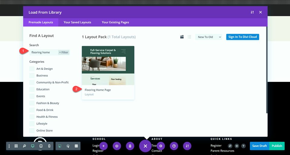
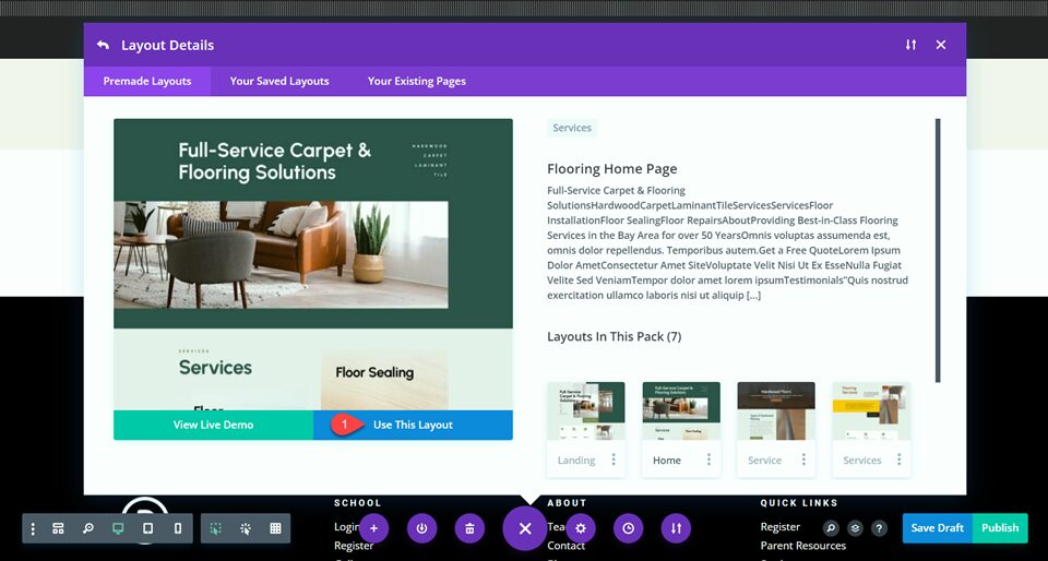
To see the header and fullwidth menu in action, let’s create a new page with a premade layout from the Divi library. For this design, we will use the Flooring Home Page from the flooring layout pack.
Add a new page to your website and give it a title, then select the option to Use Divi Builder.
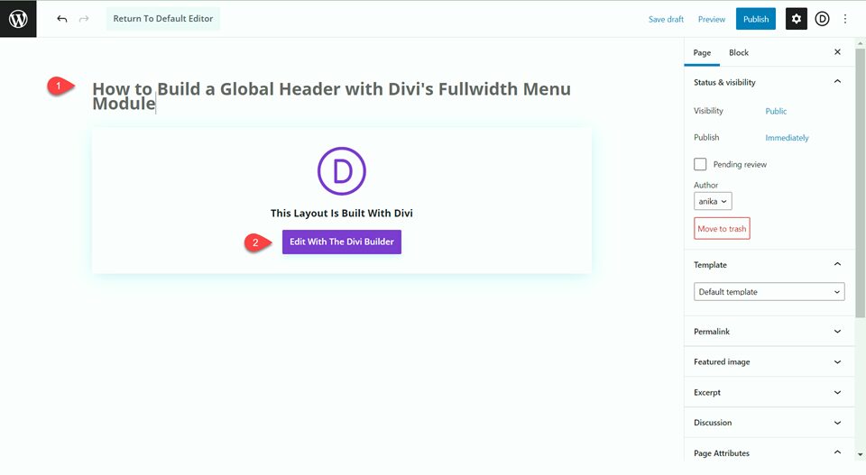
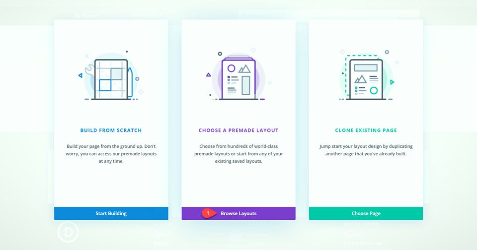
We are using a premade layout from the Divi library for this example, so select Browse Layouts.
Search for and select the Flooring Home Page layout.
Select Use This Layout to add the layout to your page.
Now the design is complete!
Final Result
Let’s take a look at the final design for our global header.


Final Thoughts
As we have discussed, the header and navigation menu is central to the user experience of your website. Now you have seen how easy it is to design a great-looking global header with Divi’s fullwidth menu module. Thankfully, Divi’s theme builder gives you control over every aspect of your website’s menu and header, and you can create totally custom and unique designs with just a few clicks. If you are interested in more header tutorials, check out this collection of 30+ Helpful Divi Header Tutorials!
Have you used Divi’s global header options to customize your header and navigation menu? We would love to hear your thoughts in the comments!
The post How to Build a Global Header with Divi’s Fullwidth Menu Module appeared first on Elegant Themes Blog.
