The contact form is an important element to include on your website if you want to capture emails and convert your visitors into customers. The Divi Contact Form Module can be easily customized to create attractive and captivating contact forms for all types of websites. The module comes with two width options that can be applied to each field in the form: inline or full-width. In this tutorial, we will present four unique layout possibilities for your Divi contact form using inline and full-width fields.
Let’s get started!
Sneak Peek
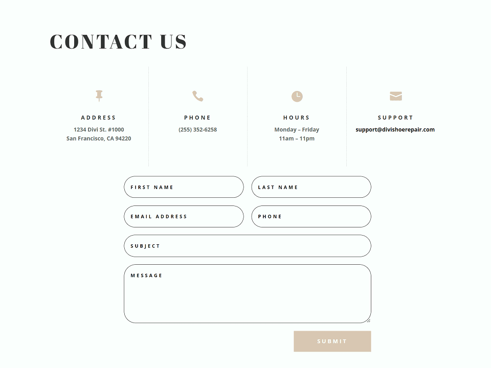
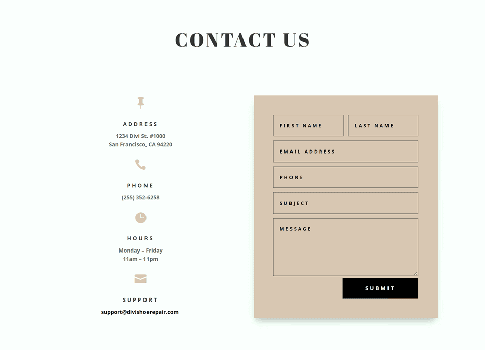
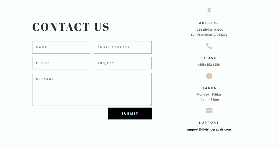
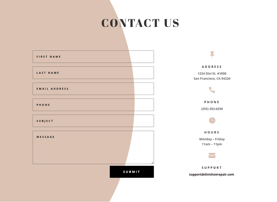
Here is a preview of what we will design.
First Layout

Second Layout

Third Layout

Fourth Layout

What You Need to Get Started
Before we begin, install and activate the Divi Theme and make sure you have the latest version of Divi on your website.
Now, you are ready to start!
4 Layout Possibilities for Your Divi Contact Form Using Inline & Fullwidth Fields
Select the Premade Layout
Each of the 4 designs are modified from the Shoe Repair Contact Page layout from the Shoe Repair Layout Pack, which you can find in the Divi library.
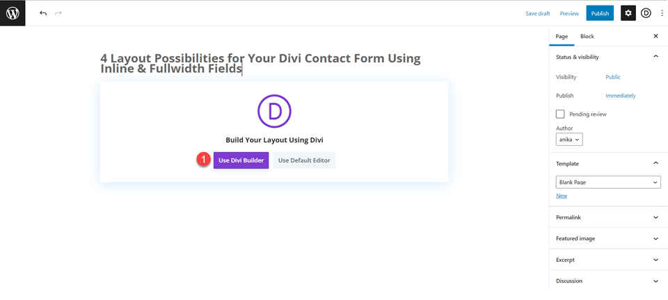
Add a new page to your website and give it a title, then select the option to Use Divi Builder.
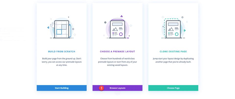
We will use a premade layout from the Divi library for this example, so select Browse Layouts.
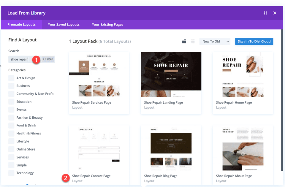
Search for and select the Shoe Repair Contact Page layout.
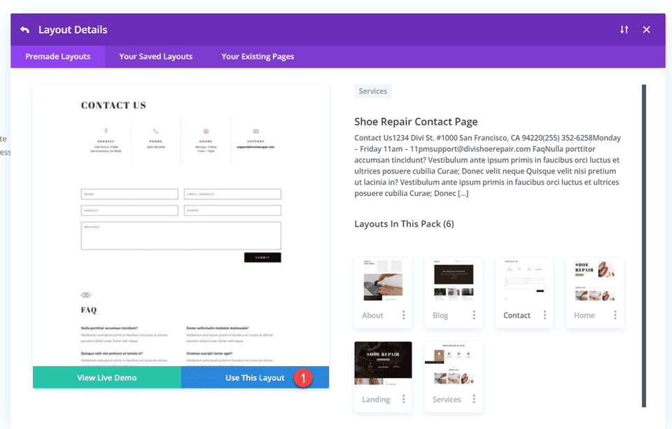
Select Use This Layout to add the layout to your page.
Now we are ready to build our designs.
First Layout
First, move the row containing the contact form module to the section above, right below the row with the blurb modules. Then you can delete the remaining empty section.
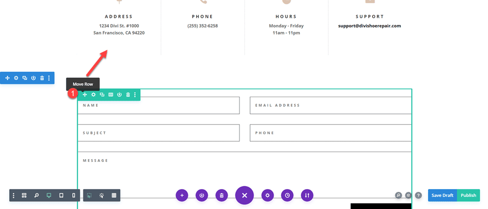
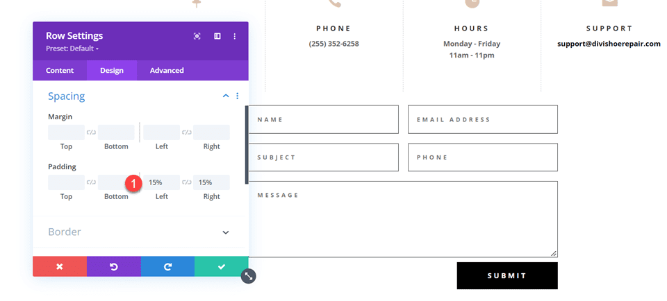
Open the row settings and add padding to the left and right,
- Padding-left: 15%
- Padding-right: 15%
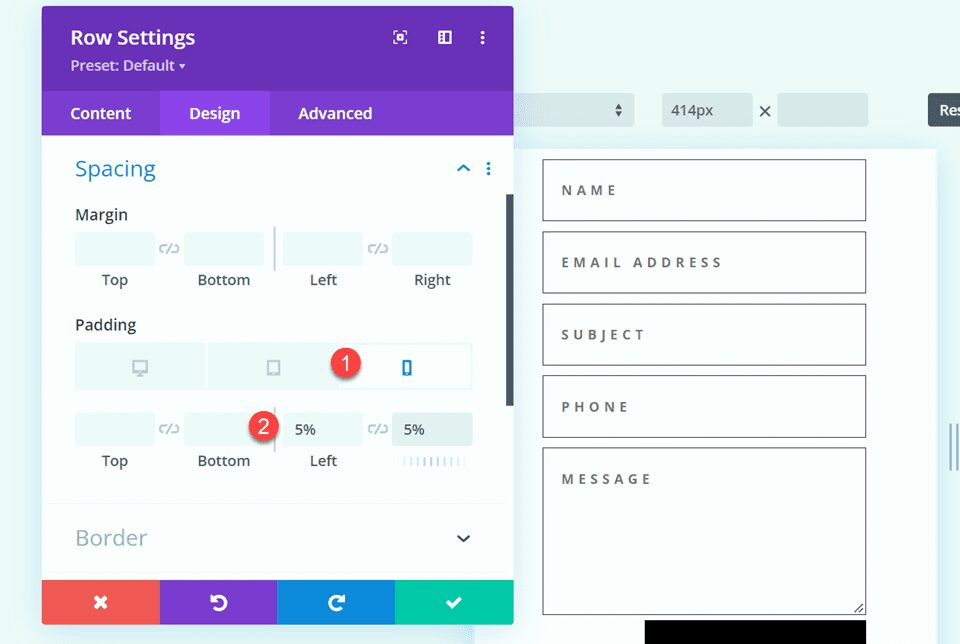
Select the responsive options and set the mobile padding.
- Padding-left: 5%
- Padding-right: 5%
Modifying the Contact Form Layout with Inline and Fullwidth Fields
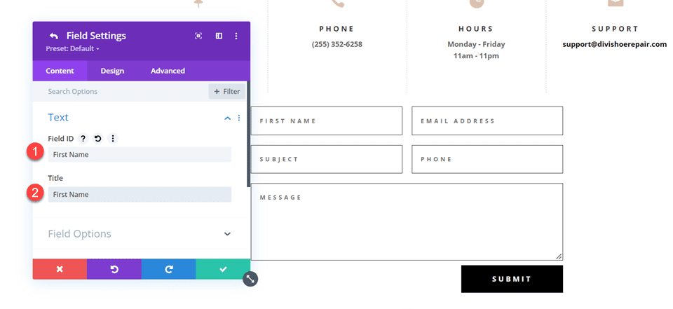
For this layout, we will create two separate fields for first name and last name. Open the contact form module settings and change the field ID and Title for the Name field to First Name.
Add a new field below the First Name field. Set the field ID and Title to Last Name.
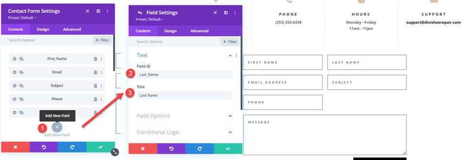
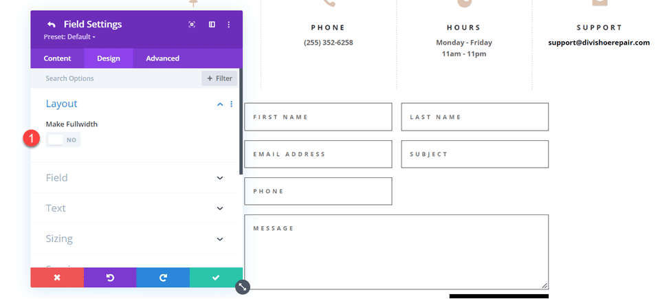
In the last name field settings, open the Layout settings and set Make Fullwidth to No.
- Fullwidth: No
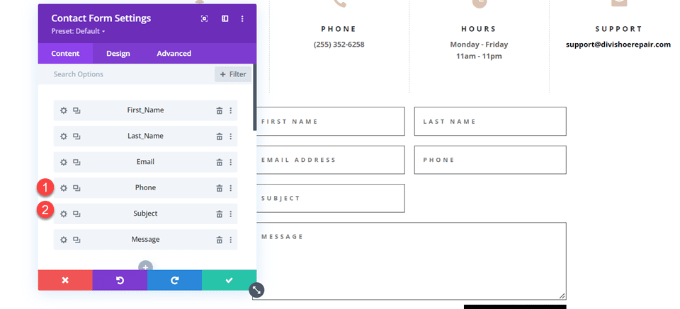
Next, under the contact form settings switch the order of Subject and Phone so that Phone is listed before Subject.
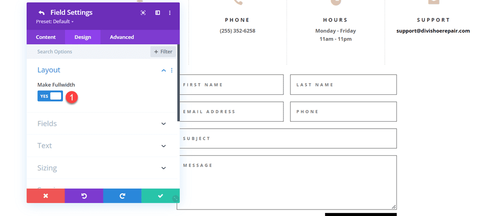
Open the subject field layout settings and make the field fullwidth.
- Make Fullwidth: Yes
Customizing the Contact Form Design
Now let’s modify a few settings to complete the design. Navigate to the design tab of the contact form settings.
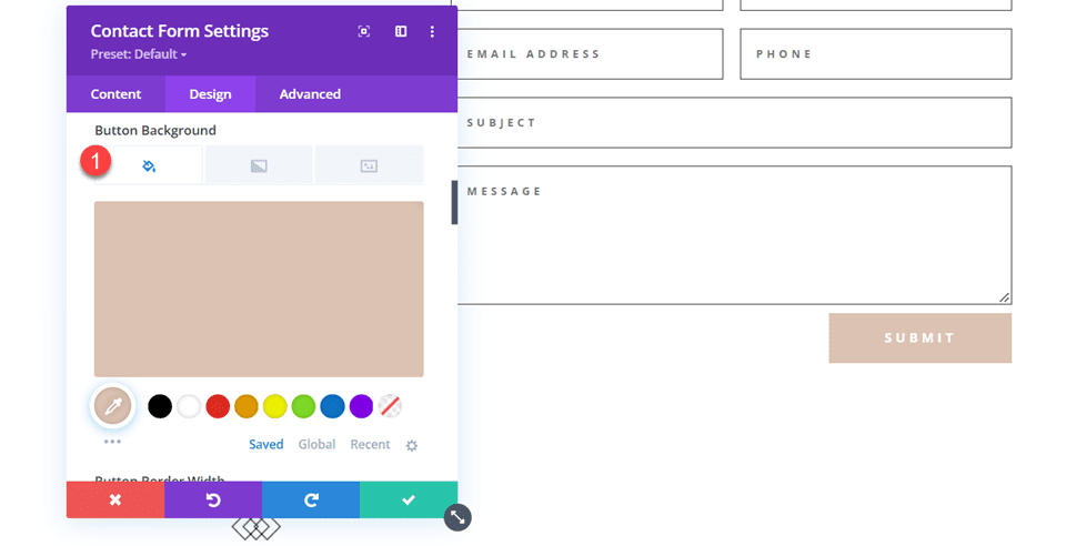
First, change the button background color.
- Button Background: #DBC2B3
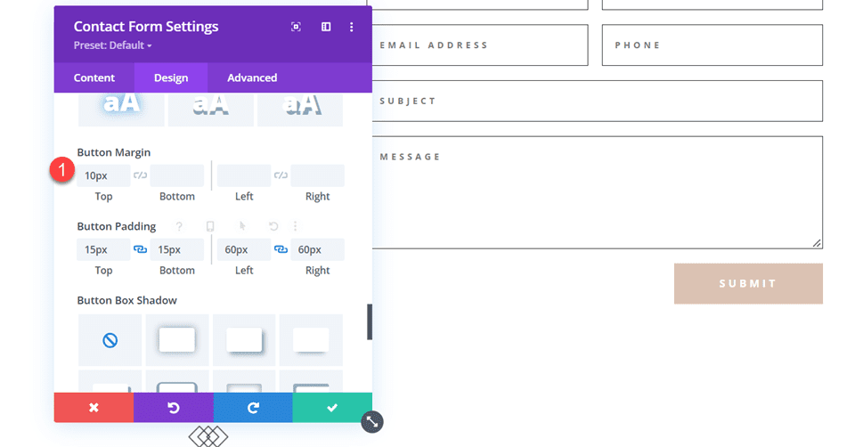
Add a top margin to the button.
- Button margin- top: 10px
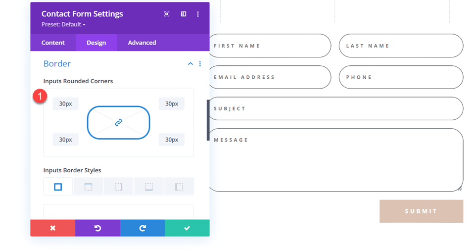
Finally, navigate to the Border settings and add rounded corners to the inputs.
- Inputs rounded corners: 30px
Final Design
Here is the final design on desktop and mobile.


Second Layout
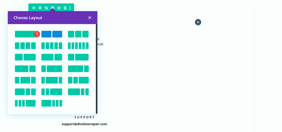
For our second design, we will move the blurb modules to the left side of the page and have the contact form on the right side of the page. Move the blurb modules to one column.
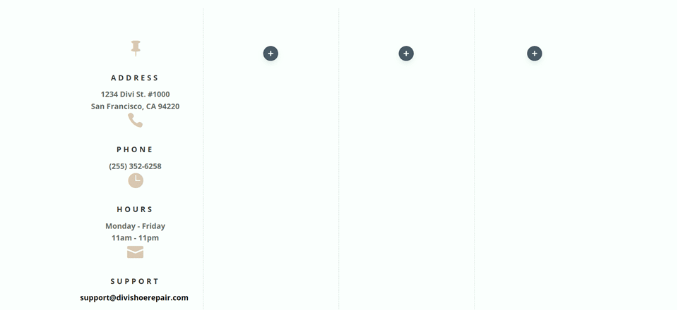
Change the row layout.
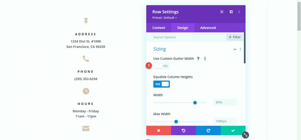
Open the row design settings and turn off Use Custom Gutter Width.
- Use Custom Gutter Width: No
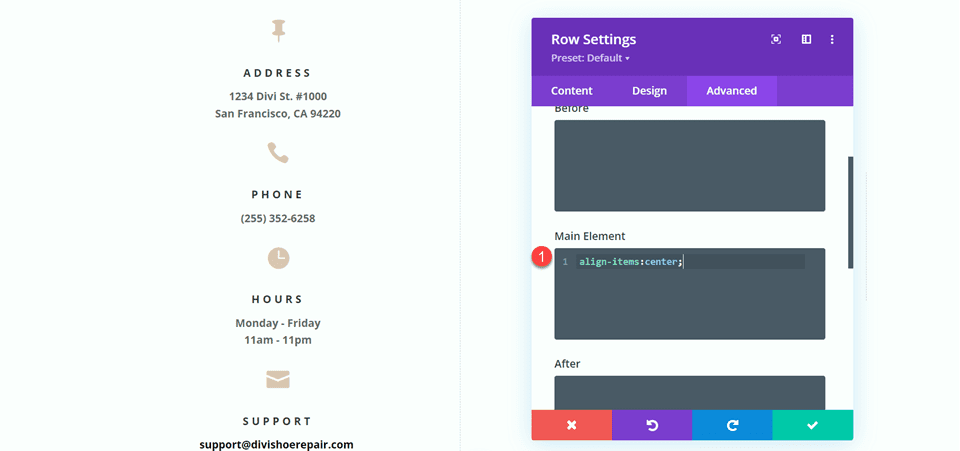
Add some code to the Main Element Custom CSS in order to vertically align the blurb modules and the contact form.
align-items:center;
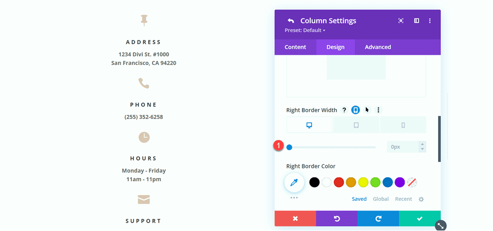
Now we need to remove the thin border between the columns. Open the row settings, then open the settings for column 1. Under the Design tab, navigate to the border settings and remove the border.
- Right border width: 0px
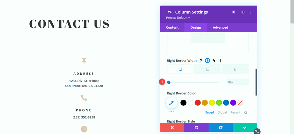
Next, open the settings for column 2 and repeat the steps to remove the border.
- Right border width: 0px
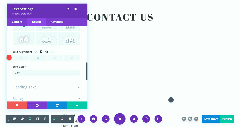
Set the “Contact Us” text to be centered.
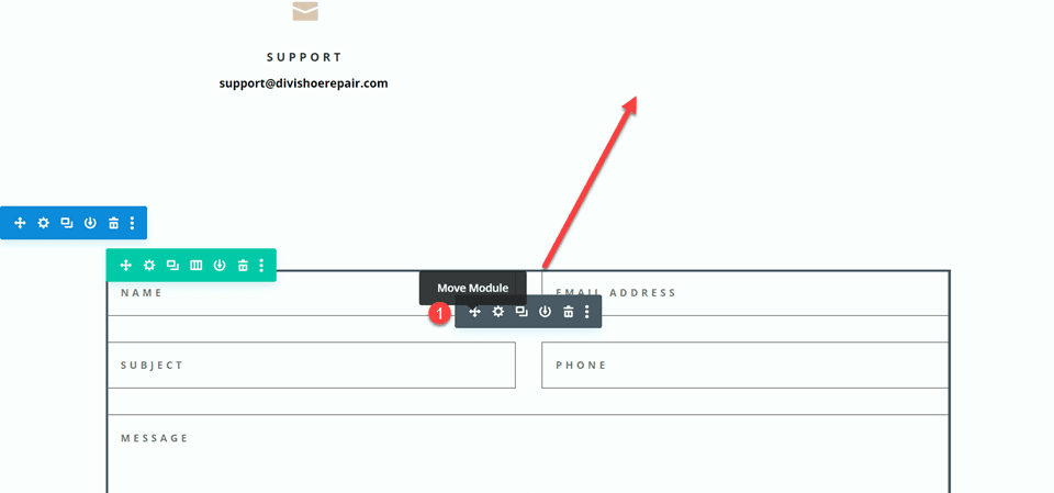
Move the contact form to the right column. Delete the empty remaining section.
Modifying the Contact Form Layout with Inline and Fullwidth Fields
This layout will also have two separate fields for first name and last name. Open the contact form module settings and change the field ID and Title for the Name field to First Name.
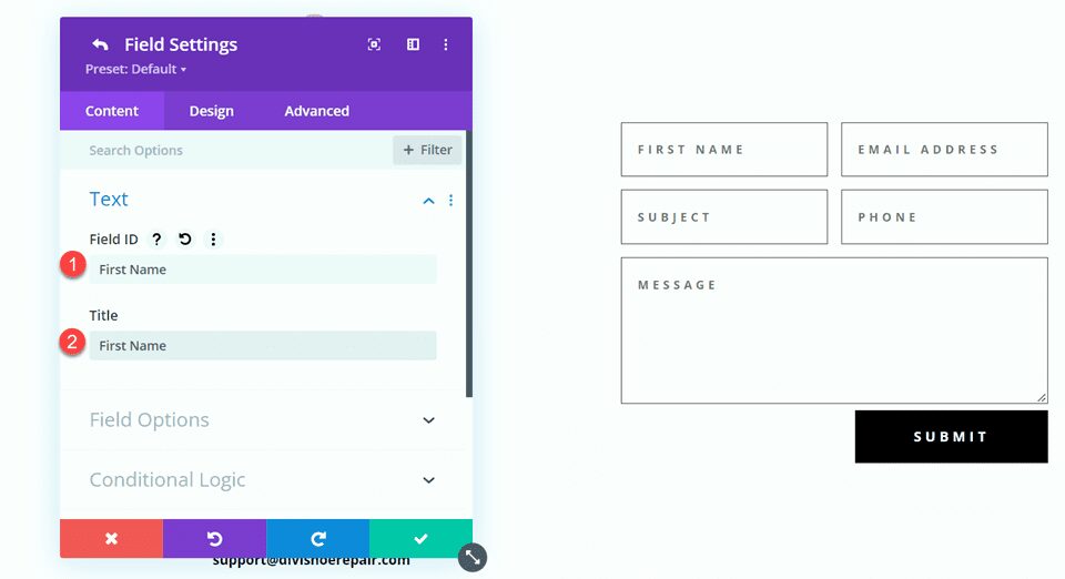
Add a new field below the First Name field. Set the field ID and Title to Last Name.
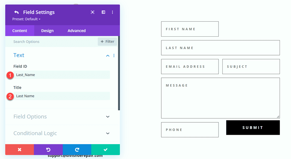
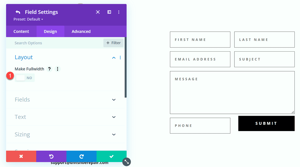
In the last name field settings, open the Layout settings and set Make Fullwidth to No.
- Fullwidth: No
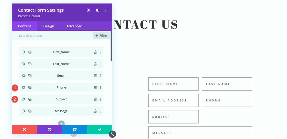
Change the order of the phone and subject fields so that phone comes before subject.
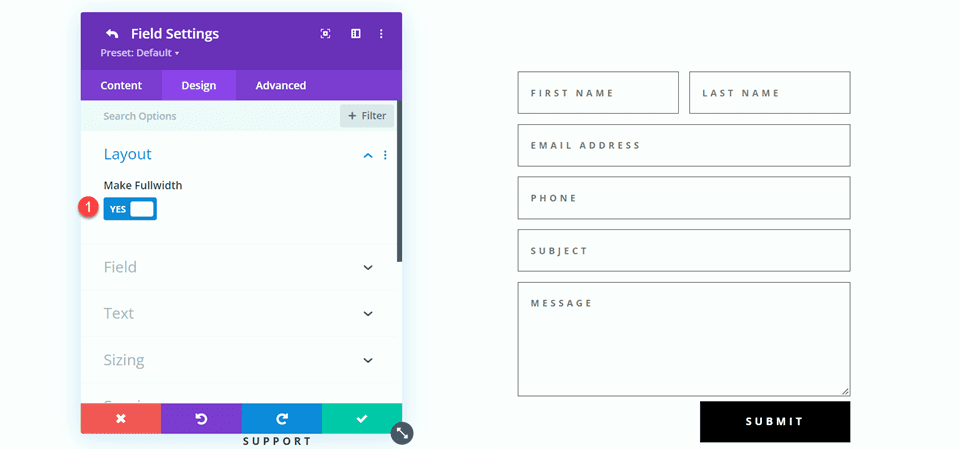
Open the field settings for Email, Phone, and Subject, and set the layout to fullwidth.
- Make Fullwidth: Yes
Customizing the Contact Form Design
Open the row settings, then open the column 2 settings. Set the background color.
- Background: #DBC2B3
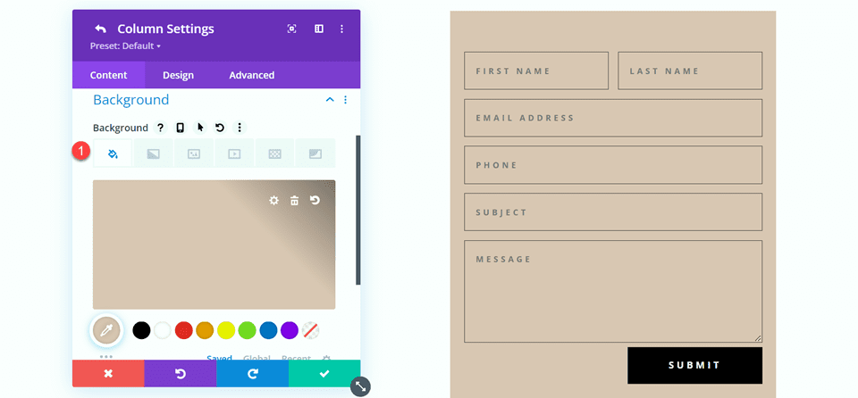
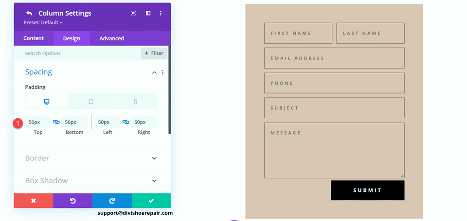
Within the column 2 settings, navigate to the design tab and add some padding.
- Padding-top: 50px
- Padding-bottom: 50px
- Padding-left: 50px
- Padding-right: 50px
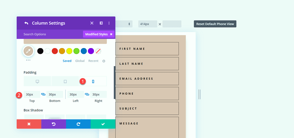
Select the mobile icon to modify the responsive settings. Set the padding for mobile.
- Padding-top: 30px
- Padding-bottom: 30px
- Padding-left: 30px
- Padding-right: 30px
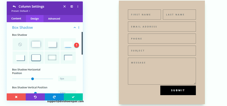
Then add a box shadow to the column.
Finally, open the contact form settings and change the field text color.
- Fields text color: #000000
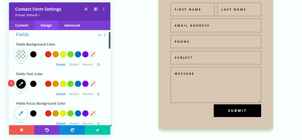
Final Design
Here is the final design for the second layout.


Third Layout
For the third layout, we will have the contact form on the left and the blurb modules on the right. Let’s get started by changing the column structure of the row containing the blurb modules.
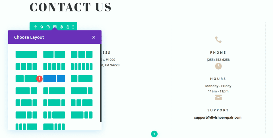
Move the address module to the right column.
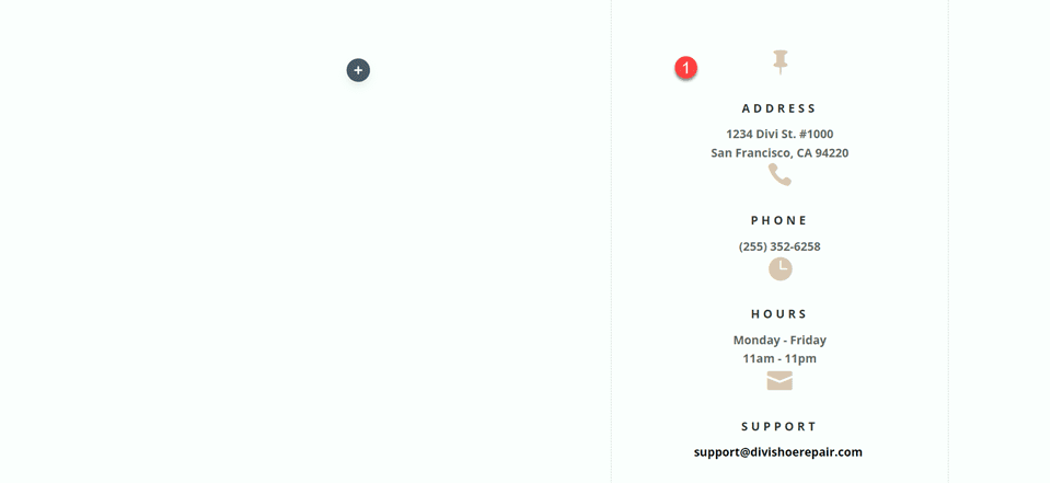
Next, move the Contact Us text module to the left column, then delete the remaining empty row.
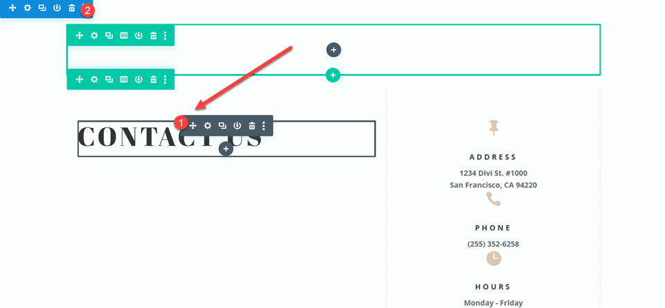
Move the contact form to the left column, below the Contact Us text module. Delete the remaining empty section.
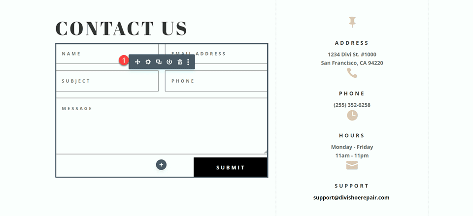
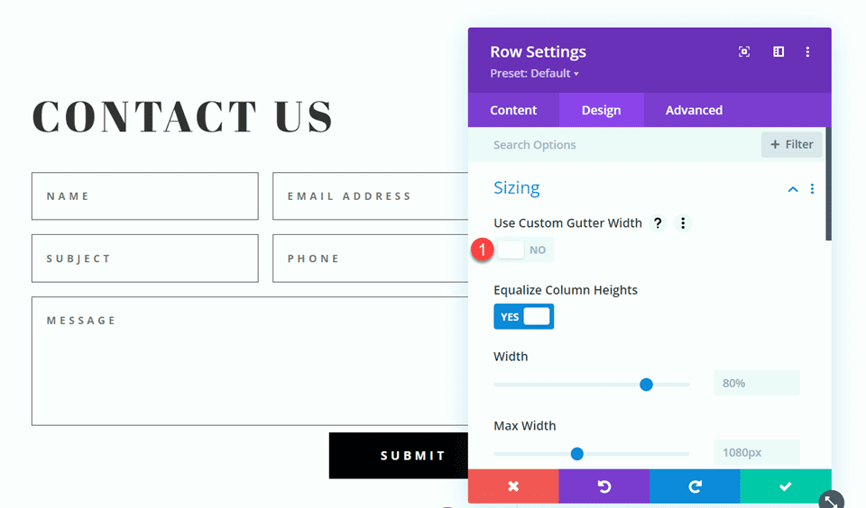
Open the row design settings and turn off Use Custom Gutter Width.
- Use Custom Gutter Width: No
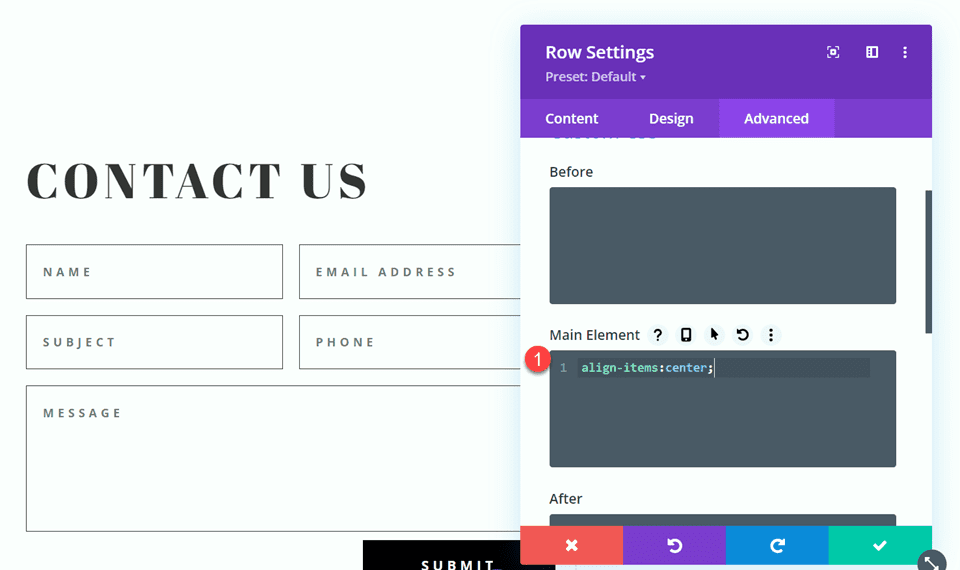
Add some code to the Main Element Custom CSS in order to vertically align the blurb modules and the contact form.
align-items:center;
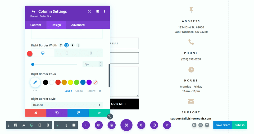
Open the row settings, then open the settings for column 1. Under the Design tab, navigate to the border settings and remove the border. Repeat the steps to remove the border from column 2.
- Right border width: 0px
Modifying the Contact Form Layout
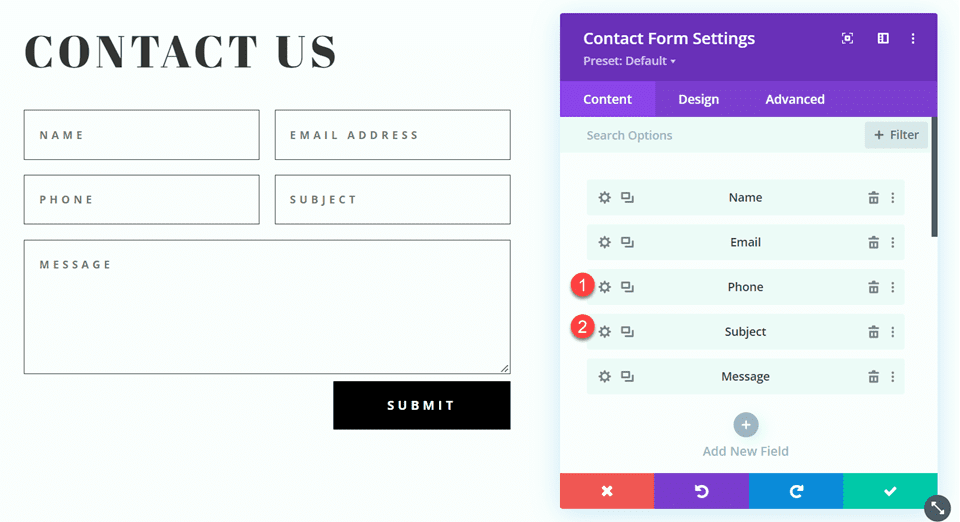
We will leave the field widths as-is for the third design, however, open the contact form settings and switch the order of the phone number and subject field so that the phone comes first.
Final Design
Here is the final design for the third layout.


Fourth Layout
For the fourth and final layout, the contact form will be on the left and the blurb modules on the right. Once again, we will start by changing the column structure of the row containing the blurb modules.
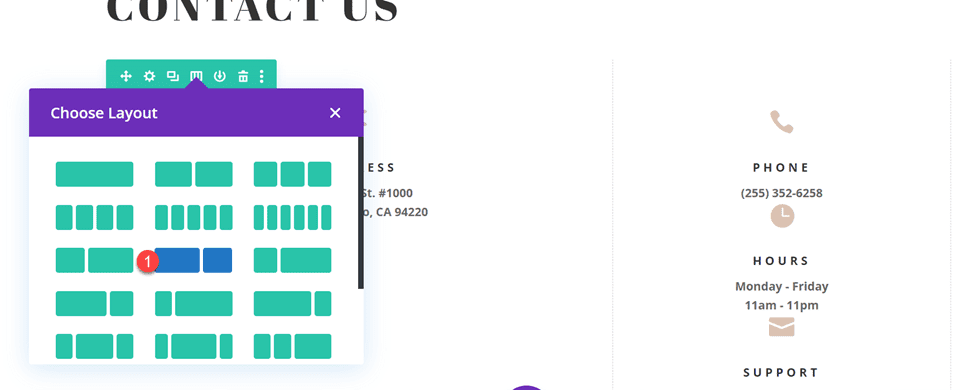
Move the address module to the right column.
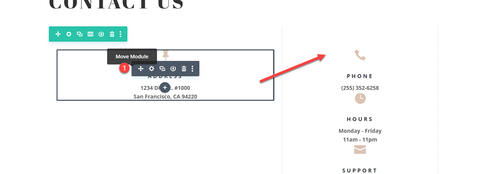
Move the contact form to the left column. Delete the remaining empty section.
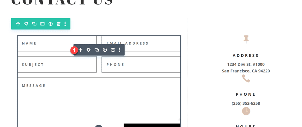
Open the row design settings and turn off Use Custom Gutter Width.
- Use Custom Gutter Width: No
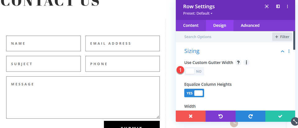
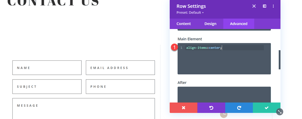
Add some code to the Main Element Custom CSS in order to vertically align the blurb modules and the contact form.
align-items:center;
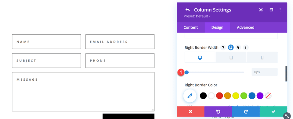
Open the row settings, then open the settings for column 1. Under the Design tab, navigate to the border settings and remove the border.
- Right border width: 0px
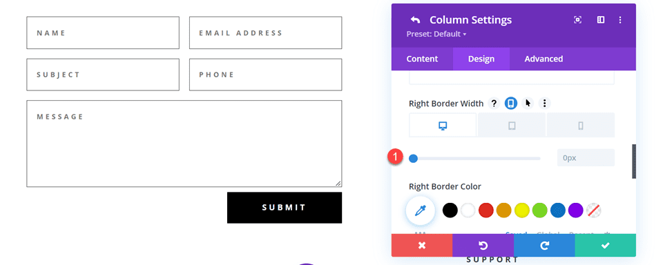
Next, open the settings for column 2 and repeat the steps to remove the border.
- Right border width: 0px
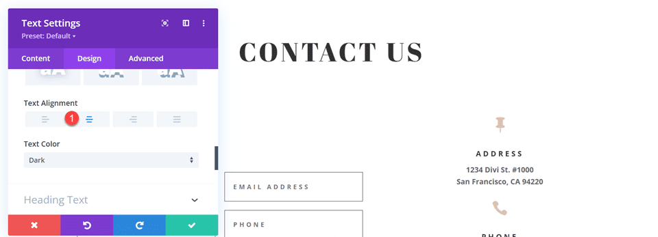
Open the text module settings for the Contact Us text and center the text.
- Text Alignment: Center
Modifying the Contact Form Layout with Inline and Fullwidth Fields
For this design, all of our fields will be fullwidth. Open the contact form settings, then open the settings for each field. Under the design tab, select Layout and set Make Fullwidth to Yes.
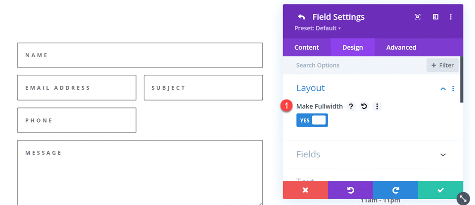
Once you make each field fullwidth, the form should look something like this.
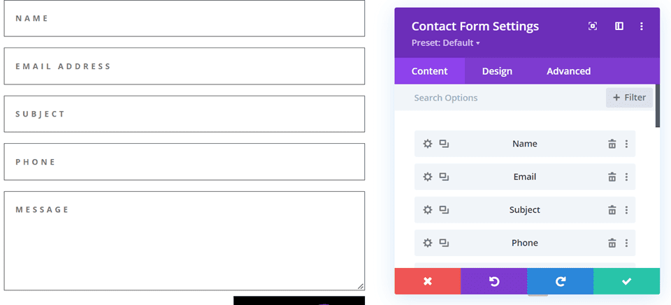
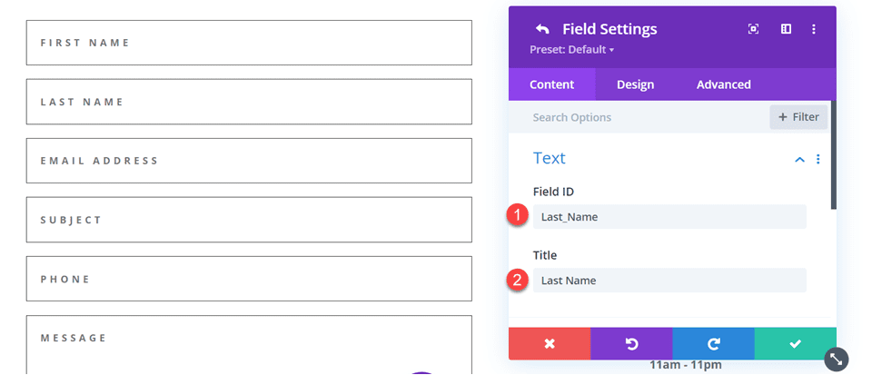
Now, change the field ID and Title for the Name field to First Name.
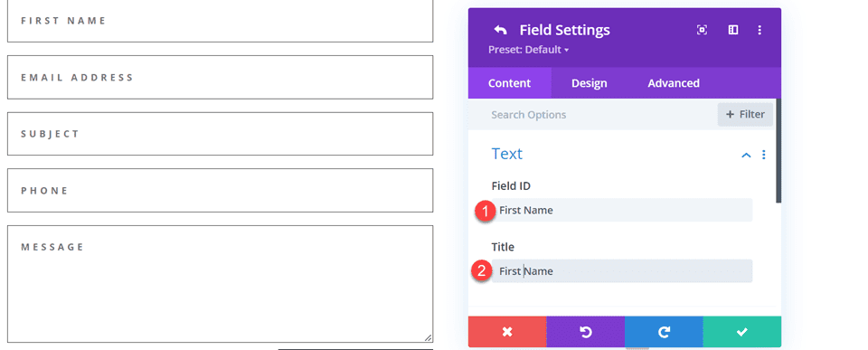
Add a new field below the First Name field. Set the field ID and Title to Last Name.
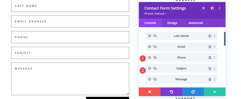
Change the order of the phone and subject fields so that phone comes before the subject.
Customizing the Contact Form Design
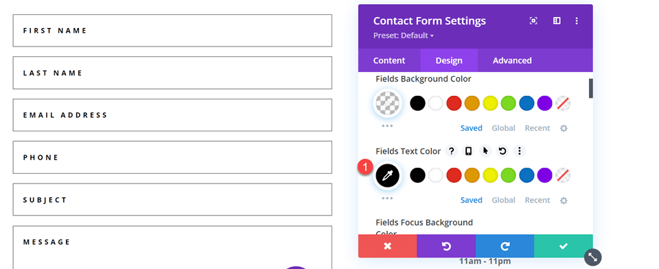
In the contact form design settings, set the Fields Text Color to black.
- Fields Text Color: #000000
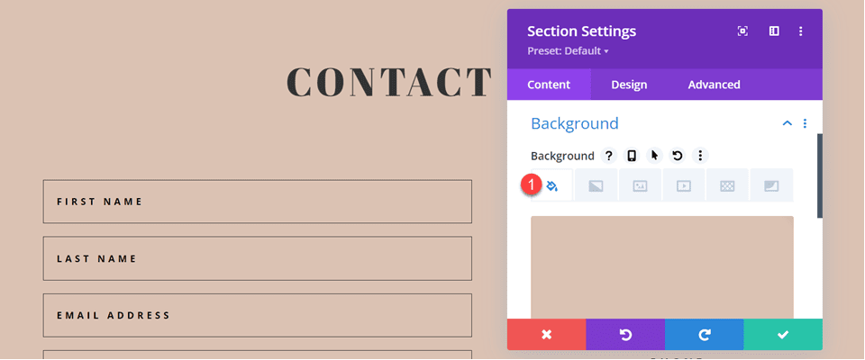
Open the section settings and add a background color.
- Background: #DBC2B3
Finally, add a background mask.
- Background Mask: Arch
- Mask Transform: Horizontal
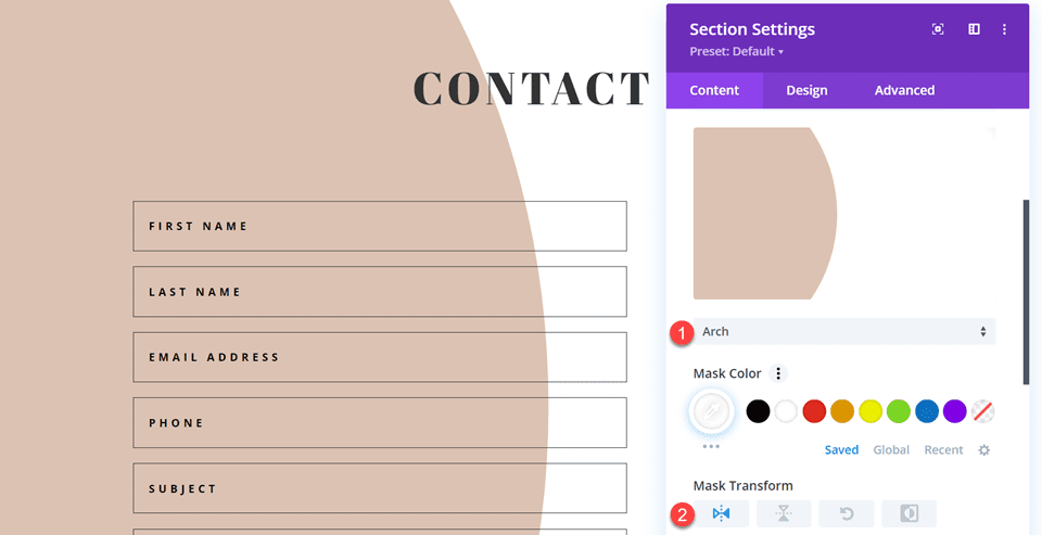
To make the background mask work better on mobile, let’s use the responsive settings.
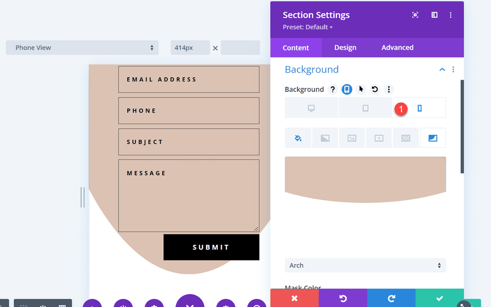
- Mask Transform on Mobile: Horizontal and Rotate
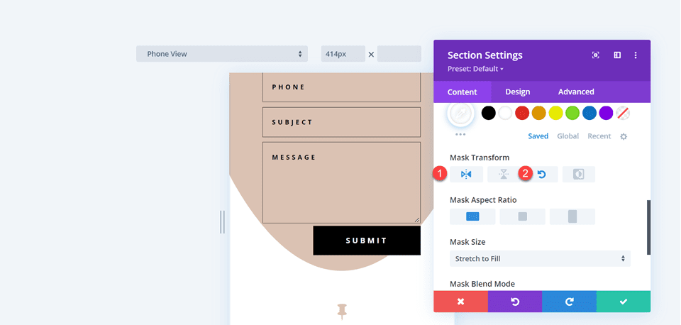
Final Design
Here is the final design for the fourth layout.


Final Result
Let’s take a look at all of our final designs once again.
First Layout


Second Layout


Third Layout


Fourth Layout


Final Thoughts
Having a great-looking contact form can increase your conversions and allows your visitors to connect directly with you. As we have demonstrated through this article, you can use the inline and fullwidth field options to create different looks and layouts for your form, and Divi’s built-in design options allow you to create unique and attractive designs to help the form stand out. To learn more about the different ways you can style the contact form module, check out this tutorial for creating a full-screen responsive form with zoom-in scroll animation, and this tutorial for 5 more unique styling options. How have you styled your contact form module? We would love to hear from you in the comments!
The post How to Combine Inline & Fullwidth Fields in Divi’s Contact Form Module appeared first on Elegant Themes Blog.
