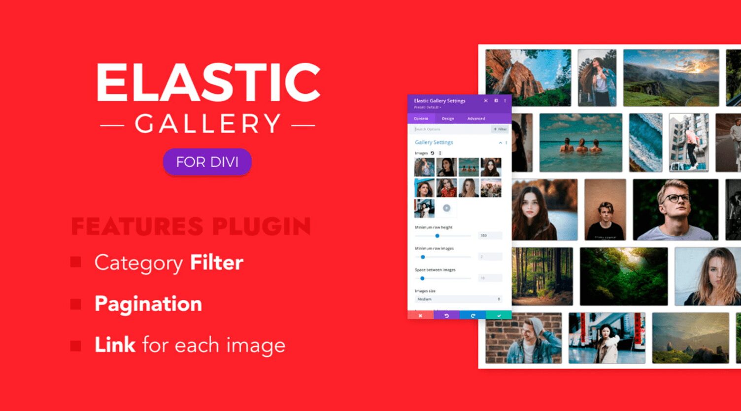
Divi Elastic Gallery is a third-party plugin for Divi that adds a new gallery module to the Divi Builder. Display images with several layout options, choose how the images react when clicked, adjust the captions, titles, filter, pagination, and more. In this post, we’ll take a close look at Divi Elastic Gallery to help you decide if it’s the right Divi Module for your needs.
Divi Elastic Gallery Module
Divi Elastic Gallery adds a new module to the Divi Builder called Elastic Gallery.
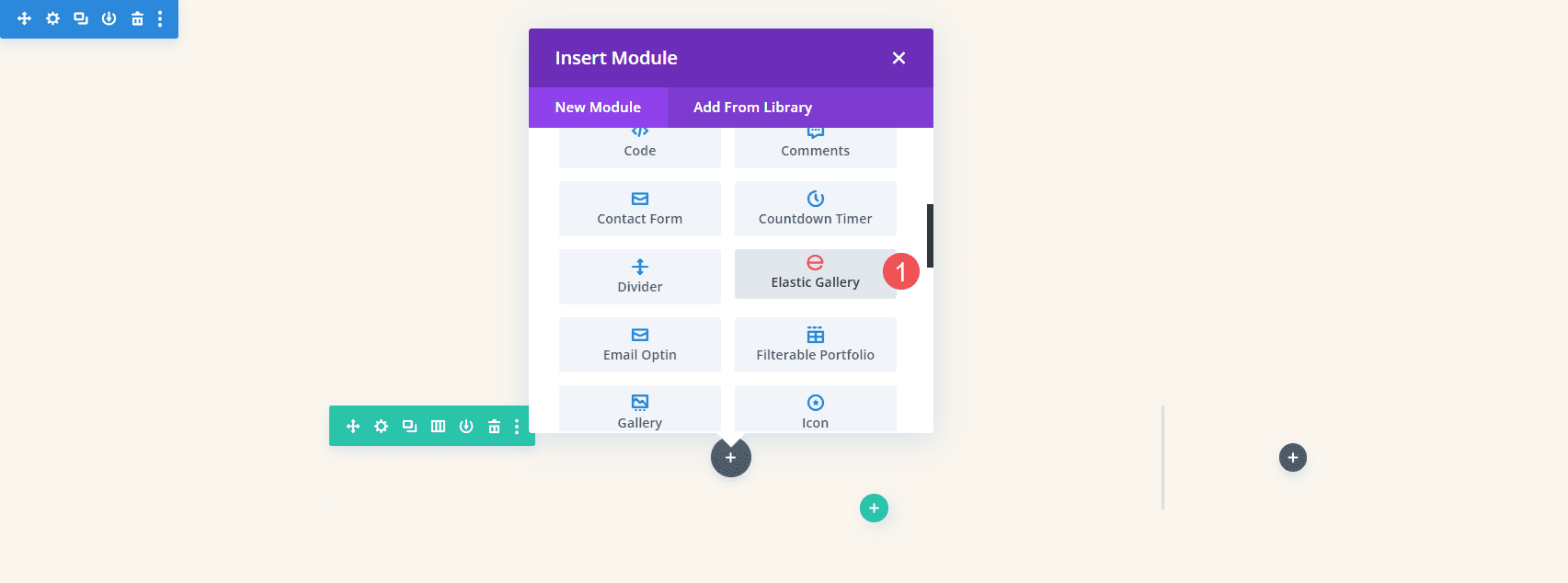
The module’s Content tab includes Gallery Settings, Background, and Admin Label. Gallery Settings includes the image selector and lots of image adjustments. To add images to the gallery, select Add Gallery Images. The Media Library will open, and you can choose the images you want to display.
Gallery Settings
Adding images automatically display them in the gallery. You can add as many as you want and it doesn’t matter what size they are.
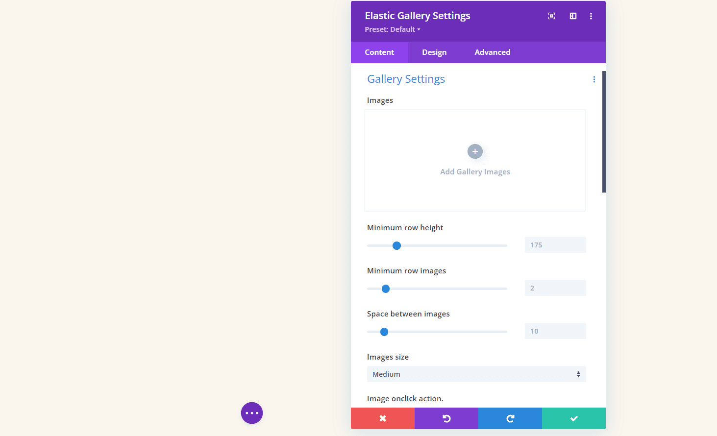
I’ve selected images of various sizes for the example below. The images have automatically adjusted in size to fit the space. This created a mosaic with various columns. We can adjust the number of images per row, the height of the images, the space between them, the image size, etc. We’ll look at a few of the settings.
Row Height and Space Between the Images
A couple of these settings took me a minute to understand. Here’s my explanation of each setting based on the documentation and my tests.
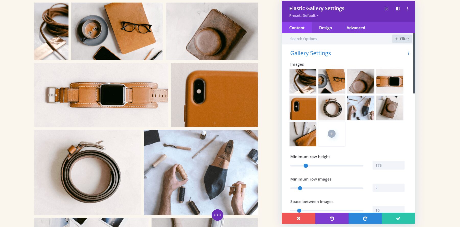
The Minimum Row Height adds images to each row until the size is higher than the minimum. Using a lower number displays more images in the gallery. In the example below, I’ve set the Minimum Row Height to 145.
Minimum Row Images determines the number of images that will appear in as many rows as possible, starting with the bottom row. In the example below, I’ve set the Minimum Row Images to 6. The bottom row displays 6 images, and the top row displays 3. If I set it to 4, the top row displays one image and the second and third rows display 4 images.
Space Between Images determines the number of pixels between each image on the top, bottom, and sides. I’ve set the example below to 21 pixels and there are 21 pixels on all sides between every image.
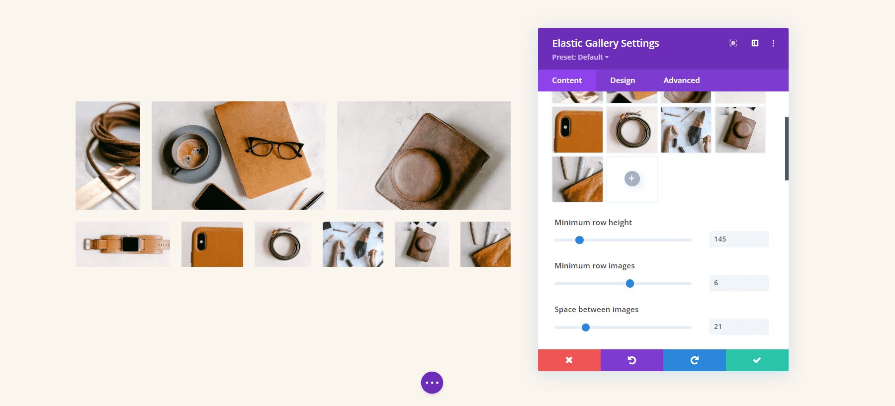
Image Onclick Action
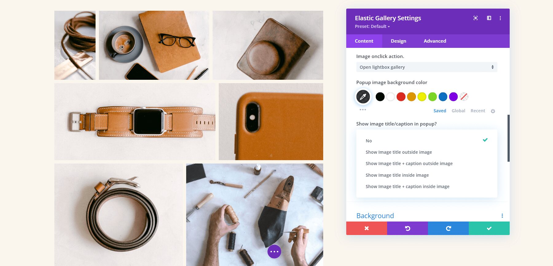
The Image Onclick Action determines what happens when the user clicks an image in the gallery. It can open the image in a lightbox, link to other pages, or do nothing. If you have it open in a lightbox, you’ll see options for the lightbox. If you have it to link to other pages, you’ll see a field where you can enter each URL with instructions on how to add the links.
Here’s a look at the lightbox options. You can adjust the lightbox color and choose between five options for the image title and caption in the popup. Show nothing, the title outside the image, the title and caption outside the image, the title inside the image, or the title and caption inside the image. Showing the title adds an option for the legend color.
Here’s the default lightbox. It has a dark background, arrow navigation, a close icon, and a title under the image.
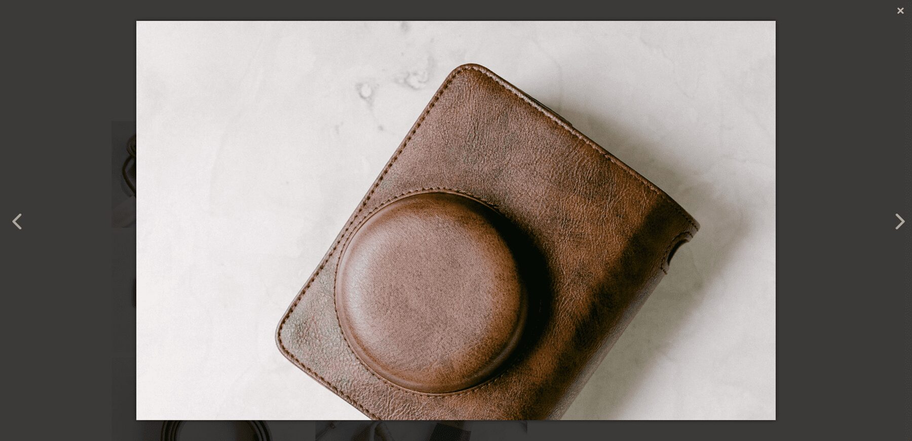
For this example, I’ve added the title inside the image and changed the background color.

Categories Filter
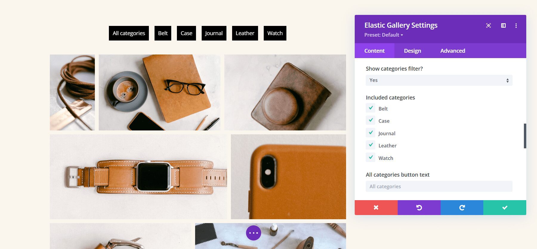
The Categories Filter lets you choose the categories to display and change the text for the All Categories button.
Pagination
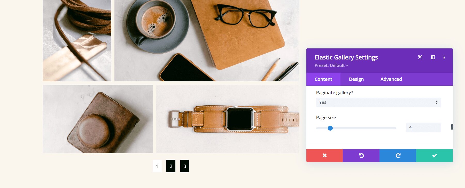
The Pagination option adds pagination under the gallery. You can also choose the page size, which determines the number of images that displays on each page. in this example, I’ve selected a Page Size of 4. This shows 4 images per page and creates 3 pages to show my images.
Divi Elastic Gallery Design Options
The Elastic Gallery Module includes all the standard Divi settings, allowing you full control over the styling of each element. Here’s a look at the main settings.
Overlay
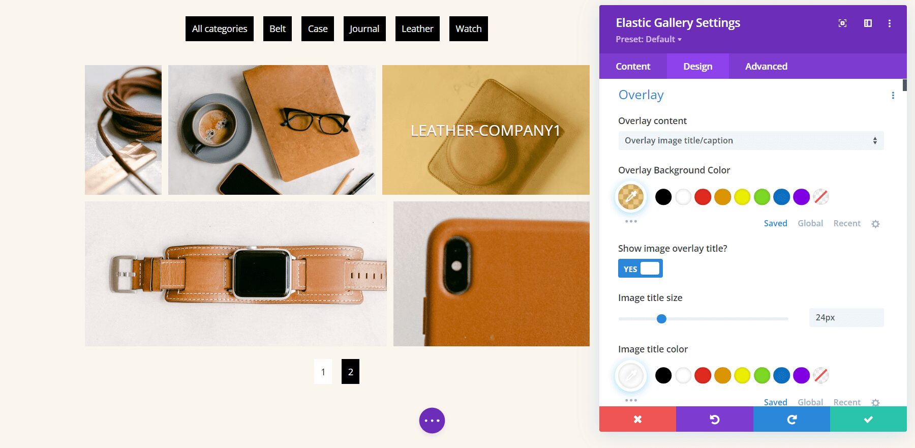
The Overlay settings let you choose between showing an icon, the image title to display in the overlay, or only showing the overlay. Change the colors and fonts with the standard Divi settings. in the example below, I’ve selected to show the title and changed the overlay color, font color, font size, style, and added a shadow to the font.
Hover Animations
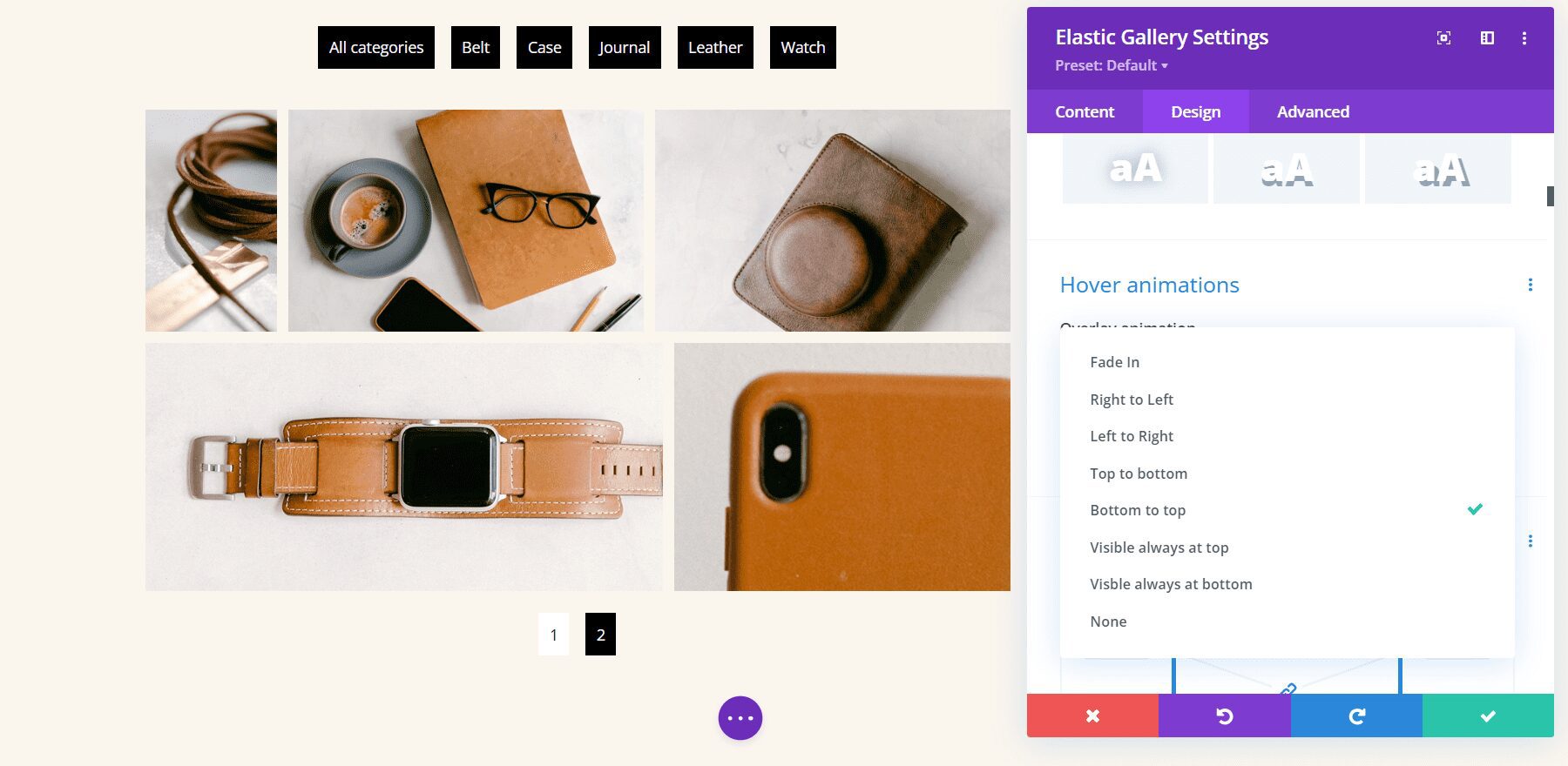
The hover animations determine how the overlay appears when the user hovers over the image. Choose from 7 animations or disable animations.
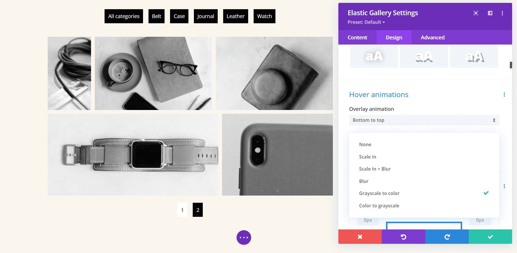
You can also choose an animation for the image that takes place at the same time as the overlay animation. Choose from 5 animations or disable the image animation. I’ve selected Grayscale to Color in the example below. This changes the images to grayscale and shows the image in color when you hover over it.
Images
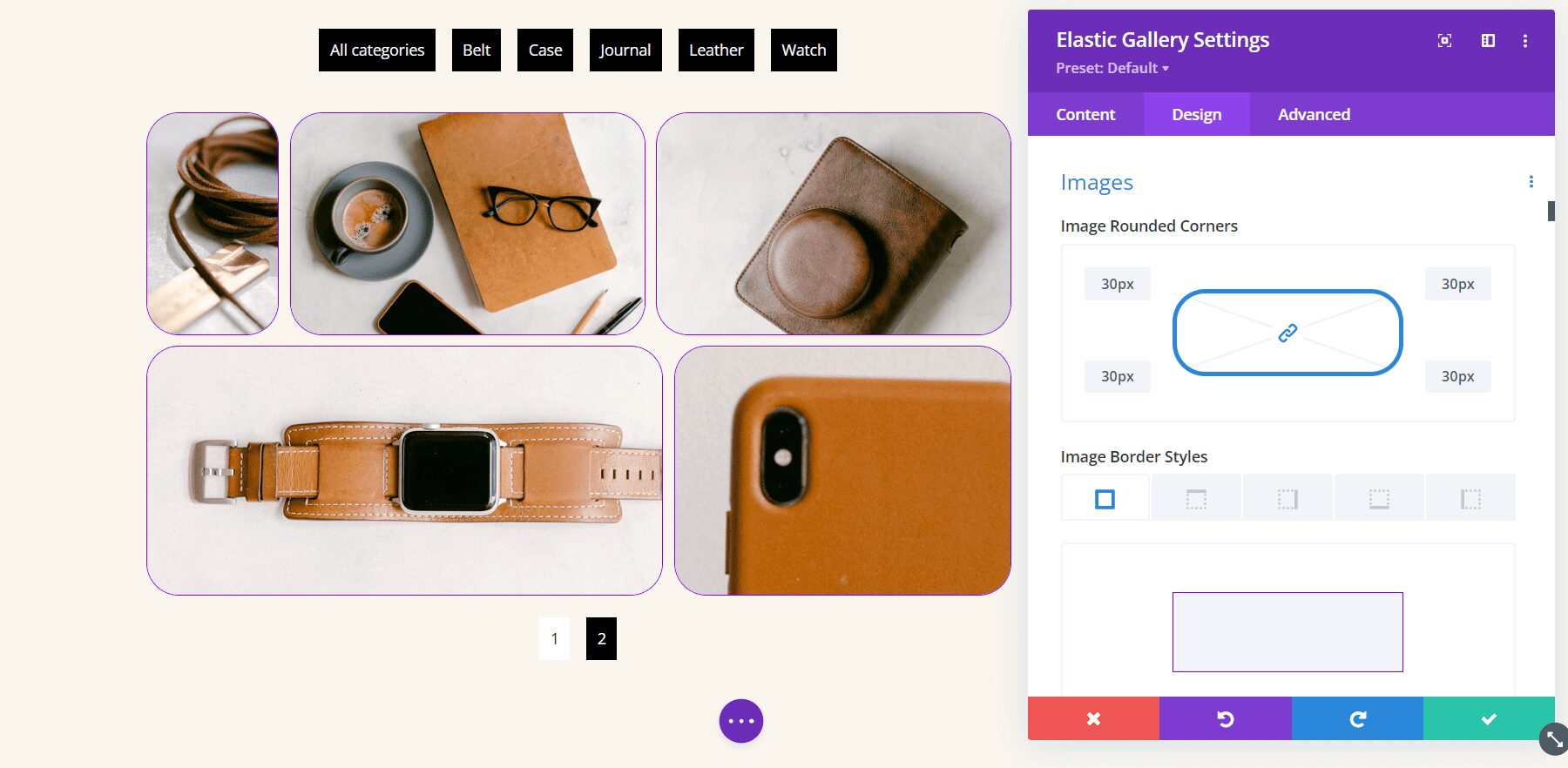
The Image settings control the rounded corners and border. Adjust the border’s styles, width, and color. In the example below, I’ve made the rounded corners 30px, added a 1-pixel border, and changed the color to purple.
Gallery Filter
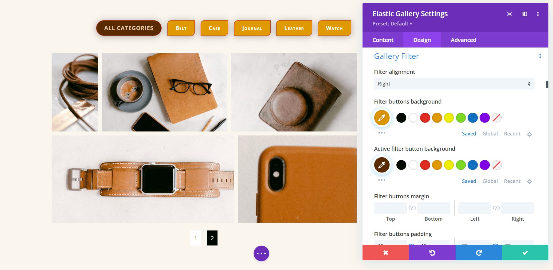
The Gallery Filter has an amazing number of options. Adjust the alignment, color, fonts, borders, etc., for the category buttons, and then adjust the current category independently. The currently active category will use the regular filter settings if you don’t adjust it separately.
In the example below, I’ve set the filter to display on the right. I’ve also increased the size of the fonts, font style, and weight, added line length, changed the background color, added a border, rounded two of the corners, and added right and left padding. I customized the active category independently.
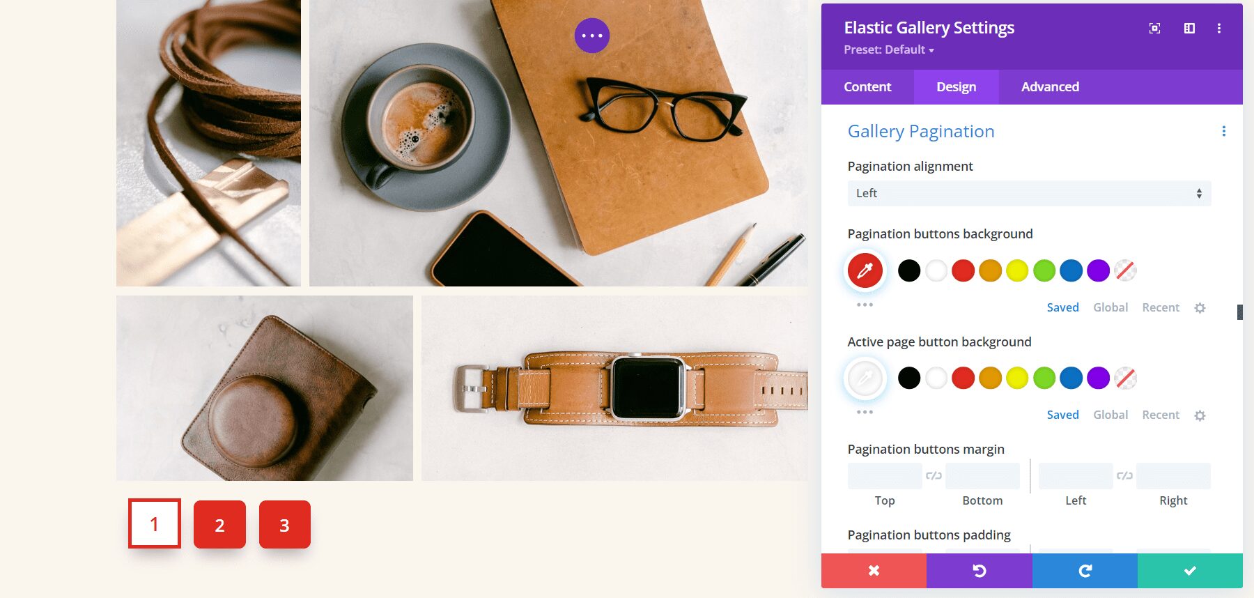
Gallery Pagination
The Gallery Pagination also has an amazing number of options. Adjust the alignment, colors, fonts, borders, spacing, shadows, and more. In this example, I’ve adjusted the size of the fonts, changed their weight, rounded the corners, changed the colors of the fonts and backgrounds, and given them a box shadow. I’ve also added a border to the active page, squared the corners, reversed the colors, and increased the size of its font.
Divi Elastic Gallery Example
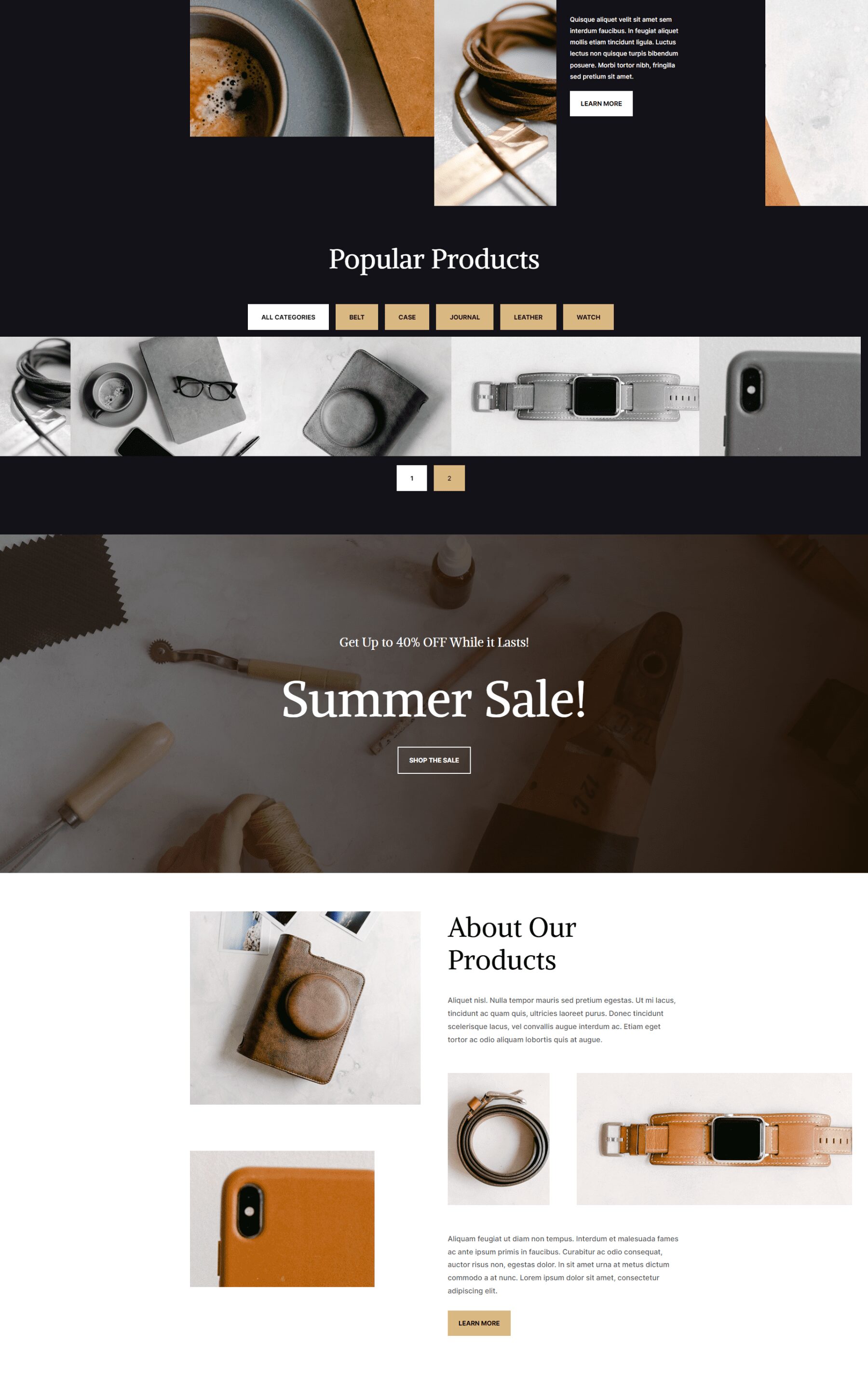
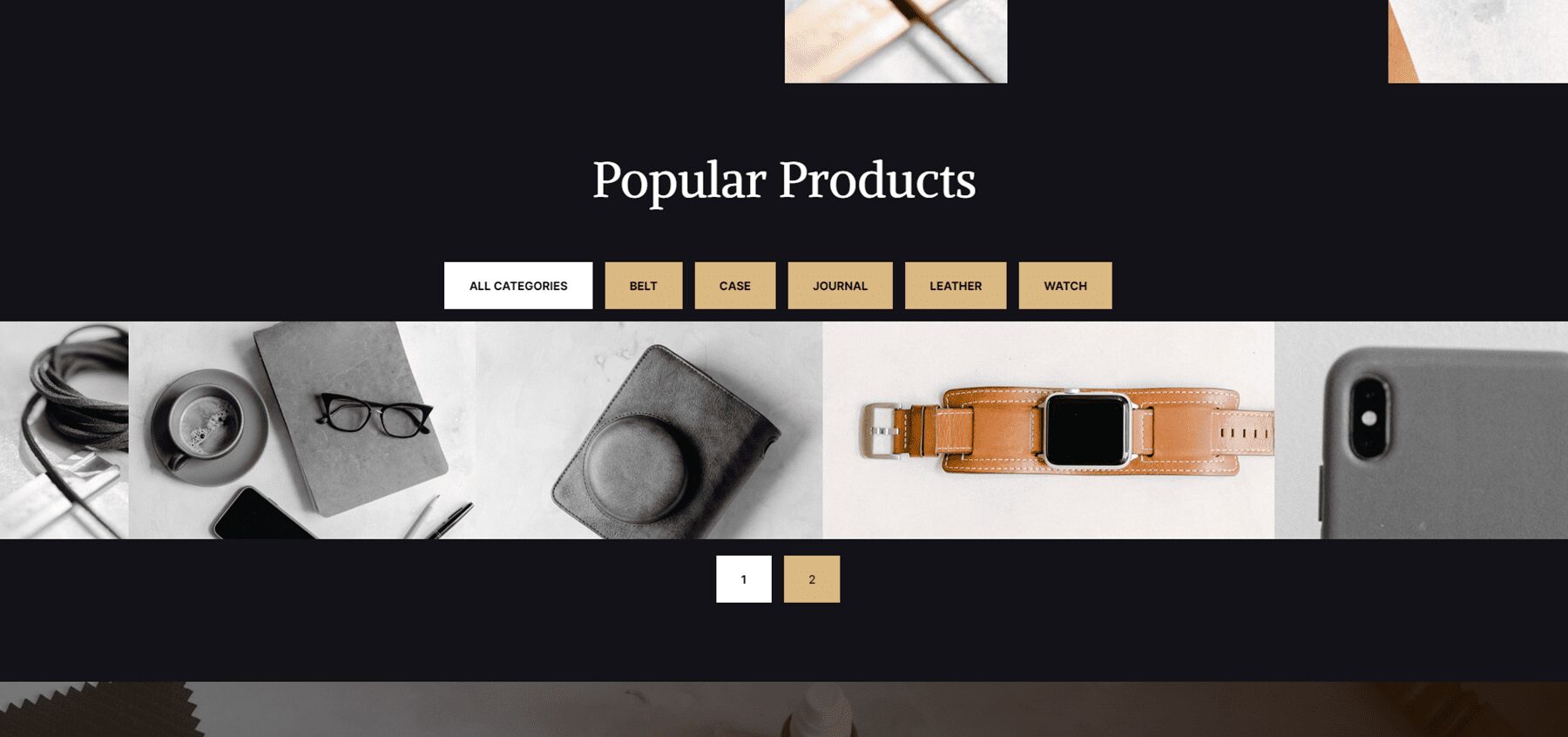
Here’s how Divi Elastic Gallery looks within a layout. I’m using the free Leather Goods Layout Pack that’s available within Divi. I’ve made the gallery full width changed the colors to match the layout and changed the images to grayscale and have them change to color on hover. The space between the images is zero. The font is Inter, with bold for the weight, and TT for the style. I’ve added 20px Padding to the top and bottom and 30px Padding to the left and right.
This example shows the Elastic Gallery with one of the images showing the hover effect. It was easy to make the gallery match the layout.
Purchase Divi Elastic Gallery
Divi Elastic Gallery is available in the Divi Marketplace for $25. It includes unlimited website usage, a 30-day money-back guarantee, and one year of support and updates.
Ending Thoughts
That’s our look at Divi Elastic Gallery. This is a simple module, but it has a lot of display and styling options to create just about any type of gallery you need. A couple of the Min settings take some tweaking to get the design you want, but I was impressed with the layouts I was able to get from it. If you’re interested in a feature-rich gallery module for Divi, Elastic Gallery is worth a look.
We want to hear from you. Have you tried Elastic Gallery for Divi? Let us know what you think about it in the comments.
The post Divi Plugin Highlight: Divi Elastic Gallery appeared first on Elegant Themes Blog.
