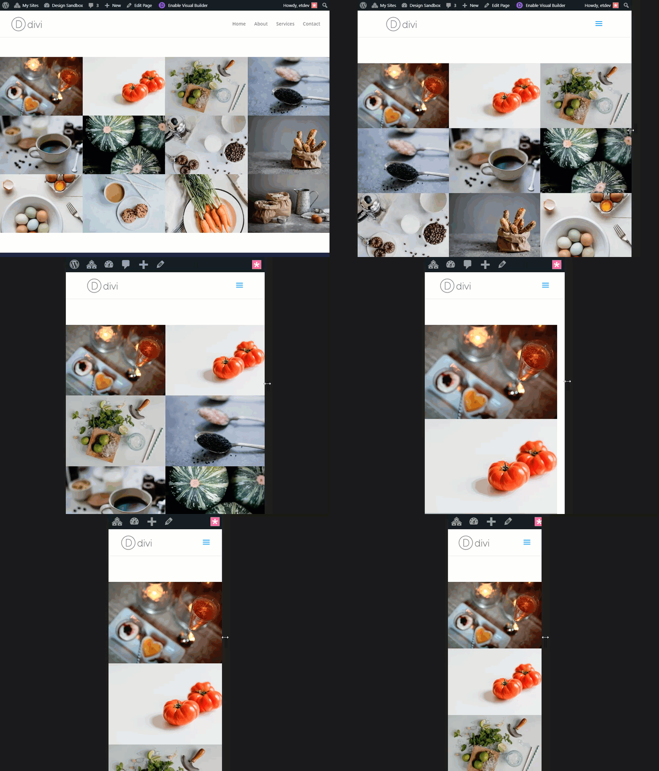
The Divi Gallery Module allows you to create beautiful image gallery in a responsive grid layout. The gallery is considered responsive because it will scale the size of your images and adjust the number of columns in the grid according to different browser widths.
By default, the gallery module has three breakpoints (points where the style changes at certain browser widths) that adjust the number of columns in the grid. It will display your image gallery in four columns on desktop and then break into three columns on tablet, two columns on small tablets (and large phones), and one column on phones.
This default setup will usually work for most cases, but sometimes you may need more control over the number of columns displayed on certain browser widths. That’s why in this tutorial, I’m going to show you how to have complete over the number of columns displayed in the Divi Gallery Module not only for desktop, but also for three additional browser breakpoints.
Sneak Peek
Here is a sneak peek of what we will build in this tutorial. Notice the different number of columns for the image gallery on different browser widths.
Preparing Your Design Elements
For this tutorial, you will need the Divi theme installed and active. You will also need 12 images added to your media library to be used for the building the image gallery. For a Divi gallery module using a grid layout, the size of your images should be around 1500px by 800px if you plan on your images opening up in lightbox display so that it fills the screen nicely on most desktops.
Implementing the Custom Spacing for the Divi Gallery Module
Setting up a New Page
For starters, create a new page, give your page a title, and deploy the Divi Builder. Select the option “Build from Scratch” and then publish your page. Then click to build on the front end.
Creating the Image Gallery
With the Divi Builder deployed, go ahead and create a new regular section with a one-column row and add a Divi Gallery Module to the row.
Divi will populate the gallery module with some images from your media gallery in a grid display like the following:
In the gallery module settings, click the gray plus icon to add 12 images to the gallery.
Then update the Divi Gallery Module settings as follows:
Images Number: 12
Show Title and Caption: NO
Show Pagination: NO
Adjust Row Settings to Make Fullwidth Gallery without Gutter Width
In order for our new column structure to work, the main thing we need to do is get rid of the default spacing/margin that exists between our images in the gallery. To do this, all we need to do is set the gutter width to 1. Also, as an option, you can make the row fullwidth in order to make the image gallery span the full width of the browser. To do this, open the row settings and update the following:
Make This Row Fullwidth: YES
Gutter Width: 1
If you want to add spacing between the images in the gallery, I suggest using this method since we need to keep the gutter width set to 1.
How the Gallery Responds to Different Browser widths by Default
As mentioned earlier, by default, the Divi gallery module will display your image gallery in four columns on desktop and then break into three columns on tablet, two columns on small tablets (and large phones), and one column on phones.
However, we are going to change this up to include a custom number of columns at certain breakpoints using a few snippets of custom CSS.
Setting a specific number of columns for all browser sizes
If you want to change the number of columns displayed in the gallery so that the number of columns stays the same on all browser sizes, there is simple way to do this. This might be helpful if you only want to display your gallery in one column, two columns, or three columns. That way you can have really large images on desktop and smaller images on mobile while keeping the column number the same. Having four or more columns will probably not work since the images will be too small for phone displays.
Let’s say you want to display three columns on all browser sizes. To do this, open your Divi gallery module settings and add the following custom CSS to the Gallery Item:
width: 33.33% !important;
margin: 0 !important;
clear: none !important;
Now your gallery will retain the three column structure on all browser sizes.
If you wanted a 2 column layout for all browser sizes, all you need to do is change the width property value to 50%.
If you want a 1 column layout, simply update the width to 100%.
That’s it.
But, if you want to gain more control of the number of columns at certain breakpoints, read on.
Changing the Number of Columns for Specific Breakpoints
If you want to gain complete control over the number of columns displayed when the browser reaches certain breakpoints, we can use a few snippets of CSS with media queries that target certain browser widths.
Add the CSS Class to the Divi Gallery Module
Before we add the custom CSS, first we need to give our gallery module a custom CSS Class so we can reference that specific class in our CSS. This will make sure our css is only applied to this specific gallery module. To do this, open the gallery module settings and add the following CSS class under the advanced tab:
CSS Class: col-width
Don’t forget to take out the custom css added to the Gallery Item in the previous section of this article if you added it.
After that, save your settings.
Add the Custom CSS to Page Settings
With you CSS class in place, you are ready to add the Custom CSS. Open the page settings by clicking the gear icon in the page settings bar at the bottom of the page (or you can use the keyboard shortcut “o”).
Then add the following Custom CSS under the advanced tab.
/** Desktop **/
@media (min-width: 981px){
.col-width .et_pb_gallery_item {
width: 16.66% !important; /*six columns*/
clear: none !important;
}
}

/** Tablet **/
@media (max-width: 980px){
.col-width .et_pb_gallery_item {
width: 25% !important; /*four columns*/
clear: none !important;
}
}

/** Small Tablet and Large Phone **/
@media (max-width: 767px){
.col-width .et_pb_gallery_item {
width: 33.33% !important; /*three columns*/
clear: none !important;
}
}

/** Phone **/
@media (max-width: 479px){
.col-width .et_pb_gallery_item {
width: 50% !important; /*two columns*/
clear: none !important;
}
}
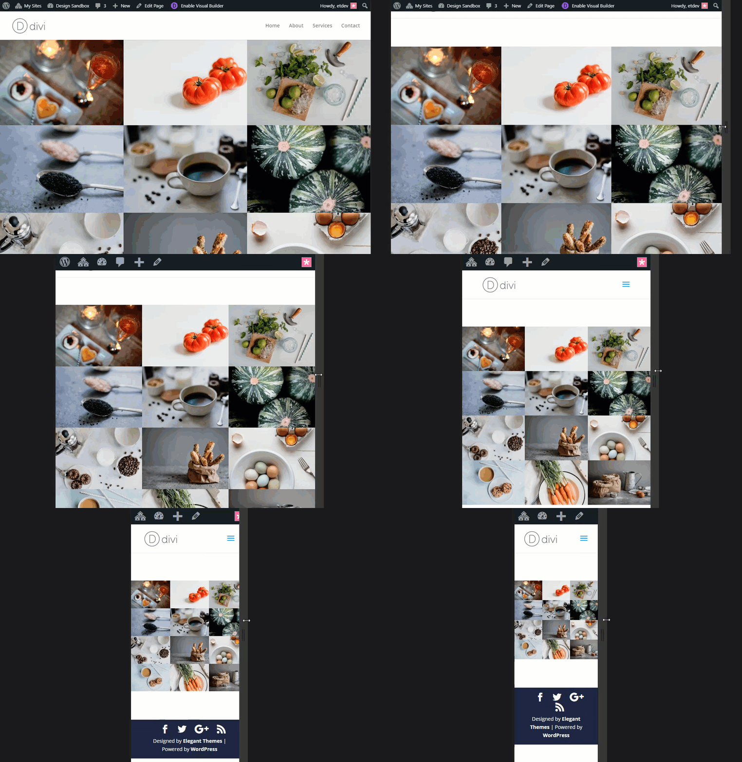
This CSS will add a custom number of columns to certain breakpoints as follows:
Desktop: 6 columns
Tablet: 4 columns
Small Tablet and Large Phone: 3 columns
Phone: 2 columns
Understanding and Adjusting the CSS
Looking at the CSS, you will notice that it is broken up into four separate media queries. The top media query adds styling to desktop browsers (browsers with a minimum width of 981px). The second media query adds styling to browsers around the size of tablet, and so on.
Within each media query, the most important CSS to take not of is the width property. This designates the size of each gallery item and which also sets the column width for the gallery.
For example, the top media query for desktop sets the width of the gallery item to 16.66%.
This is equivalent to one-sixth of the total width of its container (or row). Therefore, the gallery will display a six column layout on desktop.
To adjust the number of columns for desktop, all you would need to do is change the width property to a different value. Here is a list of width percentages that you can try.
12 columns: 8.33%
10 columns: 10%
8 columns: 12.5%
6 columns: 16.66%
5 columns: 20%
4 columns: 25%
3 columns: 33.33%
2 columns: 50%
1 column: 100%
Final Result
Here is the final result on the different browser widths.
Desktop (6 columns)
Tablet (4 columns)
Small Tablet and Large Phone (3 columns)
Phone (2 columns)
Final Thoughts
I hope this tutorial was helpful for those of you looking to gain more control over the number of columns that your gallery displays on certain devices or breakpoints. With this setup, you can add any number of columns you desire for any browser width to create gallery displays with the user in mind.
The breakpoints I used in the custom CSS are those breakpoints that Divi already uses. Feel free to check out our post on how to fine tune your designs with media queries for more information on this concept.
Until next time, I look forward to hearing from you in the comments.
Cheers!
The post Changing the Number of Columns in the Divi Gallery Module at Different Breakpoints appeared first on Elegant Themes Blog.


