Every week, we provide you with new and free Divi layout packs which you can use for your next project. For one of the layout packs, we also share a use case that’ll help you take your website to the next level. This week, as part of our ongoing Divi design initiative, we’re going to show you how to create animated titles using Divi’s hover options and the Driving School Layout Pack. This is a great approach for putting different parts of your copy in the spotlight and triggering action.
Let’s get to it!
Preview
Before we dive into the tutorial, let’s take a quick look at the outcome.

Upload Driver School Landing Page
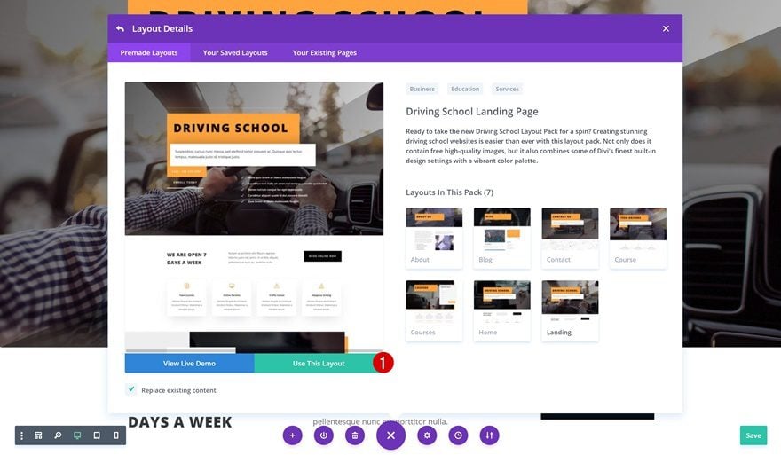
To create this tutorial, we’ll be using the Driver School Layout Pack‘s landing page. So go ahead and add a new page, enable the Visual Builder and choose the landing page from your premade layouts.
Create Animated Title #1
Change Section Gradient Background
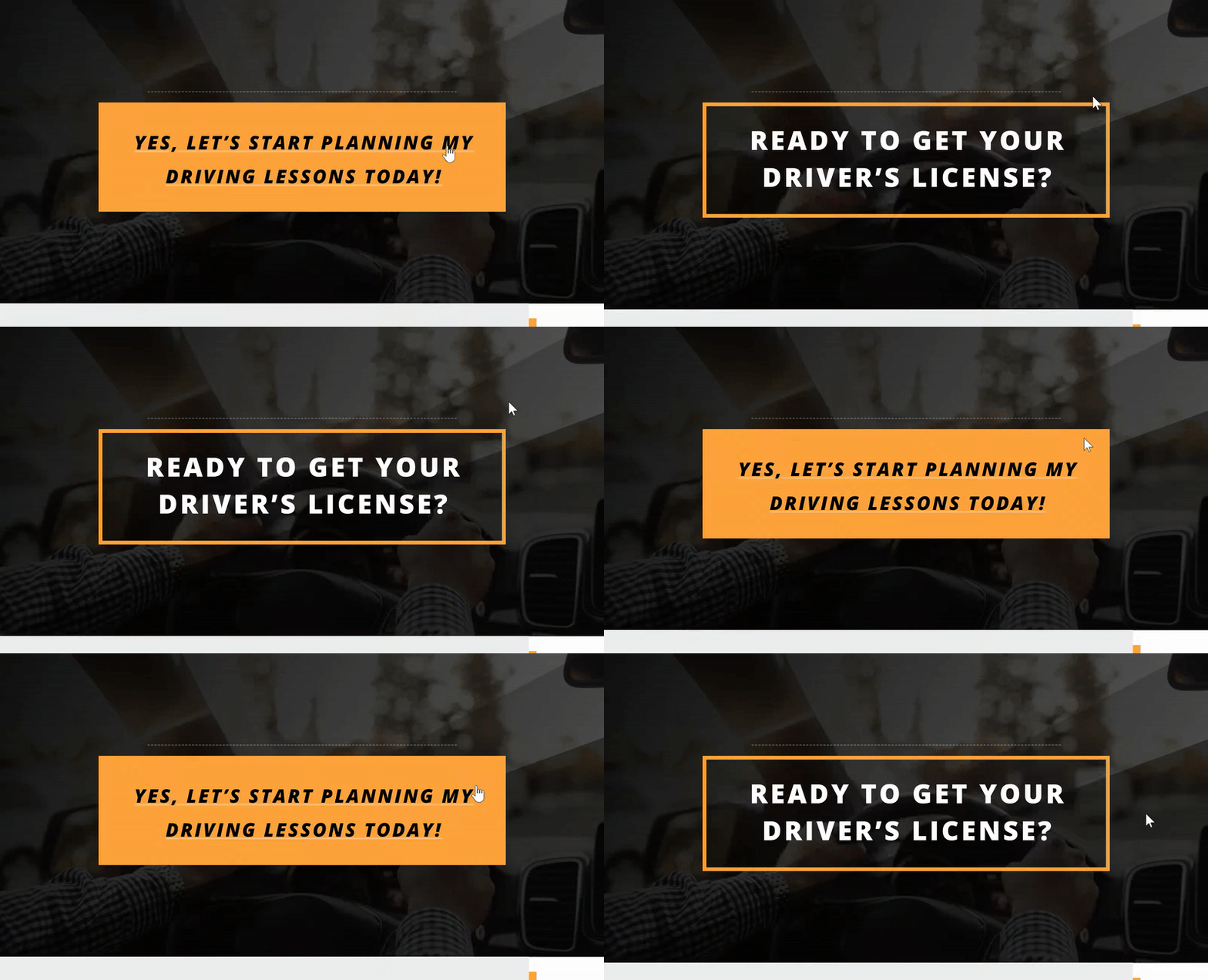
Let’s start building the first example! We’re adding this animated title to the hero section of our page. But before we get there, open the settings of your hero section and change the gradient background overlay colors.
- Color 1: rgba(0,0,0,0.94)
- Color 2: rgba(12,12,12,0.63)
Remove Two Last Rows in Hero Section
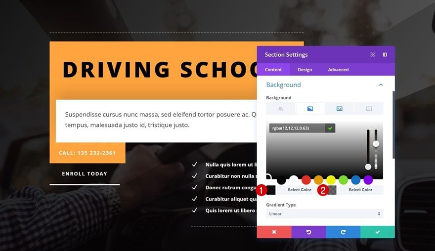
Continue by removing the two last rows in the section.
Change Divider Alignment
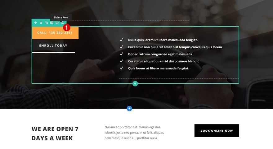
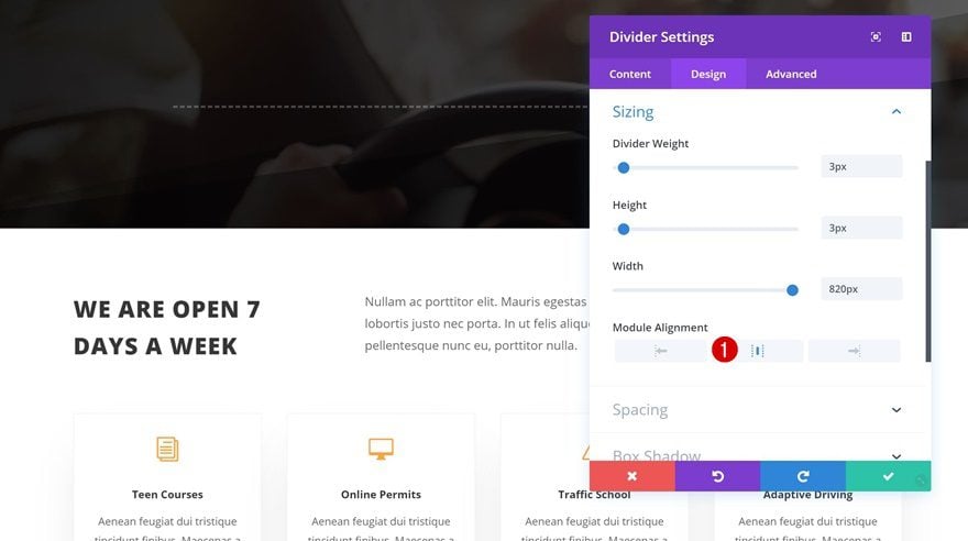
We’re keeping the row that is still there. The only thing we need to change is the module alignment of the Divider Module.
- Module Alignment: Center
Add New Row
Column Structure
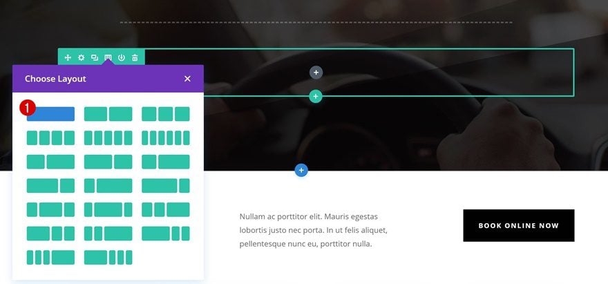
Right below the previous row, go ahead and add a new row using the following column structure:
Spacing
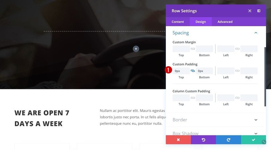
Remove the default custom padding of the row next.
- Top Padding: 0px
- Bottom Padding: 0px
Add Text Module to Column
Add Content
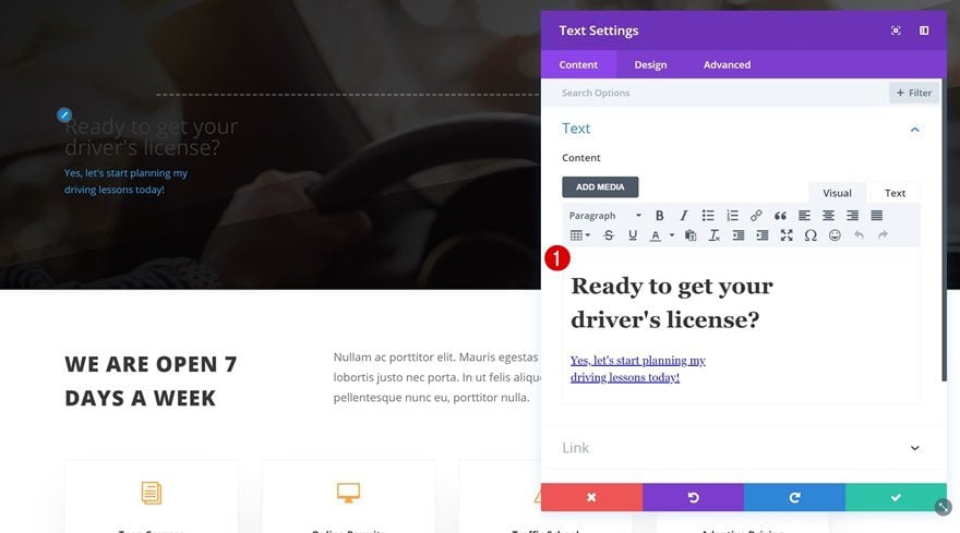
The only module we’ll need is a Text Module. We’re using two different text types: a heading and a paragraph link. Go ahead and add your copy of choice and make sure the copy appears in two lines by pressing shift + enter in the middle of each sentence.
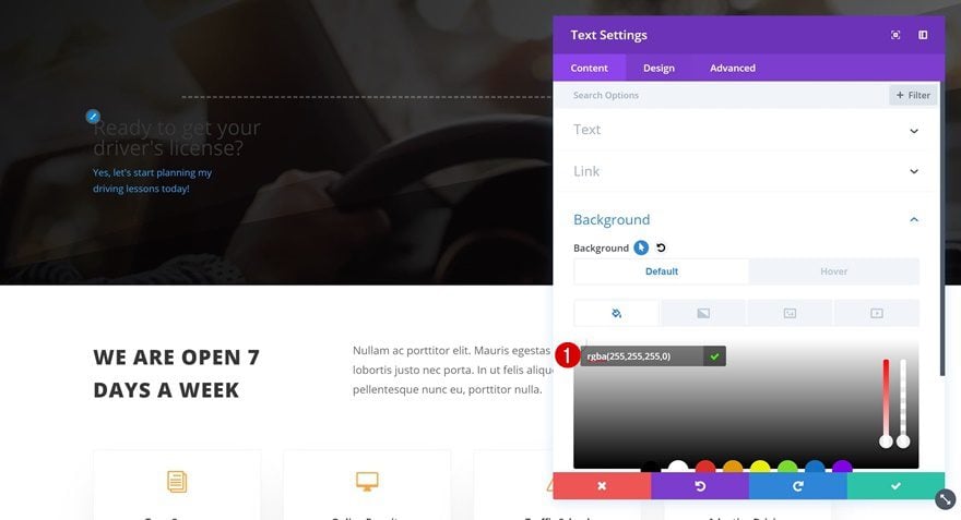
Default Background Color
Then, go to the background settings and add a default background color to the Text Module.
- Background Color: rgba(255,255,255,0)
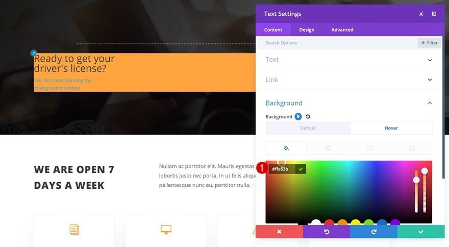
Hover Background Color
Change the background color on hover.
- Background Color: #ffa53b
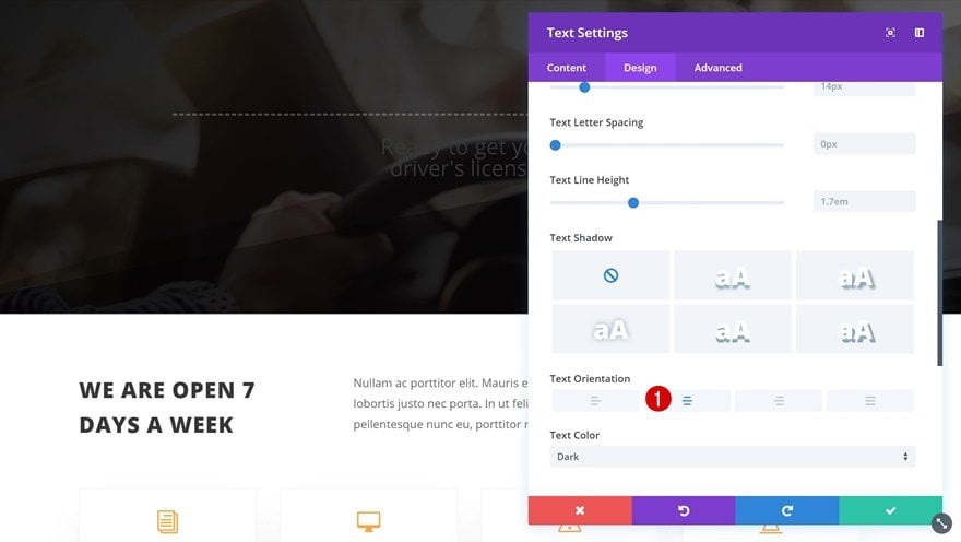
Default Text Settings
Next, change the text orientation in the overall text settings.
- Text Orientation: Center
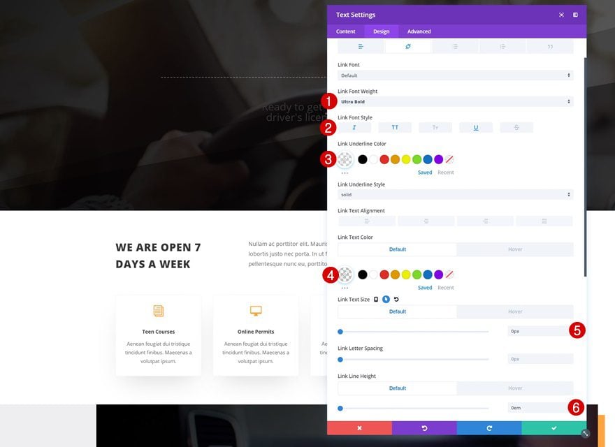
Default Link Text Settings
Switch over to the link tab and make some changes to the link copy’s appearance.
- Link Font Weight: Ultra Bold
- Link Font Style: Italic, Uppercase, Underline
- Link Underline Color: rgba(255,255,255,0.3)
- Link Text Size: 0px
- Link Line Height: 0em
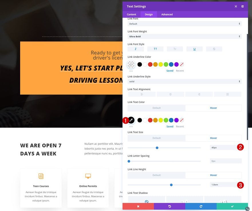
Hover Link Settings
Make some changes on hover next.
- Link Text Size: 40px
- Link Line Height: 1.8em
Default Heading Text Settings
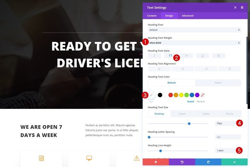
Make some changes to the heading text settings as well.
- Heading Font Weight: Ultra Bold
- Heading Font Style: Uppercase
- Heading Text Color: #ffffff
- Heading Text Size: 70px (Desktop), 40px (Tablet), 30px (Phone)
- Heading Line Height: 1.4em
Hover Heading Text Settings
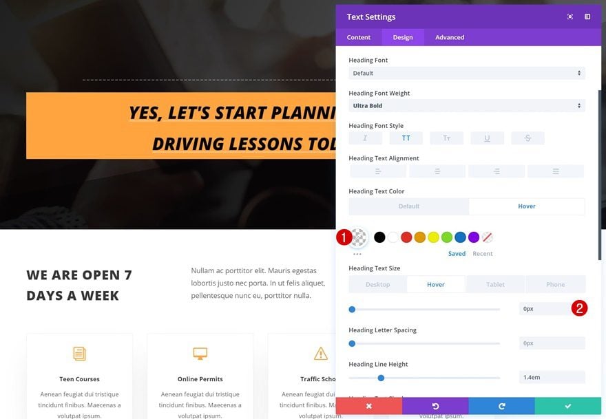
With some small tweaks on hover.
- Heading Text Color: rgba(255,255,255,0)
- Heading Text Size: 0px
Default Spacing
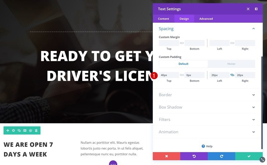
Continue by going to the spacing settings and adding some custom padding values.
- Top Padding: 40px
- Bottom Padding: 0px
- Left Padding: 20px
- Right Padding: 20px
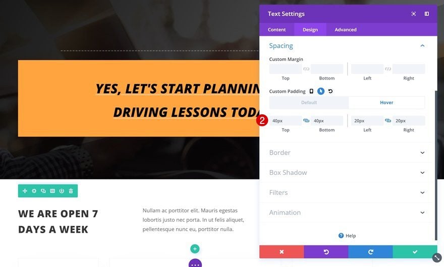
Hover Spacing
The custom padding values differ a little on hover.
- Top Padding: 40px
- Bottom Padding: 40px
- Left Padding: 20px
- Right Padding: 20px
Border
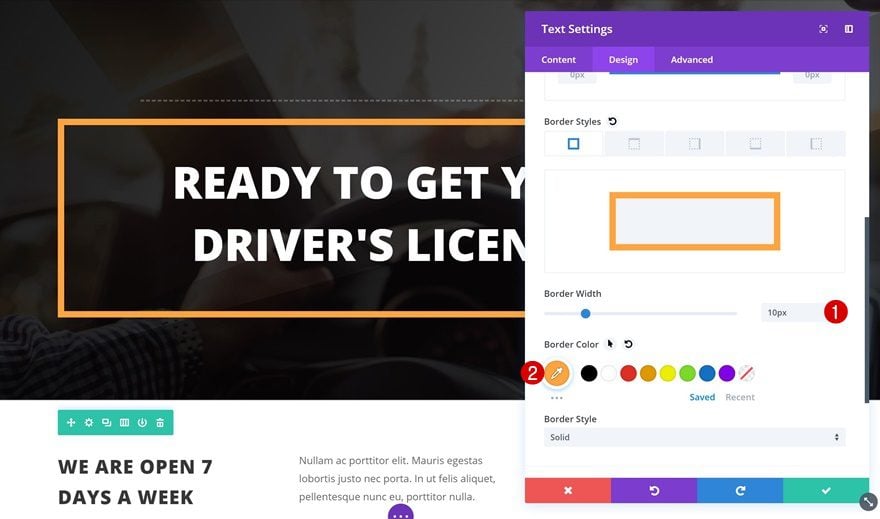
We’re using a border as well.
- Border Width: 10px
- Border Color: #ffa53b
Transitions
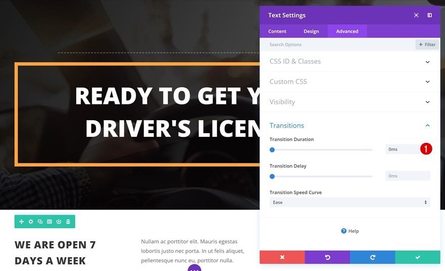
And add a fast transition by changing the transition duration in the advanced tab.
- Transition Duration: 0ms
Create Animated Title #2
Add New Section
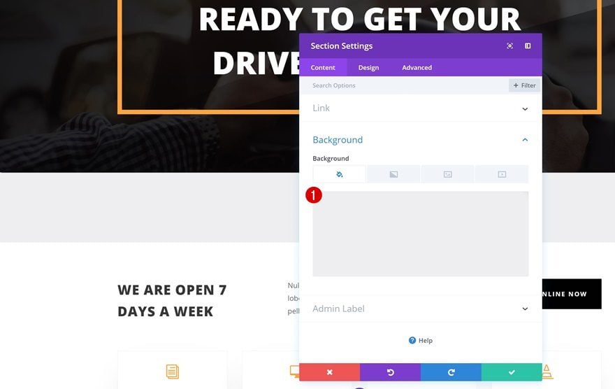
Background Color
On to the next example! Add a new section right below the hero section and add a background color.
- Background Color: #efefef
Spacing
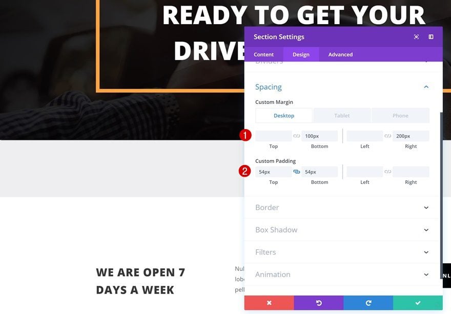
Then, go to the spacing settings and play around with the different margin and padding values.
- Bottom Margin: 100px
- Right Margin: 200px (Desktop), 100px (Tablet), 50px (Phone)
- Top Padding: 54px
- Bottom Padding: 54px
Box Shadow
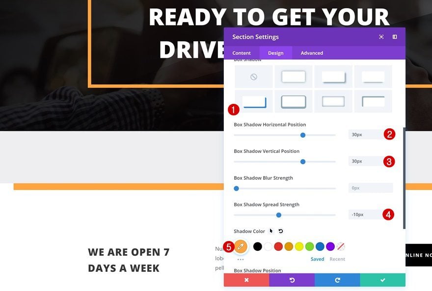
To match this section to the layout pack, we’re adding a subtle box shadow as well.
- Box Shadow Horizontal Position: 30px
- Box Shadow Vertical Position: 30px
- Box Shadow Spread Strength: -10px
- Shadow Color: #ffa53b
Add New Row
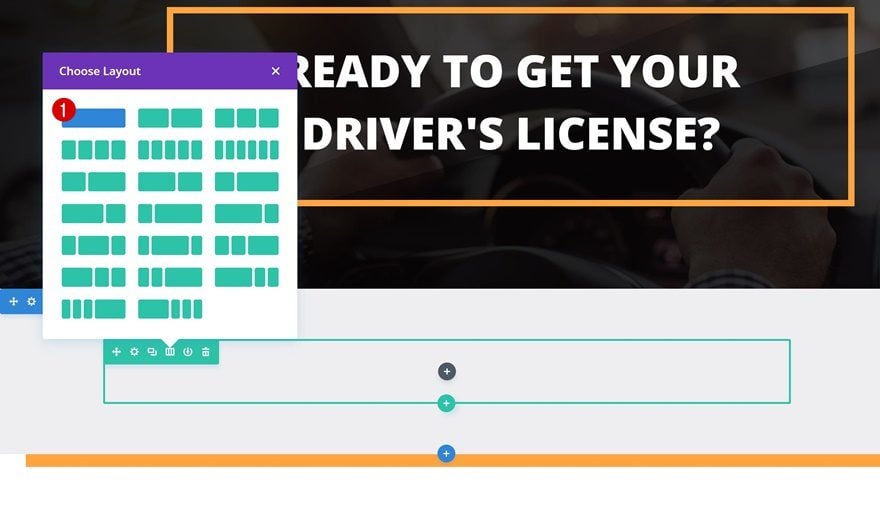
Column Structure
The row we’re adding to this section needs the following column structure:
Add Text Module
Add Content
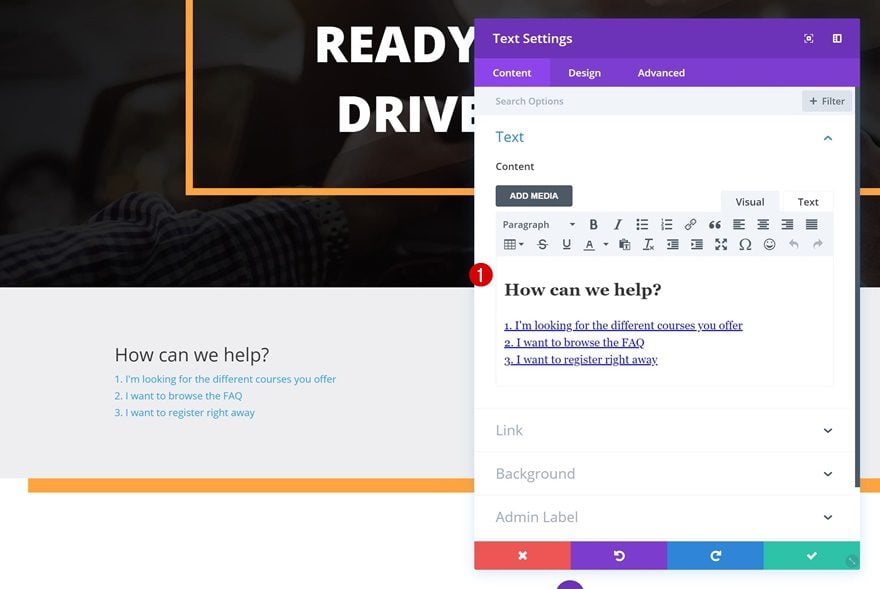
Add the content of your choice using a heading and paragraph link once again. We’re also making use of a list that’ll help visitors to easily navigate through different parts of the website.
Default Link Text Settings
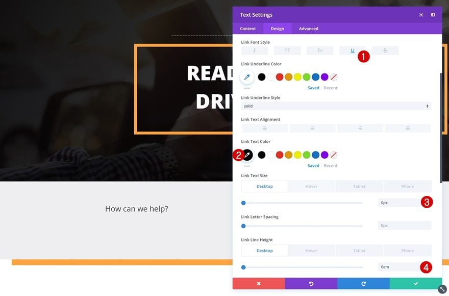
Go to the link text settings and make some changes to the link copy’s appearance.
- Link Font Style: Underline
- Link Text Color: #000000
- Link Text Size: 0px (Desktop), 20px (Tablet), 13px (Phone)
- Link Line Height: 0px (Desktop), 1.8em (Tablet & Phone)
Hover Link Text Settings
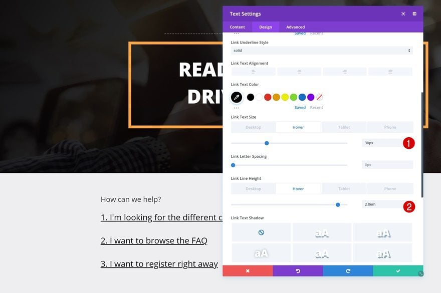
Make some small tweaks on hover.
- Link Text Size: 30px
- Link Line Height: 2.8em
Default Heading Text Settings
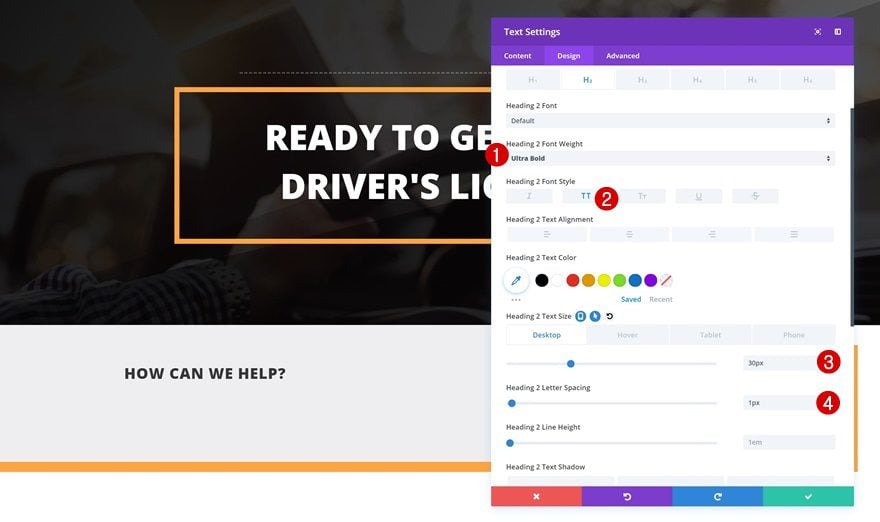
The heading you’ve chosen needs to be modified as well.
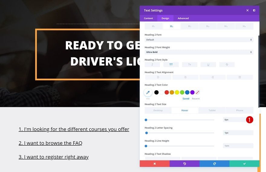
- Heading 2 Font Weight: Ultra Bold
- Heading 2 Font Style: Uppercase
- Heading 2 Text Size: 30px (Desktop & Tablet), 20px (Phone)
- Heading 2 Letter Spacing: 1px
Hover Heading Text Settings
Change the text size on hover.
- Heading 2 Text Size: 0px
Default Spacing
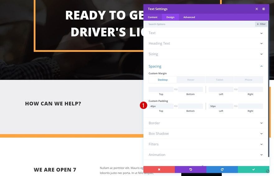
Continue by going to the spacing settings and adding some custom margin and padding values.
- Left Margin: 0px (Desktop, Tablet & Phone)
- Top Padding: 40px
- Left Padding: 50px
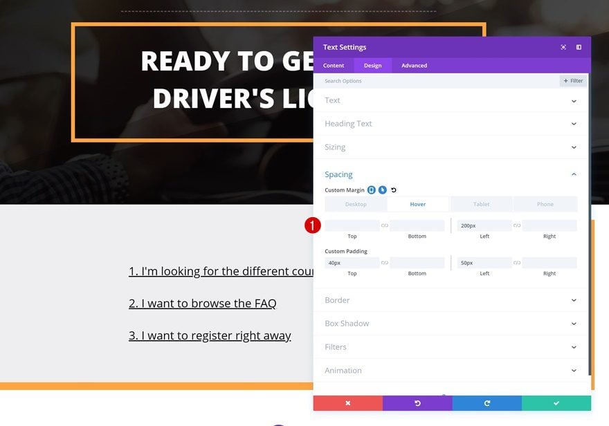
Hover Spacing
Change the left margin on hover.
- Left Margin: 200px
Default Border
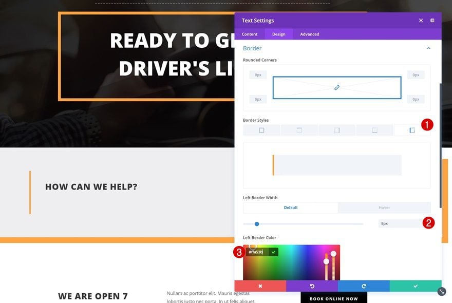
Next, add a left border to the Text Module.
- Left Border Width: 5px
- Left Border Color: #ffa53b
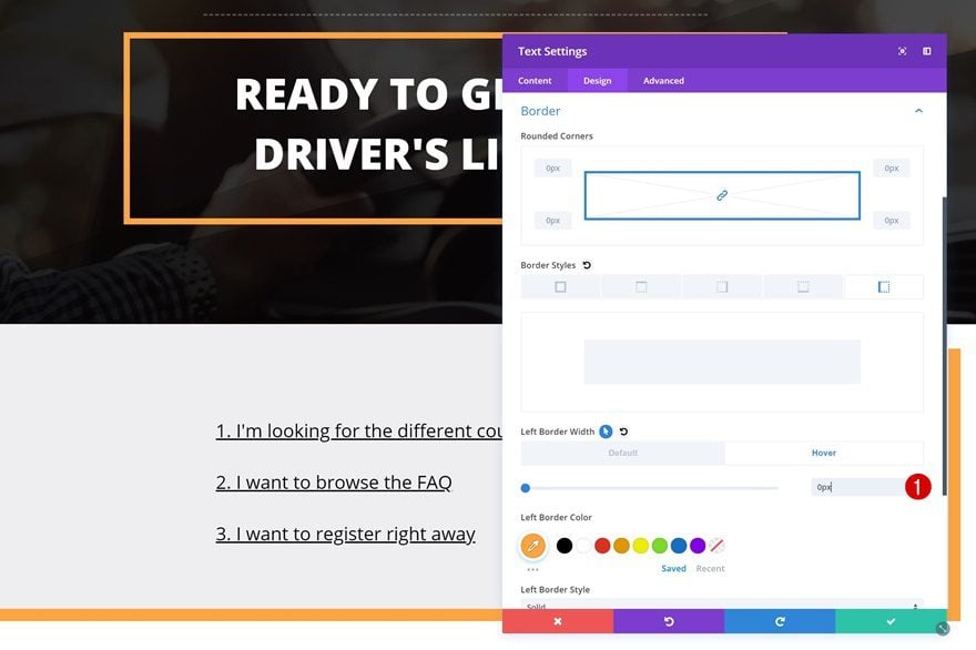
Hover Border
Remove all the border width on hover.
- Left Border Width: 0px
Transitions
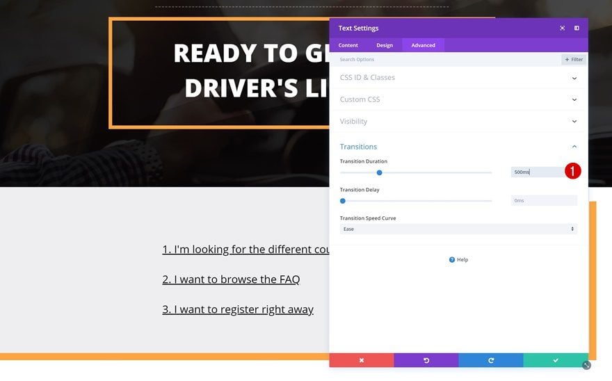
Last but not least, create a smooth transition by using a slightly higher transition duration.
- Transition Duration: 500ms
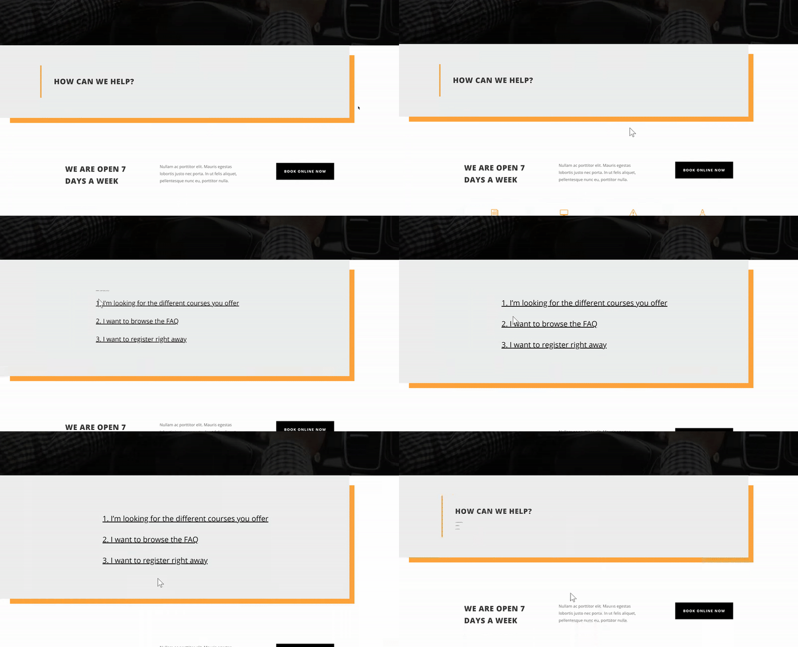
Preview
Now that we’ve gone through all steps, let’s take a final look at the end result.

Final Thoughts
In this use case post, we’ve shown you how to create animated titles on hover using Divi’s built-in options only. This is a great way to put specific parts of your copy in the spotlight and trigger action from visitors in a creative way. If you have any questions, make sure you leave a comment in the comment section below!
The post Creating Animated Titles Using Divi’s Hover Options appeared first on Elegant Themes Blog.
