In this post, I will be featuring some exemplary Divi websites from our community members. Every month we enjoy viewing all of your Divi design submissions, and today I’m excited to share with you the top ten websites for this month. I’ve highlighted some of the standout features for each throughout the post.
Enjoy!
The Best Community Divi Site Submissions for August 2017
1. Carolyn Scarrow
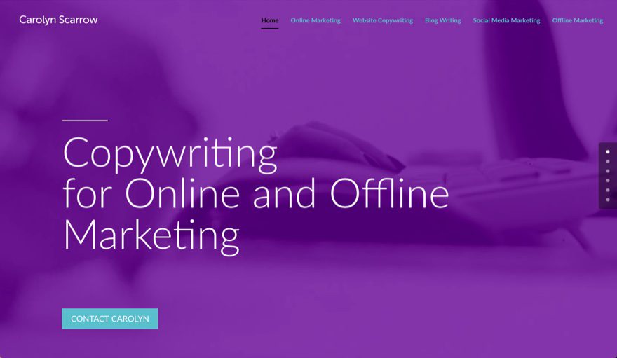
This website was submitted by Peter Dean. The unique use of color and subtle background video on the header adds a soft professional feel that I really like. Also the typing effect used for headers is a real attention grabber.
2. Real Hound
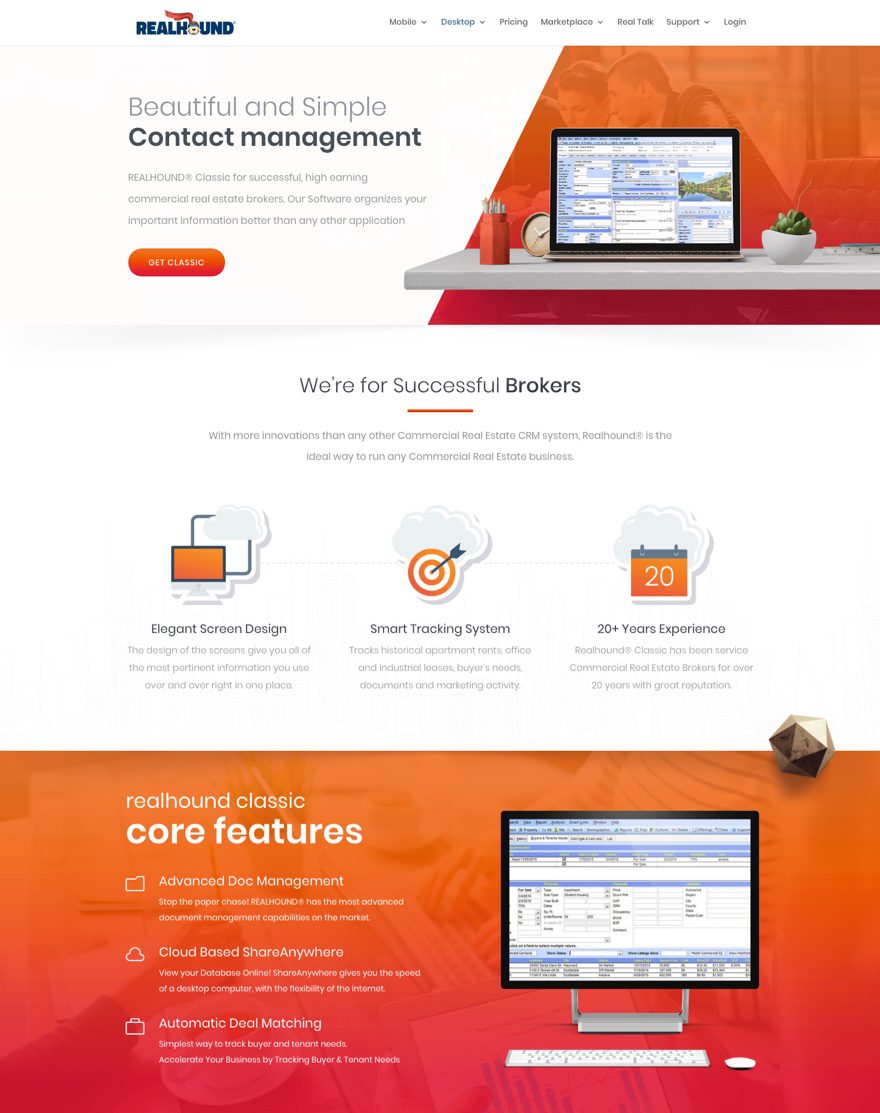
This website was submitted by Gayan Zmith. The desktop sales page is a refreshing example of how to use color gradients like a professional. The icons, divider lines, buttons and even some text all use a matching gradient color scheme. The attention to detail really makes this page pop.
3. Fitness Genes
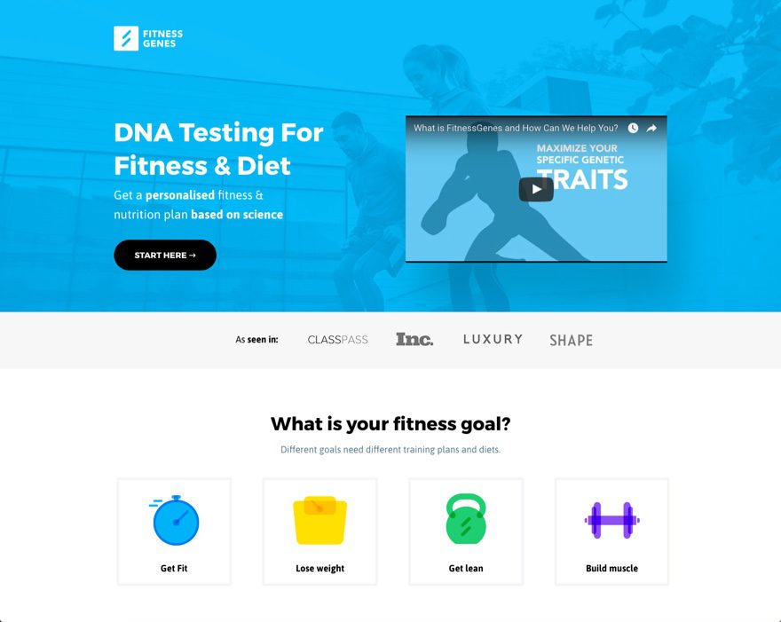
This website is credited to Yash (Designer) and George (Coder). Bold colors on a light background is a sure way to make you content stand out, and this site uses this deadly combo well. I also love the use of the icons to guide the user toward a clear call to action on the homepage.
4. Atelier Luxe
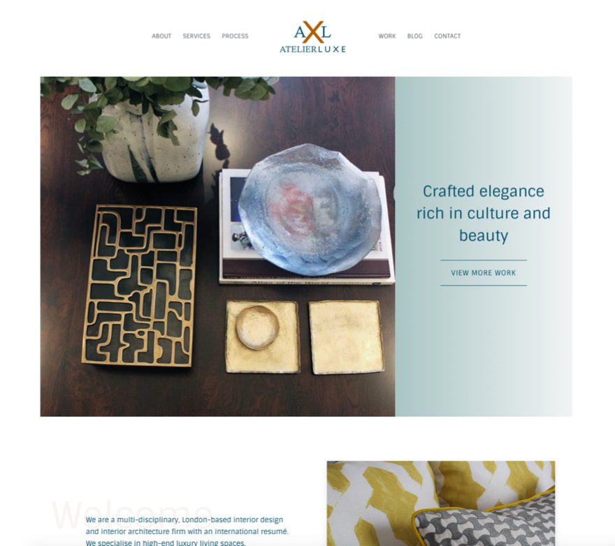
This website is credited to RoyalFound or Usama & Enes. In this minimalist site, the pictures do a great job of showcasing the product. Also, the text is easy to read because of the purposeful spacing. The large faded text in the background of the paragraphs are a nice touch as well.
5. Two Blue Toucans
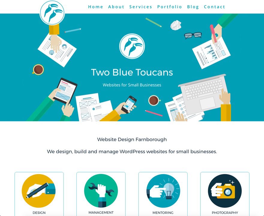
This site is submitted by Clark Morton. I really like the fixed header on this site. The overhanging logo works really well here. And the combination of large text with a short fixed header makes the menu easy to read and less destracting when scrolling through page content. The soft colors and the animated graphics also work well to add personality to the site.
6. ML Studios
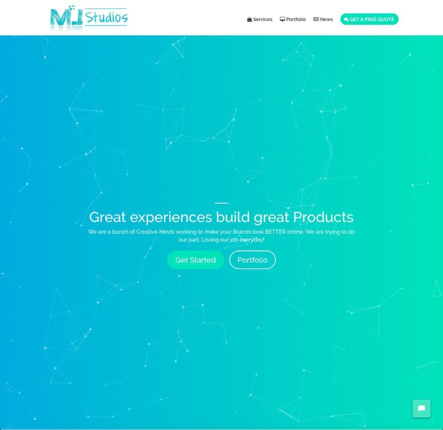
This website was submitted by Mansoor Jadoon. The moving particles in the header background provide a unique techy feel. The 3D flipbox animation on the service area boxes on the homepage are also a nice touch.
7. A Girl and Her Mac
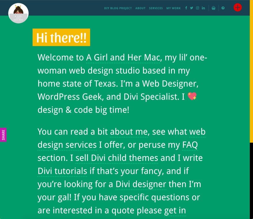
This website was submitted by Leslie Bernal. I chose this site as an example of the power of text in design. This type of text driven design can really engage readers when done correctly. And having the links strategically placed within the content is a effective alternative to traditional navigation in that each link is viewed in context instead of being isolated at the top of the page.
8. Wild Side Design Co.
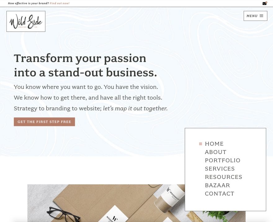
This website was submitted by Kelsey, Founder of Wild Side Design Co. It’s a beautifully designed site and a great example of how to showcase your brand and tell a story. The header fonts, icons, and graphics capture the feel of the “wild side” brand. Plus, the storytelling process throughout each page guides the user both toward brand awareness and action.
9. NY Fold
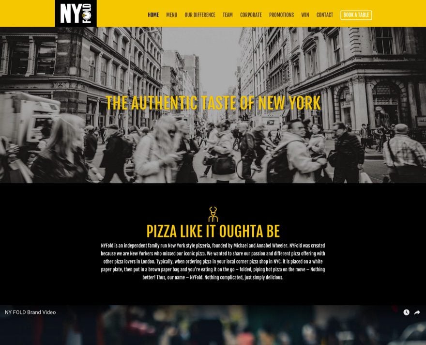
This website was submitted by Neil Bentley. It’s a pizza restaurant site that uses good design to capture the experience of eating pizza in New York. The dark background and consistent use of color work well for the brand.
10. Quantum Staffing
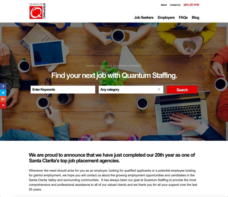
This website was submitted by Mark Wasyl. This is a great example of a hero section (or header). The background image, call to action, and job search form are all crucial elements for the user to get started quickly. A perfect fit for this site in design and functionality.
In Closing
That’s all for this round of the Divi design showcase. Great job everyone! And thanks for your submissions.
If you’d like your own design considered please feel free to email our editor at nathan at elegant themes dot com. Be sure to make the subject of the email “DIVI SITE SUBMISSION”.
We’d also like to hear from you in the comments! Tell us what you like about these websites and if there is anything they’ve done you want us to teach on the blog.
Featured image via justaa / shutterstock.com
The post Divi Design Showcase: New Submissions for August 2017 appeared first on Elegant Themes Blog.
