It’s that time again for our monthly Divi Showcase where we take a look at several awesome Divi websites made by our community members. Each month we showcase the best Divi websites that were submitted from our community and today we want to share with you the top ten sites for the month of December. Throughout the post I’ll point out some of my favorite design elements from each of the websites.
I hope you like them!
The Best Community Divi Site Submissions for December 2017
1. GoApps
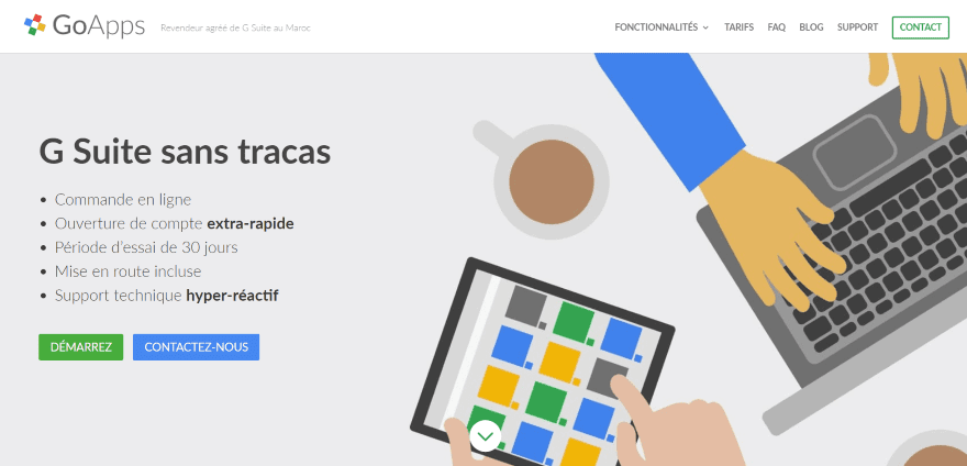
This site was submitted by Wahid Lahlou. The site uses lots of flat graphics, icons, and white space to create a clean layout. I especially like the colorful icons that create the bullet points for services and benefits. Primary colors (or at least gorgeous shades of them) such as red, green, blue, and yellow are used to highlight buttons, section backgrounds, the pricing table, and a number counter. Information is kept within toggles to help keep the design clean.
2. Palma Living
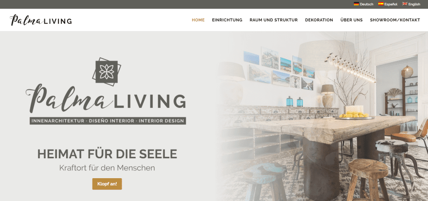
This site was submitted by Reinhard Wedemeyer. The site uses grays and browns that match perfectly with the genre. It uses a blending technique to allow images to blend between modules. This is especially nice in the three blurbs that blend into a full-width image. I also like the multi-column layout designs that display full-column images or CTA’s with multi-column sections. The site makes excellent use of parallax.
3. Makilo
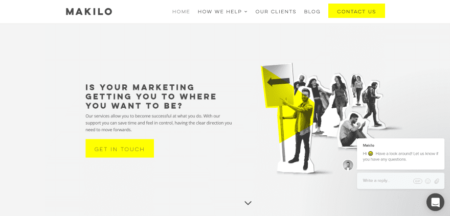
This site was submitted by Patrick Barrington. The website makes interesting use of monochrome (black and white) with yellow highlights. Blurbs create a nice card design that overlaps a yellow background. The client section displays full-color on hover. The team section especially stands out with the full-screen image in monochrome with a full-width strip of yellow. The yellow highlights are continued throughout the website, including the menu, CTA, and buttons, and looks great with the dark gray footer.
4. GRT Insurance

This site was submitted by Nicolle Principe. This one uses an elegant blue with orange and blue/green. The colors work well together. Background images are displayed with true parallax. Extra-large icons make the blurbs stand out. I also like the large typography and buttons. Even with most of the elements going large, they’re given enough breathing room and white space so they don’t feel crowded. The clear section separators give the site an extra level of detail. The images make me want to travel.
5. Itemit
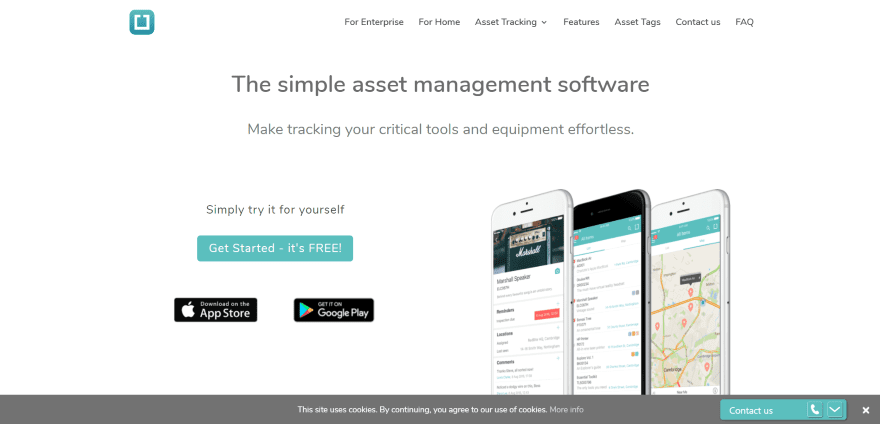
This site was submitted by Ritish Luchan. The site uses a clean layout with blue/green highlights throughout- even within other images. Several pages blend in a medium/light orange that works perfectly with the green. Other pages display information within transparent blurbs, contact forms, etc., over a background with overlay. The site does a great job of presenting information with elegant layouts while giving each section its own space on the page. It includes a clickable phone number that remains on screen.
6. Six Fig Media

This site was submitted by Kevin Geary. The site uses lots of dark backgrounds and overlays, and blue background patterns to highlight text. The cards for services are especially nice, with the title to one side over a background pattern and text on the other over a white background. I like the unique design for testimonials which displays text over background images in two columns. I also like the contact form which displays various fields (with a flip animation) based on the choice you make in a dropdown box.
7. 717 Media
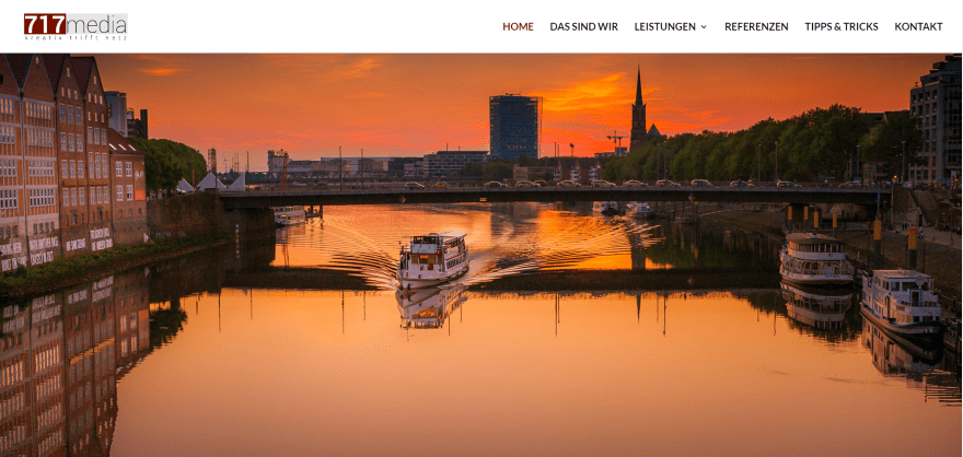
This site was submitted by Eike Muller. I love this warm and inviting header image that flips into place as the page loads. The rest of the site has a strong business focus with alternating white and gray backgrounds that help bring attention to their services and portfolio. Services are placed within the mega menu complete with images for each category. I think my favorite element is the blog post overlays. They include the post number, category, separator line, and title. They look just as good in the sidebars as on the posts themselves.
8. The Goat Locker
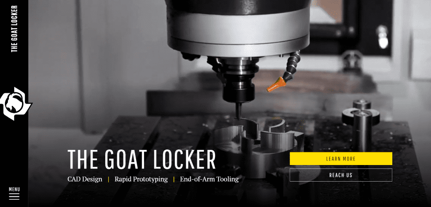
This site was submitted by Jon Langberg. This is one of the most unique Divi sites I’ve seen. The vertical menu places the hamburger menu in the lower left corner. Yellow is the highlight color throughout the website and looks great against the black. The bottom right corner forms a yellow button on scroll. A vertical line down the middle of the site connects icons that overlap the two rows. The site includes lots of small animations and highlights that never get in the way of the design. The site makes excellent use of color and large typography.
9. Tint Yoga
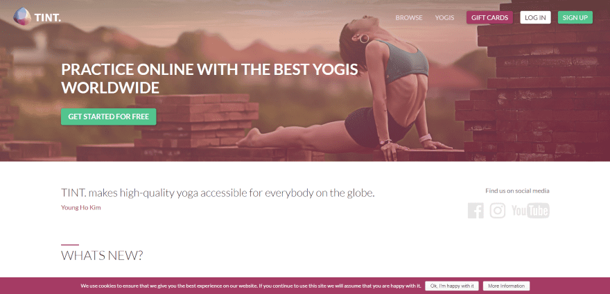
This site was submitted by Mike Brawanski. I love the gradients in this website. The site uses a red gradient overlay on each of the images and in the background of a few sections to highlight text and make the images stand out. The same red is used for small highlights such as a line above section titles, links, and even for one of the CTA buttons within the menu. The layout is clean and the What’s New section uses a magazine layout. I like the plans that look like blog cards. The site makes great use of color.
10. De Plekkenmakers
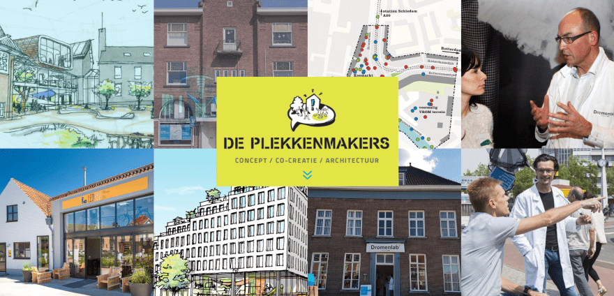
This site was submitted by John-Pierre Cornelissen. The header displays an image grid that’s slowing changing. They display a title on hover so you can easily know what they refer to. The logo and tagline are placed in the center and overlaps the images. Full-screen sections use either blue or yellow for the background (matching the secondary menu and primary menu that displays on scroll). The blog section takes the full width of the screen, which is unique for blog sections. The blue and yellow branding are done well and are memorable.
In Closing
That’s our 10 best community Divi site submissions for December. These websites look amazing and as always we want to thank everyone for your submissions!
If you’d like your own design considered please feel free to email our editor at nathan at elegant themes dot com. Be sure to make the subject of the email “DIVI SITE SUBMISSION”.
We’d also like to hear from you in the comments! Tell us what you like about these websites and if there is anything they’ve done you want us to teach on the blog.
Featured image via art4all / shutterstock.com
The post Divi Design Showcase: New Submissions from December 2017 appeared first on Elegant Themes Blog.
