DIVI Carousel Module is a third-party plugin for Divi and Extra that adds an advanced carousel slider to the Divi Builder. You have control of almost everything in the module to create just about any type of carousel you need for your Divi or Extra website. In this article, we’ll take a look at Divi Carousel Module and see what it can do and how easy it is to use.
Divi Carousel Module Installation and Activation
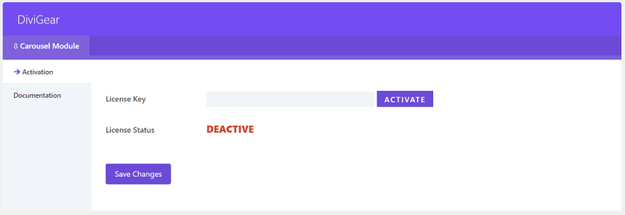
Upload and activate the plugin as normal. A new menu item is added to the dashboard called DiviGear. Go into this menu and add your license key.
Divi Carousel Module in the Divi Builder
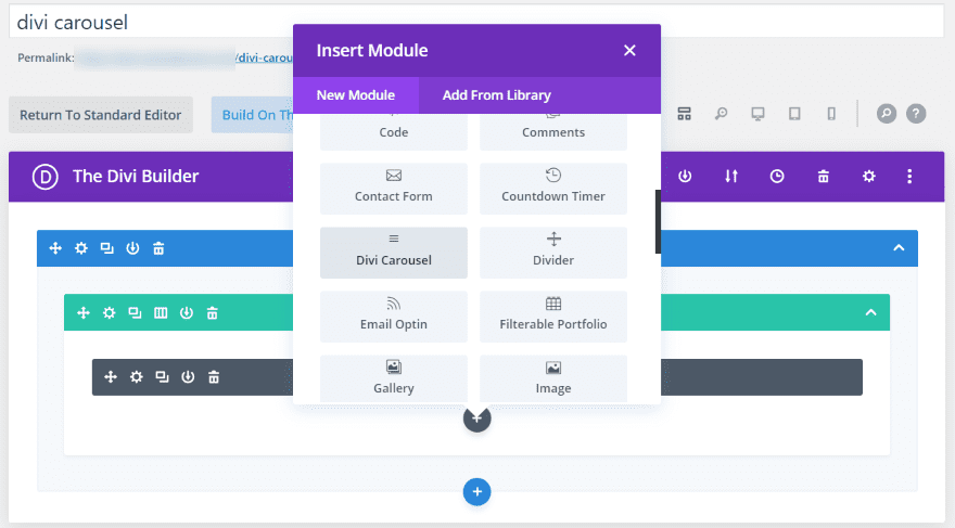
A new module is added to the Divi Builder called Divi Carousel.
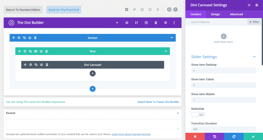
The module includes an area to add new items. The Content tab has the slider settings, which lets you choose how many slides to show based on the device the user is using, enable multislide, set the transition duration, etc. Enable center slide, loop, autoplay, arrow navigation, and dot navigation. Set item spacing, enable equal height, and vertical alignment. Advanced settings let you choose the slider effect.
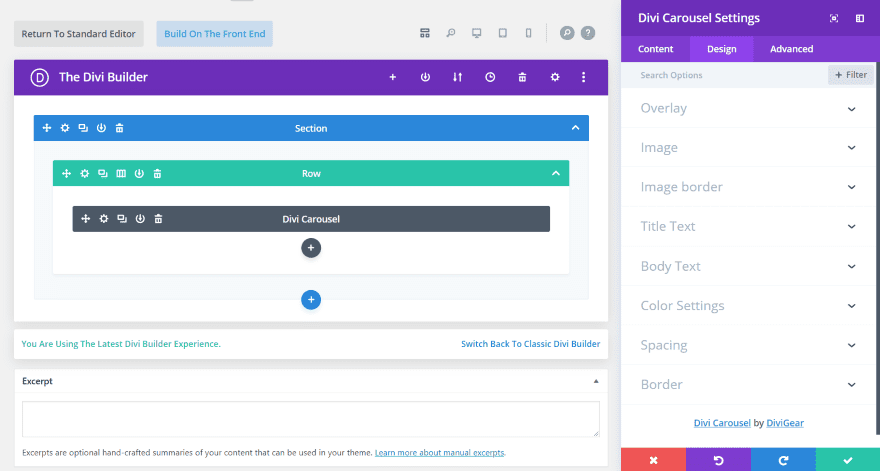
The Design tab includes settings for the overlay, image (width), image border, title and body text, color, spacing, and border. This includes color customizations for both the arrow and dot navigation.
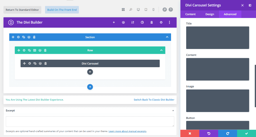
The Advanced tab has all of the CSS fields you’d expect, plus settings for visibility, and transition. It adds CSS fields for the title, content, image, and button.
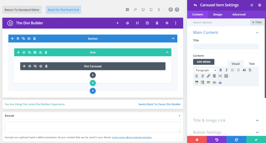
The Carousel Item Settings also includes the three tabs. These settings override anything that’s set in the main module settings. The Content tab has an area for the main content, title and image link, button settings, image settings, and background.

The Design tab includes settings for the title text, content style (body text), button, spacing, and box shadow. These are the standard design settings you’d see in most Divi modules. The Advanced tab is the basic settings found in most modules.
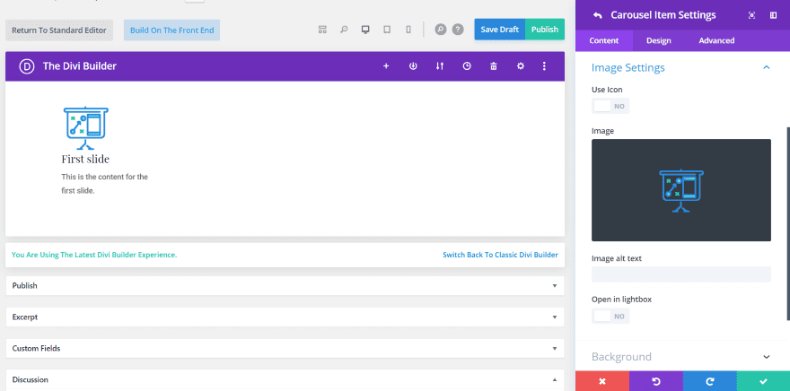
For the image settings, you can use images or icons.
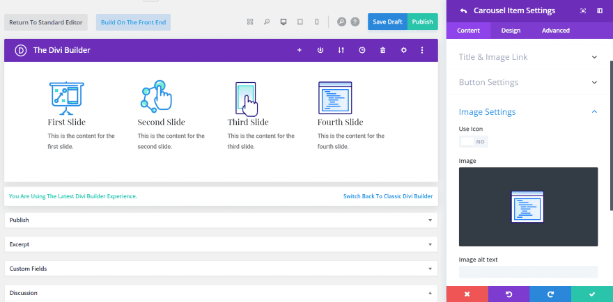
Add as many slides as you want. The slides show side by side according to the number that you’ve set to display. This one is set to display four. Of course, you can drag and drop them in any order you want.
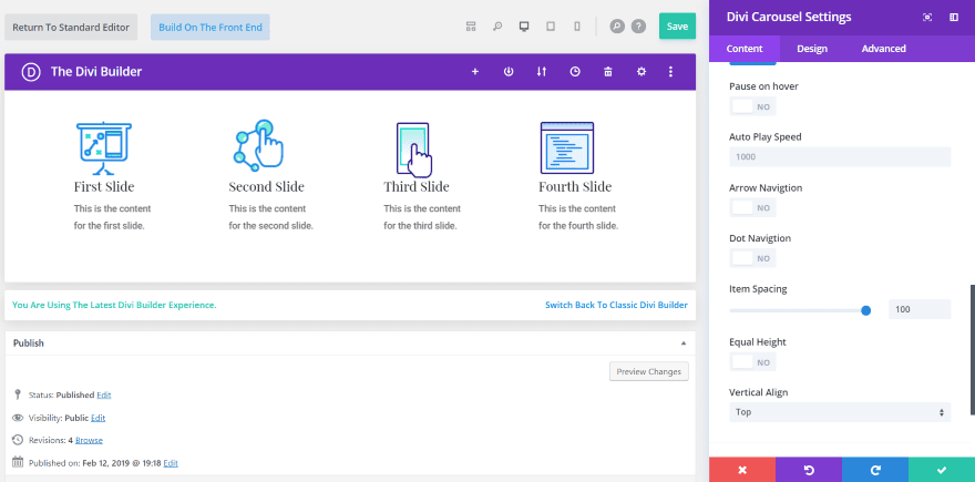
In this one, I’ve adjusted the item spacing to 100. The main difference that shows in my example is the text. It now displays fewer words per line.
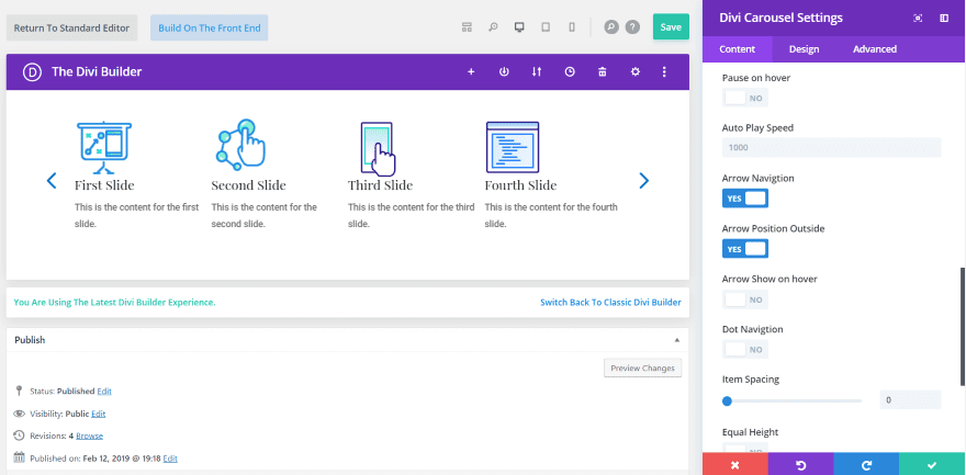
This one uses arrow navigation. I’ve set it to show on the outside of the slide. I’ve set the item spacing to 1. It’s more obvious if you use background colors.
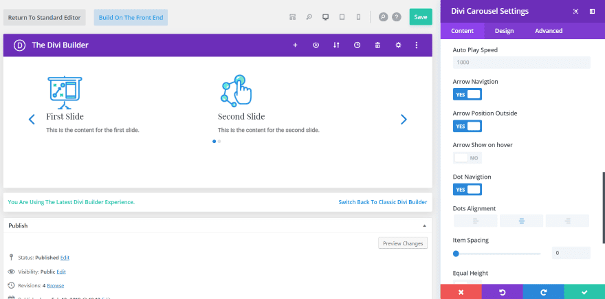
I’ve set this one to show two slides. It’s showing dot navigation.
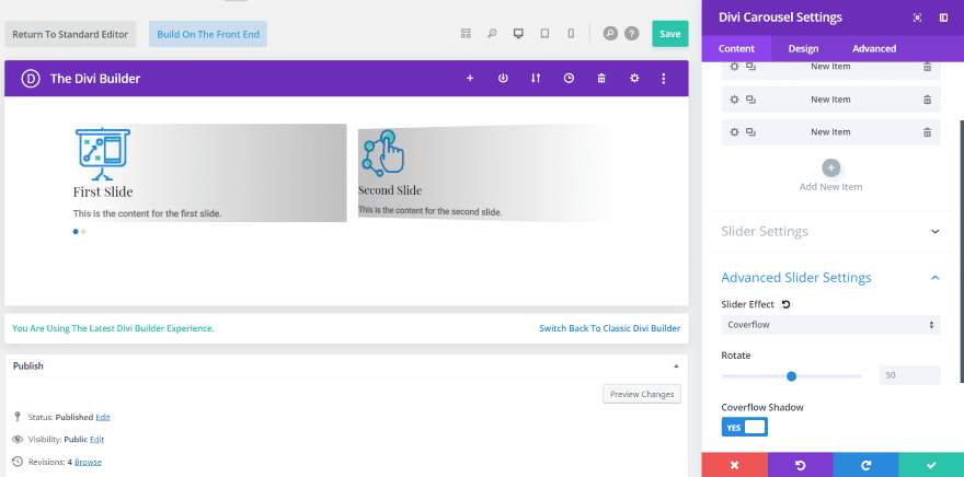
Here’s a look at the advanced settings. I’ve set the slider effect to Coverflow. This opens a rotate and a shadow option. This feature shows what really sets the module apart from a standard slider. This is the default settings.
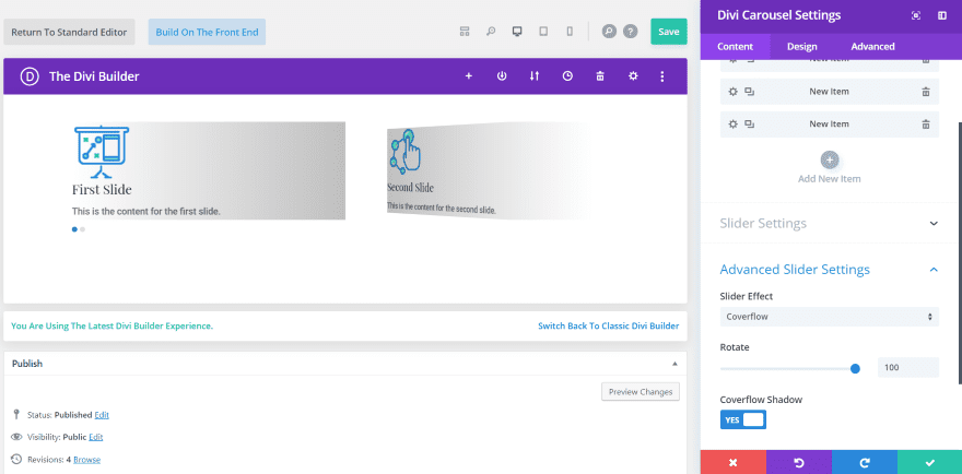
Now I’ve set the rotate to 100. The slides are tilted even more 3D toward the left side, away from the screen.
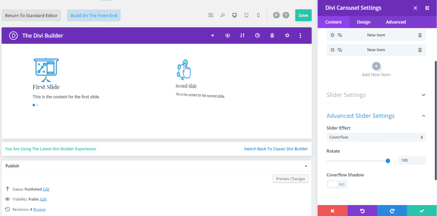
Here’s the same rotation but without the Coverflow shadow.
Divi Carousel Module Examples
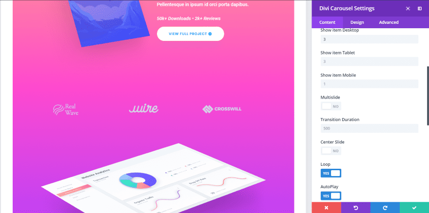
One of my favorite uses for a carousel is to show logos of clients or products. For this example, I added the module to the portfolio page of the App Developer Landing Page. I’ve set it to show 3 company logos, to loop the scroll, and to autoplay so the visitor doesn’t need to navigate through them.
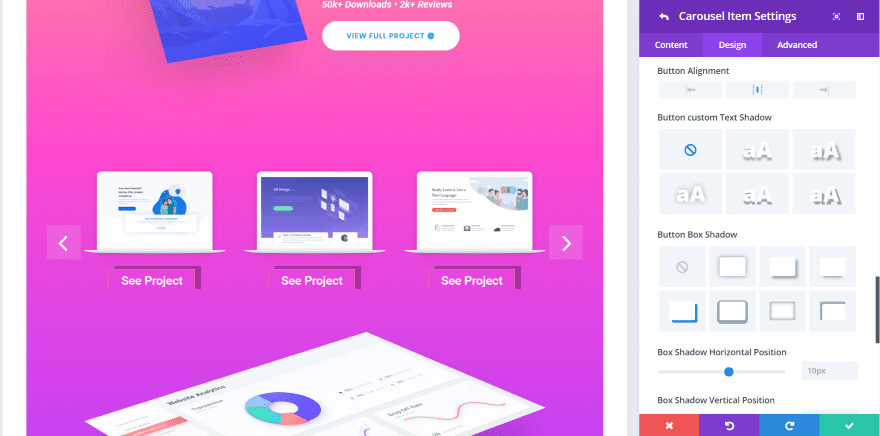
It also works to show projects you’ve worked on. For this one, I’ve added several projects with buttons so the visitor can see the project. I’ve changed the button’s text color to white and added a box shadow to the button. I made the arrows white and set the opacity of their background to almost transparent.
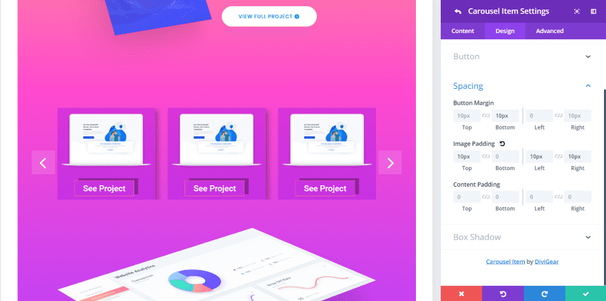
Here, I’ve added a background to the slide, made it semi-transparent, and added box shadow. Spacing includes the button, image, and content padding. I’ve added spacing to the button and image.
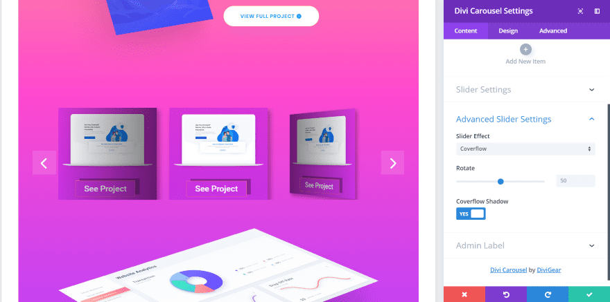
This one uses the Overflow slider effect. This is the default settings.

For this one, I’ve set it to center the slide. When used with the Overflow settings, it centers the middle slide and angles the slides on both sides to face each other. It’s set to display four slides.

This one is set to display 3 slides. I’ve set the Rotate to 80.

This one is set to display 6 slides. Rotate is set to default (50).
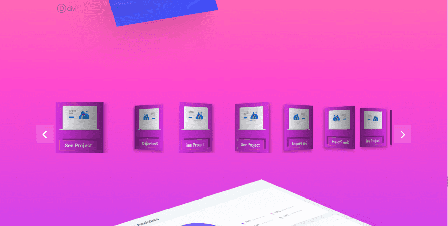
This one shows 6 slides without Center Slide or Overflow enabled.

This one shows 6 with Center Slide enabled.
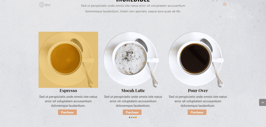
For this example, I’m using the module as a food menu slider. By adding an image, text, and a button it actually creates a slider of blurbs. The images are set to 100 width. I’ve added an overlay, a button to purchase each item (the button takes you to the product page for the item), and dot navigation. I’ve styled the overlay and the overlay icon as well as the dots for both the active and non-active slides. It fits perfectly within the Coffee layout.
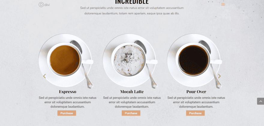
For this one, I’ve added arrow navigation and styled it to match the buttons. I have it to show the arrows on hover. You can set the arrows inside or outside the slider and change their color. You can’t change their size in the module’s settings.
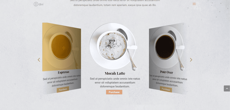
This one uses the Coverflow effect. I’m hovering over the left slide to show the overlay and arrows.
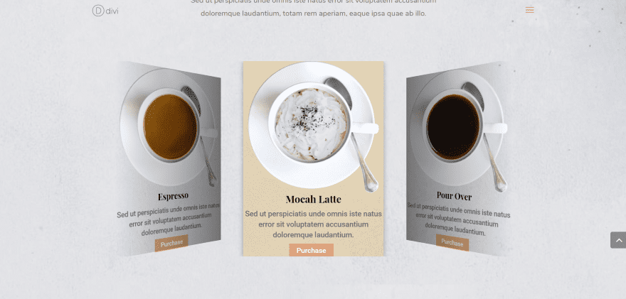
For this one, I added a background and box shadow to just one of the slides. This can be used to show what’s on sale or highlight the best deal.
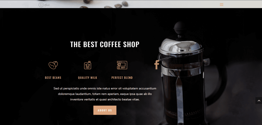
For this one, I’m using only icons. I placed the module next to a set of blurb modules and setup 6 social media links. They’re styled to match the blurbs. Clicking the icon opens the social network. I’ve set it to slide every second automatically.
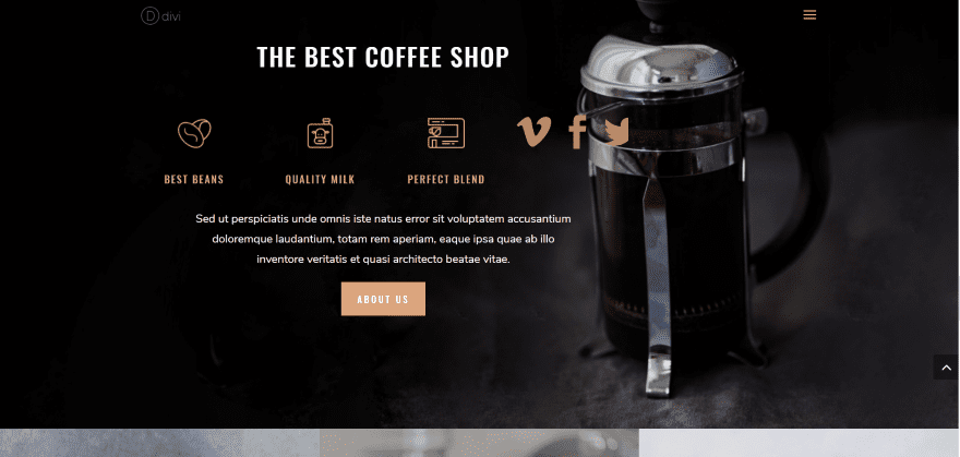
Showing multiple slides cuts off part of an icon, which gives a good visual as the slider animates.
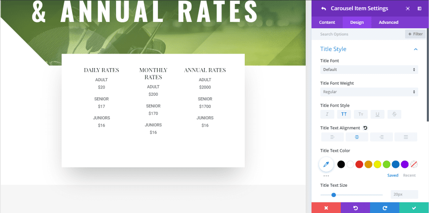
For this example, I wanted to build a simple pricing table slider. I simplified the prices from the Golf Course layout pack.
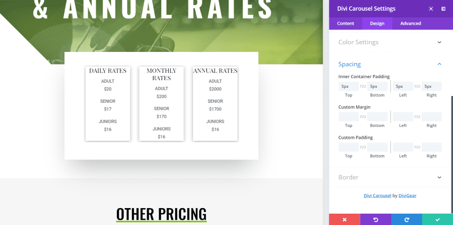
Now I’ve added box shadow. At first, I wasn’t able to get the vertical shadow to go below the slide. Then I realized that the slides were touching the sides of the module’s container. I added module padding and I could then add box shadows on all sides of the slides.
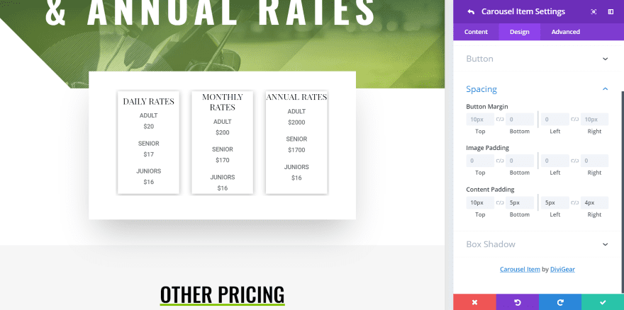
You can also adjust button, image, and content padding for each slide individually. In this example, I’m adjusting the padding for the slide on the left.
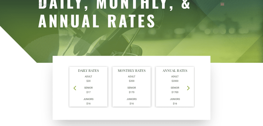
I’ve added arrows and styled them to match elements in the layout.
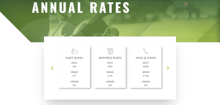
For this example, I’ve added images, changed the box shadow, and added a little more content padding so the box shadow shows fully. I’ve also moved the arrows to the outside of the slides.
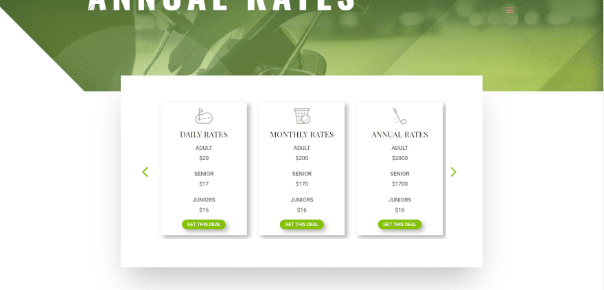
Now I’ve added a button. I’ve adjusted the button styles including colors, border radius, text size, and added a box shadow that matches the slides.
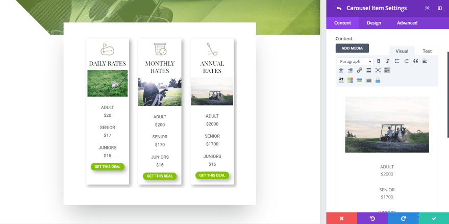
Of course, since the module includes a content area you can add any type of content you want including media. I’ve added images that match the layout. All of the content is placed under the title. The images look great in this location.
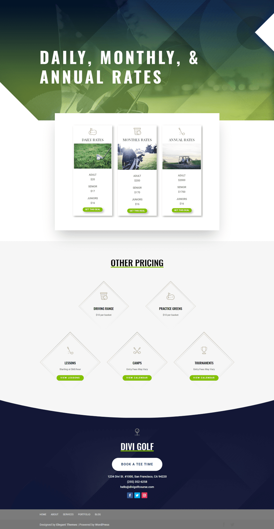
Here’s how the module looks within the Golf Course layout. The original layout had a lot of pricing features. Using the Divi Carousel Module, all of the pricing is still there but it’s shown within the slides. It looks like it belongs in this layout.
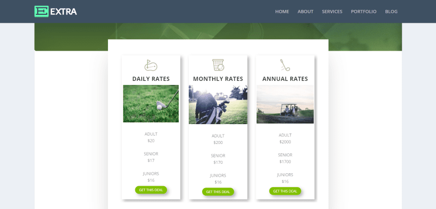
It also works great with Extra. In this example, I’ve set the page to not show a sidebar.
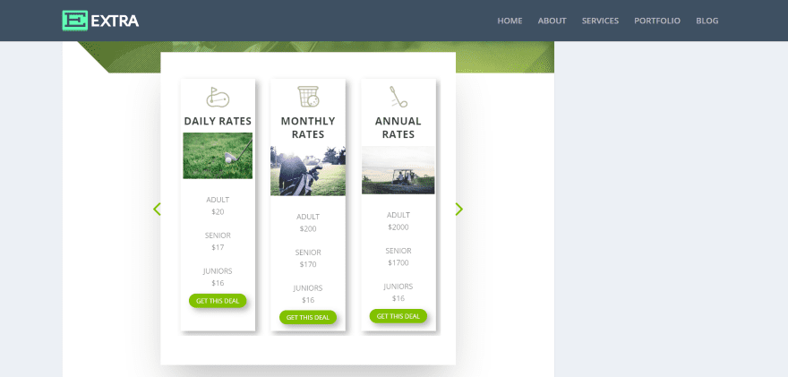
Here’s how it looks with a sidebar (although I haven’t added any widgets for the sidebar, the size is the same). You can see here that the module is responsive.
Divi Carousel Module Price
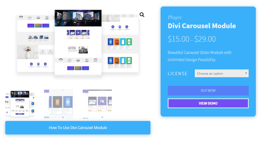
The Divi Carousel Module is available from the developer’s website. There are two options available:
- Single site – $15
- Unlimited sites – $29
Divi Carousel Module Documentation and Support
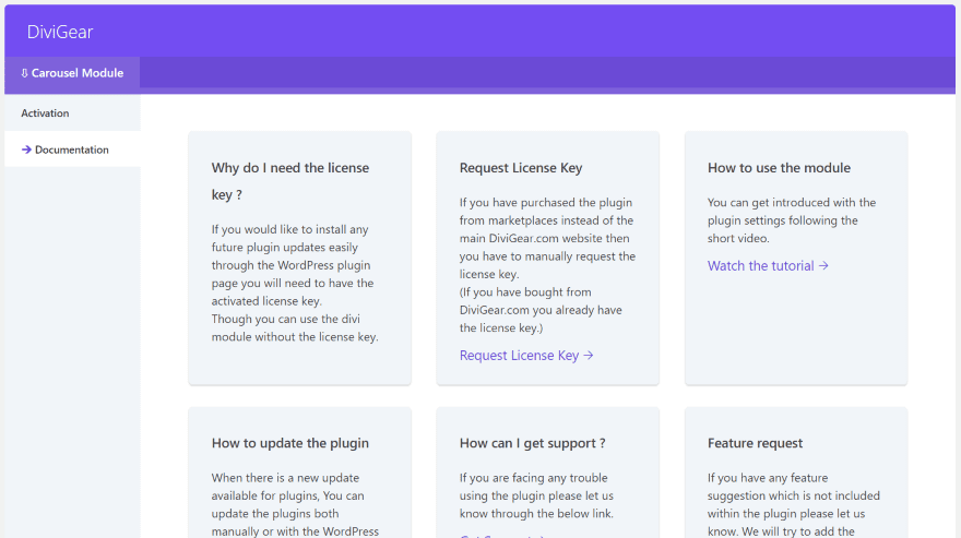
Documentation is available within the DiviGear dashboard menu. Select the Documentation tab. This provides links to a 4-minute video walkthrough on the DiviGear YouTube channel. Ticket support is provided through Freshdesk.
Ending Thoughts
The Divi Carousel Module is an easy way to add a carousel slider to the Divi Builder. It’s intuitive and actually has more customizations than I expected. There were a few times I couldn’t clone a slide correctly, but that might have been a problem on my end. I’d like to see the title you give the slide to be what shows as the name of the item within the module. Currently, they’re all named “Carousel Item”, which makes it difficult to tell them apart.
I like that it has images, content, and buttons separately. This allows you to create cards, blurbs, images, text, show icons, or anything you need to show in a slider. You can add an image to the top of the slider and still be able to add more to the content area.
Divi Carousel Module is an excellent carousel slider. It’s available from the developer’s website and in the Divi marketplaces.
We want to hear from you. Have you tried Divi Carousel Module? Let us know what you think about it in the comments below.
Featured Image via Anatolir / shutterstock.com
The post Divi Plugin Highlight: Divi Carousel Module appeared first on Elegant Themes Blog.
