Divi Carousel Module is a third-party module for Divi that creates interesting carousels. They’re great for images, products, testimonials, team members, and more. The module includes lots of design elements that make it stand out. Fortunately, it’s not difficult to use. In this post, we’ll look at Divi Carousel Module, see what it can do, and see how easy it is to use to help you decide if this is the right product for your needs. The Divi Architect Layout Pack will be the backdrop of our tutorial.
New Divi Carousel Module
Divi Carousel Module adds a new module to the Divi Builder. Add the module to any Divi layout the same way as any Divi Module.
![]()
Divi Carousel Module Slides
Each slide in the Divi Carousel Module displays slides as submodules that are added within the main module. The slides can be styled independently, or they can use the main module’s styling. To add a new slide, click Add New Item.
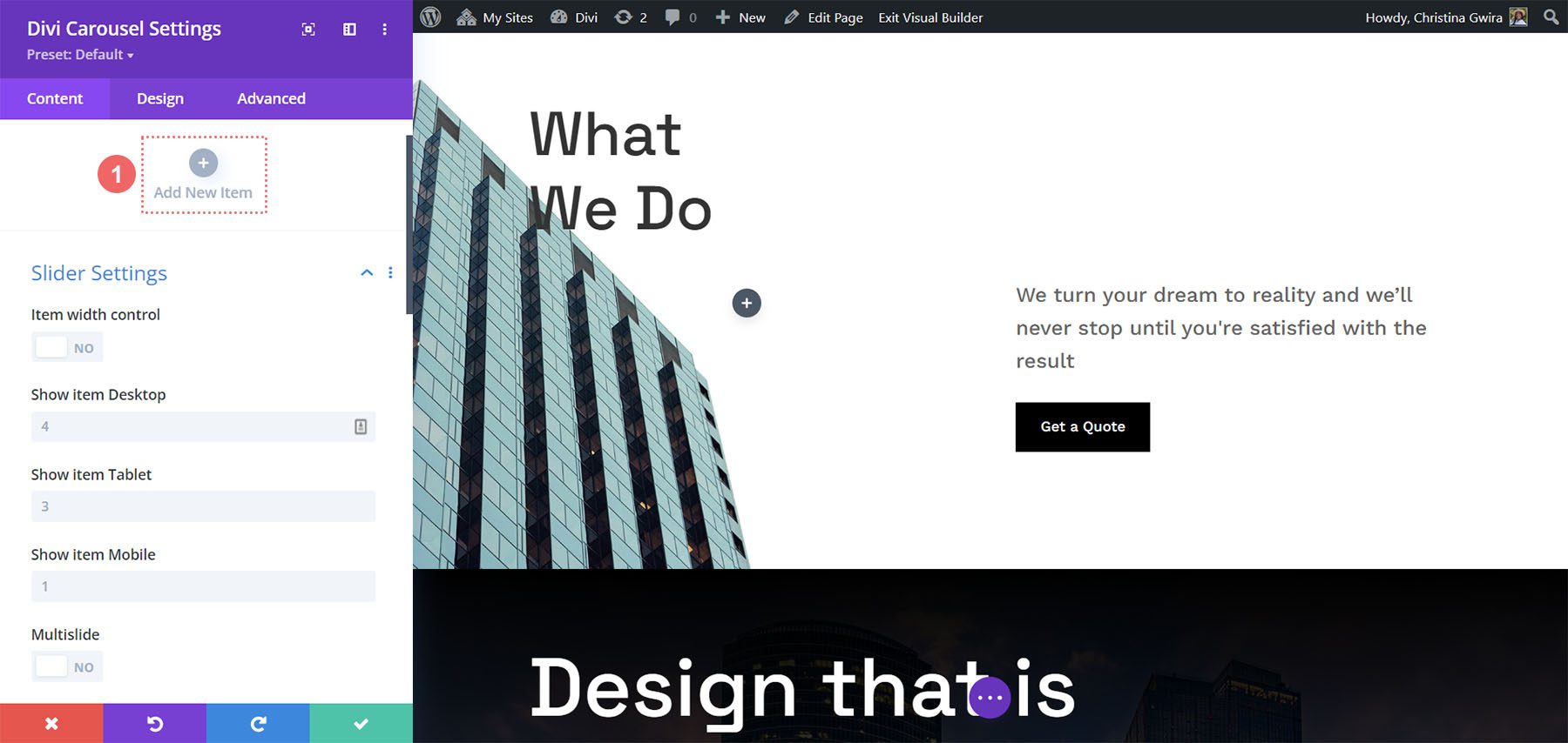
Add as many as you want. You can set the number the carousel will display on the screen for each device type in the module’s settings, so the number you add won’t affect the design. The submodules include all the standard Divi settings and a few unique settings. Here’s a look at the unique settings for the submodule.
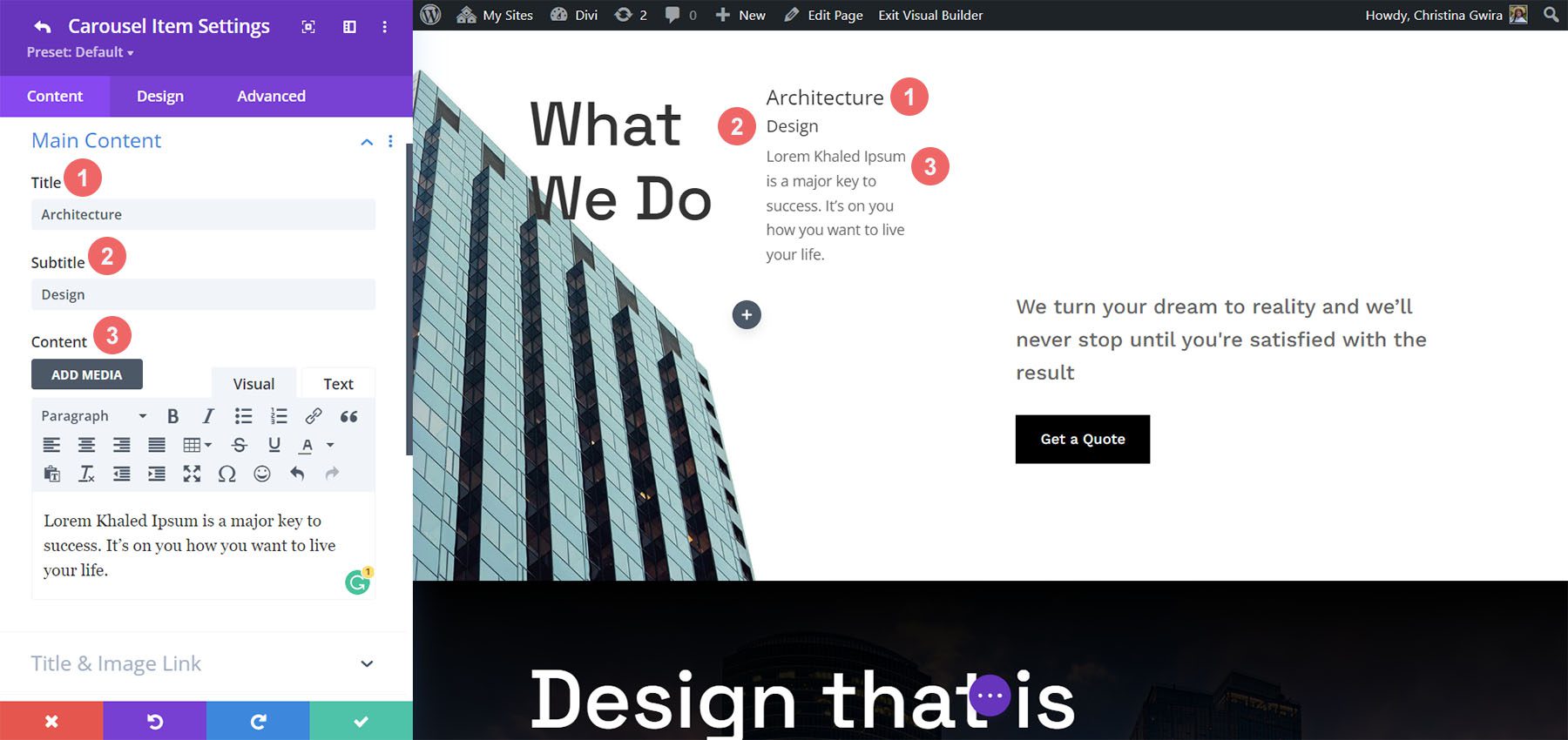
Main Content
When you add a slide, it opens to show the settings. The main content area includes the title, subtitle, and body content. Use any or all of this content you want. You can style these elements individually in the Design tab.
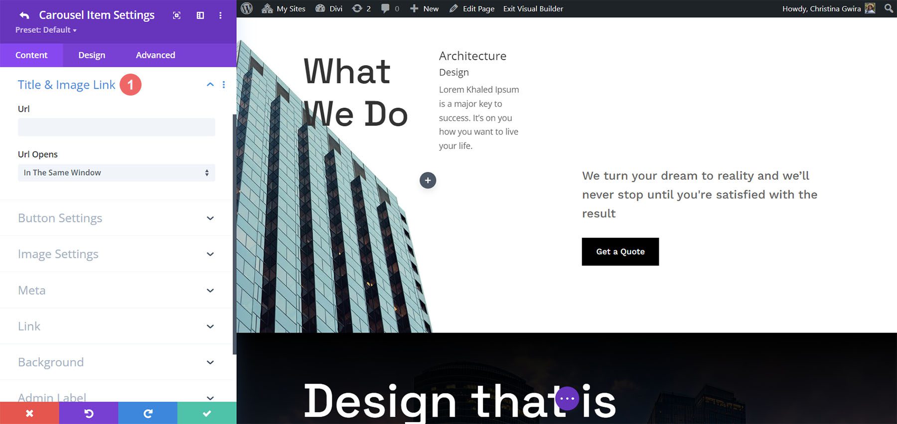
Title & Image Link
Add the URL and choose if it opens in a new window. This link applies to both the title and image, so it still works even if you only use one of the two elements.
Button Settings
This adds a button to the slide. Add the text, the URL, and choose how it opens. You can style the button in the Design tab.
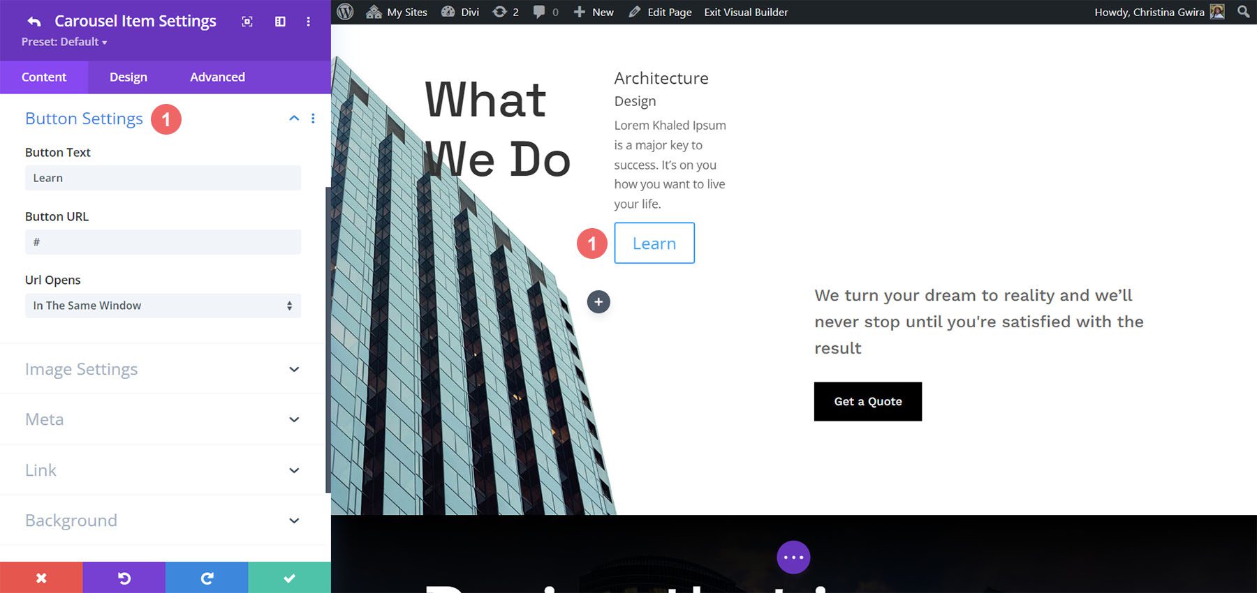
Image Settings
Here, you can choose to use an image or an icon. An image is the default setting. It includes the image picker, alt text, and if it opens in a lightbox. The image is placed above the title by default, but you can easily change this if you want.
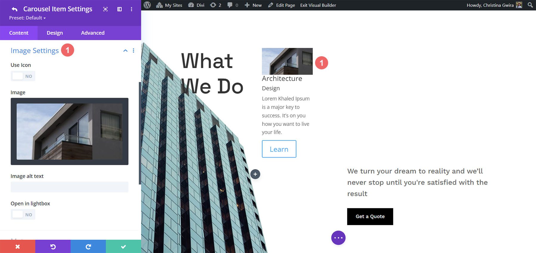
Selecting Use Icon provides an icon selector. The icon replaces the image. It can also be styled in the Design settings.
![]()
Meta
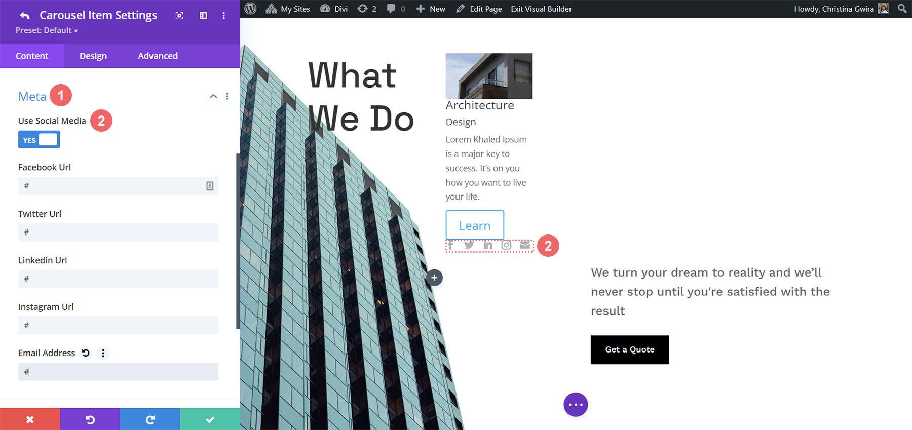
This includes two options you can select between. You can only choose one of the two options. The first option is Use Social Media. Enabling this opens the fields to enter your URLs for four social media networks and your email address.
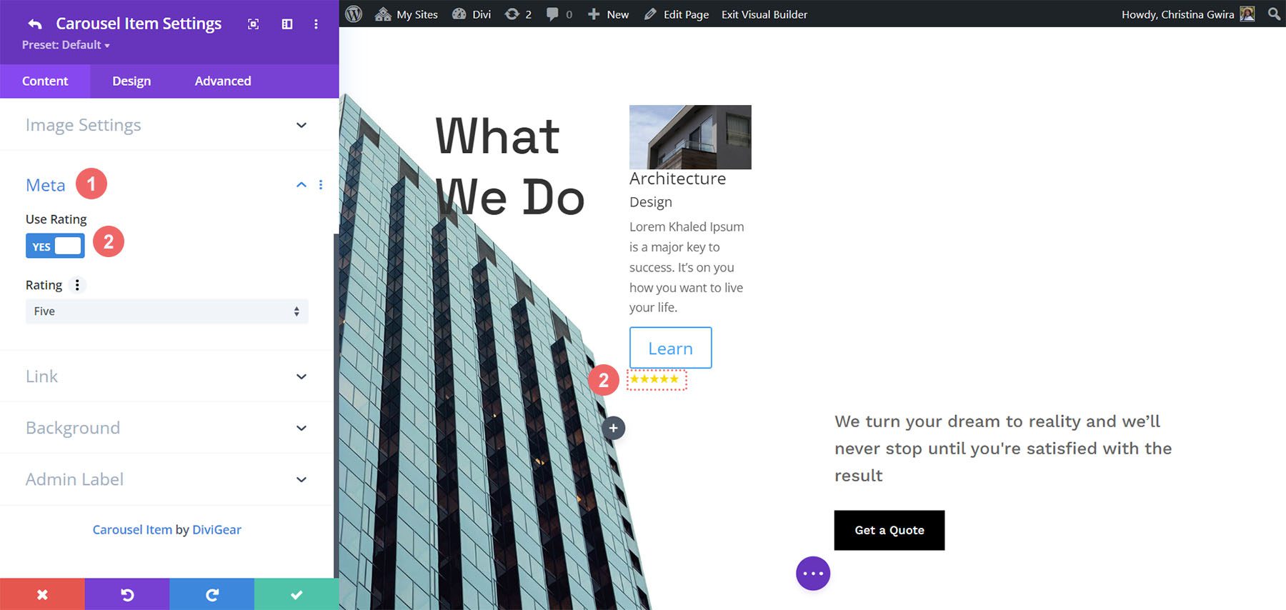
The second option is Use Rating. This opens a dropdown box where you can choose a rating from one to five. It displays the rating as stars.
Submodule Design Settings
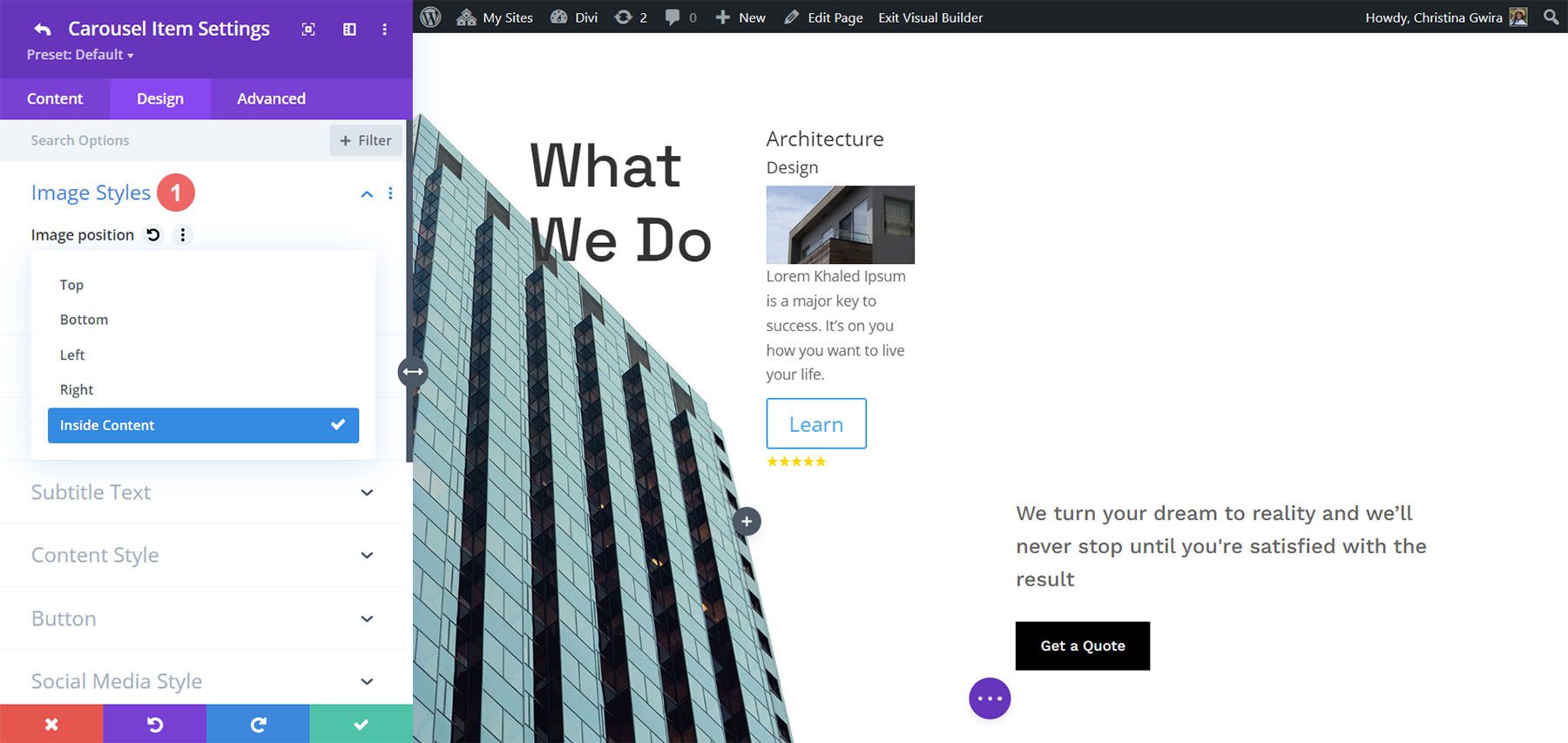
The submodule’s Design settings include the image styles, image filter, and styles for the title, subtitle, content, button, social media, and rating. If you’ve selected an icon in place of the image, you’ll see icon settings to change its color, add a circle, change its size, and adjust its alignment. In the example below, I moved the image to the center of the slide by selecting Inside Content in the Image Position dropdown box.
Main Module Settings
The main module settings include the slider details as well as the standard Divi settings. Let’s look closer at the slider’s settings.
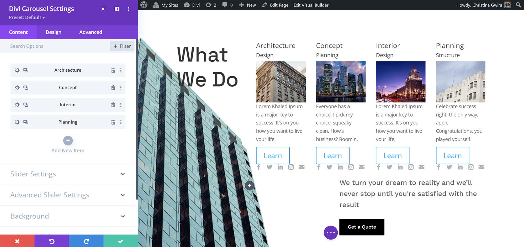
Slider Settings
The slider settings include width control, the number of slides to show on each of the device types, multislide, duration, loop, autoplay, arrow and dot navigation, spacing, lazy loading, hash navigation, and lots more. It’s interesting to see the number of items for different devices. One point about the number, you enter into these fields is they don’t have to be whole numbers. You can show a half slide if you want. Just enter the number as a decimal and experiment until the slides display the way you want.
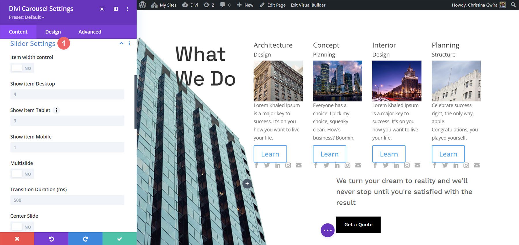
This example shows that I’ve added some arrow navigation. I also changed the way the individual carousel items appear on desktop, tablet, and mobile. In addition to the above, I’ve also added a loop feature to the module.
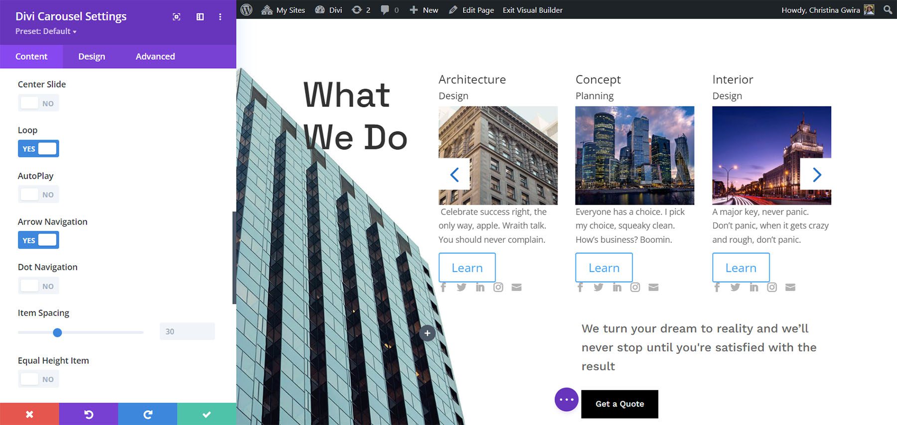
Advanced Slider Settings
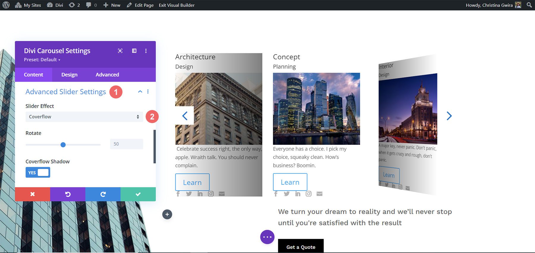
The advanced settings let you choose the slider effect. Choose between Default and Coverflow. The default setting displays the slides as normal with each card facing the user.
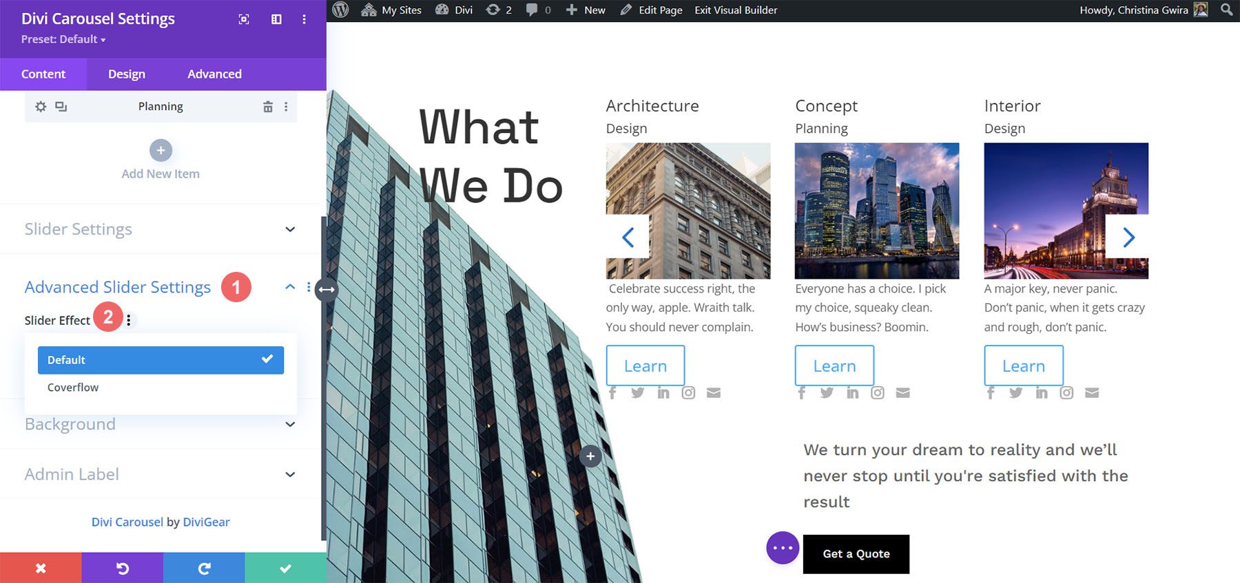
Coverflow displays the cards tilted in 3D. Choosing Coverflow adds Rotate, which adjusts the amount each card is rotated in 3D, and Shadow, which adds to the 3D effect through shadowing. The cards show an animation as they scroll into place within the carousel.
Main Module Design Settings
The main module’s Design settings include the image overlay, alignment, width, border, and box shadow. It also includes settings for the title text, subtitle text, body text, next and previous buttons, navigation color, z-index for the image, custom spacing for every element, and the standard Divi settings. I’ve adjusted many of the settings in the example below.
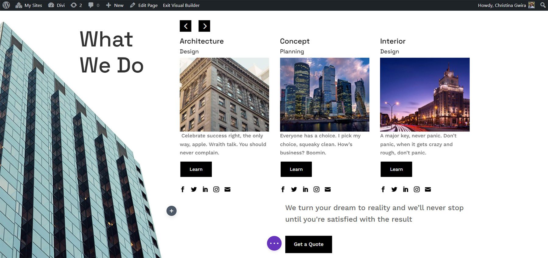
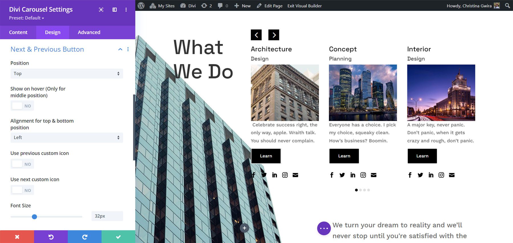
The Next and Previous arrows include several position options. You can adjust the color of the icons and backgrounds and choose custom icons for the previous and next links independently. You can also adjust the dot navigation’s colors.
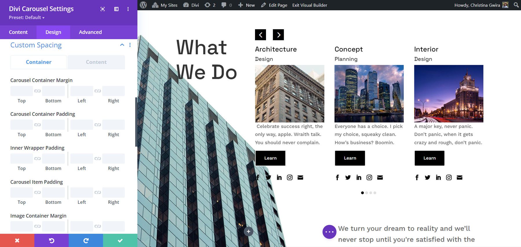
The Divi Carousel Module has an impressive amount of custom spacing options. Add margin and padding to every element for both the container and the content independently. I’ve added padding to several of the elements in the example below.
Using Divi Carousel Module
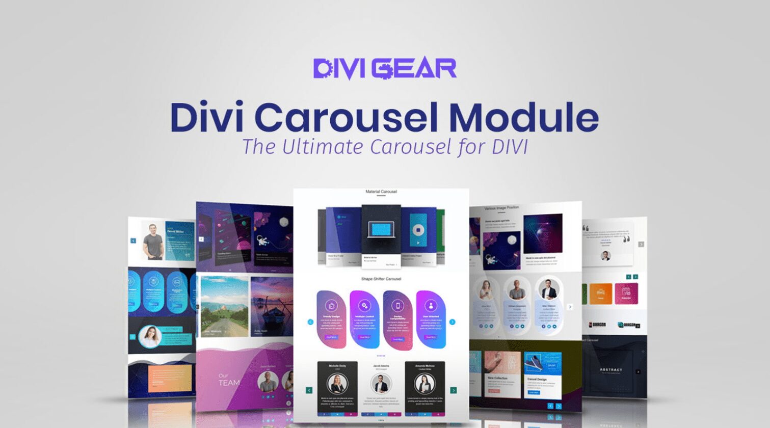
Divi Carousel Module is great for displaying lots of things including products, team members, custom blog posts and pages, services, images, testimonials, a portfolio, company logos, and lots more. The publisher’s website includes lots of downloadable templates to get you started. They’re available as JSON files. Upload them to your Divi Library and use them on any template, page, or post. Let’s look at a few of them. I’ll describe their main settings as we go.
Divi Carousel Module Content Carousel 02_05
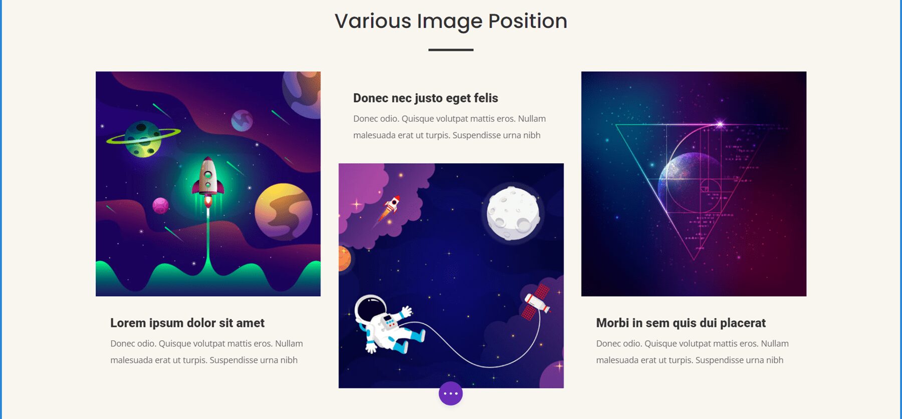
Content Carousel 02_05 includes large images and styles the cards independently to create an alternating design with the image on the top or the bottom. It shows three slides at a time on desktops, 2 on tablets, and 1 on phones. It slides them automatically every second and loops.
Divi Carousel Module Testimonial Carousel 01_07
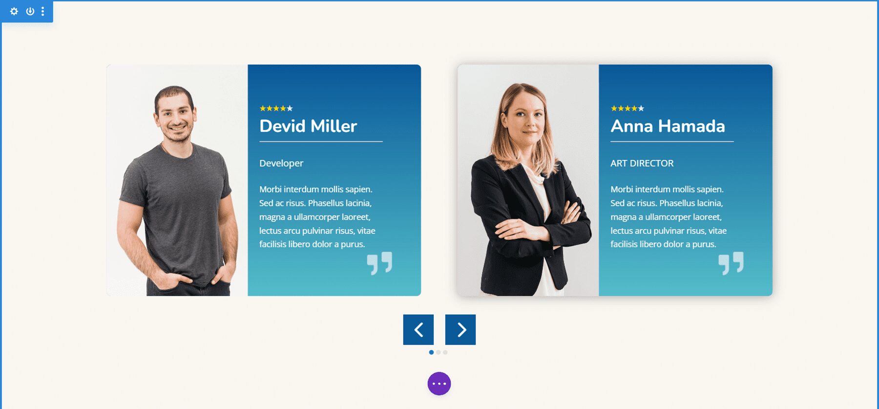
Testimonial Carousel 01_07 displays two slides on desktops and one slide on tablets and phones. It includes centered arrows and dot navigation. The slides place the images to the left and include a gradient behind the text. The quote icons are images added to the background.
Divi Carousel Module Team Carousel 01_05
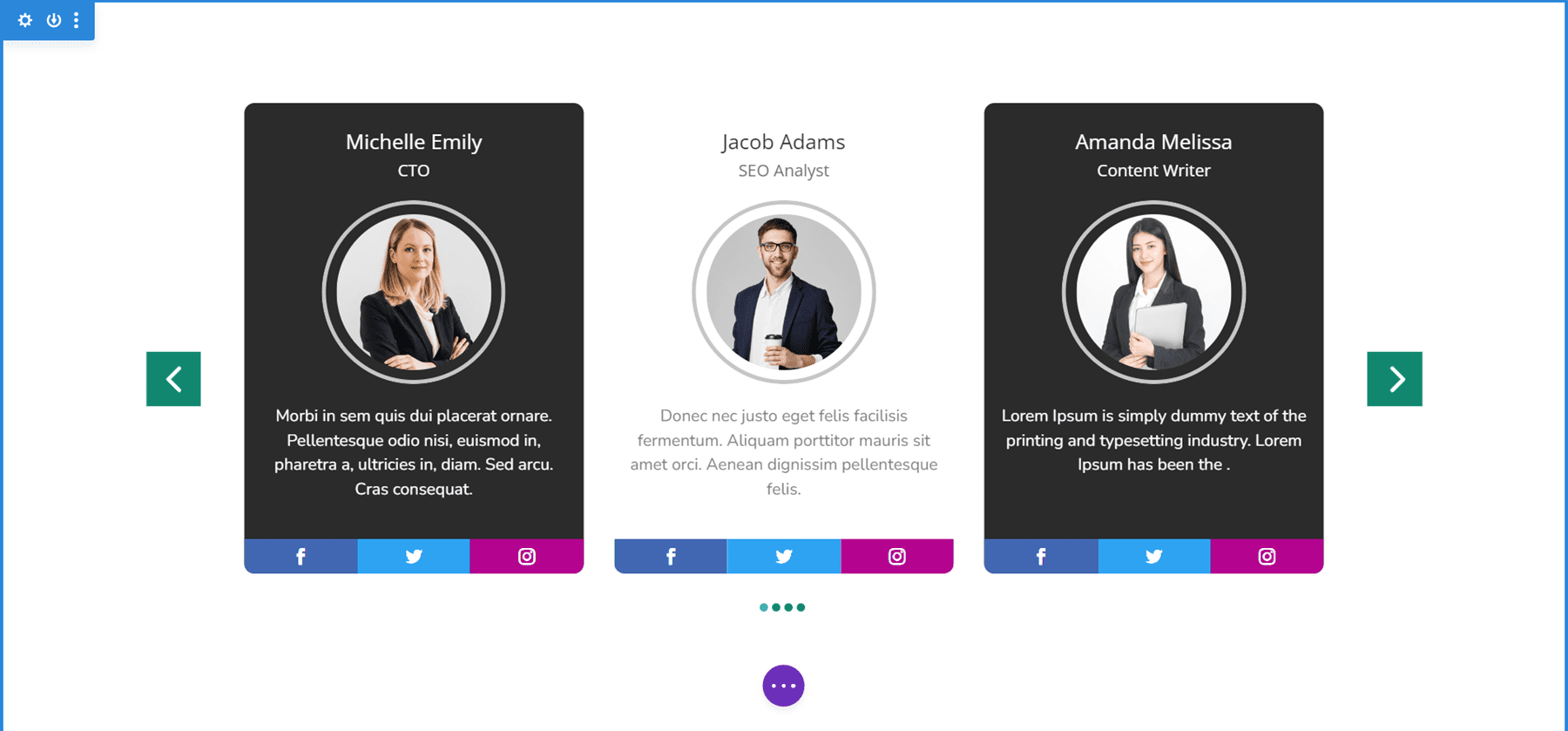
Team Carousel 01_05 displays three slides on desktops, two on tablets, and one on phones. The slides have a unique design with social icons placed at the bottom. The backgrounds of the main content area alternate between black and white. The arrows and dots are green. Images use rounded corners and include a 4px border to make them circled.
Divi Carousel Module Image Carousel 01_02
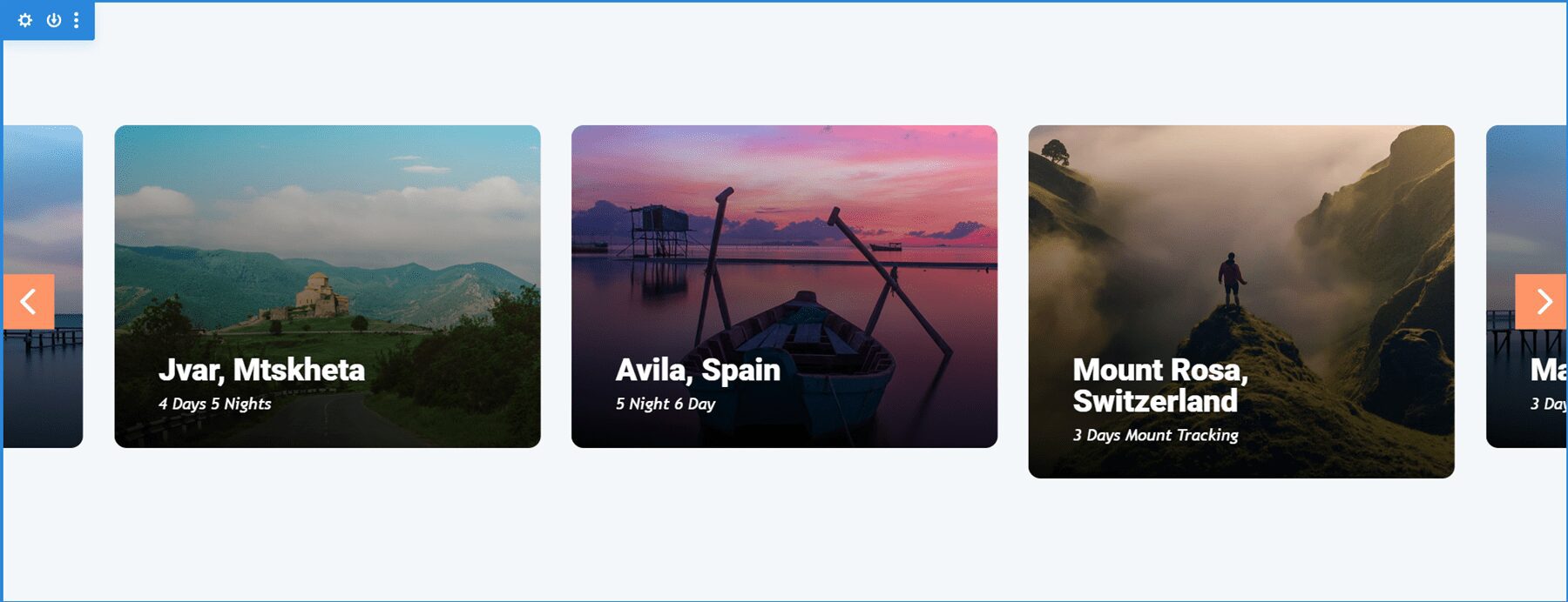
Image Carousel 01_02 displays 3.5 items on desktops and centers the slides to create the design that partially shows images on the sides of the screen. Tablets display 3 and phones display 1. It includes arrow navigation, and the slides are set to loop, so the user never has to change directions to see all the slides. The rounded corners give the images an elegant design.
Purchase Divi Carousel Module
Divi Carousel Module is available in the Divi Marketplace for $29. It includes unlimited usage, a 30-day money-back guarantee, and one year of support and updates.
Ending Thoughts
That’s our look at Divi Carousel Module. The module has a lot of features. Each element can be styled and adjusted independently, giving you lots of design possibilities. I found all the settings to be intuitive, so it felt at home in the Divi Builder. If you’re interested in a carousel module with lots of features, Divi Carousel Module is worth a look.
We want to hear from you. Have you tried Divi Carousel Module? Let us know what you think about it in the comments.
The post Divi Plugin Highlight: Divi Carousel Module appeared first on Elegant Themes Blog.
