Divi comes packed with lots of icons. Even though it has close to 400 icons, sometimes you want an icon that isn’t in the list. A lot of users turn to Font Awesome, which is one of the most popular sources of free icons. There are several ways to bring Font Awesome icons into Divi, but one of the easiest methods I’ve seen is through a third party plugin called Divi Font Awesome.
Divi Font Awesome doesn’t add new modules or features. It just adds Font Awesome icons to any module that already has icons. In this article we’ll take a look at how it works with those modules and see a few examples of it in action.
Setting Up Divi Font Awesome
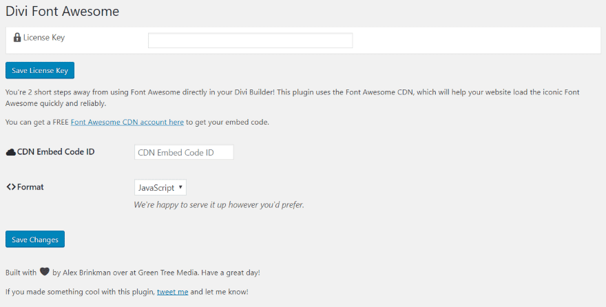
After you’ve installed and activated the plugin you’ll need to set it up. In the dashboard menu, go to Settings > Divi Font Awesome. Here you can input your license key, CDB embed code ID, and choose the format (choose between JavaScript and CSS). To get your CDN embed code ID, click the link labeled Font Awesome CDN account here.
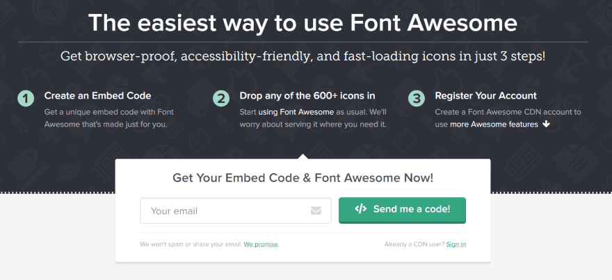
This takes you to the Font Awesome CDN website where you can sign in to get your code.
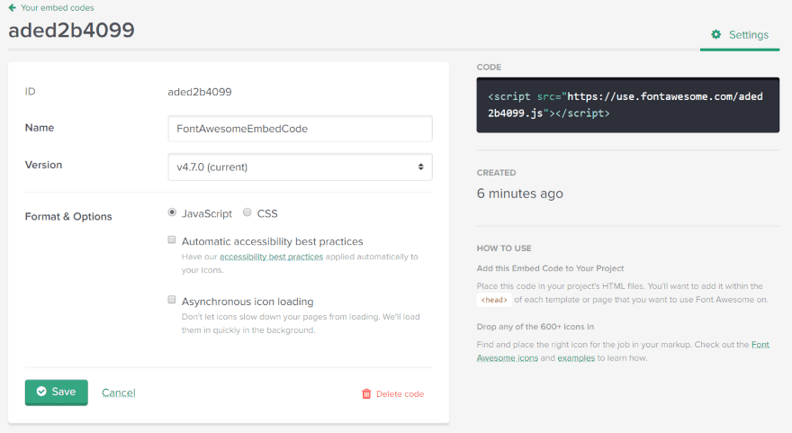
The ID is the code you’ll paste into CDN embed code ID field. You’ll need to provide some parameters first. Give the code a name and choose the version between JavaScript and CSS. If you choose JavaScript you can also choose automatic accessibility best practices and asynchronous icon loading. Copy the ID and save it when you’re done. You can edit it later if you want.
Note – I tried both formats with multiple options. The result within Divi looks the same.
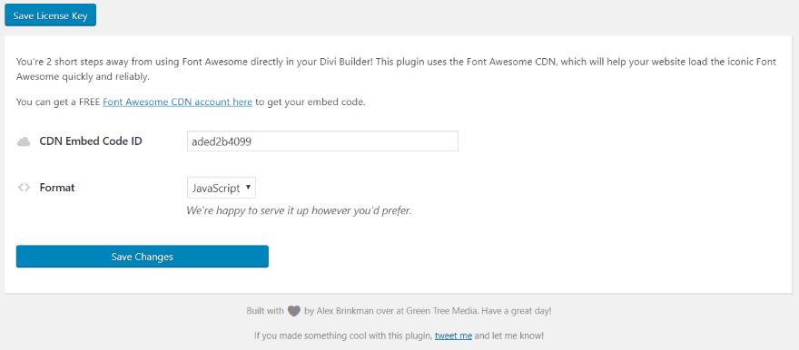
Paste in the ID and choose the format that matches what you chose when you set up the ID. I used JavaScript when I created the ID, so I chose JavaScript here to match. Save changes and you’re ready to use Divi Font Awesome.
Using Divi Font Awesome
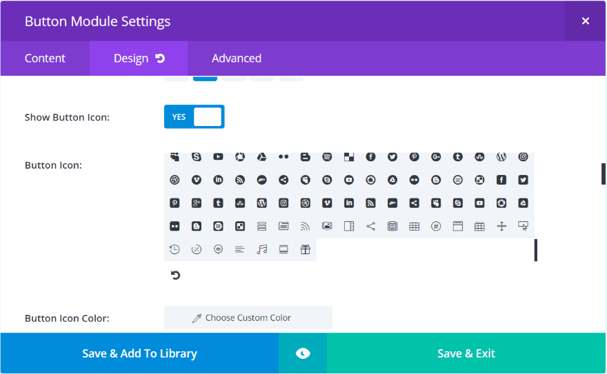
Rather than creating new modules, Divi Font Awesome adds Font Awesome icons to your current modules. The image above is the standard button module without Divi Font Awesome. This is around 380 fonts. Not bad actually.
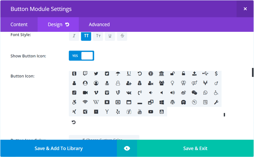
Here’s the same button module with Divi Font Awesome installed. The small scrolly line (technical term) is much smaller, indicating that it has more icons to scroll through. We now have an additional 600+ icons, bringing the total close to 1000.
The icons are added to the bottom of the list of Divi icons. This helps you to know which icons are default Divi and which are from Font Awesome. The new icons are styled along with the original icons. Meaning that all settings, adjustments, CSS, etc., applies to the Font Awesome icons without any additional work on your part.
Divi Font Awesome Examples
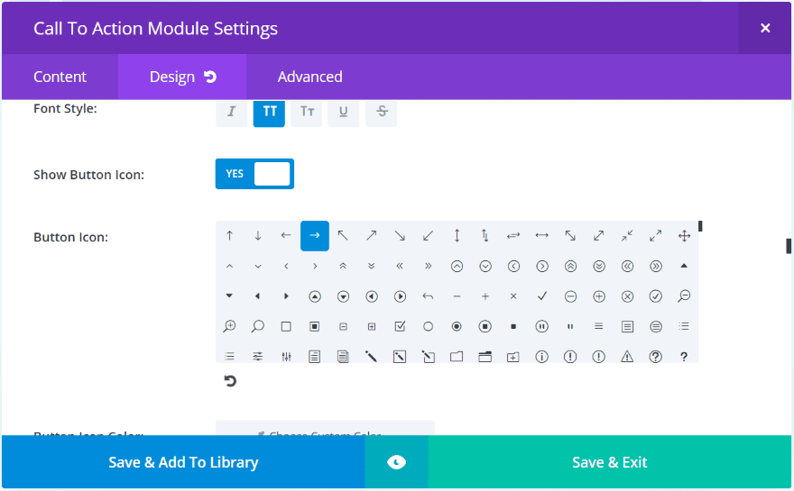
Here’re the icons within the call to action module. For the first few examples I’ll use the SEO Agency landing page, which has lots of buttons that use a right arrow. You can see this in the call to action module.

Here’s the original icon within the button. It looks nice. It’s functional and easy to understand. With Divi Font Awesome we can easily make the buttons look different than everyone else’s.
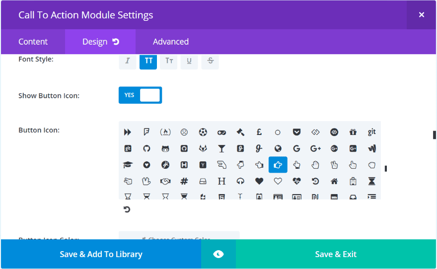
I’m replacing it with this one- a finger pointing in the same direction as the arrow.

It performs the same function but has a unique look.
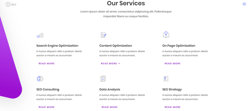
Here’s the services section of the SEO Agency landing page. It uses images rather than icons (which is an extremely versatile option) and call to action modules for the text and read more buttons. I want to replace the images with blurbs so I can use Font Awesome icons.
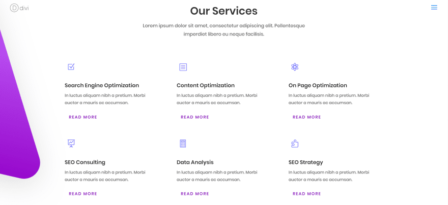
Here’s the same layout using blurbs. These icons are those built into Divi. I’m using them first so I can style them to see if the Font Awesome icons keep the same styling.
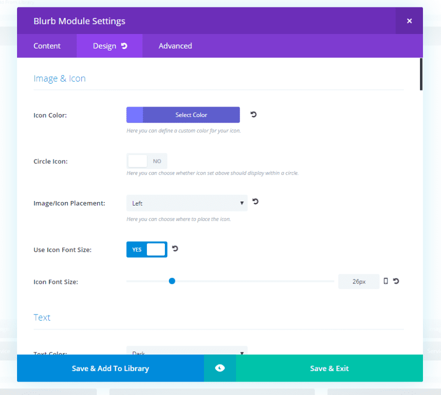
I’ve styled the color with #7676ff to match portions from the original images. I’ve set the placement to the left and adjusted the icon font size to 26 pixels. Next I’ll change the icons to those from Font Awesome.
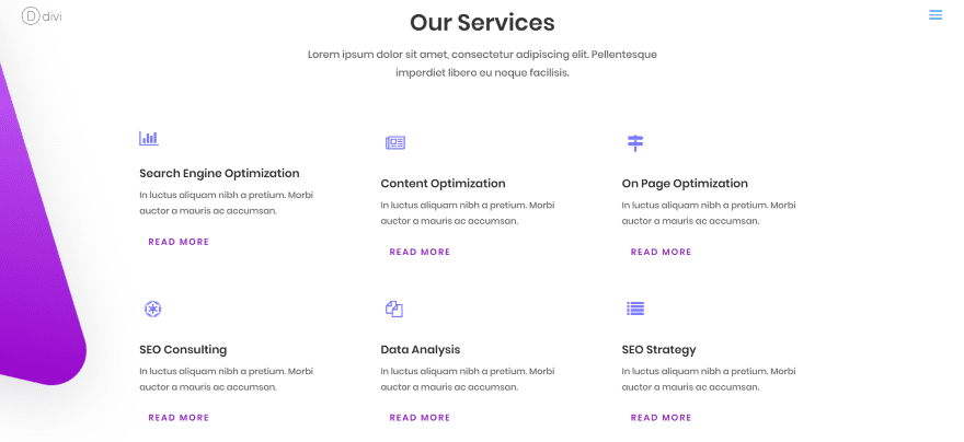
Here’s the layout using Font Awesome icons. I’ve made no changes to the styling. These icons use the same styling as the Divi icons.
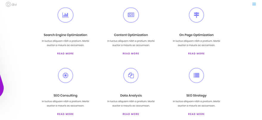
Now I’ve added a border using #a6a6ff. I’ve changed the location to the top and adjusted the icon font size to 32. To help with the center alignment I’ve centered the call to action’s text orientation and button alignment. I’ve also placed 40 pixels for padding to the bottom of the top row so the two rows of blurbs stand apart from each other.
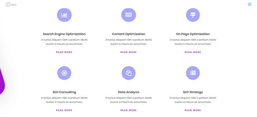
This one makes the icon white, uses the circle with color #a6a6ff, and removes the circle’s border. I’ve left the sizes the same as the previous example.
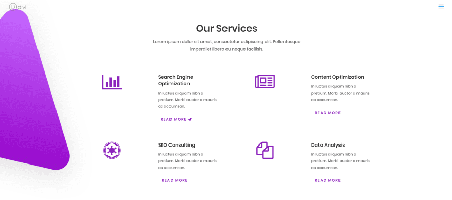
This time I changed the layout a little. I placed the icons to the left with the text on the right. I’ve set the icon color to #8b21bb, removed the circle, and set the icon font size to 64 pixels. I’ve also replaced the arrow icon for the call to action button with one from Font Awesome. The new icon automatically took on the styling that was set for the Divi icon. I made no changes to this icon.
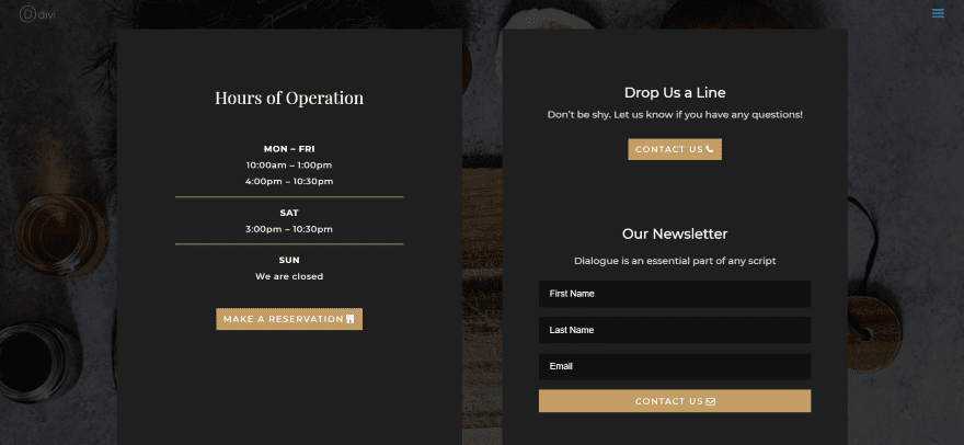
This one is the shop page from the Restaurant layout pack. I’ve added icons to each of the buttons. I didn’t make any changes to styling because I wanted them to blend with the design that’s already there, but I did disable the Only Show Icon on Hover for Button option.
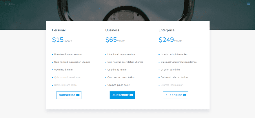
This is the pricing page from the Photo Marketplace layout pack. It uses icons for credit cards and payment gateways to show various ways that visitors can make a payment.
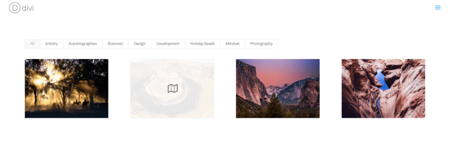
Here’s an example of the Font Awesome icons within an overlay of a filtered portfolio.
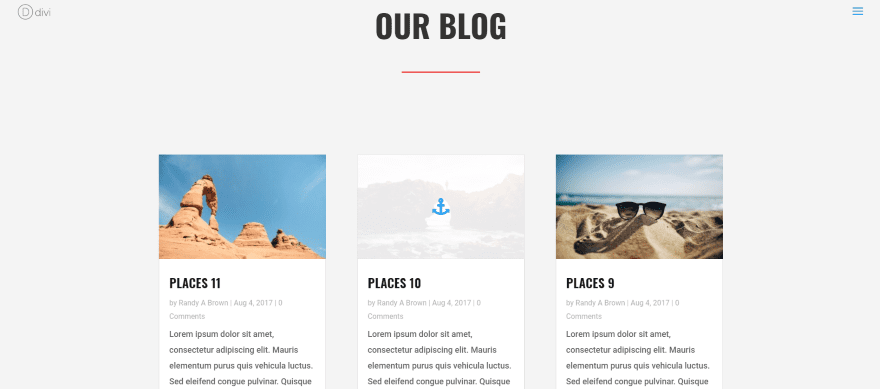
Here’s Divi Font Awesome within a blog overlay. This one’s the blog page from the Travel Agency layout pack.
Using Divi Font Awesome in the Theme Customizer

You can also access the Font Awesome icons from the Theme Customizer. All of the 600+ Font Awesome icons are available from this menu. Here I’ve selected the button menu and chosen an icon to use as the default.
Using Divi Font Awesome with Extra
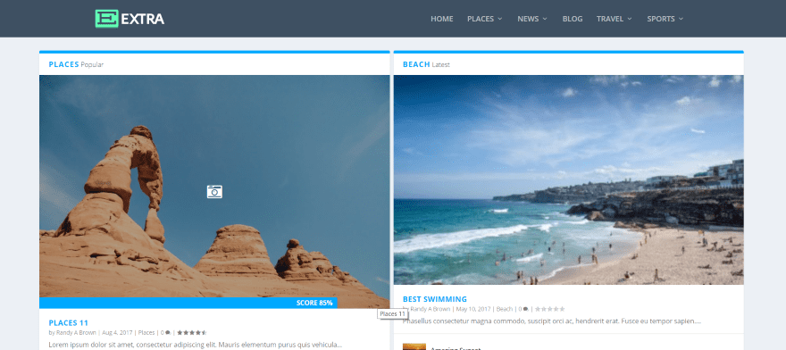
Since Divi Font Awesome adds to the Divi Builder it stands to reason that it would work with Extra. This is the Magazine Homepage layout in the Category Builder. All of the Font Awesome icons are available in the modules that include icons.
Divi Font Awesome License and Documentation
The plugin can be installed on unlimited sites that you build for yourself or your clients. It includes 6 months’ support and lifetime updates. Documentation is supplied as a video that walks you through the settings and shows examples of the plugin in use.
You can see more information about the plugin at the developer’s website.
Ending Thoughts
Divi Font Awesome is easy to set up and use. The video steps you through it if you want to see how it’s done. Since it adds icons to Divi modules, choosing your icons works the same as with normal Divi icons. Its only feature is that it adds 600+ Font Awesome icons to your existing list of available icons. The only difference you’ll notice is the number of icons available.
It also worked great with the Theme Customizer, Extra, and I even got it to work with third party plugins that utilize Divi icons. If you’re looking for added features then this plugin isn’t what you’re looking for. If you just want an easy way to add Font Awesome icons, Divi Font Awesome is worth a look.
We want to hear from you. Have you tried Divi Font Awesome? Let us know what you think about it in the comments.
Featured Image via Alex Gorka / shutterstock.com
The post Divi Plugin Highlight: Divi Font Awesome appeared first on Elegant Themes Blog.
