Divi Madmenu is a third-party plugin for Divi that adds new menu features to the Divi Theme Builder. Add buttons, a Woocommerce shopping cart, search option, and adjust the placement of each element. Design independent menus for desktop, tablet, and phones, and set the breakpoints. Set the header as fixed and add animations. Every element is customizable. In this article, we’ll take a look at Divi Madmenu and see what it can do.
Divi Madmenu with the Divi Theme Builder
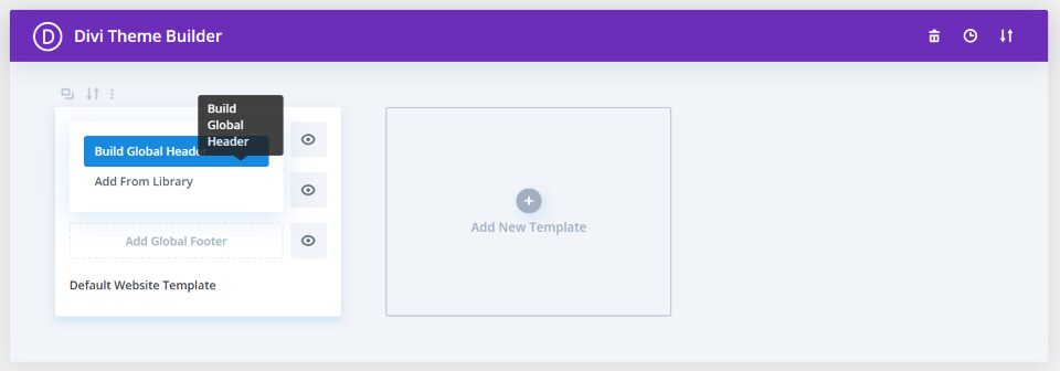
Divi Madmenu was designed specifically to work with the Divi Theme Builder. Once you’ve installed the plugin, go to the Divi Theme Builder, click Add Global Header, and select Build Global Header to create your custom header.
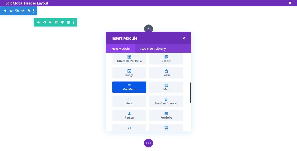
You’ll see a new module added to the Divi Builder called MadMenu. This is the only module you’ll need to use, but you can use others if you want to add even more features.
Content
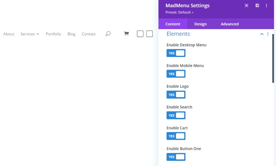
The module displays a menu and provides lots of options for customizing it. Elements allows you to enable features such as the menu for desktop and mobile, logo, search, cart, and two buttons. They can be arranged differently and styled independently.
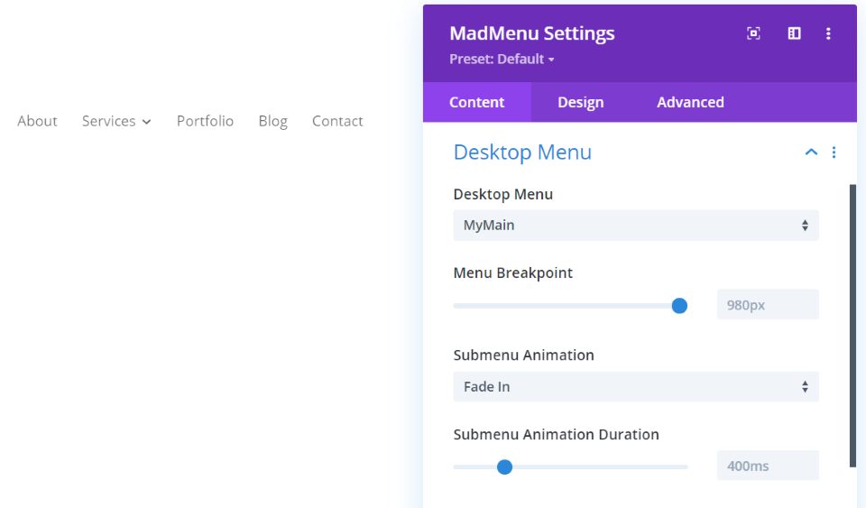
Desktop Menu allows you to choose the menu to display, set the breakpoint to determine when it changes to a mobile menu, and set the submenu animation and duration.
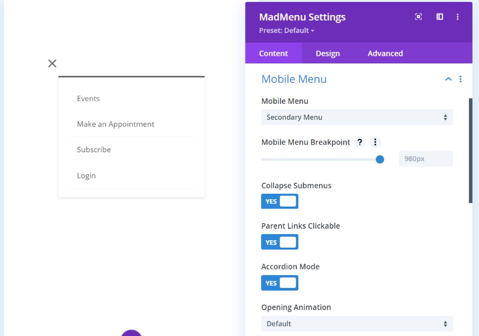
Mobile Menu lets you select a different menu for mobile and adds options to collapse the submenus, make the parent links clickable, and choose the accordion mode. It includes the same animation options as the desktop menu.
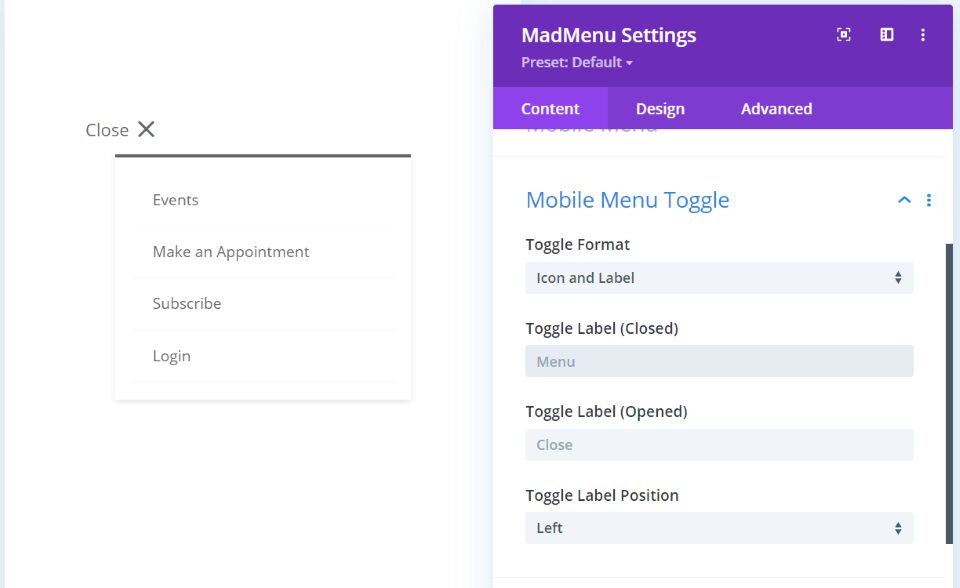
Mobile Menu Toggle includes icon and label options including the toggle format, closed and opened labels, and the label position.
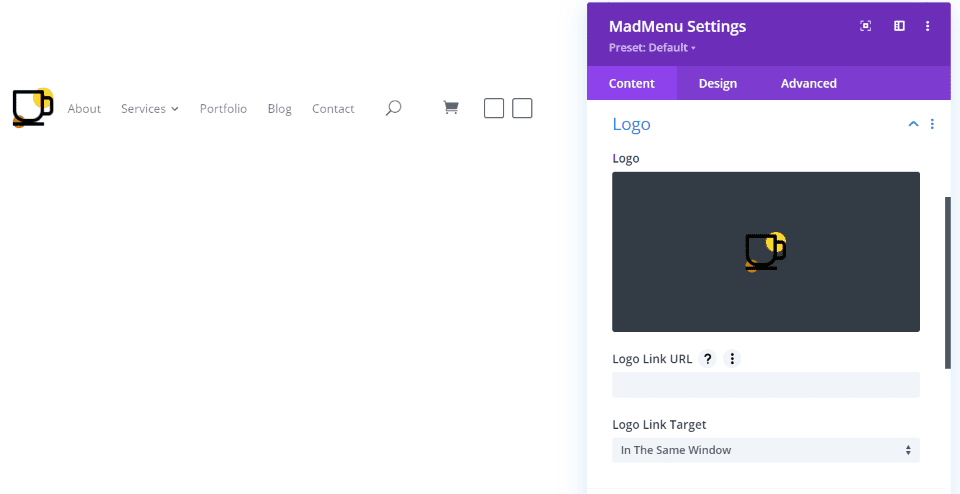
If Logo is enabled, you’ll see an option to choose the logo, provide a link URL, and decide if it will open in the same window.
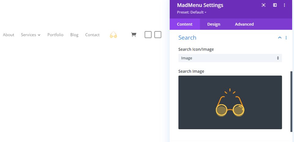
If Search is enabled, you can choose an icon or an image.
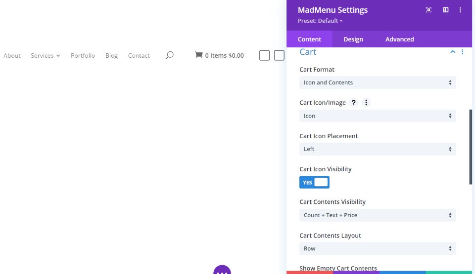
For Cart, you can show the icon, contents, or icon and contents, select an image or show the logo, choose visibility options, a live update, etc.
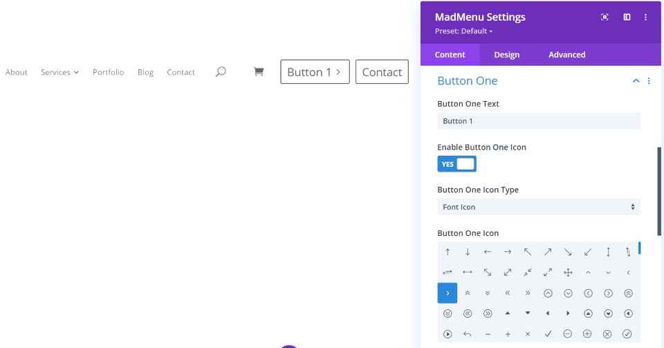
Button 1 and Button 2 are adjusted independently, but they have the same options. Add text, an icon, choose the icon placement, visibility, link, and select how it opens. In the example above, I’ve added text to both buttons and added an icon to the first button.
Design
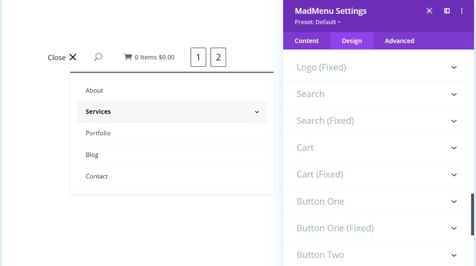
The Design tab adds options for the text, menu items, desktop and mobile menus, desktop and mobile submenus, logo, search, cart, buttons, and lots more. Here’s a look at a few of them.
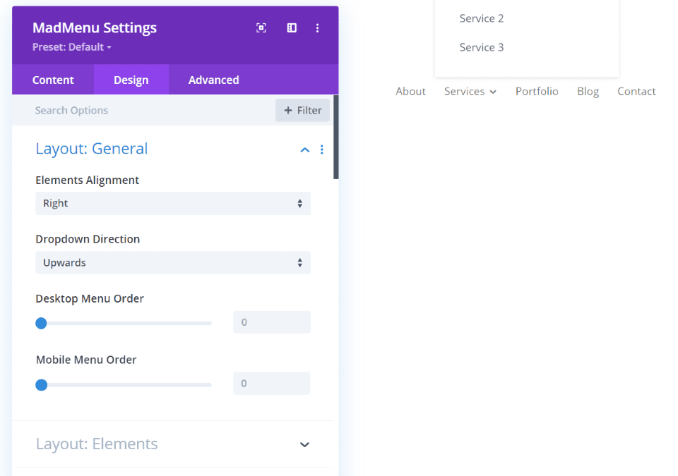
Layout General lets you choose the alignment. Set it to right, left, center, space-around, space-between, and space-evenly. Choose the dropdown direction and set the menu order for both desktop and mobile. In this example, I’ve set the alignment to right and set the dropdown direct of the submenus to upwards.
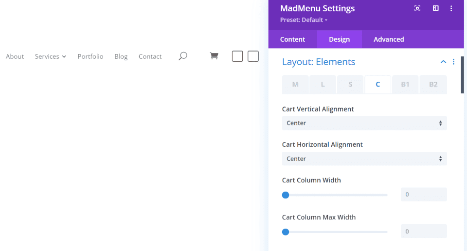
Layout Elements lets you control the alignment, width, etc., of the menu, logo, search, cart, button 1, and button 2.
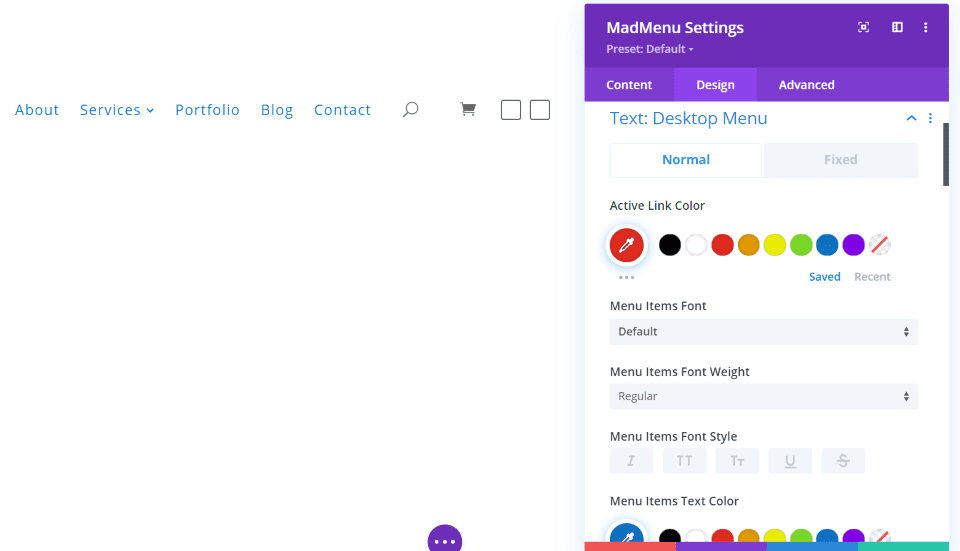
Each of the elements has a Text design option that includes settings for both the normal and fixed menu. Adjust the active link color, regular link color, font, font weight, size, spacing, etc. The example above is Text: Desktop Menu. I’ve changed the colors, font sizes, and spacing.
Text
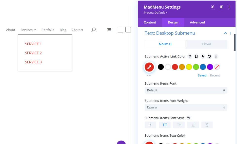
This is Text: Desktop Submenu. I’ve changed the colors, font sizes, and made the text upper case.
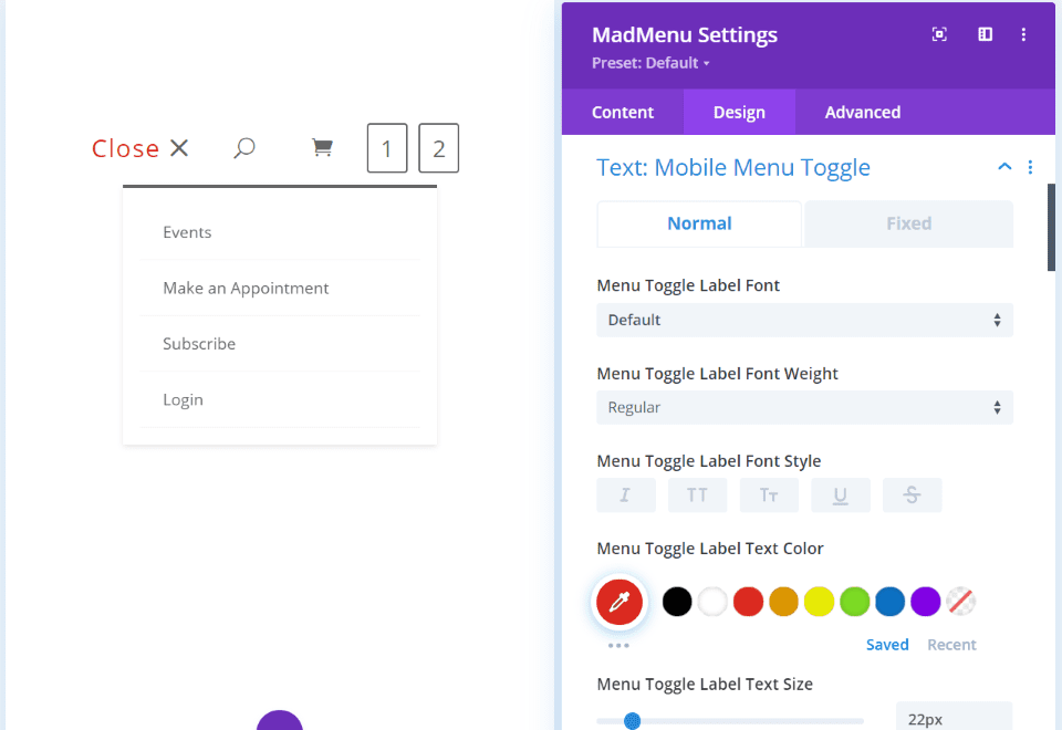
This is Text: Mobile Menu Toggle. It provides text customizations for the open and close text. I’ve changed the font color and increased the size and letter spacing.
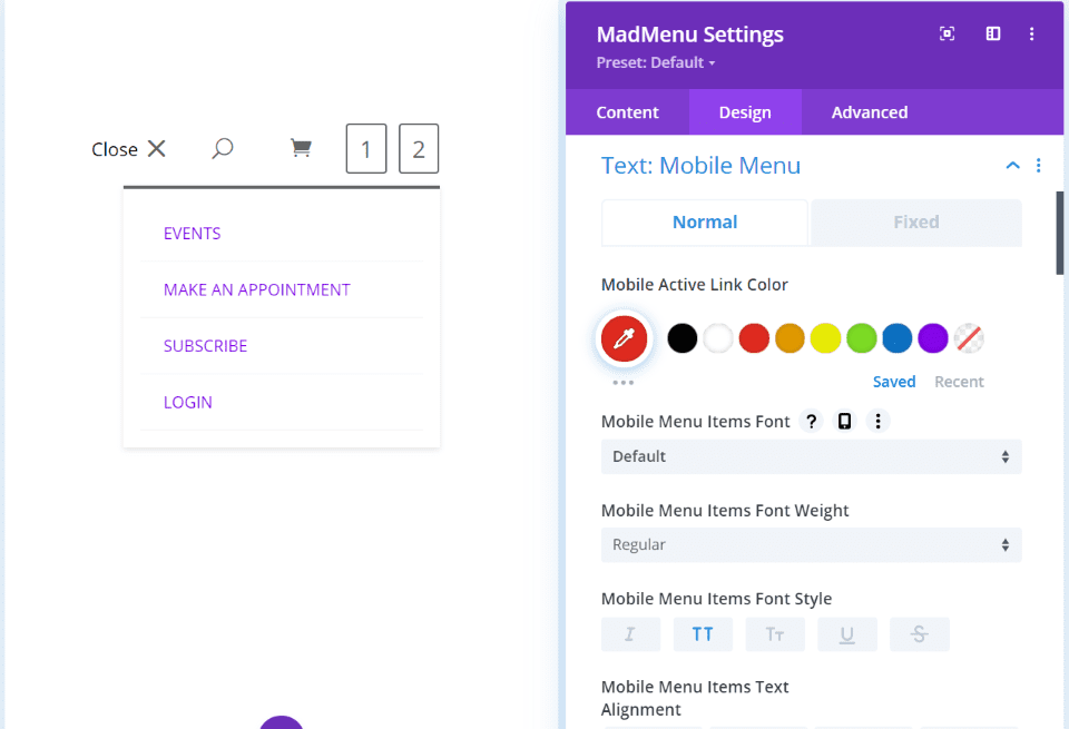
This is Text: Mobile Menu. I’ve changed the font colors and made the text upper case.
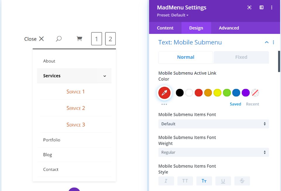
Text: Mobile Submenu controls the fonts for the dropdown menu. I’ve changed the colors, selected uppercase text with a larger first letter for each word, increased the font size, and centered the text.
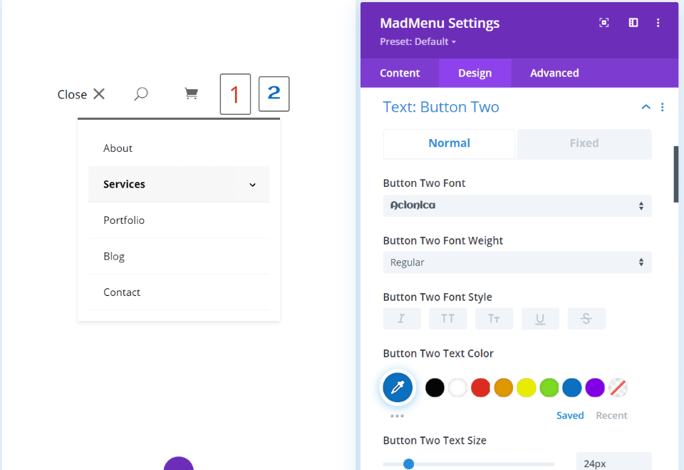
Text: Button 1 and Text: Button 2 has the same options and controls their buttons independently. I’ve increased the font size for both buttons and made Button 1 larger. I’ve also changed their colors. For Button 2, I selected a different font.
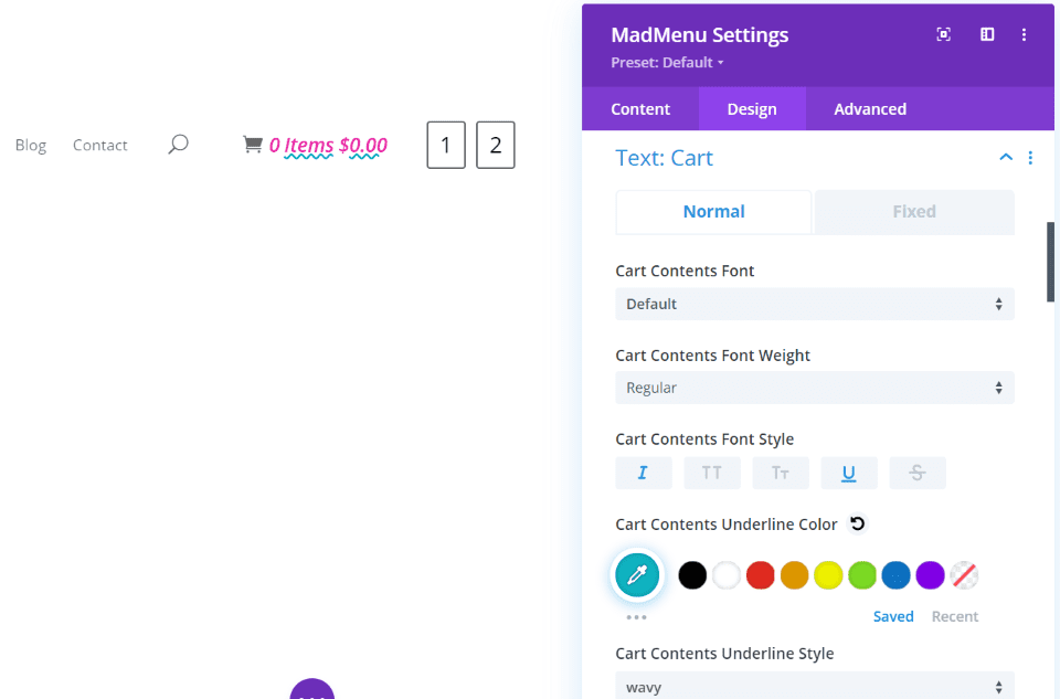
Text: Cart controls the font for the cart content text. I’ve changed the font color, increased the size, made the font italic, underlined the font with a wavy style, and changed the underline color.
Menu
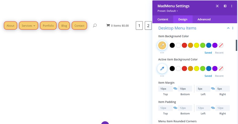
Desktop Menu Items gives you control over the backgrounds, margin, padding, corners, borders, box shadow, etc. I’ve changed the background color, added margin and padding to add space between the menu items, added corners, borders, and a box shadow.
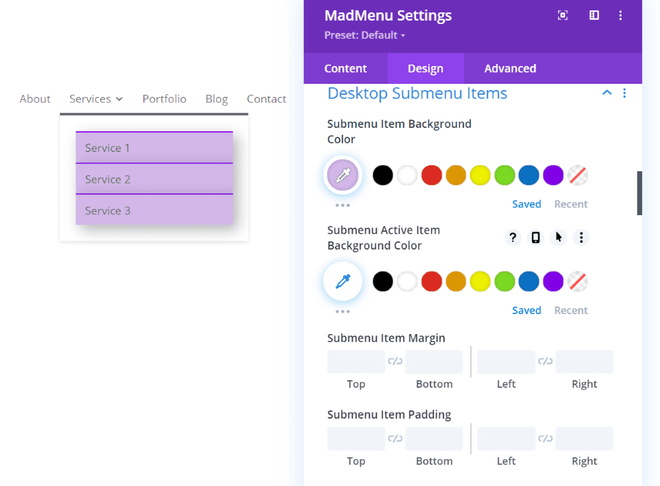
Desktop Submenu Items gives you the same control as the menu items. I’ve changed the background color, added a border to the top of each item, and added a box shadow.
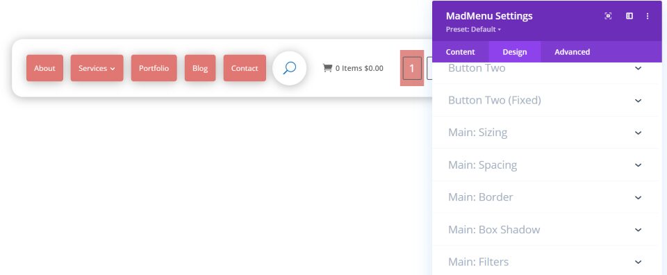
I like that each of the items can be styled individually. I’ve added box shadows to the main menu, menu items, and search, and I’ve rounded their corners. I’ve also changed the colors of the fonts and backgrounds.

Here’s one that I created for my test site. I’ve added the logo with a box shadow, main menu, search, cart, and both buttons. The buttons are styled with white backgrounds and black borders. I’ve also added a bottom border using colors from the layout.
We can get a better idea of what can be done with menus by digging into the demos.
Divi Madmenu Demos
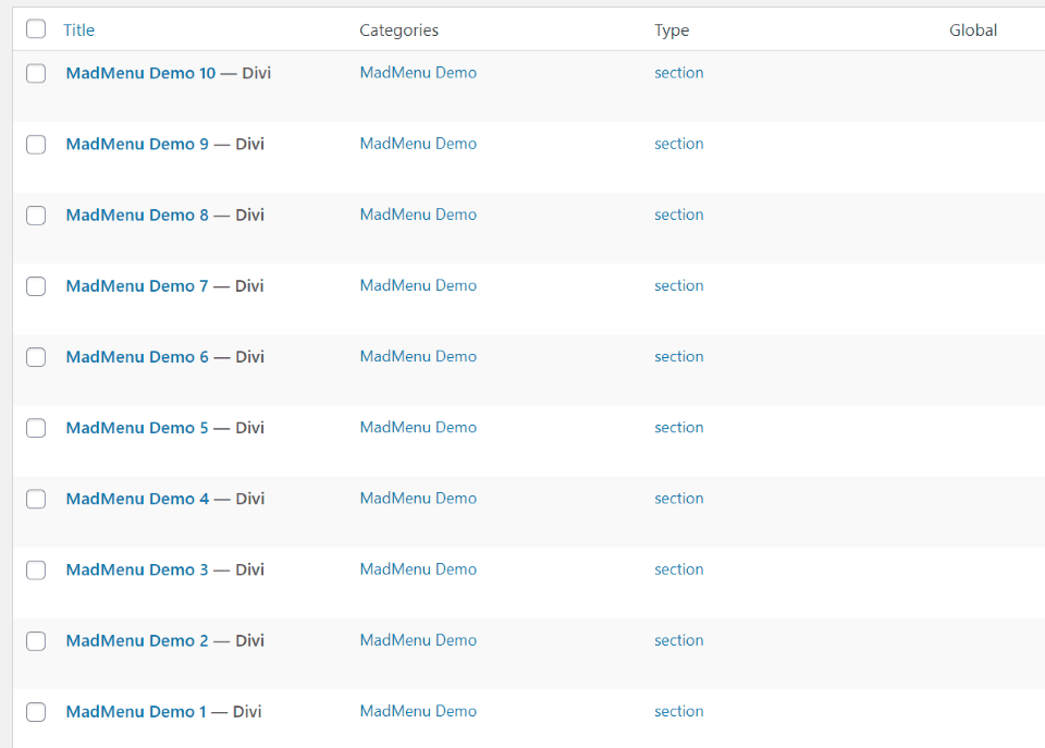
The plugin comes with 10 Madmenu demos that you can upload to Divi Library. Several of the demos have images within their folders. You’ll need to upload them to the media library.
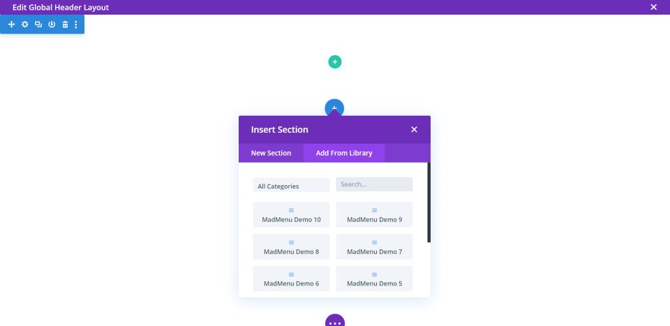
To use a demo with the Theme Builder, click to build a global header. Click to insert a section and choose Add From Library. Now you can choose any of the demos to use.
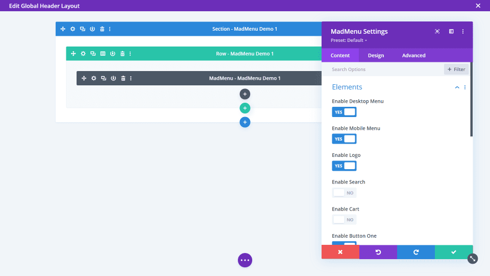
Use the demos as a starting point to create designs or just add your logo and menus. They make good use of the background colors, logo options, search options, and CTA buttons. Let’s look at a few of the demos with my test site. They include different designs for the desktop, tablet, and phone headers.
Demo 1

Demo 1 uses the site title, menu, and button 1. The menu uses the center alignment. The submenu includes styling with a box shadow and borders to separate the links. I’m hovering over the second link.
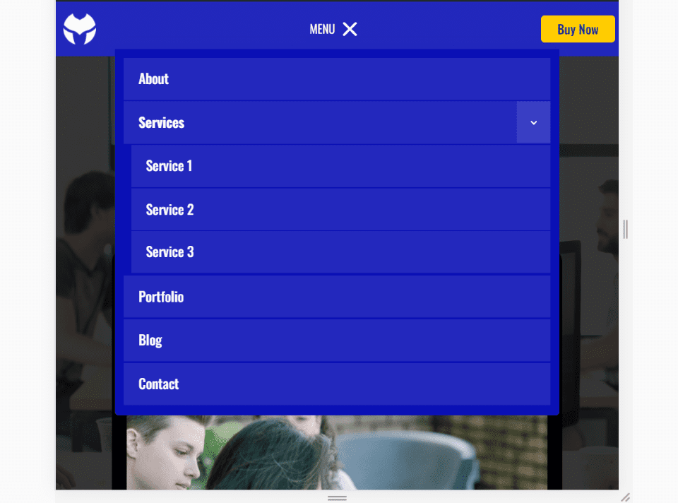
Mobile increases the size of the fonts and uses the same styling for the main menu and submenu. It also uses text with an icon for the open and close button and replaces the site’s title with the logo.
Demo 2

Demo 2 adds a logo, search with a circled icon with a border to one side, centered menu, shopping cart, and buttons. Both of the buttons display social media logos. The submenu items are style independently of the background.
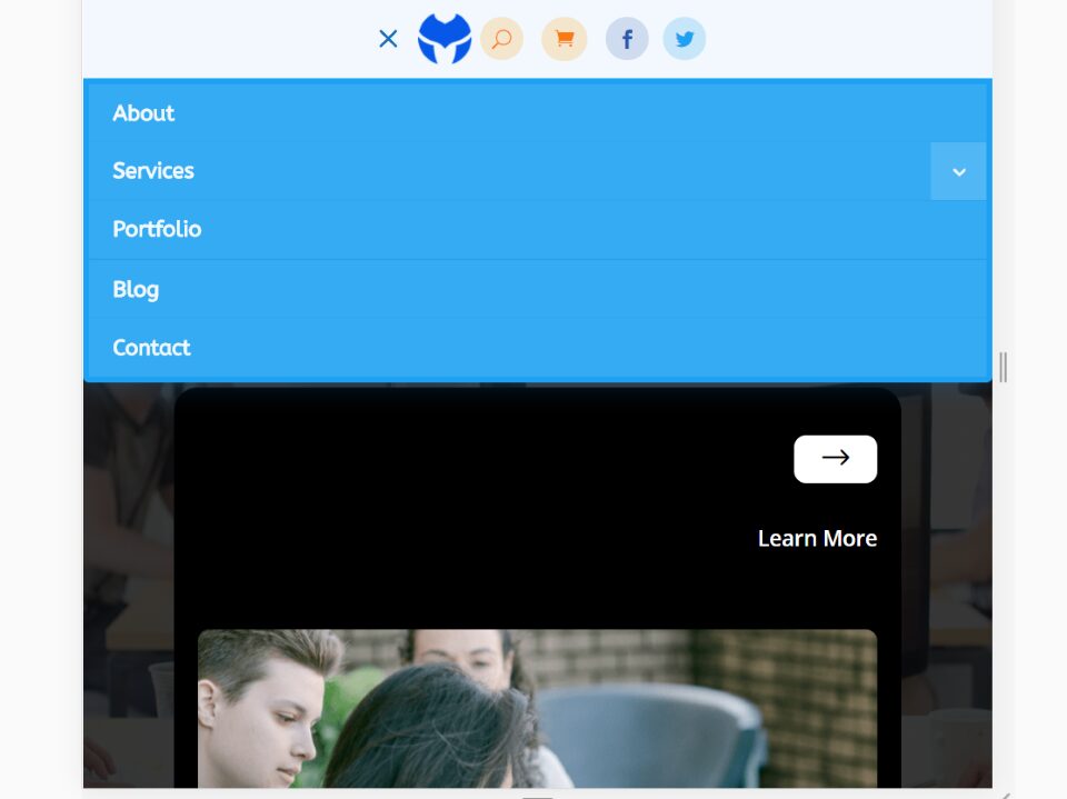
The mobile menu centers all of the icons, replaces the menu text with an open icon, and adds the light blue for the menu.
Demo 3

Demo 3 makes interesting use of buttons. Button 1 includes text to log in or register and it has a hover effect that removes the background on hover. Button 2 uses an image of a line-drawn heart.
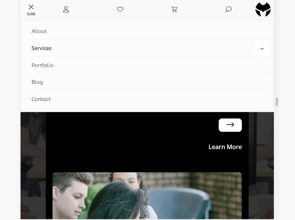
For mobile, the open/close button includes the icon and text under the icon. Icons for the buttons are equally spaced across the header using space-between. The site’s title is replaced with the logo, which is moved to the right.
Demo 5

Demo 5 uses space-between for the layout and displays the buttons as CTAs. Both buttons use different colored backgrounds to stand out.
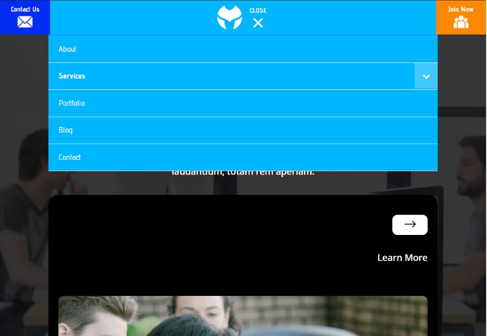
The mobile menu places the buttons on the far right and left and they add icons. The logo and open/close button with text and icon are placed in the center.
Demo 7
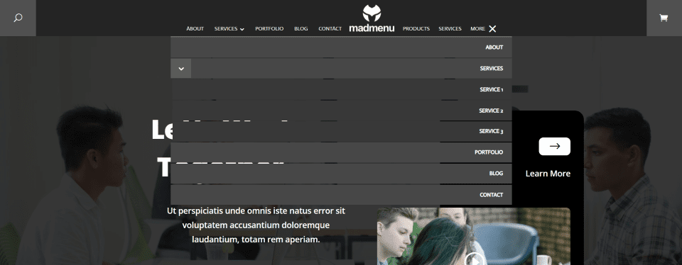
Demo 7 places the buttons on both sides of the header with the menu in the center. The logo is placed above the site’s name. The menu includes the open and close icon with text. The items in the dropdown menu are separated from each other so parts of the background can show through.
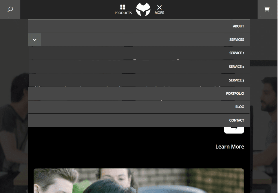
The mobile version keeps the buttons in their place and replaces the text with icons. The site’s title is also removed.
Demo 8
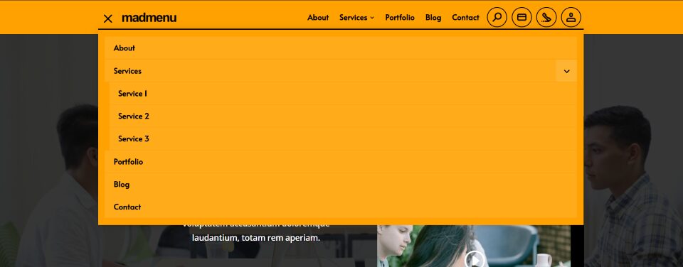
Demo 8 includes bold yellow with a dropdown menu and title to the left, and the menu with buttons on the right. Each of the buttons includes graphics.
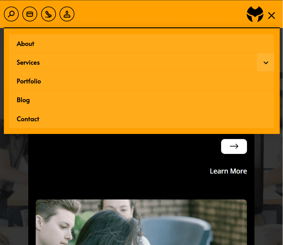
The mobile menu places the buttons on the left and the logo and menu icon on the right.
Demo 10
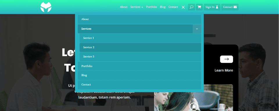
Demo 10 uses a gradient for the background and places a darker background behind each of the icons. The buttons include text and icons. Each of the links in the dropdown menu is separated from each other and the active link is darker. The logo is placed on the left.
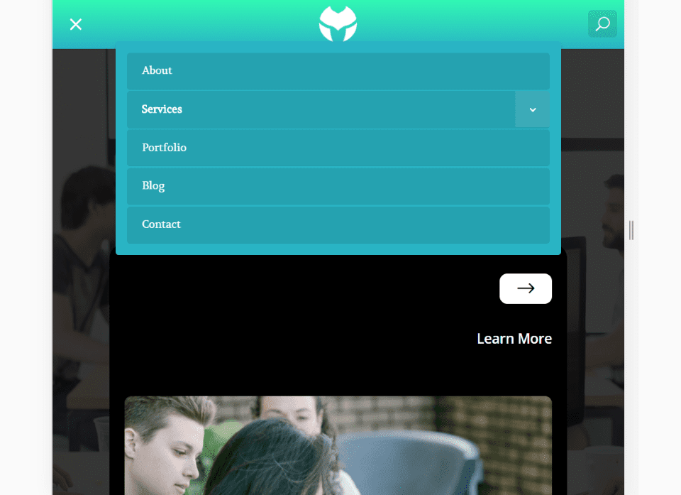
The mobile menu removes all of the icons except for the search icon. The menu is replaced by the open/close icons, and the logo is placed in the center. The dropdown menu looks the same.
Purchase Divi Madmenu
Divi Madmenu can be purchased at the publisher’s website for $39 per year for unlimited usage.
Ending Thoughts
Divi Madmenu for the Divi Theme Builder has a lot of features and customizations, making it easy to design just about any type of header you might need. The vast amount of adjustments in the design tab can be confusing at first, but they’re simple to use and it doesn’t take long to get the hang of what controls what. Using the two buttons along with adding images and icons to the search and cart buttons opens up a lot of design possibilities. If you’re interested in creating interesting menus with a single module, Divi Madmenu is worth a look.
We want to hear from you. Have you tried Divi Madmenu? Let us know what you think about it in the comments below.
Featured Image via venimo / shutterstock.com
The post Divi Plugin Highlight: Divi MadMenu appeared first on Elegant Themes Blog.
