Divi Mask is a third-party plugin for Divi that adds a new module to the Divi Builder with some unique styles for images and backgrounds. It places a mask over the image so the image takes the shape of the mask. Everything outside the mask can be any color you want including a gradient or even a different background.
It includes 54 preset masks that work as cutouts, revealing the image behind it. You can also add your own using SVGs. It includes headings, content, and a background tool. Each of the elements can be adjusted and styled.
In this plugin highlight, we’ll take a look at Divi Mask, see what it can do, and see how easy it is to use. You can purchase Divi Mask from the developer’s website.
Divi Mask Module
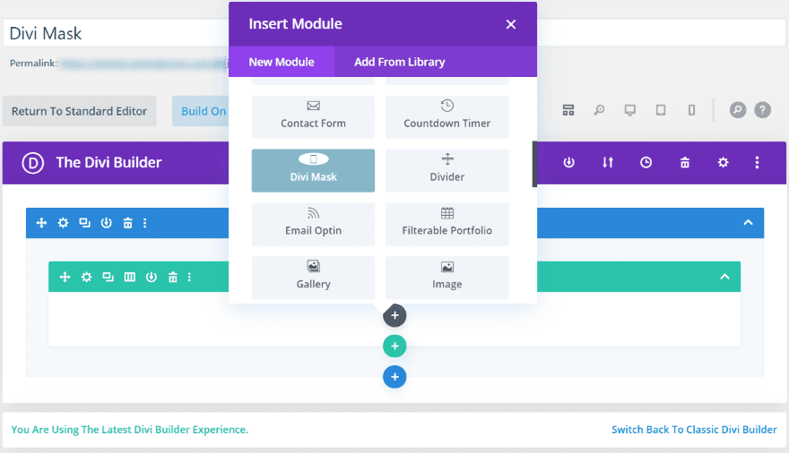
Upload and activate the plugin as normal. There’s nothing to set up. It’s ready to use as soon as it’s activated. The Divi Mask module is added to the Divi Builder.
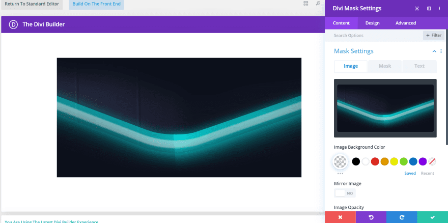
The Content tab lets you add an image, mask, and text. Other adjustments allow you to customize the image background color, mirror the image, and set the image opacity. You can also add a link and a background. This image shows the Mask tab in the Mask Settings. I’ve added an image from the eSports layout pack.
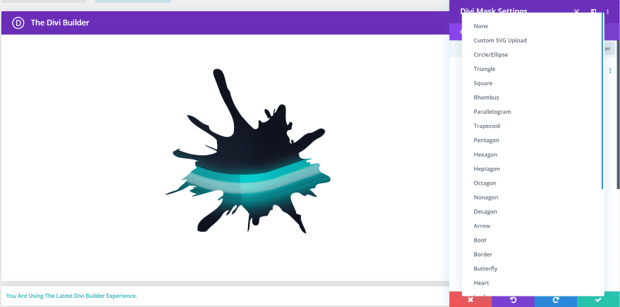
This is the Mask tab in the Mask Settings. It adds a dropdown box where you can choose between 54 built-in masks or upload your own custom mask using a free plugin called Save SVG.
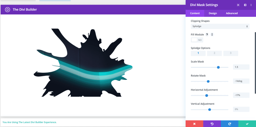
This tab also adds options to fill the module, select between three versions of the mask, scale to the size you want, rotate it, and adjust the horizontal and vertical position. I’ve adjusted each of them in this example. This is option 1 of the Splodge mask.
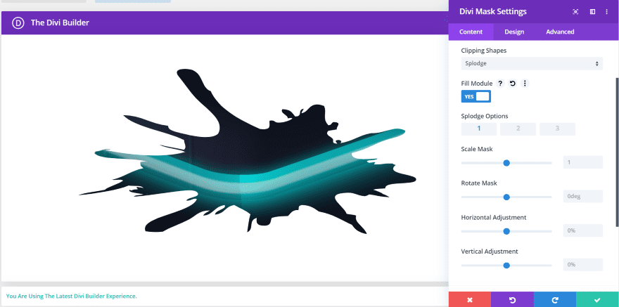
This is option 1 with Fill Module enabled. It stretches and fills up the space allotted for the module.
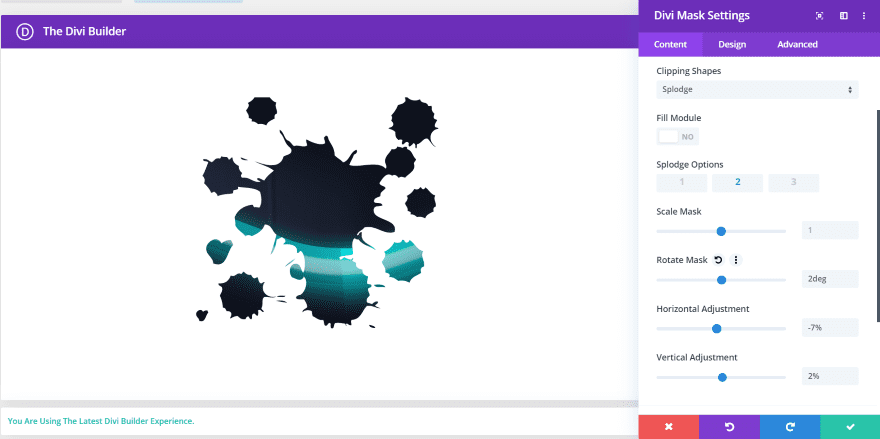
This is option 2 of the Splodge mask. It creates some interesting splotchy patterns.
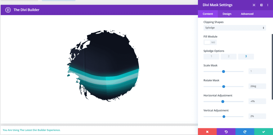
This is option 3 of the Splodge mask.
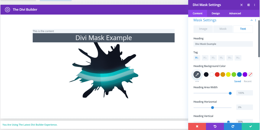
The Text tab of the Mask Settings adds areas for the heading and content, with independent customizations for each.
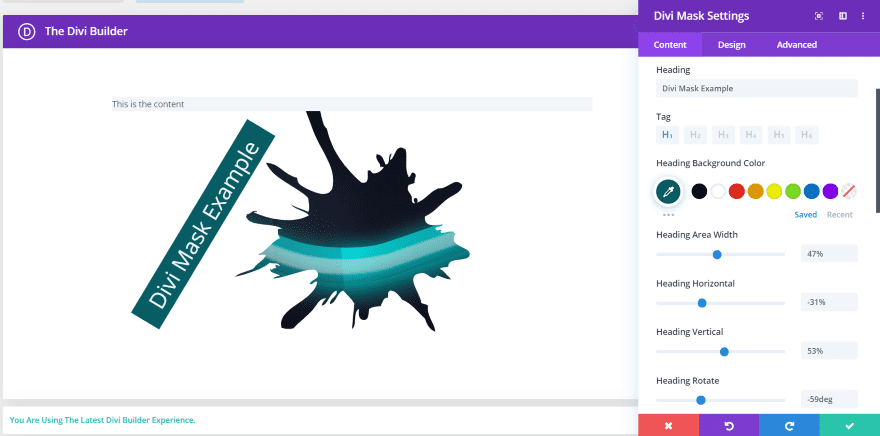
Choose the heading tag, adjust the background color, background width, horizontal and vertical position, and rotation. The text adjustments are handled in the Design tab.
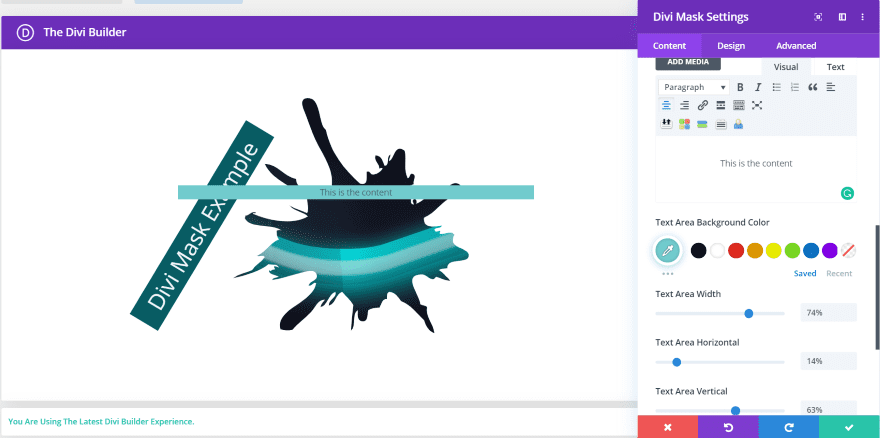
The Content area adds a complete editor where you can add text, images, media, etc. It also includes background adjustments for the color, width, and horizontal and vertical position. This one doesn’t include rotation. The adjustments for the text are in the Design tab.
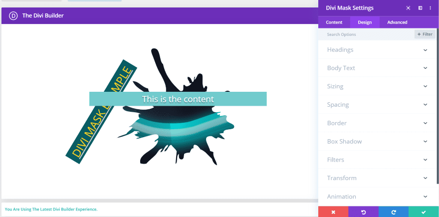
The Design Tab includes all of the expected settings for headings, body text, sizing, spacing, border, box shadow, filters, transform, and animation.
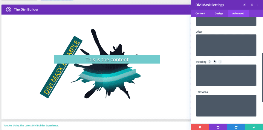
The Advanced tab includes CSS areas for the heading and text.
Divi Mask Examples
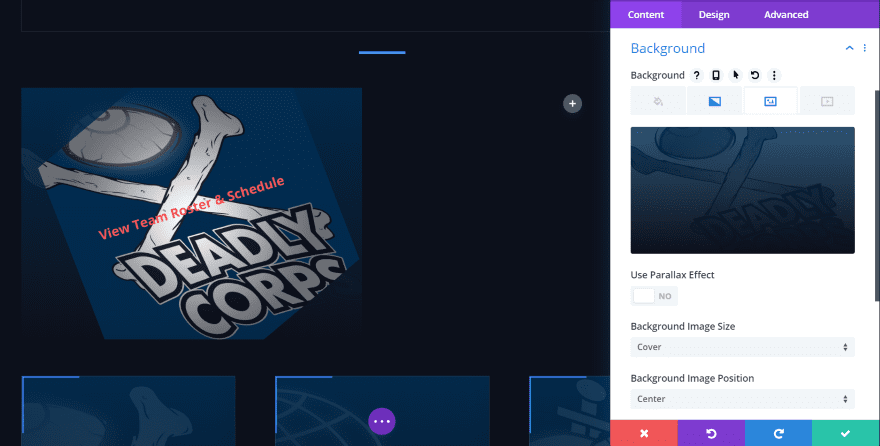
In this example, I’m using a Parallelogram mask set to fill the module. I’ve scaled the mask and adjusted its rotation and alignment. I’ve also added a background and gradient of the exact same image that I used in the Image tab of the Mask Settings. The mask reveals part of the image and allows the background image to show through in the background. I’ll use one that’s more obvious later.
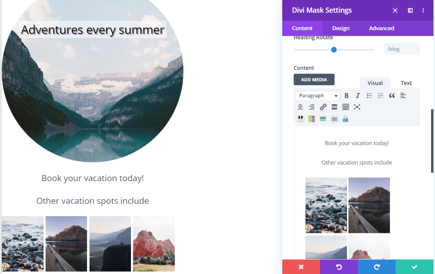
For this one, I added a Circle mask. I placed the header over the image with a white background. I reduced the width and opacity of the background and added shadow effects to the text. I moved the content below the image and added a set of photos that are clickable. Since it uses the content editor, each element can have a different URL, separate from the module’s link. Of course, I could place the content over the image if I wanted. This would make an interesting CTA.
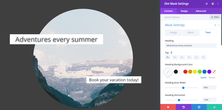
For this one, I changed the background to dark and moved the text to overlap the image. I increased the size of the header and content text and gave them a white background. I removed the thumbnail images from the previous example so the focus would be on the center image.
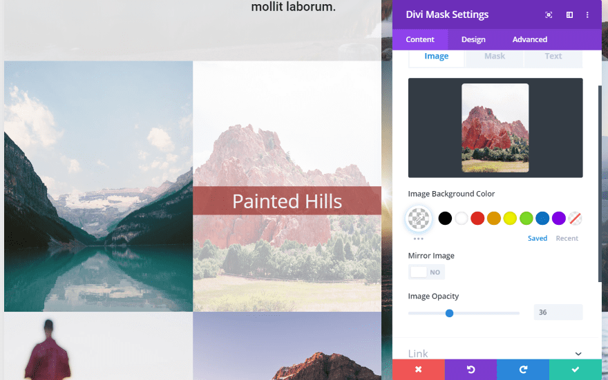
For this example, I replaced the center image module in the Travel Agency layout pack and added the same image in the Divi Mask module. I reduced the image opacity, added a header text, set it to 50% vertical position, changed the color of the header background, and lowered the opacity. This is an easy way to create links to pages, projects, posts, or just show information.
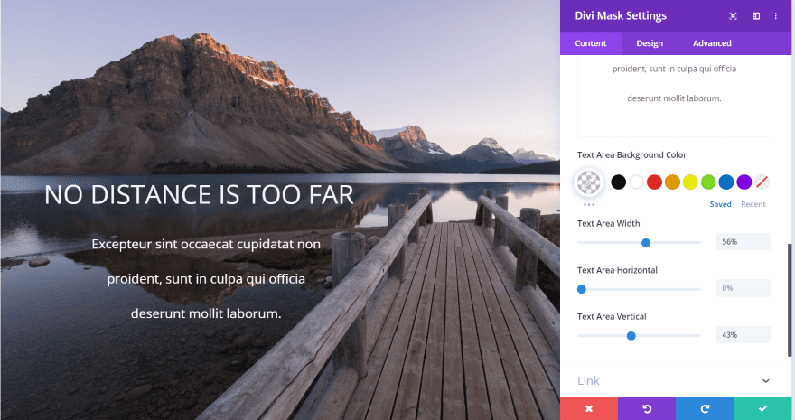
For this example, I‘m creating a full-width section and I’ll add a mask that will blend with the section separation. I’ve added the header and content text, changed their colors and sizes, made their background transparent, and positioned them where I want them on the image.
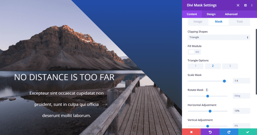
I added a Triangle mask and selected option 2. I’ve scaled it up and adjusted the horizontal setting. I’ve also added a gradient background to the module. This same gradient can be mirrored and added to the next section so they blend into each other.
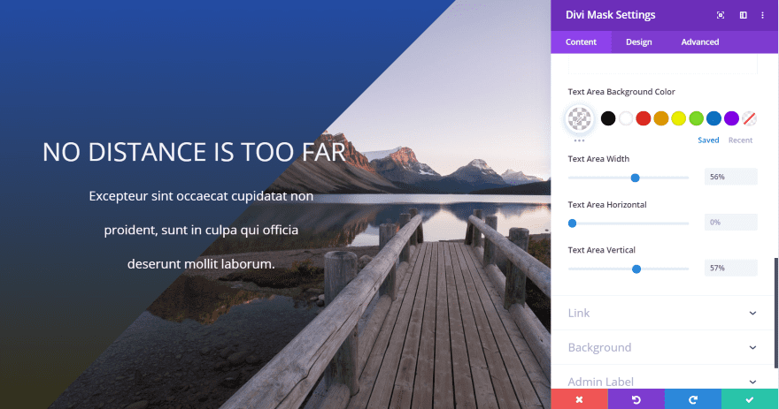
This is option 3. It flips the mask to the other side. I’ve moved the horizontal position to show more of the image and adjusted the vertical position of the header and text to overlap the mask. The text overlaps automatically.
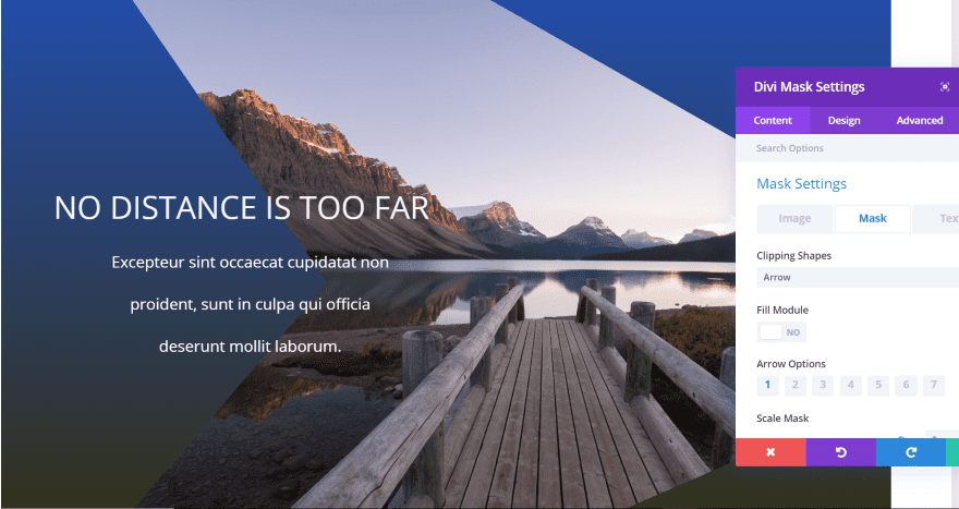
This one shows an arrow mask on option 1.
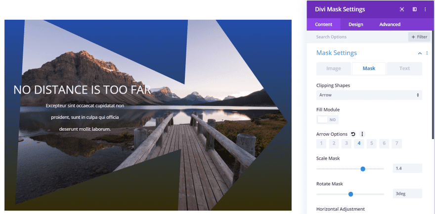
This is arrow option 4. I’ve placed it in a smaller row so more of it will show on my screen.
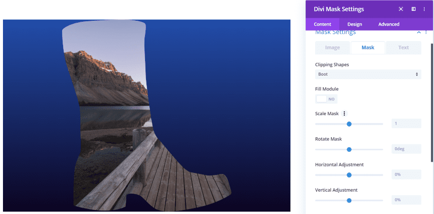
This is the Boot mask using the default settings with my background gradient.
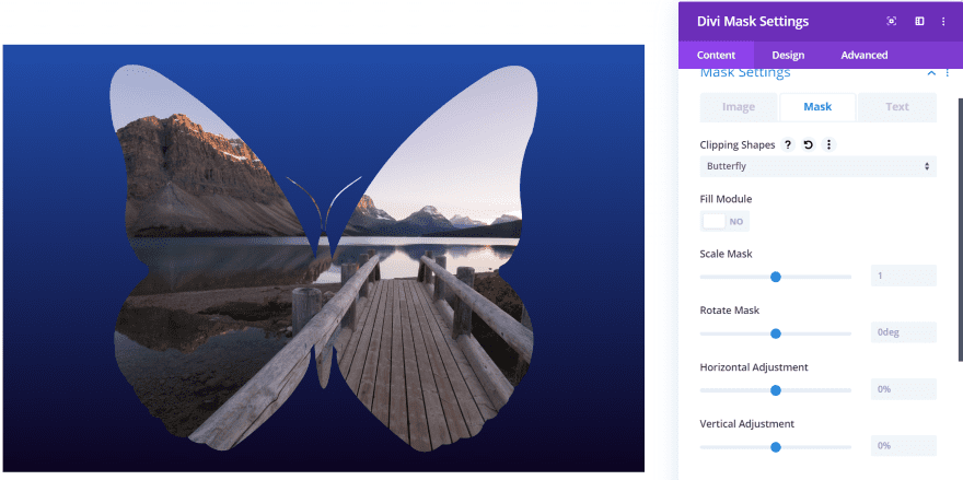
Here’s a nice Butterfly mask.
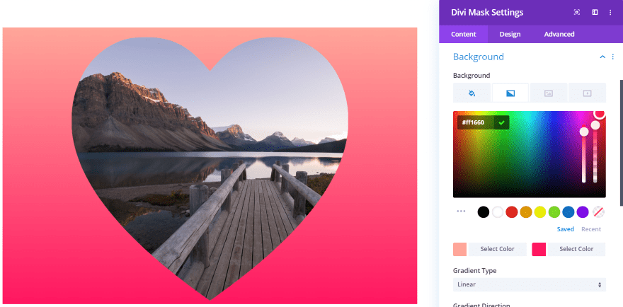
Here’s the Heart mask. I changed the background gradient just to match the heart theme.
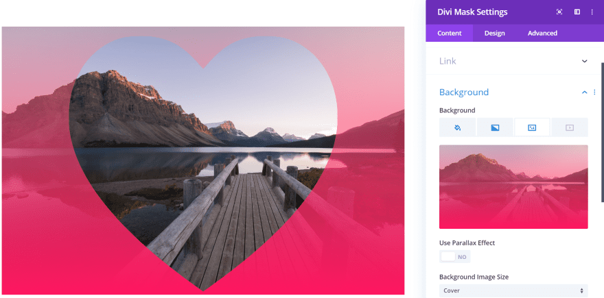
Now, I’ve added the same image as the background and set the gradient to show above the background image. This gives it the effect of the mask cutting away part of the gradient.
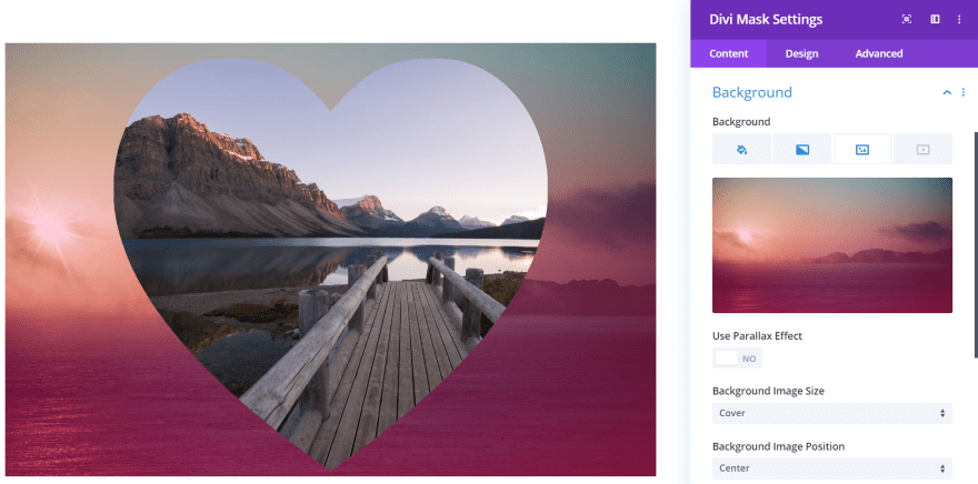
Of course, any image can be used as the background. In this example, I’ve replaced the background image so the Mask’s image shows over it. I’ve also reduced the opacity of the background so more will show through, making the effect more prominent.
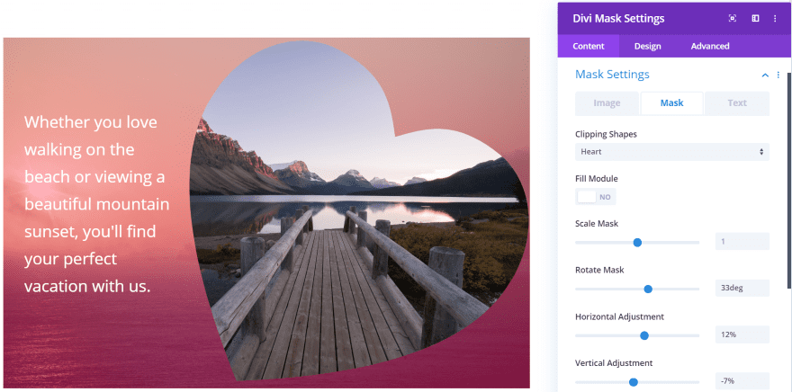
For this one, I rotated the mask and moved it to the right. I’ve adjusted the background’s gradient opacity. It’s still showing a different background image from the mask image. I’ve also added content text and adjusted the text size, and the content’s vertical position and width. This would create some interesting CTA’s or blurbs for information.
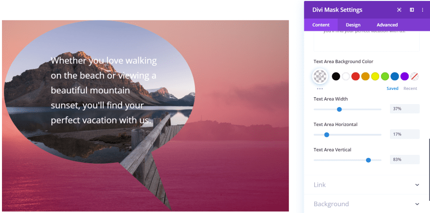
This one uses the Speech mask. I’ve adjusted its horizontal position and moved the content to center within it.
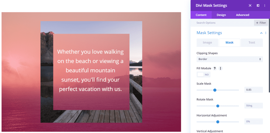
This is the Border mask. It creates a picture frame. I’ve centered it, scaled it to fit the images, and centered the content.
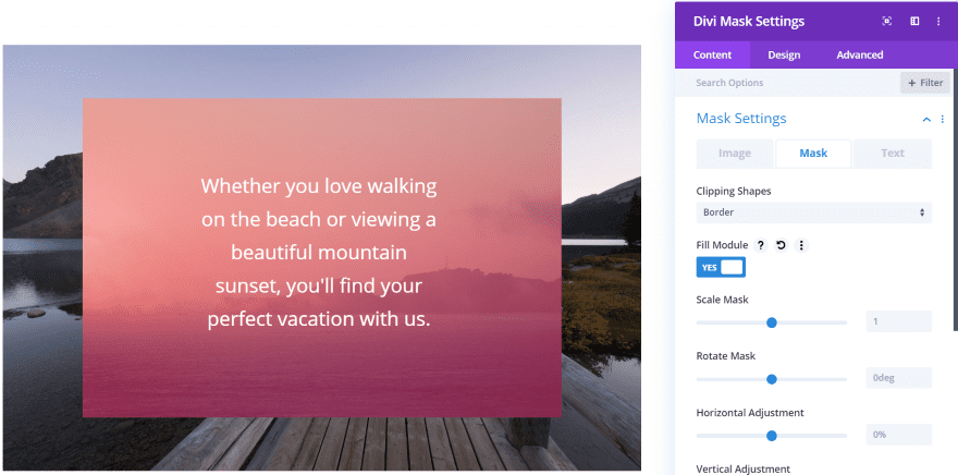
For this one, I set the scale back to default and selected Fill Module. The border still exists, but it’s outside of the viewing area.
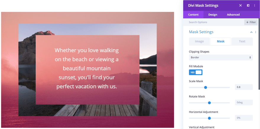
For this one, I adjusted the scale to show the border.
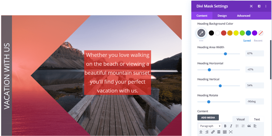
This one uses the Rhombus mask. It’s a square turned on its corner. I’ve scaled it up and moved it to the right. I’ve centered the content and given the content a background with enough transparency for the background to show through. I’ve added a header and positioned it to show on its side. I’ve also given it a background with a touch of transparency.
Divi Mask Price and Documentation

Divi Mask is $12 and includes 6 months of support and lifetime updates. It can be used on unlimited websites. You can purchase Divi Mask from the developer’s website.

The developer’s website also includes a detailed walkthrough of the plugin. This shows the basics and includes how to use the SVG feature to create your own custom masks. The site also includes a short FAQ to step you through the installation process.
Ending Thoughts
I found Divi Mask to be an interesting module. It’s highly intuitive. I never needed to read the instructions or watch the video, but it’s nice that they’re available just in case. My favorite ways to use it is in place of a blurb, as a CTA, to link to pages or products, or just to add some design styling to an image.
It is responsive, but it’s possible to create designs that don’t respond as well as you’d like. This is just something I’d keep in mind as I’m designing with it. Of course, you could also create tablet and mobile versions of your designs, and you can test the designs using the various visual modes in the Divi Builder.
I like the 54 masks that are built-in. They provide some interesting visuals and the controls expand that even further. I also like that you can create your own using SVG’s. It’s also interesting to have separate header and content elements with backgrounds that can be moved around.
Divi Mask opens up a lot of design possibilities for images and text. If you’re interested in adding cutouts to your images in Divi, Divi Mask is worth a look.
We want to hear from you. Have you tried Divi Mask? Let us know what you think about it in the comments below.
Featured Image via Oleksandr Korchahin / shutterstock.com
The post Divi Plugin Highlight: Divi Mask appeared first on Elegant Themes Blog.
