Divi Ribbon Module is a third-party plugin for Divi that adds a stylable ribbon to the module’s content. Add an image, button, title, content, and style each element as detailed as you’d like. Use it to highlight a product sale, build a call to action, or draw attention to any element. In this Divi plugin highlight, we’ll take a look at Divi Ribbon Module and see what it can do.
Installing Divi Ribbon Module

- Go to and download the plugin
- In the WordPress dashboard, go to Plugins > Add New
- Click Upload Plugin
- Select the zipped file from your computer
- Click Install Now
- When you see “Plugin installed successfully”, click Activate Plugin
- Go to Tools > Divi Ribbon Plugin License and enter your license key
Divi Ribbon Module
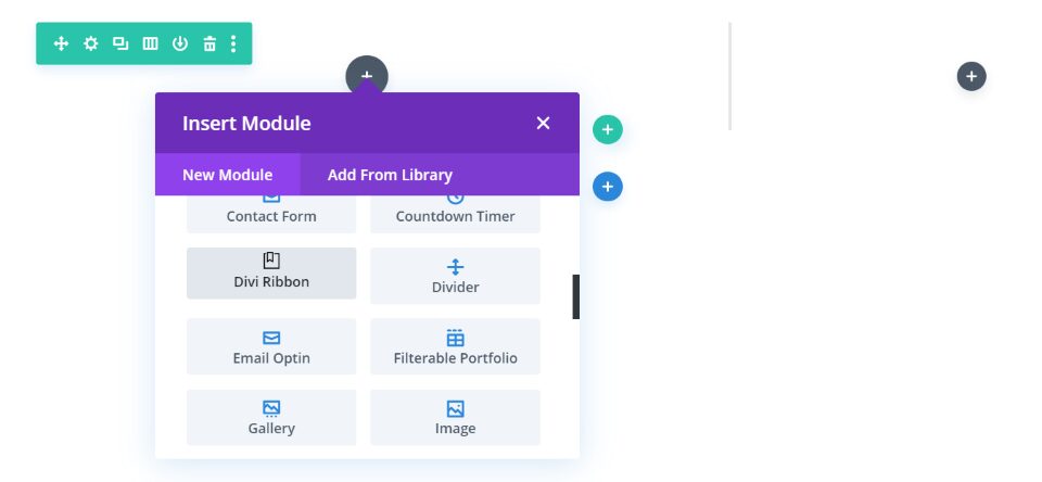
A new module is added to the Divi Builder called Divi Ribbon. The module creates a blurb (complete with a title, content, icon, image, and buttons) and places a ribbon on that blurb. You have control over the placement and styling of the ribbon as well as the other elements in the module. The blurb includes a box shadow by default.
Divi Ribbon Content Tab
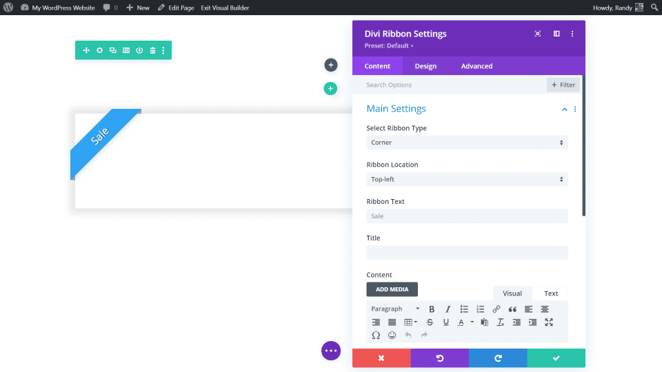
The Content tab includes the main settings, blurb rotation, image and icon, link, background, and admin label. The main settings provide selections for the ribbon type, location, text, title, and content.
Main Settings
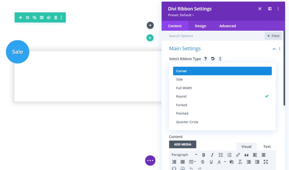
There are 7 ribbon types to choose from. They work the same way and include the same content, but they display different shapes. Shapes include ribbons with forked ends, ribbons that span the blurbs, ribbons on the side or top, and have different types of ends such as forks or circles. This gives you lots of display choices.
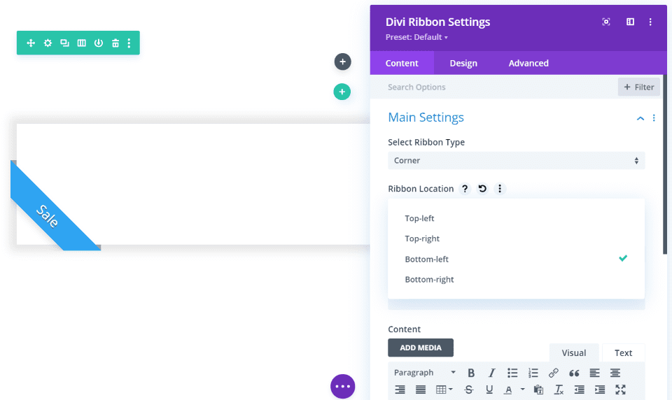
Each of the ribbon types has different location options depending on their display abilities. This example shows the corner ribbon. It can be placed on the top left or right, or on the bottom left or right.
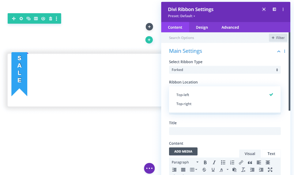
Forked can be displayed on the top left or right.
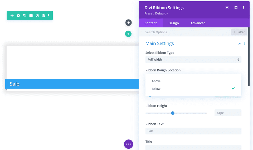
Full width can be displayed above or below.
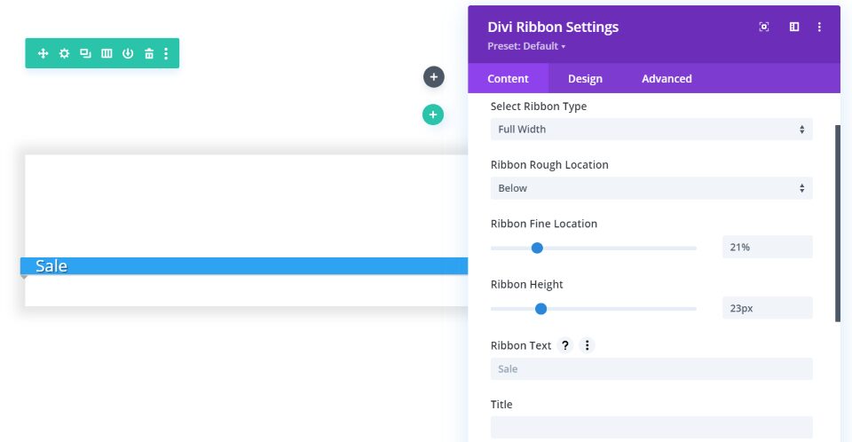
Some of the ribbon types have other options that open when you select them. This example shows the full width ribbon. You can adjust its location and height.
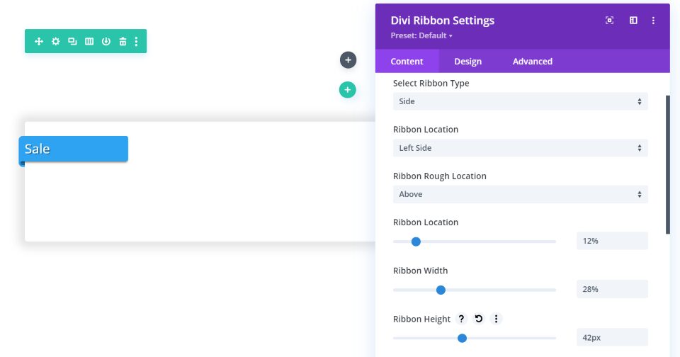
The side ribbon includes adjustments for the location, width, and height. All of the controls are the standard Divi sliders, so they’re easy to use.
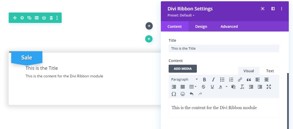
The title and content are added to the card itself. The content area has tabs for visual and text, and they can include media, links, code, and shortcodes.
Blurb Rotation
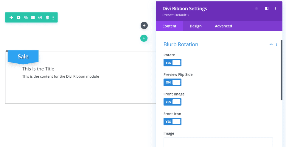
Blurb rotation adds a 3D flip option that shows the content after the card flips on its side, and an image and icon to show on the font.
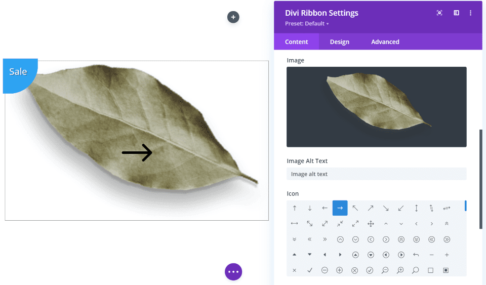
Add images from your media library and icons from the list. The image/icon will show first, and then the card will flip to show the content on hover. You can also add images as a background.
Button
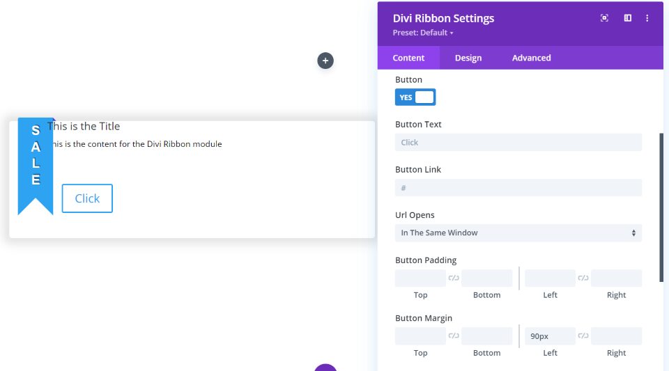
The button includes text, link, window options, padding, and margin. I’ve added some left margin to get the button out from under the ribbon.
Divi Ribbon Design Tab
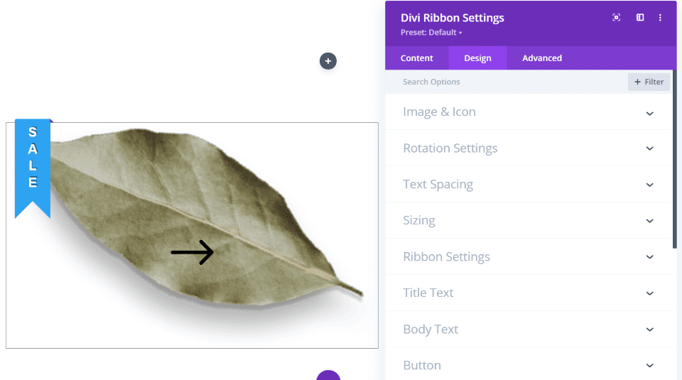
The Divi Ribbon Design tab includes settings for the image and icon, rotation, text, sizing, the ribbon, title text, body text, button, spacing, border, filters, transform, and animation.
Image and Icon
![]()
The image and icon settings allow you to adjust the image width, border, box shadow, colors, blend mode, etc.
Rotation
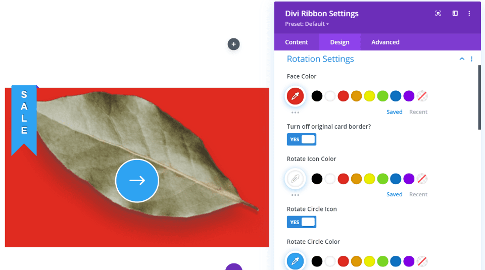
The rotation settings allow you to adjust the face color. This is the background behind the image. Disable the original card border so you can create your own. Adjust the rotation icon. It has a lot of options for the icon. Add an icon color, background, border, and use a pre-rotation font size.
At first, it was a little confusing that the icon adjustment was here instead of the image and icon settings, but it does make sense to be in this section. It would make sense to place the image settings here too, but there are so many that it needs a separate tab.
Text Spacing
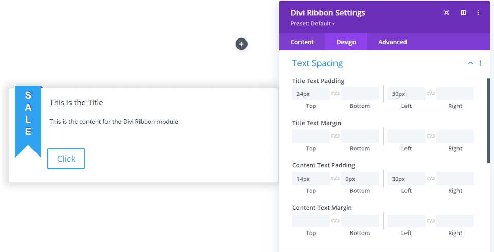
Text spacing gives you the margin and padding settings for the title and body text. Normally, the ribbon will display over the content. This lets you adjust the text positioning based on the ribbon’s location if you want it visible. I’ve added padding for both the title and body text in this example.
Ribbon Settings
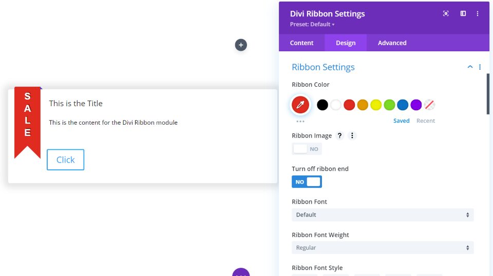
Ribbon settings allow you to change the color, add an image that will fill the ribbon, turn off ribbon end (to stop the styling from overlapping the card), adjust the fonts, add a text shadow, adjust the ribbon corners, and border. I’ve changed the ribbon color in this example.
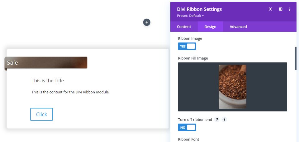
The image will fill the ribbon. I was only able to get JPGs to work, but it does work well. I recommend choosing an image that’s already the size you want so you’ll have control over how it displays.
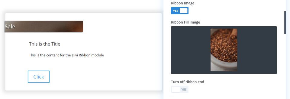
Turning off the ribbon end gets rid of the portion that folds back behind the card, as you can see on the left of the ribbon in this example.
Text
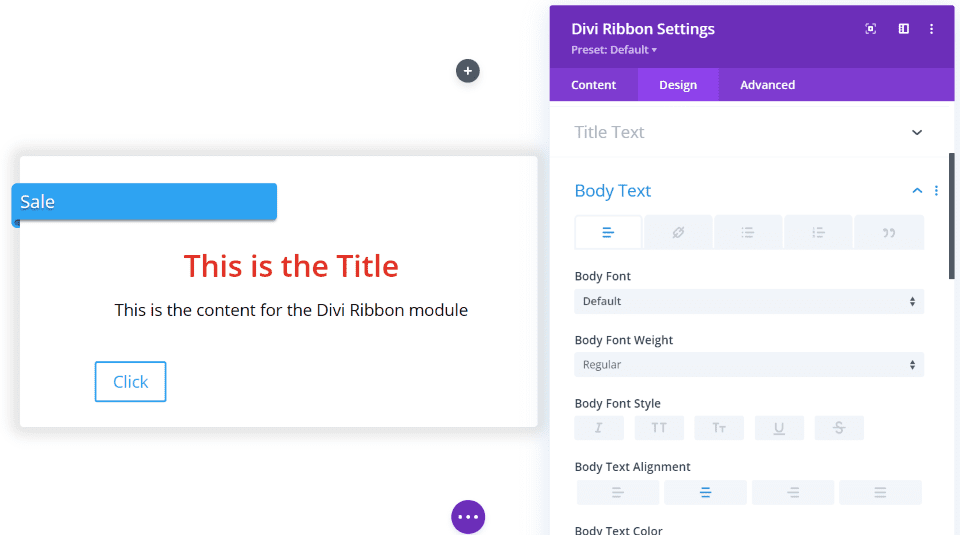
The title and body text include all of the expected options. In this example, I’ve increased the size of both, changed the color of the title text, and centered both.
Button
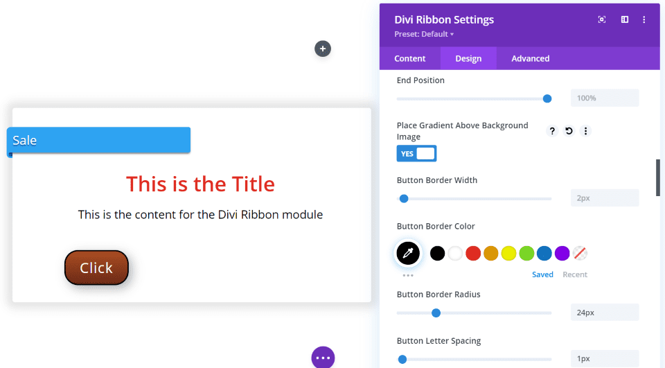
The button styling includes all of the expected options and adds a feature to display the gradient above the background image. In this example, I’ve increased the size of the font, changed the color of the font and border, rounded the border, gave the background a gradient, and added a shadow.
Divi Ribbon Examples
Here are a few examples of how Divi Ribbon looks within Divi layouts.
On Sale Ribbon
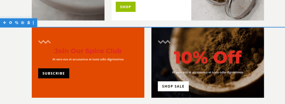
For the first example, I’ll replace the CTA on the right.
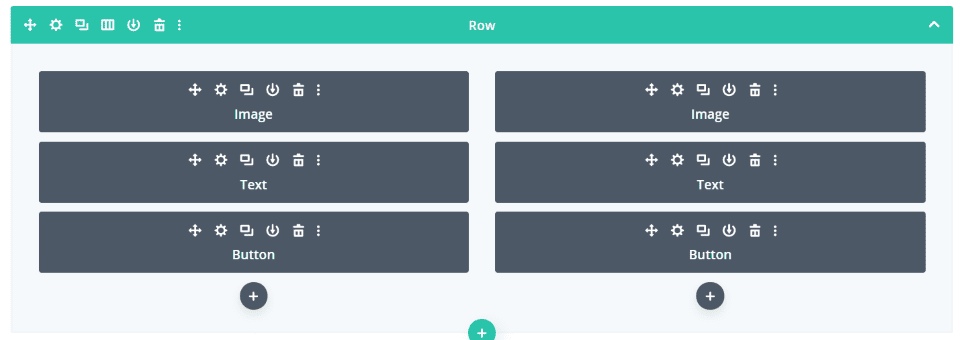
It was made with three modules: image, text, and button. I’ll use the same background, text, and button and recreate it with a single Divi Ribbon module.
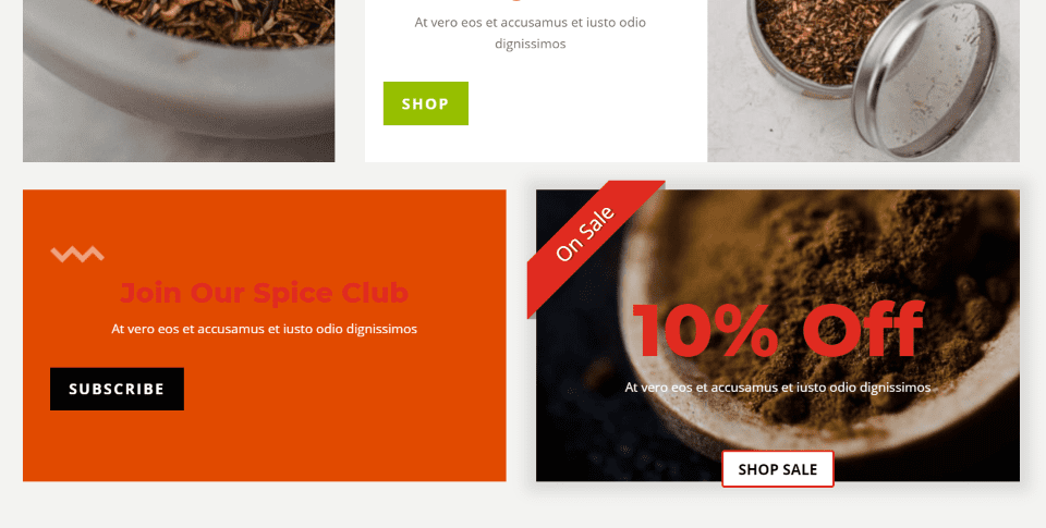
Here’s the result using Divi Ribbon. I added the image, the title text, and body text to match the original. I also added the ribbon to the corner and moved the button to the center and used the border color from the ribbon’s background. The original used the image in the column. I removed it and added the image to the module, but it would work either way.
I didn’t include the squiggly image (a triangle wave), but it could be added in the content area easily. The title would also need to be moved to the content area in order to get the graphic to appear above the title. The On Sale ribbon makes it stand out a little more.
Latest Projects Ribbon
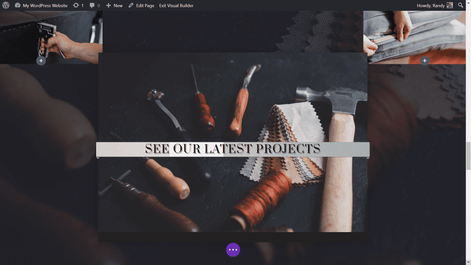
For this one, I replaced an image with the Divi Ribbon module and added a full width ribbon as a CTA to see the latest projects. The ribbon has a background image and fonts from the layout. The box shadow is the default setting. I’ve centered the text.
Product CTA Ribbon
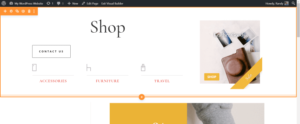
For this example, I added a Divi Ribbon module to the shop page’s hero section of the Leather Company layout. Using an image from the layout, I replaced the standard sale CTA. The ribbon and button use colors from the layout. I moved the ribbon to the bottom right corner and removed the ribbon end.
This is a Specialty section. I’m glad to see that it works well in Specialty sections. Many third-party modules are not always compatible with this type of section.
Test and Purchase
You can purchase Divi Ribbon Module from the developer’s website for $11 for personal or commercial use on a single website.
You can also test the plugin before purchasing to see if it will work for your needs. The link to test the plugin is found on the developer’s sales page. It gives you full access to the Divi Builder and the plugin, so you can style it to your heart’s content. I recommend giving it a try.
Ending Thoughts
Divi Ribbon Module is an interesting module for the Divi Builder. It includes several places to add images and you can include a title, content, an icon, and a button. With all of these features, it works great as a blurb, call to action, product link, blog link, etc. Add to that a stylable ribbon to call attention to sales or other CTA’s, and this plugin provides styling options that are hard to get with a single module.
Divi Ribbon Module works great with the Visual Builder and the Theme Builder. It’s an excellent plugin that’s easy to recommend.
We want to hear from you. Have you tried Divi Ribbon Module? Let us know about your experience in the comments.
Featured Image via Foxys Graphic / shutterstock.com
The post Divi Plugin Highlight: Divi Ribbon Module appeared first on Elegant Themes Blog.
