The Divi Shop Builder adds 14 new modules to the Divi Builder that allow you to customize the design of default WooCommerce pages with Divi. The plugin also comes with some premade shop layouts to give you a jump start on customizing your site. If you run an online store using WooCommerce and want to be able to customize WooCommerce just like you would any other Divi Module, this could be a great plugin for you! In this plugin highlight, we’ll take a close look at the features that come with Divi Shop Builder to give you an idea of what you can accomplish with this plugin.
Let’s get started!
Installing Divi Shop Builder
Divi Shop Builder can be installed just like any other WordPress plugin. Open the plugins page in the WordPress dashboard and click Add New. Click Upload Plugin at the top, then select the .zip plugin file from your computer.

Once the plugin is installed, activate the plugin.

Divi Shop Builder
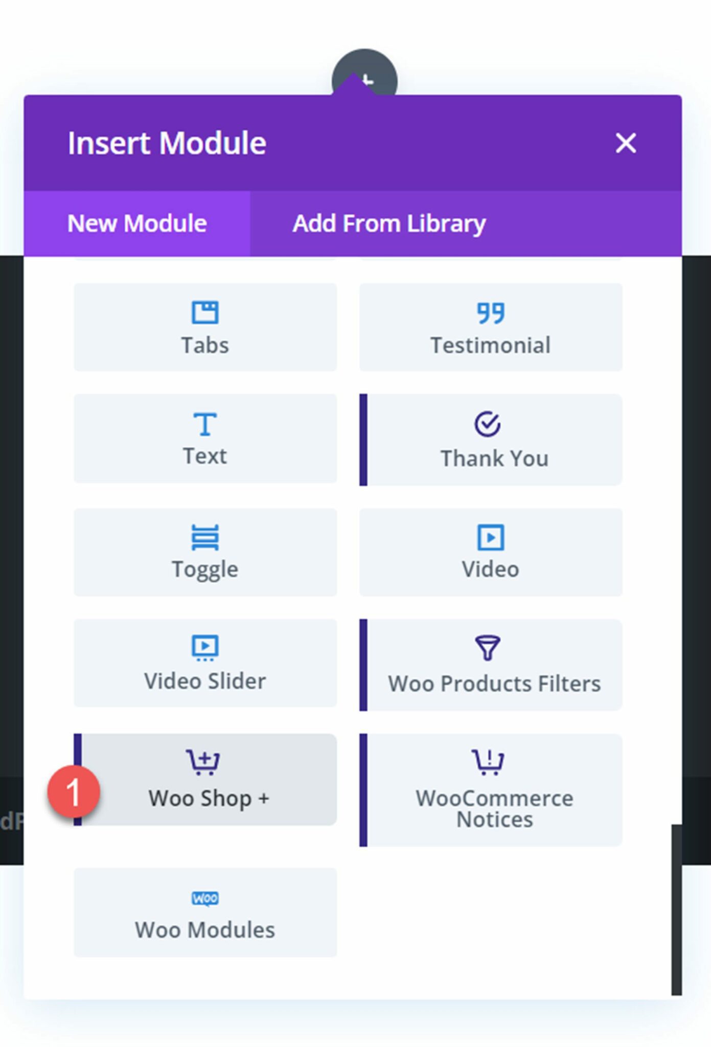
To add the Divi Shop Builder modules to your website open a page with the Divi Builder. Add a new section and row, then click the grey plus button to add a new module. You will see 14 new modules added to the insert module section, which you will use to build the shop. Let’s take a look at each module below.
Woo Shop + Module
Start by adding the Woo Shop + module to your shop page.
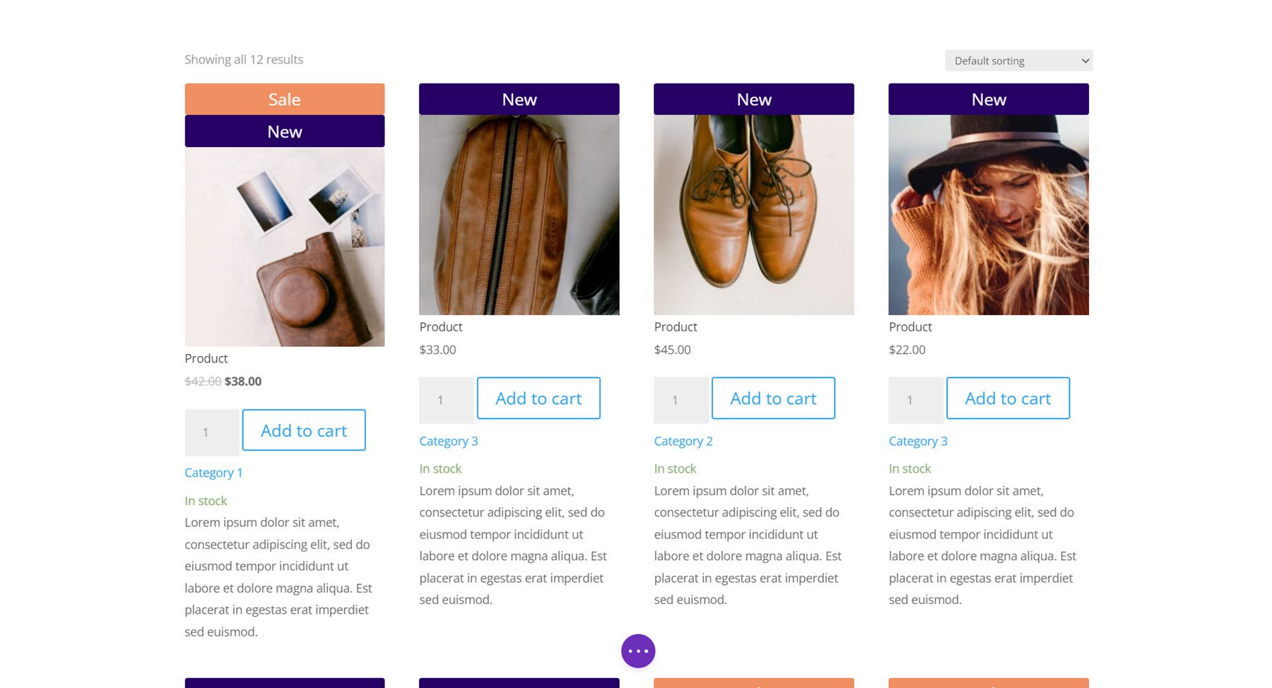
Here is how the shop module looks when it is first loaded.
Content Tab
Let’s take a look at the Woo Shop + module settings.
Products
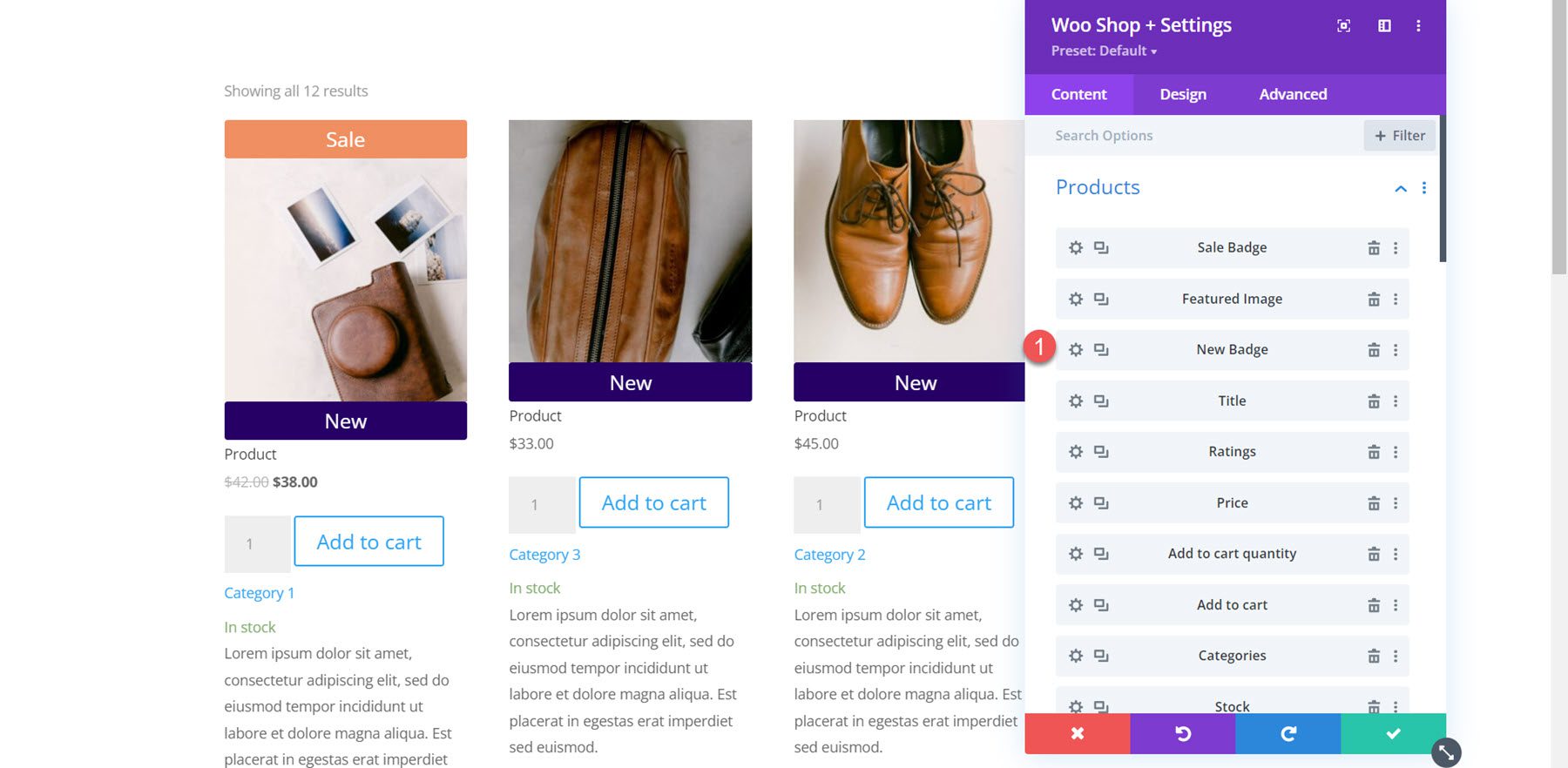
The first section under the content tab is where you can choose and reorder the components displayed in the shop module. You can add a component by clicking the Add New Item button below.
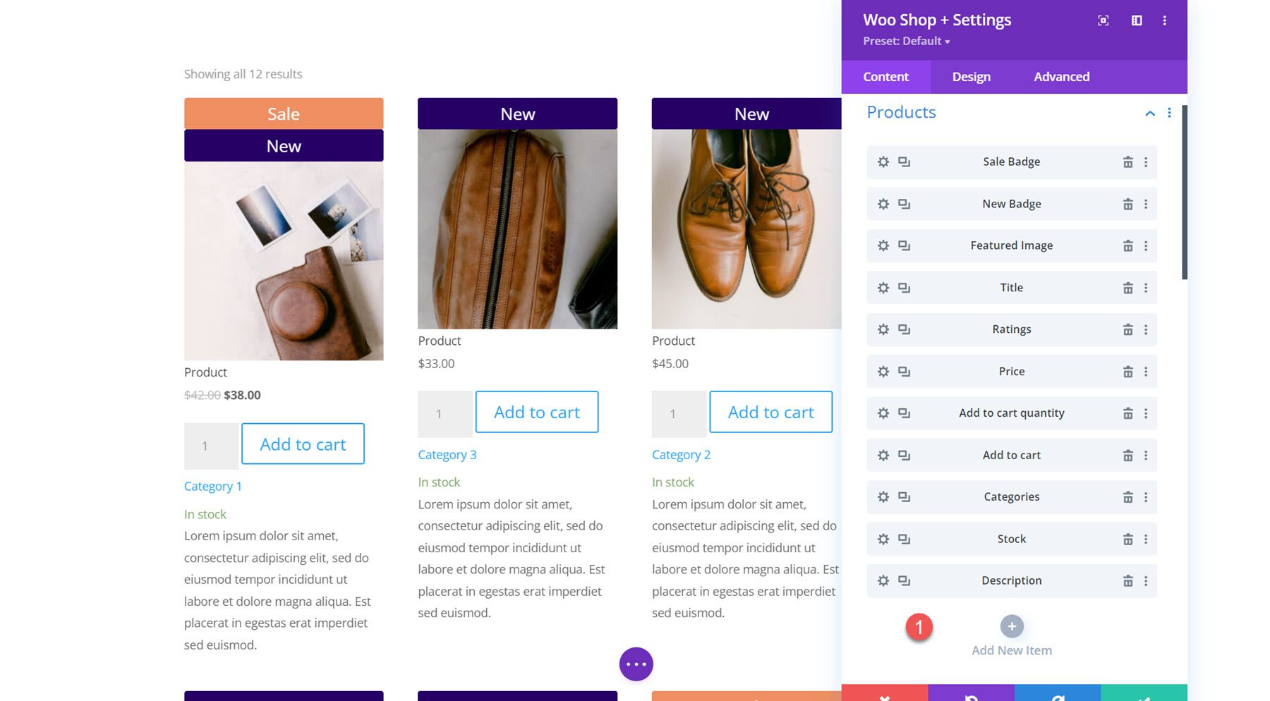
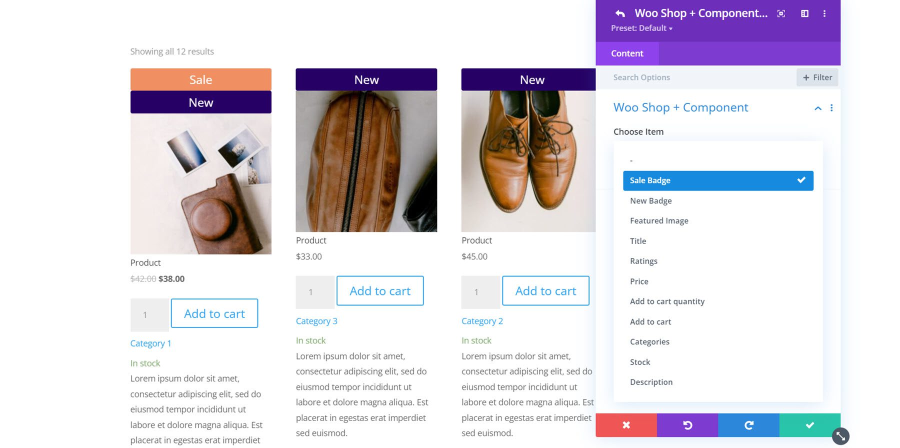
There are 11 components to select from: Sale Badge, New Badge, Featured Image, Title, Ratings, Price, Add to Cart Quantity, Add to Cart, Categories, Stock, and Description. These options give you total control over what elements to display in the shop module, what order they are placed in, and more. When we get into the design settings, you’ll see how easy it is to completely customize the design of each of these components as well.
Here I’ve reordered the product components so that the new badge appears below the featured image.
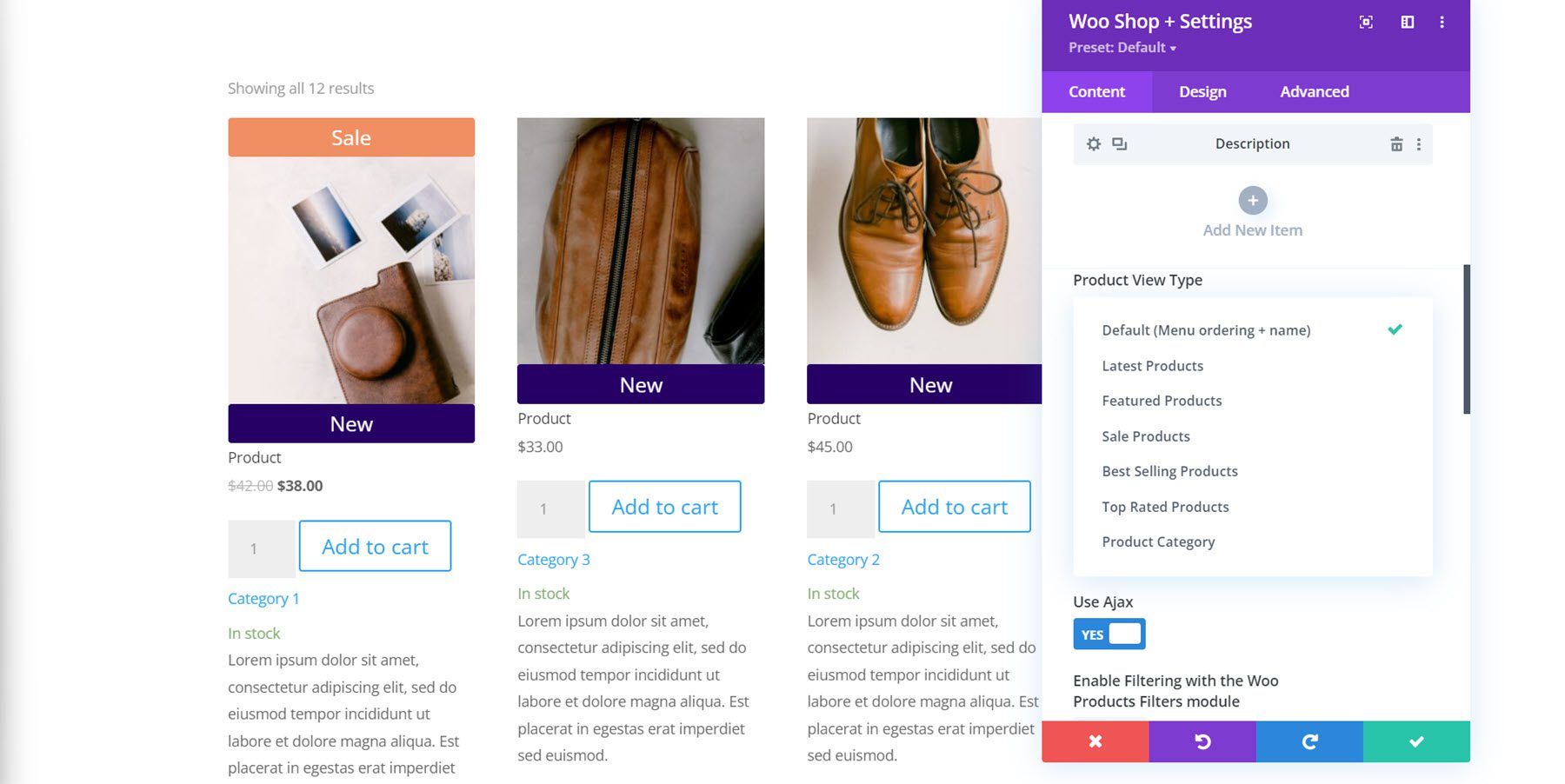
Next in the next part, you can find the product view type setting. This allows you to change the type and order of products displayed in the module. You can select from Default (Menu ordering + name), Latest Products, Featured Products, Sale Products, Best Selling Products, Top Rated Products, and Product Category.
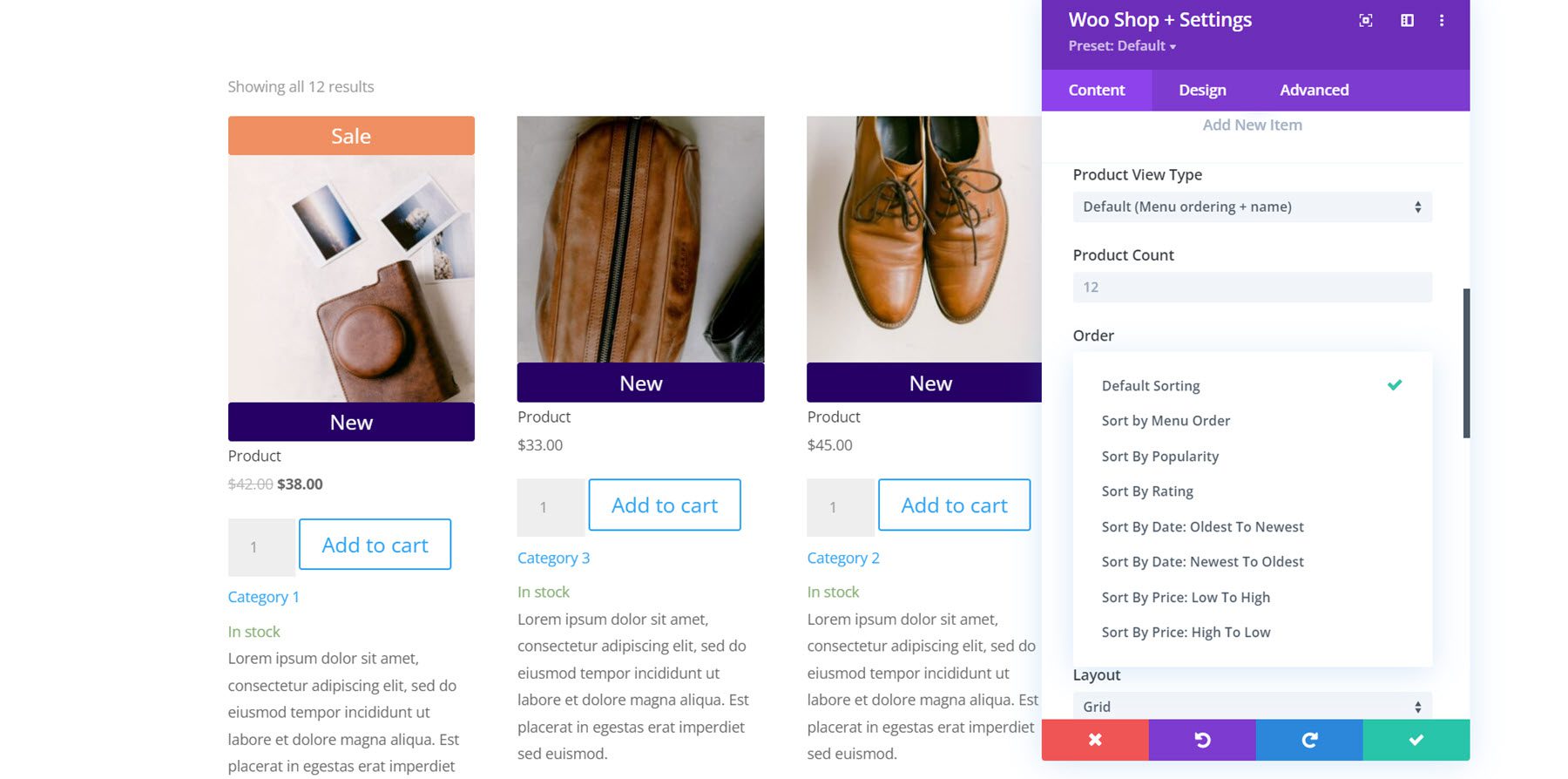
Below this, you can modify the number of products displayed in the module and change the order of products.
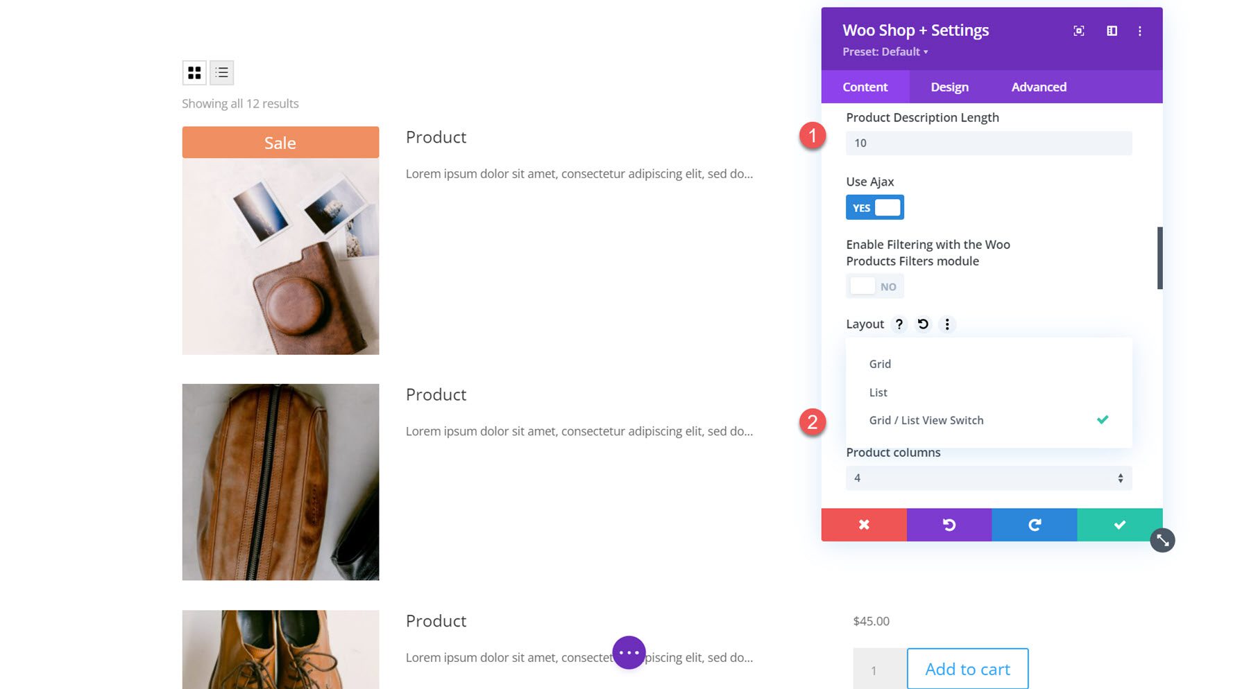
Here I modified the product description length to 10. You can also enable or disable Ajax, enable filtering with the Woo Products Filters module, change the layout, and change the number of product columns. This is the list view using the Grid/List View Switch layout, which adds a button to the top where you can switch between grid and list view.
The description content setting allows you to display a short description or a custom description. Following this, you can choose to display the product count results, product sorting, and pagination either above, below, above and below, or hide them entirely. You can also enable or disable sale flashes.
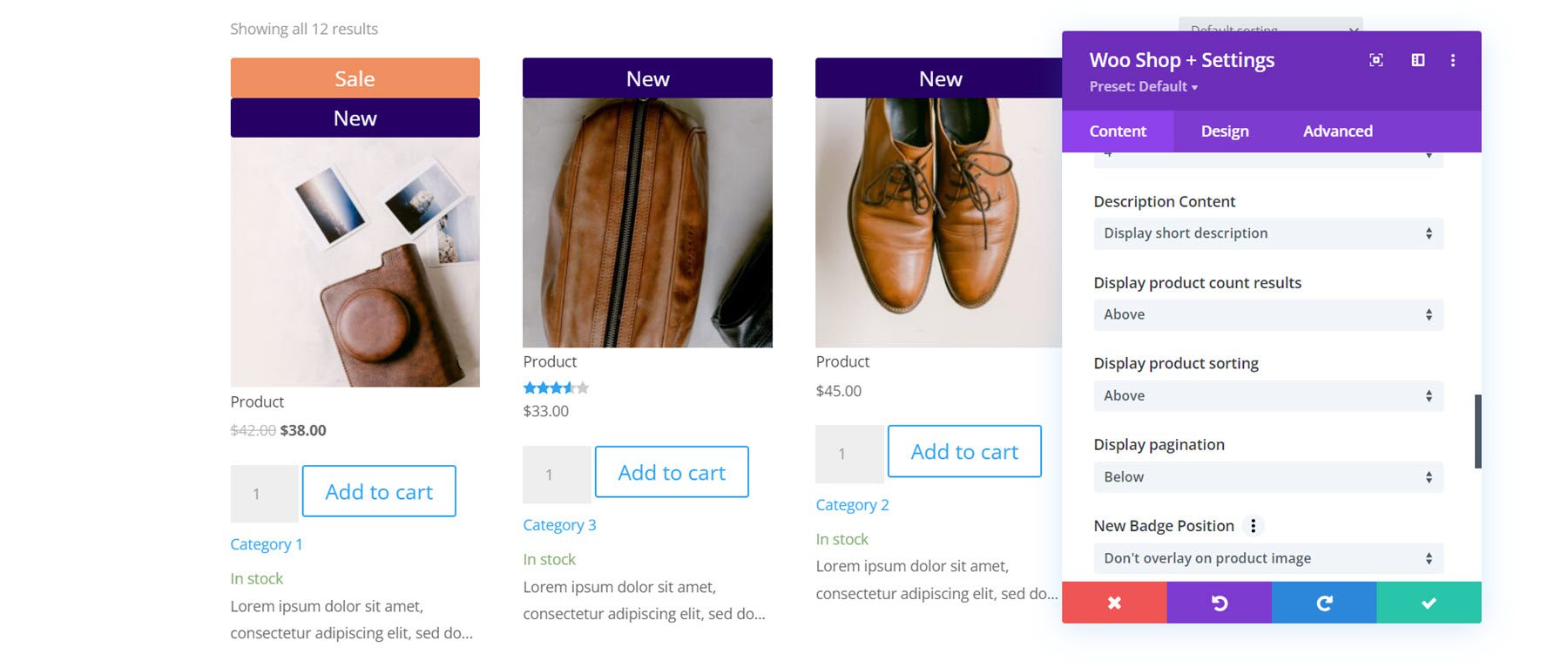
You can change the position of the new badge with the badge position settings. The default option is don’t overlay on product image, which adds a banner that spans the width of the featured image. Alternatively, you can select an overlay position (top left, top right, bottom left, bottom right) which adds a small badge over the image. You can also change the text for the new badge. Following this are the exact same settings for the sale badge.
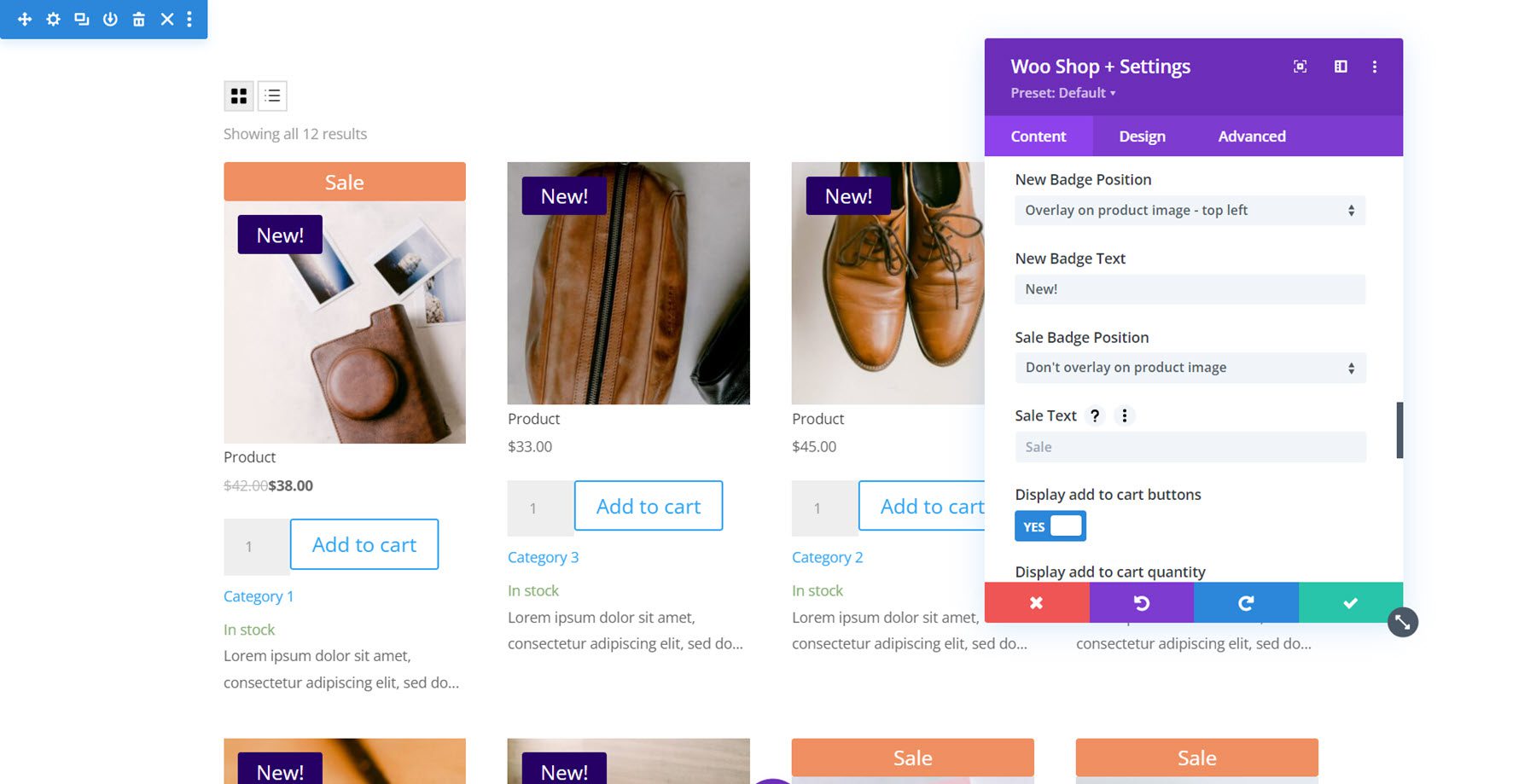
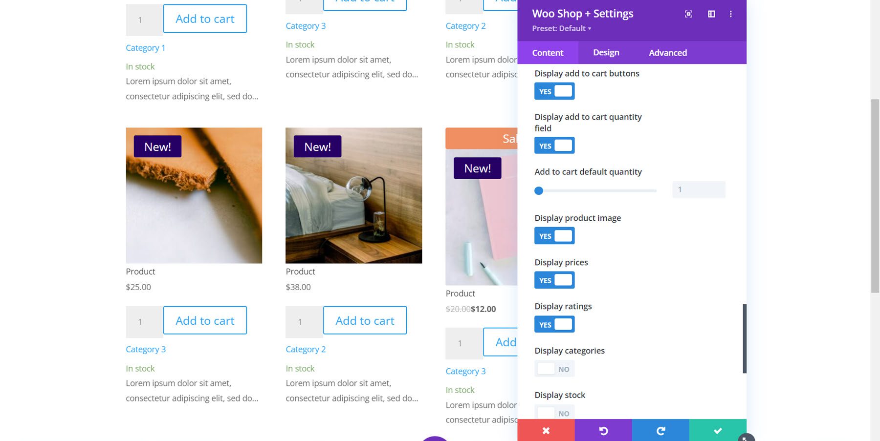
Last in this section are some display options. You can choose to display the add to cart button, the add to cart quantity field, change the default add to cart quantity, the product image, prices, ratings, categories, stock, and new badge.
No Products Found
Here you can change the heading and message text for the No Products Found page.

Default Content Tab Settings
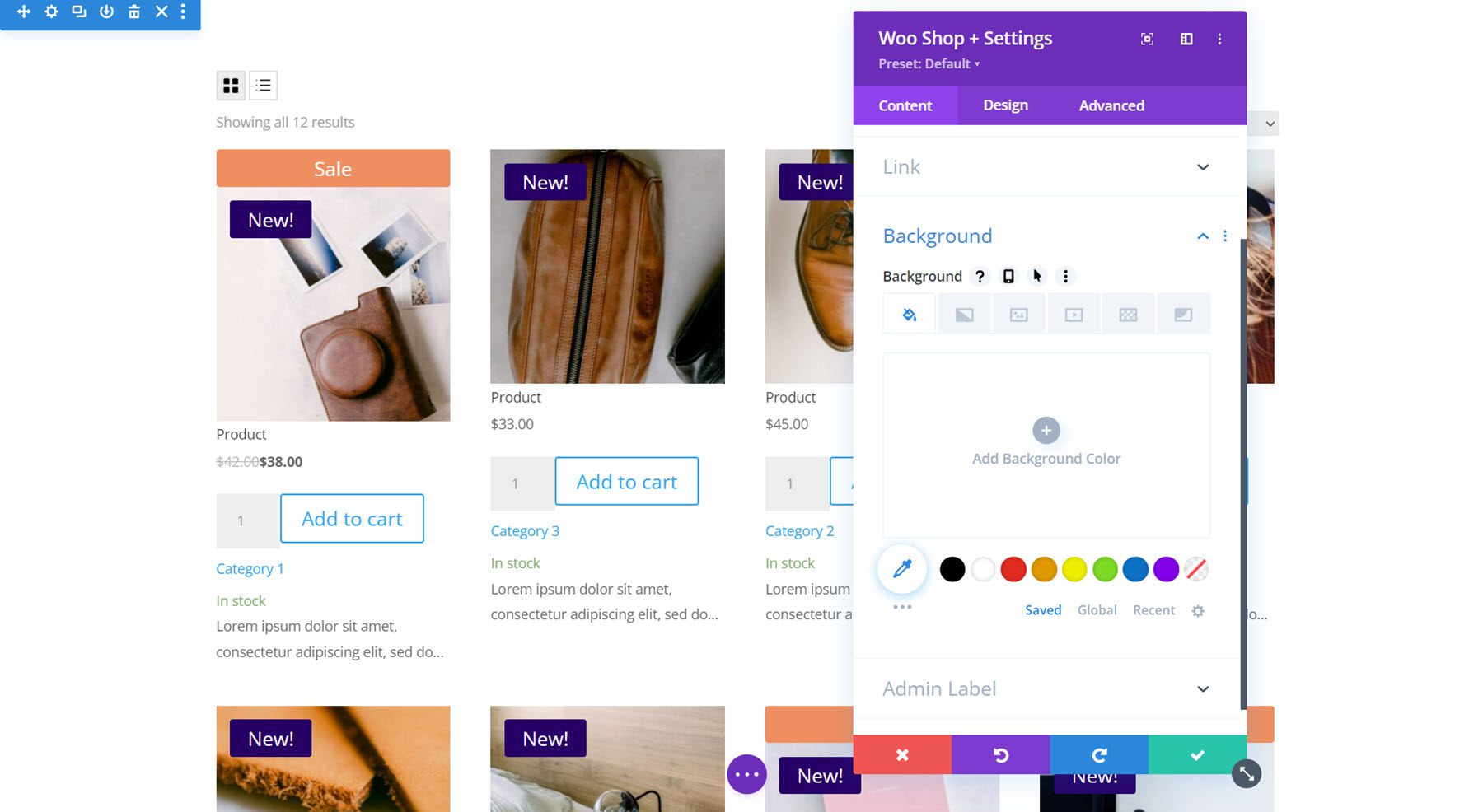
The Woo Shop + module also features the default content tab settings such as Link, Background, and Admin Label.
Design Tab
The design tab is where you can fully customize every aspect of the Woo Shop + module.
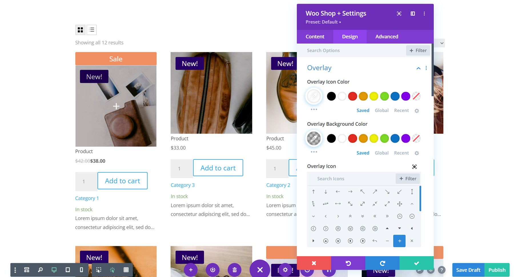
Overlay
First up, overlay settings. This is where you can customize the overlay that appears over the featured image on hover. In this example, I added a dark overlay and a white icon.
Image
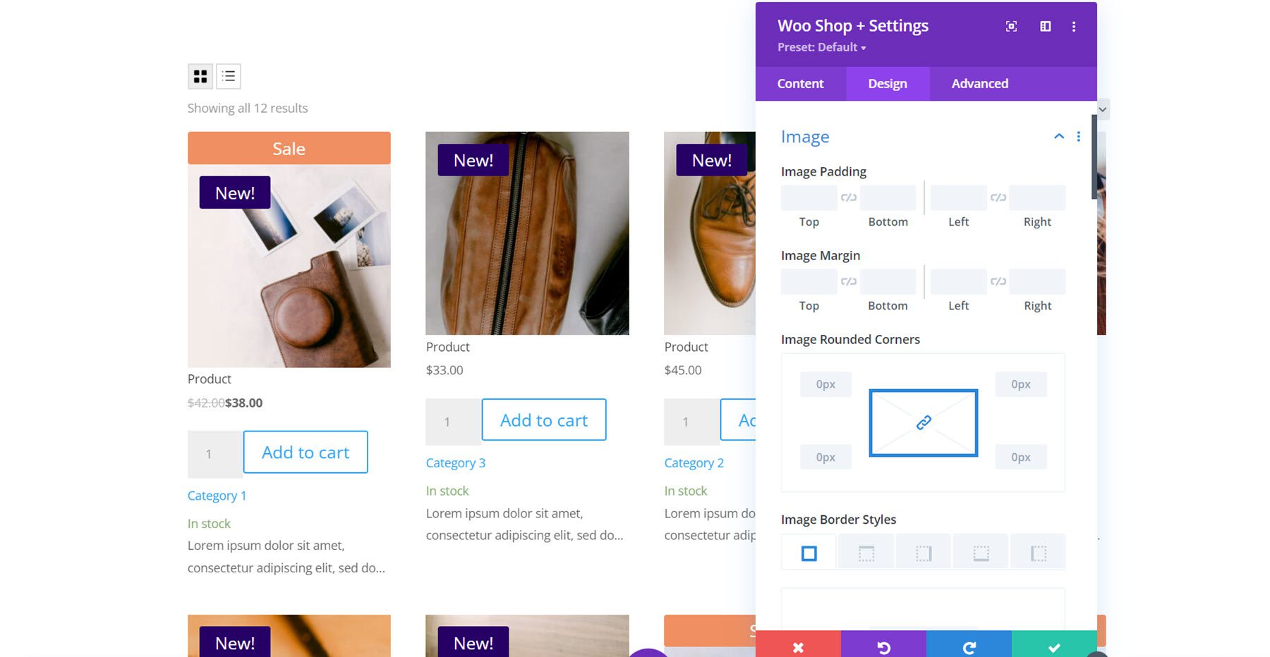
With the image settings, you can change the padding and margin, add rounded corners, customize the border, and modify the image with any of the filter settings such as hue, saturation, brightness, and more.
Star Rating
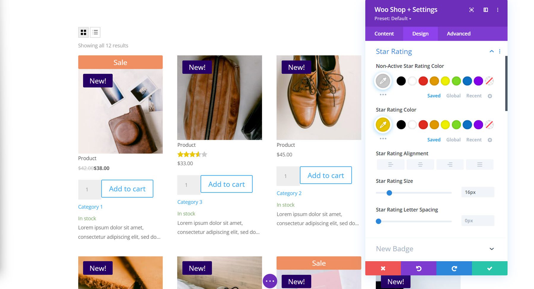
Here you can customize the design of the star rating. You can change the non-active and active star rating color as well as the alignment, size, and spacing.
New Badge
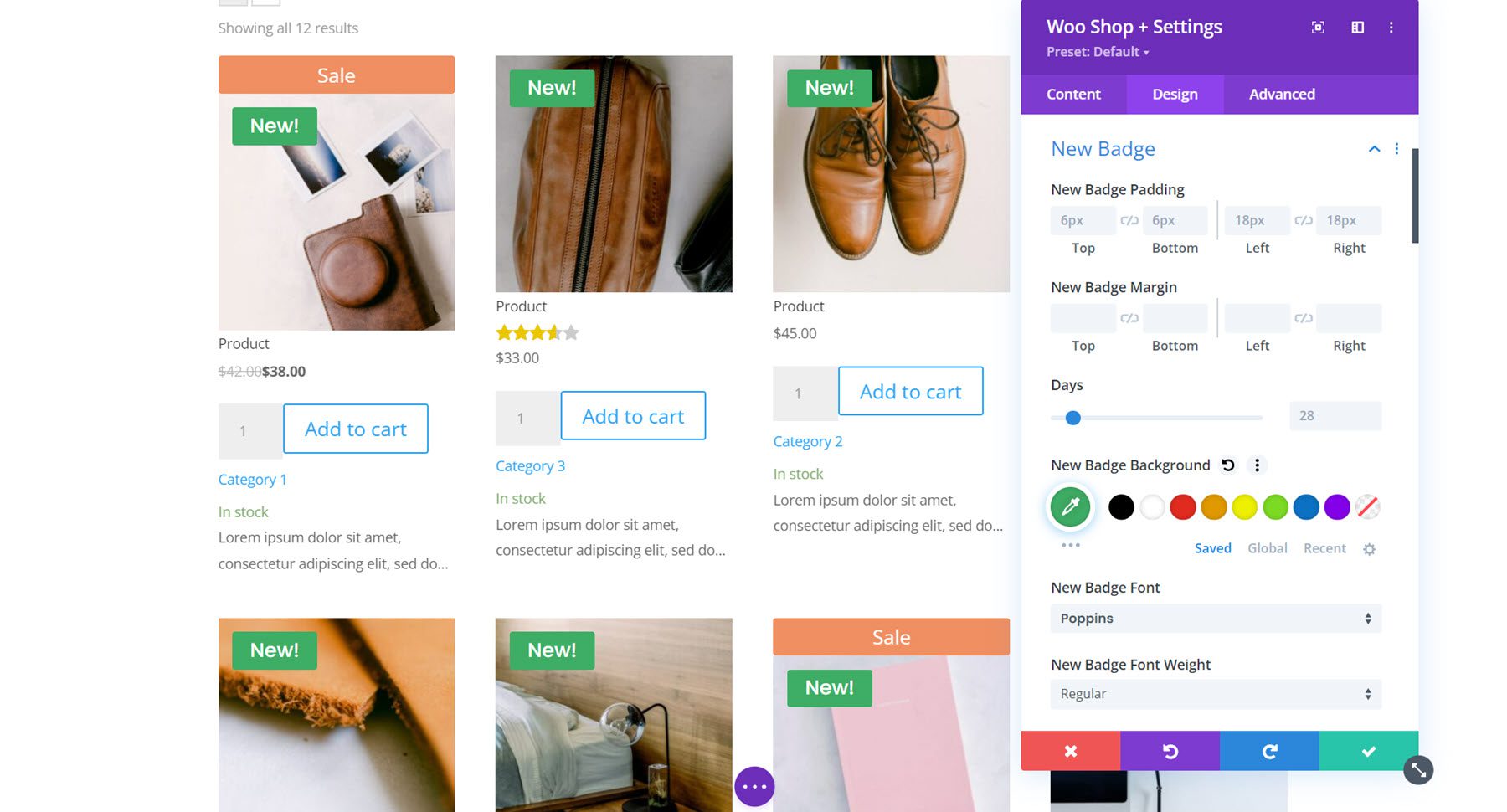
Next is the new badge settings. You can customize the padding and margin, set how many days the new tab stays, and completely customize the design with all of the background, font, and border options.
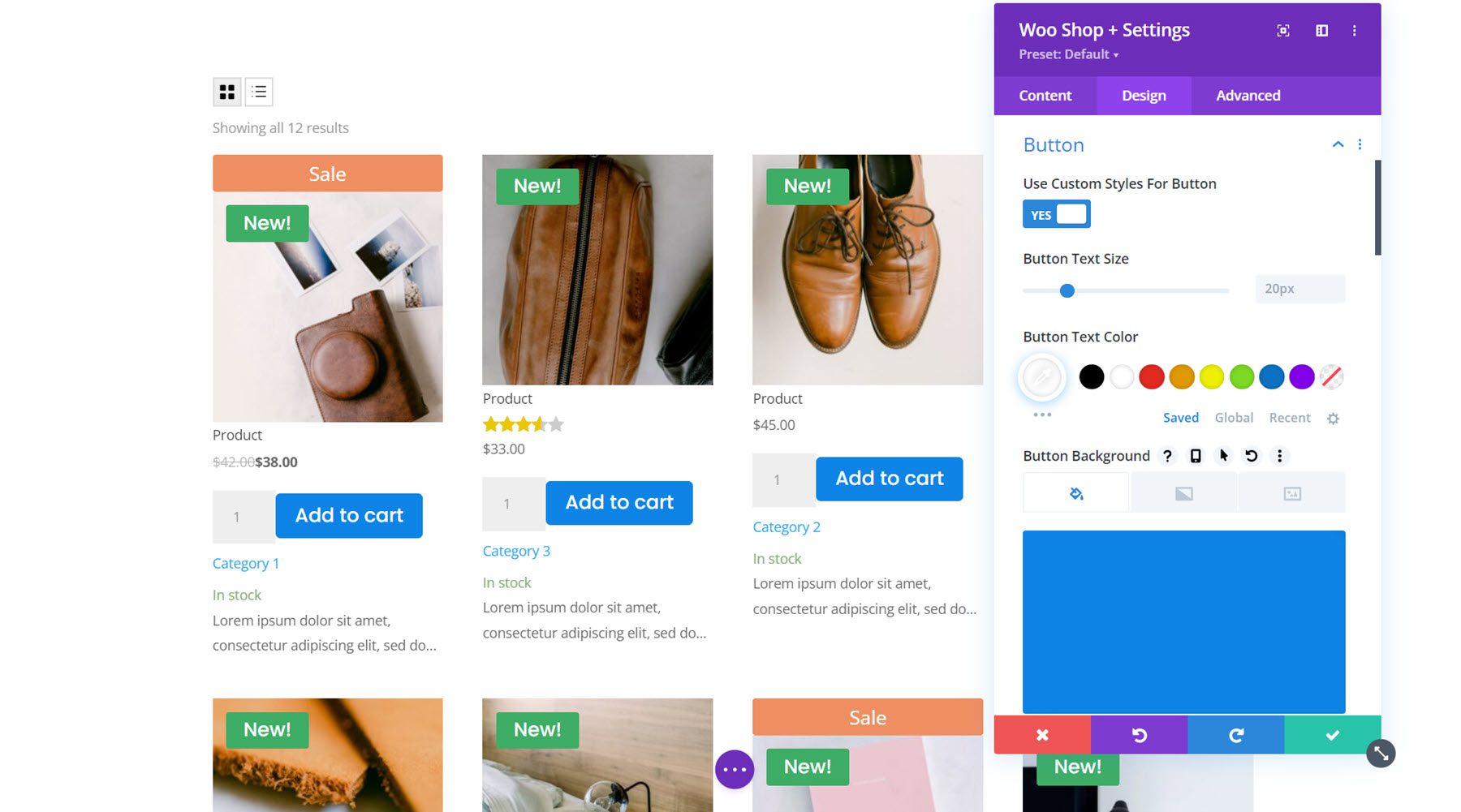
Button
The button settings group has all of the default button customization options such as background, font, border, icon, and box shadow settings. Here I customized the text color, background, font, and border radius.
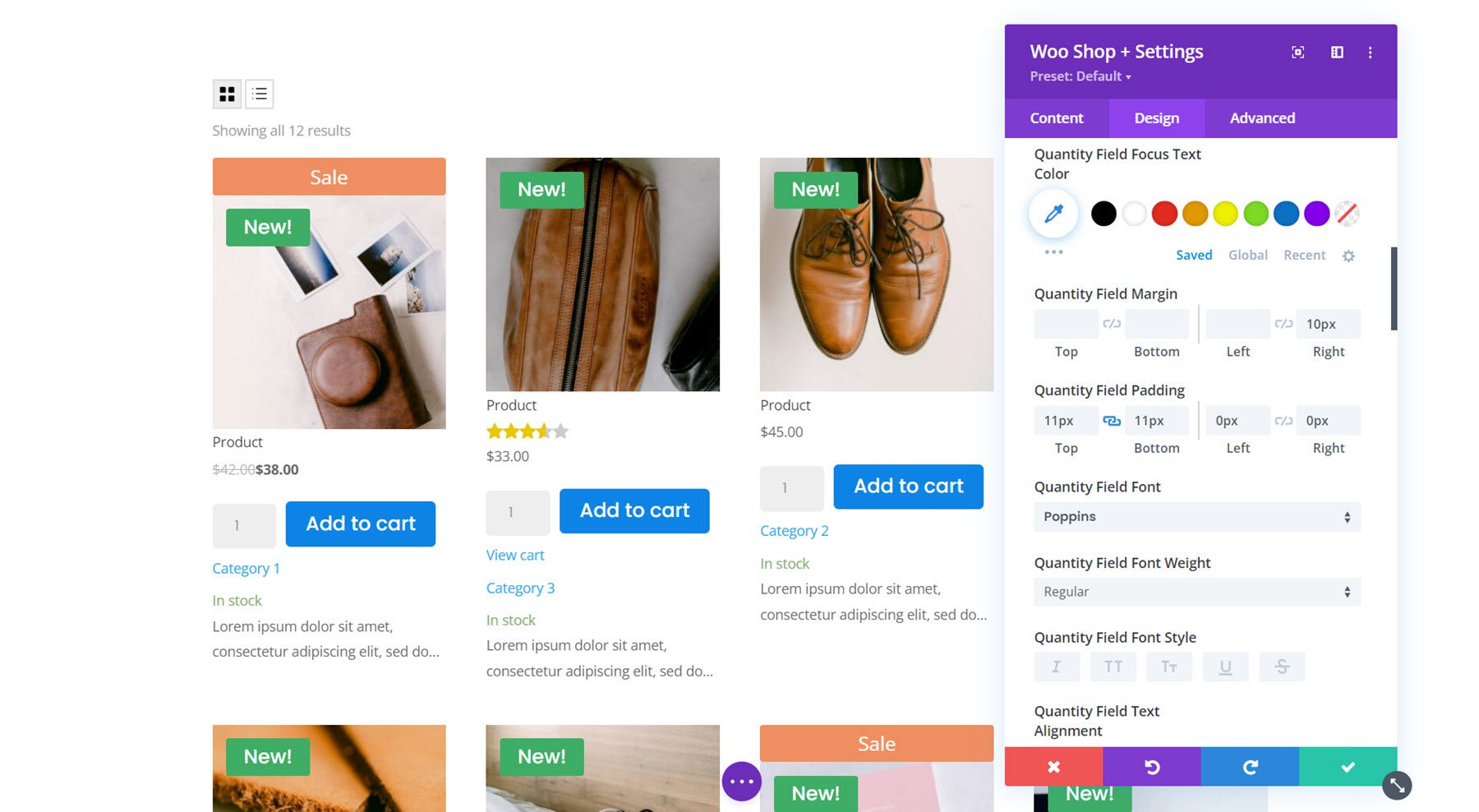
Quantity Field
With the quantity field options you can change the background color, text color, focus background color, focus text color, spacing, font, border, and shadow. I modified the spacing options to add space between the quantity field and the button. I also changed the font and border radius.
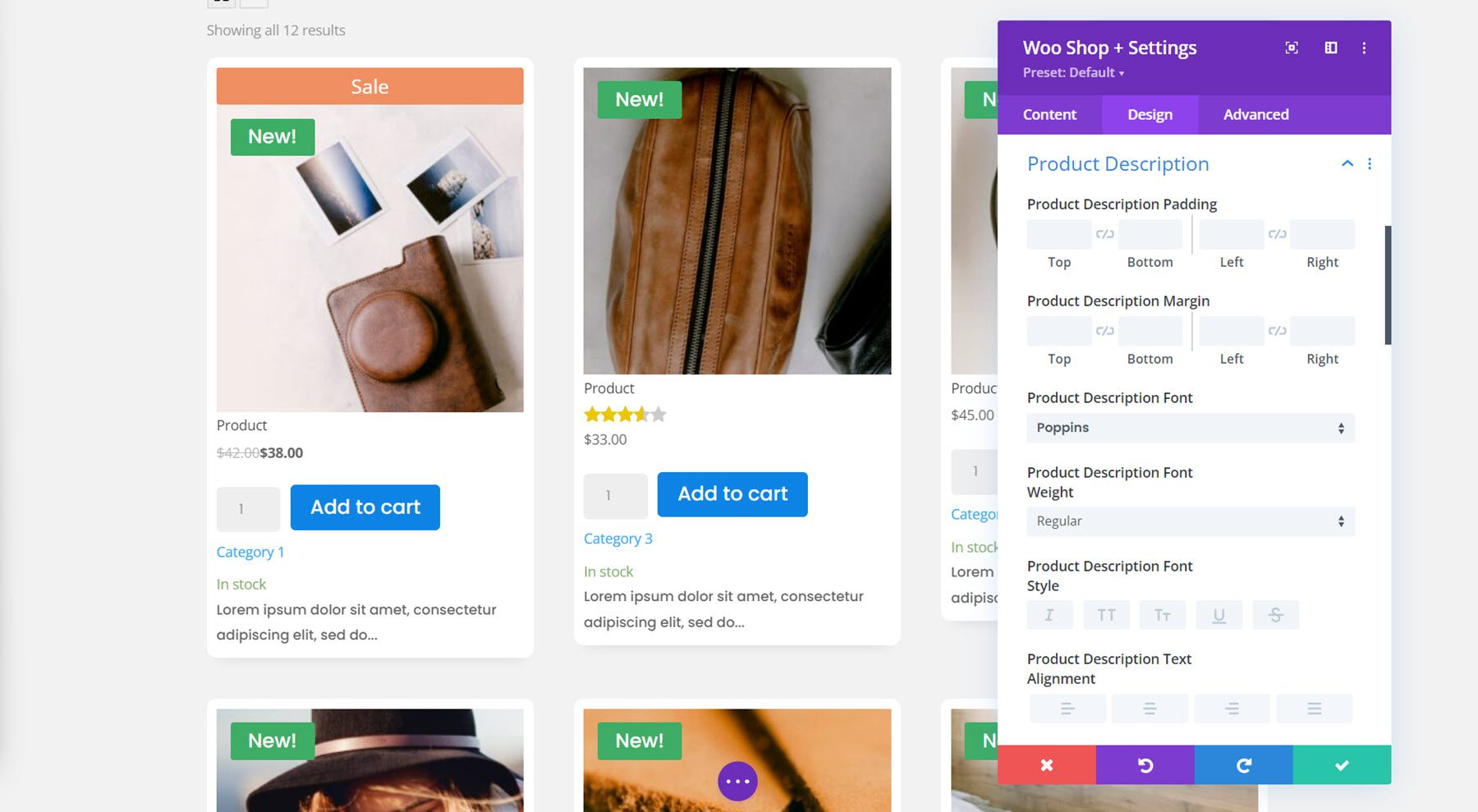
Product Container
Here you can change the design of the product container, which surrounds each individual product listed. You can change the padding, margin, background, rounded corners, border, and shadow. I added a gray background to the section and changed the grid columns to 3, then added a white background to the product container. I also added rounded corners and a shadow to achieve this design.

Product Description
This is where you can customize the product description text. It includes settings for the description padding and margin as well as all of the default font options.
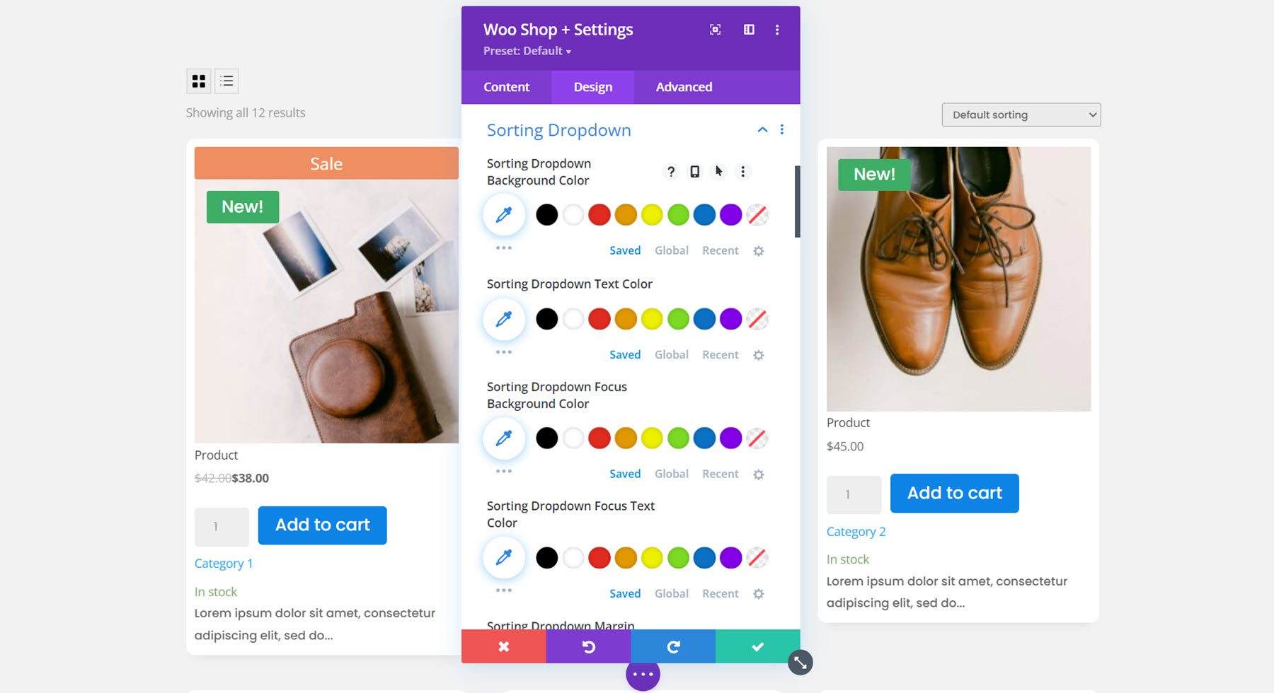
Sorting Dropdown
Next, in this section you can customize the design of the sorting dropdown for the shop module. You can change the background color, text color, focus background and text color, set the dropdown margin and padding, modify the font options, and customize the border. For this example, I kept it simple by changing the font and adding a gray border.
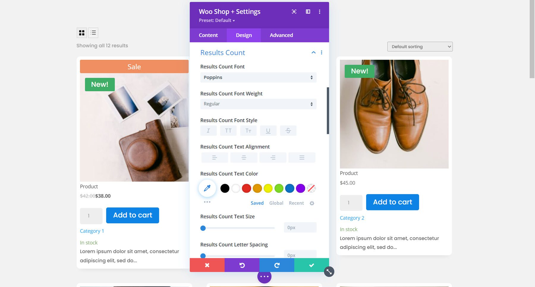
Results Count
The results count options allow you to customize the font settings for this text. Here I changed the font.
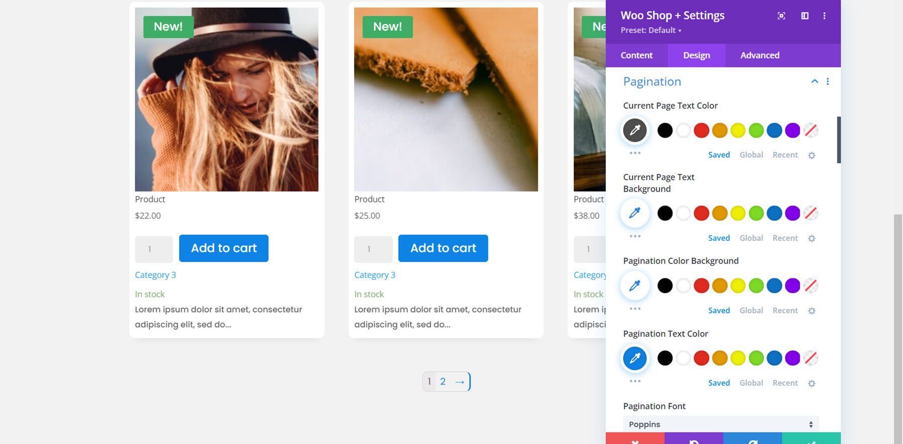
Pagination
You can customize the design of the pagination here. There are options for the current page text color, current page text background, pagination color background, pagination text color, pagination font, and pagination border. In this example, I modified the current page text color, pagination text color, pagination font, pagination text size, and pagination wrapper rounded corners.
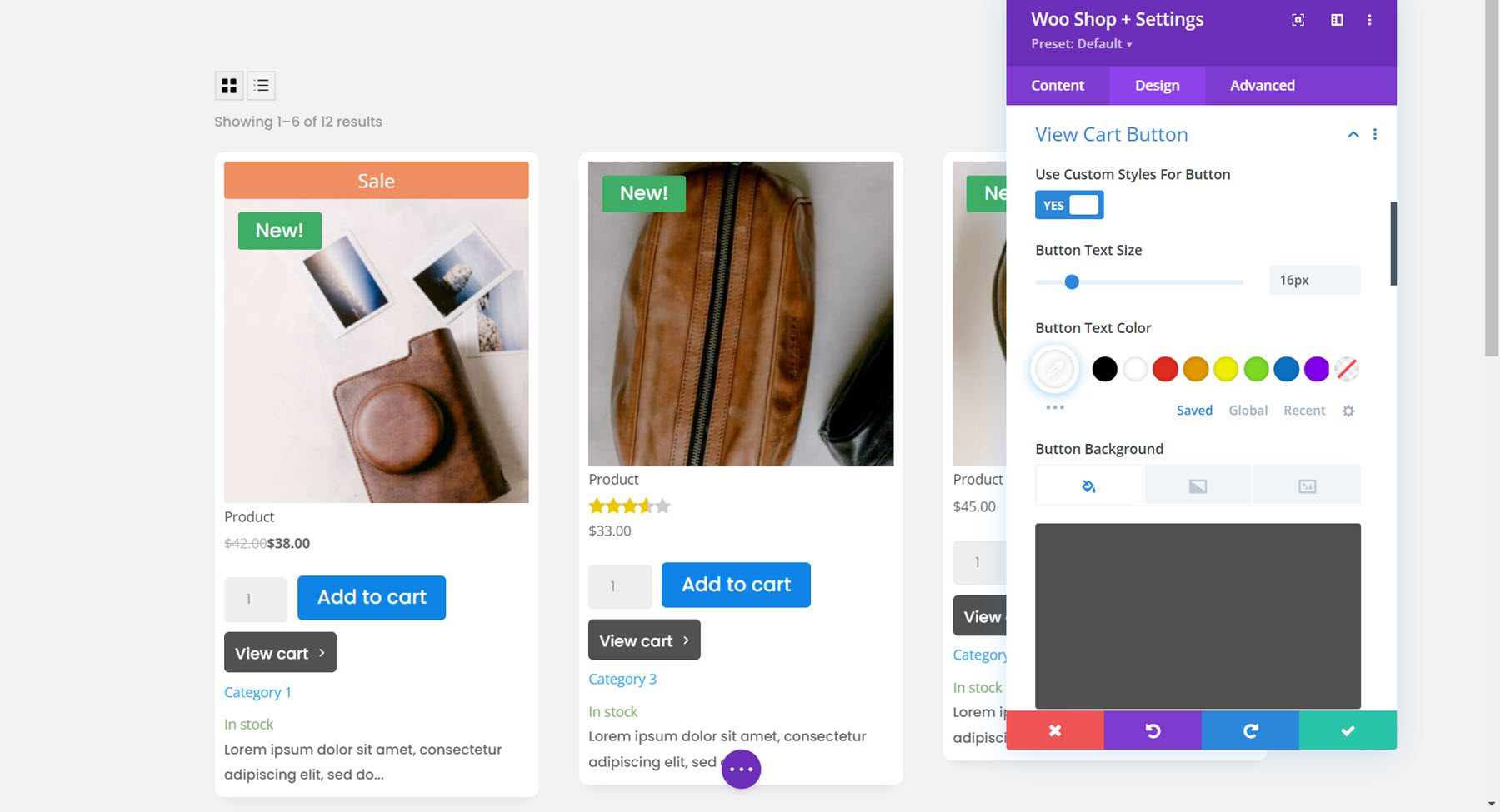
View Cart Button
The view cart button appears once a user adds a product to their cart. I enabled custom styles for the button and changed the text size, color, button background, border radius, font, icon, margin, and padding.
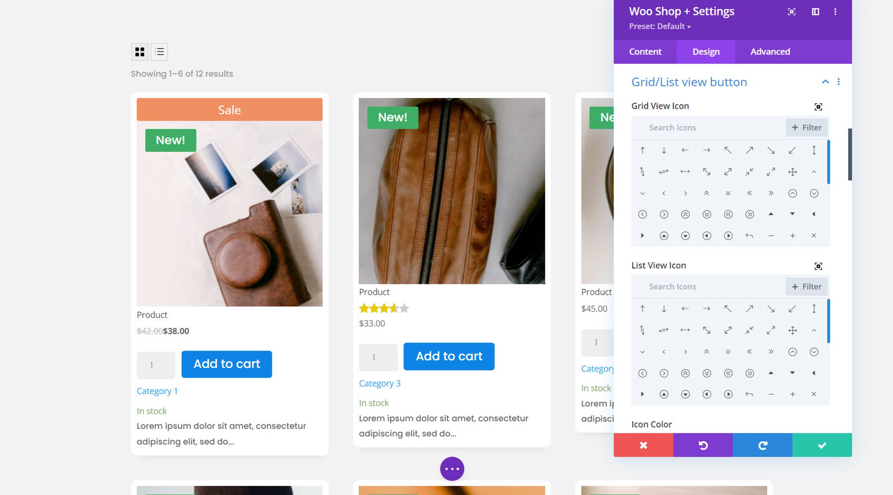
Grid/List View Button
The grid/list view button options allow you to change the icons, modify the icon and background colors, adjust the padding and margin, and customize the border and box shadow. I left the options default for this example.
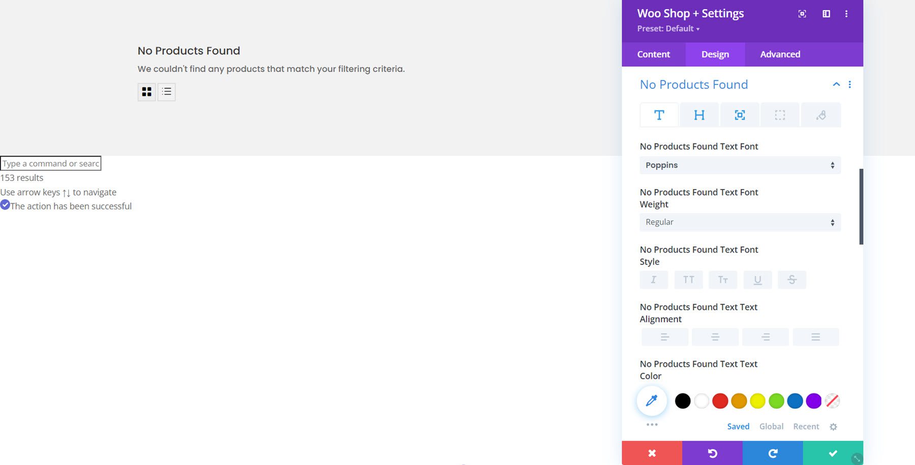
No Products Found
In this settings group you can change the text and heading font, the spacing, the border, and the colors for the no products found message. I modified the text and heading font and added some bottom padding to the section.
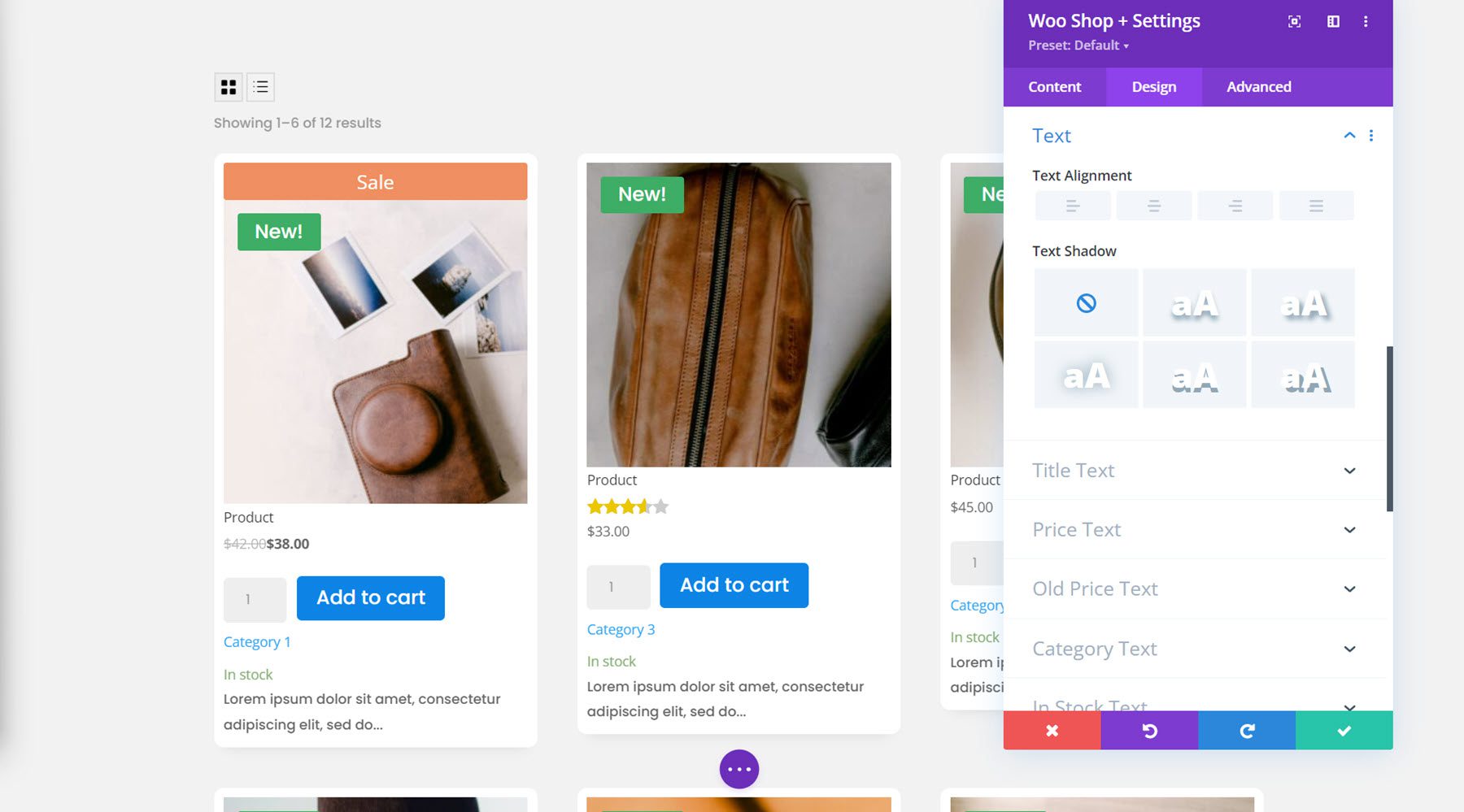
Text
Here you can change the text alignment and add a text shadow.
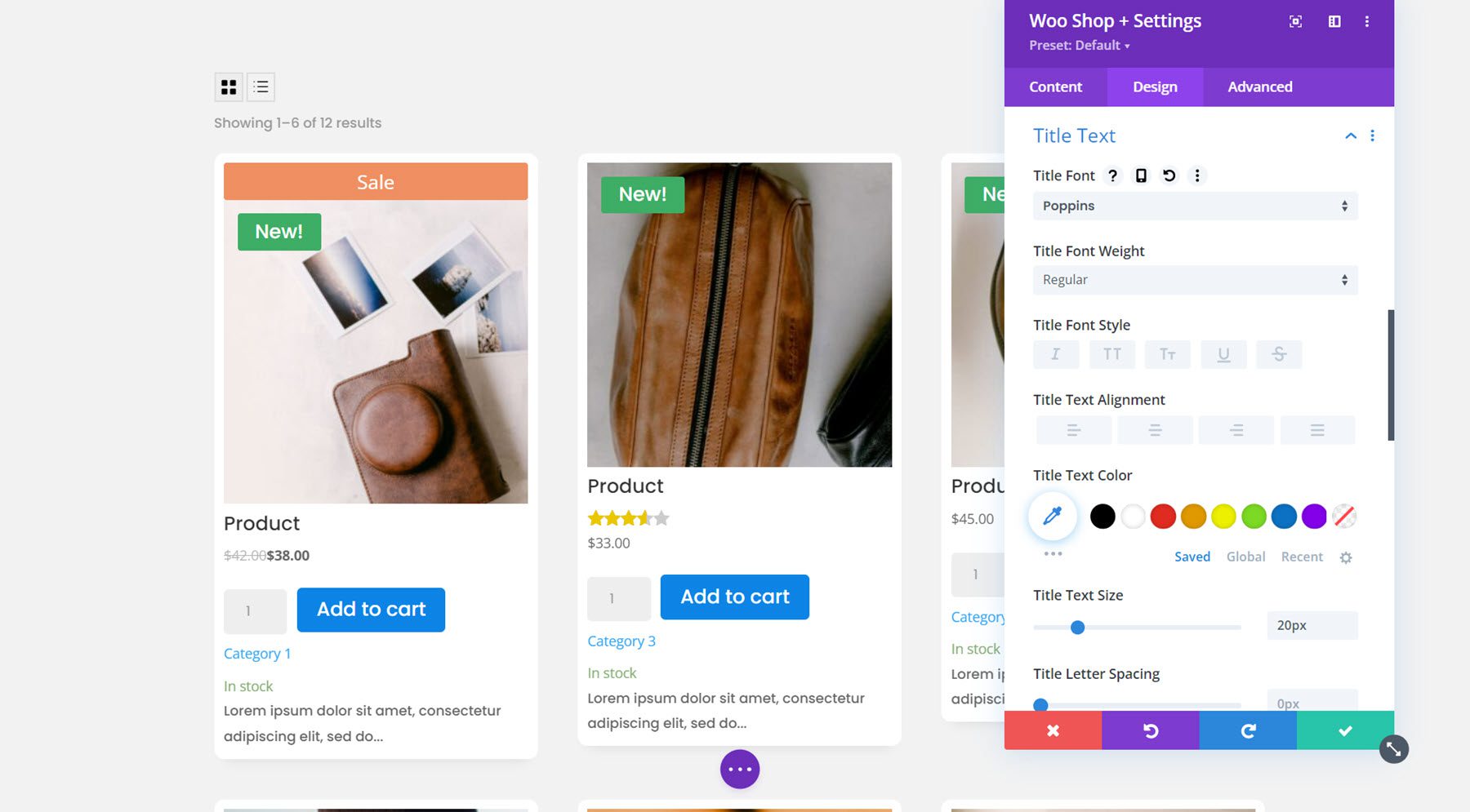
Title Text
Next is the title text settings, where you can customize the product title font. For this example, I changed the font and the text size.
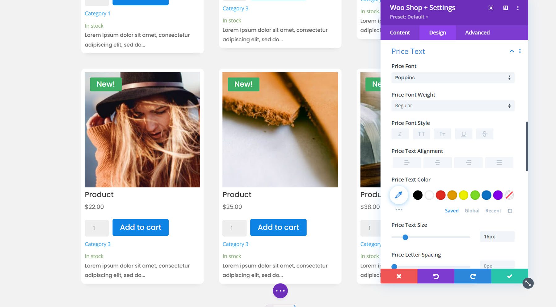
Price Text
All of the font options are available for the price text as well. Again, I changed the font and the text size for the price.
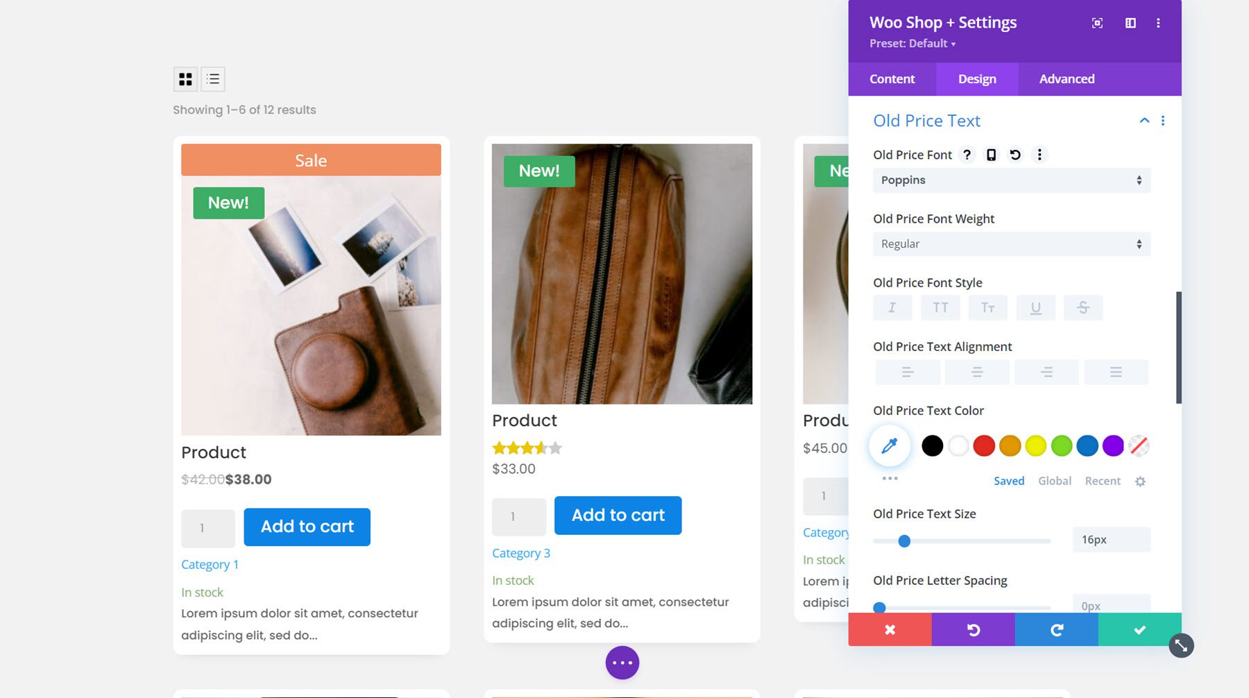
Old Price Text
The old price text appears with a strikethrough effect whenever a product is on sale. You can customize the font options here. I changed the font and increased the text size to match the regular price font.
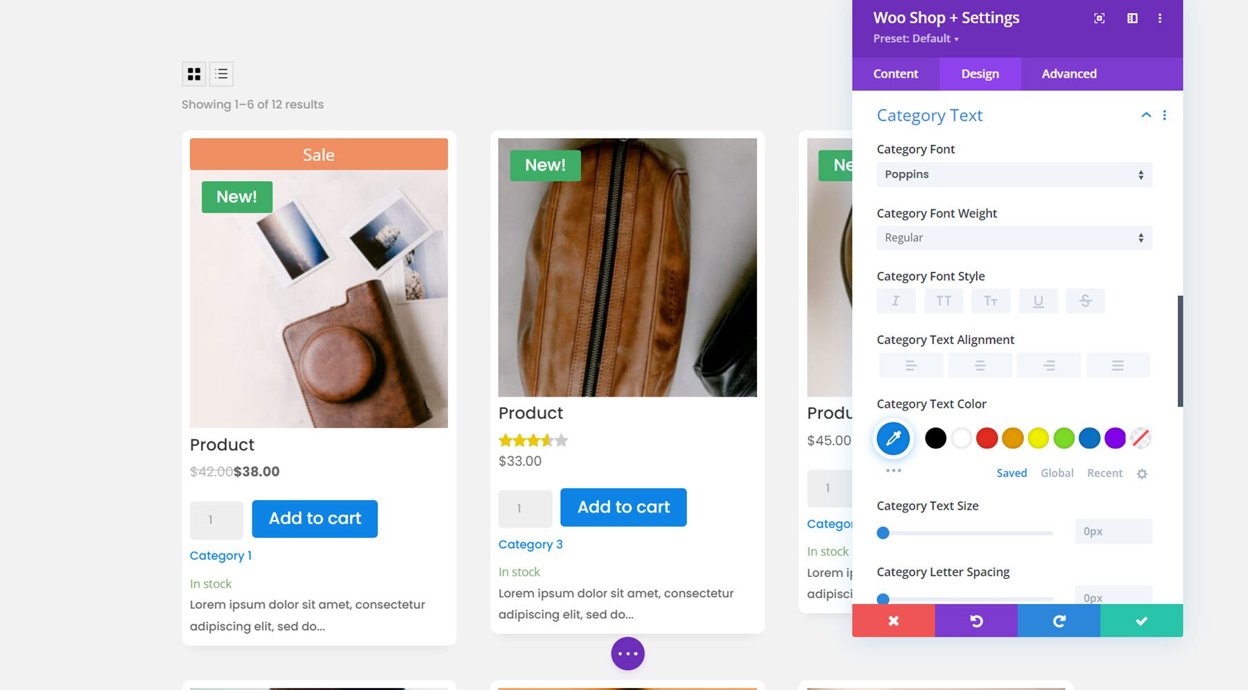
Category Text
For the category text, I used the font options to change the font and text color.
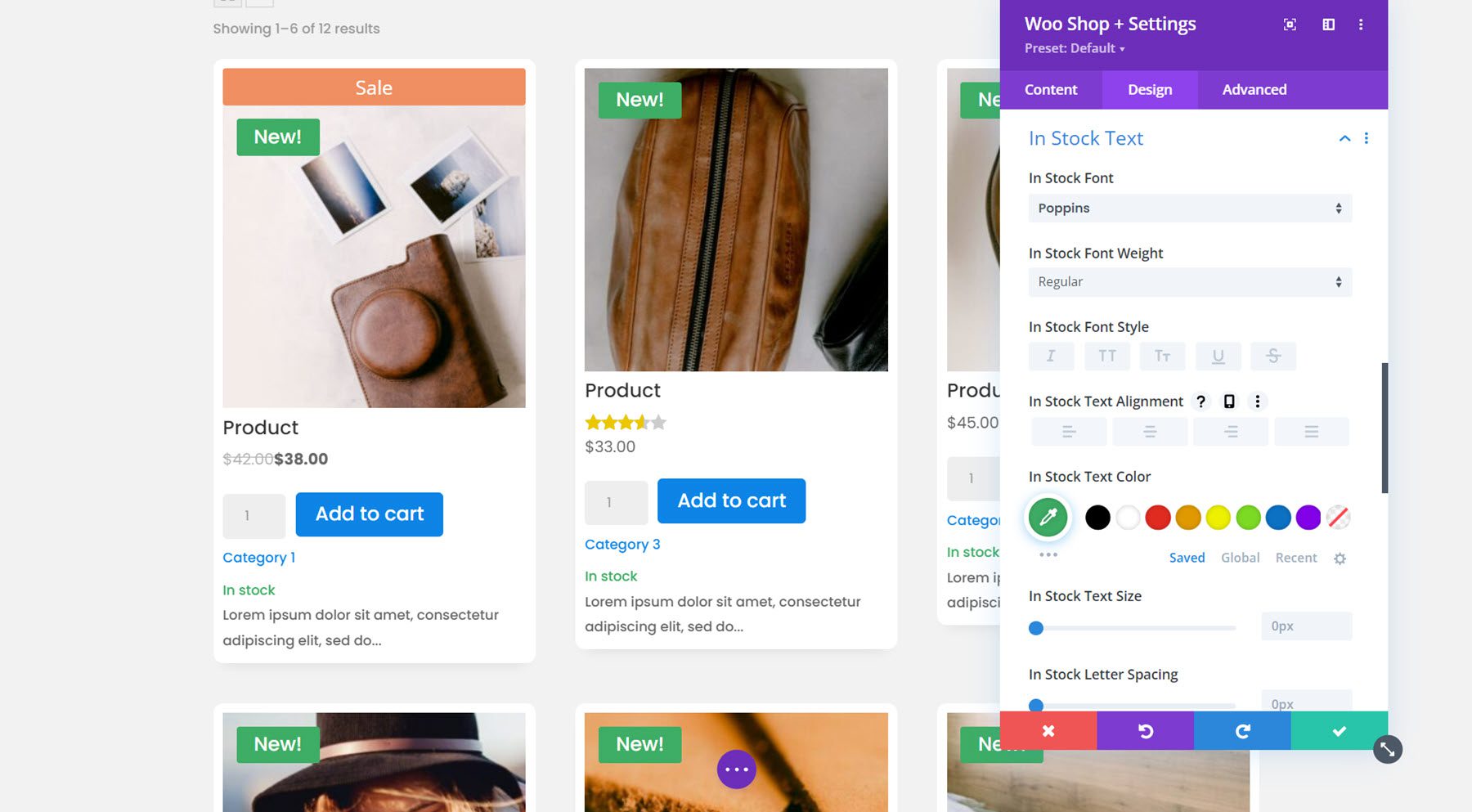
In Stock Text
You can customize the in stock text with all of the font options as well. I changed the font and text color.
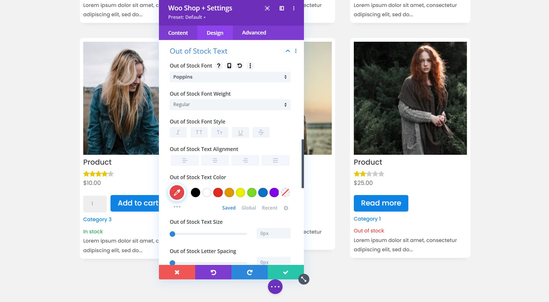
Out of Stock Text
Next is the out of stock text. I kept it simple and changed the font for this example.
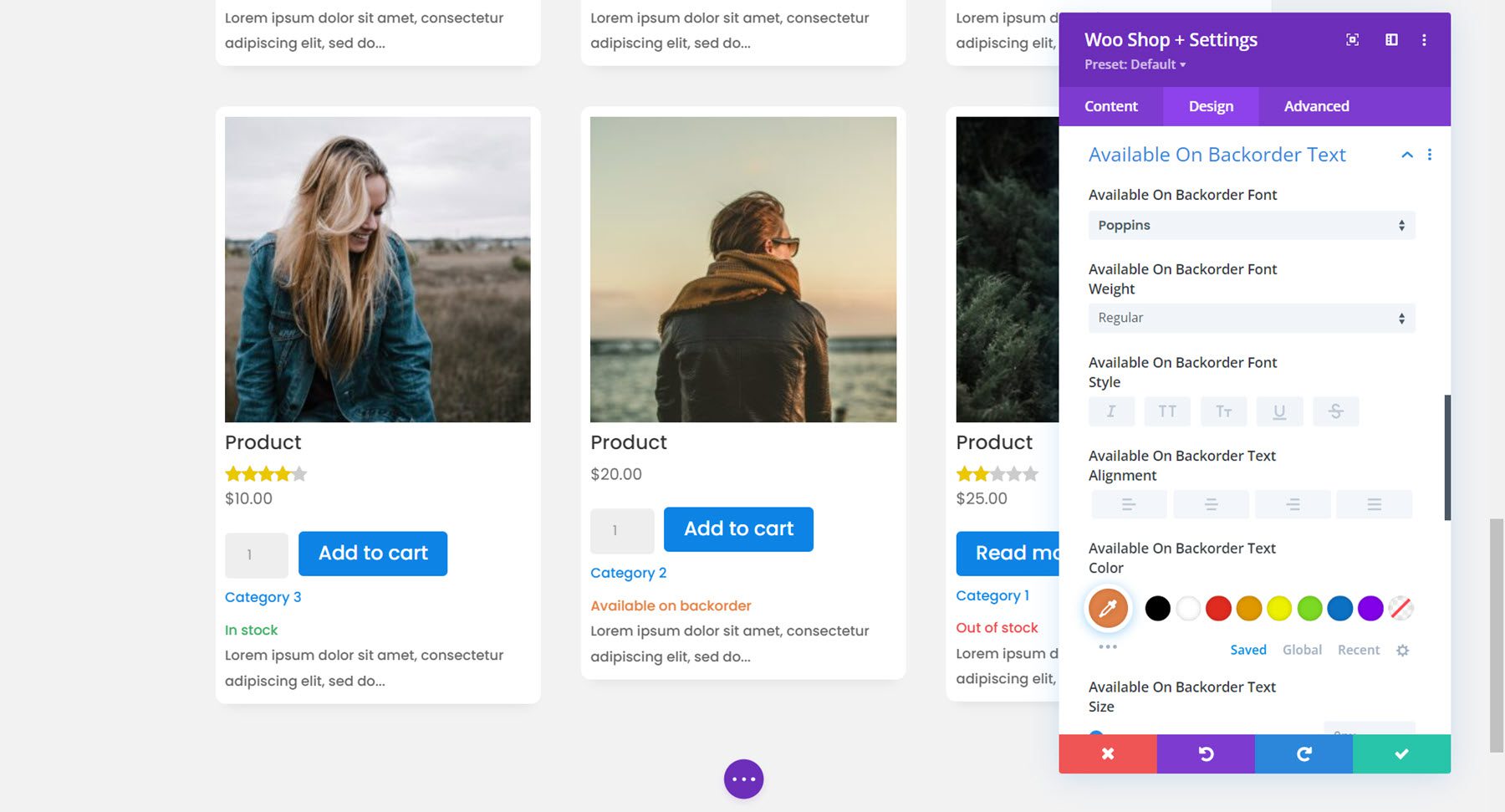
Available On Backorder Text
Here I changed the available on backorder font and changed the text color to orange.
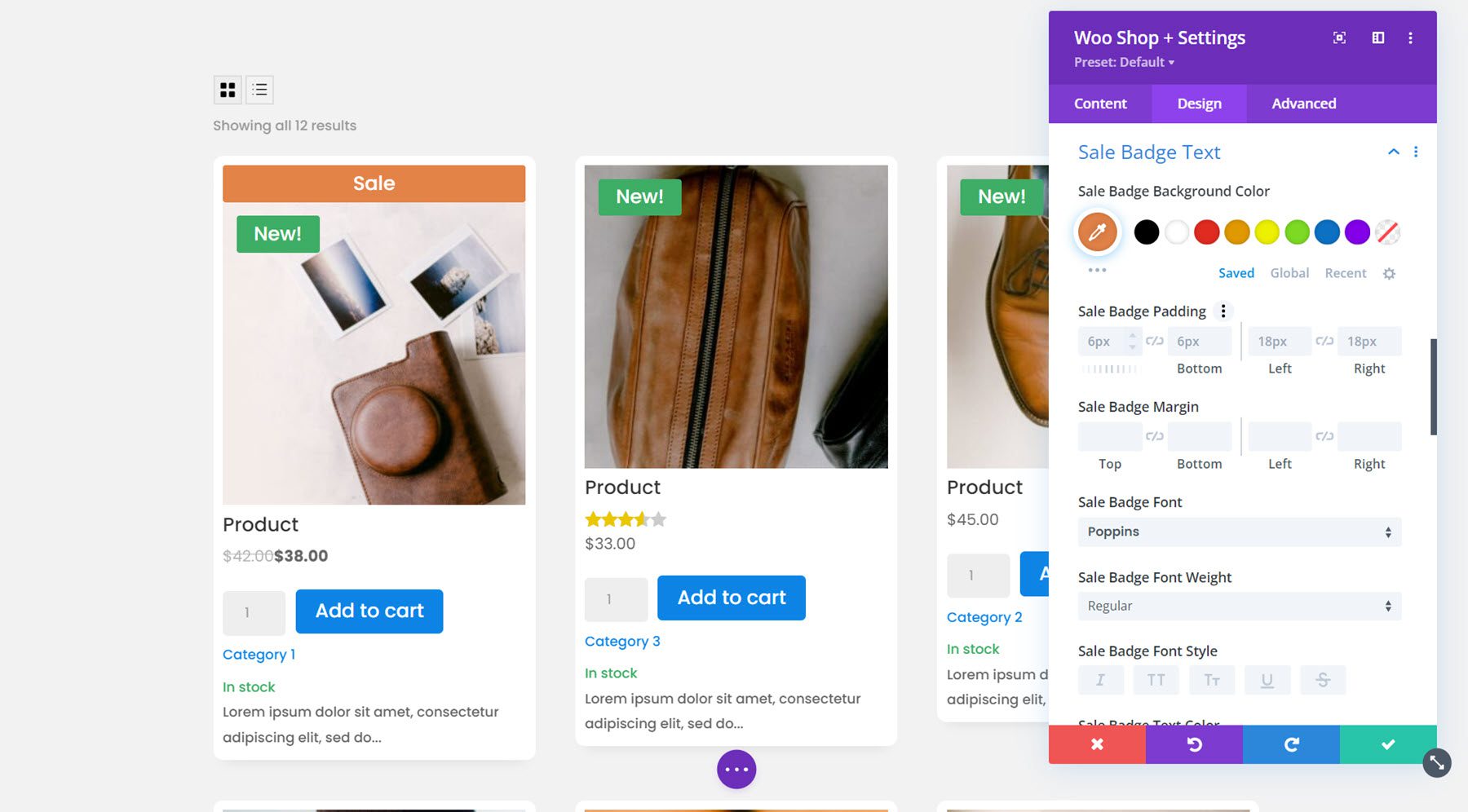
Sale Badge Text
Here you can customize the design of the sale badge. I changed the font and the background color.
Sale Price Text
Finally, I adjusted the font for the sale price text with the font options available.

Default Design Tab Settings
That’s it for the new settings added to the design tab. The module also comes with several of the default design tab options such as sizing, spacing, border, box shadow, filters, transform, and animation. You can use these design options to further enhance your Woo Shop + module.
Advanced Tab
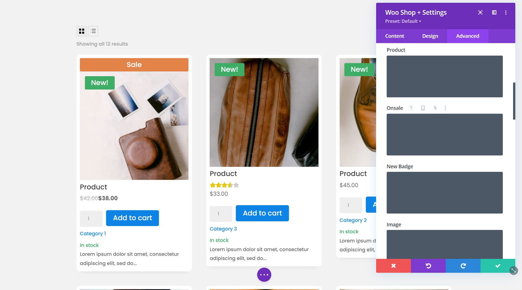
The advanced tab is fairly standard and comes with all of the sections you would expect to find in order to customize your module with CSS and more. Under the Custom CSS section, you can add CSS to individually customize aspects of the shop module, such as product, onsale, new badge, image, and more.
Woo Products Filter Module
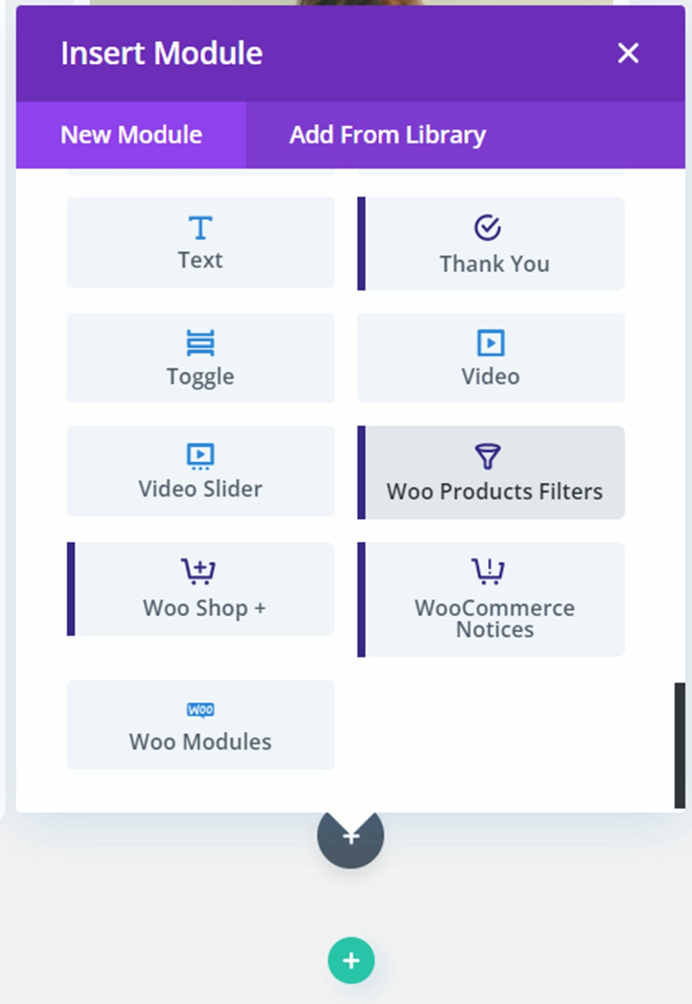
Now that we’ve taken a close look at the shop module, let’s take a look at the Woo Products Filter module. This module adds a filter to your page that you can use to modify your shop results. Click the grey plus button to insert a module and select the Woo Products Filters module.
Once you add the module, you may see this error message about enabling filtering.
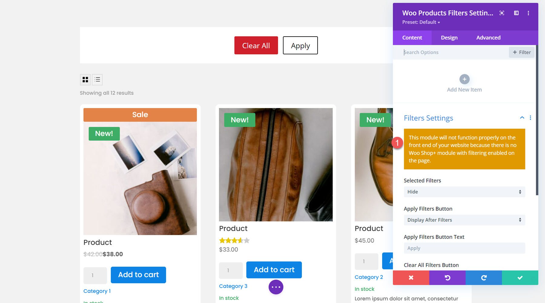
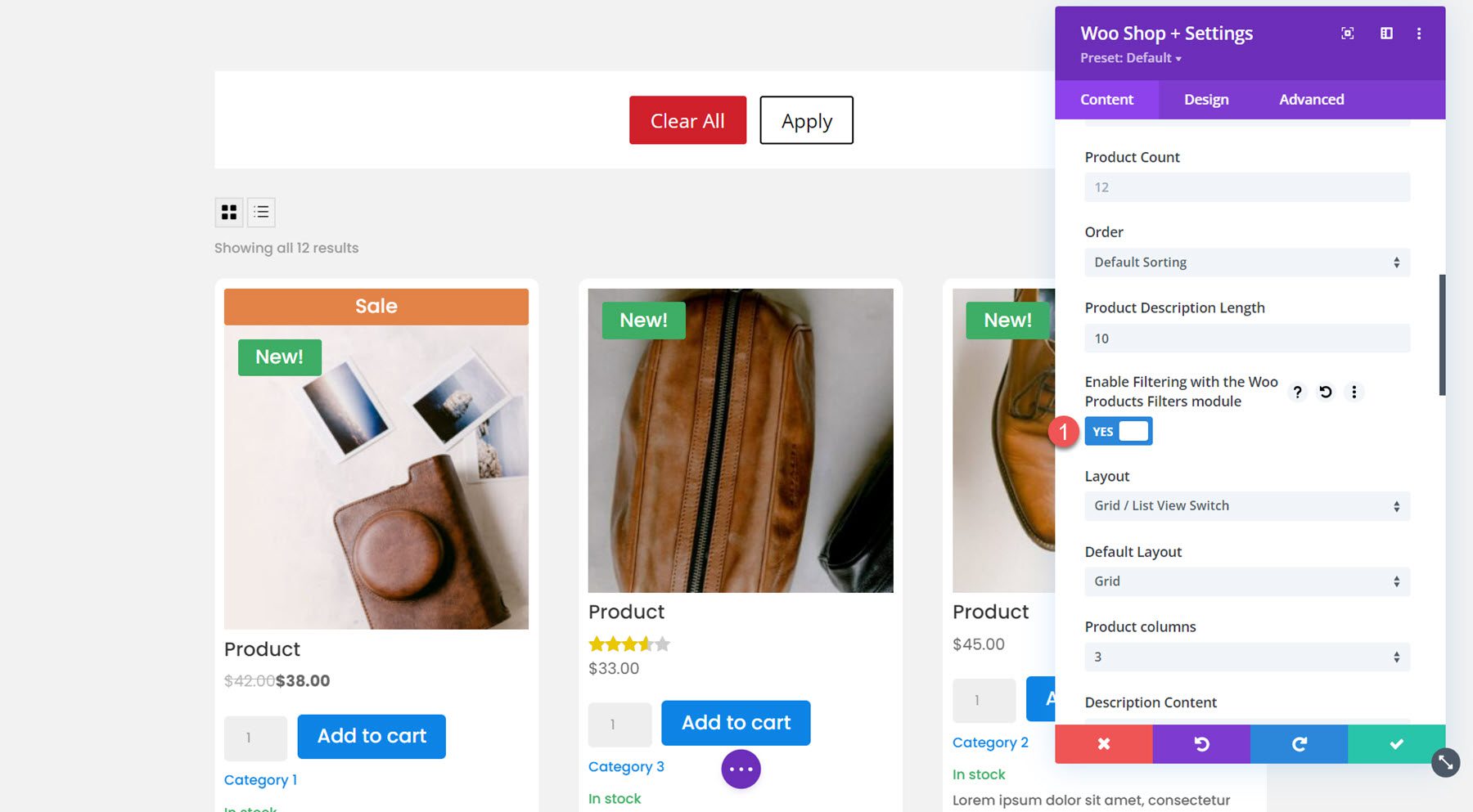
Open your Woo Shop + module and select the option to enable filtering with the Woo Products Filters module. This will help connect the filter module and the shop module so that the shop items will change depending on the filters you select.
Content Tab
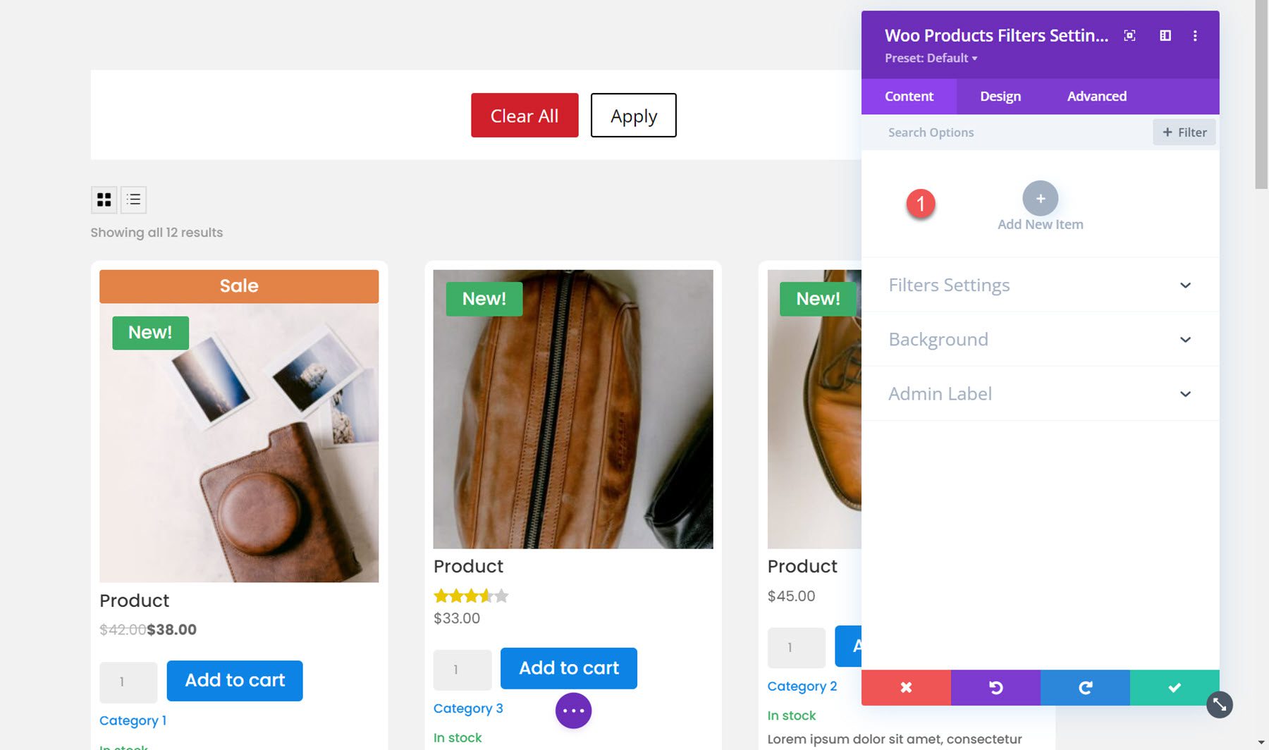
Under the content tab, you can add a new item to your filter module.
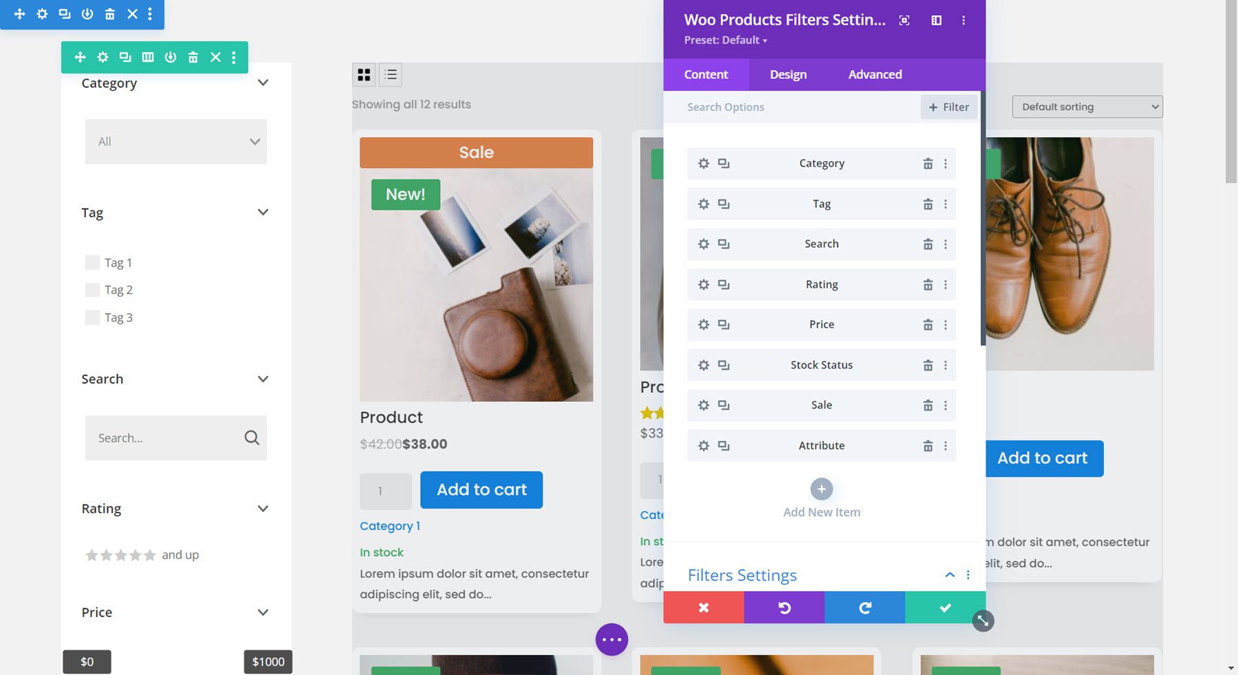
Once you add a new item it will open up in an individual settings window where you can select the type of filter and customize many aspects of the filter. There are individual design options for each filter which you can use to individually style the look of the filter. Each of these options are also available in the filter module design tab, where you can customize the overall design of each filter type.
There are 8 types of filters you can add: Category, Tag, Attribute, Search, Rating, Price, Stock Status, and Sale. Here I added a column to the row so that the filter can be placed to the side of the shop module.
Under the filter settings for the individual filter, you can select the filter type, choose to display or hide the filter title, and add custom filter title text.
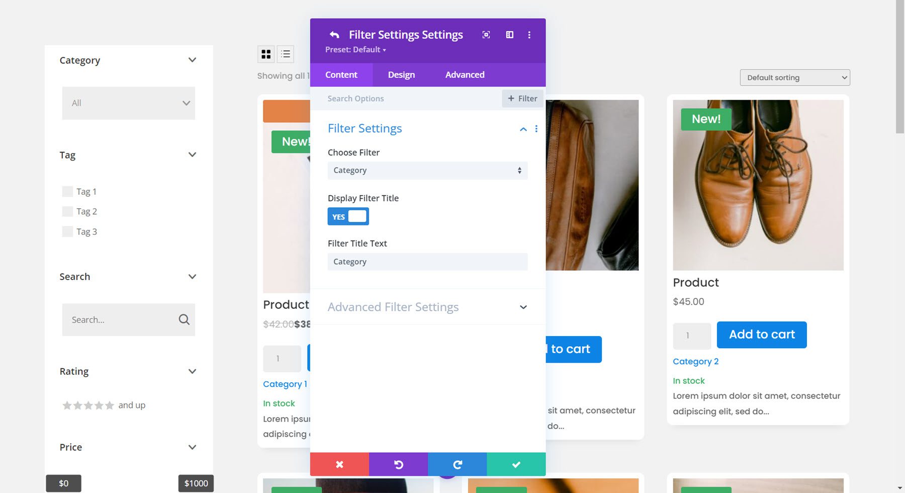
Category Filter
The advanced filter settings for the individual filter change depending on the type of filter you have selected. For the category filter, you can choose to show parent categories only, parent categories and subcategories non-hierarchical, or parent categories and subcategories hierarchical. You can also change how the filter is displayed: checkboxes list, radio buttons list, dropdown single select, dropdown multi select, or tag cloud. For this example, I selected the dropdown multi select. Also in this section, you can enable or disable display as toggle, choose to show or hide the number of products, and change the “please select” text.
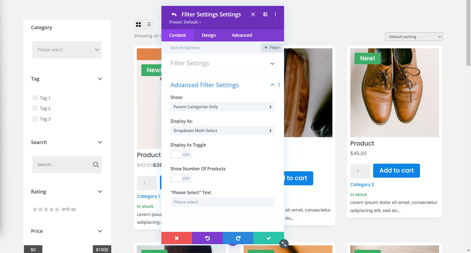
Tag Filter
For the tag filter, I am enabling the tag cloud display and disabling the toggle display.
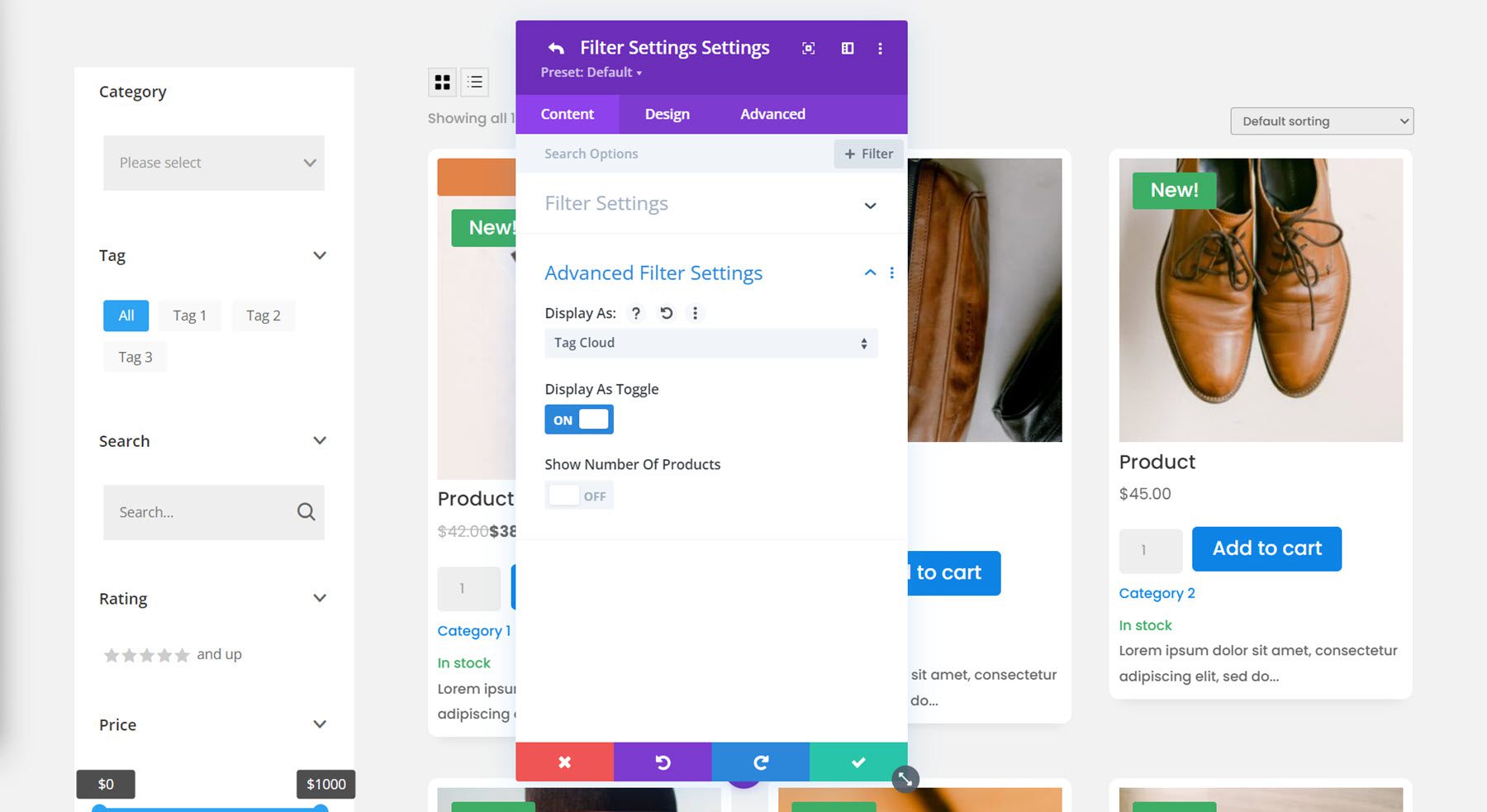
Search Filter
Here are the search filter settings. Once again I’ve disabled the toggle view.
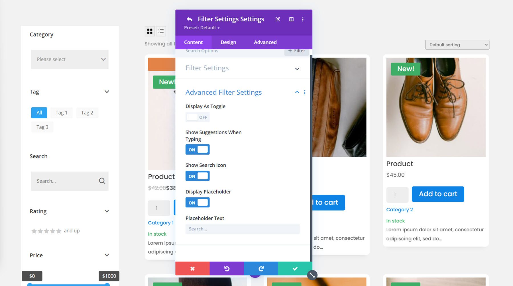
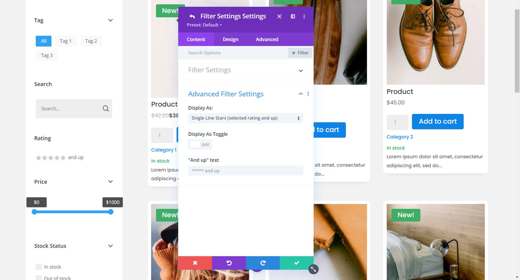
Rating Filter
The rating filter has several display options: single line stars (selected rating and up), single line stars (only selected rating), radio buttons stars, radio buttons text, checkboxes stars, checkboxes text, dropdown stars, dropdown text. I have selected the single line stars (selected rating and up) option.
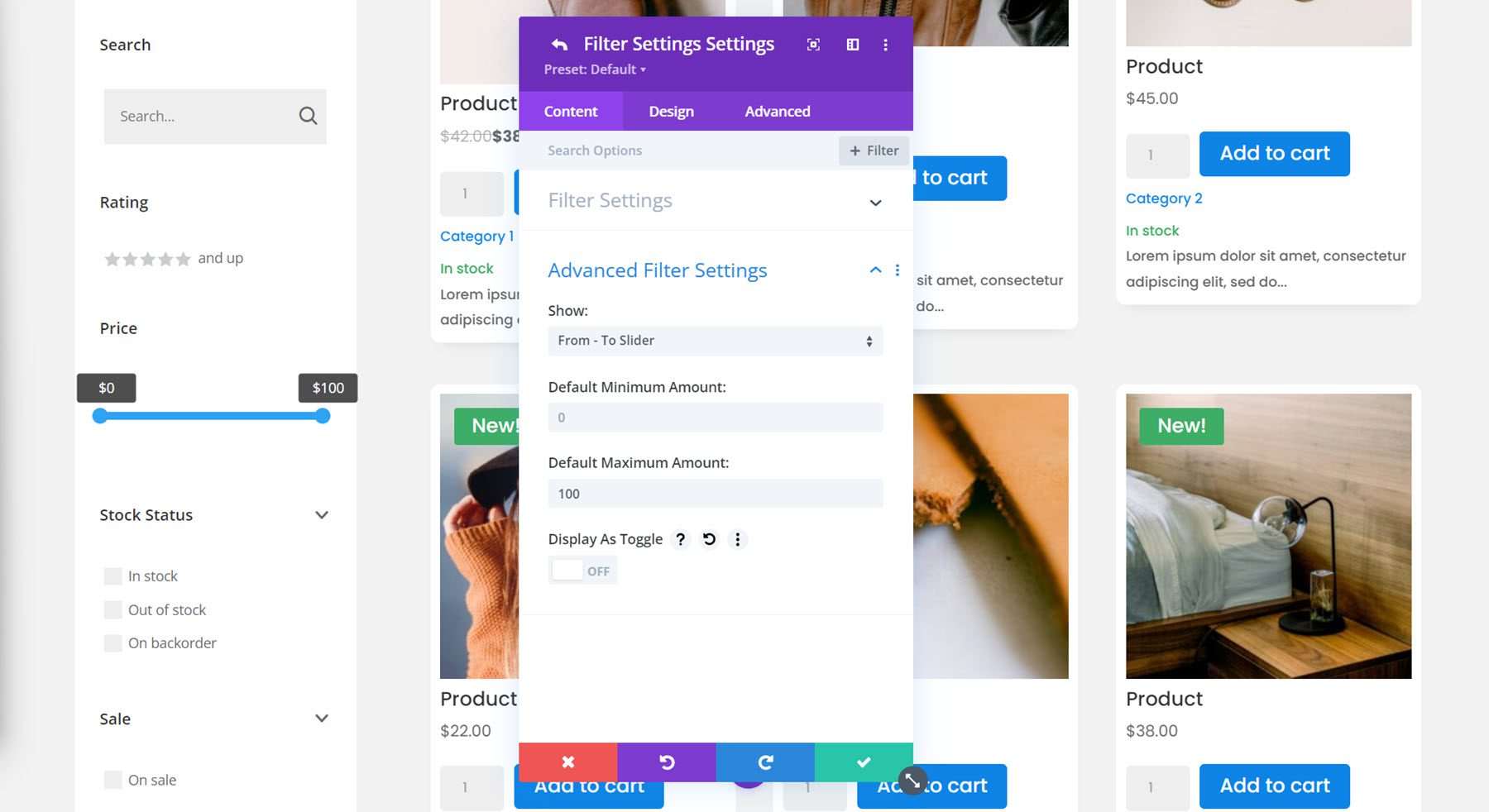
Price Filter
Next is the price filter. You can choose between a from-to slider, a from-to number input, or a from-to slider and number input. For this example I selected the from-to slider and adjusted the maximum amount.
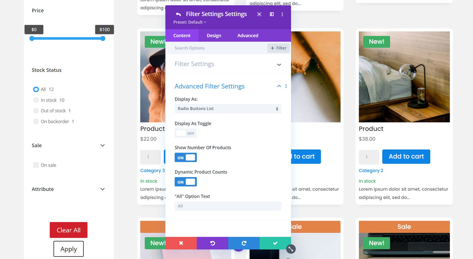
Stock Filter
You can display the stock filter as a checkbox list, a radio button list, a dropdown single select, a dropdown multi select, or a tag cloud. I selected the radio buttons list for this filter and selected to display the number of products.
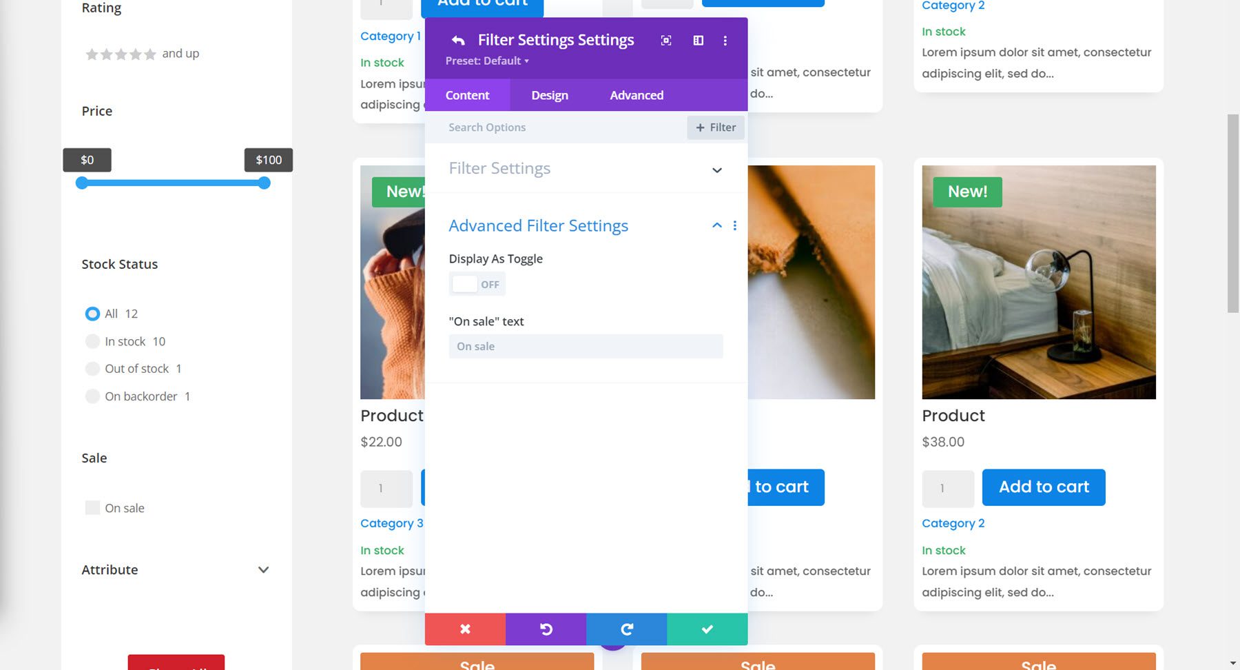
Sale Filter
The sale filter options are pretty simple – you can enable or disable the toggle display and change the on sale text.
Attribute Filter
Finally, we have the attribute filter. I’ve chosen to use colors for the attribute example, and I have selected the checkboxes list display option.
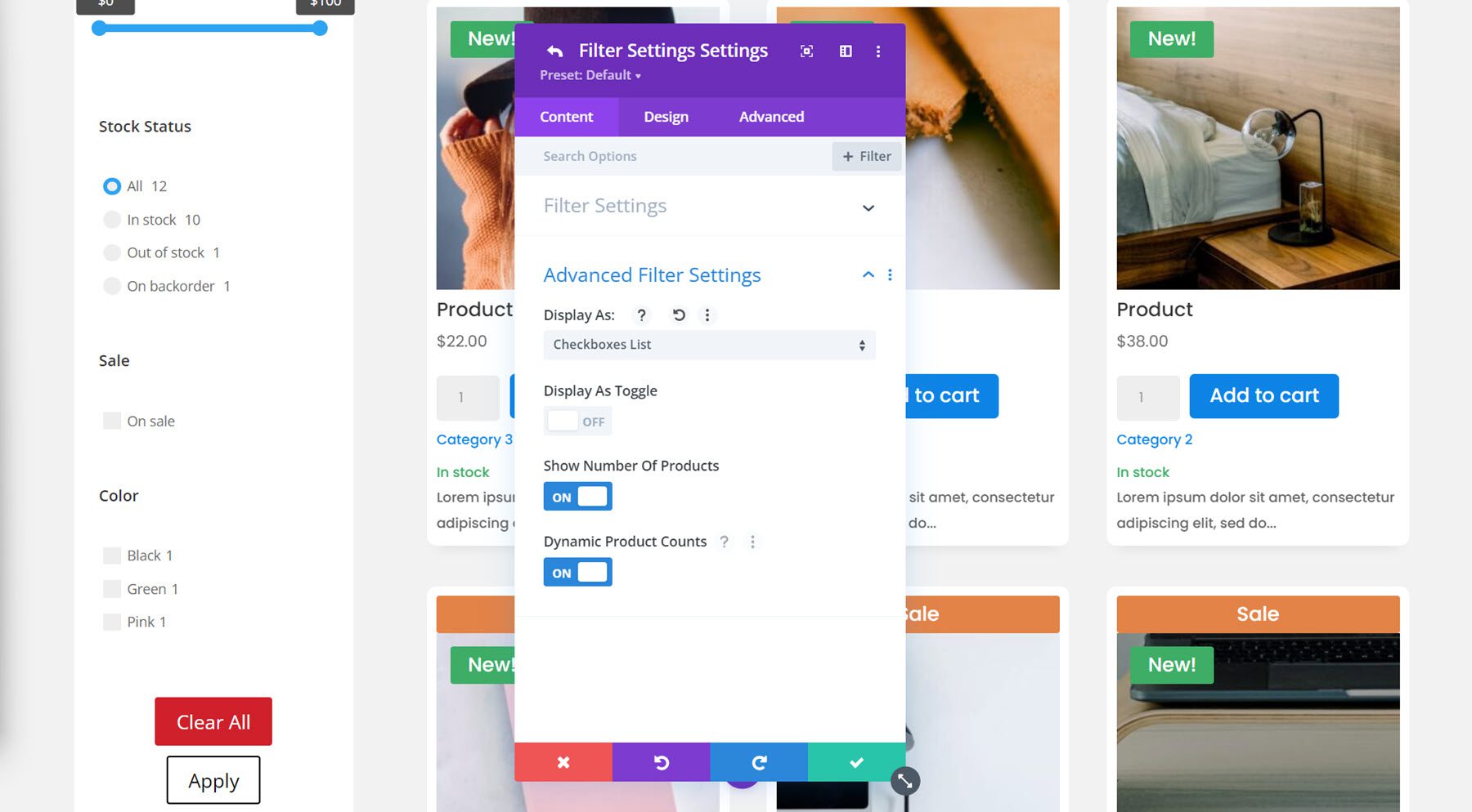
Content Tab Filters Settings
Back in the content tab of the filter module settings, there are some additional options listed under the filters settings group.
First, you can select to display selected filters at the top or bottom, or hide them entirely. I chose to display them at the top. You can also choose to display or hide the selected filters title and change the title text.
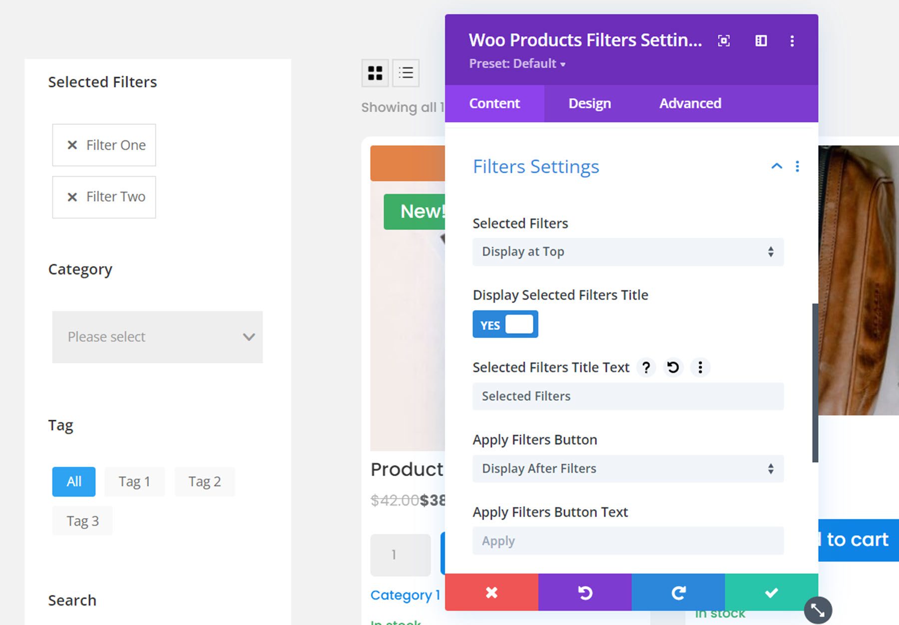
Also in this section are options for the apply filters and clear filters buttons. You can choose to display them before or after the filters, or not at all. You can also change the button text. I chose to display both buttons after the filters.
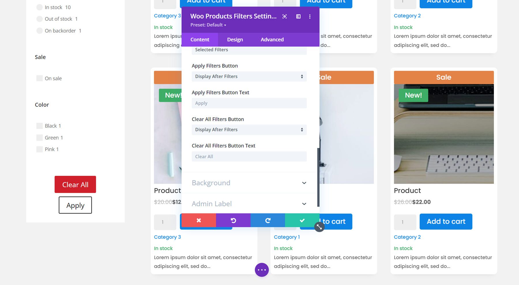
The content tab also has a section for background settings and admin label settings.
Design Tab
The design tab for the filter module has an extensive amount of design options for you to completely customize the filter designs. You can customize the font, spacing, border, and background for each of the filter types. You can also customize the buttons, selected filters, sizing, spacing, border, box shadow, filters, transform, and animation options. We won’t go into much detail here, but just know that you can modify just about any aspect of the filter module to your liking.
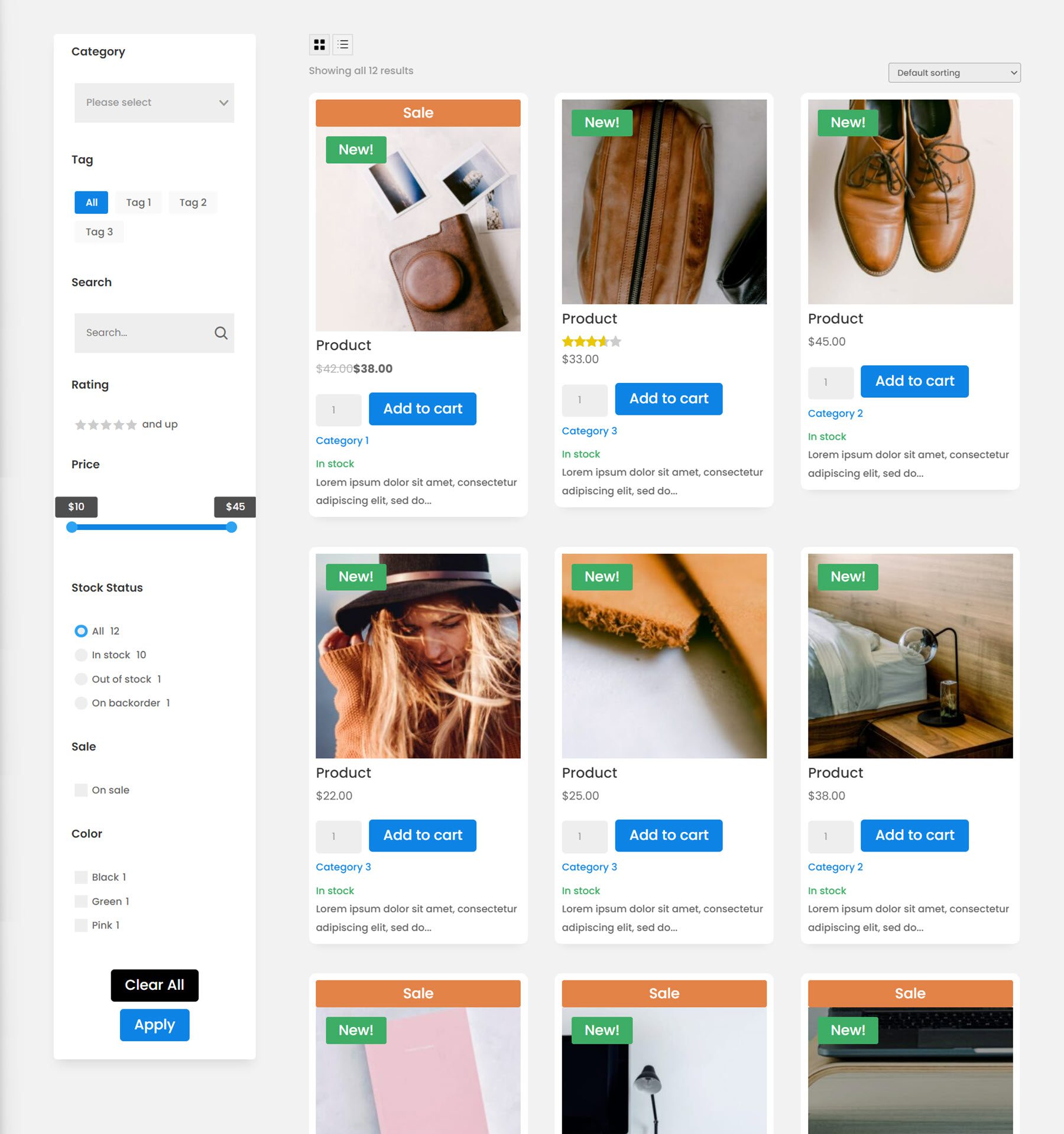
For this example, I modified the font, added rounded corners to the selected filters, decreased the bottom margin between filters, added a border to the dropdown filter, changed the color of the active tag, price filter, stock status, and checkmarks to match the color scheme, customized the button design, and added a rounded corner and box shadow to the filter module. Here is the final design with the filter module and shop module.
Cart List Module
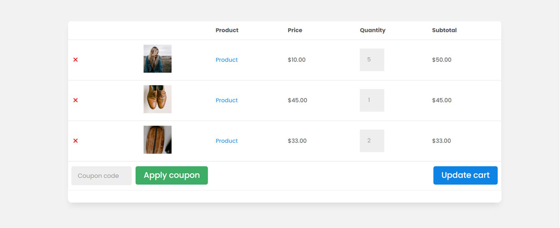
Now let’s move over to the cart page. First, the cart list module. This module will display the contents of your cart.
Content Tab
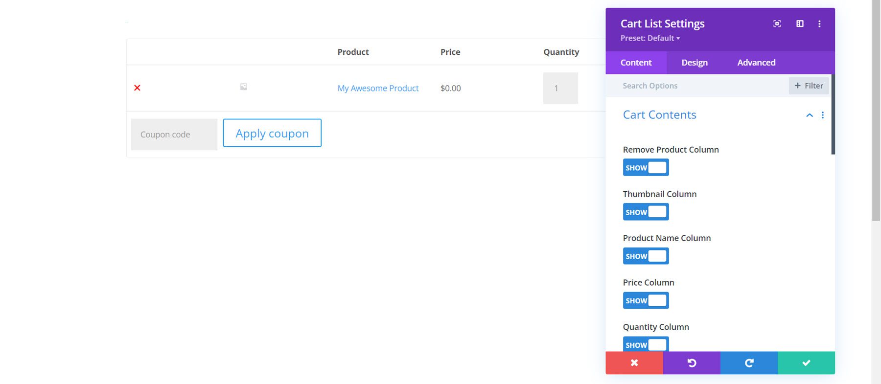
Within the module settings, you can change the content that is displayed. You can choose to show or hide certain columns such as the remove product column, the product column, the thumbnail, the product name, the price, the quantity, the subtotal, and the coupon code.
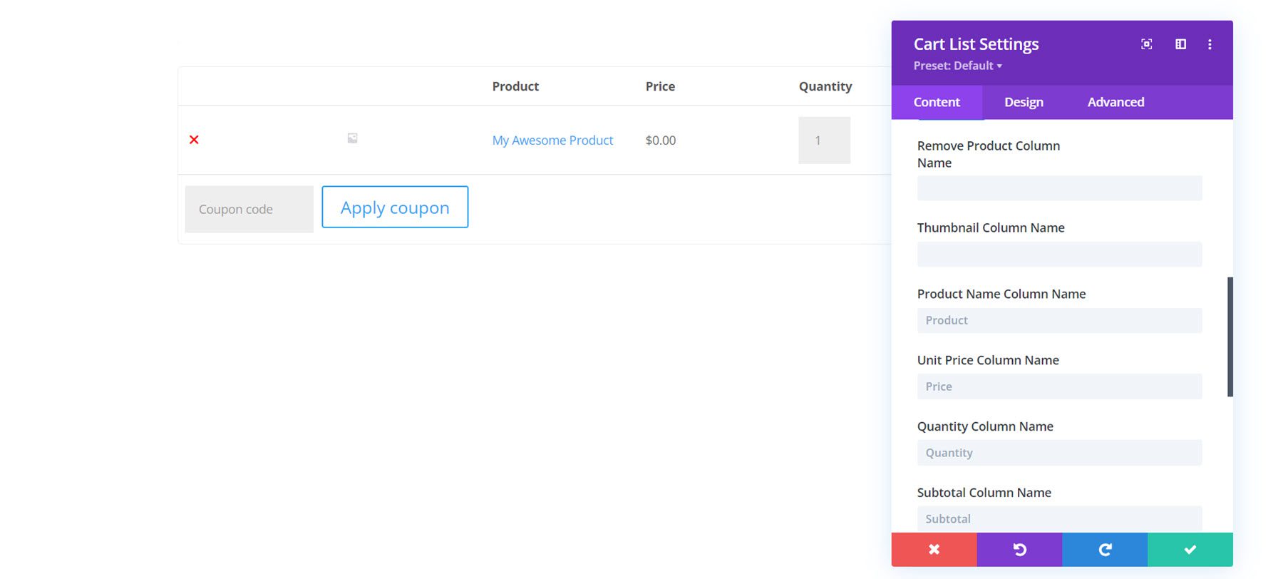
You can also rename any of the columns with custom text.
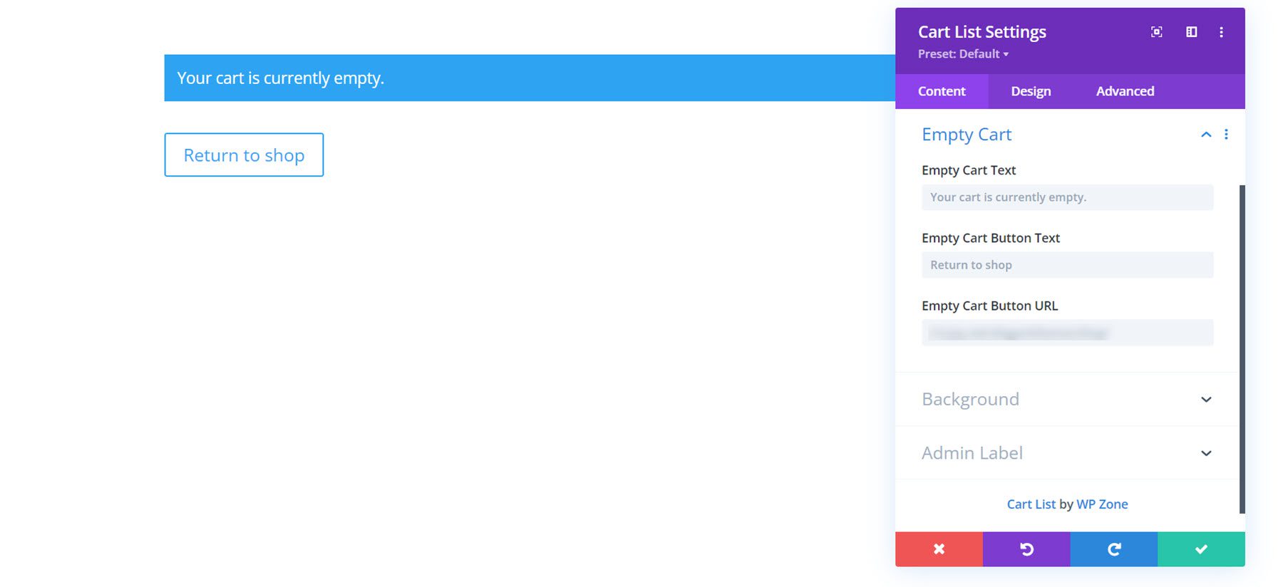
Additionally, you can customize the empty cart text, button text, and button URL.
The content tab also features the default background and admin label settings.
Design Tab
Here you can completely customize the design of the cart module. Every aspect of the cart module can be changed, including the buttons, the text, the table, and more.
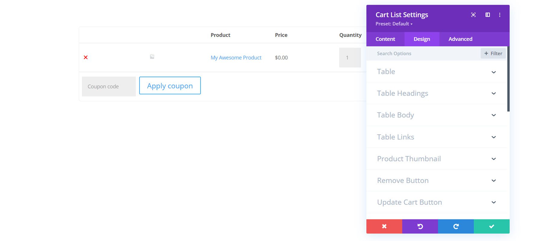
I’ve customized the design by adding a white background and rounded corners, changing the font, increasing the image thumbnail size, and customizing the buttons.
Cart Totals Module
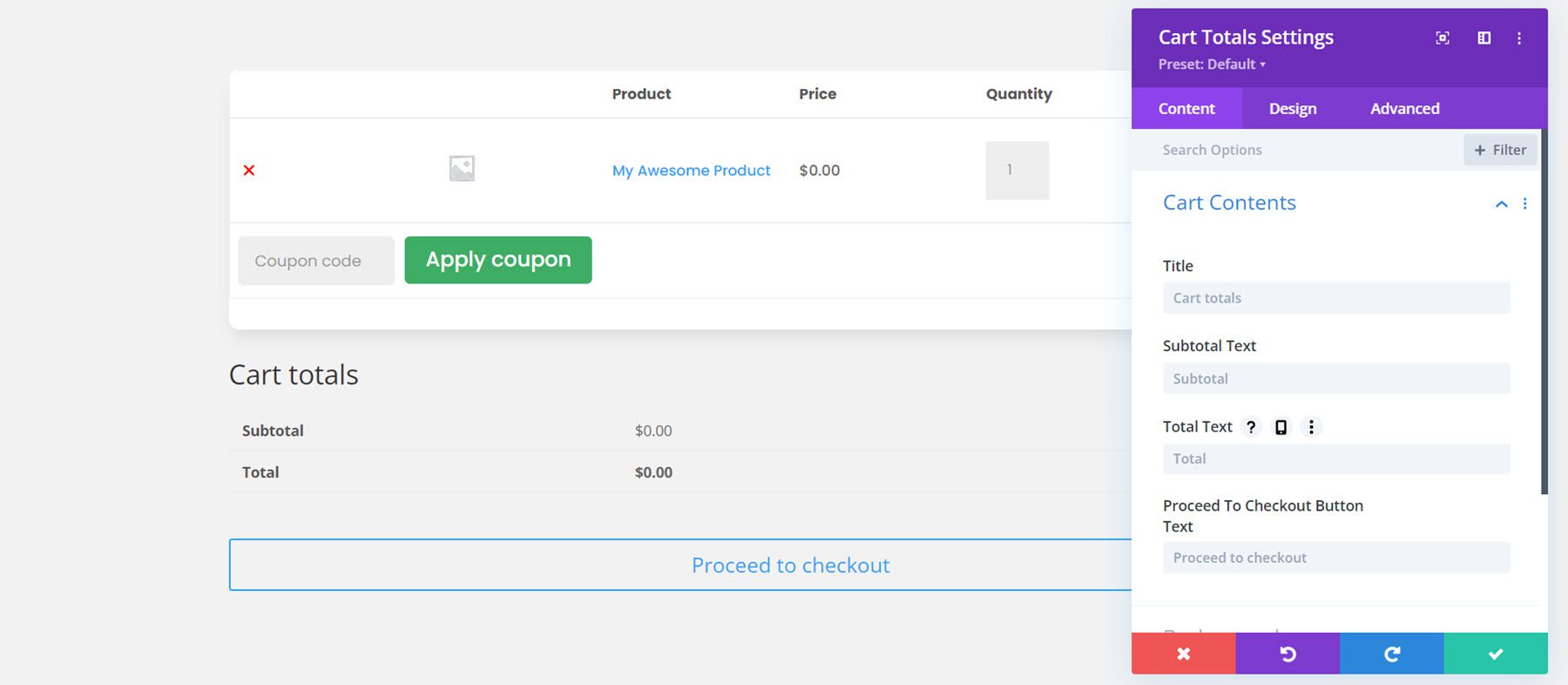
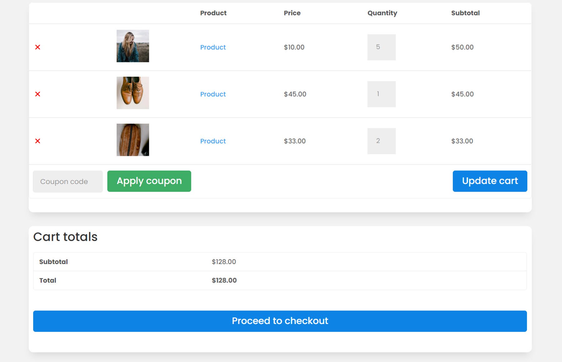
The cart totals module should also be added to the cart page. It will display the subtotal and total for the cart items and has a button to proceed to checkout.
Content Tab
Within the module settings, you can change the text such as the title, subtotal text, total text, and proceed to checkout button text. You can also add a background and change the admin label.
Design Tab
With the design settings, you can customize every aspect of the cart totals module. For this example, I added a background, a box shadow, and rounded corners to the module. I changed the font to match the rest of the design, and also customized the proceed to checkout button.
WooCommerce Notices Module
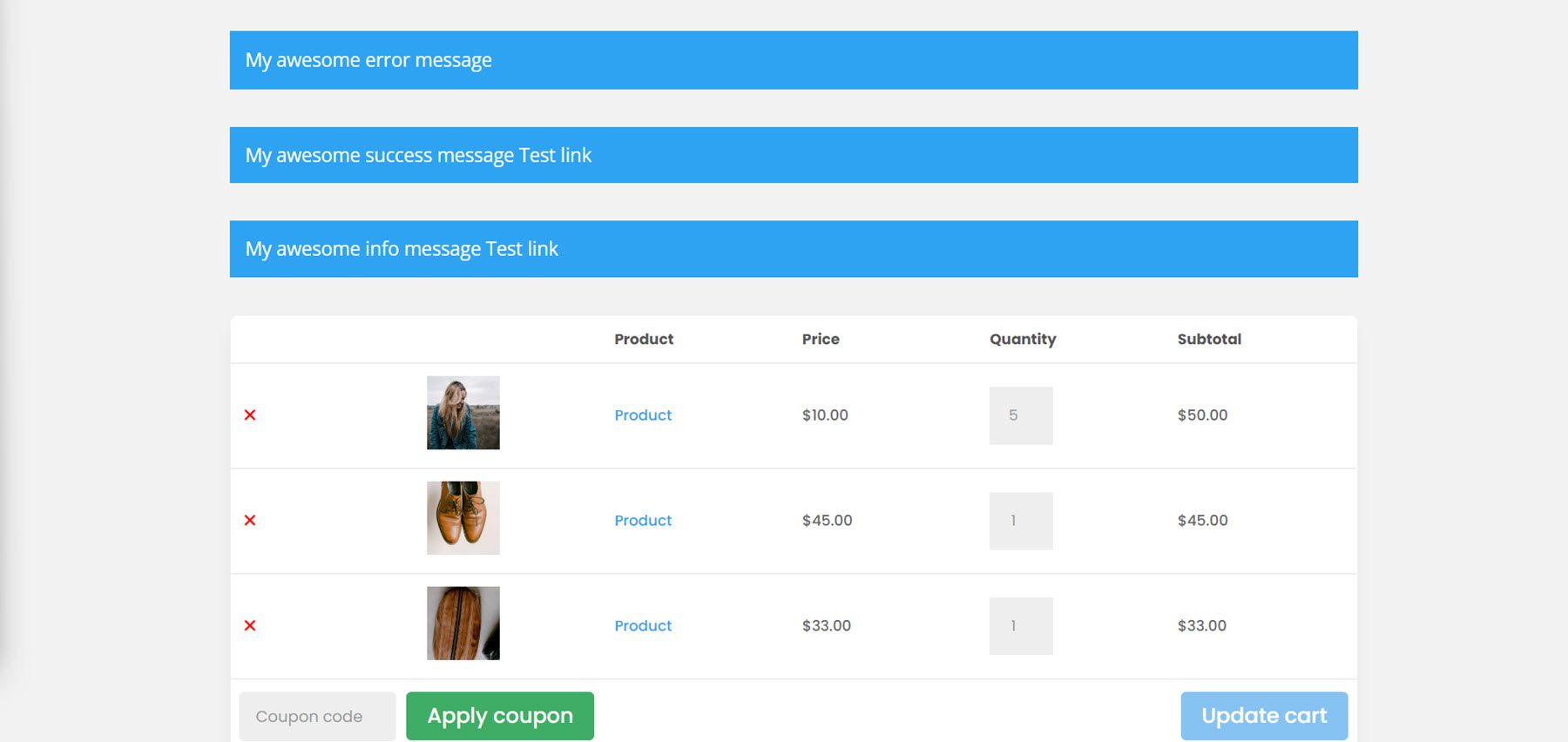
The WooCommerce Notices module can also be placed on the cart page. This module will display any error messages or notices that may come up. I’m adding it to the top of the cart page, above the cart list module.
Content Tab
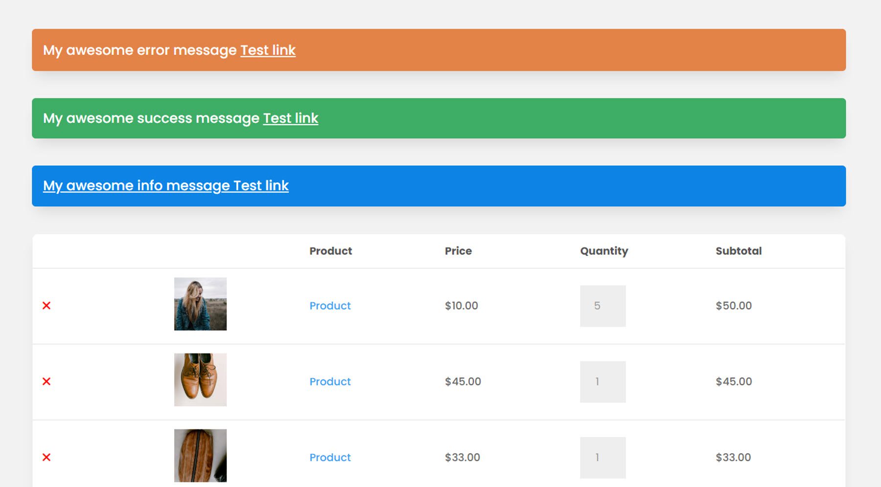
Under the content tab you can enable test mode, which will display all of the notices on the front end while you test the design. Here is what the three different notices look like by default.
Design Tab
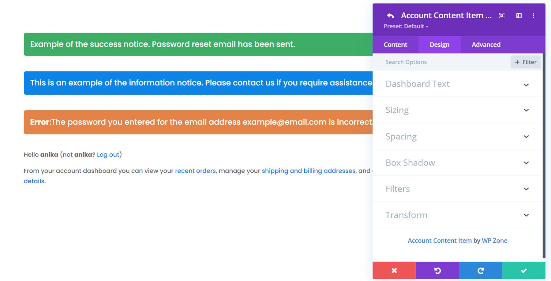
Here you can modify the design of the notices. I changed the background colors to correspond with the type of notice, and changed the styling to match the rest of the design.
Checkout Billing Module
Moving on to the checkout page, first up is the billing module. This is where you can collect billing details to complete the transaction.
Content Tab
Under the content tab, you can change the billing title text as well as any of the field labels. You can also add a link or background and change the admin label. Here I added a background color to the layout.
Design Tab
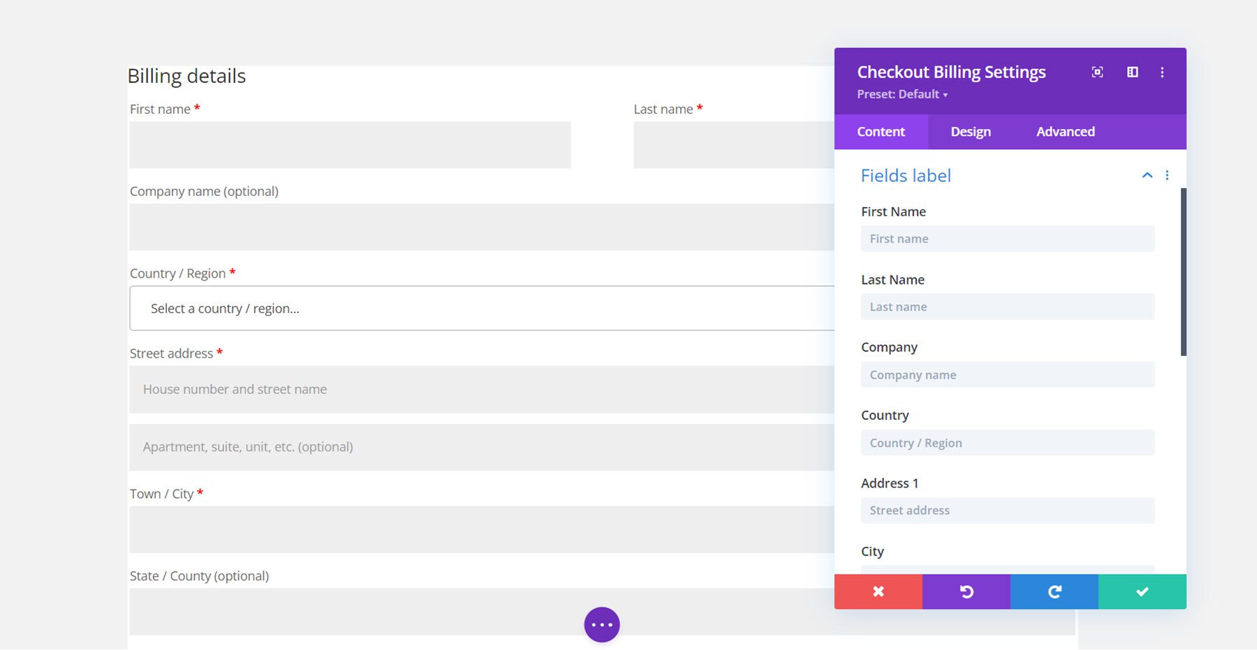
The design tab has options to customize everything from the heading and labels to the fields and borders. For this example, I kept the design in alignment with the other modules and added a rounded border and a box shadow, changed the spacing, and modified the font.
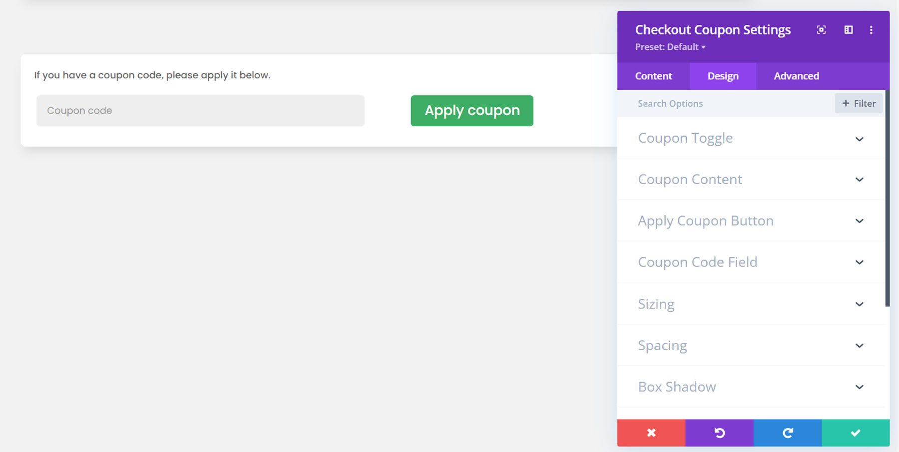
Checkout Coupon Module
Next, we can add the checkout coupon module to the checkout page.
Content Tab
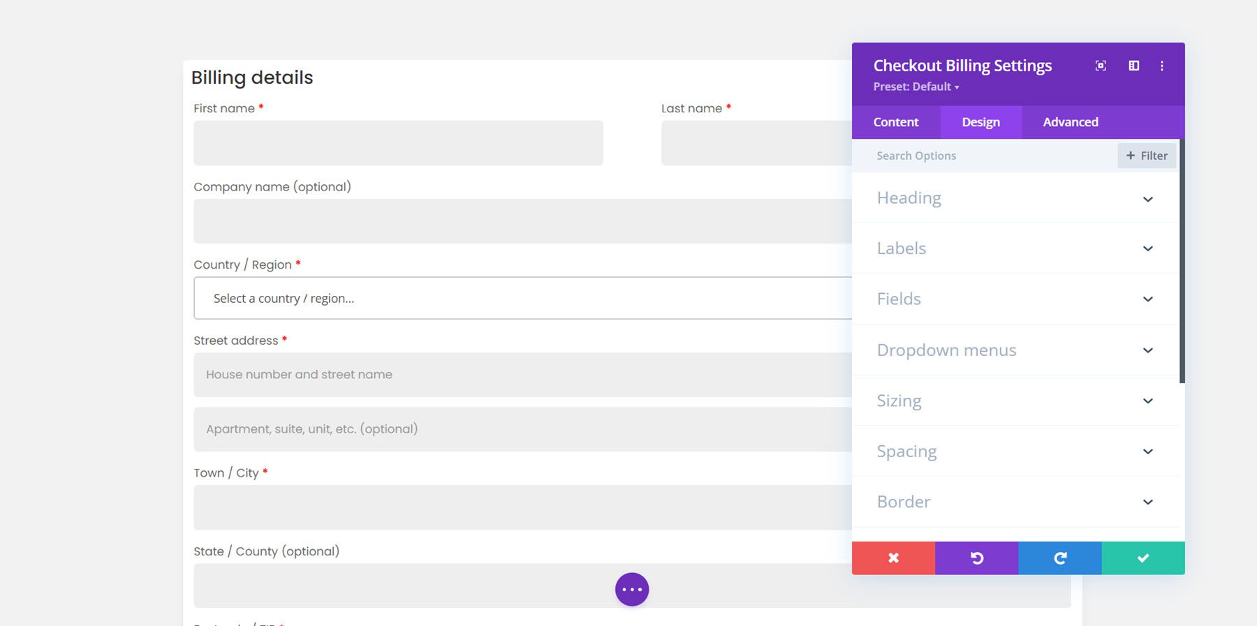
In the content tab, you can choose to show the coupon section via toggle or to have it always displayed. I chose to have it displayed. Here you can also change the text for any of the coupon module elements.
Design Tab
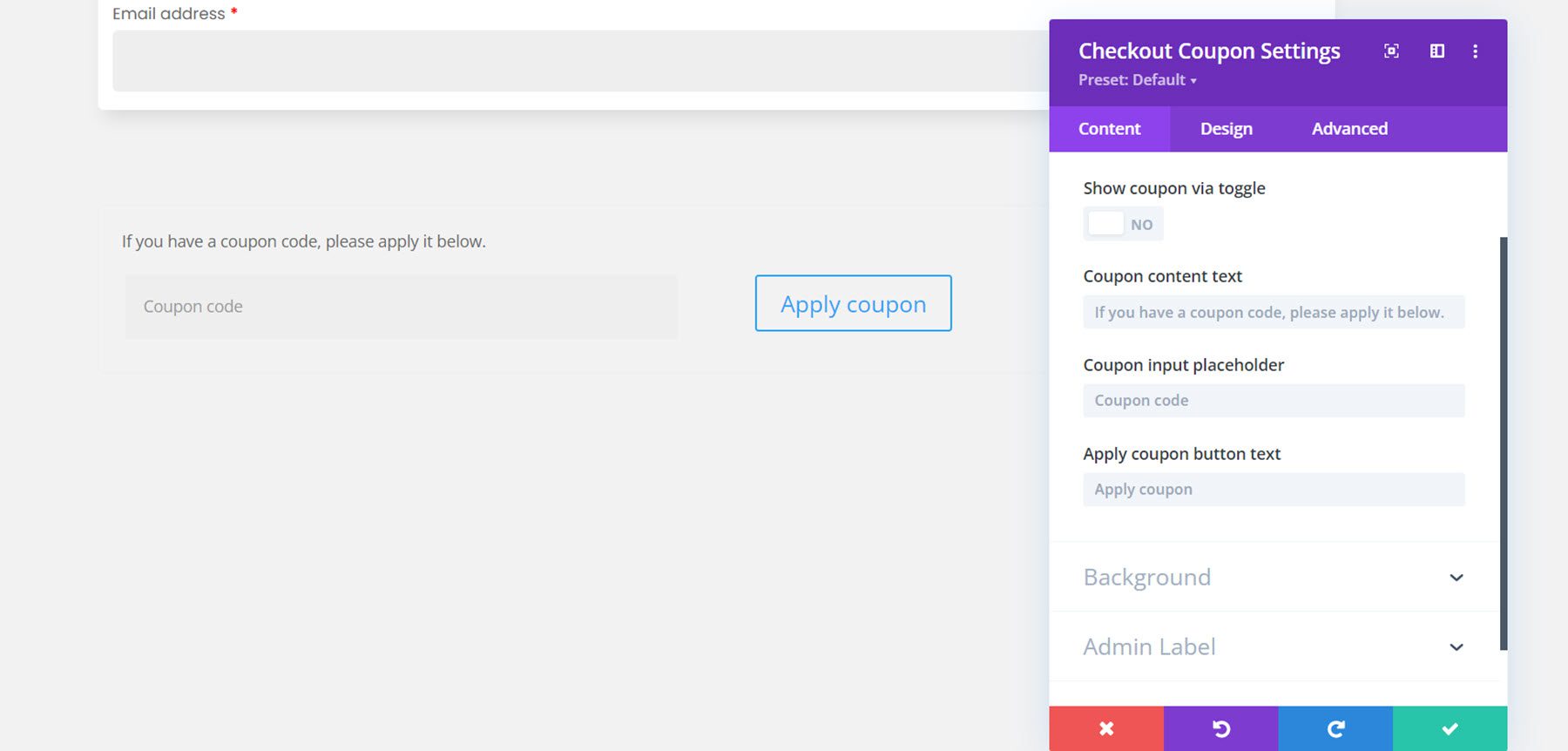
Here is the designed coupon module. I added a background, box shadow, and rounded corners. I also changed the font and customized the button.
Checkout Order Module
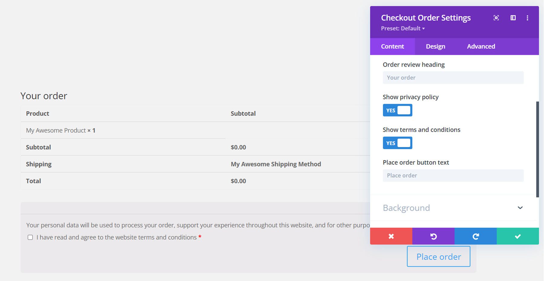
Now let’s move on to the checkout order module. This is another module for the checkout page and it displays the customer’s order information such as the selected products, the subtotal, shipping, the total cost, payment options, and a privacy policy checkbox.
Content Tab
In the content tab you can change the heading text and the place order button text. You can also choose to show or hide the privacy policy and terms and conditions. Of course, you can also add a background and change the admin label here as well.
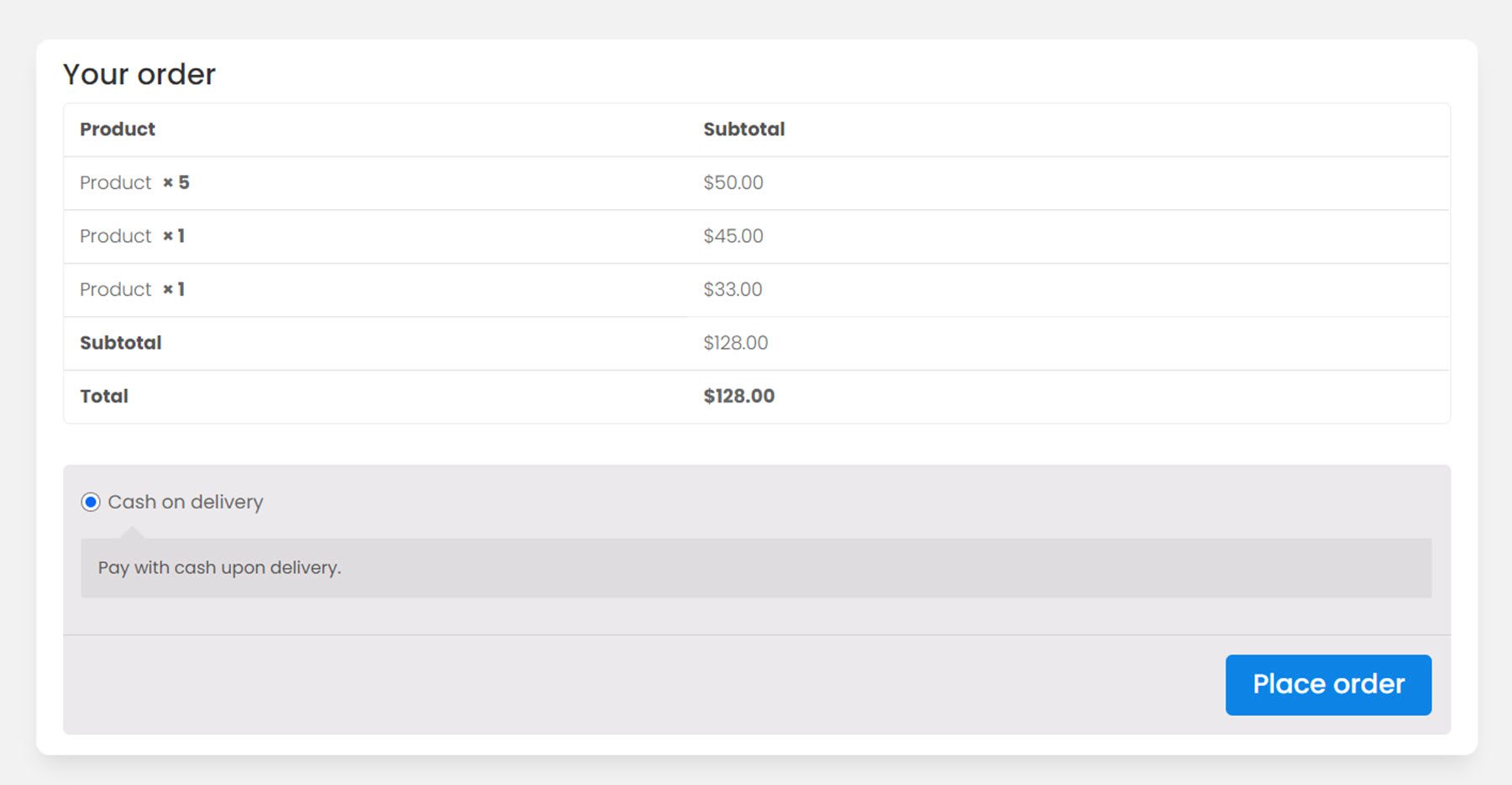
Design Tab
Just like the other modules, the checkout order module can also be completely customized. Here I changed the font, added a background and rounded corners, and customized the button.
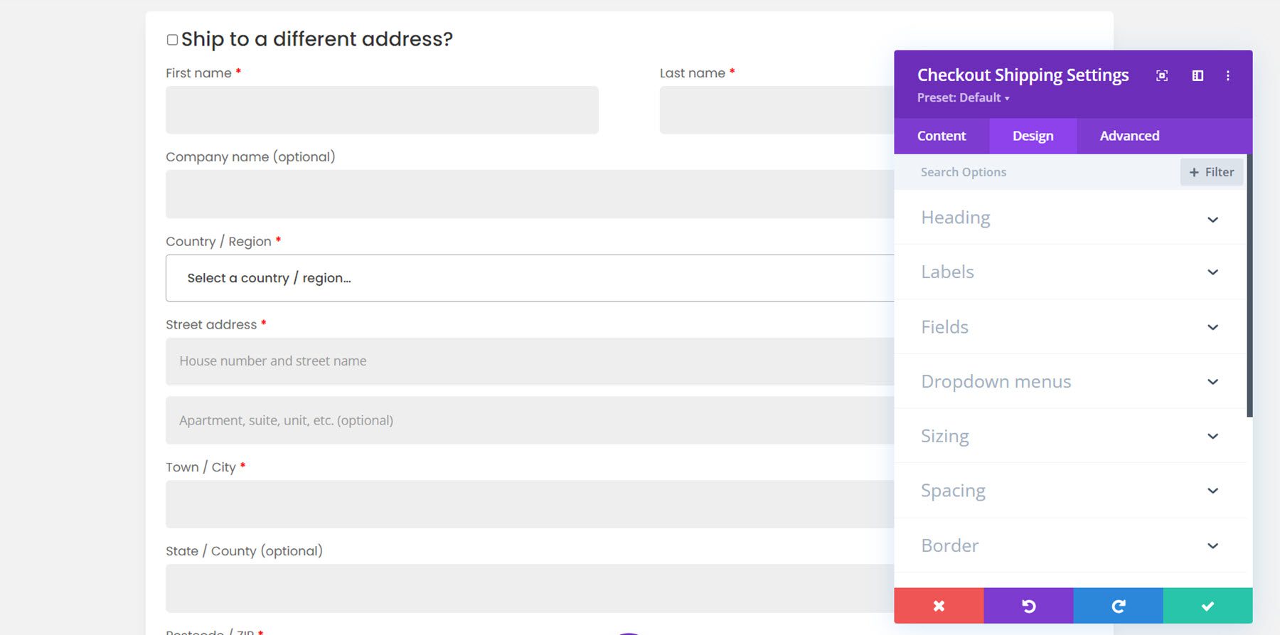
Checkout Shipping Module
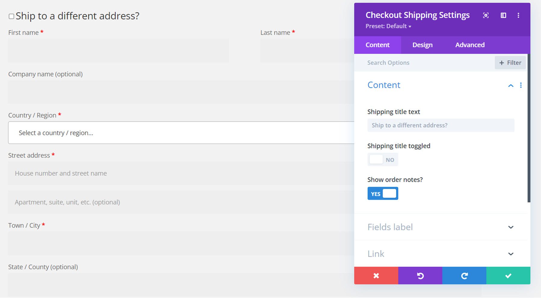
The last module for the checkout page is the checkout shipping module.
Content Tab
In the content tab, you can change the title text, choose to have the title toggle, and show or hide order notes. You can also change any of the field labels.
Design Tab
Here is the customized design. Again, I added a background, rounded borders, a box shadow, and changed the font.
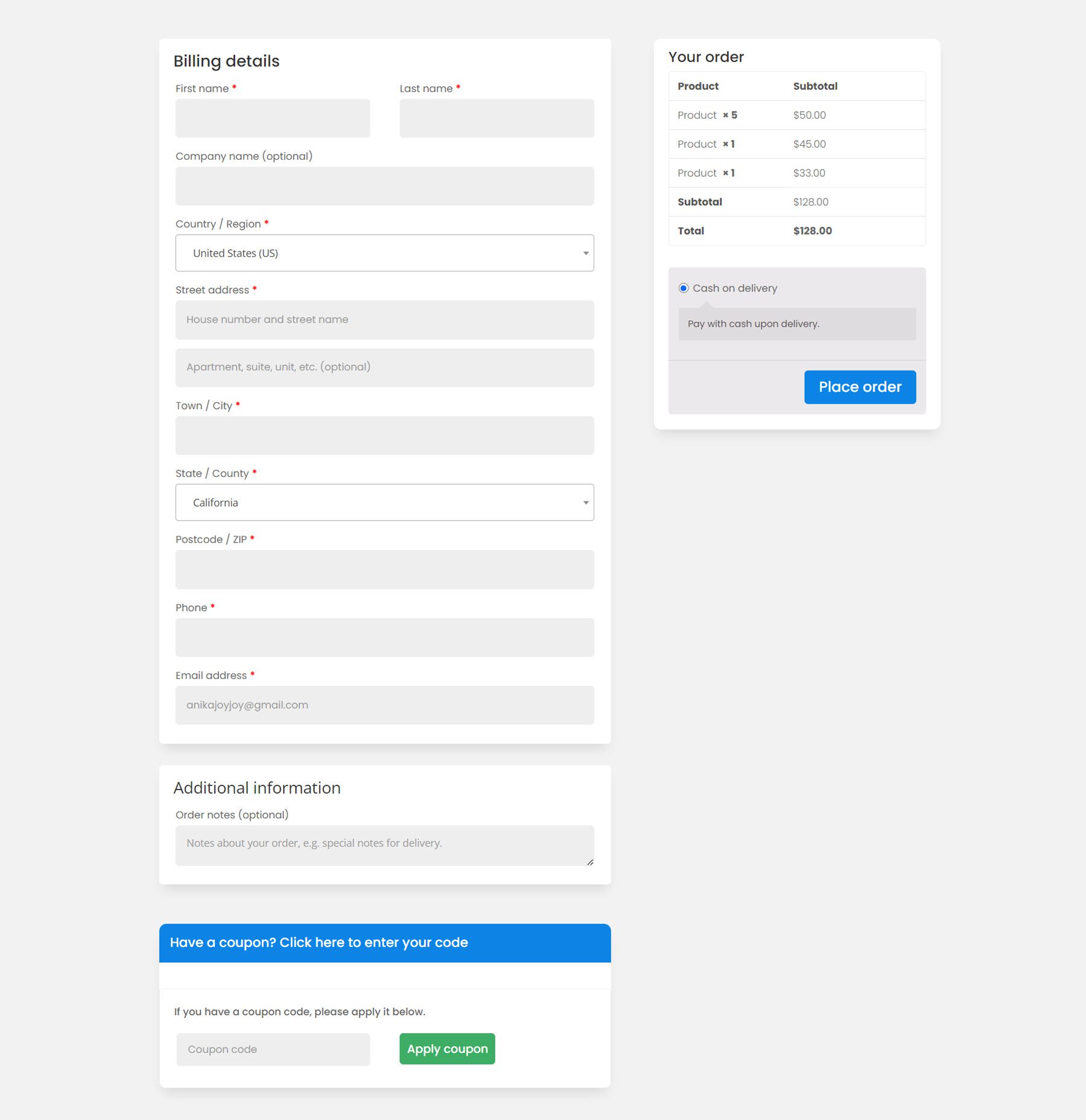
And here is the full design for the checkout page.
Account Content Module
Divi shop builder also comes with some modules to customize the account page. Let’s take a look at the account content module first. There are different elements you can add to the page and you can rearrange them however you would like. These elements include dashboard, orders, subscriptions, downloads, addresses, account details, login, register, and lost password sections. Each element has its own settings page where you can customize the individual element’s design. The account content module also has design options where you can customize the overall design.
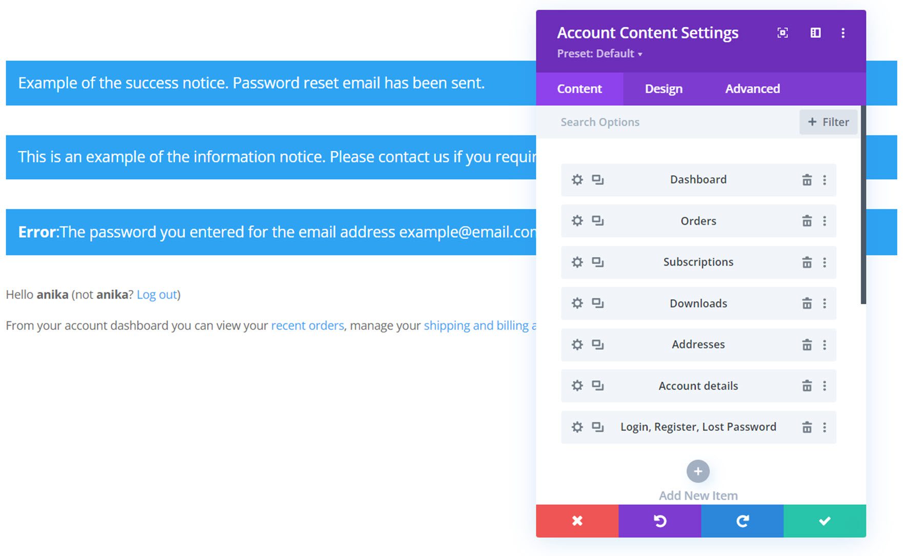
Here is the styled default dashboard view, along with the notice messages at the top.
This is the styled orders page, where customers can see all of their completed and pending orders.
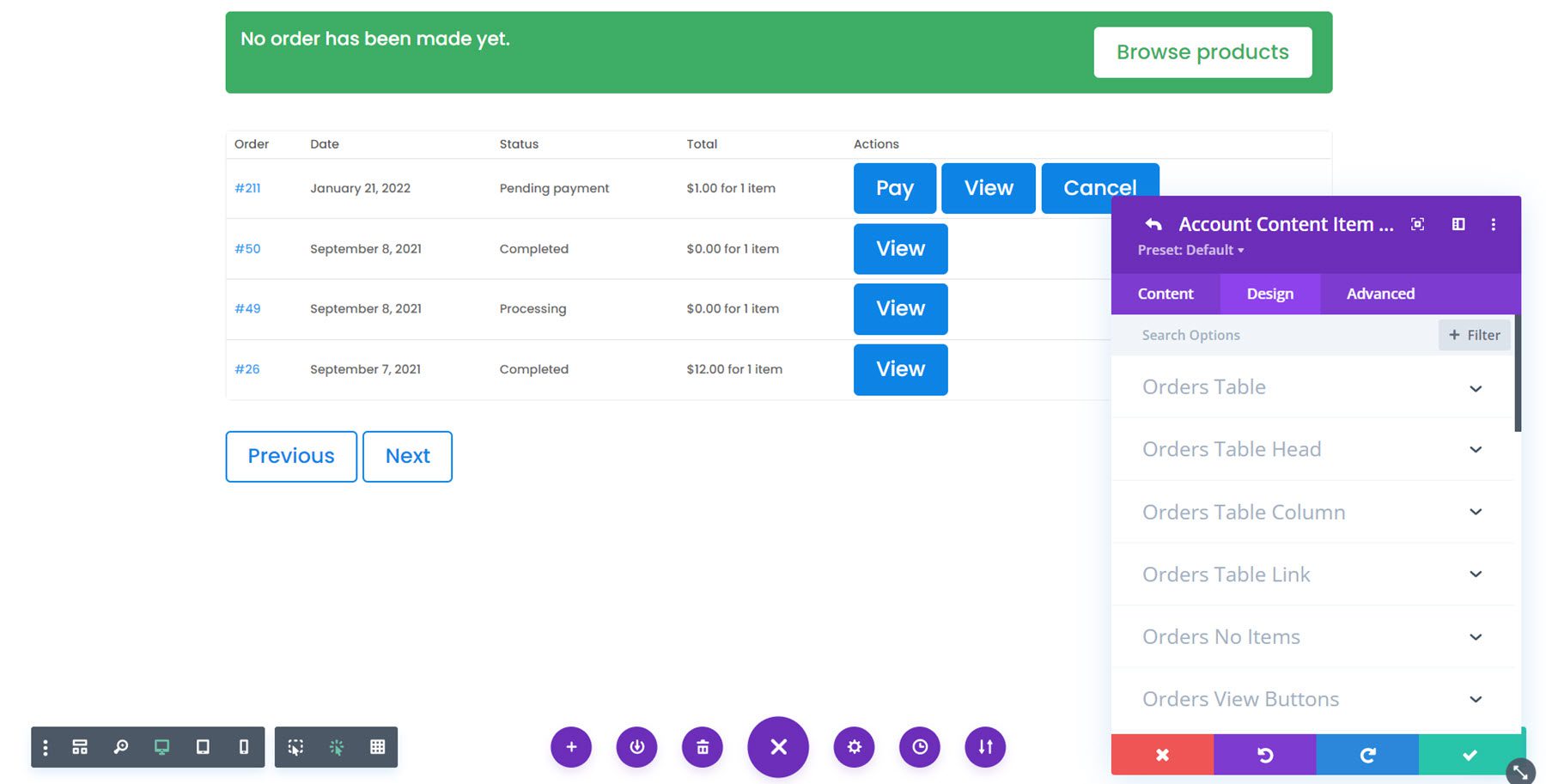
This is an example of a downloads page.

As you can see, this plugin gives you total control over the design of the account page as well. Let’s take a look at a couple more modules that work with the account page.
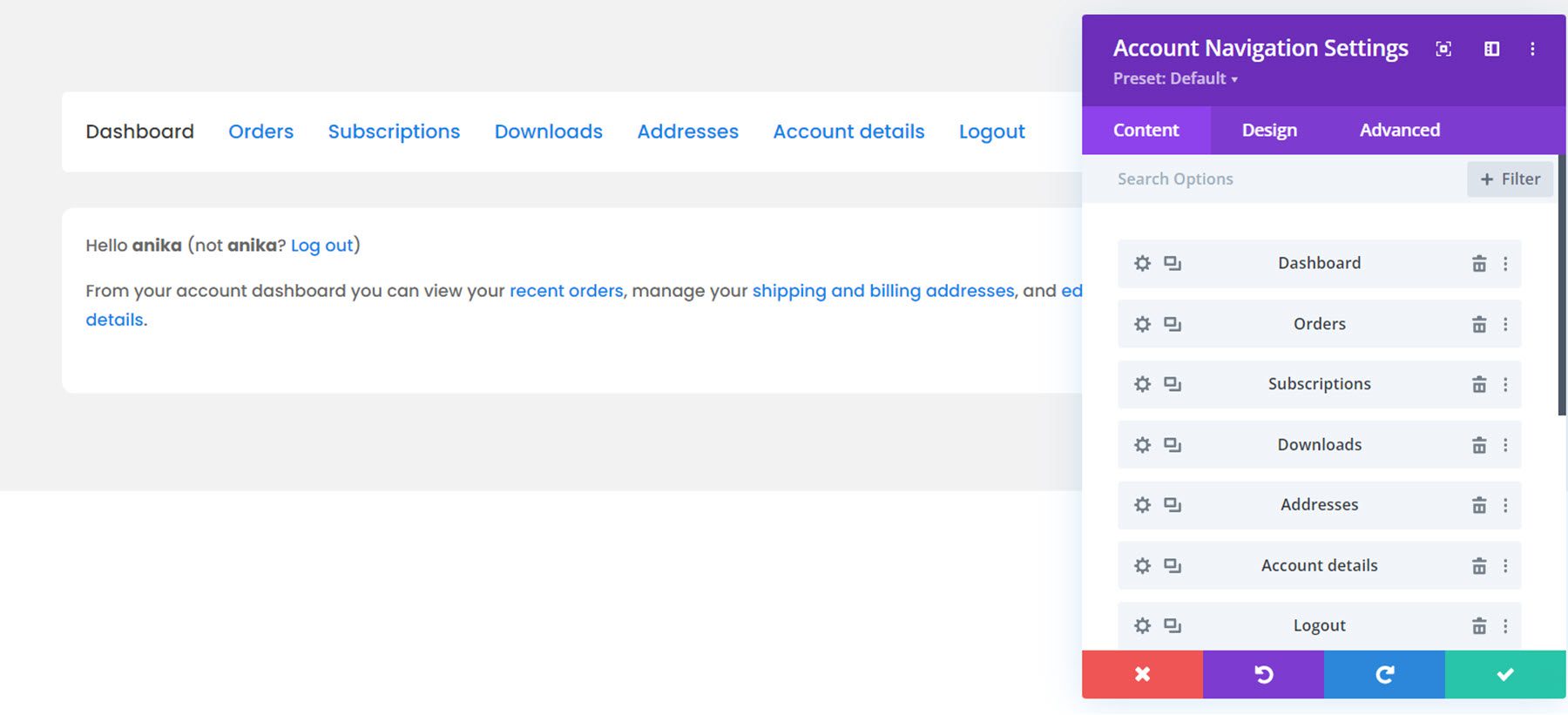
Account Navigation Module
This module adds a navigation menu to the page so that users can view the different pages in their account. Just like the account content module, you can add and remove any of the pages from the menu and change their order. Here is the styled navigation module.
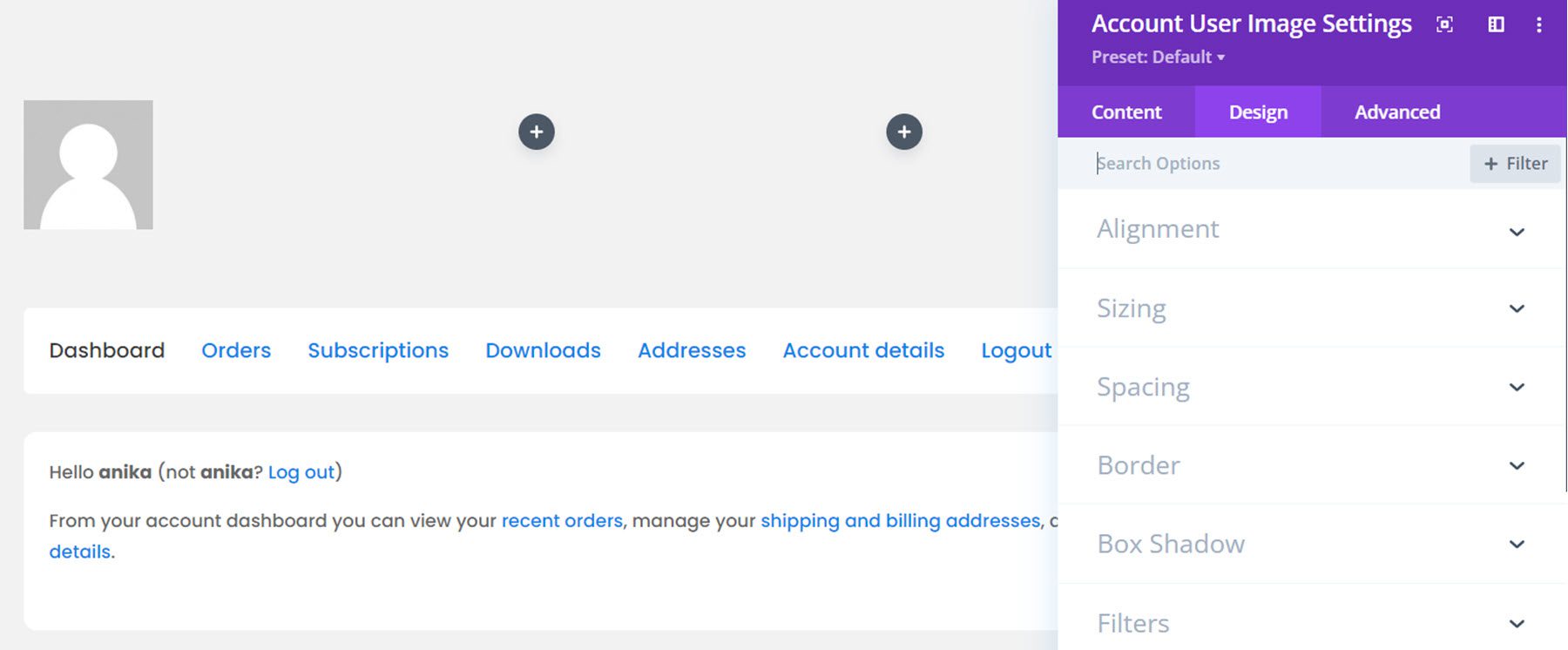
Account User Image Module
The account user image module adds the user’s profile image to the page. Here it is in action.
Account User Name Module
Similarly, the account user name module adds the user’s username to the page. You can alternatively select to display the first name, last name, full name, or display name.
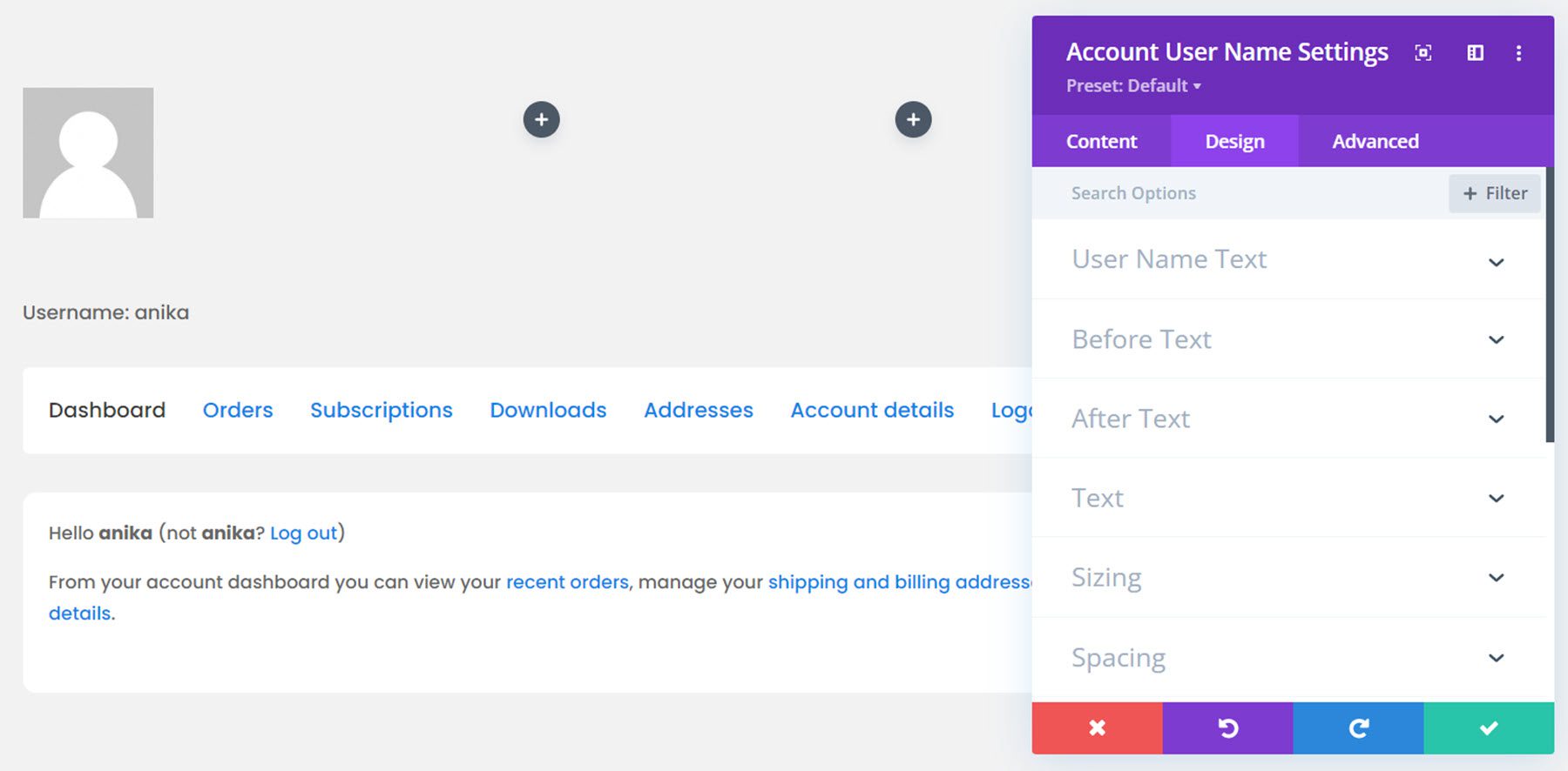
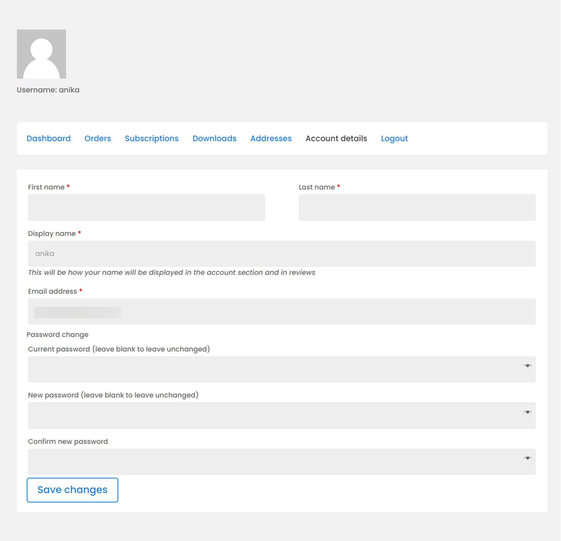
Here is the full account interface on the front end. This is the account details page.
Thank You Module
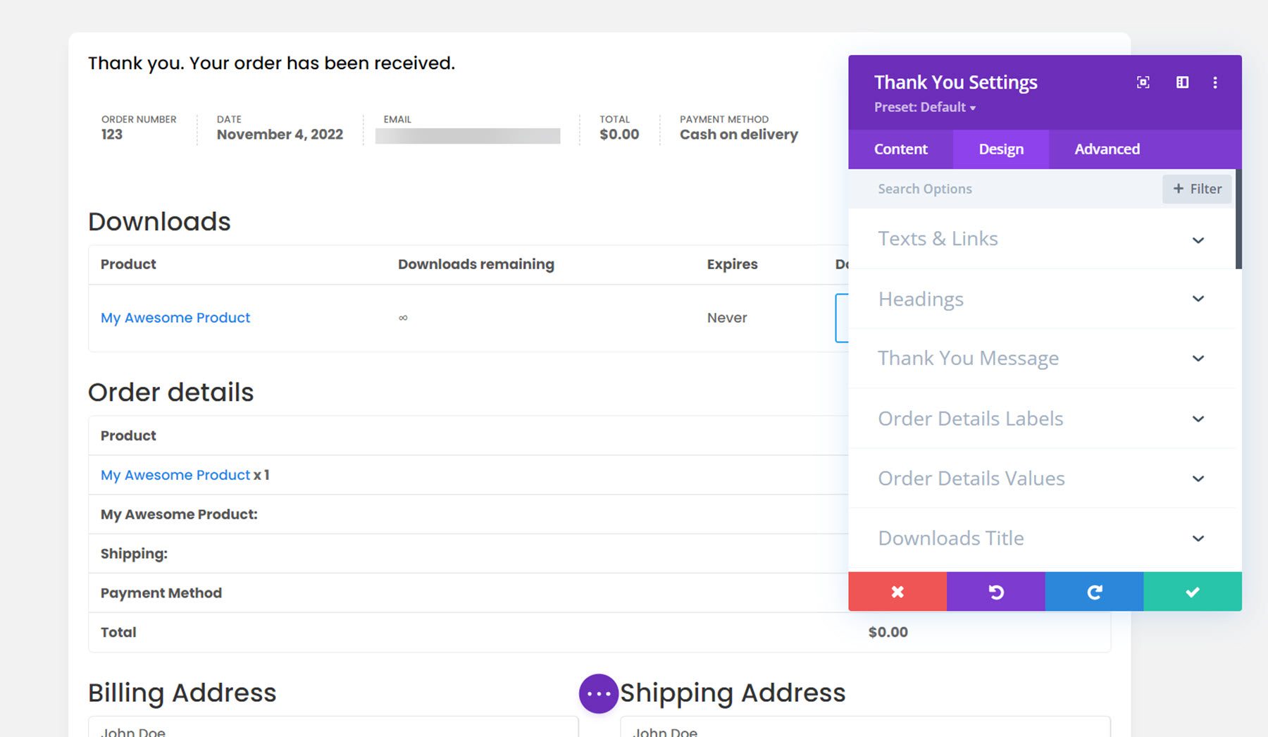
The final module we’ll cover is the thank you module. This will appear after an order has been completed. You can change any of the labels using the content tab settings, and of course the entire module can be customized with its design settings. Here is the styled thank you page.
Divi Shop Builder Layouts
Divi Shop Builder also comes with several premade shop layouts that you can use to jump-start the design process. Let’s take a look at a couple of the designs.
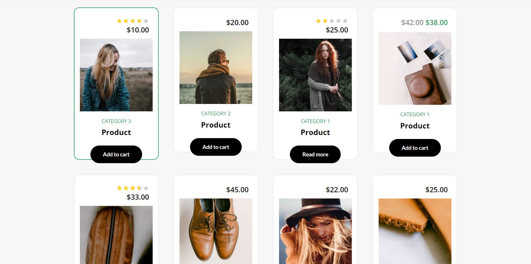
Woo Shop + Module Demo 1
This is one of the shop demo layouts. It has a card-style design and features a green border that appears on hover.
Coffee Cart and Checkout Layouts
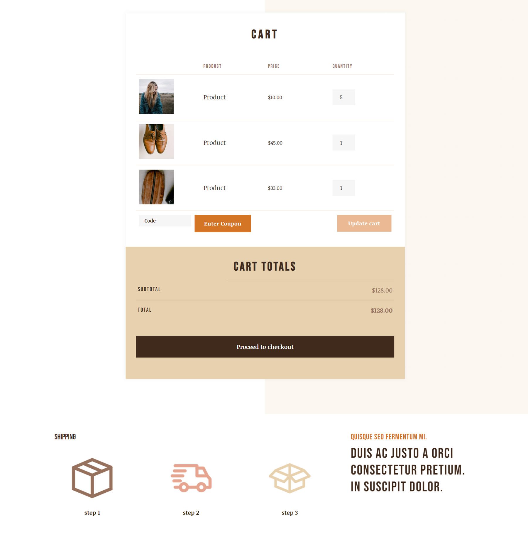
The coffee layout comes with a cart layout and a checkout layout. Here is the cart layout.
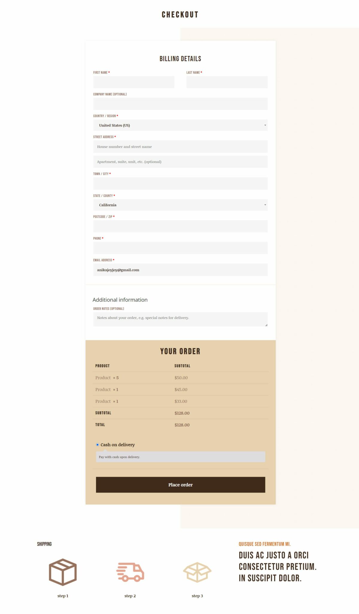
And here is the checkout layout.
Woo Shop + Food Layout
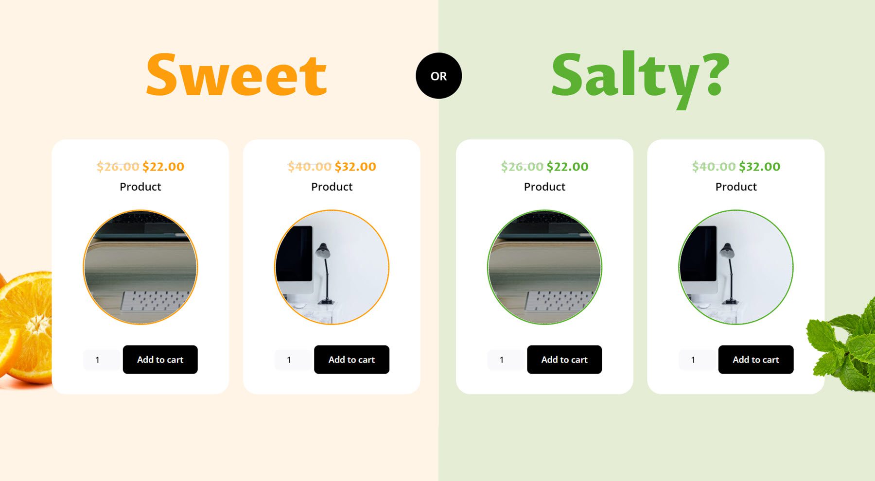
This is another shop module layout with a creative “sweet or salty” split layout. This layout features a round product image with a colored border.
Purchase Divi Shop Builder
Divi Shop Builder is available in the Divi Marketplace. It costs $109 for unlimited website usage and 1 year of support and updates. The price also includes a 30-day money-back guarantee.
Final Thoughts
That was our look at Divi Shop Builder. As you can see, this plugin is jam-packed with modules and design options that give you complete control over the design of your shop, cart, checkout, account, and thank you pages. As comprehensive as this plugin is, it is also very easy to use and customize. The plugin author also has extensive documentation for the product, which is very helpful. If you are looking for a way to customize your WooCommerce shop with Divi, this is a great option. We would love to hear from you! Have you tried Divi Shop Builder? Let us know what you think about it in the comments!
The post Divi Plugin Highlight: Divi Shop Builder appeared first on Elegant Themes Blog.
