Testimonials are an important part of building a business. Divi’s testimonial module makes it easy to display what your customers are saying about you and your work, but it’s also limited in that the testimonials live within their specific modules. This makes it difficult to modify the design of the modules because you have to customize each one individually. Also, it displays only one testimonial.
A third-party plugin called Testimonial Slider adds three new modules to the Divi Builder to display testimonials from a library with categories. With the new modules you can display the testimonials within a grid or one at a time within a slider, and customize the module once and all of the testimonials match.
In this article we’ll take a closer look at Testimonial Slider. In these examples I’m using images and layouts from several layout packs including:
I’m using Testimonial Slider version 1.2. and Divi 3.0.98.
Testimonial Slider Dashboard Menu
A new menu item is added to the dashboard menu called Testimonials. Here you’ll find All Testimonials (seen in the image above), Add New, and Testimonial Category. All Testimonials lists every testimonial you’ve added and allows you to edit, quick edit, trash, view, view by category, sort by date, and search. You can also add a new testimonial from here.
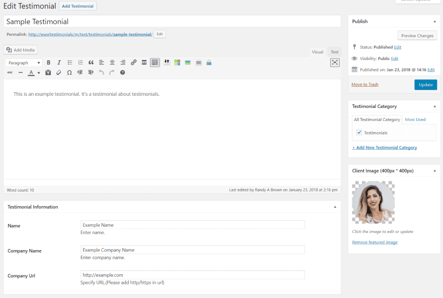
Add New provides a WordPress TinyMCE editor where you can create the testimonial. Here you can create categories, add the image, and provide testimonial information (name, company name, and URL) that will display as the information for the testimonial.
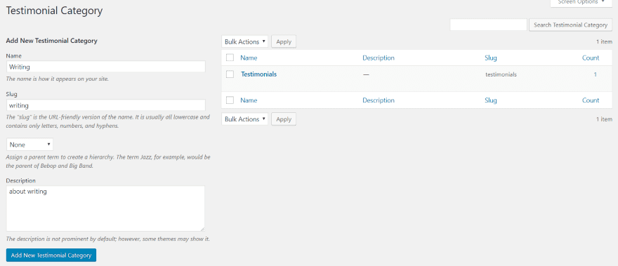
Testimonial Category is a category editor for Testimonial Slider. It works exactly the same as the standard WordPress category editor.
Testimonial Slider Archive Page Settings
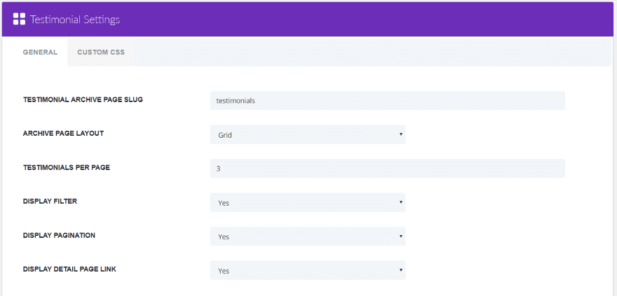
In the dashboard menu, go to Divi > Testimonial Settings. Here you can set the archive page slug, adjust the archive page settings, choose to display in a grid or list, the number of testimonials per page, to display the filter, pagination, and the detail page link. It also has a custom CSS tab so you can target this specific page.
Testimonial Slider Modules
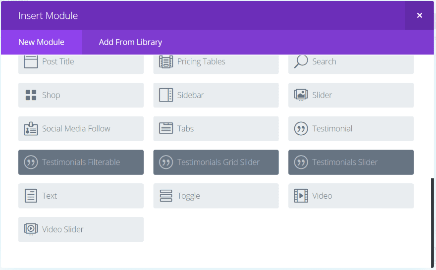
Three new modules are added to the Divi Builder:
- Testimonials Filterable
- Testimonials Grid Slider
- Testimonials Slider
Testimonials Filterable
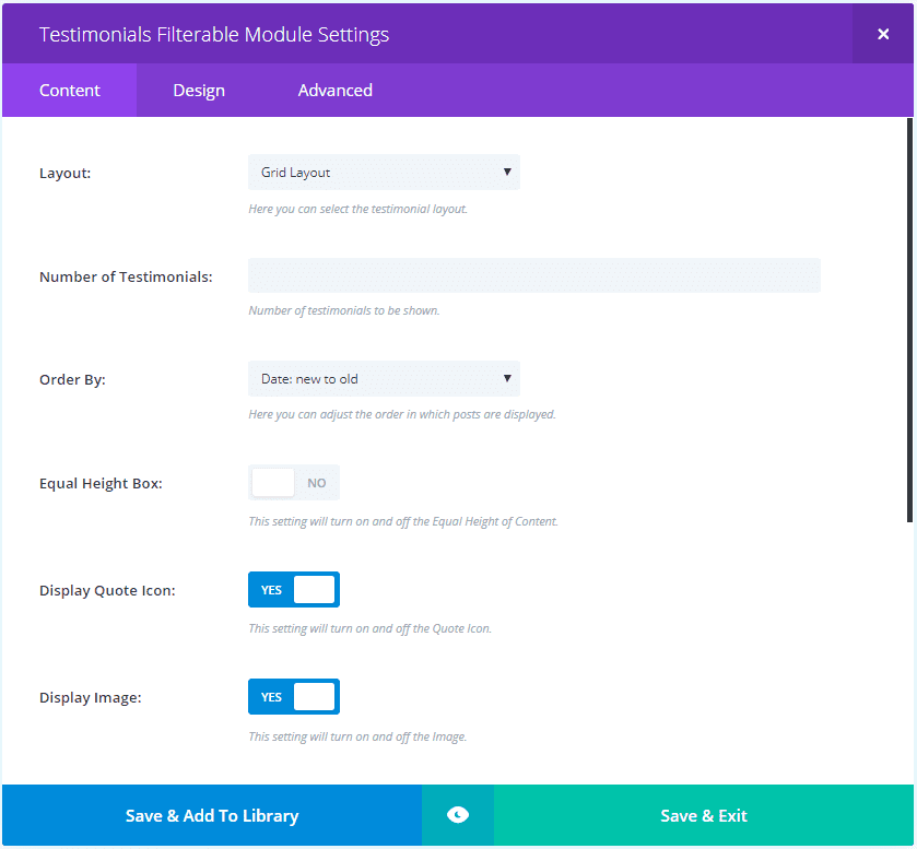
Content settings for the Filterable module include the layout (choose from grid or list), number of testimonials to display, order by, equal height, display quote icon, display image, display category filter, which category to display, and background color.
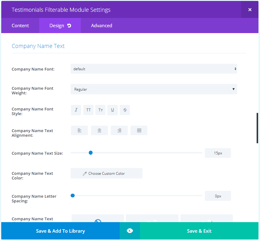
The Design tab settings include body text, client name text, company name text, border, box shadow, and animation.
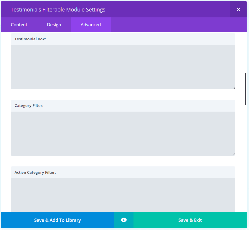
The Advanced tab gives you CSS access to all of the basics plus the testimonial box, category filter, active category filter, testimonial image, icon, text, name, company name, pagination, pagination on hover, and pagination current.
Here’s a look at its default settings.
Testimonials Grid Slider
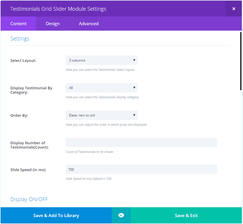
The Grid Slider Content settings includes layout (from 1-4 columns), speed, enable or disable each of the elements, and color options for each of the elements including dot nav. The Design and Advanced tabs are the same as the Filterable module except the Advanced tab adds CSS for dot nav.
Here’s a look at its default settings. Dot navigation is added to the bottom.
Testimonials Slider
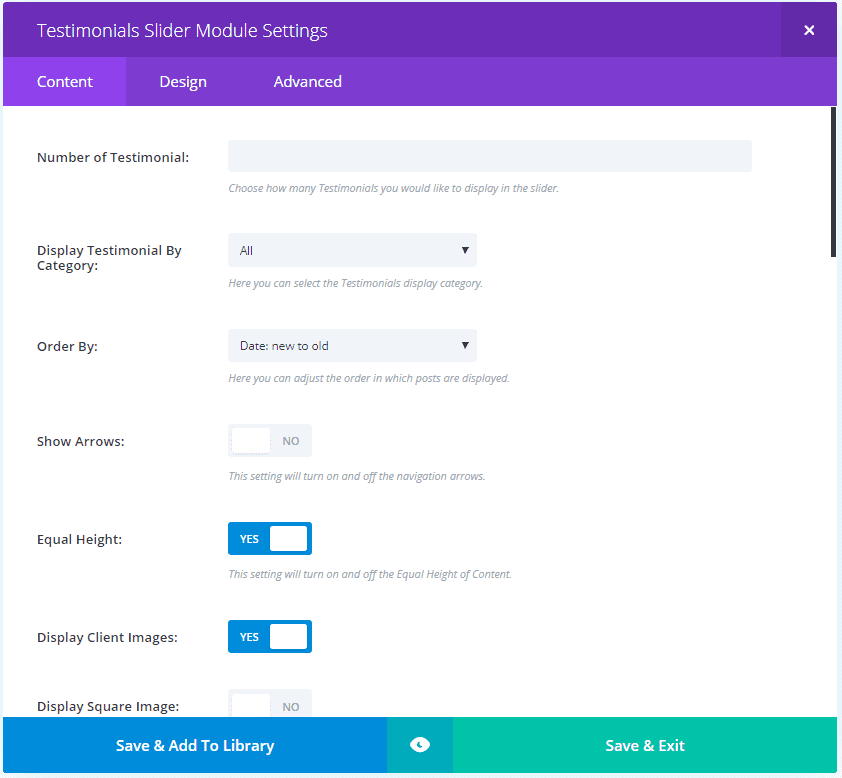
The Testimonials Slider Content tab adds arrows, square or round images with size adjustments, a text overlay, automatic slide on hover, and display one image at a specific size. It also adds background adjustments using solid backgrounds and images. It doesn’t include gradients or video. The Design tab adds text overlay border radius and arrow color. The Advanced tab adds custom CSS for the arrow.
Here’s the testimonial with default settings. The image for the active testimonial is raised and shows the image without an overlay. The inactive image has an overlay (in this case it’s darkened). It displays the image without the overlay as you hover over it.
Testimonials Filterable Examples
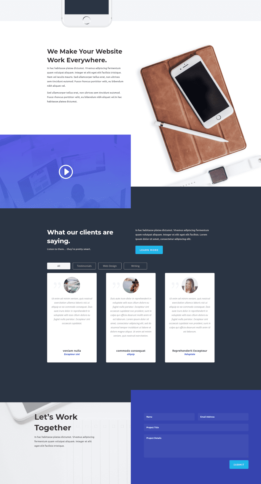
I’m using the testimonial section from the Photo Marketplace layout pack. The image above is that section as it looks when you upload it. This layout uses three testimonial modules, however with Testimonial Slider we’ll only need to use one module because it brings in the testimonials from the premade list and displays them in the grid layout that we choose.
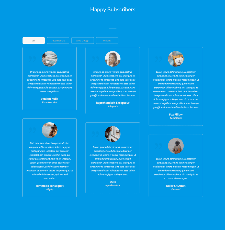
The Testimonial Filterable module displaying a grid layout. I’ve made the text white or light gray. The testimonials automatically display the blue background.
I’ve added a background color to the testimonials and set them to equal heights. This module doesn’t have a color adjustment for the quote icon and you can’t set the image to a square.
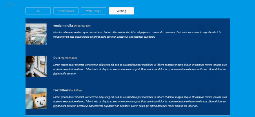
This one uses the list layout. I’ve filtered by a category so the list will display 3 testimonials. They don’t show the category within the testimonials themselves. The images are automatically displayed as square. There isn’t an option for changing it.
Also, I wasn’t able to add padding (without using CSS) to the left side of the images to bring it away from the border. I’d like to see a few image features so we could move the image to different locations, change sizes, etc. I’d also like a feature to adjust the filter’s text.
Here’s an example using the Web Design layout pack.
Testimonials Grid Slider Examples
The Testimonials Grid Slider displays a grid that slides one card at a time. The only change I’ve made to this example was to make the text white.
Here I’ve customized the colors for the body text, name, company name, background, quote icon, and navigation dots. This one uses a 2 column grid.
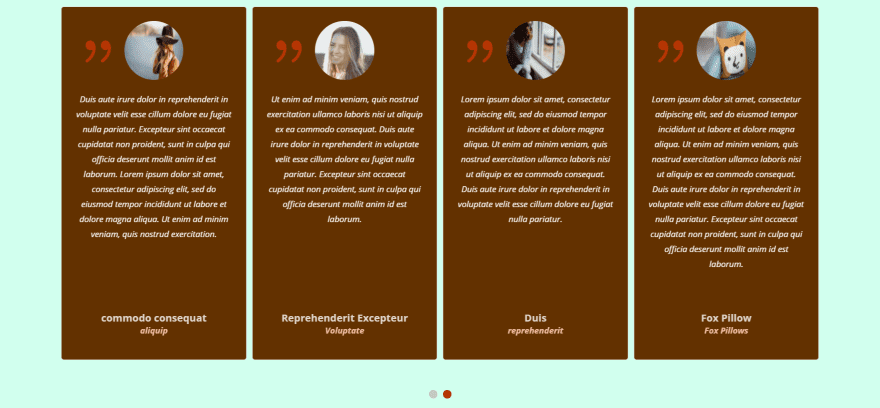
Here a 4 column grid. I’m also equalizing the heights.
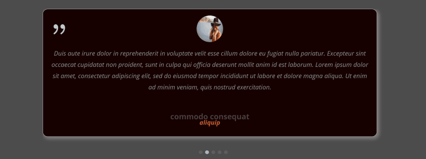
Here’s a 1 column layout. I’ve increased the font sizes, changed the colors, added a box shadow and rounded the corners.
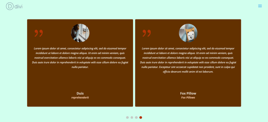
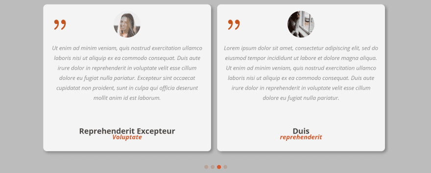
Here’s a 2 column grid with box shadow. I’ve reduced the corner pixels and adjusted colors again.
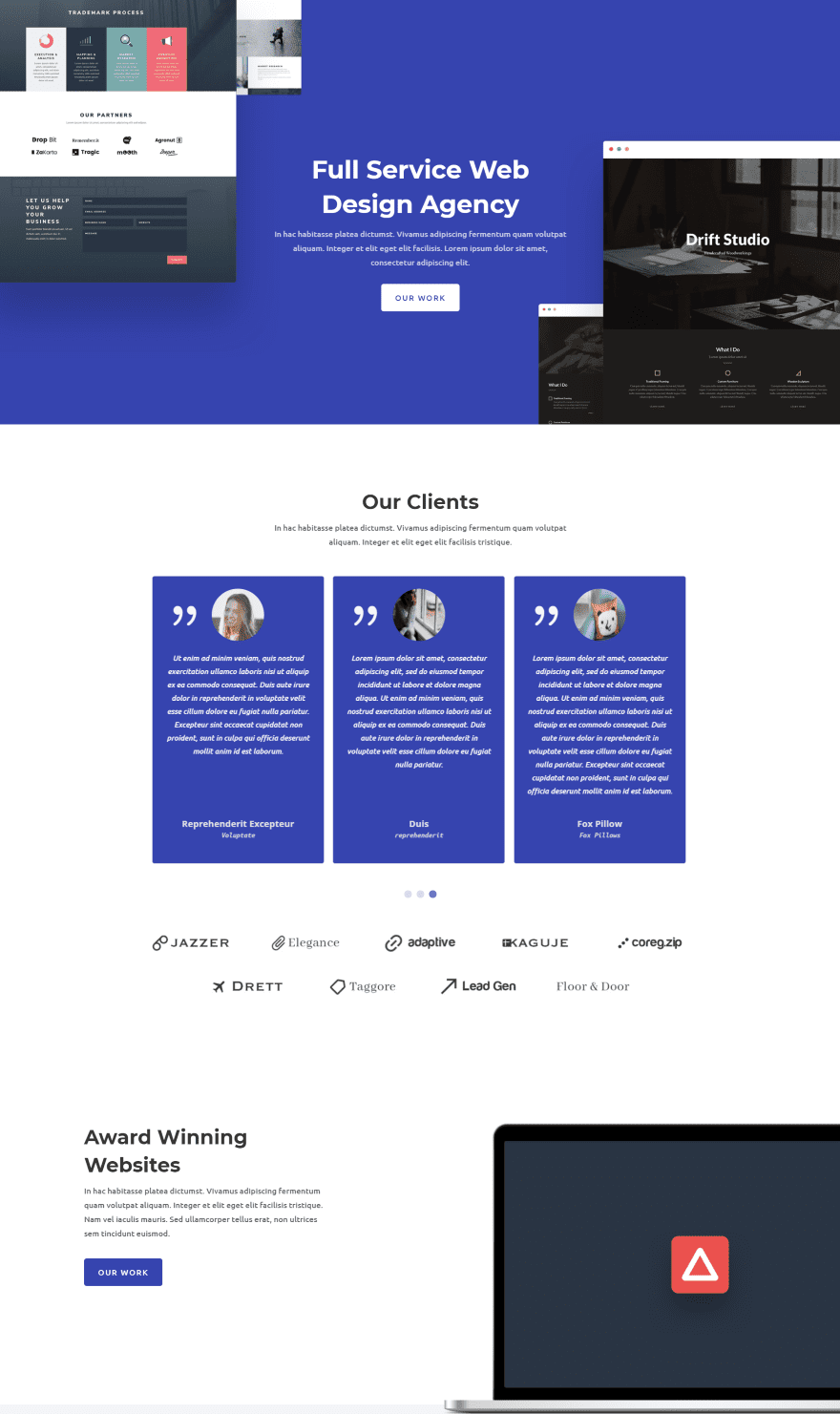
Here’s the Testimonial Grid Slider placed within the web design layout pack using text and colors to match the design.
Testimonials Slider Examples
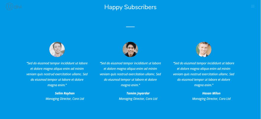
This is the Testimonials Slider module’s default layout. We can make it fit within the design easily.
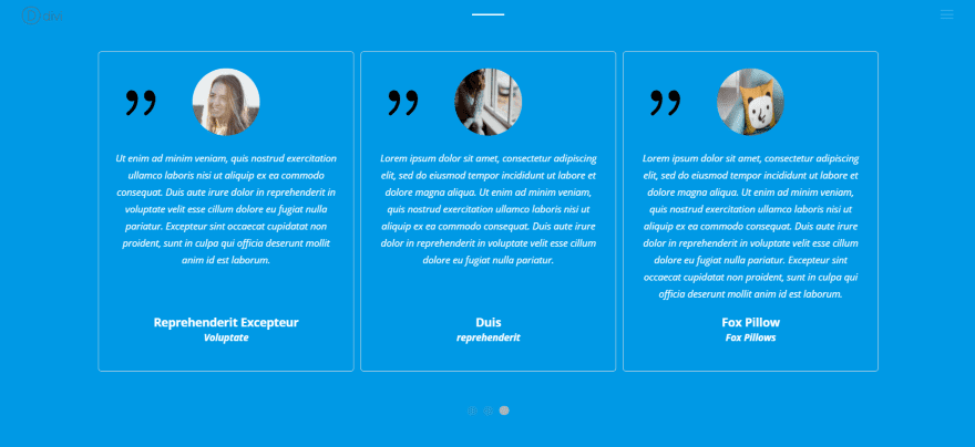
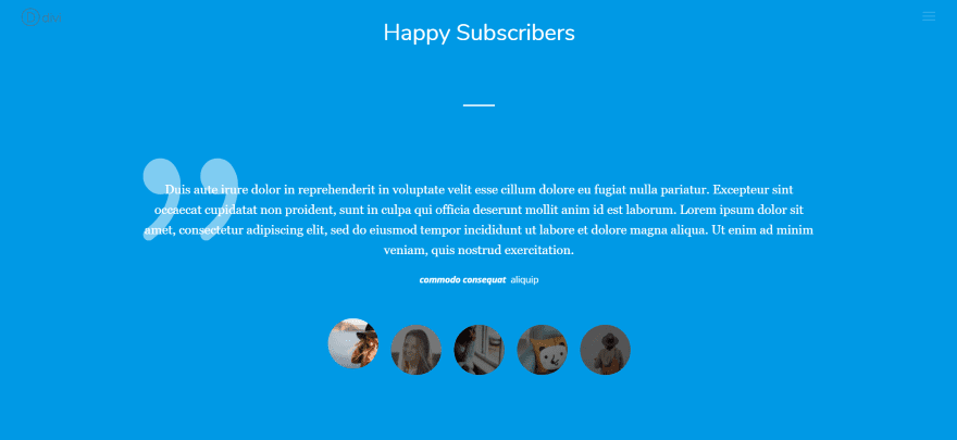
Here I’ve changed the color of all the text and the quote icon to white and made the background blue to match the section.
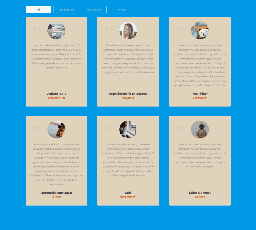
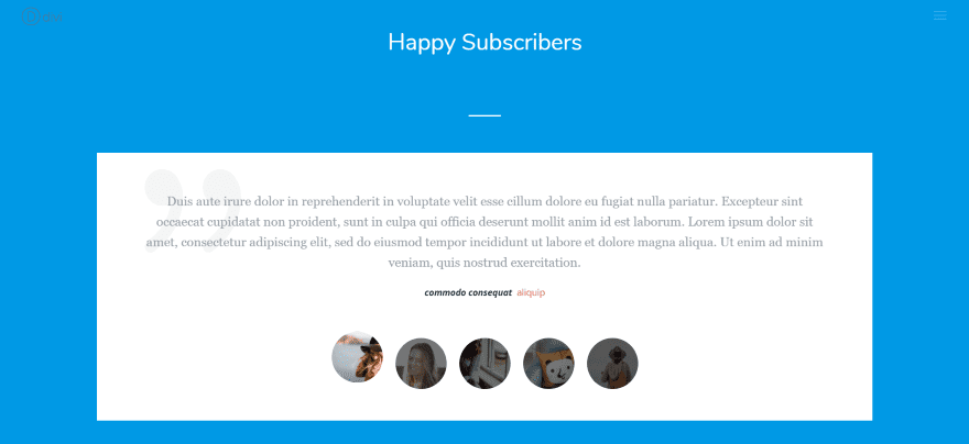
In this example I’ve changed the background to a lighter cream and change the text and icon colors again. This time each element has its own color. I’ve set the image to display as square. If you choose square you’re given a couple of fields where you can set the size of the images in pixels. I’ve left it to the default 80px. Each image is resized and line up perfectly even though I chose images in several sizes.
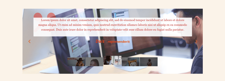
This one displays a background image with text overlay, which places the overlay only behind the body text itself. You can make the text overlay any color you want. I’ve changed the font, arrow, and quote icon colors and sizes, and I made the images square with 120 pixels wide and 60 pixels high to create a rectangular shape.
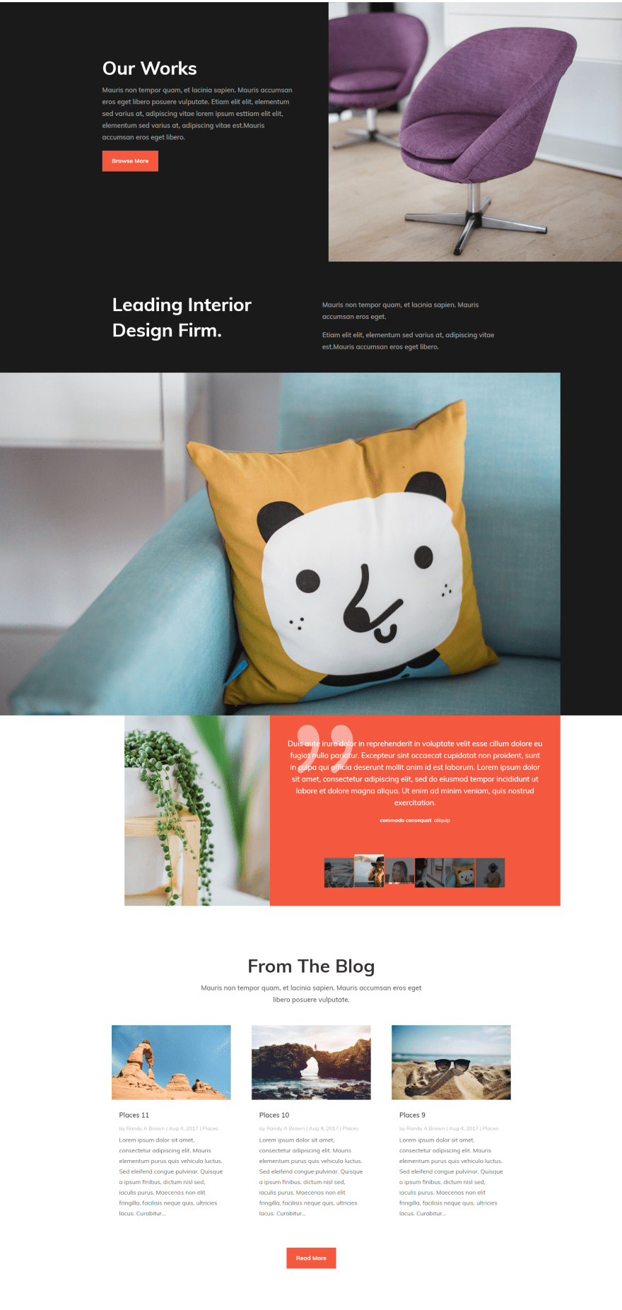
Here’s the Testimonials Slider placed within the interior design layout pack. I’ve replaced the original testimonial module with the Testimonials Slider using the same colors and fonts. The original had a circular image, but I’ve made the images square to match the design. The module fits nicely with the design of this layout.
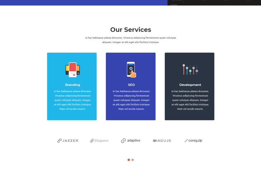
Here’s an example of using the Testimonials Slider as a logo slider. I’ve turned off the client name text, company name text, client image, and quote icon. I’ve placed the logos in the visual editor and chosen a single category.
Using Testimonial Slider with Extra
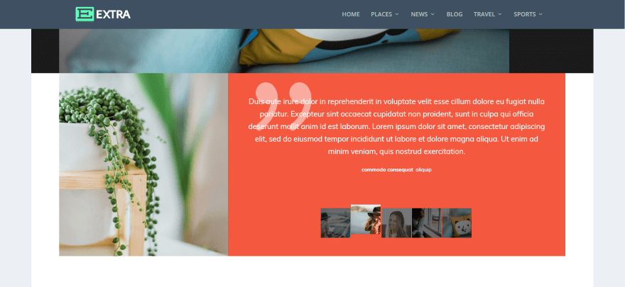
Testimonial Slider works just as well with Extra. Here’s a look at the testimonial portion of the interior design layout using the Testimonials Slider module.
Testimonial Slider License
It includes 6 months’ support (extendable to 12 months) and lifetime updates. There are two licenses to choose from:
- Regular (for use on one website) – €25.00
- Extended (for use on unlimited websites) – €85.00
You can purchase Testimonial Slider from the developer’s website.
Ending Thoughts
I found Testimonial Slider easy to use. I was able to create practically any type of slider design I wanted. There are a few features that I’d like to see added. For example, you can control the size and shape of the square images but not the round images. Of course you can do a lot of additional adjustments with CSS, so this helps with any features that are not available in the settings if you’re comfortable with CSS.
There are a few limitations between the modules, but with all three modules, and the fact that they have different options, Testimonial Slider offers a lot of features. One of my favorite features was the ability to select categories to display. You can choose as few or as many categories as you want, creating a specific testimonial slider for a specific page or service. If you’re interested in a testimonial slider this one is worth a look.
We want to hear from you. Have you tried Testimonial Slider? Let us know what you think about it in the comments.
Featured Image via Blablo101 / shutterstock.com
The post Divi Plugin Highlight: Testimonial Slider appeared first on Elegant Themes Blog.


