Adding a button to your Divi header could not be simpler. By using the Divi Theme Builder, you can control placement, design, and specific page assignment. Perhaps a button in your header is necessary on specific landing pages but not on individual blogs. We are going to walk you through the process of using the theme builder to add a button to your Divi header. Afterward, you can use these skills to add buttons anywhere you want in your theme builder templates. Let’s get started!
Preview
Here’s a preview of what we’re working on today, using the downloadable free header design that matches our Security Services layout pack.
Desktop

Mobile

How to Add a Button to your Divi Header
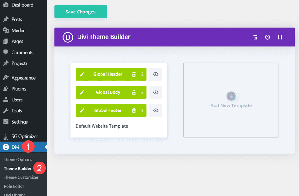
We are going to be using the Divi Builder to accomplish this addition, so be sure to load it up in your WordPress dashboard. You will find it under Divi – Theme Builder in your admin panel, and the main page will look something similar to this.
Create or Add a Header
Once you’re inside the Divi Theme Builder, you need to either create, add, or edit the header to which you need to add the button. If you have an existing header you will be adding the button to, just go ahead and enter the builder so you can get to work.
For the rest of us, we are going to use the freebie header for our Security Services layout pack. If you want to use this one (or another header which you’ve downloaded), you will need to open the Portability options in the theme builder by clicking the double-arrow icon in the builder.
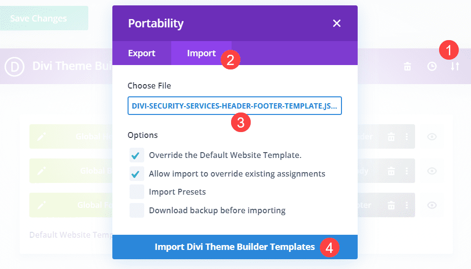
If you downloaded a header from us or somewhere else (maybe even exported your own as a backup), find the JSON file of the header you will upload and click Import Divi Theme Builder Templates. When the import finishes, your site will have the new header installed and ready for you to stick in your button.
Enter the Divi Builder
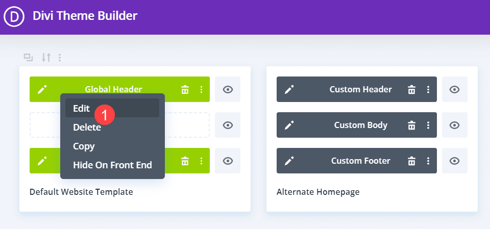
Double-click the header to enter the builder (or right-click and select Edit from the context menu).
The header will load up in the builder, and you can see all of the spaces in which Divi lets you place the module.

Choose Where to Put the Button
When it comes to editing your site’s header, you must consider spacing before anything else. Not only is it an element that every single visitor sees, but it’s also an element that shifts dramatically between desktop and mobile. So if you’re adding a button to an existing layout of any kind, you need to be sure that it’s not going to ruin anything.
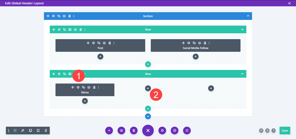
For this particular header, we are going to add a Subscribe button to the main header. To do so, we need to adjust the Column Structure of the containing row from 1 to 3 Columns.
Move and Edit the Menu Module
With that one, move the Menu Module to the right-most column and go into its Settings. Under the Content tab, go to the Logo options and remove it.
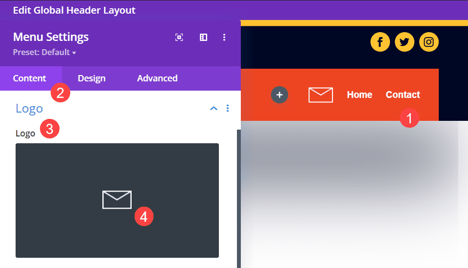
Note, you can also change this to a brand logo, or you can keep your own if you’re not using this layout pack. The envelope logo just doesn’t work for this design.
Add a Button Module
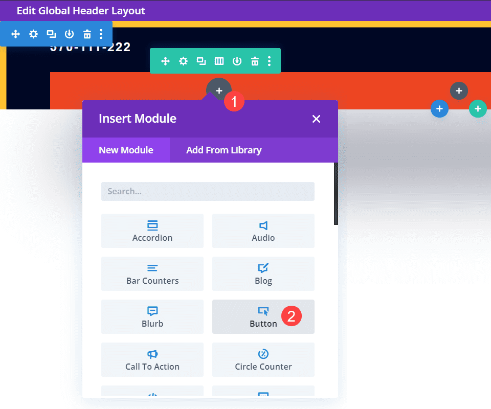
When the Menu module has been moved, you can go ahead and add the Button module to the left-most column. Click the black + circle and find the Button module in the list that appears.
Edit Button Text
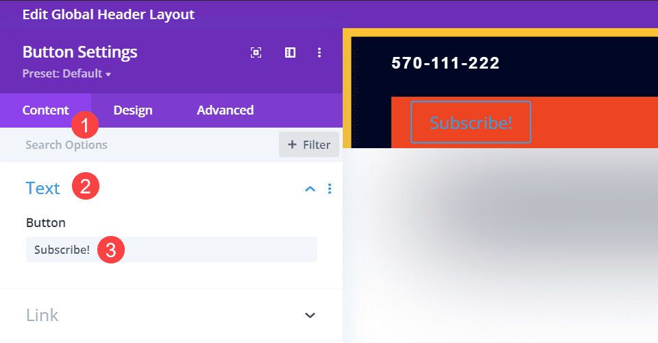
Then, go into the module settings and under the Content tab, find the Text area, and in the Button field, add the text you want to appear to users.
Add a Button Link
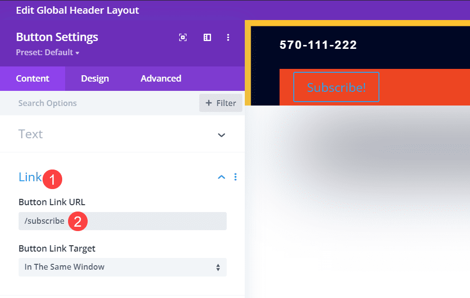
Below that in the Content tab, go into the Link options and set the button to whatever URL where you send new subscribers. Some email providers give specific URLs to forms, while others just give you embeds for your own pages. Whichever works best for your conversion funnel will go here.
Style the Button to Match the Site
The Divi button module is great, but the default styling does not match the header in which we’re placing it. So we want to have a button that users the same fonts, colors, and styles as the rest of the site.
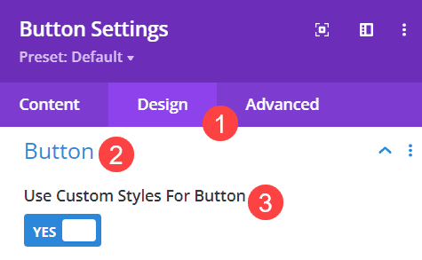
First, go into the Button module settings and into the Design tab. Then, find the area labeled Button and enable the toggle for Use Custom Styles for Button.
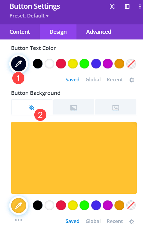
Next, choose the color’s from your site’s palette that works best. For this header, we’re using the same background and icon color as the social icons, which is #ffc230 for the background and for #000724 the text color.
After that, you need to make sure the fonts and other text styles match. You might want the button text to be larger and more prominent, but for this particular header, we’re going to make the button text match and compliment the menu it’s sharing the header with.
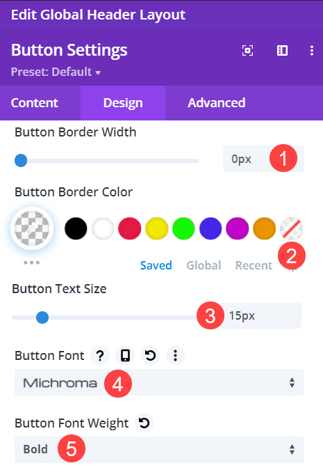
In this case, this means that we’re setting the Button Border Width to 0px and the Button Border Color to transparent, thus removing the border entirely. Then, we set the Button Text Size to 15px to match the header menu, and use Michroma as the Button Font and Bold as the Font Weight.
With all that done, you should now have a button in your Divi header that matches the rest of the site’s design spot on.
Final Results
When all the customization is complete, the final results may appear something like this.
Desktop

Mobile

Wrapping Up
If you’re a Divi user, getting comfortable using the theme builder can help greatly expand your skillset and design potential. Even something as simple as changing column structure and adding a button can take a good design all the way to a great design. Just make sure that your styling stays consistent and that the button takes users to content that really makes placing the button front and center worth it.
Why do you use buttons in your Divi header?
The post How to Add a Button to Your Divi Header appeared first on Elegant Themes Blog.

