Keeping up with trends in the web design space is one of the best ways to stay up-to-date as a web designer. It allows you to create modern-day websites that’ll impress your clients and help bring your skillset to the next level. In today’s tutorial, we’ll show you how to get familiar with a trend you often see nowadays in advanced websites; circle text SVG animations. We’ll show you how to add these inside your Divi page design, and even use them as a button too. You’ll be able to download the JSON file for free as well!
Let’s get to it.
Preview
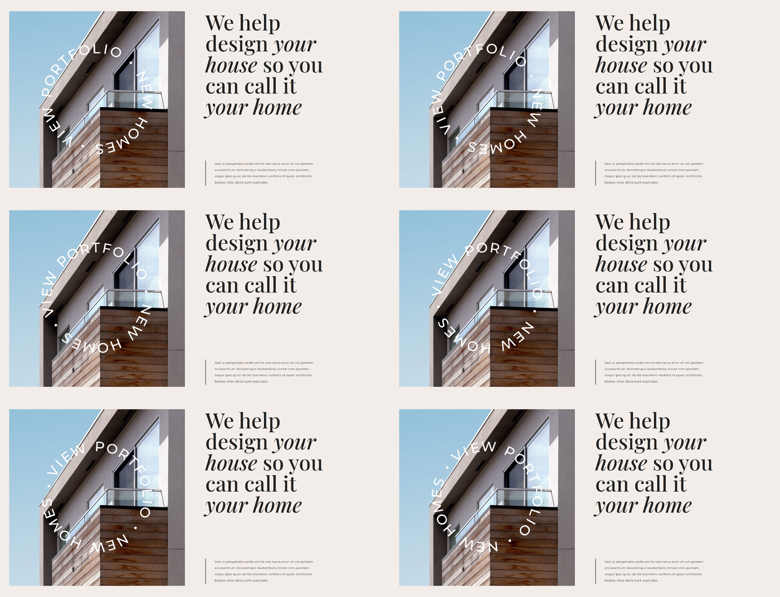
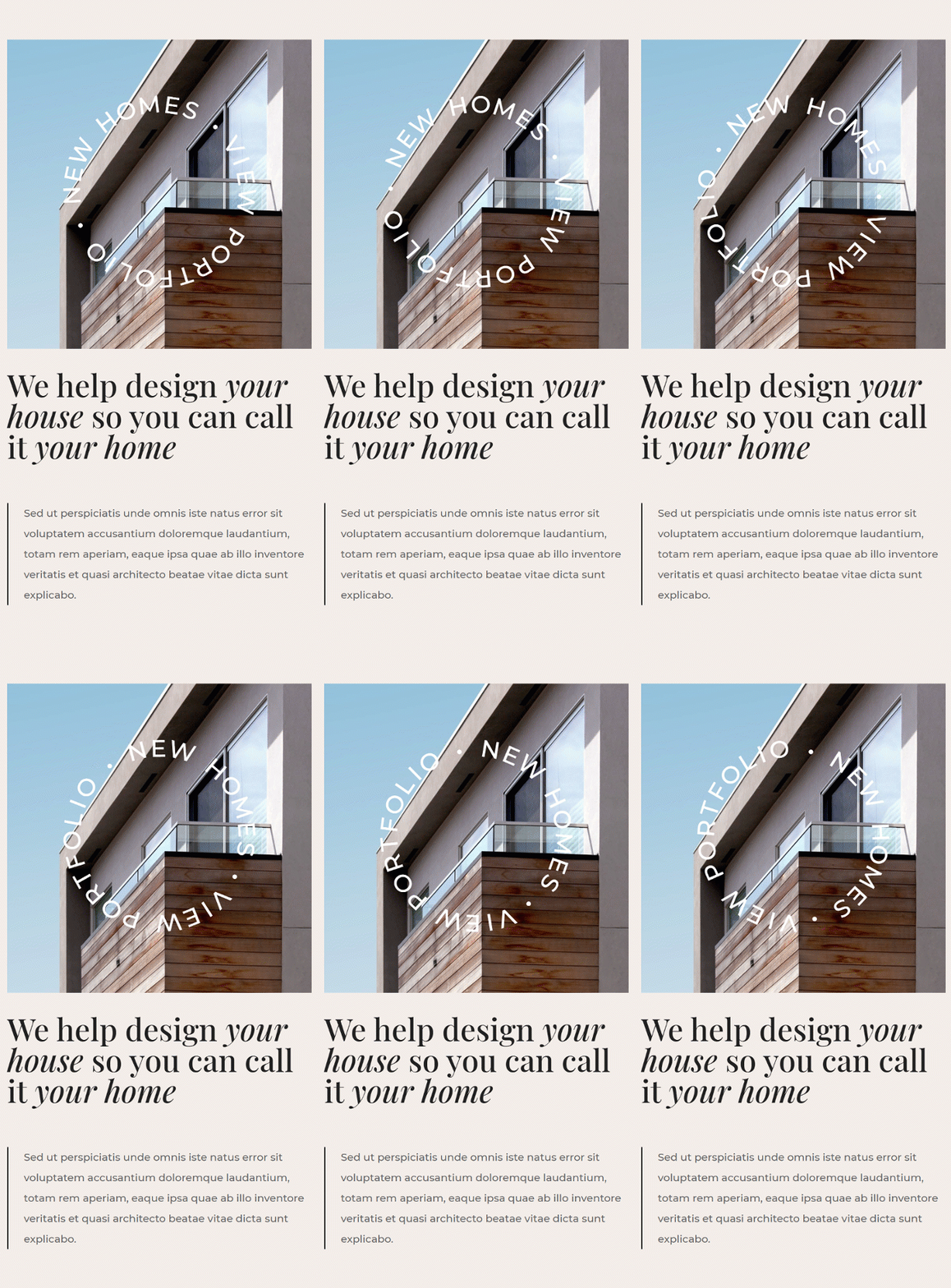
Before we dive into the tutorial, let’s take a quick look at the outcome across different screen sizes.
Desktop
Mobile
Download The Layout for FREE
To lay your hands on the free layout, you will first need to download it using the button below. To gain access to the download you will need to subscribe to our Divi Daily email list by using the form below. As a new subscriber, you will receive even more Divi goodness and a free Divi Layout pack every Monday! If you’re already on the list, simply enter your email address below and click download. You will not be “resubscribed” or receive extra emails.
Create Hero Design
Add New Section
Background Color
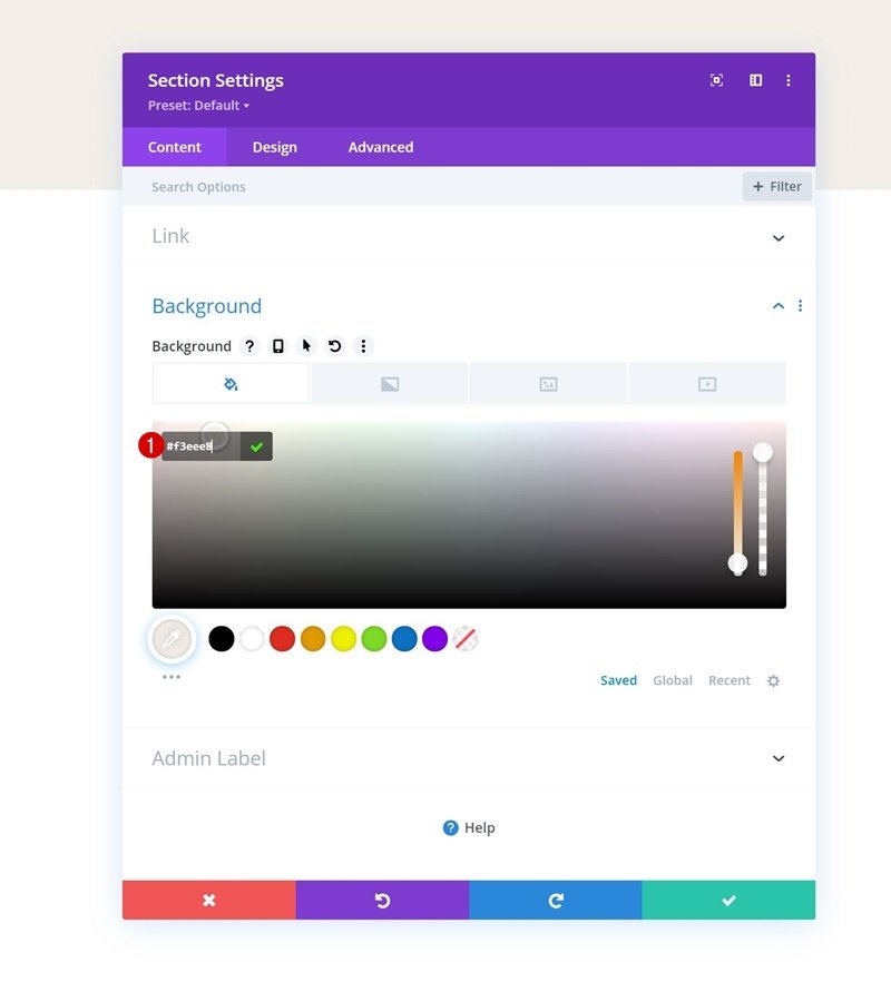
Let’s start by creating the hero design. Open a new or existing page with Divi and add a new regular section to it. Open the section settings and apply a background color of your choice.
- Background Color: #f3eee8

Spacing
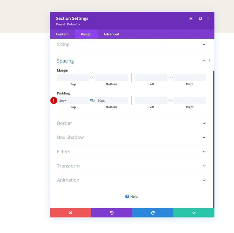
Move on to the spacing settings next and modify the top and bottom padding values.
- Top Padding: 30px
- Bottom Padding: 30px
Add New Row
Column Structure
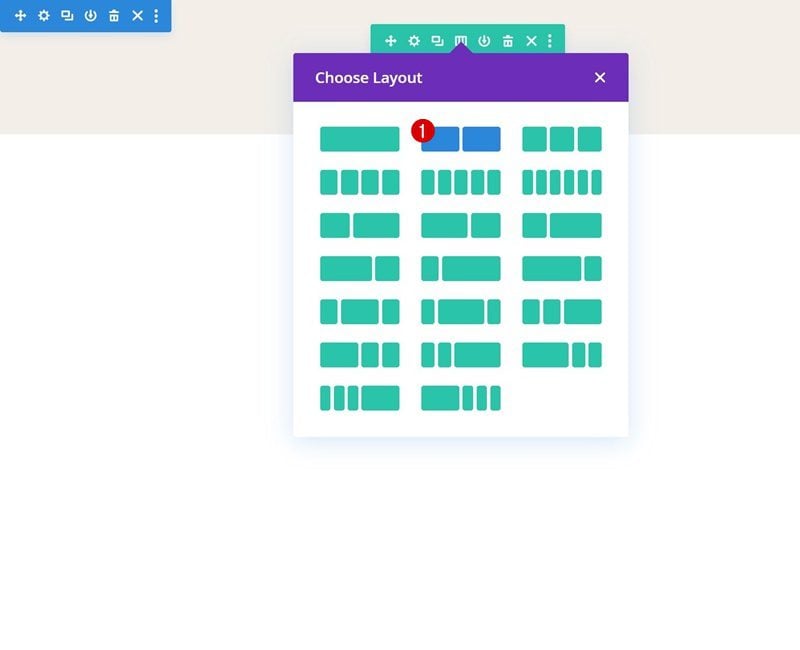
Continue by adding a new row to the section, using the following column structure:
Sizing
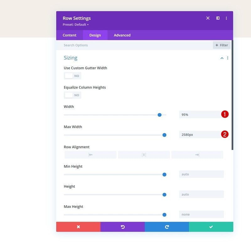
Without adding modules yet, open the row settings, navigate to the design tab, open the sizing settings and make the following adjustments:
- Width: 95%
- Max Width: 2580px
Column 1 Settings
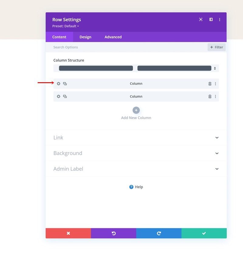
Once the general row settings are in place, you can proceed to open the first column’s settings.
Background Image
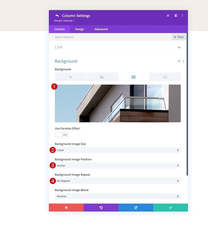
Inside the background settings, upload a background image of your choice. This image will appear below the circle text SVG animation further down the tutorial.
- Background Image Size: Cover
- Background Image Position: Center
- Background Image Repeat: No Repeat
Add Text Module #1 to Column 2
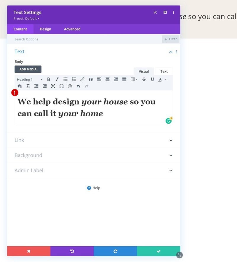
Add H1 Content
Time to add modules, starting with a first Text Module in column 2. Add some H1 content of your choice if you’re using this section as a hero, or H2 content if you’re using this anywhere else on your page.
H1 Text Settings
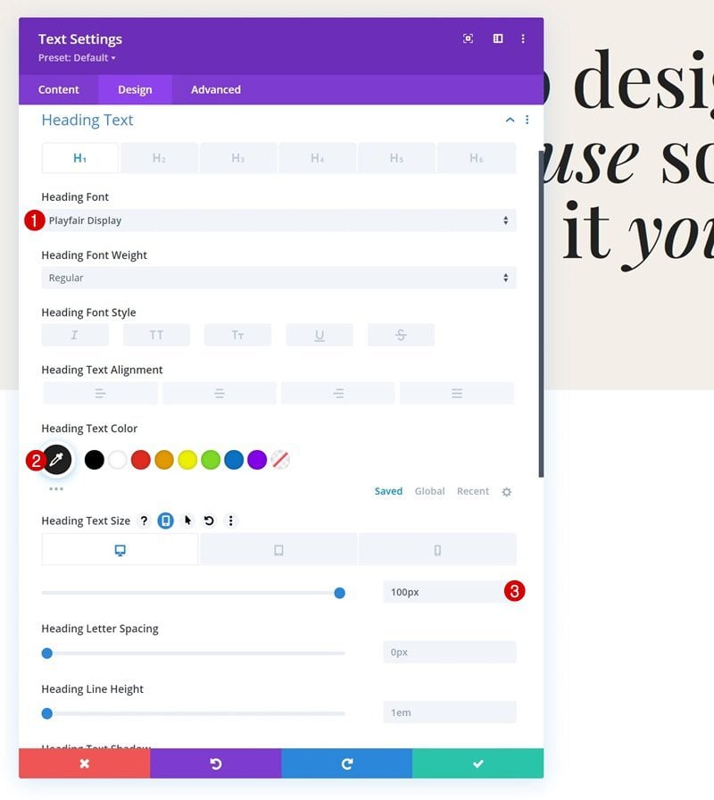
Style the heading text settings of this module next.
- Heading Font: Playfair Display
- Heading Text Color: #212121
- Heading Text Size:
- Desktop: 100px
- Tablet: 60px
- Phone: 45px
Sizing
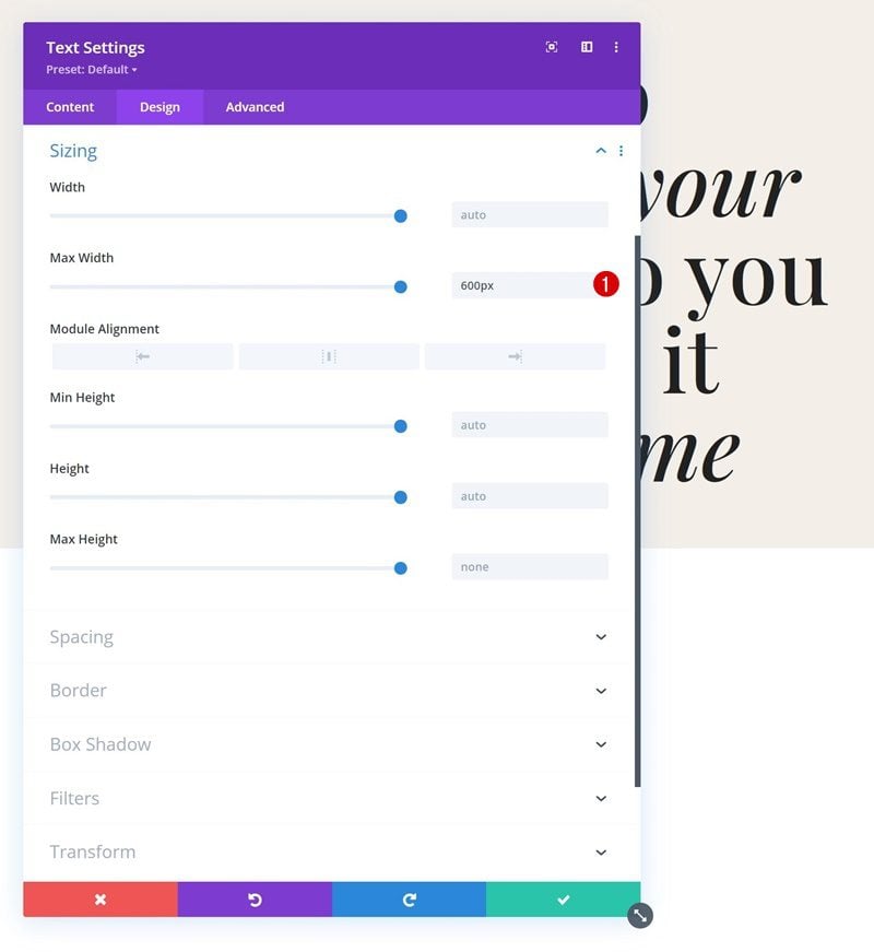
Then, go to the sizing settings and apply a max width.
- Max Width: 600px
Add Text Module #2 to Column 2
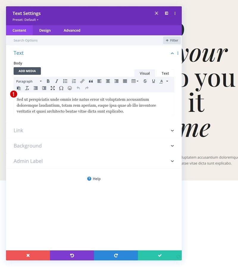
Add Content
Below the first Text Module, we’ll add another Text Module. This time, we’ll include some description content.
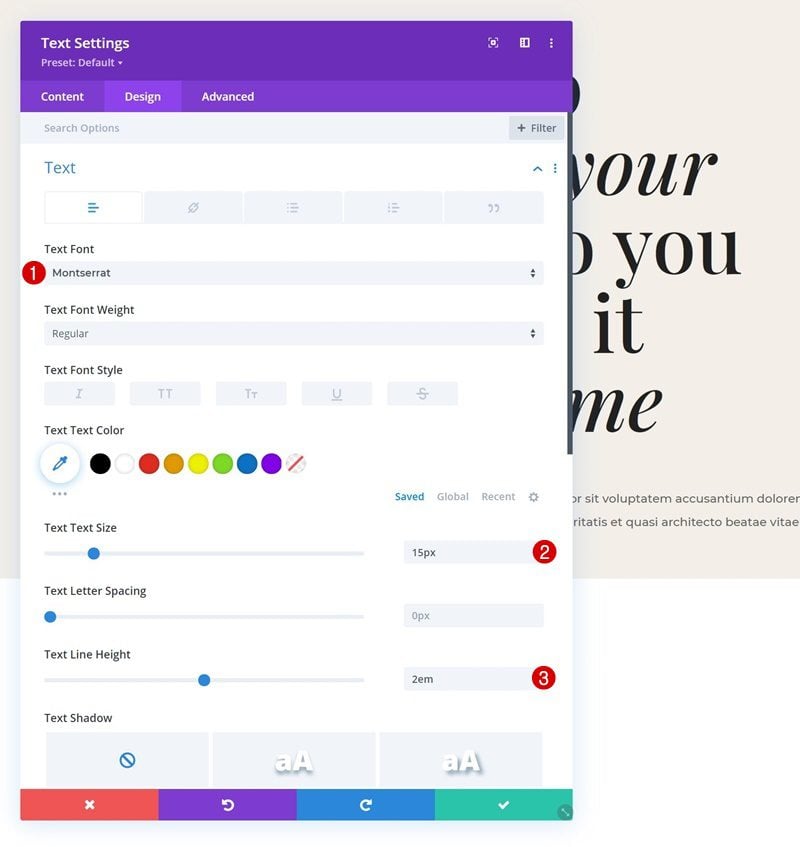
Text Settings
Navigate to the design tab and style the text as follows:
- Text Font: Montserrat
- Text Size: 15px
- Text Line Height: 2em
Sizing
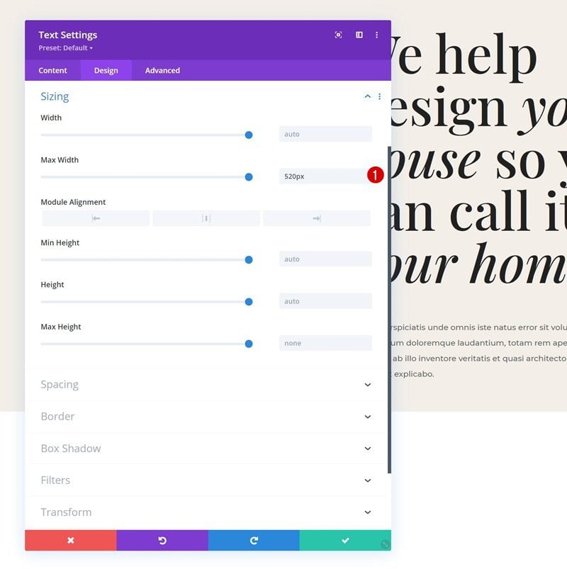
Use a max width in the sizing settings too.
- Max Width: 520px
Spacing
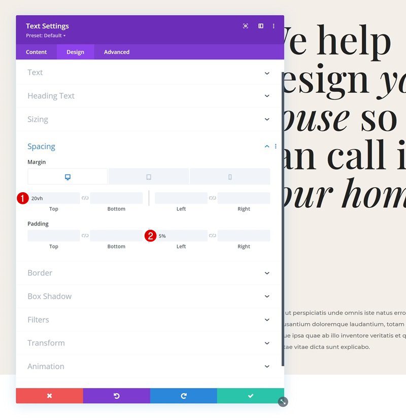
Then, navigate to the spacing settings and use some responsive values.
- Top Margin:
- Desktop: 20vh
- Tablet & Phone: 50px
- Left Padding: 5%
Border
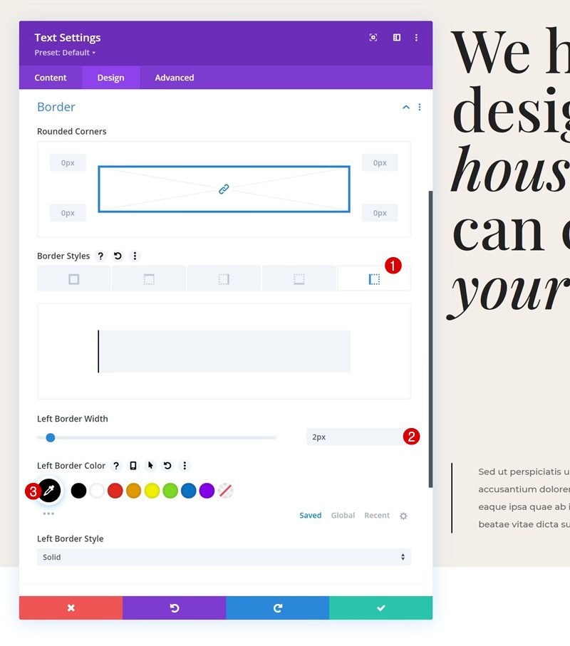
We’re including a left border in the border settings too.
- Left Border Width: 2px
- Left Border Color: #000000
Add Circle Text SVG Animation
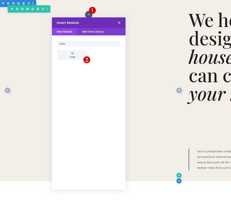
Add Code Module to Column 1
Now that we’ve created the foundation of our section design, we can focus on creating the circle text SVG animation. To add the circle text SVG animation, we’re going to use a Code Module in column 1. Go ahead and add one.
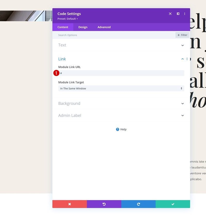
Add Link
If you want this circle text SVG animation to be clickable, you can add a URL of your choice in the link settings of the module.
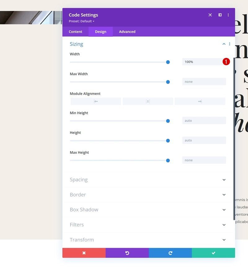
Sizing
Make sure the module’s width is set to “100%” in the sizing settings as well.
- Width: 100%
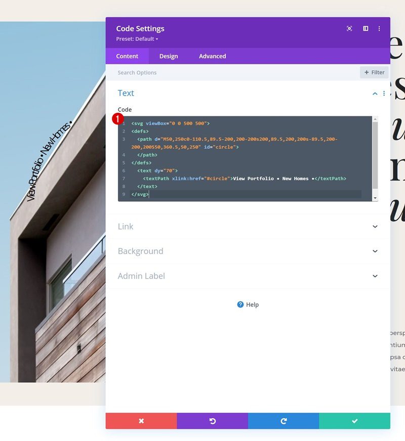
Add Circle & Text SVGs to Code Box
Back to the code box in the content tab. Here, we’re first going to add the circle SVG and text path using the following HTML code:
View Portfolio • New Homes •
Style SVGs with CSS
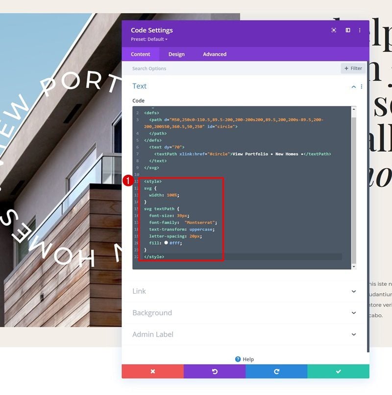
Of course, we’ll need to style the SVG text path to make it match our design. We’re making sure the SVG is set to “100%” as well. Paste the following lines of CSS code inside the code box, between style tags:
svg {
	width: 100%;
}
svg textPath {
  font-size: 39px;
	font-family:  "Montserrat";
	text-transform: uppercase;
	letter-spacing: 20px;
	fill: #fff;
}
Add AnimateTransform HTML Tags
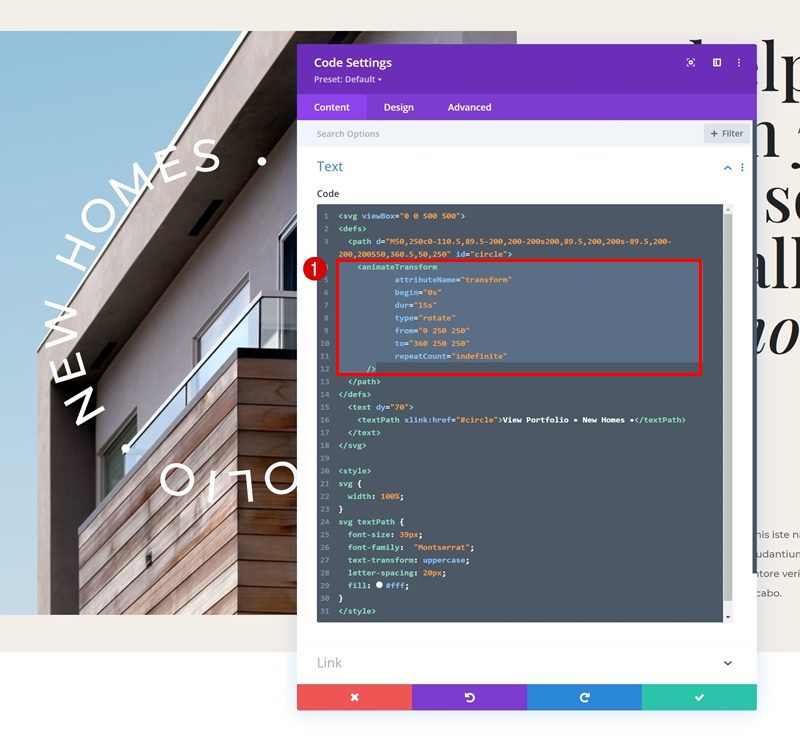
Now, to create an endless rotation for our text, we’re going to use the animate transform element that allows us to create the animation without the need for external JavaScript code. These are the attributes we’re assigning to our SVG:
You can modify these attributes however you want, to create the animation of your choice. Notice how the last attribute, repeatCount, is set to “indefinite”. This allows us to create an endless loop of rotation for our SVG.
Modify Text Path For Own Use
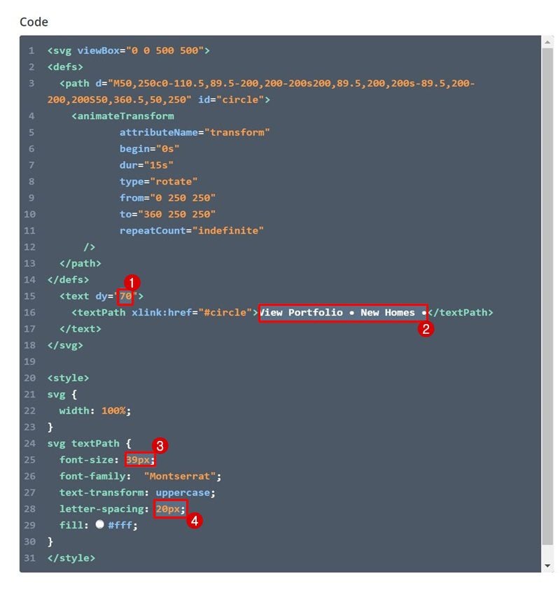
Of course, you’ll want to modify the text to make it match your own website, you can do that easily between the text path tags. However, once you change the length of the copy, you’ll need to modify the settings to make sure you create a perfect circle. You can play around with the “dy” value, which indicates a shift along the y-axis and change the font size and letter spacing of the text path until you get your desired outcome. That’s it!
Preview
Now that we’ve gone through all the steps, let’s take a final look at the outcome across different screen sizes.
Desktop

Mobile

Final Thoughts
In this post, we’ve shown you how to keep your website up to date with design trends. More specifically, we’ve shown you how to create a circle text SVG animation and use it elegantly in your Divi design. Once you get the approach, you’re able to use this element to display any text you want and finetune it to your own design. You were able to download the JSON file for free as well! If you have any questions or suggestions, feel free to leave a comment in the comment section below.
The post How to Add a Circle Text Path SVG Animation to Your Divi Design appeared first on Elegant Themes Blog.

