Who doesn’t love subtle animations? They’re a nice way to add a bit of complexity to your website. If done well they can look gorgeous and professional at the same time.
In this tutorial, we’re going to show you how to add subtle, animated shapes using Divi’s built-in options. No extra CSS needed. Once you get the approach and practice with the examples below, the sky becomes the limit. You can create all kinds of shapes and apply them on your website with little effort.
Result
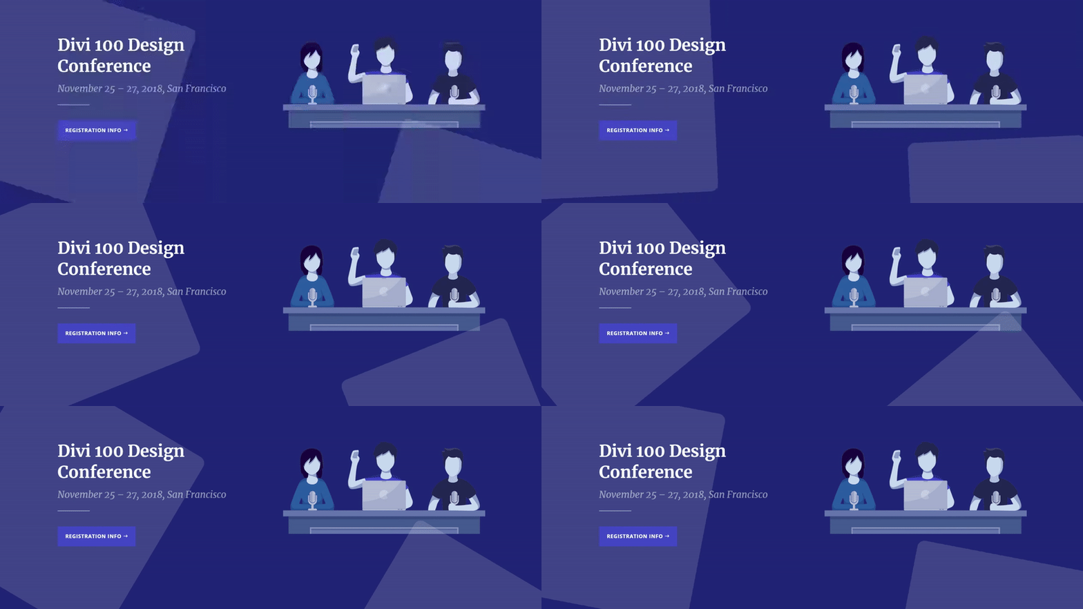
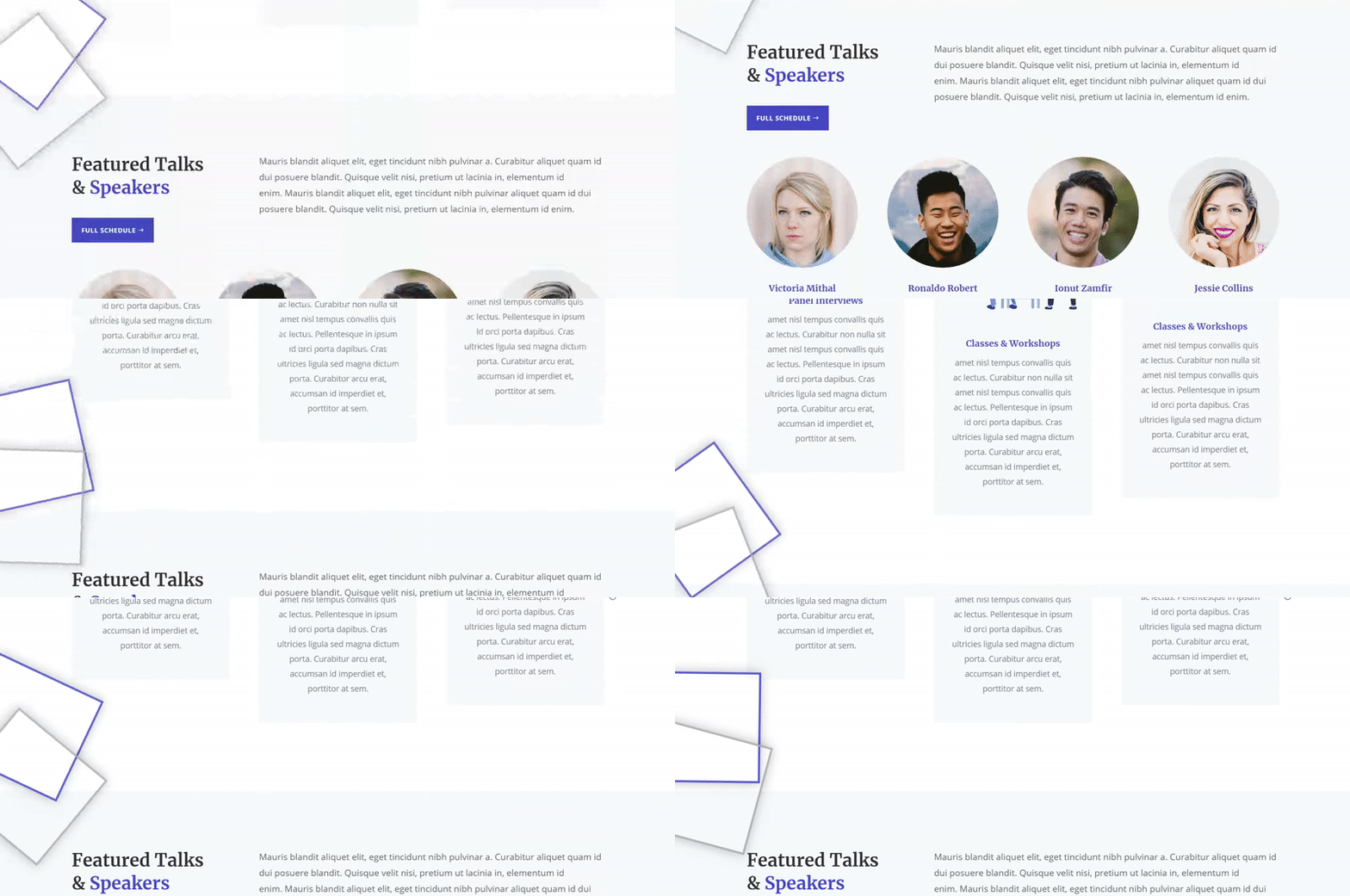
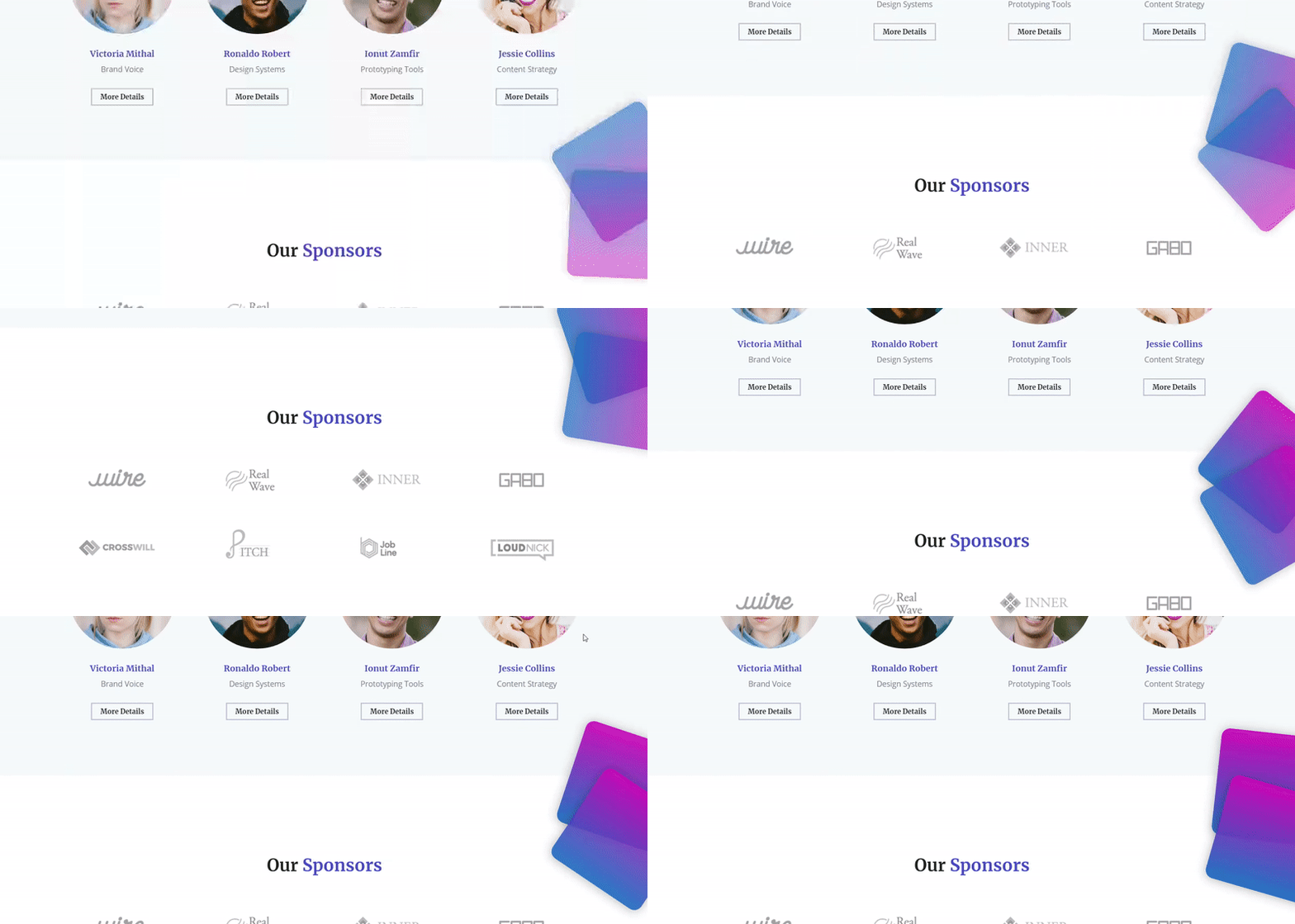
Before we dive into the tutorial, let’s take a quick look at the four different animated shapes we’ll recreate.
Animated Shape #1
Animated Shape #2
Animated Shape #3
Animated Shape #4
How to Add Subtle & Animated Shapes to Your Website with Divi
Subscribe To Our Youtube Channel
Approach
- We’re placing the shapes in new rows of which we’ll remove all the padding (to limit the extra space that’s being created)
- Depending on which side you want your animated shapes to appear, you’ll have to modify the row alignment
- A left or right row alignment makes sure these animated shapes remain on that side of the screen no matter what screen size
- We’re using empty Text Modules to create the shapes
- Using an empty Text Module allows you to benefit from all the other Divi built-in options
- Custom margin and padding play an important role in making the objects fit
- We’re using positive and negative margins to reduce the space that was created by the row and modules and kind of make them overlap with two different sections
- The padding, on the other hand, is used to create the kind of shape you want
- The Background, Border and Box Shadow subcategories allow you to design the type of shape you want
- We’re adding linear animation loops which will keep the animation going on at a slow pace
- You can apply the same method while using your own shapes within Image Modules
Create New Page with Design Conference Home Page
Create New Page
Once you read the general approach and keep it in mind, go ahead and create a new page on your WordPress dashboard.
Switch Over to Visual Builder
After adding a title, switch over to Visual Builder right away.
Upload Design Conference Home Page
In this tutorial, we’ll focus on creating the animated objects. And what better way is there to do this than by using a premade layout? For this tutorial, we’re going to choose the homepage of the Design Conference Layout Pack which you can find in your premade layouts. But of course, you can apply these animated shapes to any page or layout.
Add Animated Shape #1
Add New Row
Row Position
Now, to add the first animated shape, add a new row to your hero section:
Column Structure
We’re using two columns for this row.
Row Alignment
Then, go to the Design tab and select left Row Alignment because we want the animated shape to appear on the left side of the screen.
Spacing
Next, open the Spacing subcategory and remove all of the default padding this row contains by adding ‘0px’ to each one of the options.
Add Empty Text Module to Column 1
Add Text Module & Leave Content Box Empty
Time to start adding the shape! Add a Text Module to column 1. We’re not going to share any text or copy within this Text Module, we’re rather using it for its Divi built-in options. So, make sure you leave the content box empty.
Background Color
Then, add ‘rgba(255,255,255,0.14)’ as the background color of this Text Module.
Spacing
We’re going to do two four things within the Spacing subcategory; making a shape with the custom padding, getting rid of the space that’s been created by the row and module, pushing the shape more to the left and making the Text Module overlap the second row:
- Top Margin: -100px
- Right Margin: 100px
- Bottom Margin: -500px
- Left: -100px
- Top Padding: 200px
- Bottom Padding: 400px
Border
To create a circle of the rectangle, open the Border subcategory and apply ‘500px’ to each one of the corners.
Animation
Lastly, add your loop animation by opening the Animation subcategory and applying the following settings:
- Animation Style: Roll
- Animation Repeat: Loop
- Animation Direction: Center
- Animation Duration: 20000ms
- Animation Intensity: 500%
- Animation Start Opacity: 100%
- Animation Speed Curve: Linear
Clone Row
Row Position
We’re going to save ourselves some time by cloning this entire row to create the shape in the bottom right corner of the hero section.
Change Row Alignment
The first thing we’ll need to change about this row is the Row Alignment. Instead of left, use right.
Place Empty Text Module in Column #2
Evidentally, we’ll also need to place the Text Module in the second Column instead of the first.
Change Empty Text Module Spacing
We’re going to change the spacing of this Text Module as well (push it to the right instead of left):
- Right Margin: -50px
- Bottom Margin: -350px
- Left: 50px
- Top Padding: 250px
- Bottom Padding: 250px
Add Animated Shape #2
Create Animated Shape #1
To create the second animated shape, simply go through the process of creating the animated shape #1 first. We’ll need to make few modifications only.
Modify Both Empty Text Modules
Border
The first thing you’ll need to modify is the rounded corners of the Border subcategory. Use ’20px’ instead of ‘500px’ for each one of the corners.
Animation
Because of the shape, it will roll a lot quicker than the circle shape does. That’s why we’re going to increase the Animation Duration to ‘100000ms’.
Add Animated Shape #3
Add New Row
Row Position
To create animated shape #3, scroll down your page until you pass the ‘About Divi 100 Design’ section. Add your row as the last row of that section:
Column Structure
Select the following column structure for your row:
Row Alignment
Again, we’re making sure the Row Alignment matches the side we’re adding the animated shape to. In this case, that’s the left side.
Spacing
We’re also removing all of the default padding of this row by adding ‘0px’ to each one of the options.
Visibility
The two first animated shapes work great on tablet and phone as well. The other two, however, are too invasive for smaller screen sizes. That’s why we’re going to disable the entire row on tablet and phone within the Visibility subcategory.
Add Empty Text Module to Column 1
Add Text Module & Leave Content Box Empty
Again, add an empty Text Module to the first column of this row.
Spacing
We’re going to make sure there’s no additional space being created by the new row and Text Module by playing around with the custom margin. Open the Spacing subcategory and apply the following values:
- Top Margin: -150px
- Right Margin: 25%
- Bottom Margin: -50px
- Left Margin: -25%
- Top Padding: 250px
Border
Next, we’ll add a border to this shape by going to the Border subcategory and applying the following settings:
- Border Width: 5px
- Border Color: #4646c4
Box Shadow
Depending on your preferences, you can also add some depth to this object by selecting the first option within the Box Shadow subcategory without making any modifications to the default settings.
Animation
Lastly, we’ll apply the loop animation to this object by opening the Animation subcategory and applying the following settings to it:
- Animation Style: Roll
- Animation Repeat: Loop
- Animation Direction: Center
- Animation Duration: 25000ms
- Animation Intensity: 100%
- Animation Starting Opacity: 50%
- Animation Speed Curve: Linear
Clone Empty Text Module & Keep it in Column 1
Change Spacing
Clone the first empty Text Module and leave it in the first column. We’ll make some modifications to it, starting with the Spacing. Open the Text Module settings, go to the Design tab, open the Spacing subcategory and apply the following custom margin and padding to it:
- Top Margin: -50%
- Right Margin: 25%
- Bottom Margin: -200px
- Left Margin: -25%
- Top Padding: 250px
Change Border Color
We’ll also change the border color to ‘#aaaaaa’.
Change Animation
The last change we’ll need to make is adding an animation delay to this shape by going to the Animation subcategory and adding ‘1000ms’ to the Animation Delay option.
Add Animated Shape #4
Add New Row
Row Position
We’ve reached the final animated shape of this tutorial which we’ll place right before the ‘Our Sponsors’ Text Module of our page:
Column Structure
We’re, again, choosing for a row with four columns:
Row Alignment
These animated shapes will appear on the right side of our page so naturally, we’re going to enable right Row Alignment.
Spacing
We’re going to reduce the space this row takes up by adding ‘0px’ to all of the custom padding options within the Spacing subcategory.
Visibility
And again, we want these animated shapes to appear on tablet only so we’ll disable them on tablet and phone in the Visibility subcategory of the Advanced tab.
Add Empty Text Module to Column 4
Add Text Module & Leave Content Box Empty
Let’s start creating the animated shape. Add an empty Text Module to column 4.
Gradient Background
We’re going to use a gradient background for this Text Module containing the following two colors and the default gradient background settings:
- First Color: #d002ba
- Second Color: #166cc2
Spacing
The spacing of this Text Module will create a shape, will push the shape to the right and will make it overlap with the previous section. Open the Spacing subcategory and enter the following values:
- Top Margin: -80%
- Right Margin: -25%
- Bottom Margin: -120px
- Left Margin: 25%
- Top Padding: 250px
Border
We’ll also use some rounded corners for this animated shape by going to the Border subcategory and adding ’20px’ to each one of the corners.
Box Shadow
To create more depth, we’ll enable the first box shadow option in the Box Shadow subcategory. We’re using the default values but feel free to modify these to your needs.
Animation
And last but not least, we’ll also add the loop animation in the Animation subcategory using the following settings:
- Animation Style: Roll
- Animation Repeat: Loop
- Animation Direction: Center
- Animation Duration: 25000ms
- Animation Intensity: 100%
- Animation Starting Opacity: 70%
- Animation Speed Curve: Linear
Clone Empty Text Module & Keep it in Column 4
Change Spacing
We’re going to save ourselves some time, clone this empty Text Module and make two small modifications to it. Open the spacing subcategory and change the top margin to ‘-50%’.
Change Animation
And, as shown in animated shape #3
as well, we’re going to add an animation delay of ‘1000ms’. And voilà, there you have your stunning animated shapes!
Result
Now that we’ve gone through all of the examples, let’s take a final look at the result.
Animated Shape #1
Animated Shape #2
Animated Shape #3
Animated Shape #4
Final Thoughts
In this post, we’ve shown you how to add subtle, animated shapes to your website using Divi’s built-in options only. You can apply this method to any other shapes you’d like to add to your website. They help you add a bit of extra interaction and style to your website. If you have any questions or suggestions, make sure you leave a comment in the comment section below!
The post How to Add Subtle & Animated Shapes to Your Website with Divi appeared first on Elegant Themes Blog.


