We all know sliders are great for enticing users with featured services, products or pages in one convenient location above the fold. Some sites (I’m thinking photographers) need to feature one or more of their photo galleries on the homepage. Using a slider for this may be a nice option. However you may have not considered featuring your photo gallery in a slider quite like this.
In this tutorial, I’m going to show you an easy way to embed Divi image galleries into your slides to create a completely custom photo gallery slider in Divi. The trick is to create a WordPress image gallery in the content area of your slider. Then you just need to make sure and select the option to use the Divi Gallery instead of the default WordPress Gallery style. Its super easy and fun to implement.
Let’s get started.
Sneak Peek
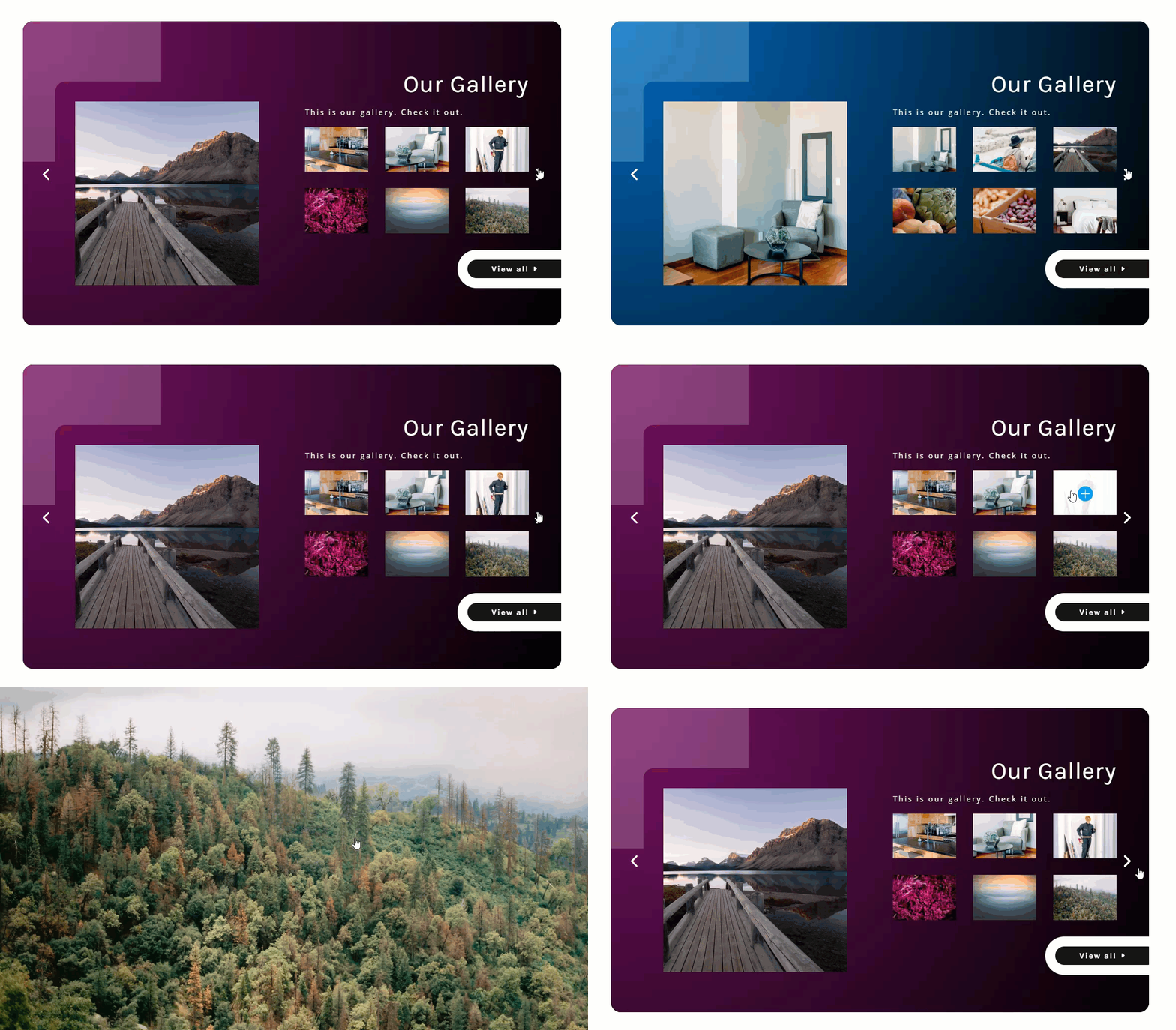
Here is a sneak peak of the photo gallery slider we will build in this tutorial.
Download the Custom Photo Gallery Slider Layout for FREE
To lay your hands on the designs from this tutorial, you will first need to download it using the button below. To gain access to the download you will need to subscribe to our Divi Daily email list by using the form below. As a new subscriber, you will receive even more Divi goodness and a free Divi Layout pack every Monday! If you’re already on the list, simply enter your email address below and click download. You will not be “resubscribed” or receive extra emails.
@media only screen and ( max-width: 767px ) {.et_bloom .et_bloom_optin_1 .carrot_edge.et_bloom_form_right .et_bloom_form_content:before, .et_bloom .et_bloom_optin_1 .carrot_edge.et_bloom_form_left .et_bloom_form_content:before { border-top-color: #ffffff !important; border-left-color: transparent !important; }
}.et_bloom .et_bloom_optin_1 .et_bloom_form_content button { background-color: #f92c8b !important; } .et_bloom .et_bloom_optin_1 .et_bloom_form_content .et_bloom_fields i { color: #f92c8b !important; } .et_bloom .et_bloom_optin_1 .et_bloom_form_content .et_bloom_custom_field_radio i:before { background: #f92c8b !important; } .et_bloom .et_bloom_optin_1 .et_bloom_border_solid { border-color: #f7f9fb !important } .et_bloom .et_bloom_optin_1 .et_bloom_form_content button { background-color: #f92c8b !important; } .et_bloom .et_bloom_optin_1 .et_bloom_form_container h2, .et_bloom .et_bloom_optin_1 .et_bloom_form_container h2 span, .et_bloom .et_bloom_optin_1 .et_bloom_form_container h2 strong { font-family: “Open Sans”, Helvetica, Arial, Lucida, sans-serif; }.et_bloom .et_bloom_optin_1 .et_bloom_form_container p, .et_bloom .et_bloom_optin_1 .et_bloom_form_container p span, .et_bloom .et_bloom_optin_1 .et_bloom_form_container p strong, .et_bloom .et_bloom_optin_1 .et_bloom_form_container form input, .et_bloom .et_bloom_optin_1 .et_bloom_form_container form button span { font-family: “Open Sans”, Helvetica, Arial, Lucida, sans-serif; } p.et_bloom_popup_input { padding-bottom: 0 !important;}

Download For Free
Join the Divi Newlsetter and we will email you a copy of the ultimate Divi Landing Page Layout Pack, plus tons of other amazing and free Divi resources, tips and tricks. Follow along and you will be a Divi master in no time. If you are already subscribed simply type in your email address below and click download to access the layout pack.
You have successfully subscribed. Please check your email address to confirm your subscription and get access to free weekly Divi layout packs!
To import the layout to your page, simply extract the zip file and drag the json file into the Divi Builder.
Let’s get to the tutorial shall we?
What You Need to Get Started
To get started, you will need to have the following setup:
- The Divi Theme installed and active
- A new page created to build from scratch on the front end (visual builder)
- About 6-8 images to be used for the slider image and photo gallery
After that, you will have a blank canvas to start building some hover tabs in Divi.
Enable the Divi Gallery Option in Divi Theme Options
Divi allows you to replace the default WordPress Gallery display with a Divi Gallery display. So whenever you create a WordPress gallery and embed it inside a module, the gallery be displayed like a gallery using the Divi Gallery Module. This basically allows you to add Divi image galleries to any module in the Divi Builder. In our case, we will be adding a Divi Gallery to the slider module.
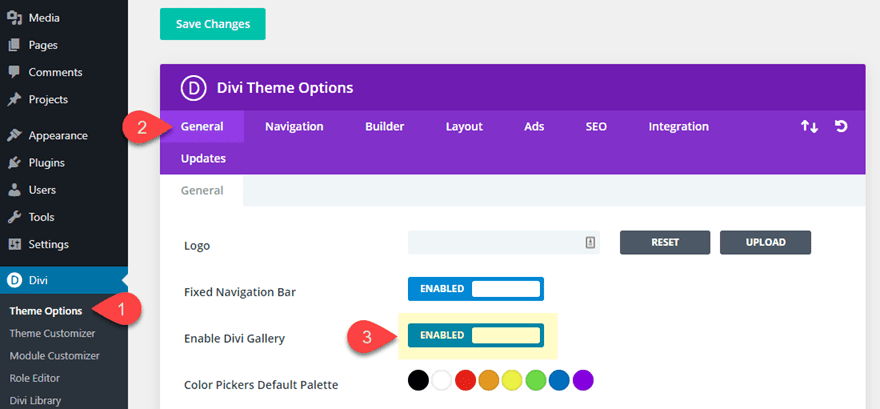
To change the setting, navigate to Divi > Theme Options. Then under the General Tab, click to enable the Divi Gallery option.
That’s it! Now the default WordPress Gallery shortcode will display a Divi-styled photo gallery.
Creating the Custom Photo Gallery Slider in Divi
The Section and Row
To kick things off, go ahead and create a regular section with a one column row.
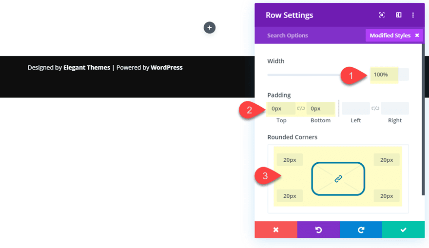
Then update the row settings as follows:
- Width: 100% (so the slider will be fullwidth on mobile)
- Padding: 0px top, 0px bottom
- Rounded Corners: 20px
Building the Slider Content
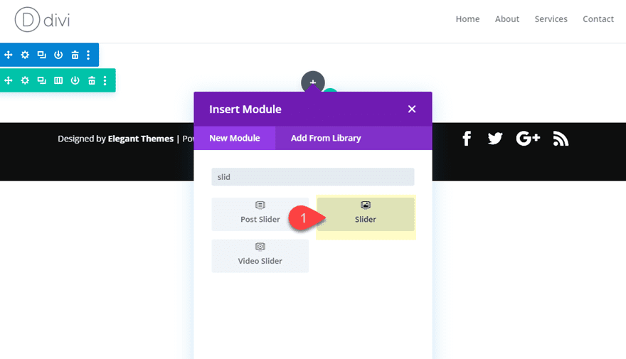
Next, add a slider module to the row.
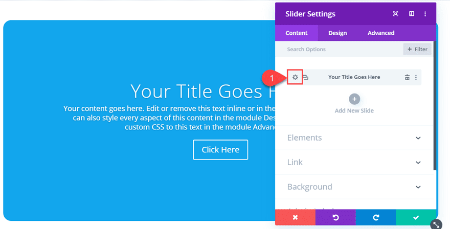
Open the slider settings and delete one of the slides that was added by default. Then click the gear icon on the slide to open the slide settings for that slide.
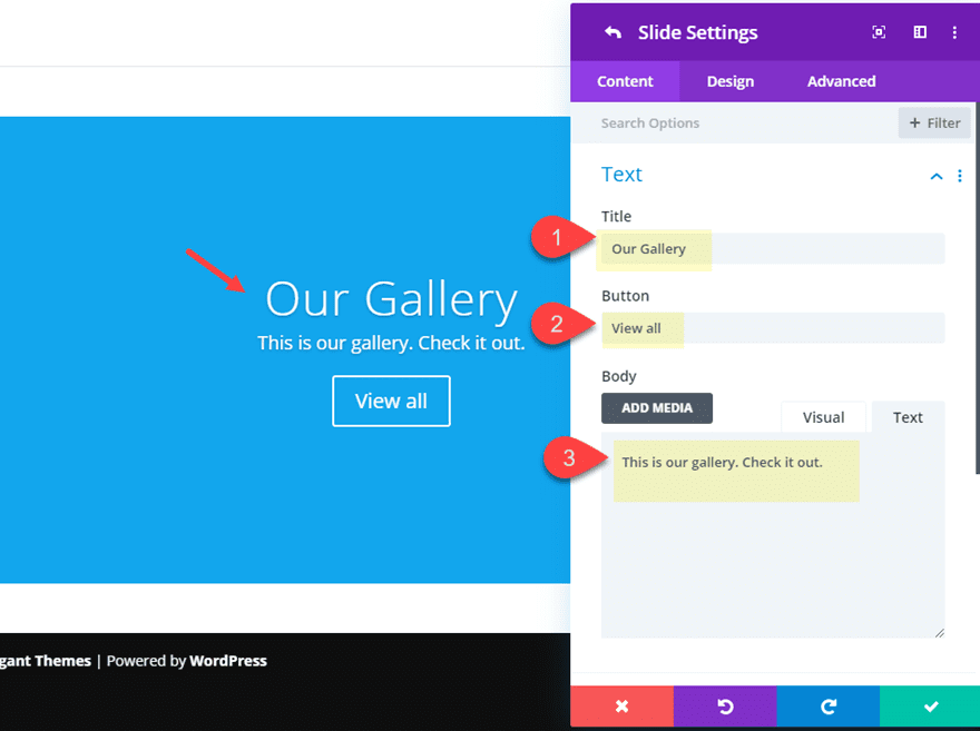
Then update the slide content with the following:
- Title: Our Gallery
- Button: View all
- Body: This is our gallery. Check it out.
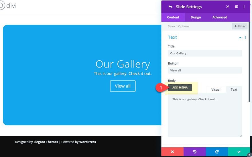
Under the body content area, click the Add Media button.
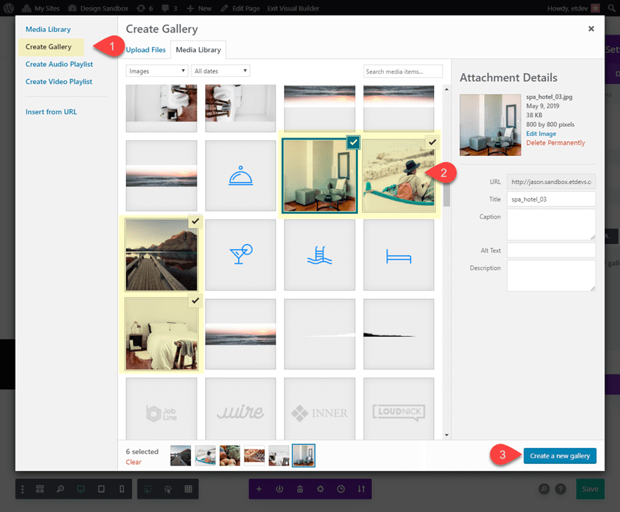
In the Media Library popup, select the Create Gallery tab on the top left. Then select 6 images you want to use for the gallery and click the “Create a New Gallery” button on the bottom right.
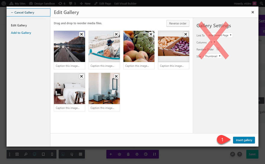
This will bring you to the edit category page inside the popup. Ignore the gallery settings at the top right because the Divi Gallery styles will override these WordPress Gallery settings.
Then click the “Insert Gallery” button.
This places a gallery shortcode within the slider module content. If you want the gallery to be displayed after the current body text, make sure to place the shortcode after the content.
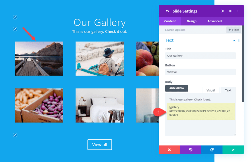
Now you have an embedded Divi-styled gallery displayed in the content area of your slider module. Pretty cool stuff!
Let’s continue updating our slide content by adding a main slide image.
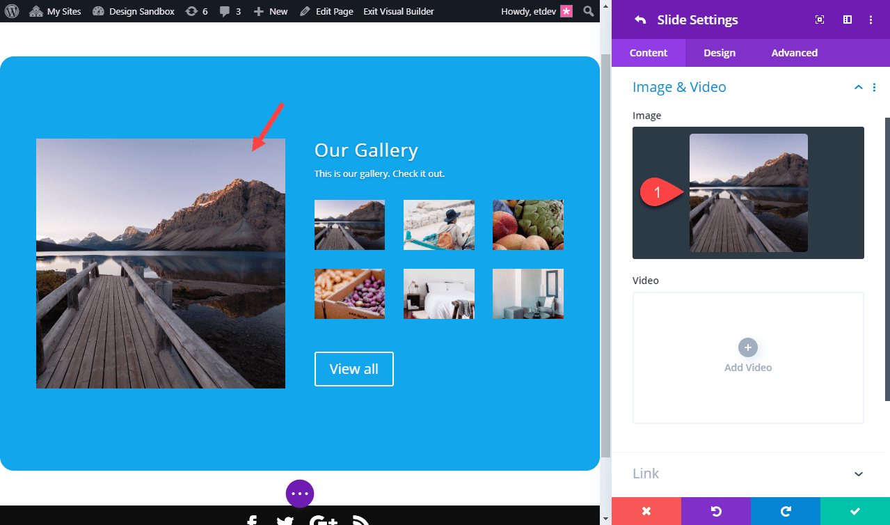
Now that we have our slider content ready to go, save your settings for slide 1.
Slider Settings
Make sure you save the settings for the individual slide. Then update the following design Settings for the main slider. This will make sure the design updates will affect all individual slides that you will add.
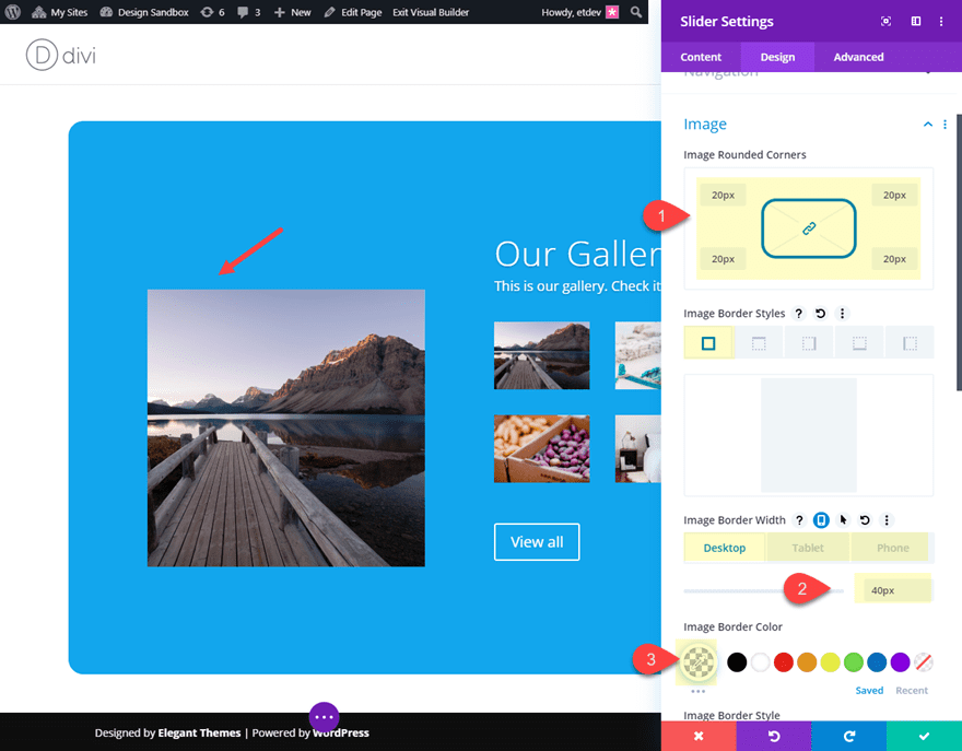
Image Border and Box Shadow
- Image Rounded Corners: 20px
- Image Border Width: 40px (desktop), 0px (tablet)
- Image Border color: rgba(0,0,0,0)
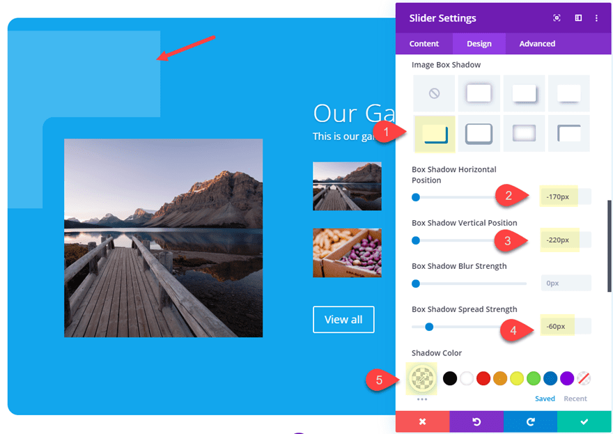
- Image Box Shadow: see screenshot
- Box Shadow Horizontal Position: -170px
- Box Shadow Vertical Position: -220px
- Box Shadow Spread Strength: -60px
- Shadow Color: rgba(255,255,255,0.2)
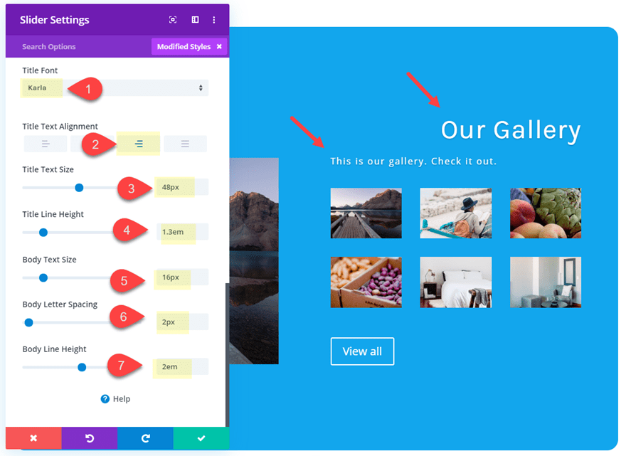
Title and Body Text
- Title Font: Karla
- Title Text Alignment: right
- Title text Size: 48px
- Title Line Height: 1.3em
- Body Text Size: 16px
- Body Letter Spacing: 2px
- Body Line Height: 2em
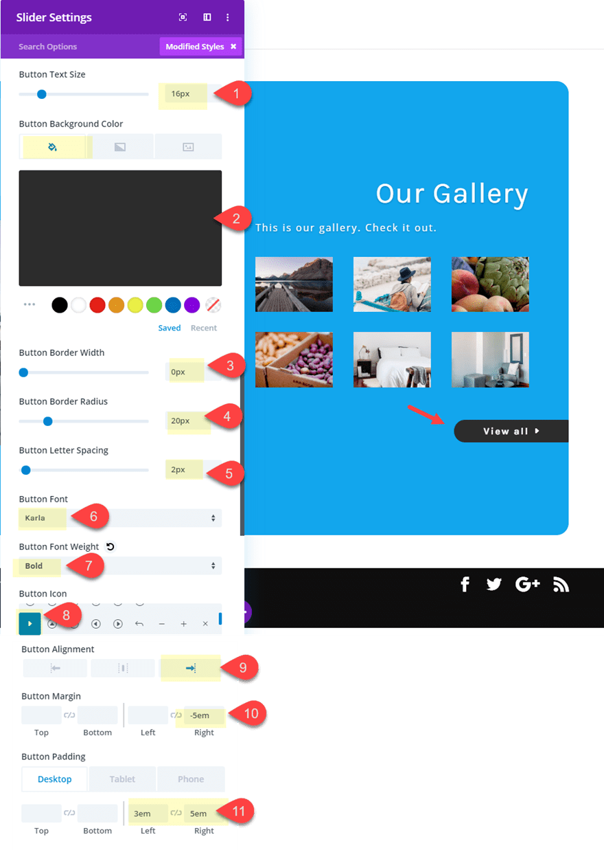
Button Styles
- Button Text Size: 16px
- Button Background Color: #333333
- Button Border Width: 0px
- Button Border Radius: 20px
- Button Letter Spacing: 2px
- Button Font: Karla
- Button font Weight: Bold
- Button Icon: see screenshot
- Button Alignment: right
- Button Margin: -5em right
- Button Padding (desktop): 3em left, 5em right
- Button Padding (phone): 2em left, 6em right
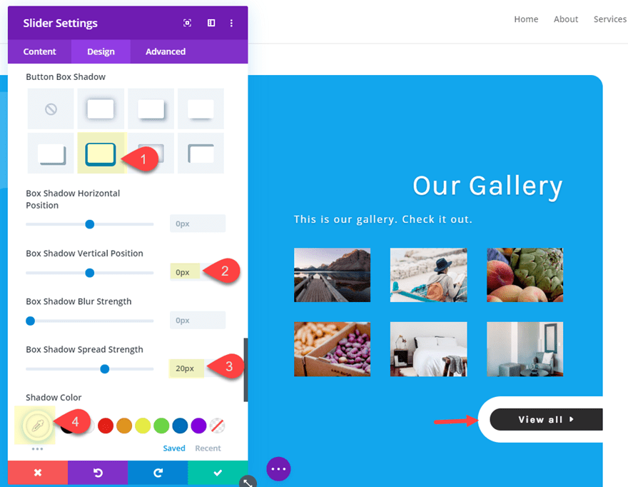
- Button Box Shadow: see screenshot
- Box Shadow Vertical Position: 0px
- Box Shadow Spread Strength: 20px (desktop), 10px (phone)
- Shadow Color: #ffffff
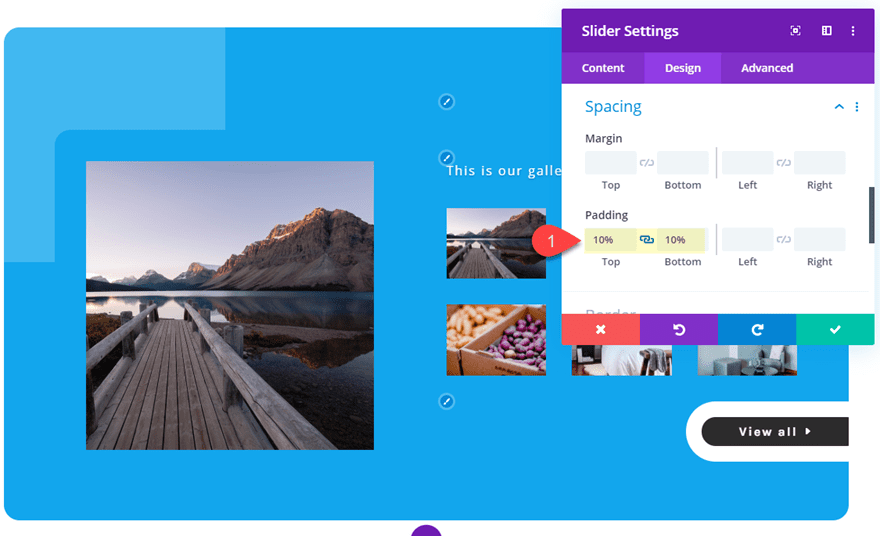
Slider Padding
- Padding: 10% top, 10% bottom
Adding a Background Gradient to Slide 1
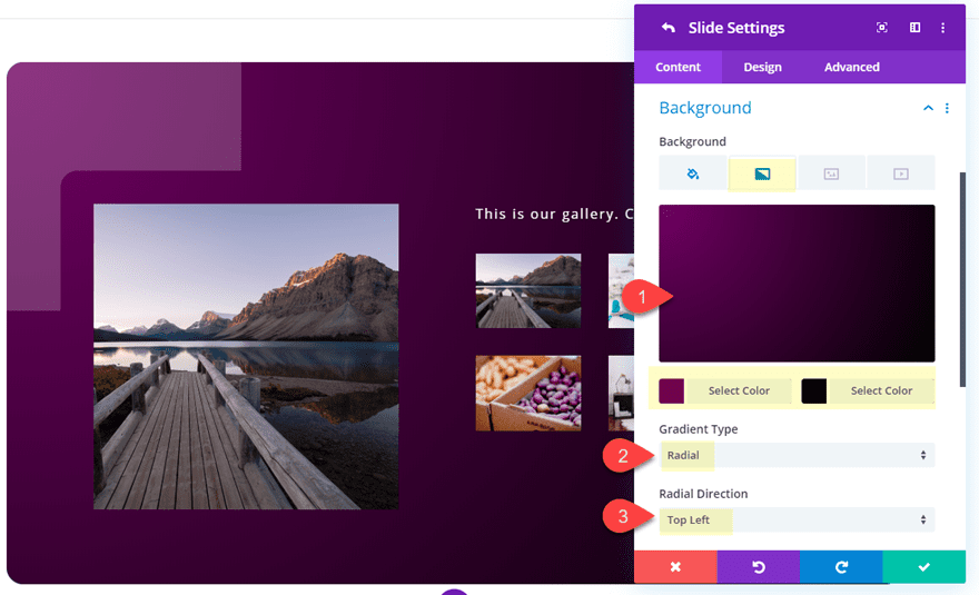
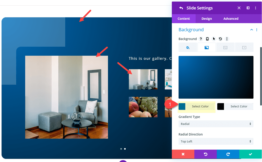
Now that we have the slider styling in place, we can add a custom background gradient to our individual slide. Open the slide settings for slide 1 and update the following:
- Background Gradient Left Color: #6d0066
- Background Gradient Right Color: #000000
- Gradient Type: Radial
- Radial Direction: Top Left
Creating Slide 2
To create the second slide, we can just duplicate slide 1 using the duplicate icon. Then open the duplicated slide (slide 2) settings.
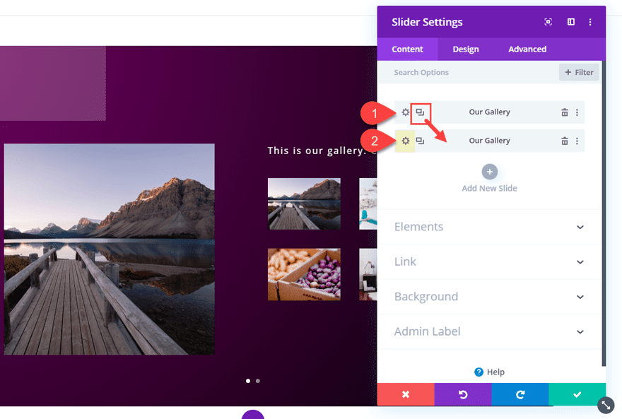
At this point you can update the content of the new slide as needed. For example, you could add a new slide image and generate another gallery embed shortcode to add a new photo gallery to the slide.
Then update the background gradient as follows:
- Background Gradient Left Color: #0c71c3
Final Result
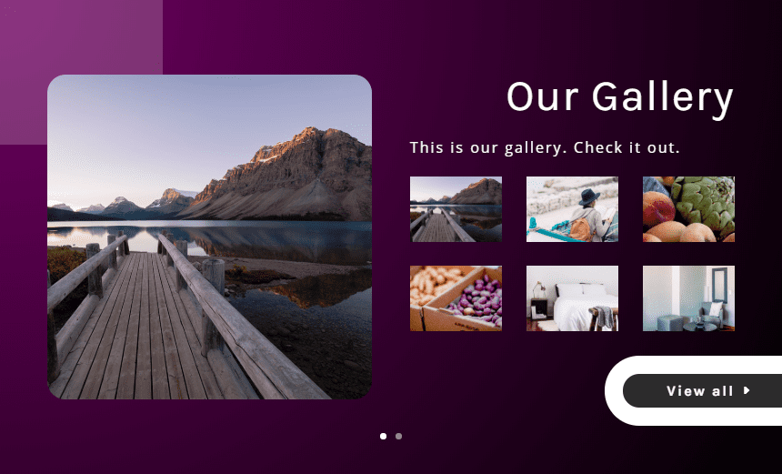
Here is the final result.

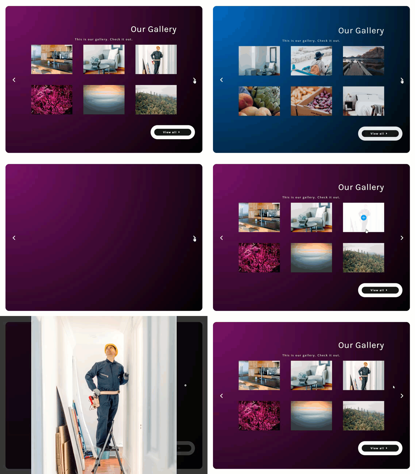
And here is what the slider looks like on tablet and phone.
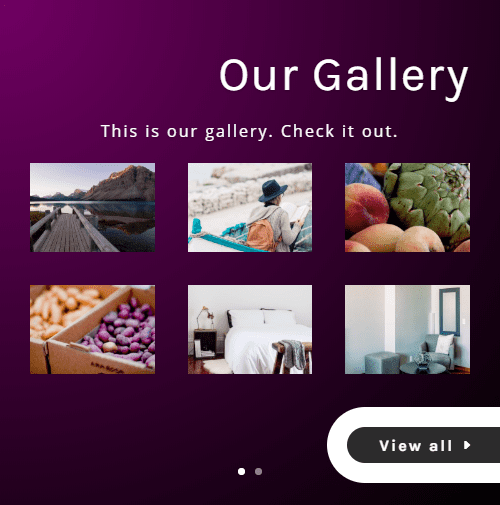
And here is the slider if you take out the slide images so that only the slide content and gallery shows.

Final Thoughts
The ability to embed a divi gallery inside Divi’s Slider Module opens up the opportunity to create some great looking photo gallery sliders with little effort. Hopefully, this tutorial will give you some inspiration for creating some beautiful photo gallery sliders.
For more info on this divi gallery embed technique (including tips on styling the embed divi gallery), check out the post on how to embed Divi galleries into toggles.
I look forward to hearing from you in the comments.
Cheers!
The post How to Create a Custom Photo Gallery Slider in Divi appeared first on Elegant Themes Blog.
