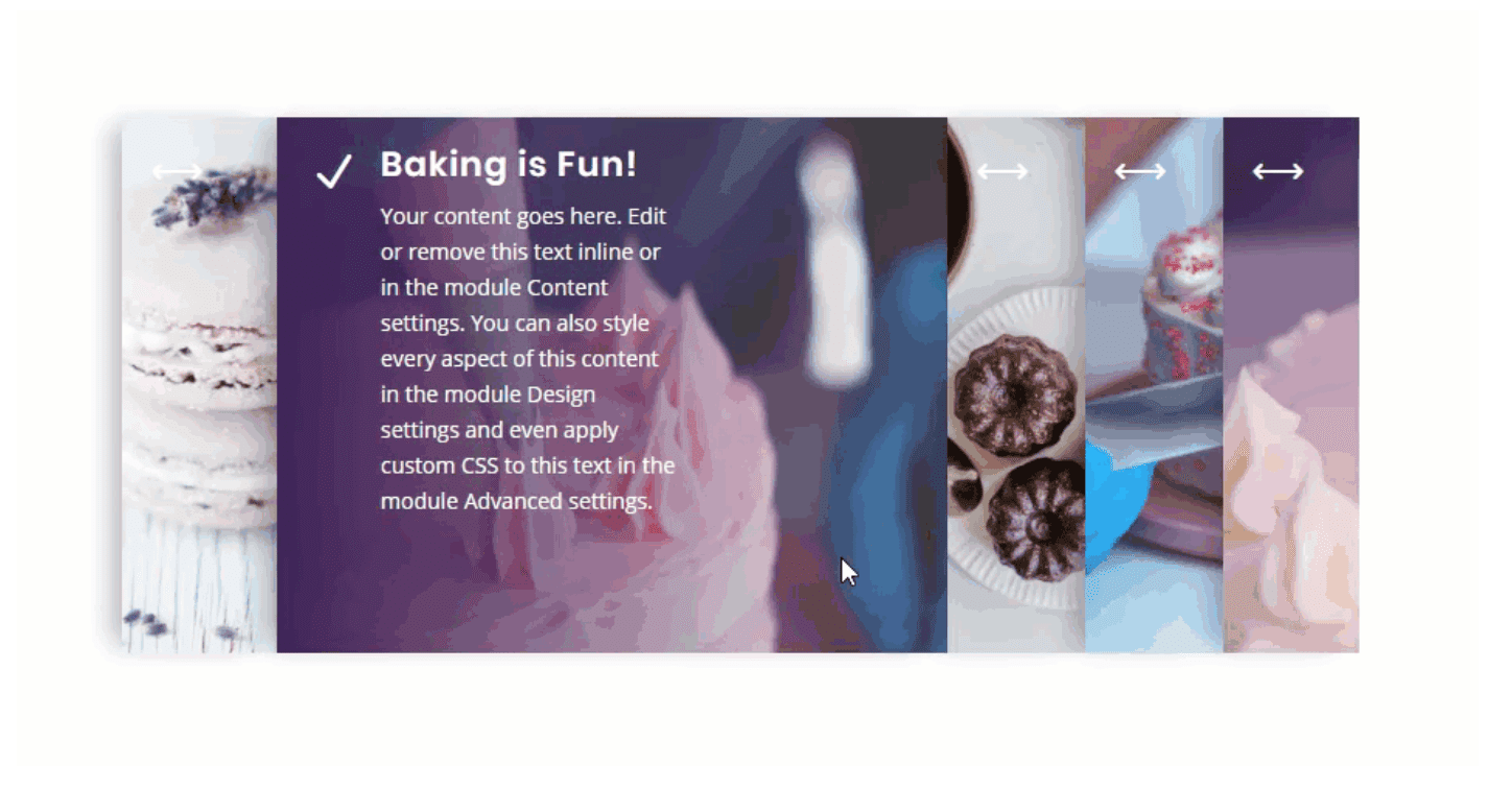
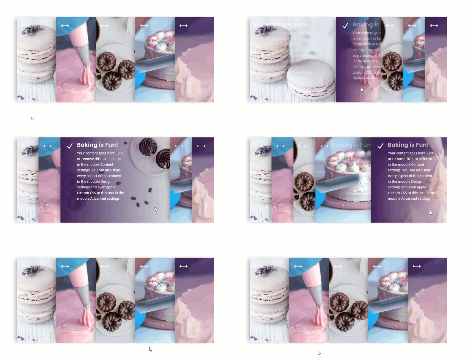
An accordion slider is a fun and engaging way to display content in a small space. Accordion sliders usually consist of multiple elements (or panels) stacked horizontally like the folds of a curtain. And when you hover over one of the panels, it expands to reveal content as the other accordion panels contract. This is where we get the accordion type effect of expanding and contracting.
In this tutorial, I’m going to show you how to create a responsive accordion slider in Divi using nothing but CSS. To do this we will be using multiple Divi modules to serve as accordion panels. Any module could be used, but for this example, we are going to use blurb modules in a very creative way to build a beautiful accordion slider that looks (and works) great both on desktop and mobile.
Check it out!
Sneak Peek
Here is a quick peek at what we will be building in this tutorial.
Desktop
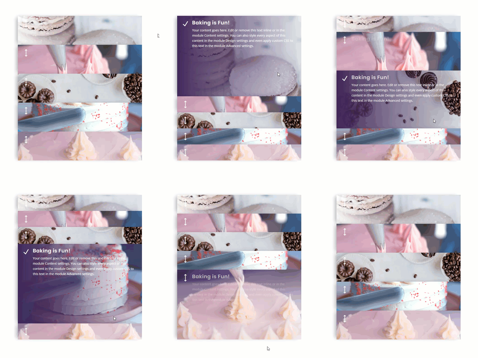
Tablet and Phone
Download the Divi Responsive Accordion Slider Layout for FREE
To lay your hands on the accordion slider designed in this tutorial, you will first need to download it using the button below. To gain access to the download you will need to subscribe to our Divi Daily email list by using the form below. As a new subscriber, you will receive even more Divi goodness and a free Divi Layout pack every Monday! If you’re already on the list, simply enter your email address below and click download. You will not be “resubscribed” or receive extra emails.
@media only screen and ( max-width: 767px ) {.et_bloom .et_bloom_optin_1 .carrot_edge.et_bloom_form_right .et_bloom_form_content:before, .et_bloom .et_bloom_optin_1 .carrot_edge.et_bloom_form_left .et_bloom_form_content:before { border-top-color: #ffffff !important; border-left-color: transparent !important; }
}.et_bloom .et_bloom_optin_1 .et_bloom_form_content button { background-color: #f92c8b !important; } .et_bloom .et_bloom_optin_1 .et_bloom_form_content .et_bloom_fields i { color: #f92c8b !important; } .et_bloom .et_bloom_optin_1 .et_bloom_form_content .et_bloom_custom_field_radio i:before { background: #f92c8b !important; } .et_bloom .et_bloom_optin_1 .et_bloom_border_solid { border-color: #f7f9fb !important } .et_bloom .et_bloom_optin_1 .et_bloom_form_content button { background-color: #f92c8b !important; } .et_bloom .et_bloom_optin_1 .et_bloom_form_container h2, .et_bloom .et_bloom_optin_1 .et_bloom_form_container h2 span, .et_bloom .et_bloom_optin_1 .et_bloom_form_container h2 strong { font-family: “Open Sans”, Helvetica, Arial, Lucida, sans-serif; }.et_bloom .et_bloom_optin_1 .et_bloom_form_container p, .et_bloom .et_bloom_optin_1 .et_bloom_form_container p span, .et_bloom .et_bloom_optin_1 .et_bloom_form_container p strong, .et_bloom .et_bloom_optin_1 .et_bloom_form_container form input, .et_bloom .et_bloom_optin_1 .et_bloom_form_container form button span { font-family: “Open Sans”, Helvetica, Arial, Lucida, sans-serif; } p.et_bloom_popup_input { padding-bottom: 0 !important;}

Download For Free
Join the Divi Newlsetter and we will email you a copy of the ultimate Divi Landing Page Layout Pack, plus tons of other amazing and free Divi resources, tips and tricks. Follow along and you will be a Divi master in no time. If you are already subscribed simply type in your email address below and click download to access the layout pack.
You have successfully subscribed. Please check your email address to confirm your subscription and get access to free weekly Divi layout packs!
To import the layout to your page, simply extract the zip file and drag the json file into the Divi Builder.
Let’s get to the tutorial shall we?
What You Need to Get Started
To get started, you will need to do the following:
- If you haven’t yet, install and activate the Divi Theme installed (or the Divi Builder Plugin if not using the Divi Theme).
- Create a new page in WordPress and use the Divi Builder to edit the page on the front end (visual builder).
- Upload about 5 different mock images to the media library to be used for the background images needed in the tutorial.
After that, you will have a blank canvas to start designing in Divi.
Creating a Responsive Accordion Slider in Divi
Creating the Row
To start, add a one-column row to the regular section.
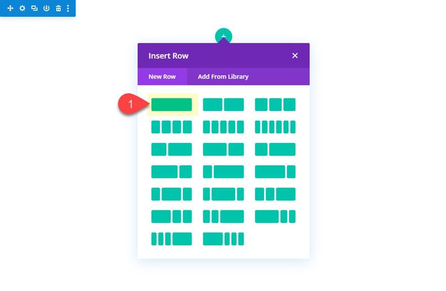
Then open the row settings and update the following:
- Gutter Width: 1
- Width: 100%
- Max Width: 800px
- Height: 400px (desktop); 700px (tablet and phone)
The width and max width values can be changed to whatever you need. The accordion will scale and function within any row width. Also, it is very important to set a fixed height for the design to work. The child elements (column and modules) will have a height of 100% so if you don’t set the fixed height of the row, the child elements will not have a height at all.
Column Settings
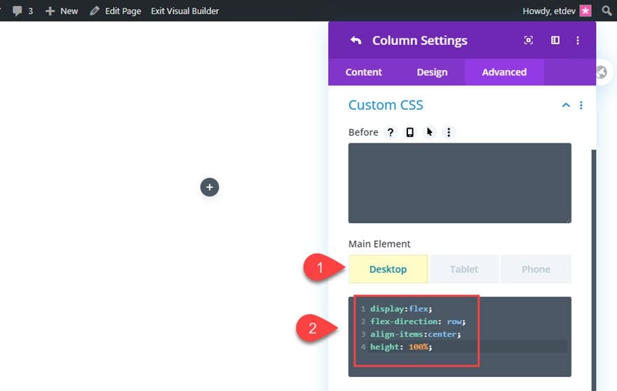
Now that we have a set height for the row, open the column settings and add the following CSS to the main element:
Desktop
display:flex;
flex-direction: row;
align-items:center;
height: 100%;
Tablet
flex-direction: column;
The flex property will align the accordion panels horizontally on desktop and vertically on tablet and phone. The 100% height will allow the modules we will add to use the 100% height value as well.
Creating the Accordion Panel with Blurb Modules
The accordion slider can be built using any type of module(s). If we wanted to we could use a combination of different modules to serve as our accordion panel. But for this design, we are going to use blurb modules.
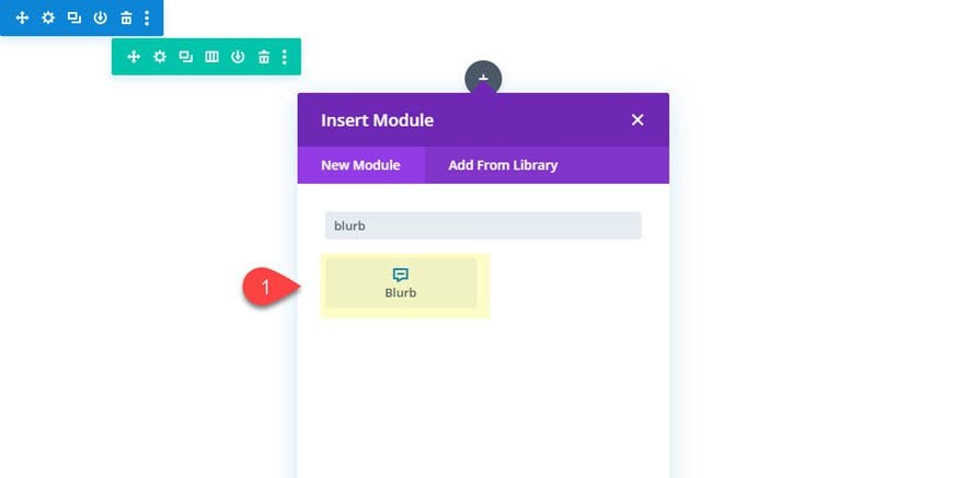
Begin by adding a blurb module to the row.
Designing the Blurb Module
Open the blurb module settings and update the following:
Keep the mock title and body content. We can always change that later.
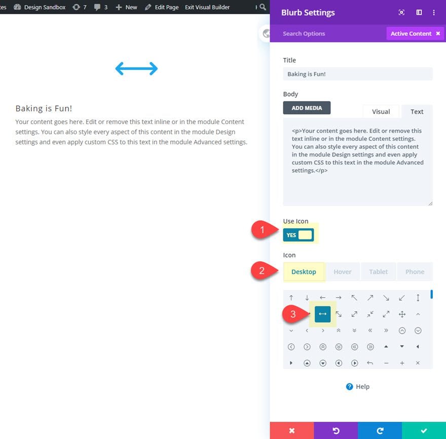
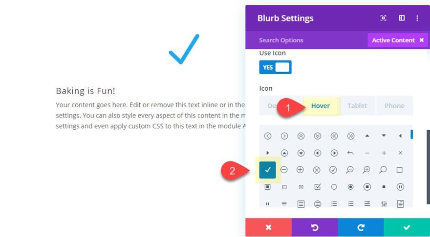
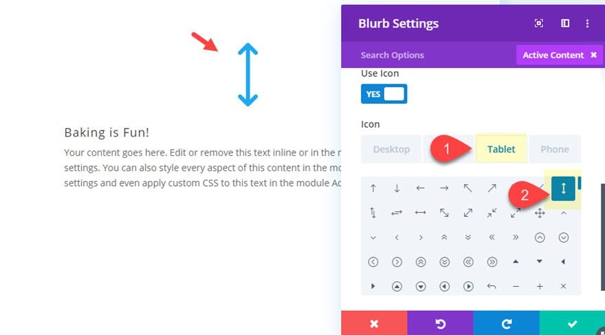
Then update the blurb icon as follows:
- Icon (desktop): horizontal arrow line icon (see screenshot)
- Icon (hover): check icon (see screenshot)
- Icon (tablet and phone): vertical arrow line icon (see screenshot)
Background
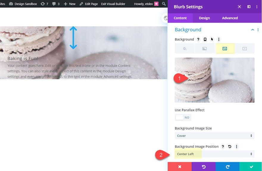
Then give the blurb a background image and a gradient overlay on hover as follows:
- Add a Background Image at least 1000px wide
- Background Image Position: Center Left
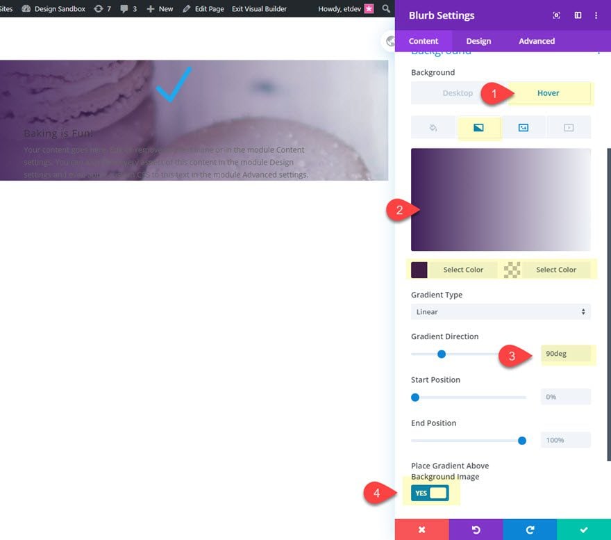
Then add a gradient background overlay on hover.
Hover
- Background Gradient Left Color (hover): #3e215b
- Background Gradient Right Color (hover): rgba(0,0,0,0)
- Gradient Direction: 90deg
- Place Gradient Above Background Image: YES
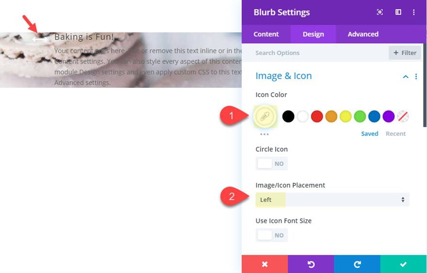
Icon
- Icon Color: #ffffff
- Image/Icon Placement: Left
Next, jump over to the design tab and update the following:
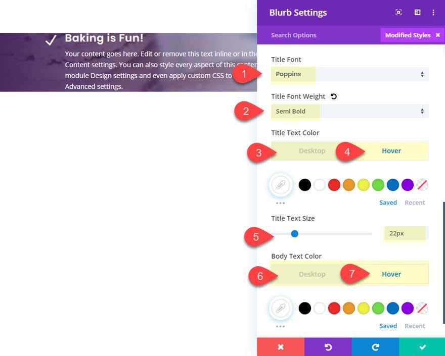
Title and Body Text
- Title Font: Poppins
- Title Font Weight: Semi Bold
- Title Text Color: transparent (desktop), #ffffff (hover)
- Title Text Size: 22px
- Body Text Color: transparent (desktop), #ffffff (hover)
Height and Box Shadow
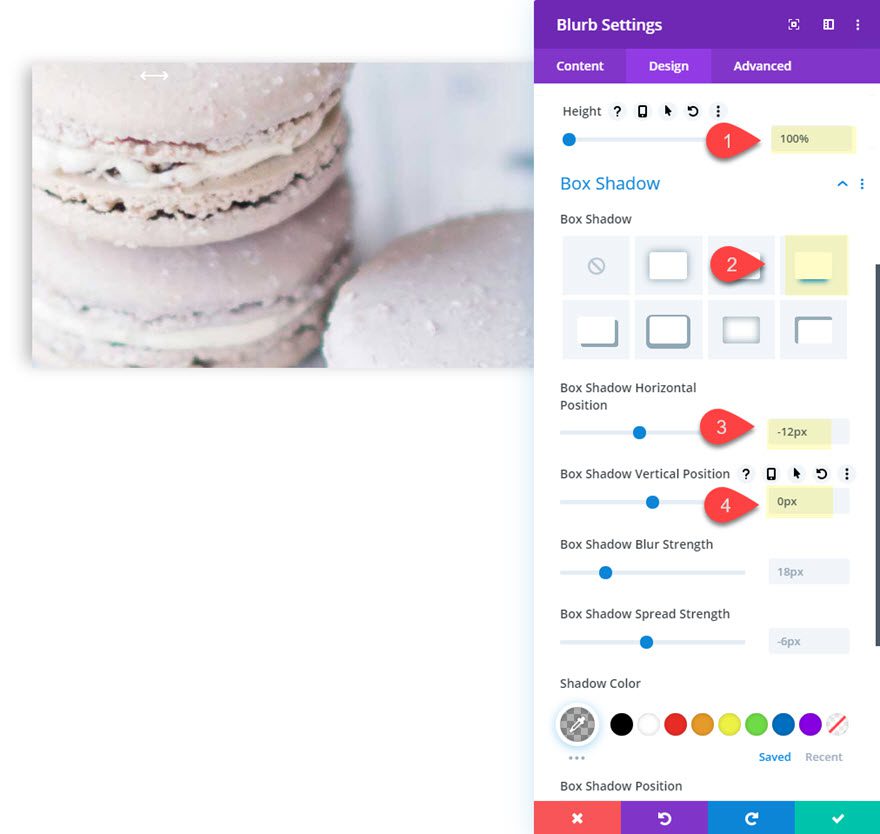
After the text is styled, give the module a 100% height and a box shadow as follows:
- Height: 100%
- Box Shadow: See Screenshot
- Box Shadow Horizontal Position: -12px
- Box Shadow Vertical Position: 0px
Blurb Custom CSS
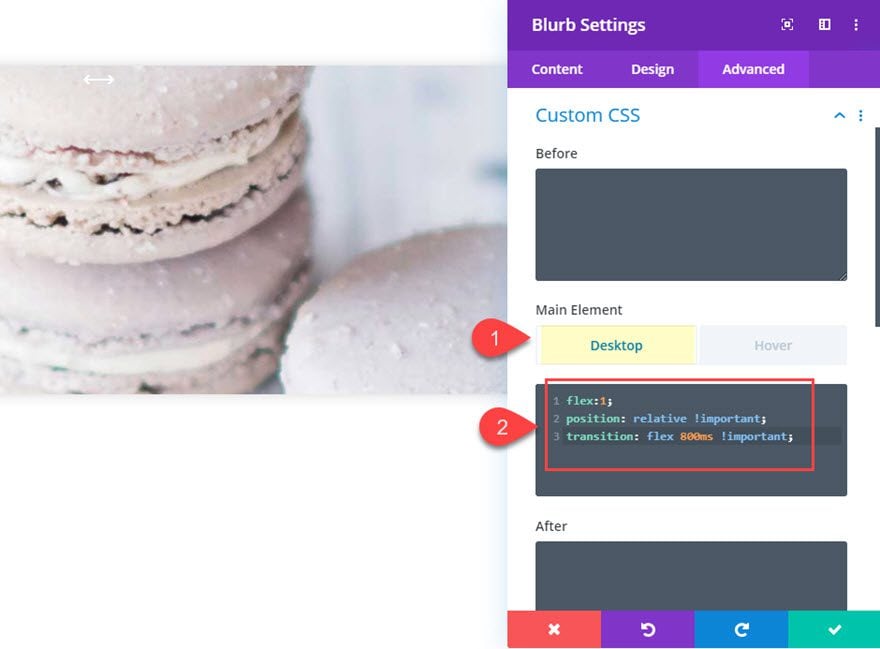
In order to get our accordion panels (or blurb module) to expand and contract with the rest of the modules, we need to add some custom css to change the size of the module with flex-grow. Since we are going to have a total of 5 modules that make up the accordion, we add “flex:1” for the default state and then change it to “flex:5” on the hover state.
Under the advanced tab, add the following custom CSS the Blurb Main Element:
Desktop
flex:1;
position: relative !important;
transition: flex 800ms !important;
Tablet
flex:5;
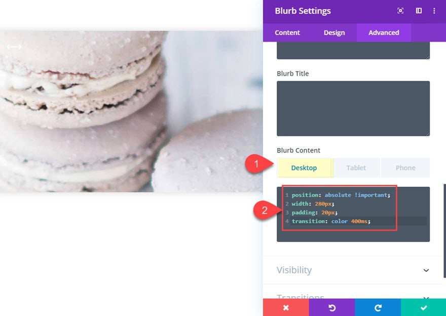
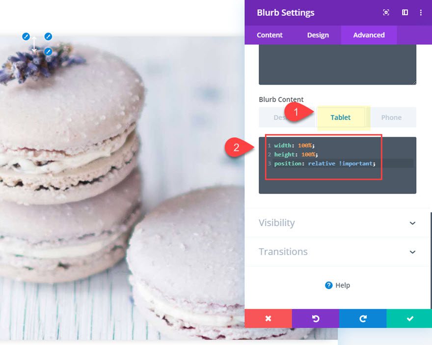
Then add the following custom css to the Blurb Content CSS:
Desktop
position: absolute !important;
width: 280px;
padding: 20px;
transition: color 400ms;
Tablet
width: 100%;
height: 100%;
position: relative !important;
Overflow and Transition
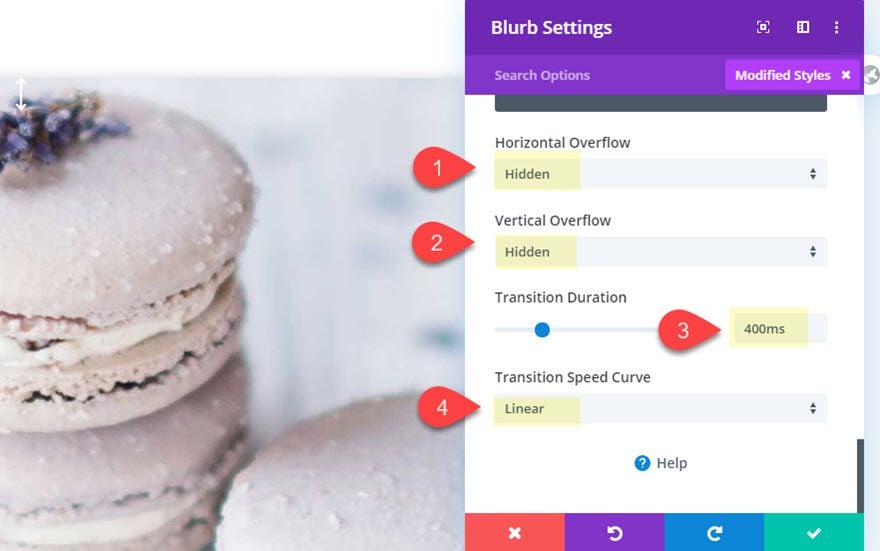
- Horizontal Overflow: hidden
- Vertical Overflow: hidden
- Transition Duration : 400ms
- Transition Speed Curve: Linear
Alright! That was some serious customization to a blurb module. But the good news is that all we need to do is duplicate them to create the remaining accordion panels.
Duplicating the Blurbs for More Accordion Panels
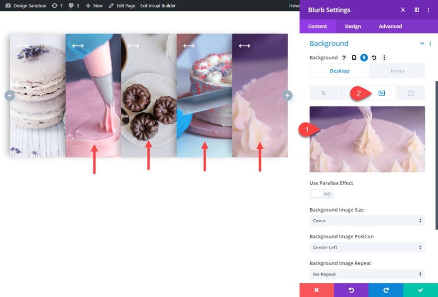
Hover over the blurb module and click the duplicate icon four times to create a total of five accordion panels (or modules).
Then update the background images for each of the new blurbs you duplicated.
Final Result
Desktop

Tablet and Phone

Final Thoughts
This responsive accordion slider really does have some unique elements that make it fun to use. The accordion panels expand and contract seamlessly on hover without any unexpected glitches. And the blurb icons change on hover and on mobile in order to boost UX. Hopefully, this design will come in handy for your next project.
I look forward to hearing from you in the comments.
Cheers!
.inline-code{padding: 0px 4px; color: crimson; font-family: Monaco,consolas,bitstream vera sans mono,courier new,Courier,monospace!important}
The post How to Create a Responsive Accordion Slider in Divi appeared first on Elegant Themes Blog.

