Throughout all the design trends, footers remain essential. People have gotten so used to them, which in turn makes them highly user-friendly. They help visitors organize their stay on your website and navigate to the precise page they’re looking for. With Divi, you can easily create any kind of footer in one single section.
Now, if you’re looking to give your footer some extra dimension and interaction, you’re going to love this post. We’ll creatively combine a footer section with section dividers to create a footer scroll reveal.
Let’s get to it!
Preview
Before we dive into the tutorial, let’s take a quick look at the outcome across different screen sizes.
Desktop
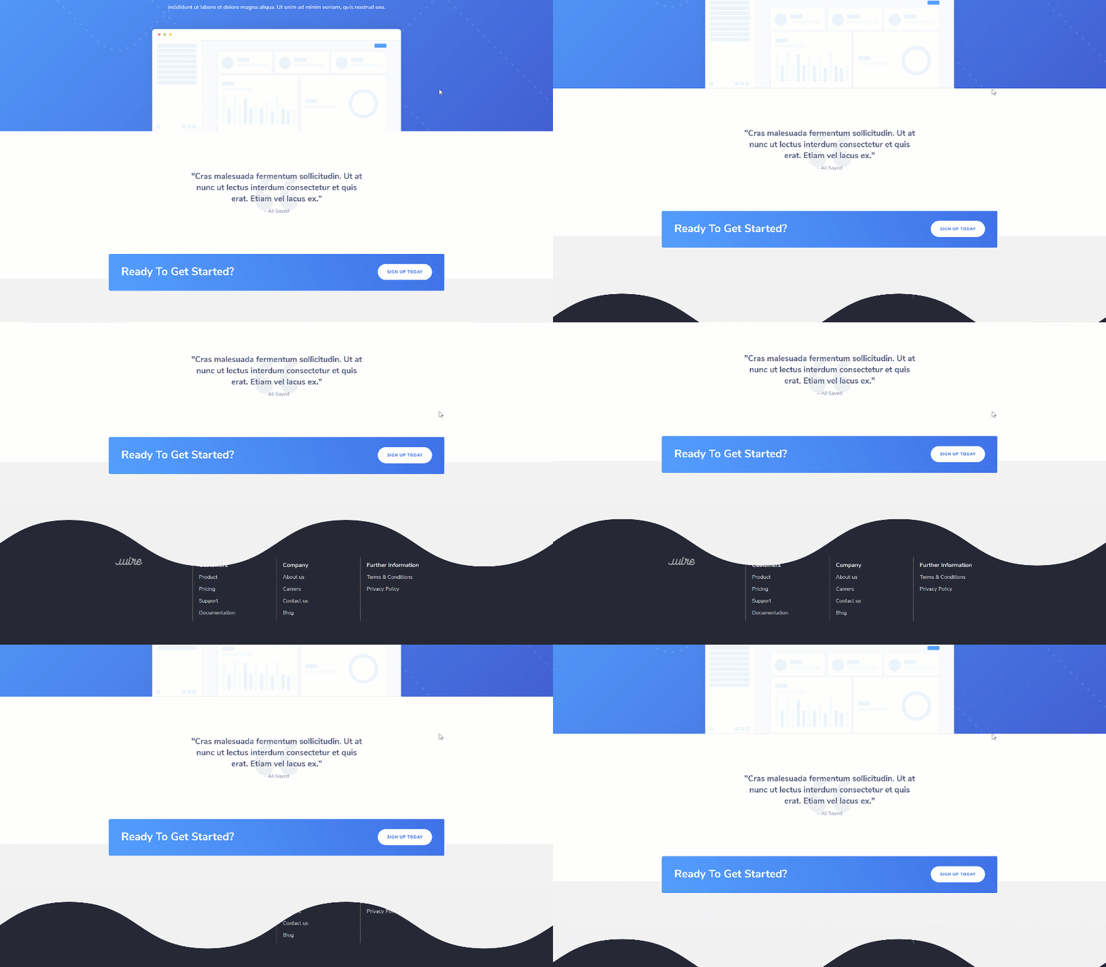
Mobile

Download The Layout for FREE
To lay your hands on the free layout, you will first need to download it using the button below. To gain access to the download you will need to subscribe to our Divi Daily email list by using the form below. As a new subscriber, you will receive even more Divi goodness and a free Divi Layout pack every Monday! If you’re already on the list, simply enter your email address below and click download. You will not be “resubscribed” or receive extra emails.
@media only screen and ( max-width: 767px ) {.et_bloom .et_bloom_optin_1 .carrot_edge.et_bloom_form_right .et_bloom_form_content:before, .et_bloom .et_bloom_optin_1 .carrot_edge.et_bloom_form_left .et_bloom_form_content:before { border-top-color: #ffffff !important; border-left-color: transparent !important; }
}.et_bloom .et_bloom_optin_1 .et_bloom_form_content button { background-color: #f92c8b !important; } .et_bloom .et_bloom_optin_1 .et_bloom_form_content .et_bloom_fields i { color: #f92c8b !important; } .et_bloom .et_bloom_optin_1 .et_bloom_form_content .et_bloom_custom_field_radio i:before { background: #f92c8b !important; } .et_bloom .et_bloom_optin_1 .et_bloom_border_solid { border-color: #f7f9fb !important } .et_bloom .et_bloom_optin_1 .et_bloom_form_content button { background-color: #f92c8b !important; } .et_bloom .et_bloom_optin_1 .et_bloom_form_container h2, .et_bloom .et_bloom_optin_1 .et_bloom_form_container h2 span, .et_bloom .et_bloom_optin_1 .et_bloom_form_container h2 strong { font-family: “Open Sans”, Helvetica, Arial, Lucida, sans-serif; }.et_bloom .et_bloom_optin_1 .et_bloom_form_container p, .et_bloom .et_bloom_optin_1 .et_bloom_form_container p span, .et_bloom .et_bloom_optin_1 .et_bloom_form_container p strong, .et_bloom .et_bloom_optin_1 .et_bloom_form_container form input, .et_bloom .et_bloom_optin_1 .et_bloom_form_container form button span { font-family: “Open Sans”, Helvetica, Arial, Lucida, sans-serif; } p.et_bloom_popup_input { padding-bottom: 0 !important;}

Download For Free
Join the Divi Newlsetter and we will email you a copy of the ultimate Divi Landing Page Layout Pack, plus tons of other amazing and free Divi resources, tips and tricks. Follow along and you will be a Divi master in no time. If you are already subscribed simply type in your email address below and click download to access the layout pack.
You have successfully subscribed. Please check your email address to confirm your subscription and get access to free weekly Divi layout packs!
1. Create New Blank Page & Upload Layout of Choice
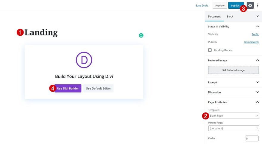
Add New Blank Page
The first thing you will need to do is create a new blank page.
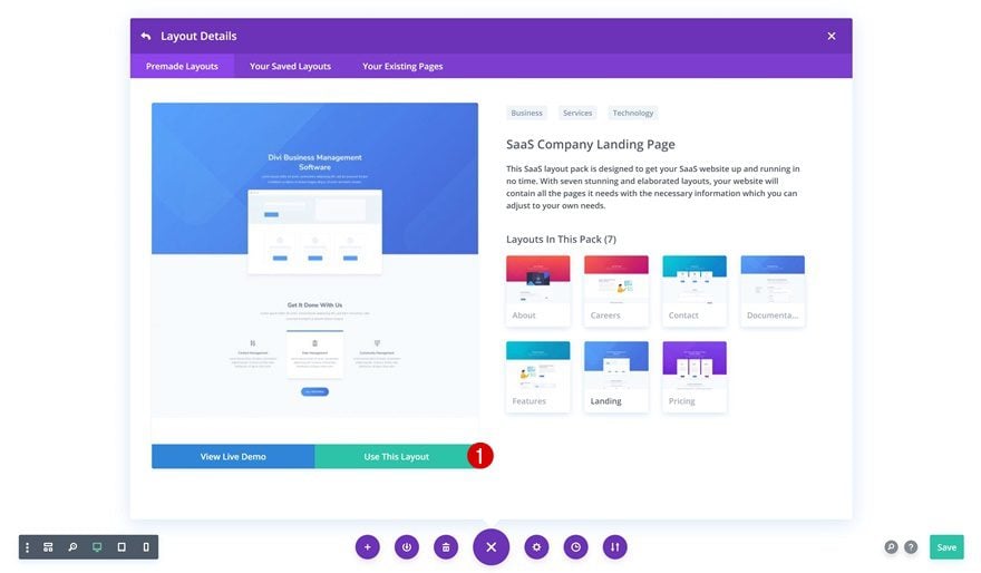
Upload SaaS Company Layout Pack Landing Page
Switch over to the Visual Builder and upload the SaaS Company Layout Pack’s landing page. Although we’re using this specific layout, you can make the technique work on any kind of page you’re working on.
2. Add Z Index to Each Section & Remove Section Animations
Add Z Index to Hero Section
Continue by changing the z index of the hero section on the page.
- Z Index: 3
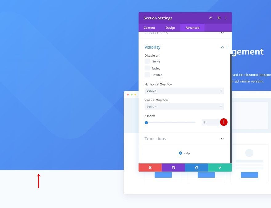
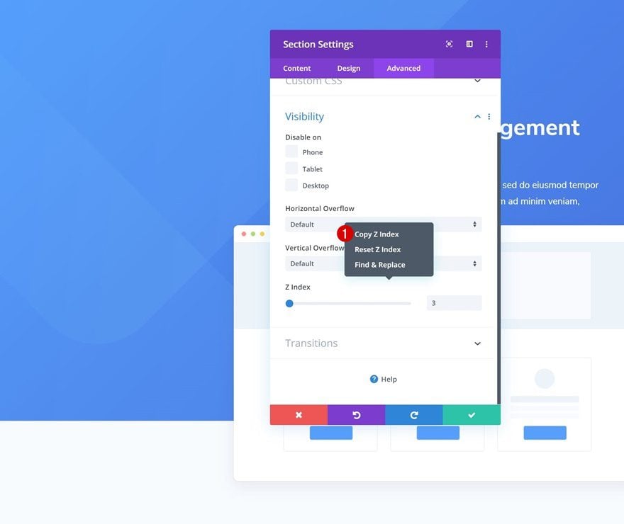
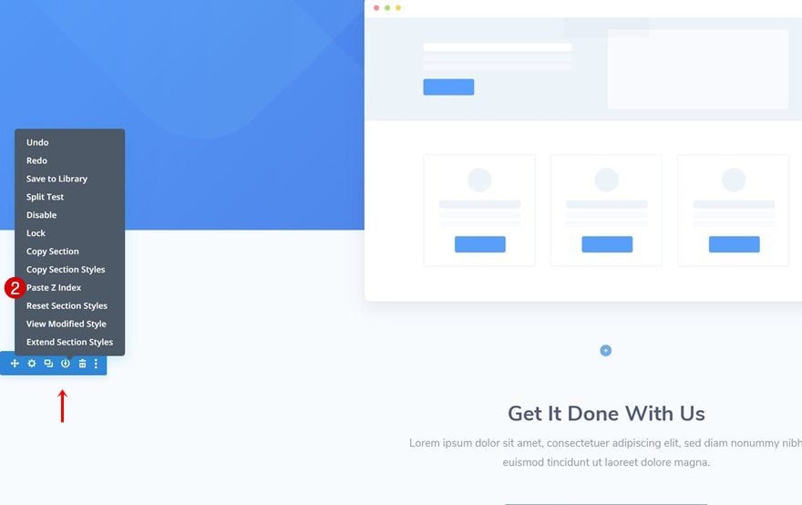
Copy Z Index & Paste to All Other Sections on Page
Copy the z index and paste it to all the other sections on the page. Increasing the z index for each one of the sections is a crucial step to making the tutorial work. It’ll allow each one of the sections to appear on top of the footer section which we’ll add later on the post.
Remove Hero Section Animation
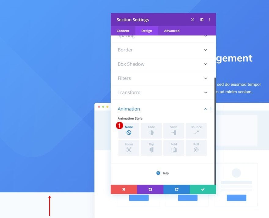
To make sure the footer remains hidden until the bottom of the page, we’re also going to remove all section animations. Open the hero section and remove the animation.
- Animation Style: None
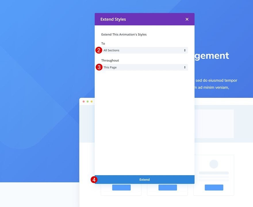
Extend Animation to All Sections on Page
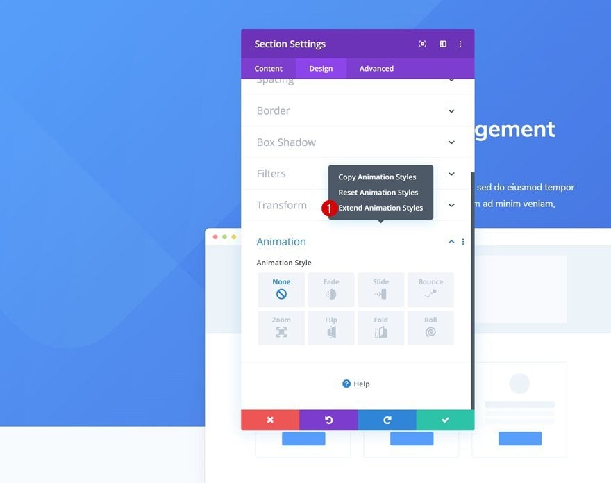
Extend the animation styles to all sections throughout the page.
3. Modify Last Section on Page
Change Background Color
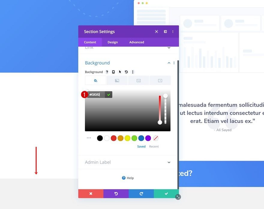
Move on to the last section on the page and change the background color.
- Background Color: #f2f2f2
4. Add Regular Section #1 to Bottom of Page
Section Settings
Background Color
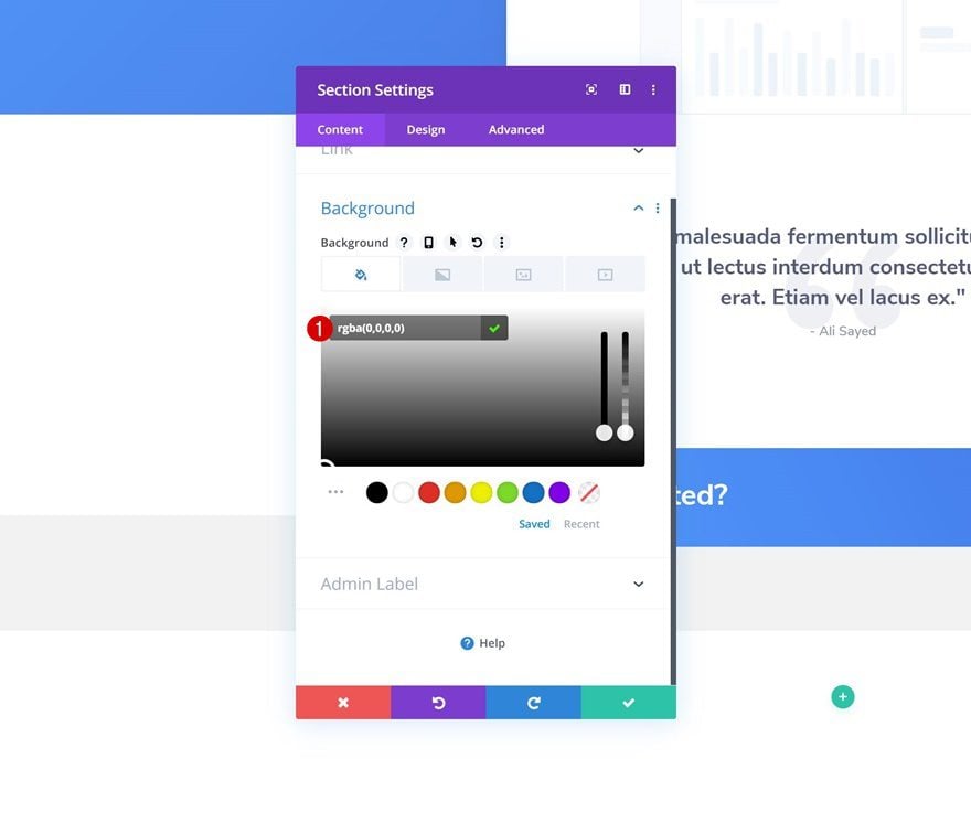
As you can notice in the preview of this post, the footer will appear below a section divider. We’ll dedicate a new section at the bottom of our page to this section divider. Open the section settings and use an entirely transparent background color. This will allow the footer to show through the section container, even though its position will be below it.
- Background Color: rgba(0,0,0,0)
Top Divider
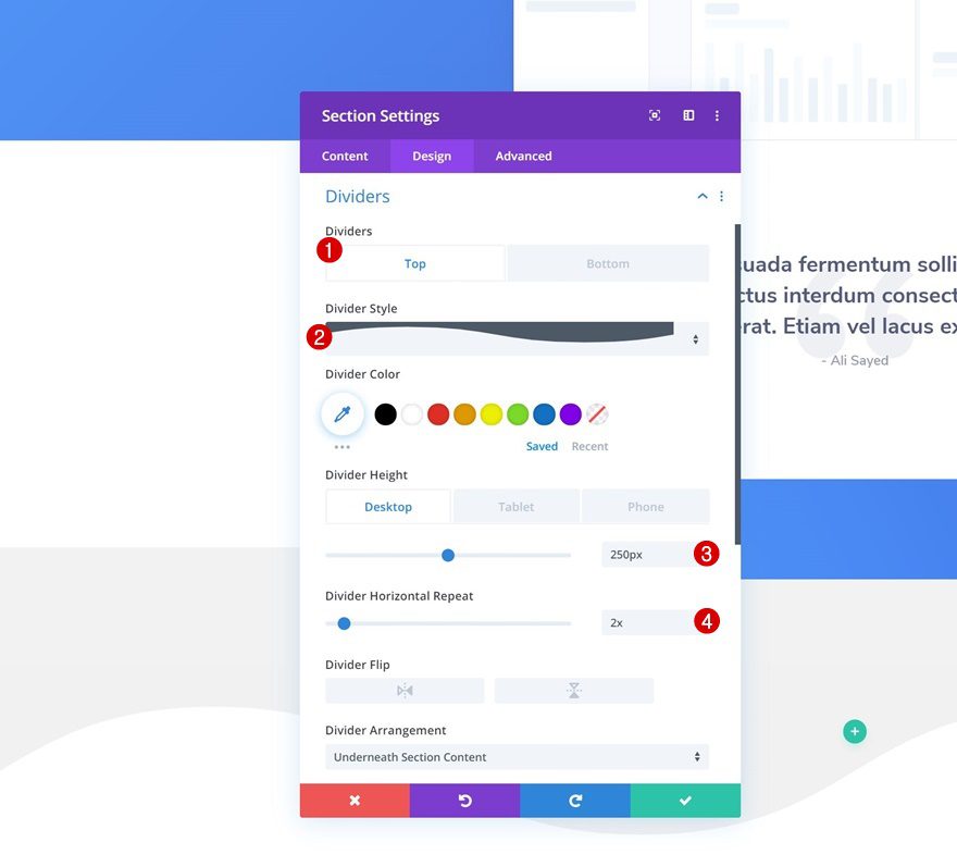
Move on to the design tab of the section and add a top divider of your choice.
- Divider Style: Find in List
- Divider Height: 250px (Desktop), 150px (Tablet), 100px (Phone)
- Divider Horizontal Repeat: 2x
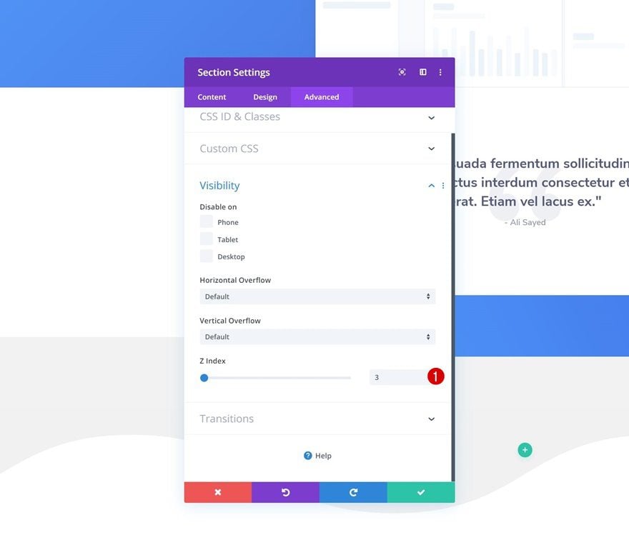
Z Index
This new section needs an increased z index as well.
- Z Index: 3
5. Add Regular Section #2 to Bottom of Page
Section Settings
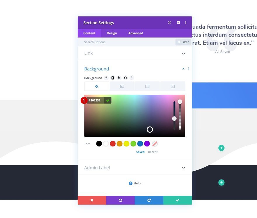
Background Color
Time to create the footer section! Add another new regular section to the bottom of the page and select a background color of your choice.
- Background Color: #202332
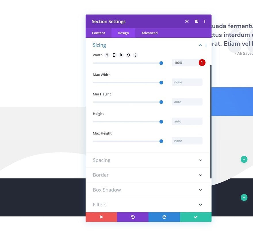
Sizing
Go to the design tab and make sure the width is ‘100%’.
- Width: 100%
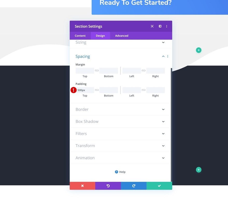
Spacing
We’ll also need to increase the top padding of the section.
- Top Padding: 500px
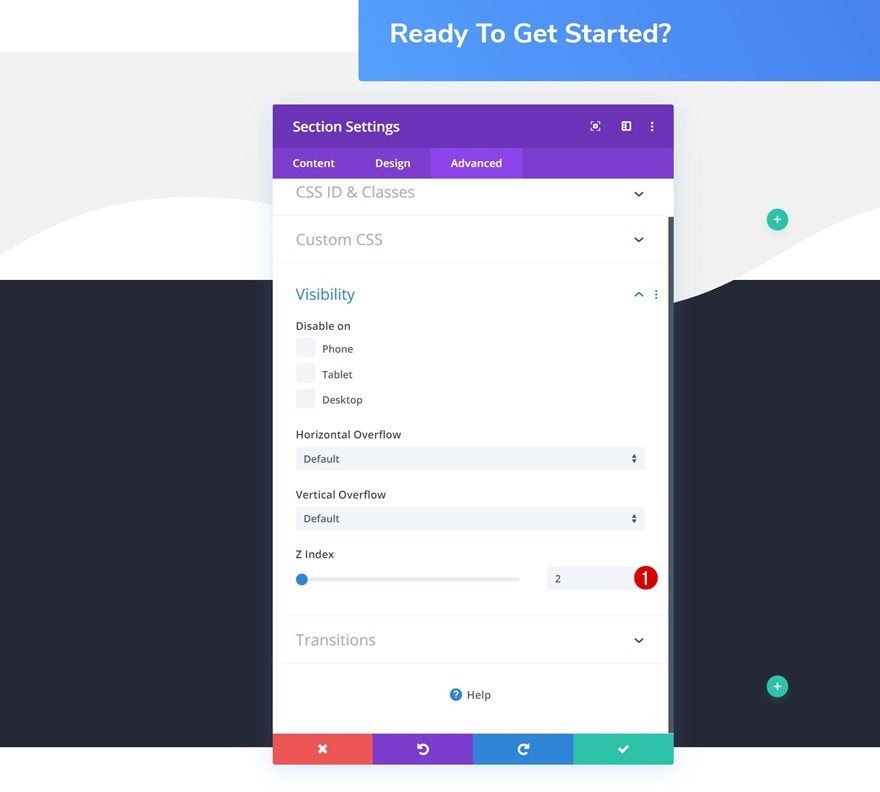
Z Index
The z index we’re assigning to this section is lower than that of the other sections on the page. This will help us hide the section until we’re at the bottom of the page.
- Z Index: 2
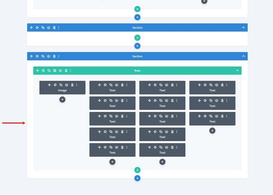
Add New Row
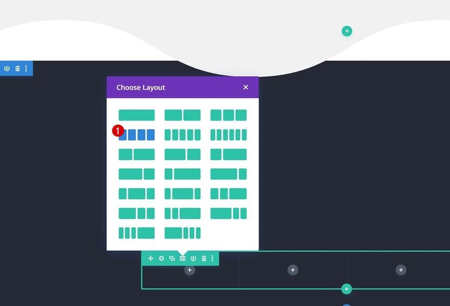
Column Structure
Continue by adding a new row using the following column structure:
Sizing
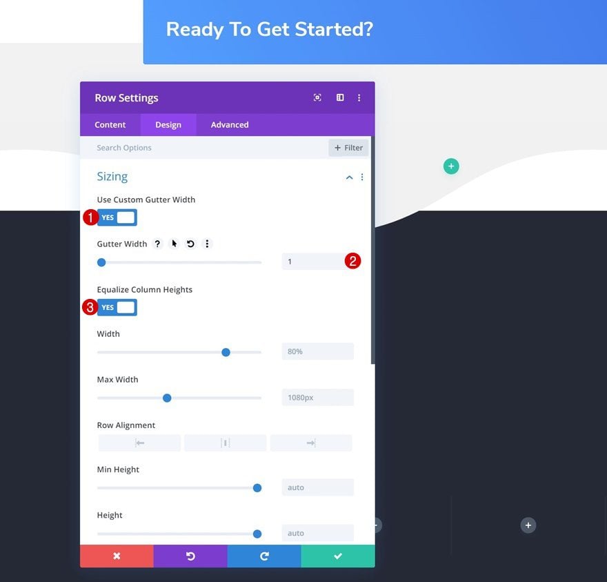
Open the row settings and change the sizing settings accordingly:
- Use Custom Gutter Width: Yes
- Gutter Width: 1
- Equalize Column Heights: Yes
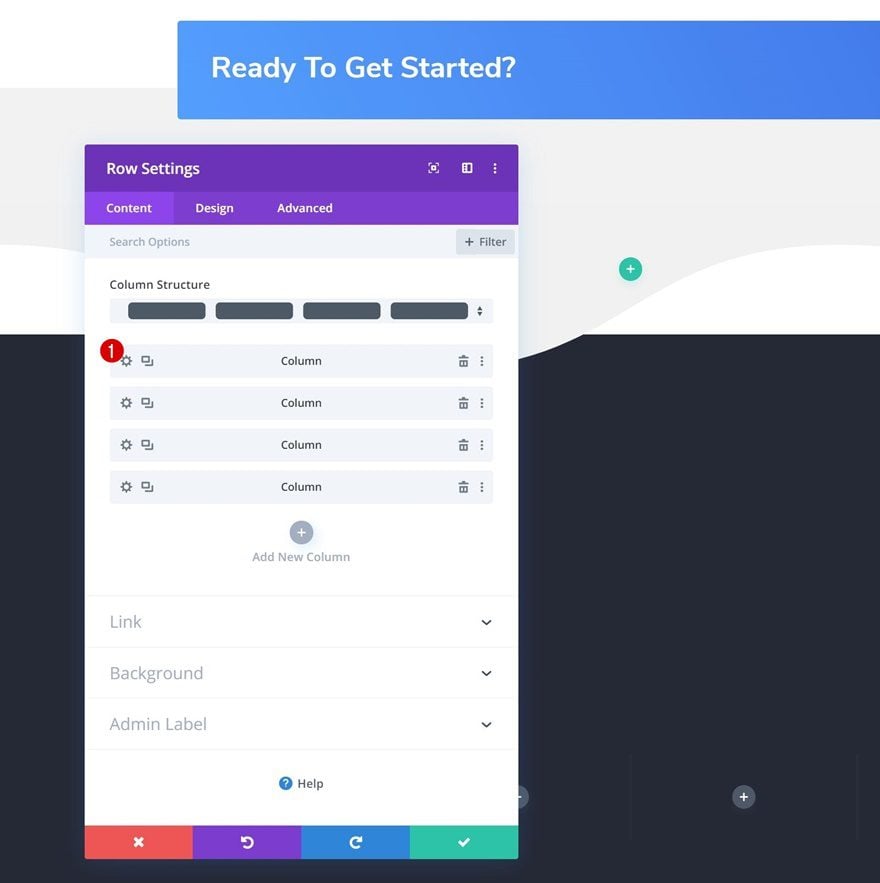
Column Spacing
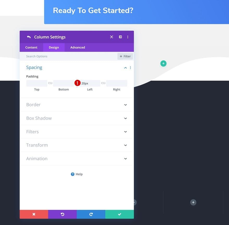
Open the column 1 settings next and add some left padding.
- Left Padding: 20px
Column Right Border
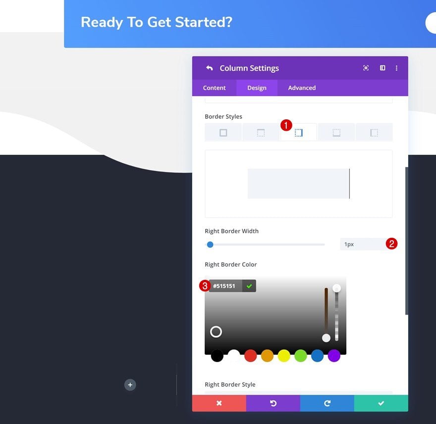
Add a right border to the column as well.
- Right Border Width: 1px
- Right Border Color: #515151
Copy Paste Column Styles
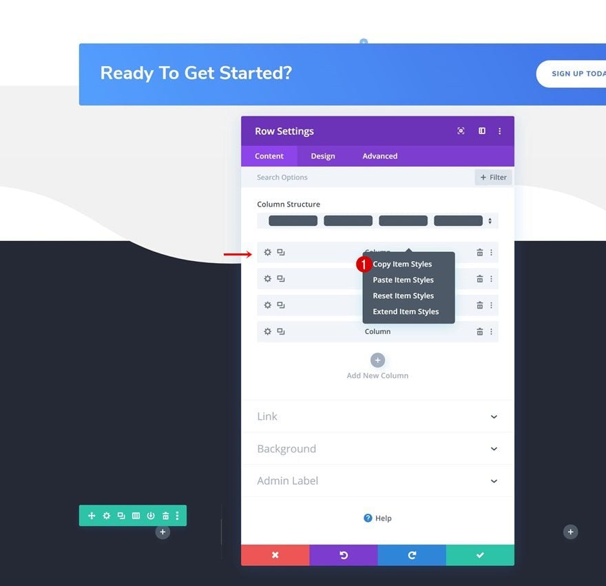
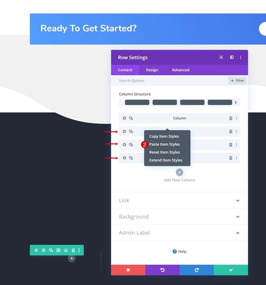
Apply the changes to all columns by either extending the styles or using the copy-paste option.
Add Image Module to Column 1
Upload Image
Time to start adding modules! Add a new Image Module to the first column and upload your logo.
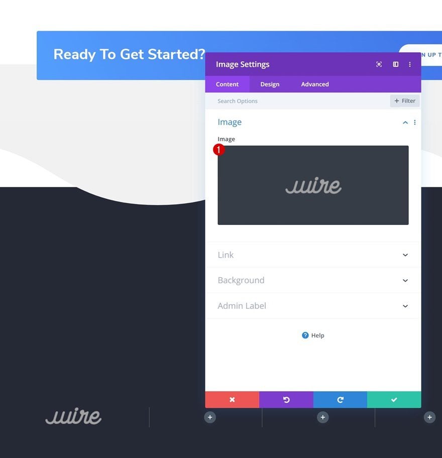
Sizing
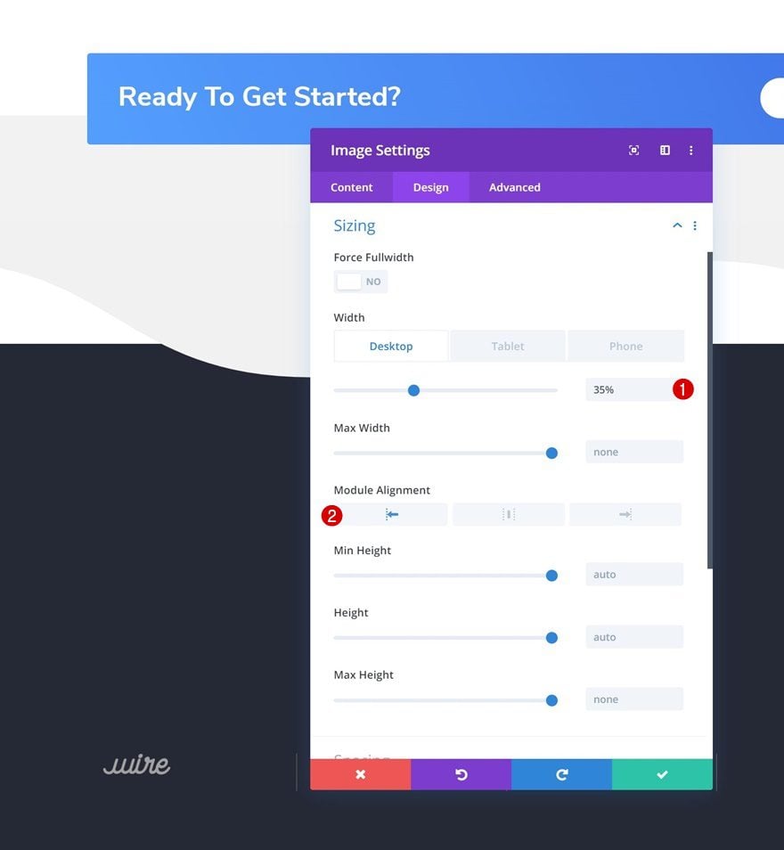
Move on to the design tab and change the width across different screen sizes.
- Width: 35% (Desktop), 30% (Tablet), 25% (Phone)
- Module Alignment: Left
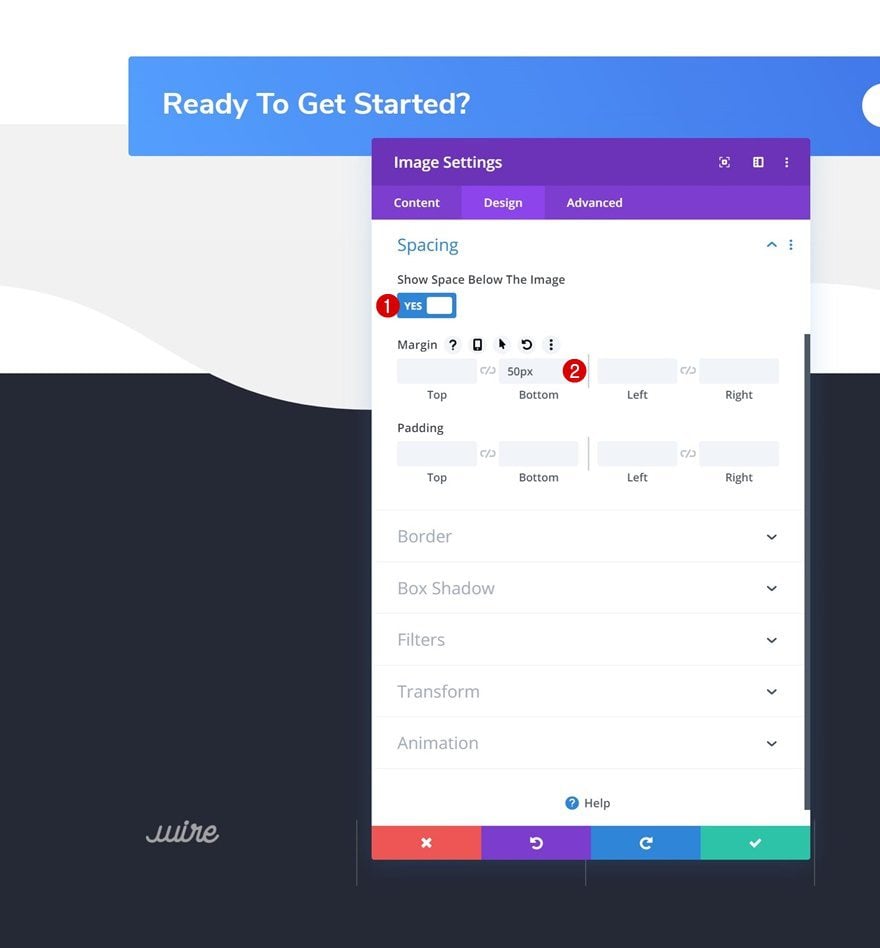
Spacing
Add some bottom margin as well.
- Show Space Below The Image: Yes
- Bottom Margin: 50px
Add Text Module #1 to Column 2
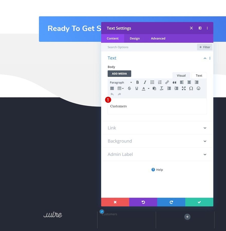
Add Content
On to the second column! Add a first Text Module with some content of your choice.
Text Settings
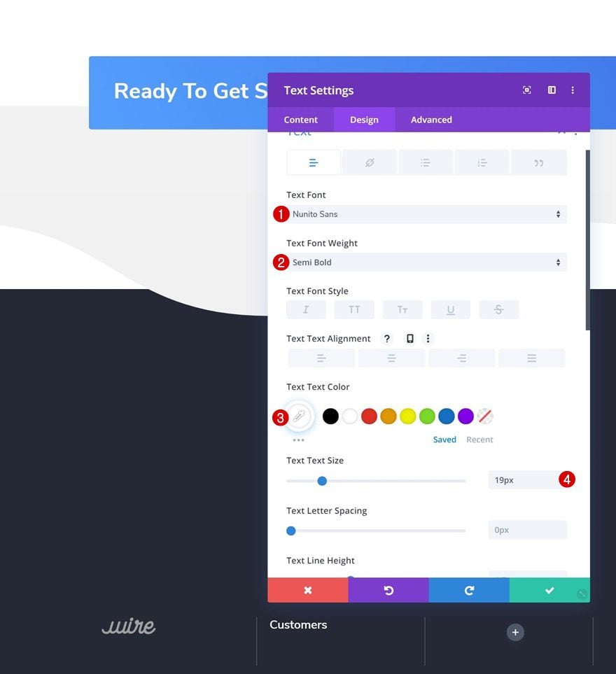
Modify the text settings.
- Text Font: Nunito Sans
- Text Font Weight: Semi Bold
- Text Color: #ffffff
- Text Size: 19px
Spacing
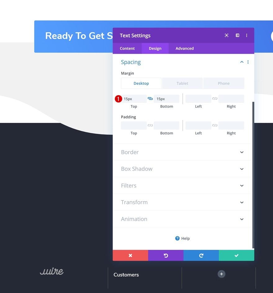
And add some custom top and bottom margin across different screen sizes.
- Top Margin: 15px (Desktop & Tablet), 10px (Phone)
- Bottom Margin: 15px (Desktop & Tablet), 10px (Phone)
Add Text Module #2 to Column 2
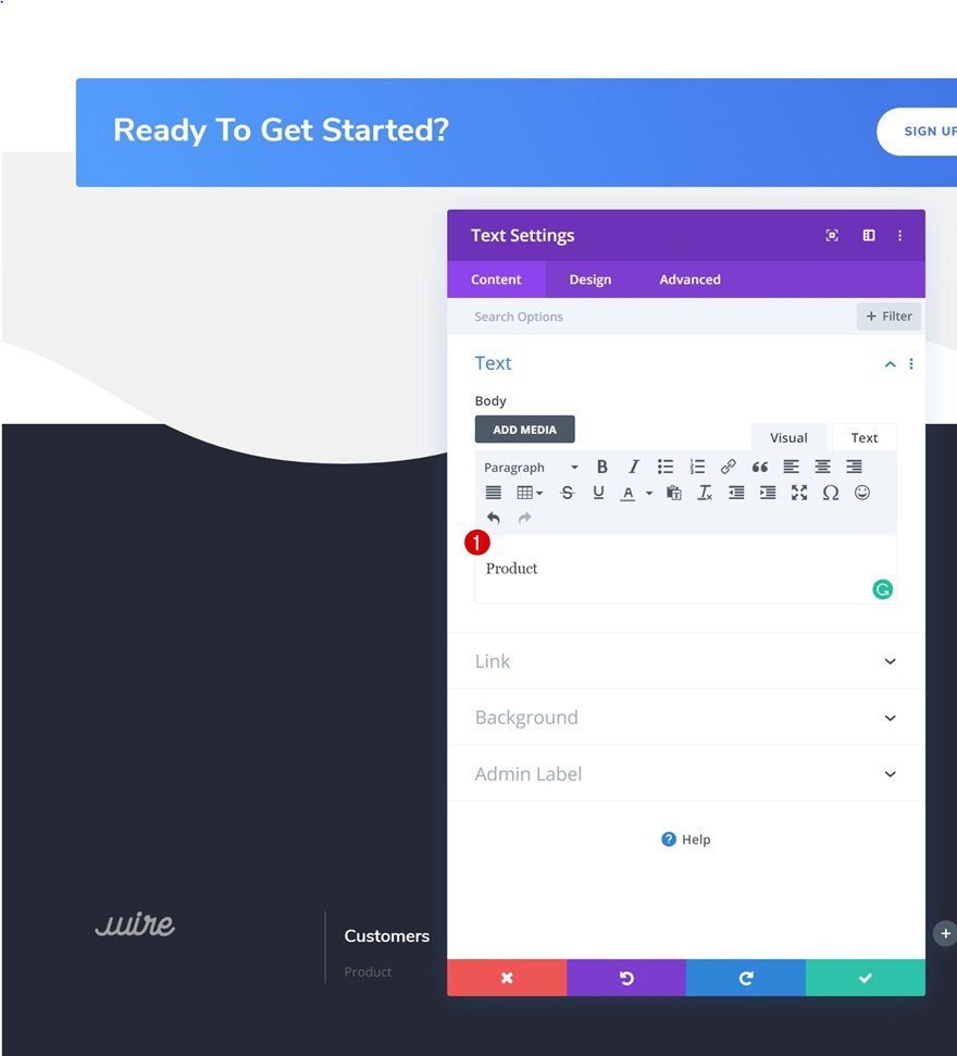
Add Content
Add a second Text Module to the second column and enter some content of your choice.
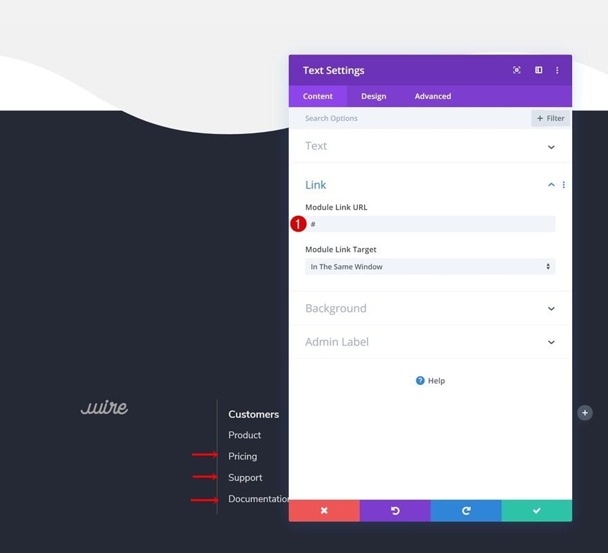
Add Link
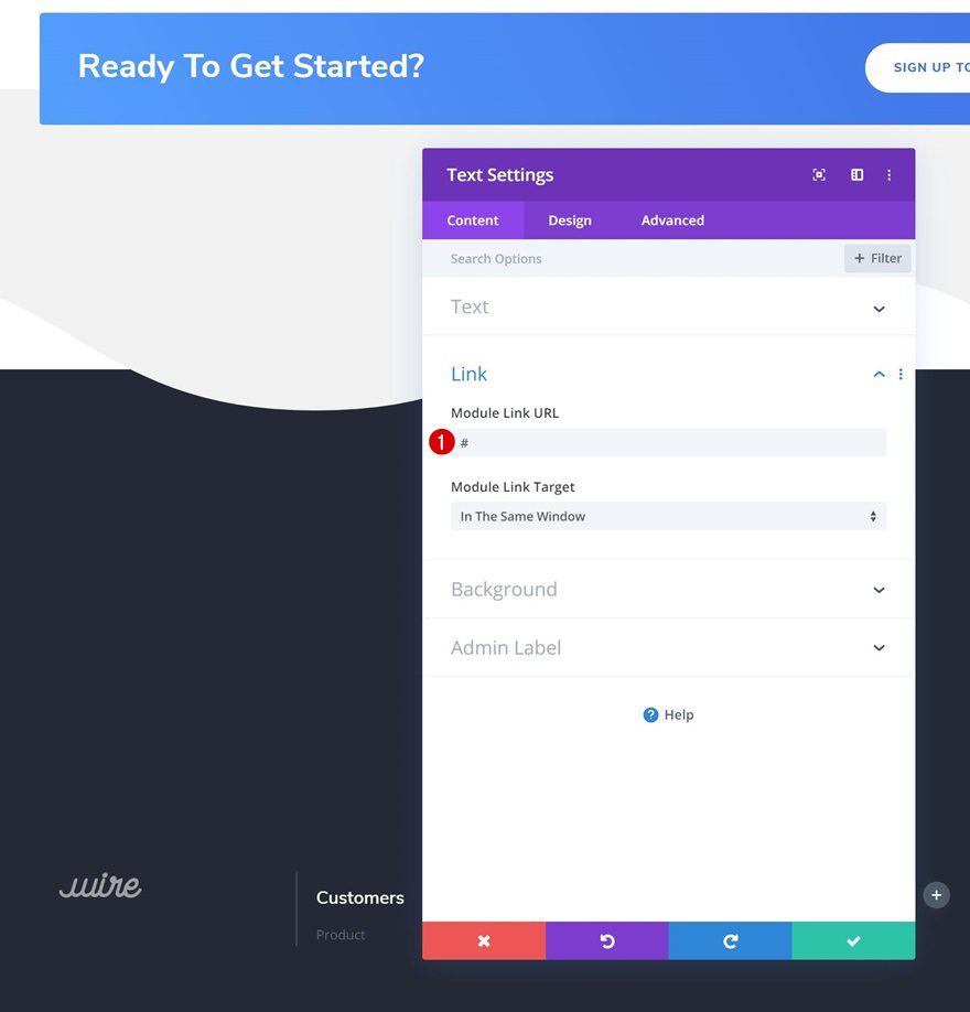
Add a link that matches the footer item.
- Module Link URL: #
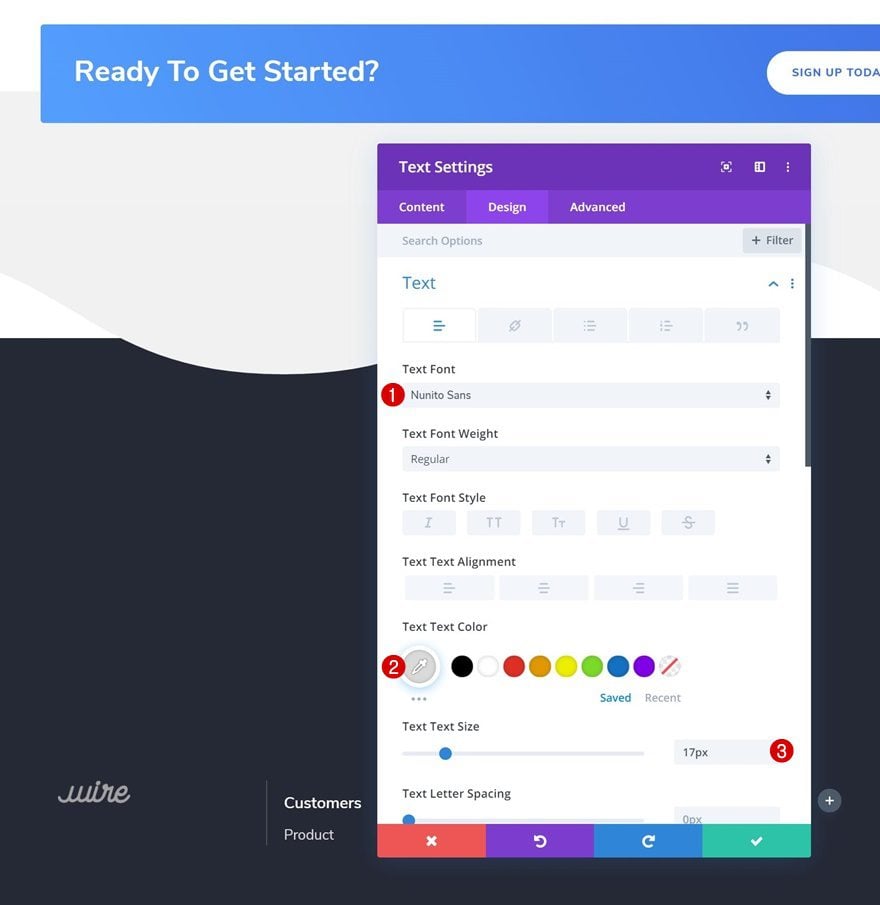
Text Settings
Modify the text settings next.
- Text Font: Nunito Sans
- Text Color: #dbdbdb
- Text Size: 17px
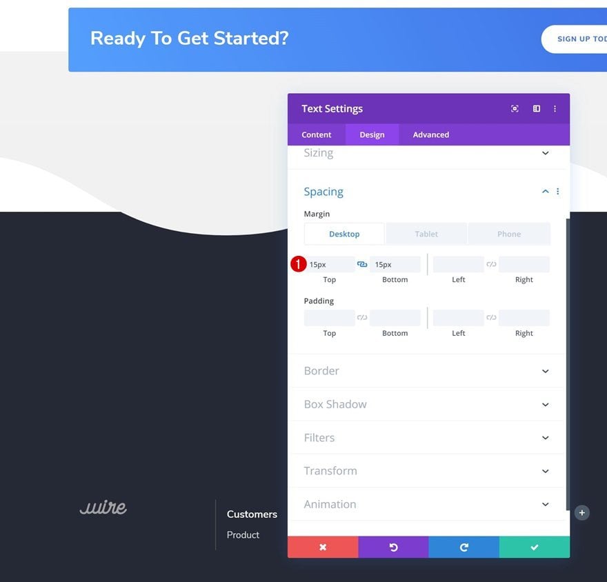
Spacing
And add some custom top and bottom padding across different screen sizes.
- Top Margin: 15px (Desktop & Tablet), 10px (Phone)
- Bottom Margin: 15px (Desktop & Tablet), 10px (Phone)
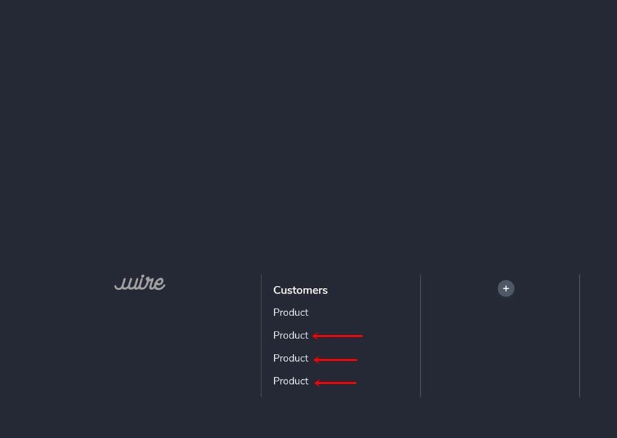
Clone Text Module #2 as Many Times as Needed
Clone the second Text Module in column 2 as many times as needed.
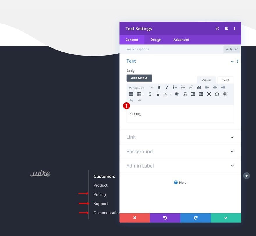
Change Content
Make sure you change the content.
Change Links
Along with the links.
- Module Link URL: #
Clone Modules in Column 2 & Place in Remaining Columns
Once you’ve completed the second column, you can clone both modules up to as many times as needed and place the duplicates in the two remaining columns of the row.
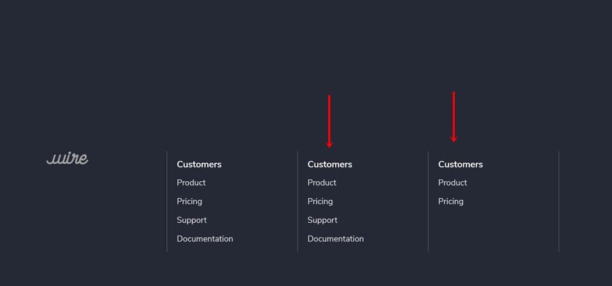
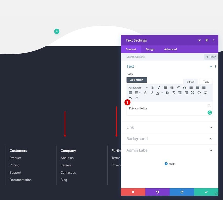
Change Content
Change the content of each duplicate.
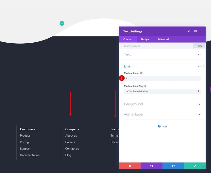
Change Links
Along with the link.
- Module Link URL: #
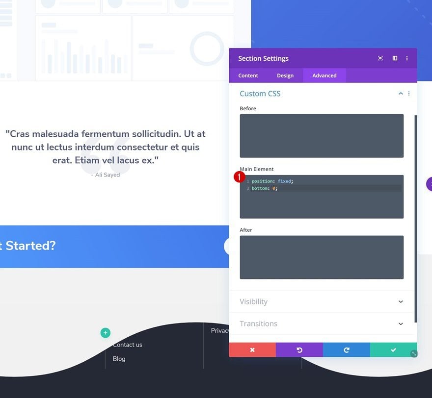
6. Make Section #2 Fixed to Bottom of Page
Add Custom CSS
Now, to create the scroll reveal, we’re going to make sure the footer section sticks to the bottom of our page by adding two lines of CSS code to the main element of the section.
position: fixed;
bottom: 0;
7. Add Bottom Margin to Section #1 to Create Reveal Effect
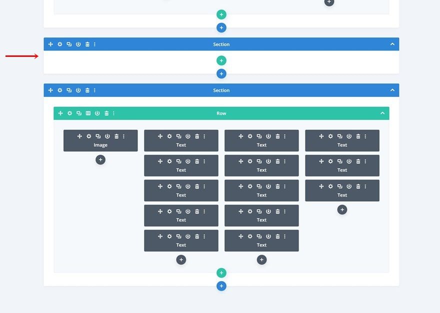
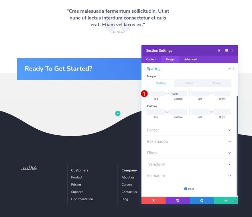
Add Bottom Margin Across Different Screen Sizes
We’ll also need some space at the bottom of our page that’ll allow the footer to show up. Open the section containing the section divider and add some bottom margin across different screen sizes and you’re done!
- Bottom Margin: 400px (Desktop), 700px (Tablet), 800px (Phone)
Preview
Now that we’ve gone through all the steps, let’s take a final look at the outcome across different screen sizes.
Desktop

Mobile

Final Thoughts
In this post, we’ve shown you how to create beautiful footer scroll reveals below section dividers to create a unique effect. This is a great way to make any footer interactive and draw attention to the items that are listed in the footer. We hope this tutorial inspires you to create your own section divider footer reveals as well! If you have any questions or suggestions, make sure you leave a comment in the comment section below.
If you’re eager to learn more about Divi and get more Divi freebies, make sure you subscribe to our email newsletter and YouTube channel so you’ll always be one of the first people to know and get benefits from this free content.
The post How to Create Beautiful Footer Scroll Reveals Below Divi’s Section Dividers appeared first on Elegant Themes Blog.
