In the world of web design, we usually think of shadows as something we can add in Photoshop or as a CSS property (like box-shadow or text-shadow). But with Divi, we can think outside the box (or box-shadow). With just a few adjustments to Divi’s built-in filter and scroll effect options, we can transform any image into a lifelike shadow.
In this tutorial, we are going to show you how to create moving image shadows on scroll in Divi. The trick is to find a PNG image with a unique shape so that, once the image is transformed, it will keep the shape and look like a realistic shadow of the image. After the image/shadow is ready, we can add a few scroll effects to move the shadow as the user scrolls. This unusual (yet familiar) effect will add a stunning design element that will bring new life to your site.
Let’s get started!
Sneak Peek
Here is a quick look at the design we’ll build in this tutorial.
Download the Layout for FREE
To lay your hands on the designs from this tutorial, you will first need to download it using the button below. To gain access to the download you will need to subscribe to our Divi Daily email list by using the form below. As a new subscriber, you will receive even more Divi goodness and a free Divi Layout pack every Monday! If you’re already on the list, simply enter your email address below and click download. You will not be “resubscribed” or receive extra emails.
@media only screen and ( max-width: 767px ) {.et_bloom .et_bloom_optin_1 .carrot_edge.et_bloom_form_right .et_bloom_form_content:before, .et_bloom .et_bloom_optin_1 .carrot_edge.et_bloom_form_left .et_bloom_form_content:before { border-top-color: #ffffff !important; border-left-color: transparent !important; }
}.et_bloom .et_bloom_optin_1 .et_bloom_form_content button { background-color: #f92c8b !important; } .et_bloom .et_bloom_optin_1 .et_bloom_form_content .et_bloom_fields i { color: #f92c8b !important; } .et_bloom .et_bloom_optin_1 .et_bloom_form_content .et_bloom_custom_field_radio i:before { background: #f92c8b !important; } .et_bloom .et_bloom_optin_1 .et_bloom_border_solid { border-color: #f7f9fb !important } .et_bloom .et_bloom_optin_1 .et_bloom_form_content button { background-color: #f92c8b !important; } .et_bloom .et_bloom_optin_1 .et_bloom_form_container h2, .et_bloom .et_bloom_optin_1 .et_bloom_form_container h2 span, .et_bloom .et_bloom_optin_1 .et_bloom_form_container h2 strong { font-family: “Open Sans”, Helvetica, Arial, Lucida, sans-serif; }.et_bloom .et_bloom_optin_1 .et_bloom_form_container p, .et_bloom .et_bloom_optin_1 .et_bloom_form_container p span, .et_bloom .et_bloom_optin_1 .et_bloom_form_container p strong, .et_bloom .et_bloom_optin_1 .et_bloom_form_container form input, .et_bloom .et_bloom_optin_1 .et_bloom_form_container form button span { font-family: “Open Sans”, Helvetica, Arial, Lucida, sans-serif; } p.et_bloom_popup_input { padding-bottom: 0 !important;}

Download For Free
Join the Divi Newsletter and we will email you a copy of the ultimate Divi Landing Page Layout Pack, plus tons of other amazing and free Divi resources, tips and tricks. Follow along and you will be a Divi master in no time. If you are already subscribed simply type in your email address below and click download to access the layout pack.
You have successfully subscribed. Please check your email address to confirm your subscription and get access to free weekly Divi layout packs!
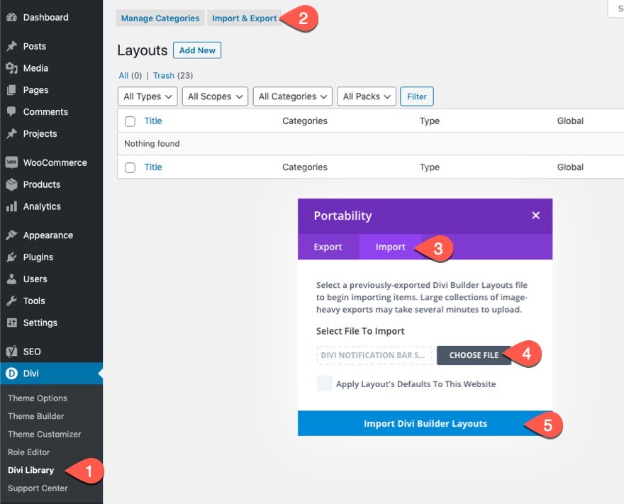
To import the section layout to your Divi Library, navigate to the Divi Library.
Click the Import button.
In the portability popup, select the import tab and choose the download file from your computer.
Then click the import button.

Once done, the section layout will be available in the Divi Builder.
Let’s get to the tutorial, shall we?
What You Need to Get Started
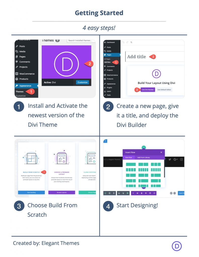
To get started, you will need to do the following:
- If you haven’t yet, install and activate the Divi Theme.
- Create a new page in WordPress and use the Divi Builder to edit the page on the front end (visual builder).
- Choose the option “Build From Scratch”.
After that, you will have a blank canvas to start designing in Divi,
Part 1: Designing the Section Layout
In this first part, we are going to design a quick section layout to complement the moving image shadow scroll effect.
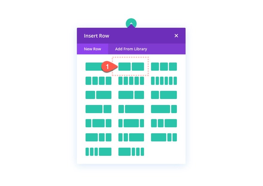
Add the Two-Column Row
To get started, add a two-column row to the regular section.
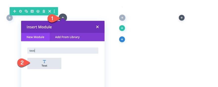
Add the Text Module
In the left column, add a new text module. This will serve as our mock text content.
Text Content
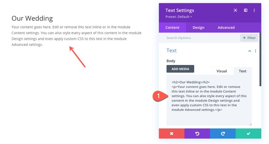
Then paste the following HTML inside the body content:
Our Wedding
Your content goes here. Edit or remove this text inline or in the module Content settings. You can also style every aspect of this content in the module Design settings and even apply custom CSS to this text in the module Advanced settings.
Text Design
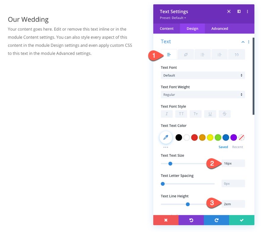
Under the design tab, update the settings as follows:
- Text Text Size: 16px
- Text Line Height: 2em
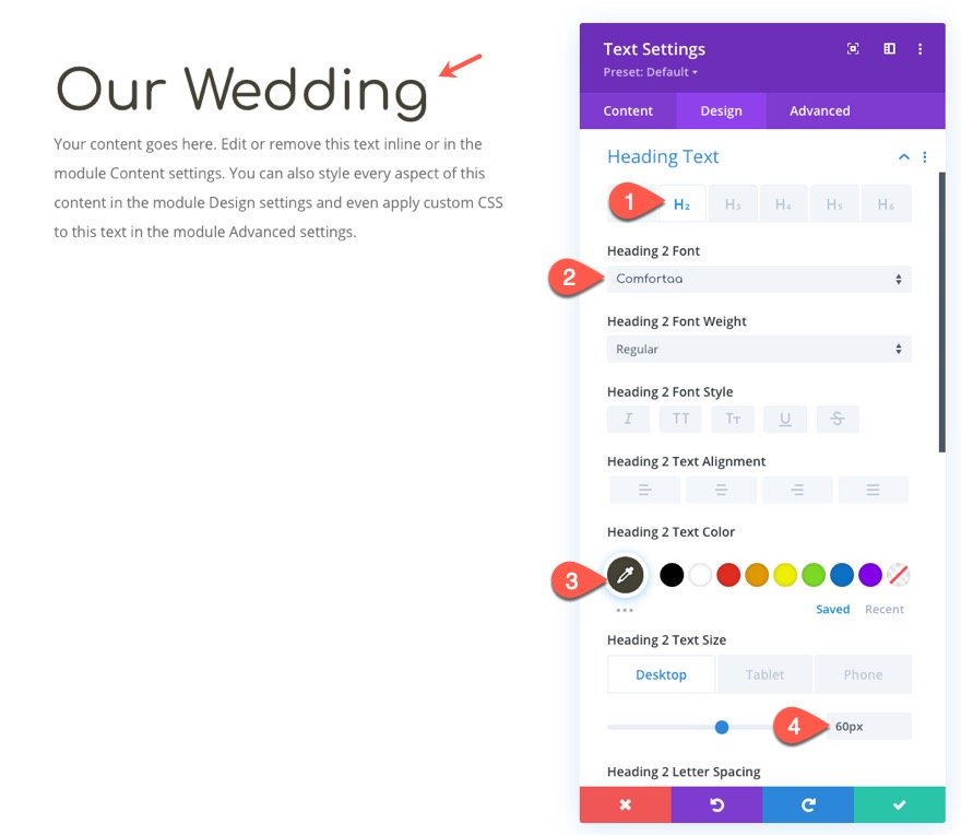
- Heading 2 Font: comfortaa
- Heading 2 Text Color: #444235
- Heading 2 Text Size: 60px (desktop), 40px (tablet)
Add Image Design Accent
Under the text module, we are going to add an image that will serve as a design accent to the text. We are going to use the image of a tree branch from the Holistic Healer Layout Pack. This will be the same image we will use later for our moving image shadows.
Add Image
Add a new image module under the text module.
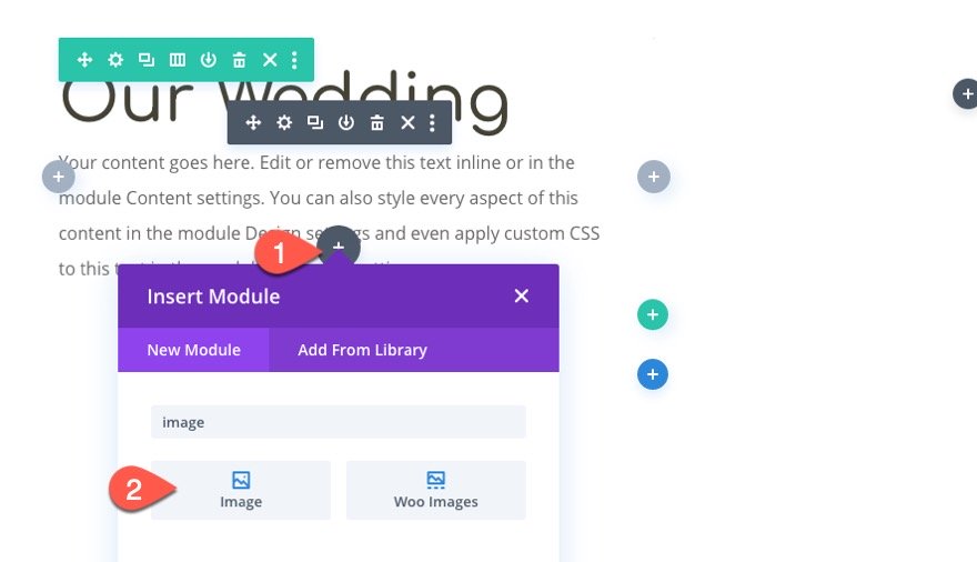
Then upload the image.
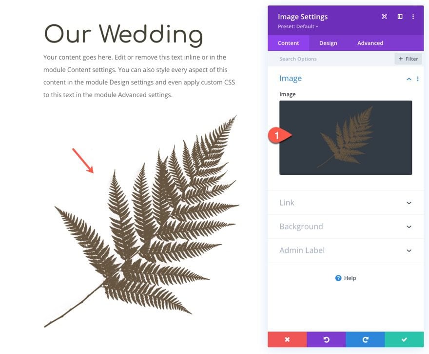
Image Design
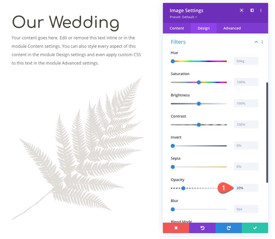
Under the design tab, bring down the opacity of the image using the filter settings.
- Opacity: 20%
Next, move the image over to the left and upward using the following transform option:
- Transform Translate X-Axis: -20%
- Transform Translate Y-Axis: -90%
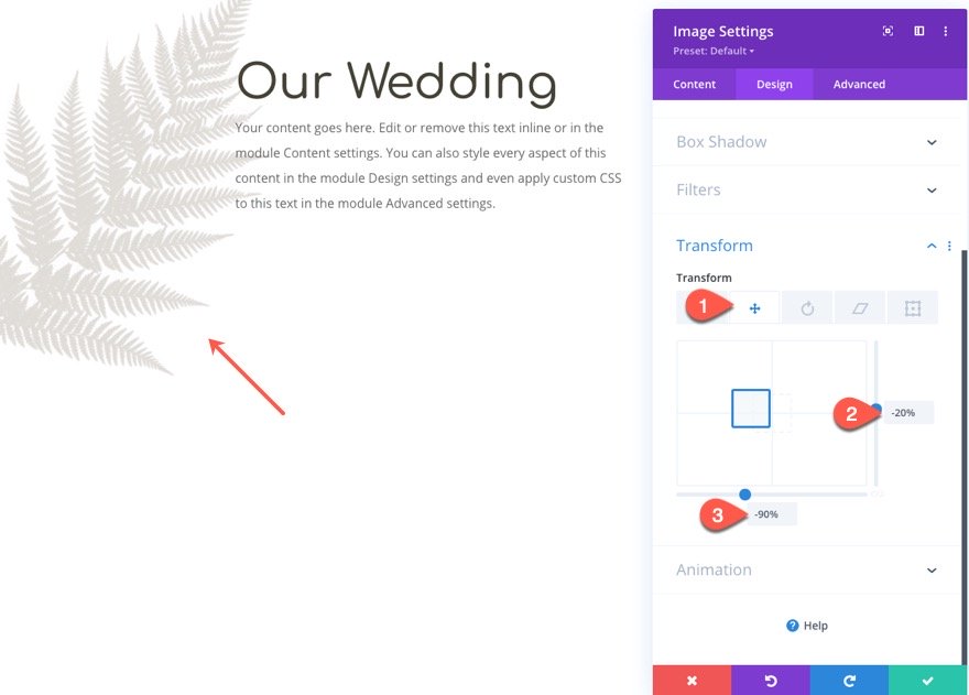
Image Position
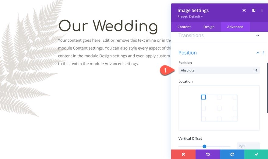
Then give the image an absolute position.
- Position: Absolute
Part 2: Creating the Moving Image Shadows
Once the mock content in the left column are finished, we are ready to start creating the image and those moving image shadows.
Add Main Image
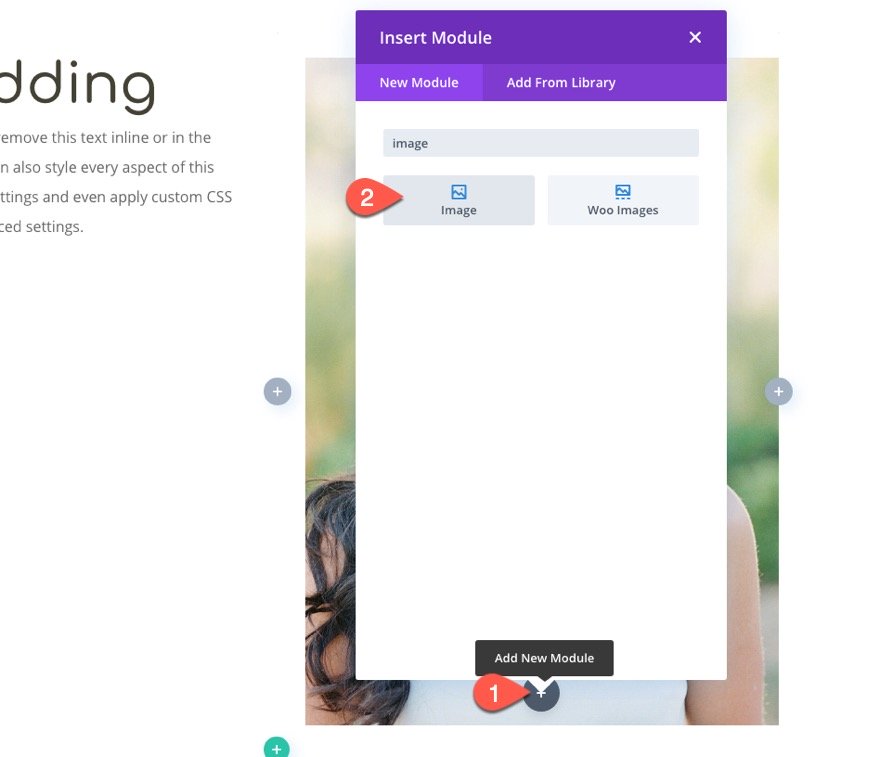
Add a new image module to the right column.
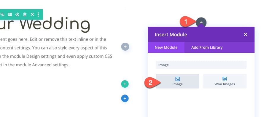
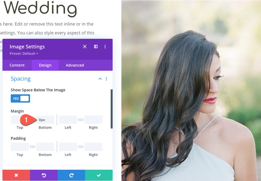
Then upload an image that is at least 800px wide. Since we are going to be adding a moving image shadow of a tree branch, it makes sense to use a picture of somewhere outside.
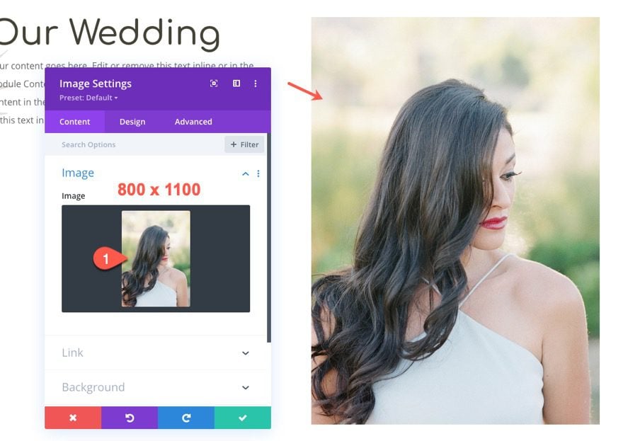
Then take out the default bottom margin under the module as follows:
- Margin Bottom: 0px
Creating Moving Image Shadow 1
Now we are ready to create the first moving image shadow. The basic idea is to use an image in the PNG file format so that the transparent background of the image will not show. Then we will use the filter effects to adjust the brightness, opacity, and blur to transform the image to look like a shadow. Because the PNG image has a unique shape, the shadow will also keep the same shape.
Let’s start by adding the same PNG image of a branch from the Holistic Healer Layout Pack.
Here it is…
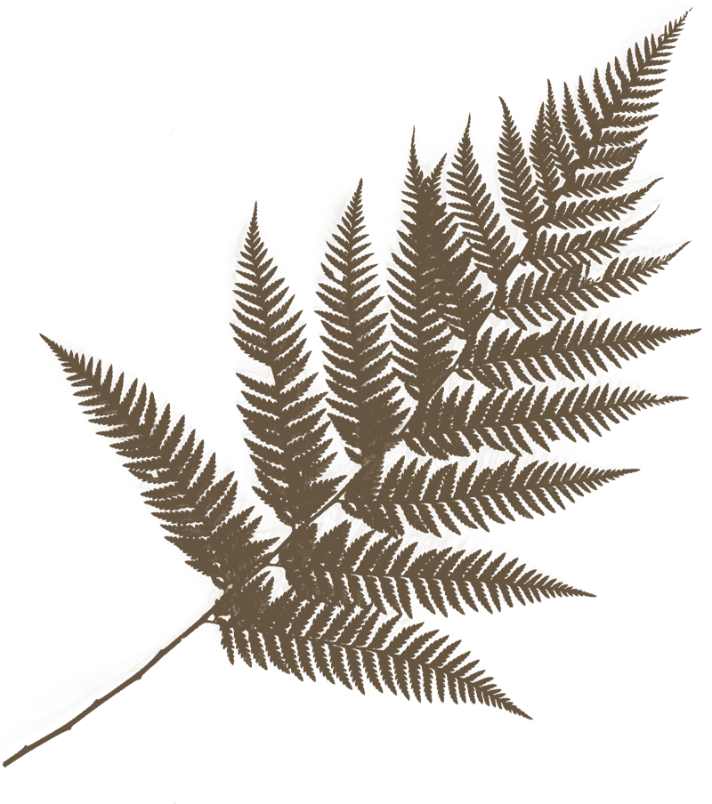
Add the image module under the image in the right column.
Then upload the image to the module.
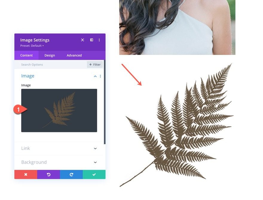
Image Filters
Under the design tab, update the filters to make the image look like a shadow.
- Brightness: 0%
- Opacity: 25%
- Blur: 8px
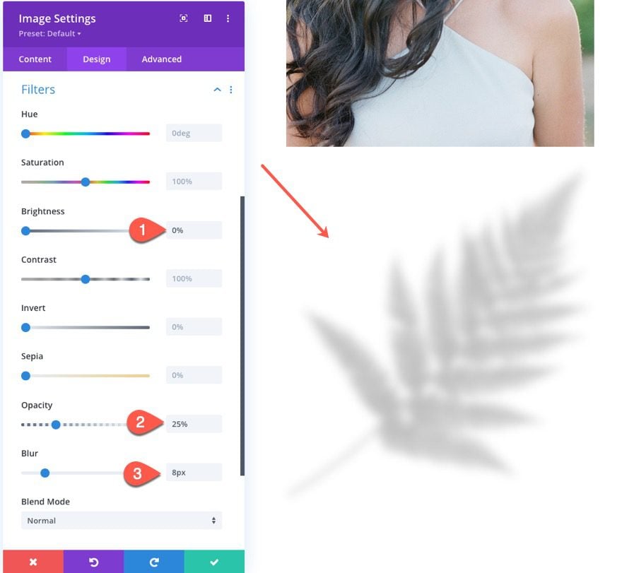
Image Position
Then give the image shadow an absolute position so that it sits above the main image above.
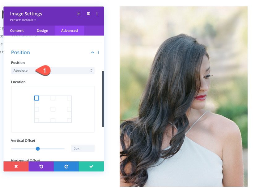
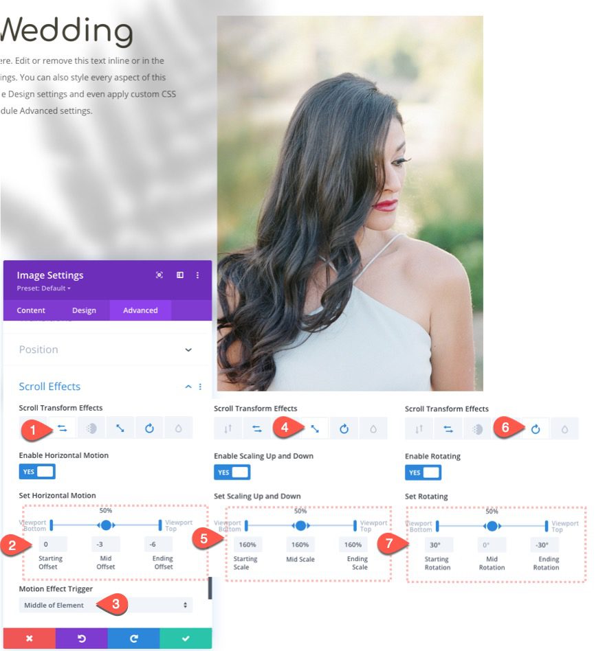
Image Scroll Effects
To move the image shadow, update the following scroll effects.
Under the Horizontal Motion tab…
- Enable Horizontal Motion: YES
- Starting Offset: 0 (at 0%)
- Mid Offset: -3 (at 50%)
- Ending Offset: -6 (at 100%)
Under the Scaling Up and Down tab…
- Enable Scaling Up and Down: YES
- Starting Scale: 160% (at 0%)
- Mid Scale: 160% (at 50%)
- Ending Scale: 160% (at 100%)
(NOTE: This will enlarge the shadow to 160% and keep it there throughout the entire scrolling effect. But feel free to adjust the scale percentages at different points.)
Under the Rotating tab…
- Enable Horizontal Motion: YES
- Starting Rotation: 30° (at 0%)
- Mid Rotation: 0° (at 50%)
- Ending Rotation: -30° (at 100%)
Checking the Result So Far
At this point, we can view the result so far by adding the following margin to the section temporarily so that we can scroll down the live page.
- Margin: 70vh top, 70vh bottom
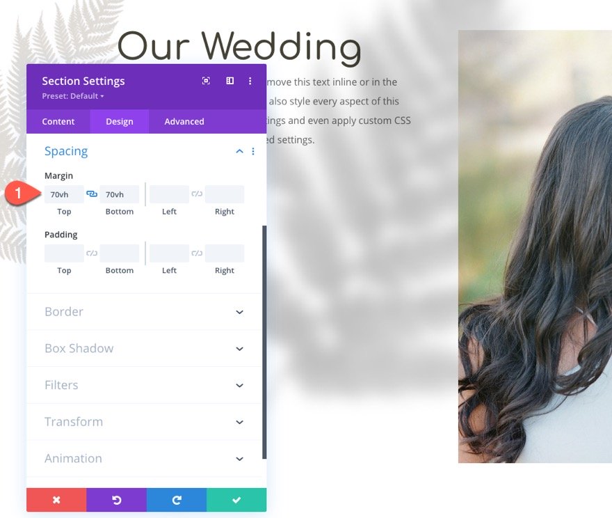
Here is what the effect looks like so far.
Hiding the Column Overflow
In order to contain the image shadow within the same column of the main image, open the settings for column 2, and update the overflow options as follows:
- Horizontal Overflow: Hidden
- Vertical Overflow: Hidden
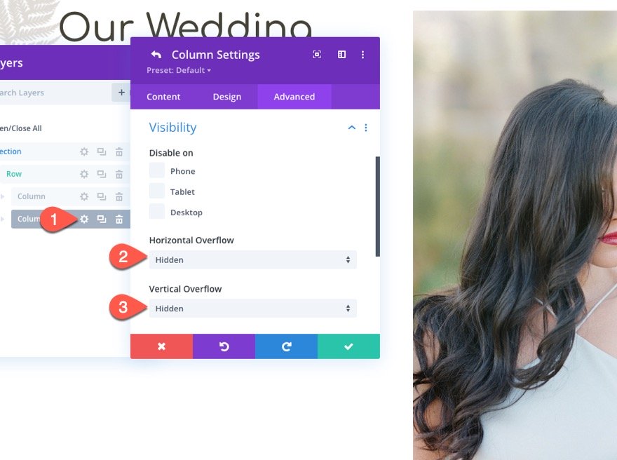
Now check out the result.
Creating Moving Image Shadow 2
Once we have our first image shadow in place, it is easy to create another one. All we need to do is duplicate the existing image shadow and update the scroll effects. The dual moving image shadows will create a beautiful unveiling effect to the image.
Duplicate Existing Image Shadow
Using the Layers modal, duplicate the shadow image.
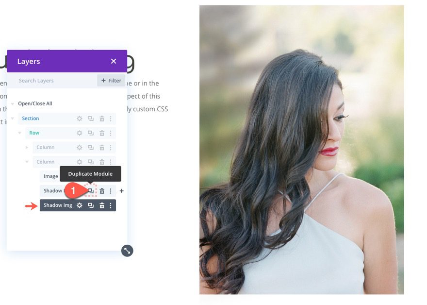
Update Scroll Effects
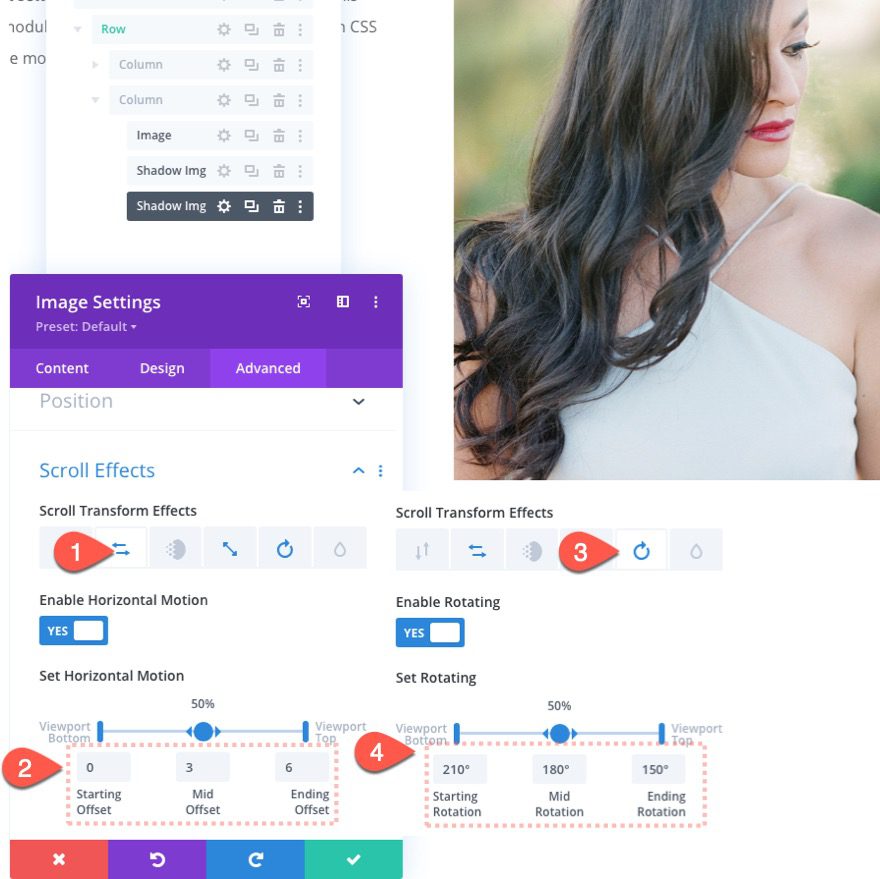
Then open the settings for the duplicate and update the scroll effects as follows:
Under the Horizontal Motion tab…
- Enable Horizontal Motion: YES
- Starting Offset: 0 (at 0%)
- Mid Offset: 3 (at 50%)
- Ending Offset: 6 (at 100%)
Under the Rotating tab…
- Enable Horizontal Motion: YES
- Starting Rotation: 210° (at 0%)
- Mid Rotation: 180° (at 50%)
- Ending Rotation: 150° (at 100%)
Here is the result…
Adding a Zoom-In Effect to the Main Image
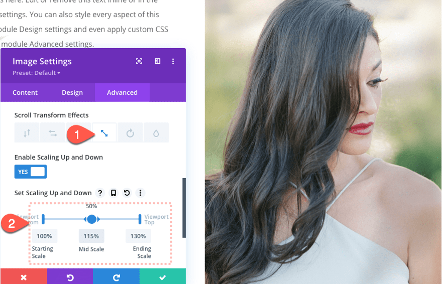
Because the column overflow is hidden, we can scale the main image on scroll to create a subtle zoom-in (or ken burns effect) that will complement the moving image shadows.
To do this, open the settings for the main image and update the following:
Under the Scaling Up and Down tab…
- Enable Scaling Up and Down: YES
- Starting Scale: 100% (at 0%)
- Mid Scale: 115% (at 50%)
- Ending Scale: 130% (at 100%)
This will create a zoom-in effect as the user scrolls.
Final Result
And here is the final result.
Final Thoughts
I hope these moving image shadows were as fun to build for you as they were for me. It is a simple, yet stunning design element that has the potential for even more creative additions. Feel free to explore adding different colors, blend modes, and other scroll effects to make the design your own.
I look forward to hearing from you in the comments.
Cheers!
.inline-code{padding: 0px 4px; color: crimson; font-family: Monaco,consolas,bitstream vera sans mono,courier new,Courier,monospace!important} video.with-border {border-radius: 8px;box-shadow: 0 8px 60px 0 rgba(103,151,255,.11), 0 12px 90px 0 rgba(103,151,255,.11);display:block;margin: 0 auto;}
The post How to Create Moving Image Shadows on Scroll in Divi appeared first on Elegant Themes Blog.

