In today’s Divi tutorial, we’ll be showing you how you can create stunning section chapters for your website. These chapters serve as a guideline for your visitors. It’ll show them when they are entering another section of a page. Usually, chapters are used in combination with one specific background color throughout all of the sections.
If you are considering using section chapters on your website, this post might be a nice place to get some inspiration. We’re going to show you 4 styles of section chapters that you can easily recreate by following this post.
Result
Before we get into the practical side of the four section chapter styles, let’s take a look at what you can expect from the end result.
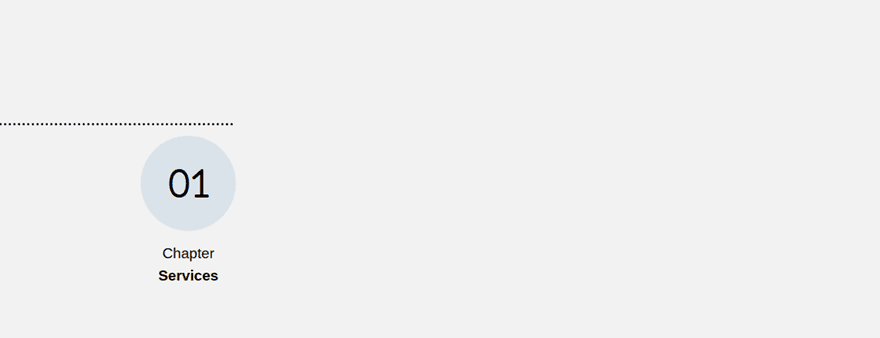
Section Chapter Style #1
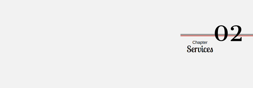
Section Chapter Style #2
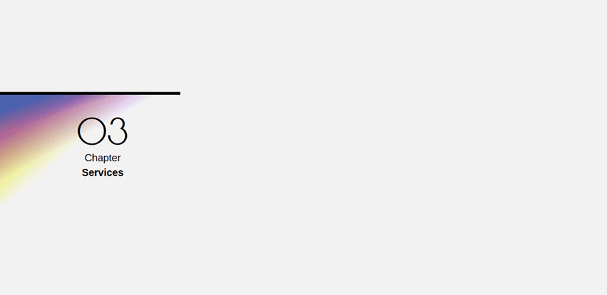
Section Chapter Style #3
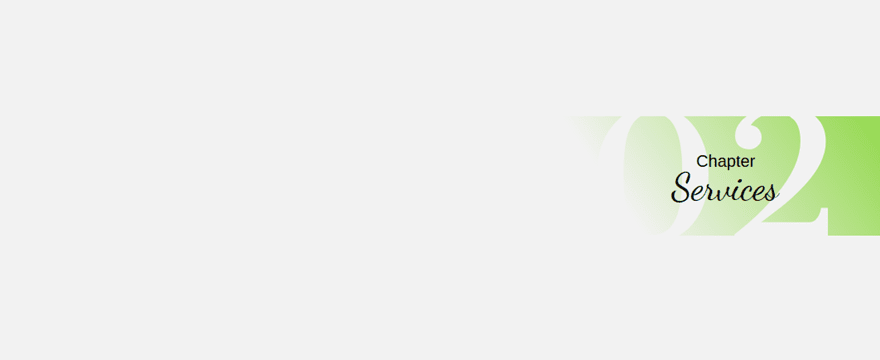
Section Chapter Style #4
How to Create Section Chapters Using Divi’s New Design Options
Subscribe To Our Youtube Channel
Section Chapter Style #1
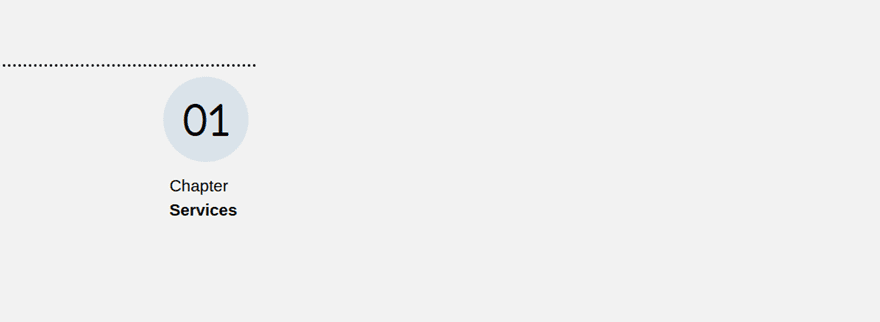
Row Options
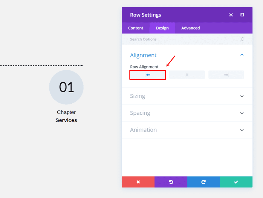
Start by adding a two-column row to the page you’re working on and selecting the left Row Alignment within the Design tab.
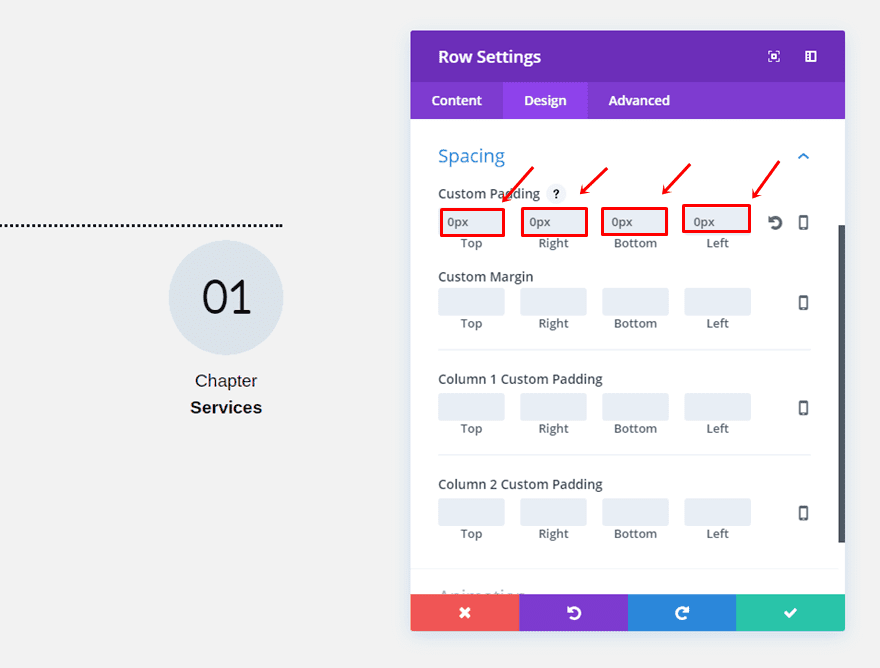
Scroll down the same tab and make sure you select ‘0px’ for the top, right, bottom and left padding. The reason why we’re doing this is to make the row as small as possible so it won’t take up a lot of place in the section.
Divider Module
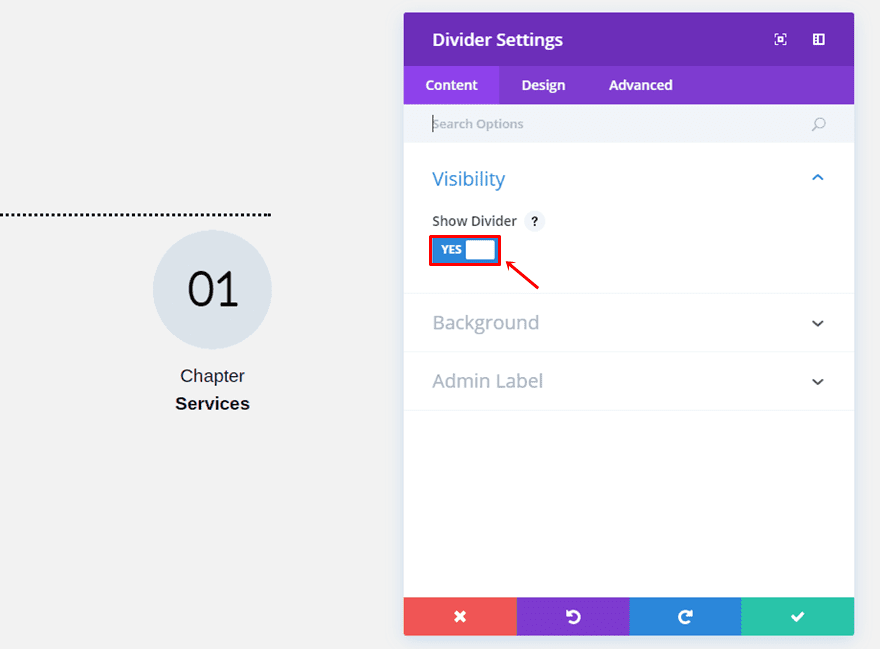
In all of our examples, we’ll only be using one of the two columns (depending on the row alignment). If you’re placing your chapter on the left side of your page, choose the left column. Then, add a Divider Module and enable the ‘Show Divider’ option within the Content tab.
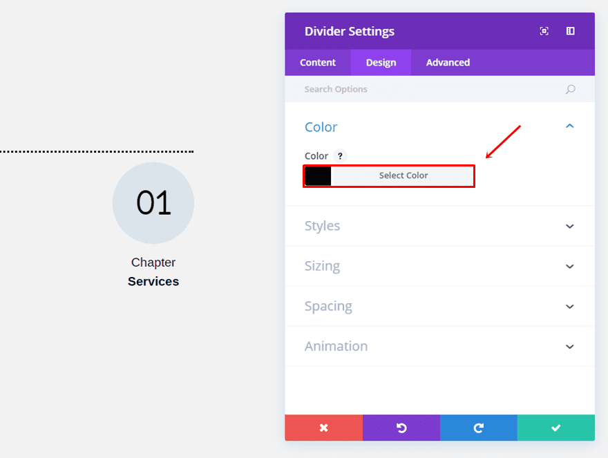
Move on to the Design tab and use ‘#000000’ as your divider color.
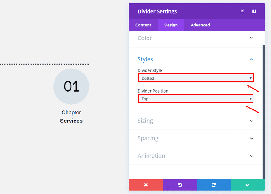
Then, open the Styles subcategory and choose ‘Dotted’ as the Divider Style and ‘Top’ as the Divider Position.
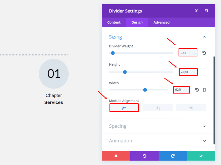
Next, make sure the following settings apply to the Sizing subcategory:
- Divider Weight: 3px
- Height: 23px
- Width: 62%
- Module Alignment: Left
First Text Module
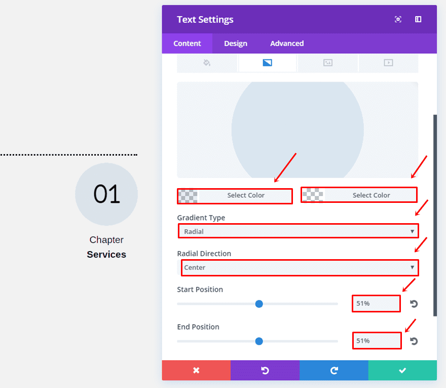
Once you’ve added the Divider Module, it’s time to add the first Text Module right below it. After choosing the chapter number, use the following gradient background:
- First Color: rgba(96,150,193,0.16)
- Second Color: rgba(255,255,255,0)
- Gradient Type: Radial
- Radial Direction: Center
- Start Position: 51%
- End Position: 51%
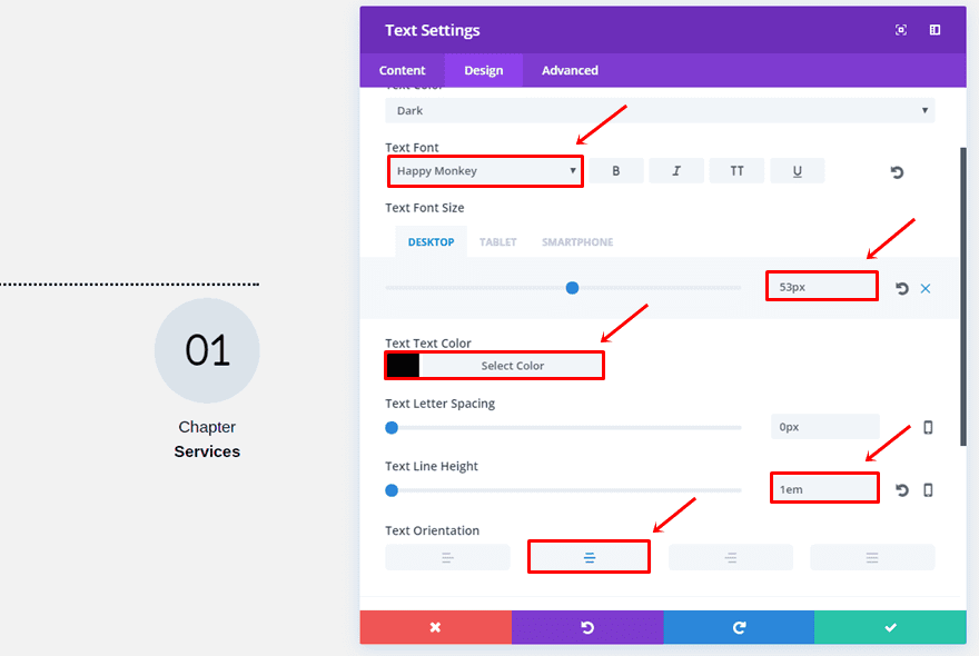
Then, move on to the Design tab and make the following changes to the Text subcategory:
- Text Font: Happy Monkey
- Text Font Size: 53 (Desktop & Tablet), 25 (Phone)
- Text Color: #000000
- Text Line Height: 1em
- Text Orientation: Center
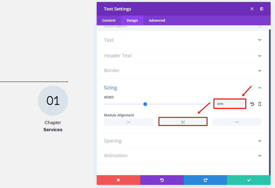
Open the Sizing subcategory, choose a width of ‘40%’ and select the center Module Alignment.
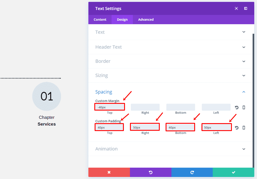
The last thing this Text Module needs is the following custom margin and padding:
- Top Margin: -40px
- Top Padding: 40px
- Right Padding: 50px
- Bottom Padding: 40px
- Left Padding: 50px
Second Text Module
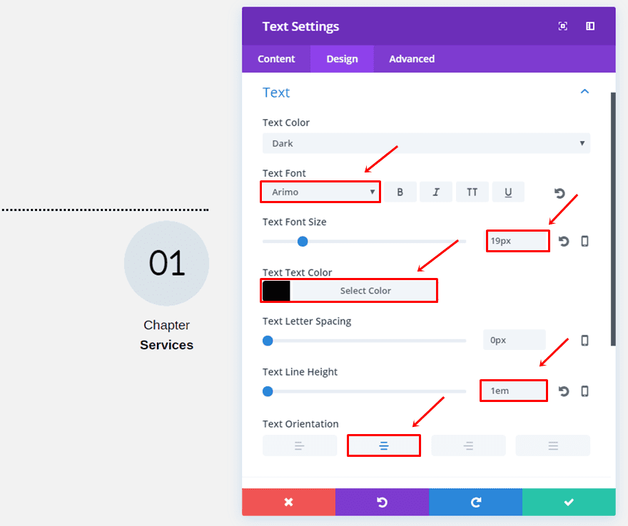
Add another Text Module with the following Text subcategory settings:
- Text Font: Arimo
- Text Font Size: 19px
- Text Color: #000000
- Text Line Height: 1em
- Text Orientation: Center
Scroll down the same tab, use a width of ‘97%’ and enable the center Module Alignment option.
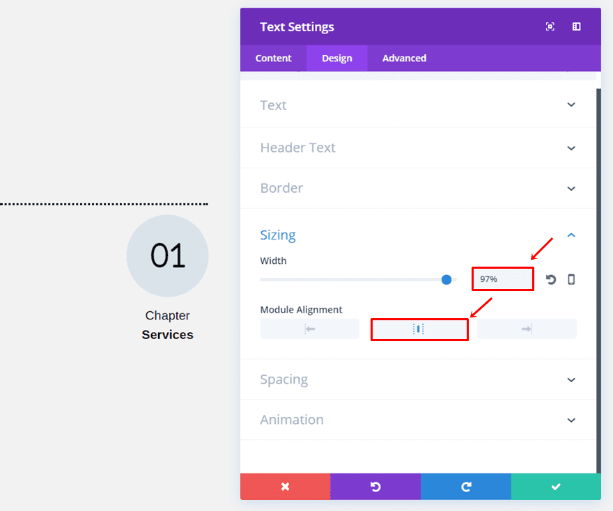
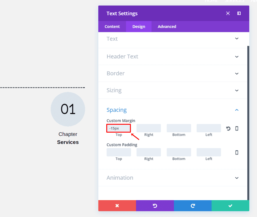
Lastly, add a top margin of ‘-15px’ as well.
Third Text Module
The last Text Module of the section chapter has the following Text subcategory settings:
- Text Font: Arimo
- Text Font Style: Bold
- Text Font Size: 19px
- Text Color: #000000
- Text Line Height: 1em
- Text Orientation: Center
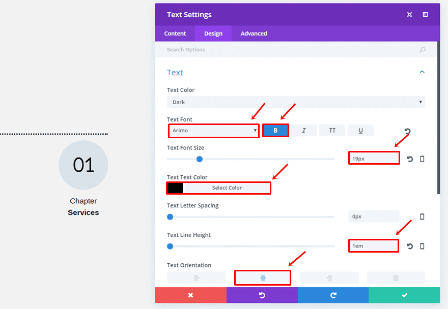
Within the Sizing subcategory, use a width of ‘99%’ and select the center Module Alignment.
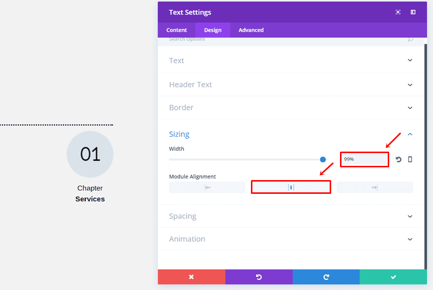
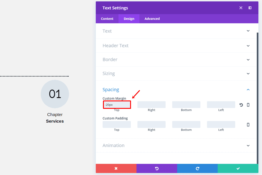
The last thing you’ll need to do for this section chapter is adding a top margin of ‘-20px’.
Section Chapter Style #2

Row Options
The second example is located on the right side of the screen. Once again, add a two-column row but choose the right Row Alignment instead.
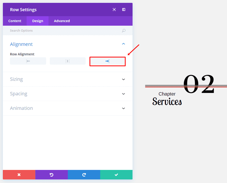
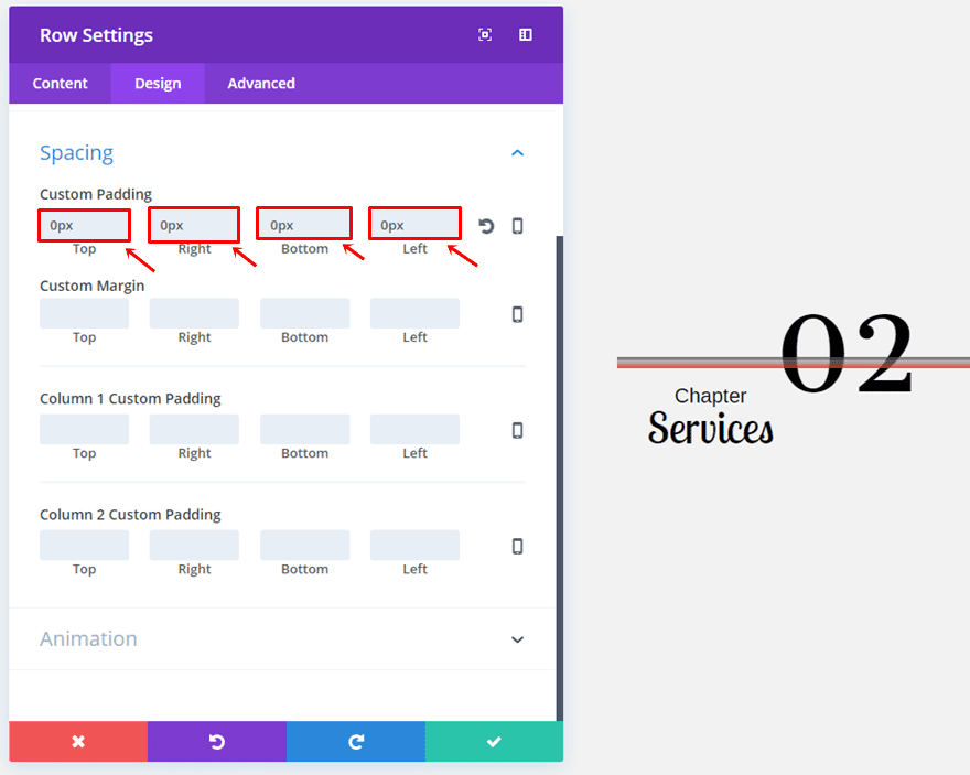
Open the Spacing subcategory and assign ‘0px’ to the top, right, bottom and left padding.
Divider Module
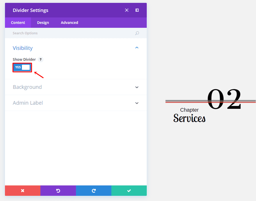
Add a Divider Module to the column on the right and enable the ‘Show Divider’ option.
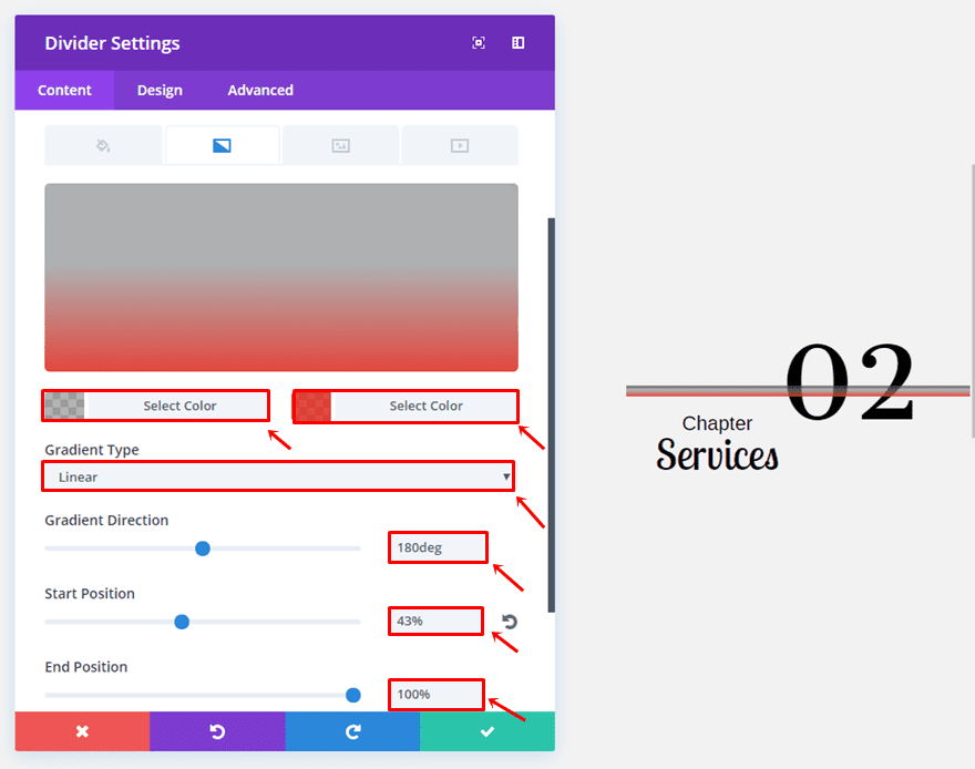
We’re going to use the following gradient background for the divider:
- First Color: rgba(132,132,132,0.61)
- Second Color: rgba(224,43,32,0.86)
- Gradient Type: Linear
- Gradient Direction: 180deg
- Start Position: 43%
- End Position: 100%
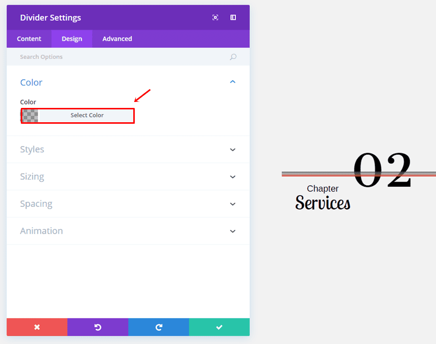
Move on to the Design tab and select ‘rgba(0,0,0,0.26)’ as the divider color.
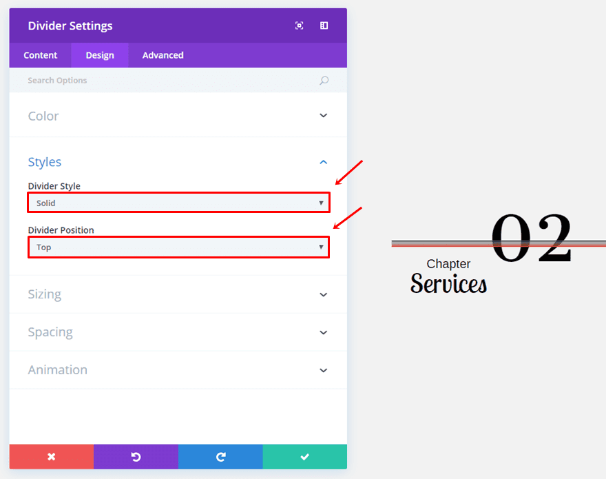
Next, use ‘Solid’ as the Divider Style and ‘Top’ as the Divider Position.
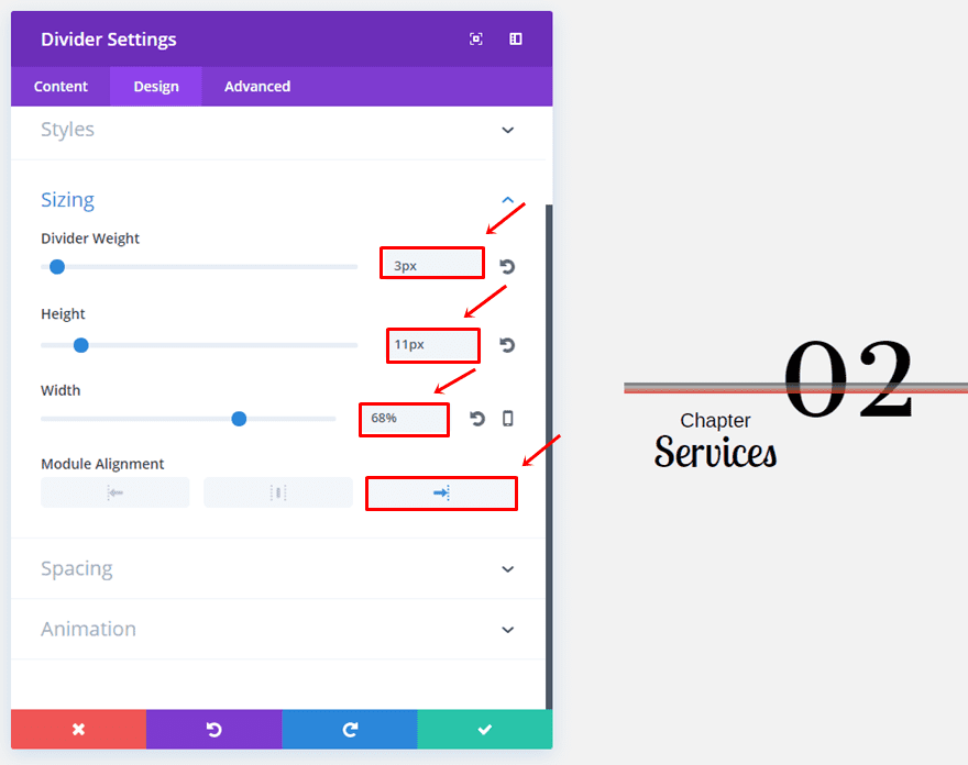
Then, open the Sizing subcategory and make the following settings apply:
- Divider Weight: 3px
- Height: 11px
- Width: 68%
- Module Alignment: Right
First Text Module
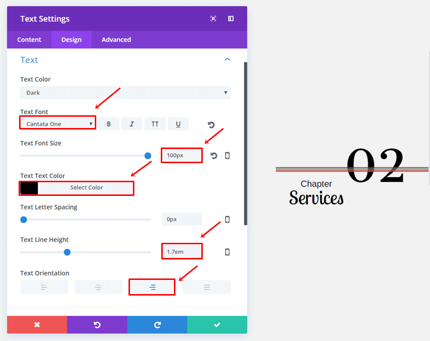
The first Text Module has the following Text subcategory settings:
- Text Font: Cantata One
- Text Font Size: 100px
- Text Color: #000000
- Text Line Height: 1.7em
- Text Orientation: Right
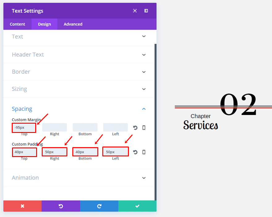
Open the Spacing subcategory and use the following custom margin and padding:
- Top Margin: -95px
- Top Padding: 40px
- Right Padding: 50px
- Bottom Padding: 40px
- Left Padding: 50px
Second Text Module
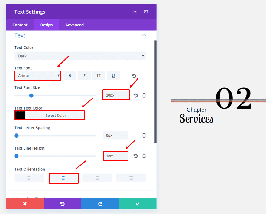
Add another Text Module and use the following Text subcategory settings instead:
- Text Font: Arimo
- Text Font Size: 20px
- Text Color: #000000
- Text Line Height: 1em
- Text Orientation: Center
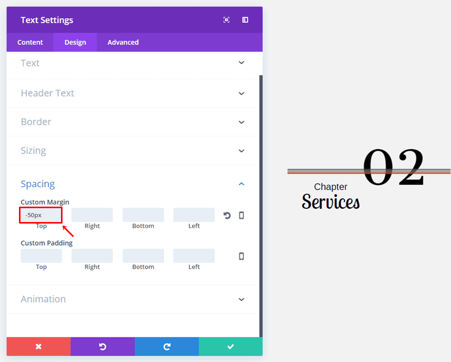
Next, add a top margin of ‘-50px’.
Third Text Module
The third and last Text Module of this example has the following Text subcategory settings:
- Text Font: Lobster Two
- Text Font Size: 43px
- Text Color: #000000
- Text Line Height: 1em
- Text Orientation: Center
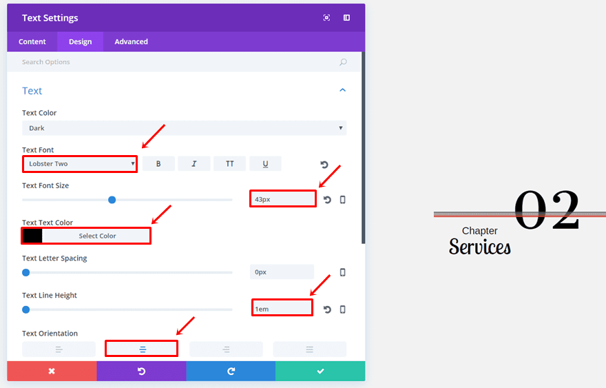
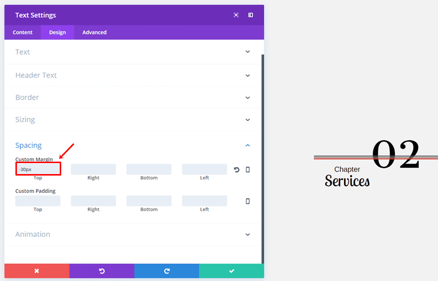
Lastly, add a top margin of ‘-30px’.
Section Chapter Style #3

Row Options
For the third example, we are going to use a two-column row with the following Column 1 gradient background:
- First Color: #edf000
- Second Color: rgba(255,255,255,0)
- Column 1 Gradient Type: Linear
- Column 1 Gradient Direction: 139deg
- Column 1 Start Position: 11%
- Column 1 End Position: 36%
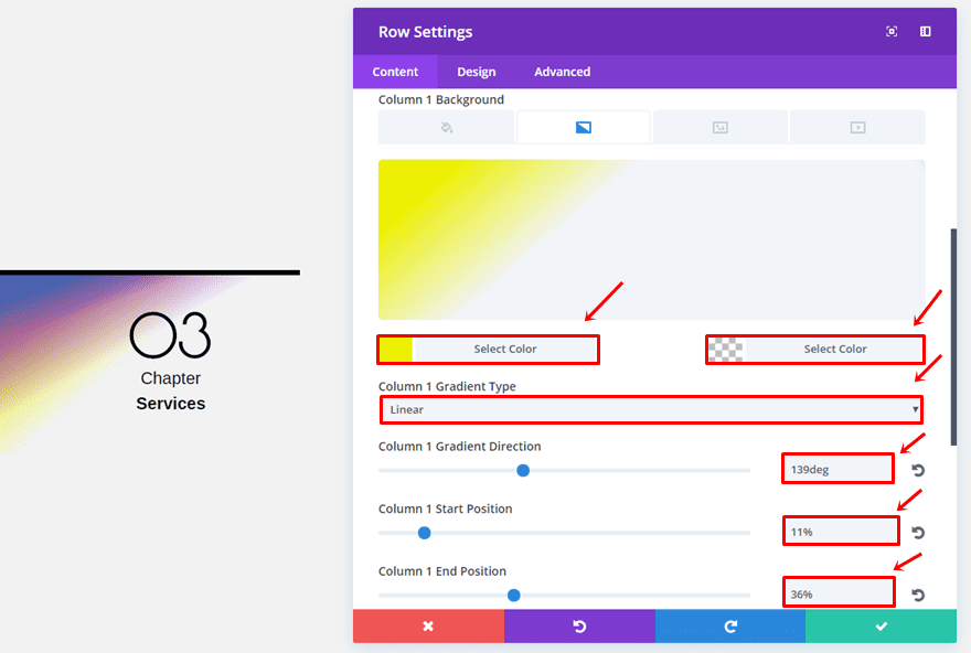
Go to the Design tab and select the left Row Alignment.
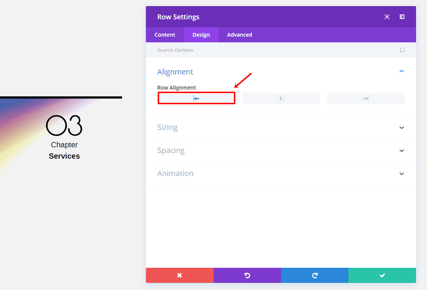
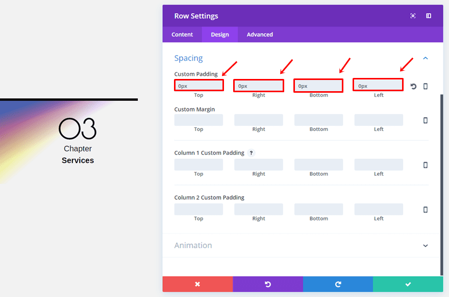
Once again, we’re going to use ‘0px’ for the top, right, bottom and left margin.
Divider Module
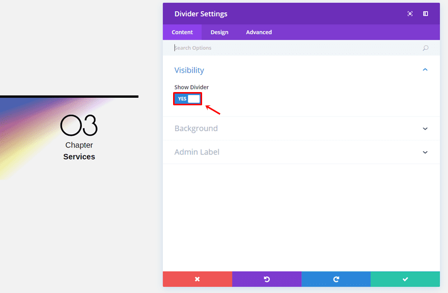
Now, add a Divider Module to the left column and enable the ‘Show Divider’ option.
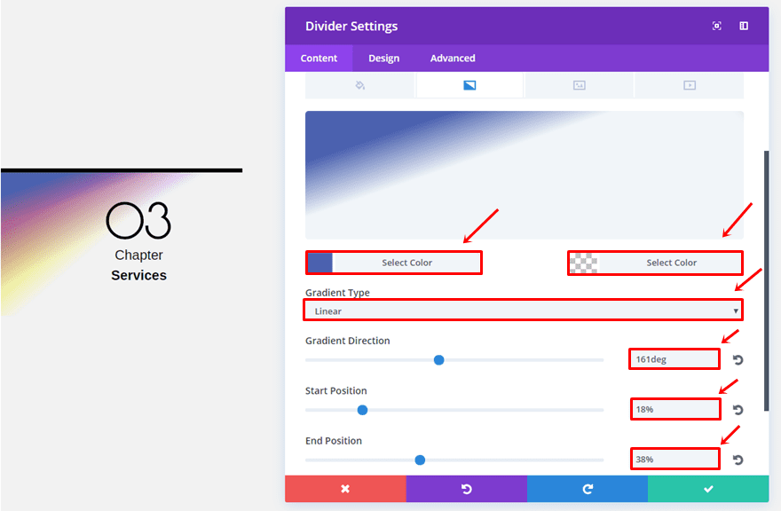
Open the Background subcategory and use the following gradient background:
- First Color: #4b61af
- Second Color: rgba(255,255,255,0)
- Gradient Type: Linear
- Gradient Direction: 161deg
- Start Position: 18%
- End Position: 38%
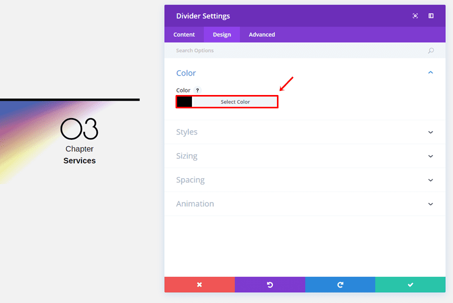
Open the Design tab and choose ‘#000000’ as the divider color.
Within the Styles subcategory, use ‘Solid’ as the Divider Style and ‘Top’ as the Divider Position.
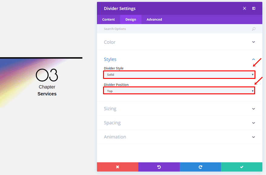
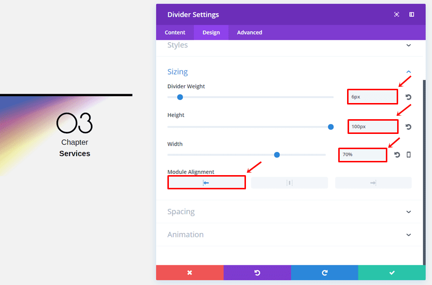
Then, make sure the following settings apply to the Sizing subcategory:
- Divider Weight: 6px
- Height: 100px
- Width: 70%
- Module Alignment: Left
First Text Module
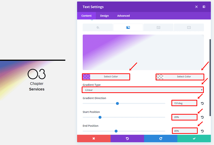
Continue by adding the first Text Module right below the Divider Module and choosing the following gradient background:
- First Color: rgba(131,0,233,0.58)
- Second Color: rgba(255,255,255,0)
- Gradient Type: Linear
- Gradient Direction: 151deg
- Start Position: 20%
- End Position: 40%
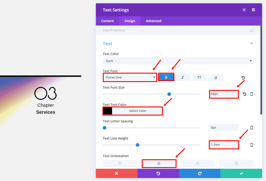
Go to the Design tab and use the following Text subcategory settings:
- Text Font: Poiret One
- Text Font Style: Bold
- Text Font Size: 69px
- Text Color: #000000
- Text Line Height: 1.7em
- Text Orientation: Center
Open the Sizing subcategory, use a width of ‘70%’ and select the left Module Alignment.
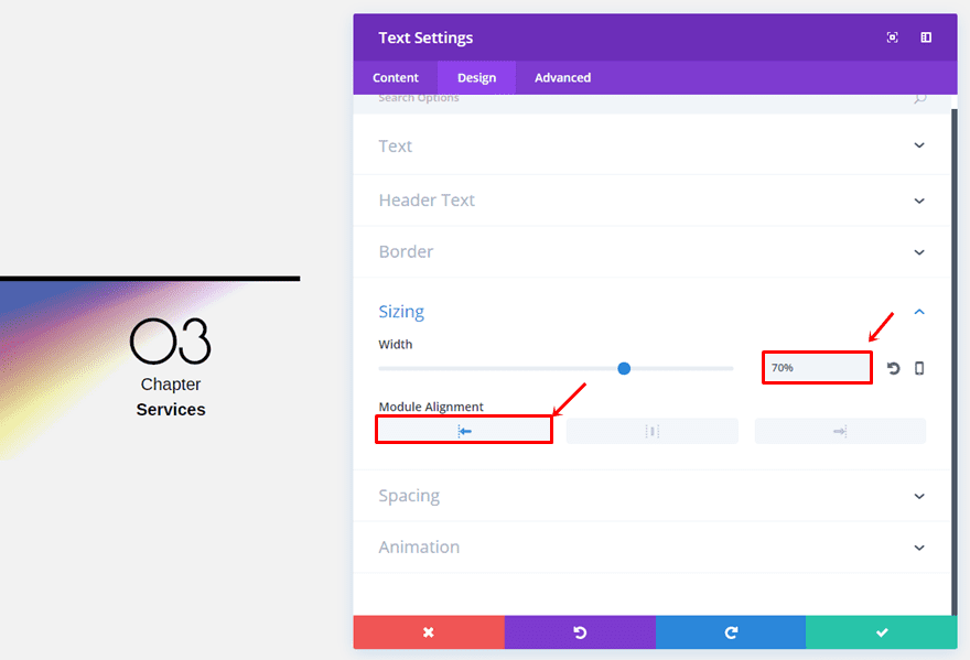
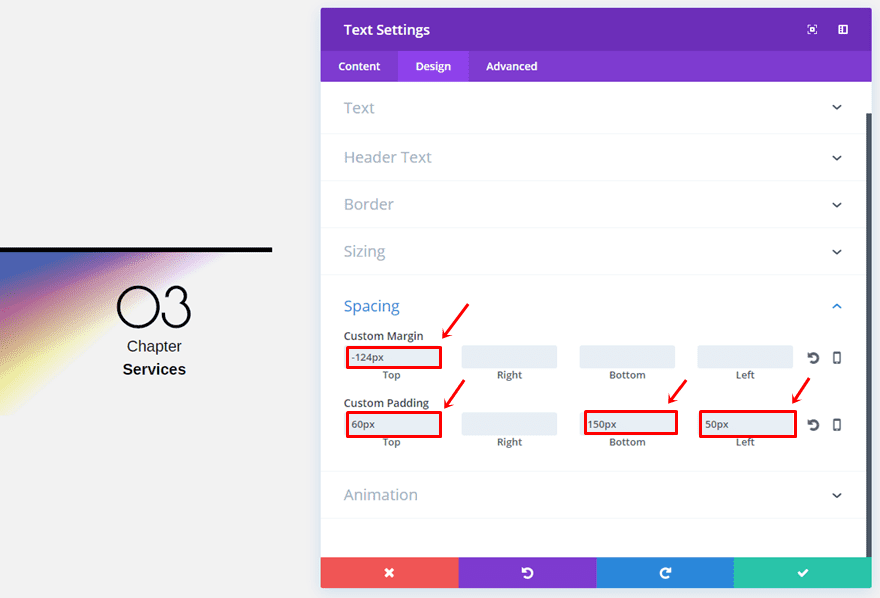
Lastly, use the following custom margin and padding:
- Top Margin: 124px
- Top Padding: 60px
- Bottom Padding: 150px
- Left Padding: 50px
Second Text Module
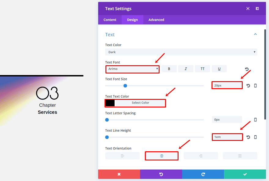
Go ahead and add another Text Module with the following Text subcategory settings:
- Text Font: Arimo
- Text Font Size: 20px
- Text Color: #000000
- Text Line Height: 1em
- Text Orientation: Center
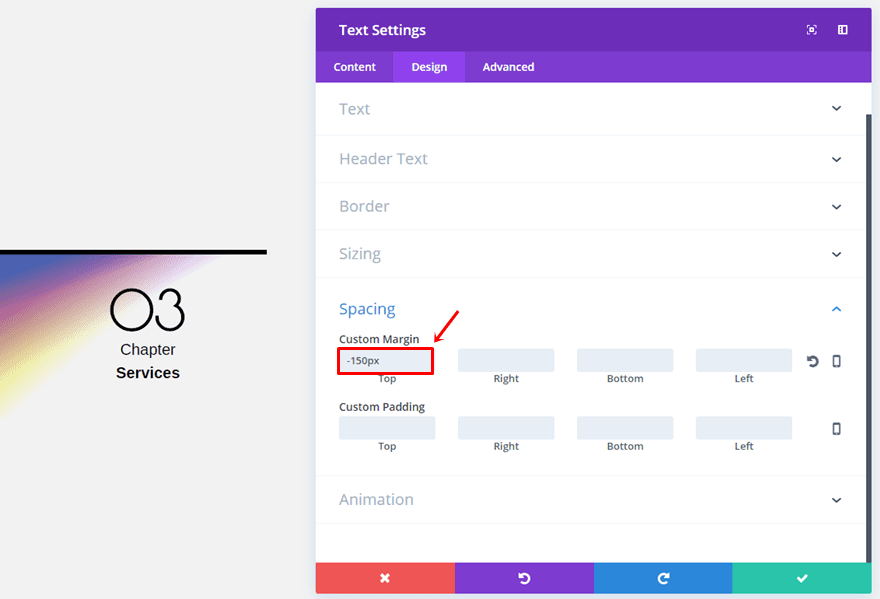
Open the Sizing subcategory, select a width of ‘80%’ and choose the left Module Alignment.

Lastly, add a top margin of ‘-150px’.
Third Text Module
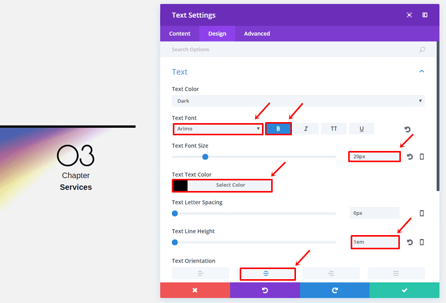
Add the last Text Module to the first column and make sure the following Text subcategory settings apply:
- Text Font: Arimo
- Text Font Style: Bold
- Text Font Size: 20px
- Text Color: #000000
- Text Line Height: 1em
- Text Orientation: Center
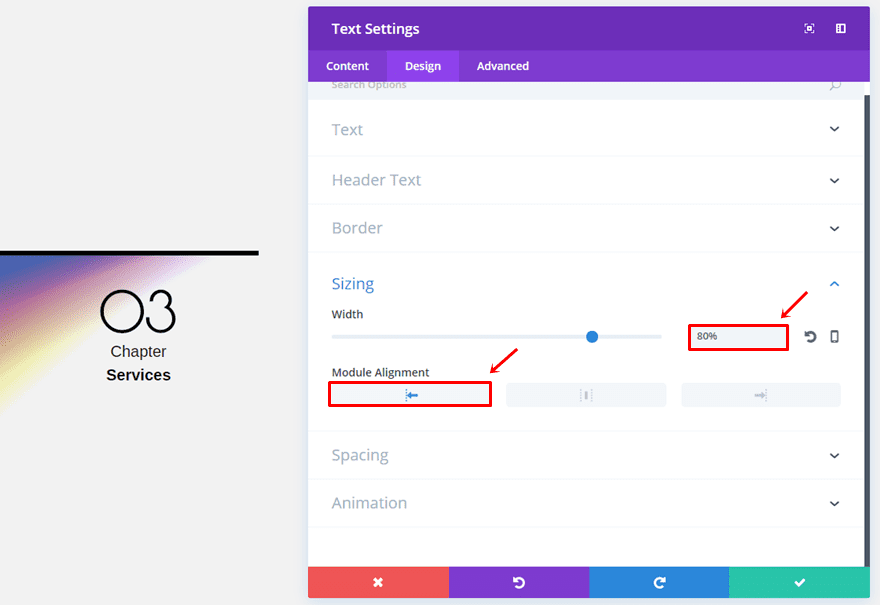
Open the Sizing subcategory, use a width of ‘80%’ and choose the left Module Alignment.
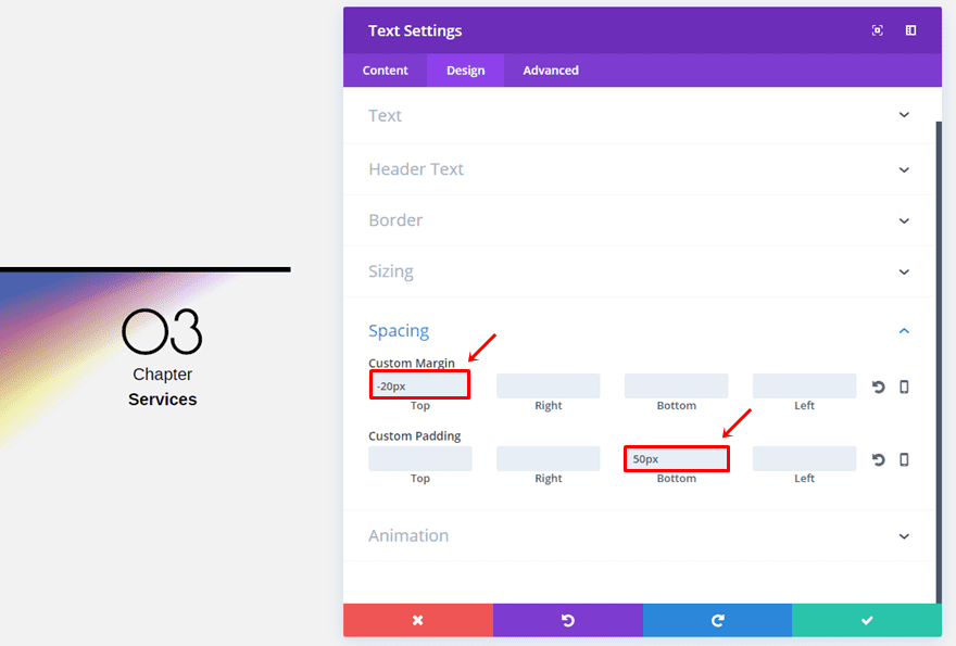
Lastly, choose a top margin of ‘-20px’ and a bottom padding of ’50px’.
Section Chapter Style #4

Row Options
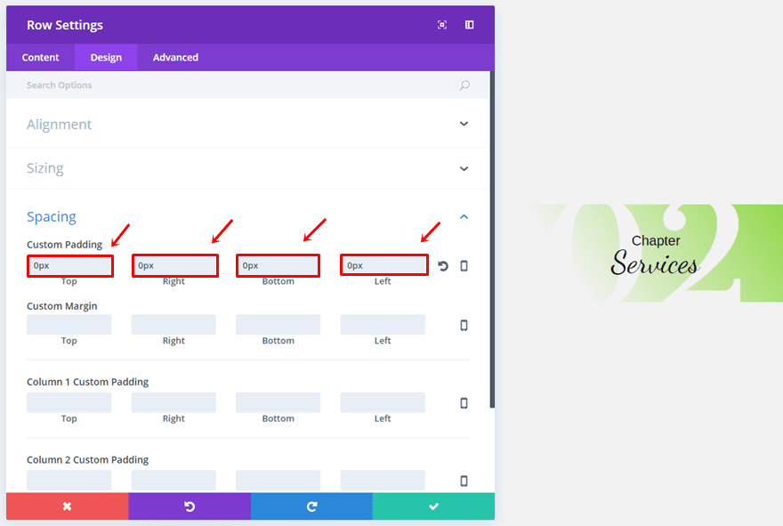
For the last example, we’re going to use the right Row Alignment again.
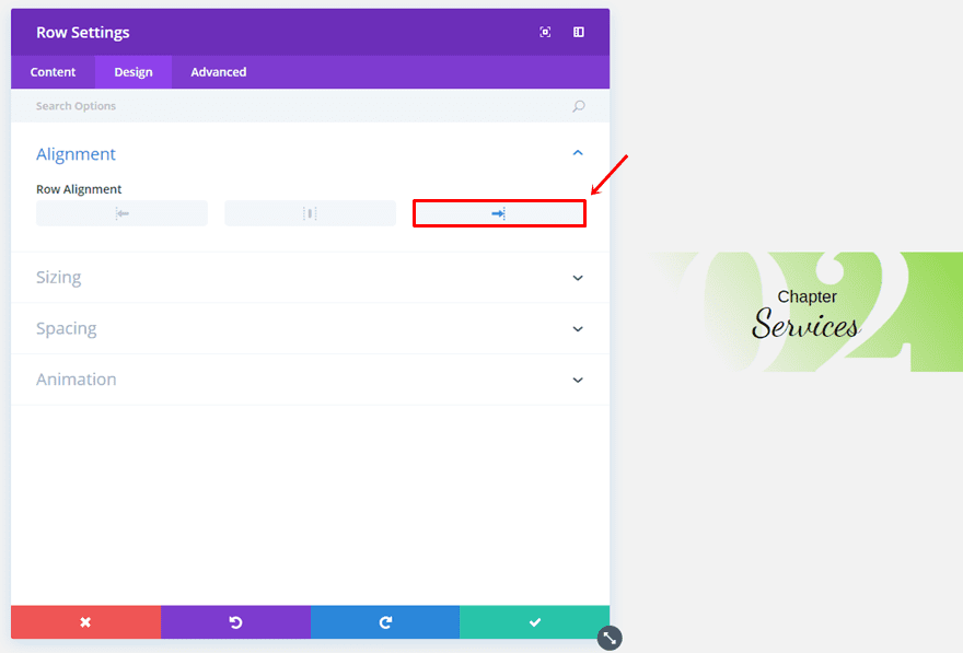
Then, open the Spacing subcategory and assign ‘0px’ to the top, right, bottom and left padding.
First Text Module
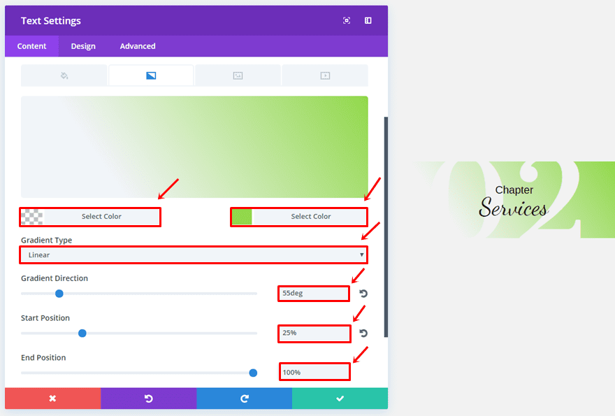
This last example doesn’t contain a Divider Module so go ahead and add a Text Module to the left column. Once you’ve done that, choose the following gradient background:
- First Color: rgba(255,255,255,0)
- Second Color: #92d84b
- Gradient Type: Linear
- Gradient Direction: 55deg
- Start Position: 25%
- End Position: 100%
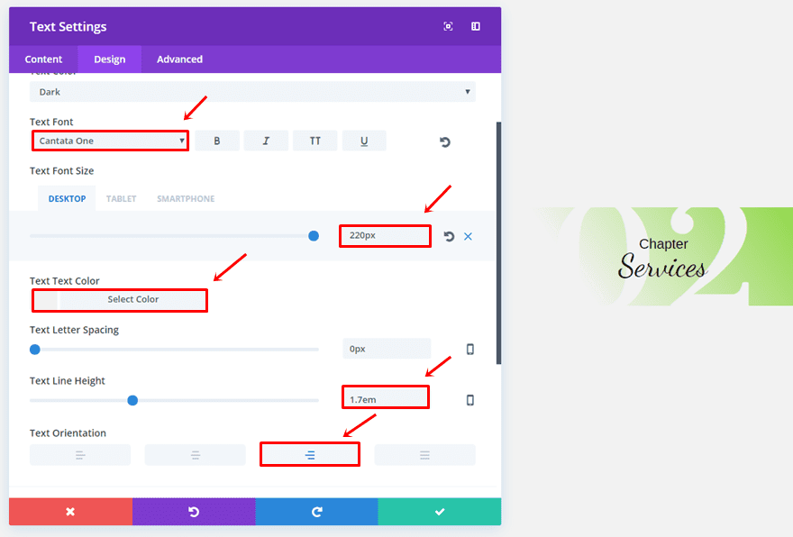
Then, go to the Design tab and make sure the following Text subcategory settings apply:
- Text Font: Cantata One
- Text Font Size: 220 (Desktop & Tablet), 100px (Phone)
- Text Color: #f2f2f2 (Match with the section background color)
- Text Line Height: 1.7em
- Text Orientation: Right
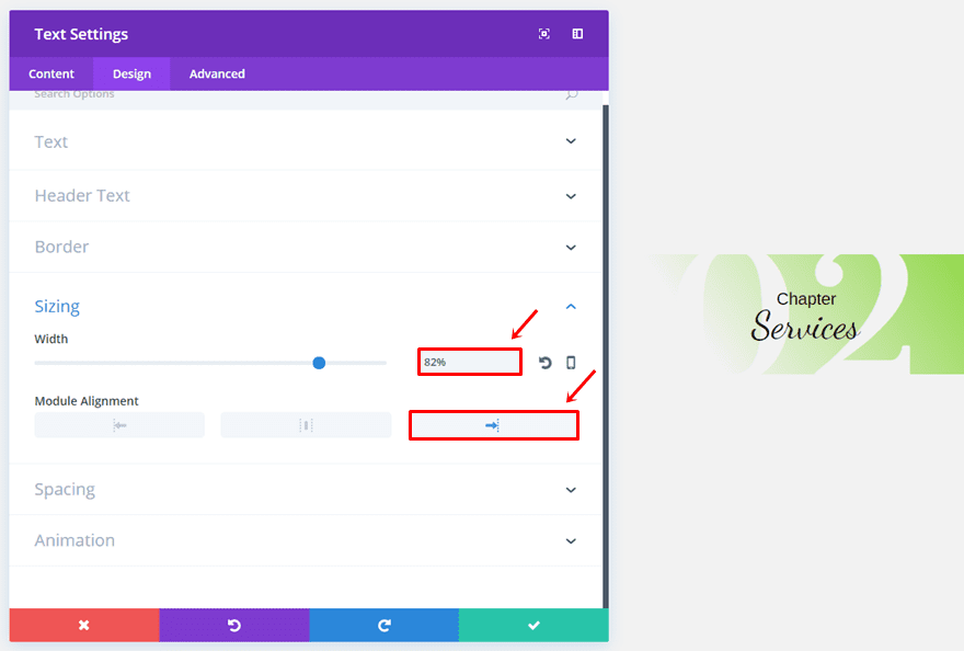
Open the Sizing subcategory, use a width of ‘82%’ and select the right Module Alignment.
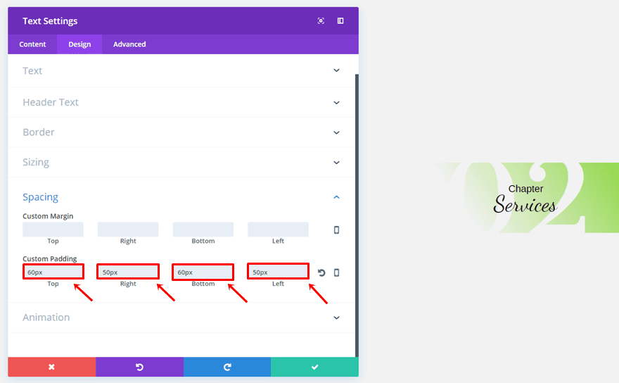
Lastly, use the following custom padding:
- Top: 60px
- Right: 50px
- Bottom: 60px
- Left: 50px
Second Text Module
Add another Text Module and use the following settings within the Text subcategory:
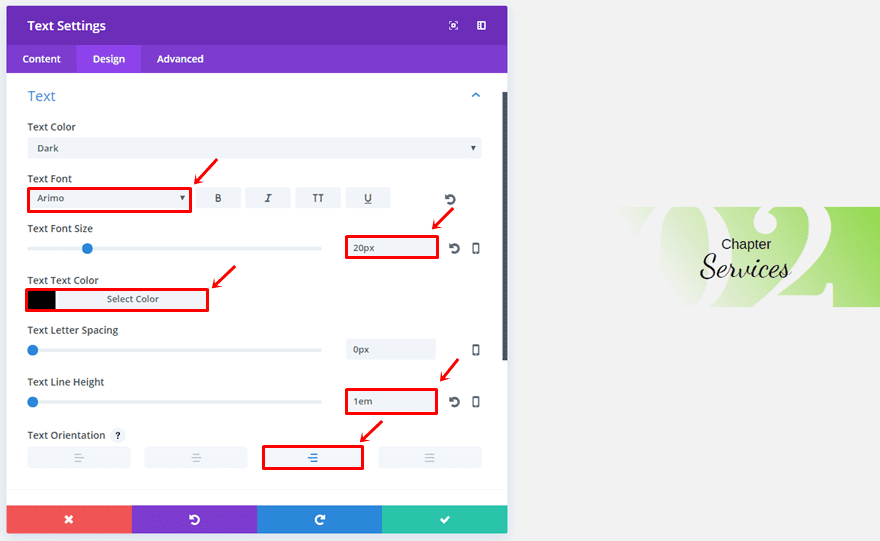
- Text Font: Arimo
- Text Font Size: 20px
- Text Color: #000000
- Text Line Height: 1em
- Text Orientation: Right
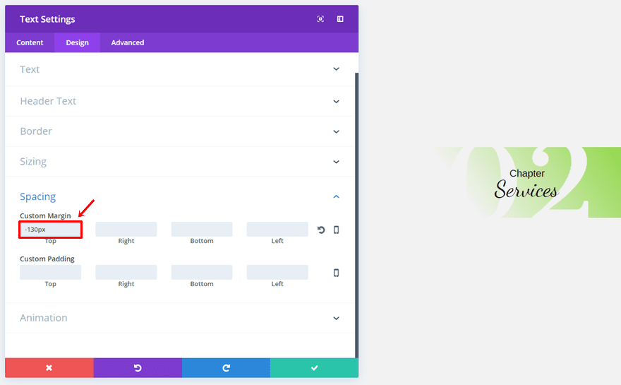
Open the Sizing subcategory, choose a width of ‘39%’ and choose the center Module Alignment.

Lastly, add ‘-130px’ to the top margin.
Third Text Module
The last Text Module of this chapter example has the following Text subcategory settings:
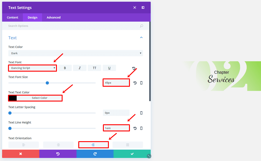
- Text Font: Dancing Script
- Text Font Size: 45px
- Text Color: #000000
- Text Line Height: 1em
- Text Orientation: Right
Open the Sizing subcategory, choose a width of ‘50%’ and select the center Module Alignment.
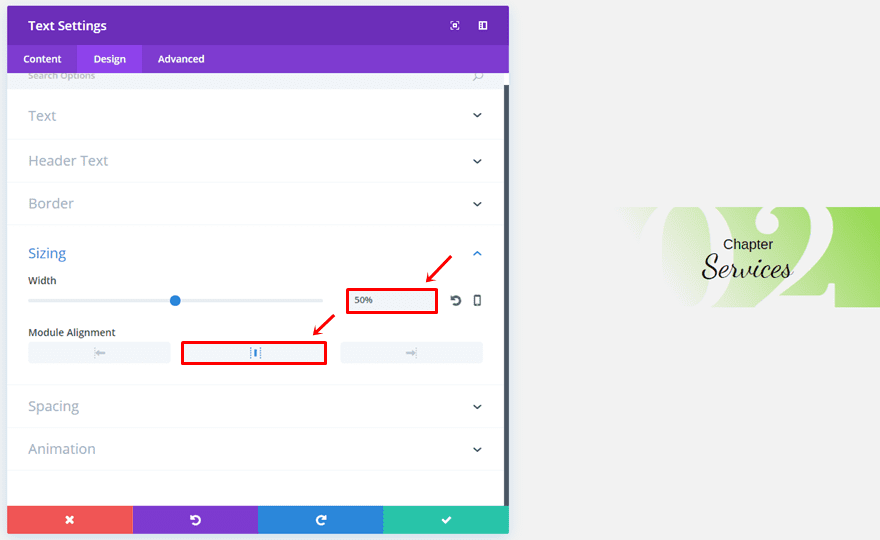
Last but not least, choose a top padding of ‘-30px’ and you’re done!

Final Thoughts
In this post, we’ve shown you how you can creatively create and style section chapters on your website. These chapter sections allow you to create a division between sections while using the same background color for each one of the sections. If you have questions or suggestions; make sure you leave a comment in the comment section below!
Be sure to subscribe to our email newsletter and YouTube channel so that you never miss a big announcement, useful tip, or Divi freebie!
Featured Image by Kwok Design / shutterstock.com
The post How to Create Section Chapters Using Divi’s New Design Options appeared first on Elegant Themes Blog.
