Divi’s new background pattern masks have opened up a lot of design options for backgrounds. They work great with the background colors and patterns to create lots of unique designs. In this post, we’ll see how to create subtle background pattern masks with Divi. We’ll also discuss the advantages of using a subtle mask and create three examples.
Let’s get started.
Subscribe To Our Youtube Channel
Background Pattern Mask Preview
Before we start designing, here’s a look at what we’ll build in this Divi tutorial.
Background Pattern Mask Example One
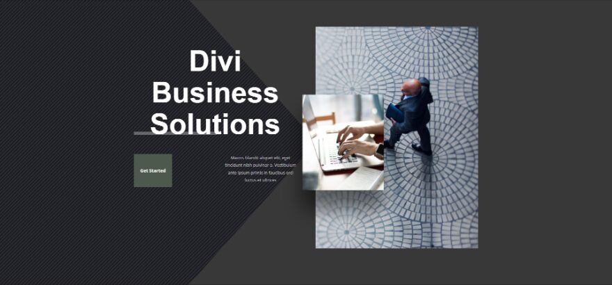
Mask Example Two

Mask Example Three

How to Create a Background Mask
The background mask will cover the background pattern and allow portions of the pattern to show through. It works great with background colors and patterns. You can adjust the background to fit the content, adjust the content to fit the background, or adjust both.
First, open the settings for the section you want to add the background mask.

Next, you’ll need to choose a background color for the section. Scroll down to Background. With the Background tab selected, choose your background color from the color picker.

Next, you’ll need to choose a background pattern and set its size and location. Select the Background Pattern tab and click Add Background Pattern.

This opens a list of pattern options. Choose your pattern from the list. It will fill the section.

Next, you’ll need to choose a background mask and adjust its color and settings to fit your design. Select the Background Mask tab and click Add Background Mask.

Another modal will open with mask options. Choose your background mask from the list. The mask will be white until you choose a color.

Adjust the background mask settings to get the look you want. You can change the size, position, direction the mask is facing, rotation, and more. Playing around with these settings can help you create some interesting designs.

Here’s a look at the background I just created without any modules. The colors are similar, but they’re different enough to stand out just a little bit. This keeps it from being too distracting.

How to Create a Subtle Background Pattern Mask
One of the best design directives for a background mask is to make it subtle. It shouldn’t be the focal point of the page design. Use it for background texture to create a small amount of visual variation. Your content should be the focus. Use the background mask to help support the content. Here are a few things to consider when creating a subtle background pattern mask.
Choose Matching Colors
Choose colors for your patterns and masks that don’t differ too much from the section’s background color. The colors shouldn’t have high contrast with each other. The colors should be different enough to see the mask and patterns, but not so much that it’s overpowering. Use the same color for the pattern and background, and then choose a slightly lighter or darker color for the mask.
Adjust for Legibility
Prioritize legibility in your design. Legibility should always be a priority over making the design look good. The content in a design that looks good but is difficult to read gets ignored.
Try Different Pattern Sizes
Play around with the different pattern sizes to see what you can create. Custom sizes can give you more flexibility over the design and can give you a more unique design.
Try all the Background Mask Settings
Play around with all the background mask settings to see what you can create. Also, try the settings with the background pattern settings to see what you like. All these settings can work together to create some interesting designs.
Subtle Background Pattern Mask Examples
Now, let’s look at three subtle background pattern mask examples. I’m adding the background mask to the hero section of the free Corporate landing page that’s available within Divi. Here’s a look at the original page before we add the background pattern masks.

We’ll also change the background colors of the buttons. Using the same subtle design concepts, we’ll make them stand out more than in the background. The divider is another element that we’ll see change color, but this element uses transparency to get its color from the background, so we won’t need to make changes to its color.
Background Pattern Mask Example One
This example will use the original background and button colors.

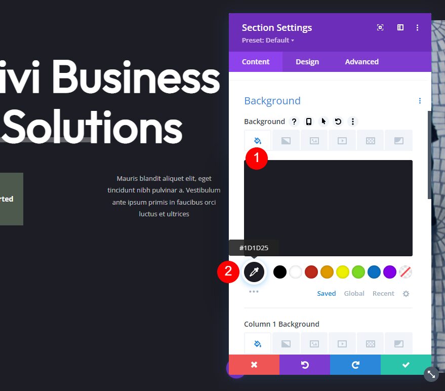
Background Color
For our first example, we’re using the original Background Color of this layout – #1d1d25. We’ll also keep the original Button Color – #4c594c
- Background Color: #1d1d25
- Button Color: #4c594c
Background Pattern
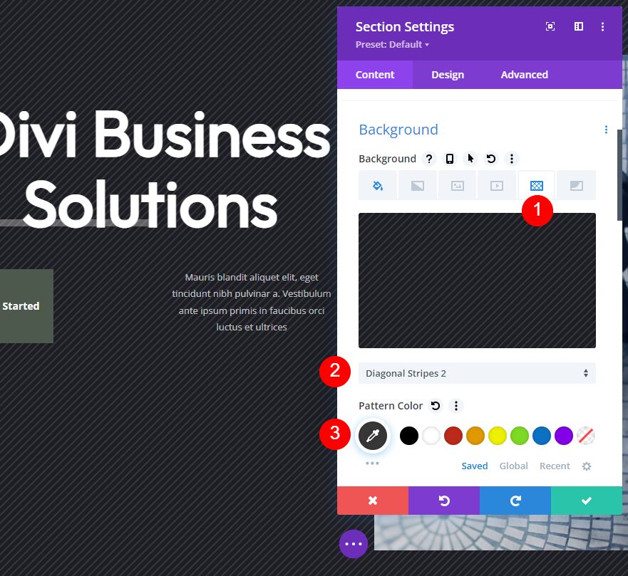
Select the Background Pattern tab and choose Diagonal Stripes 2. Change the Pattern Color to #383838.
- Background Pattern: Diagonal Stripes 2
- Pattern Color: #383838
- Pattern Size: Actual Size
- Pattern Repeat Origin: Top Left
- Pattern Repeat: Repeat
Background Mask
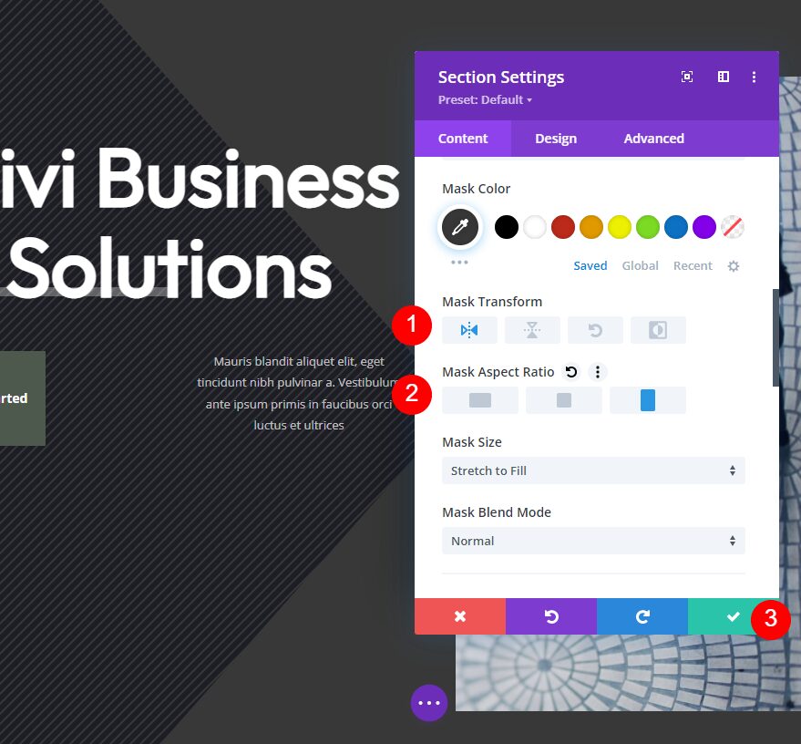
Next, select the Background Mask tab. Choose Caret and set the color to #383838.
- Mask: Caret
- Mask Color: #383838
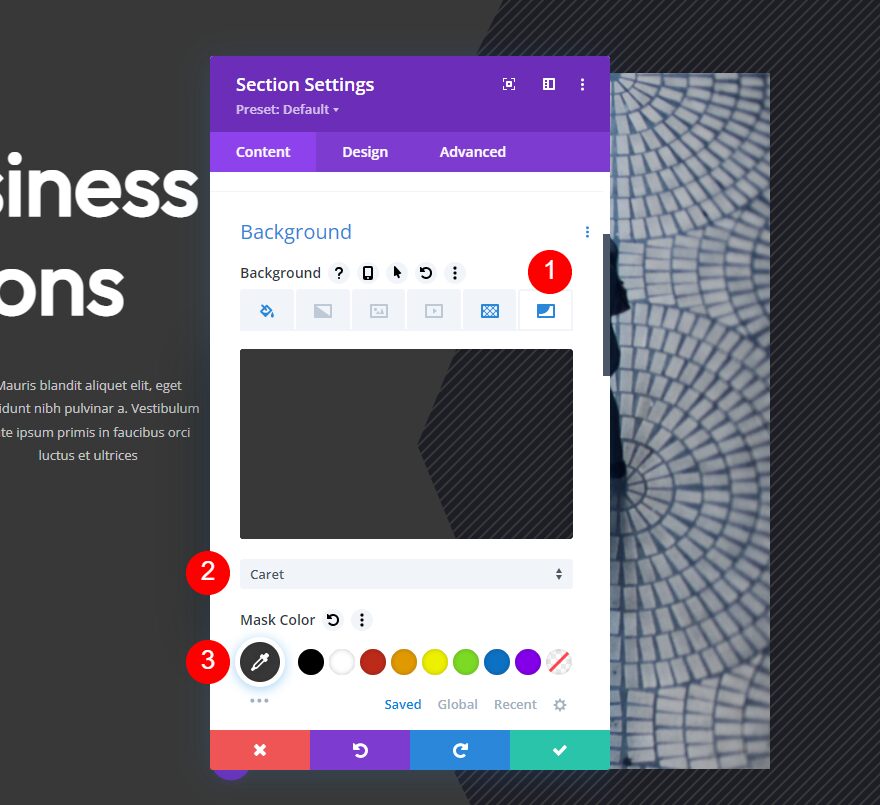
Under the Mask Color, select the horizontal Transform option and the portrait Aspect Ratio. Close the section’s settings and save your work.
- Transform: Horizontal
- Aspect Ratio: Tall (portrait)
Background Pattern Mask Example Two
For our second example, we’ll change the background and button colors to purple.

Background Color
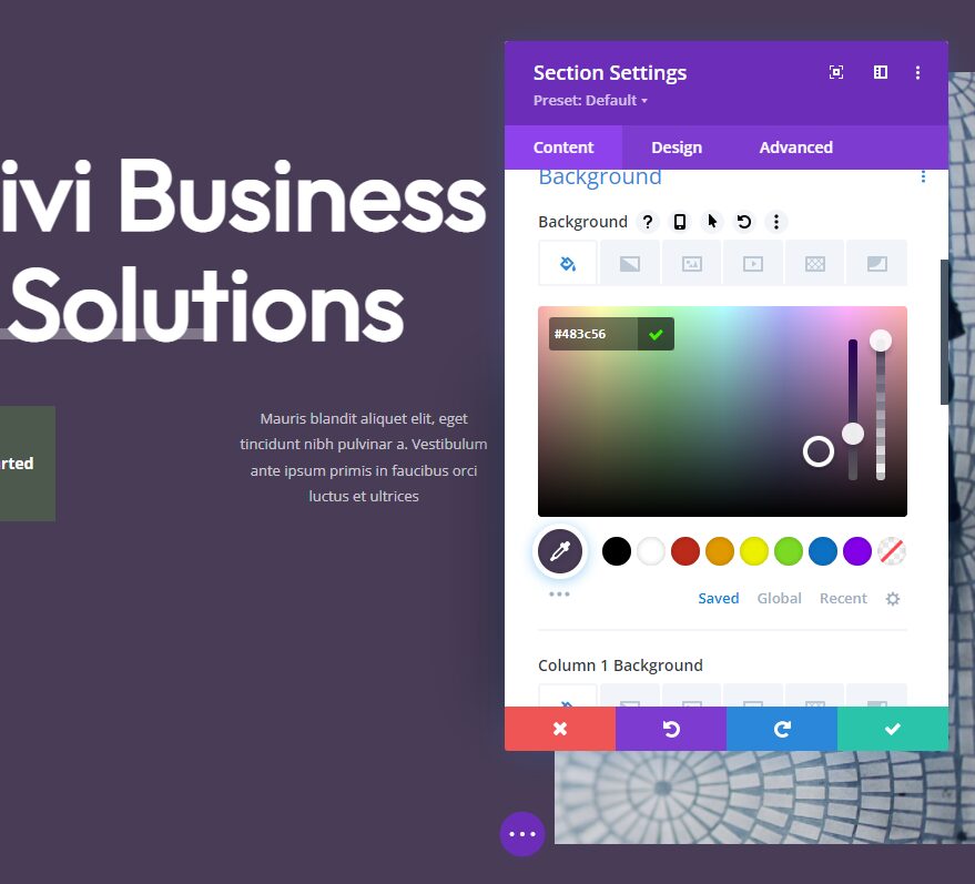
Open the section settings. Make sure you’re on the Background Color tab and change the Background Color to #483c56.
- Background Color: #483c56
Background Pattern
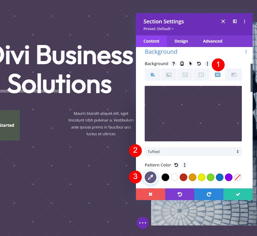
Next, select the Background Pattern tab and choose Tufted for the Background Pattern. Change the Pattern Color to #635c84.
- Background Pattern: Tufted
- Pattern Color: #635c84
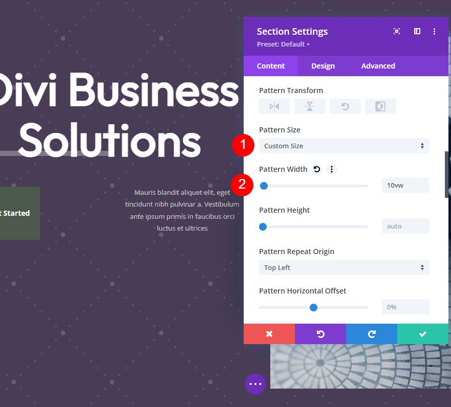
Next, choose Custom Size. This opens another set of options. Change the Width to 10vw.
- Size: Custom Size
- Width: 10vw
- Pattern Repeat Origin: Top Left
- Pattern Repeat: Repeat
Background Mask
Now it’s time to set up our background mask. Select the Background Mask tab and choose the Mask named Arch. Change its Color to #67557a.
- Mask: Arch
- Mask Color: #67557a
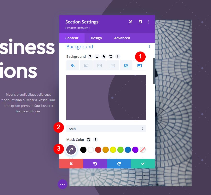
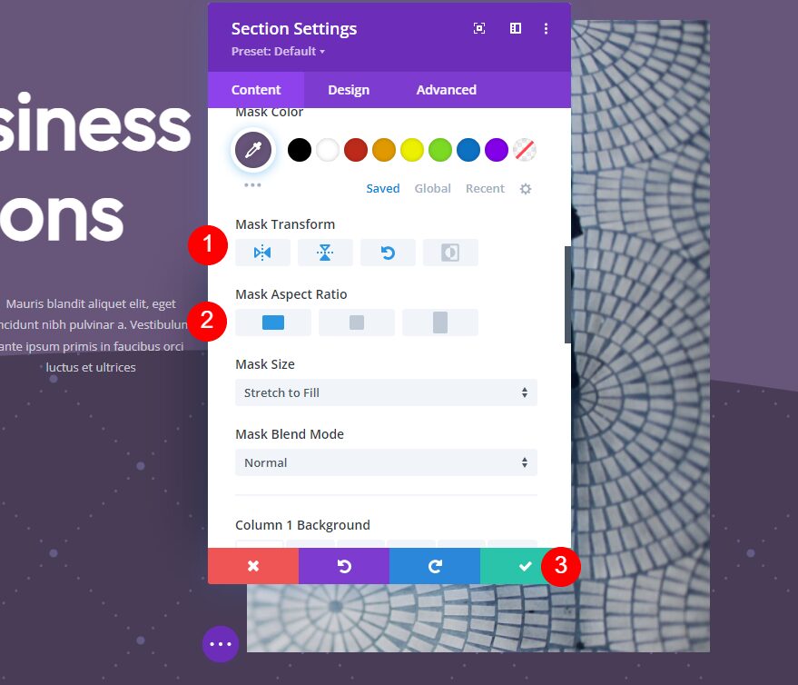
Next, set its Transform options to Horizontal, Vertical, and Rotate. For the Aspect Ratio, choose the wide, or landscape, option. Close the section’s settings.
- Transform: Horizontal, Vertical, and Rotate
- Aspect Ratio: Wide (landscape)
Button
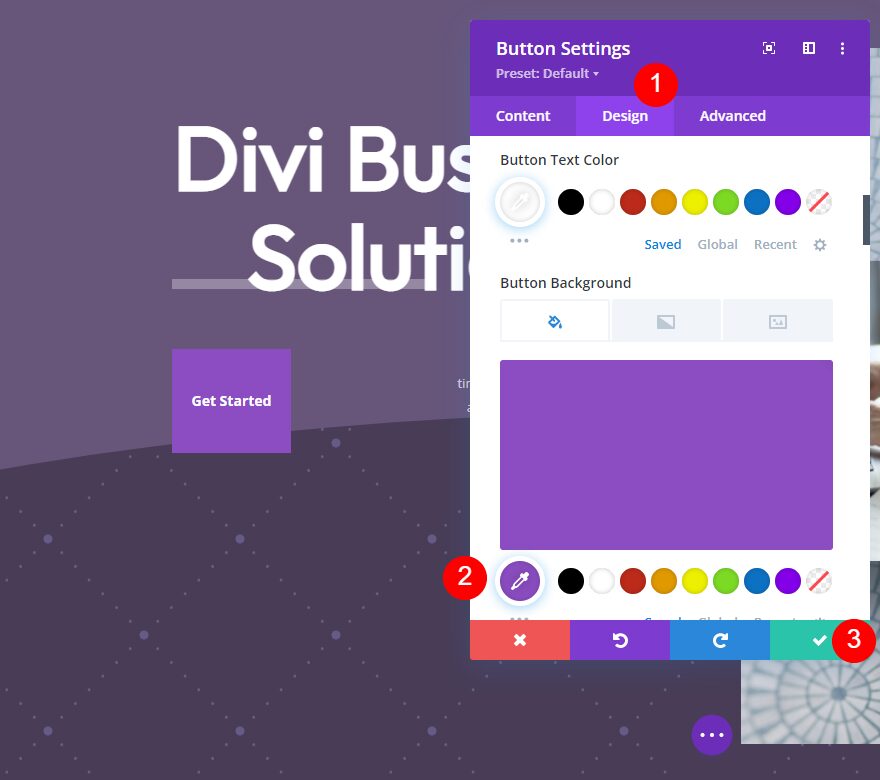
Finally, let’s adjust the CTA button in this hero section. We want it to blend in with the design, but we also want it to stand out. Open the button’s settings. We’ll only need to change the Background Color. It can be a similar color to the background, but different enough that it doesn’t get lost on the page. We’ll go with a brighter color for the background. We’ll leave the Text Color the same.

Select the design tab, scroll down to Background, and change the Button Background Color to #8b4dc1. This gets us the contrast that we want and it works great with the purple background. Close the button’s settings and save your page.
- Button Background Color: #8b4dc1
Background Pattern Mask Example Three
For our third example, we’ll change the background and button colors to green using the same concepts as the previous two examples.

Background Color
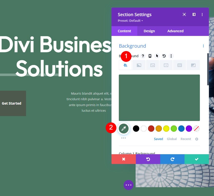
First, open the section’s settings. With the Background Color tab selected, change the Background Color to #497762.
- Background Color: #497762
Background Pattern
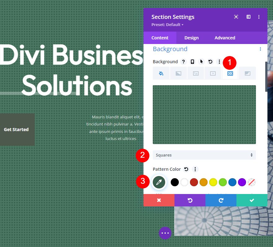
Next, select the Background Pattern tab, choose Squares, and change the Color to #3a604e. We’ll leave the squares their original size and apply the mask over most of them.
- Background Pattern: Squares
- Pattern Color: #3a604e
- Pattern Size: Actual Size
- Pattern Repeat Origin: Top Left
- Pattern Repeat: Repeat
Background Mask
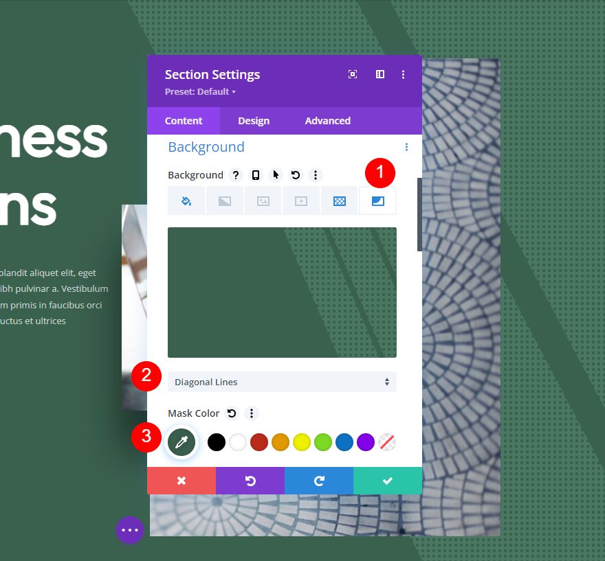
Next, select the Background Mask tab. Choose Diagonal Lines for the Mask and change the Color to #3a604e.
- Mask: Diagonal Lines
- Mask Color: #3a604e
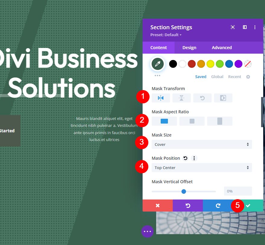
Next, set Transform to Horizontal and choose the wide, or landscape, option for the Aspect Ratio. Set the Size to Cover and the Mask Position to Top Center. Close the section’s settings.
- Transform: Horizontal
- Aspect Ratio: Wide (landscape)
- Size: Cover
- Mask Position: Top Center
Button
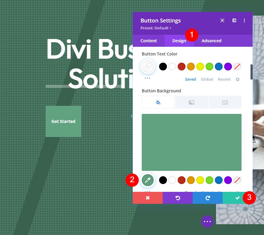
Finally, open the button’s settings and select the design tab. Scroll down and change the Button Background Color to #61a380. Close the module’s settings and save your work.
- Button Background Color: #61a380
Background Pattern Mask Results
Here’s how our background pattern masks look within the hero section of our layout.
Background Pattern Mask Example One Result

Mask Example Two Result

Mask Example Three Result

Ending Thoughts
That’s our look at how to create subtle background pattern masks with Divi. A subtle mask stands out just enough to give the background some visual texture. They look great without drawing attention away from your CTAs and other elements. Divi’s background pattern masks are simple to use, and their settings ensure you can create something unique. Experiment with the settings to create your own background pattern masks.
We want to hear from you. Do you create your own subtle background pattern masks for your Divi backgrounds? Let us know about your experience in the comments.
The post How to Create Subtle Background Pattern Masks with Divi (3 Examples) appeared first on Elegant Themes Blog.
