Using toggles on your web page is a great way to organize your content in a clean and concise manner. This can help boost the user experience by cutting down on scrolling and giving the user more control over what they want to see on your page. An online restaurant menu is a good example where toggles can work well. A user can easily find the menu item they like and click the item for more information.
In this tutorial, I’m going to show you how create some intuitive and mobile friendly toggles for your restaurant menu using Divi toggles. I’ll even show you how optimize your toggle for mobile and embed Divi image galleries inside of your toggle content to showcase stunning photos of specific dishes.
Let’s get started.
The Before and After
Here is a sneak peek of the before and after for the restaurant menu design we will be building.
Before
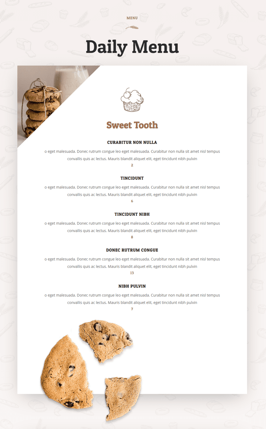
After
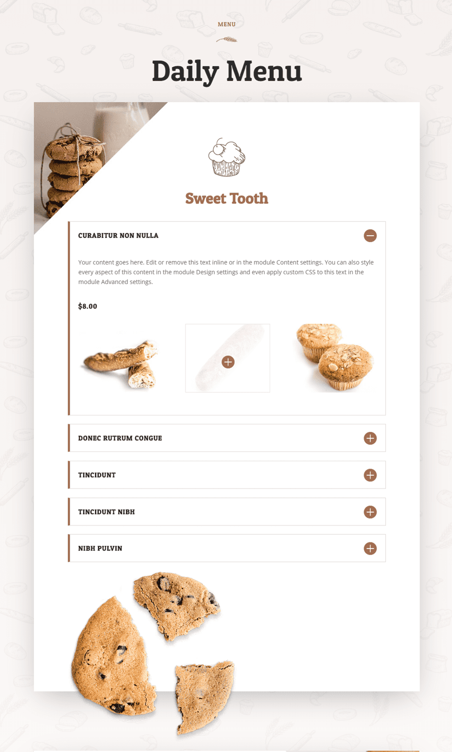

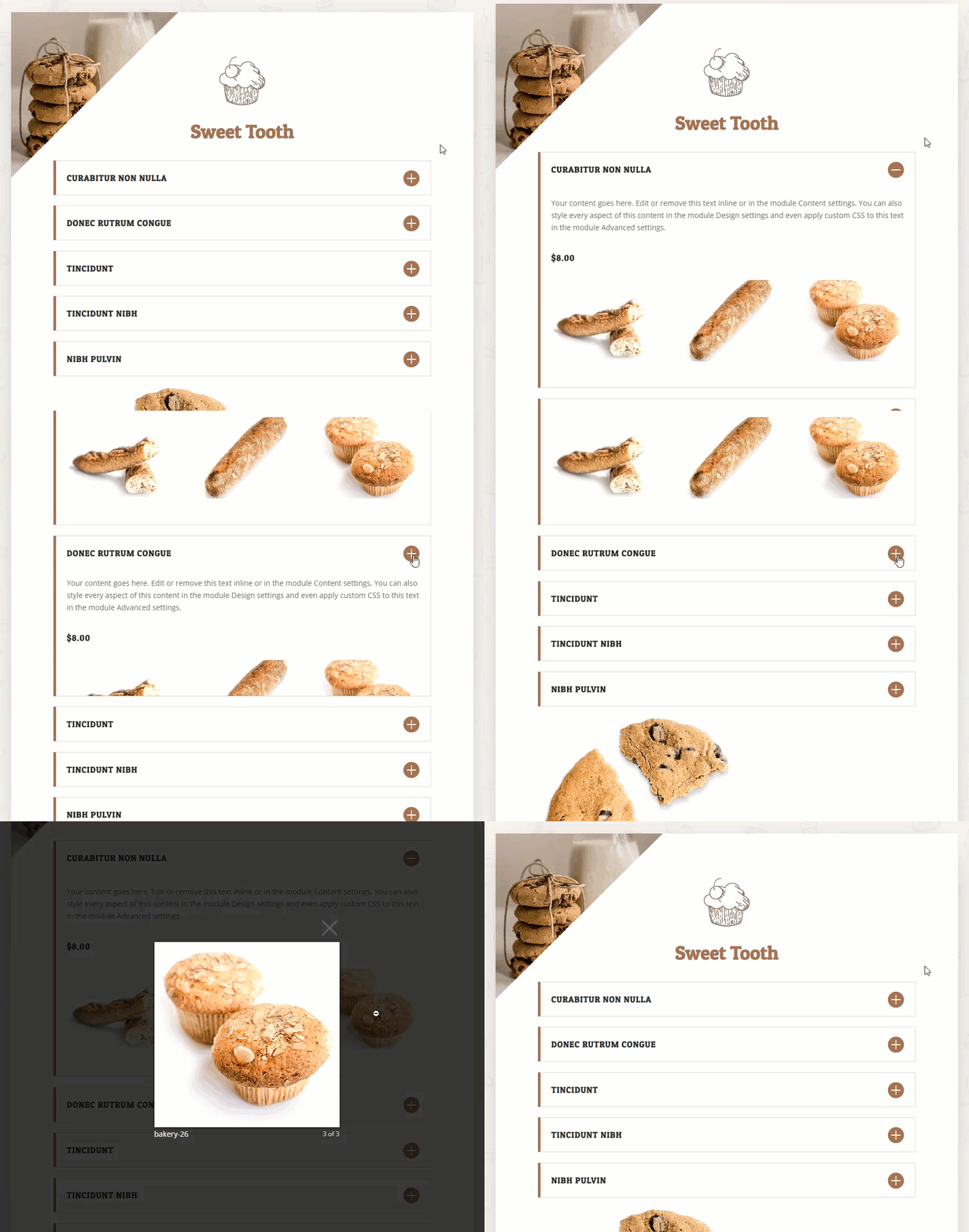
Getting Started
Replacing WordPress Gallery Display with Divi Gallery Display
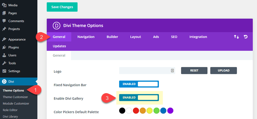
Divi allows you to replace the default WordPress Gallery display with a Divi Gallery display. So whenever you create a WordPress gallery and embed it to your page, the gallery be displayed like a gallery using the Divi Gallery Module. This allows you to add Divi image galleries to any module in the Divi Builder (more on this later). To implement this change, navigate to Divi > Theme Options. Under the General tab, click to enable the Divi Gallery option.
Setting Your Theme Accent Color (optional)
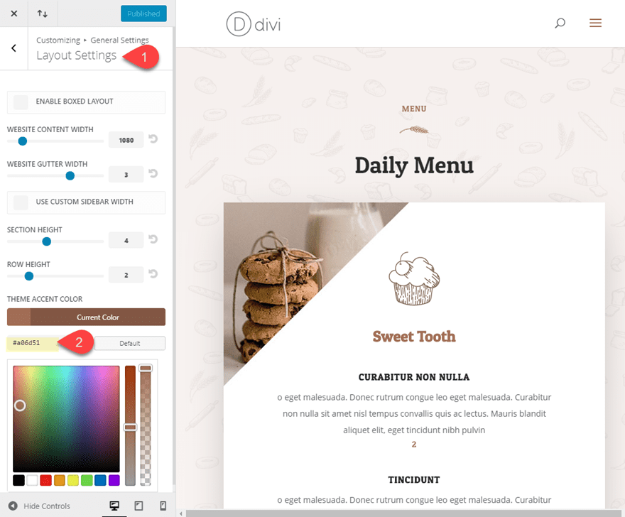
Since we will be inserting a Divi gallery into a toggle module, the icon color that shows when you hover over an image in the gallery will automatically inherit the accent color you have set for the Divi theme. You can set the theme accent color from your WordPress Dashboard by navigating to Divi > Theme Customizer > General Settings > Layout Settings. Under Layout Settings, update the theme access color to the following:
Theme Accent Color: #a06d51
This is the color that will match the Bakery Menu Layout we will be using for this tutorial.
Updating the Default Toggle Icon Size in the the Module Customizer (optional)
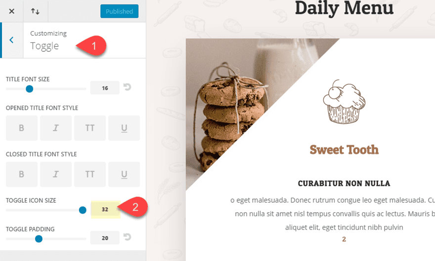
For this design, I thought it would be helpful to display a larger toggle icon when using the Divi Toggle module. You can change the default size of the Toggle Module by navigating to Divi > Module Customizer. Then select the Toggle Module from the list and update the icon size as follows:
Toggle Icon Size: 32
Setting up your New Page with the Bakery Menu Page Layout
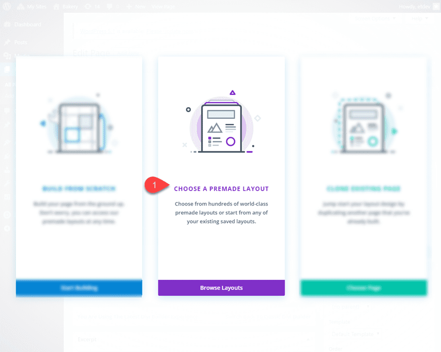
For starters, you will need to create a new page, give your page a title, and deploy the Divi Builder. Select the option “Choose a Premade Layout”.
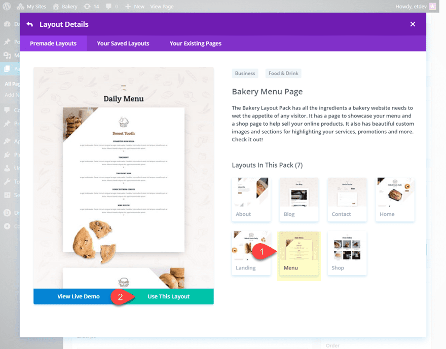
From the load from library popup, choose the Bakery Layout Pack and then click to use the Bakery Menu Page Layout.
Once the layout has been loaded to the page, publish your page. Then click the button “Build on Front End”. and then publish your page. Then click to build on the front end.
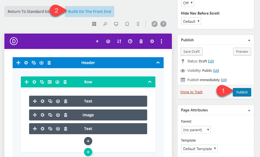
Once done, you are ready to start designing the menu!
Implementing the Custom Restaurant Menu Design with Divi Toggles and Image Galleries
Designing a Menu Item Toggle
With the Divi Builder active on the front end, add a Toggle module under the text module with the subheading that reads “Sweet Tooth”.
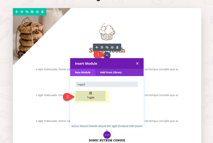
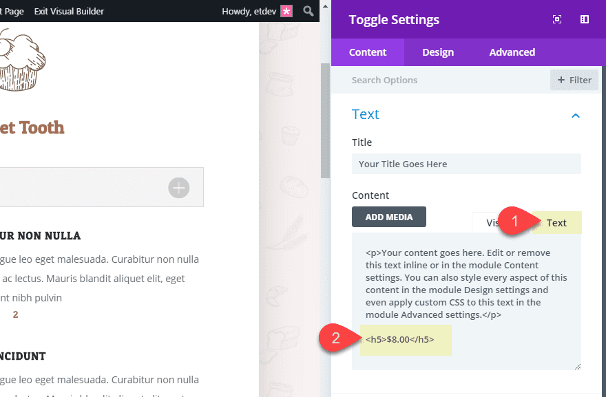
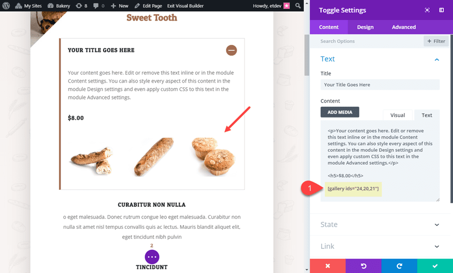
For now, you can leave the default mock content used for the Title and Body Content. But, you will need to add a price for the menu item inside the body content of the tab. Click the Text tab (instead of Visual) and add the following html under the current default text.
<h5>$8.00</h5>
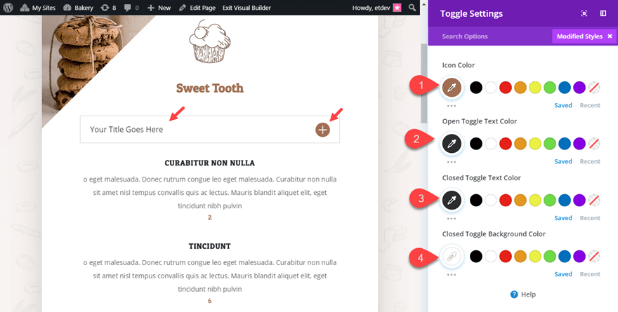
Then start updating the toggle settings as follows:
- Icon Color: #a06d51
- Open Toggle Text Color: #333333
- Closed Toggle Text Color: #333333
- Closed Toggle Background Color: #ffffff
- Title Font: Patua One
- Title Font Weight: Bold
- Title Font Style: TT
- Title Letter Spacing: 1px
- Title Line Height: 4em
- Custom Padding: 0px top, 0px bottom
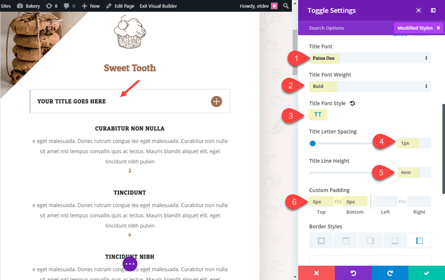
In order to increase the clickable area of the toggle title, the title line height is increased and the top and bottom padding is taken out.
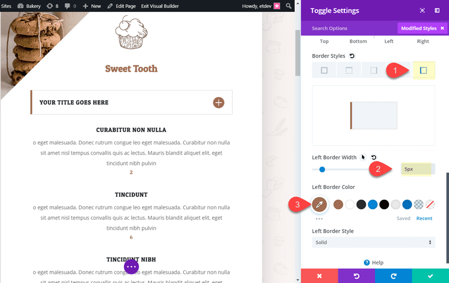
Now let’s add a left border to our toggle.
- Left Border Width: 5px
- Left Border Color: #a06d51
Adding an Image Gallery to the Toggle Module
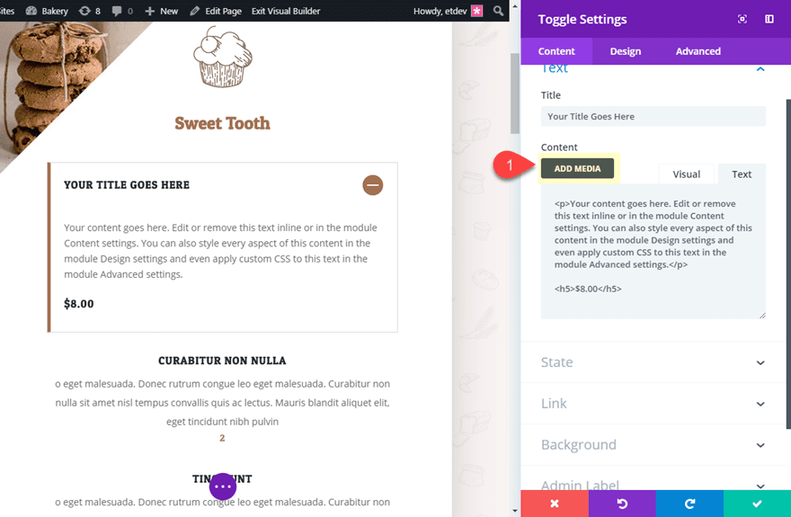
As mentioned earlier, when you enable the Divi Gallery option in the Divi Theme Options, a WordPress Gallery embed will take on the style of a Divi Gallery. This allows you to embed a Divi-styled image gallery to any module. For this example, we want to add some images inside of the toggle module to display some images of a particular restaurant menu item. To do this, open the toggle settings and click the Add Media button above the content box.
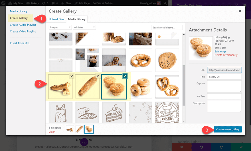
In the Media Library popup, select the Create Gallery tab on the left. Then select the image(s) you want to use for the gallery and click “Create a New Gallery”.
On the Edit Gallery section of the popup, ignore the gallery settings because the Divi Gallery styles will override these WordPress Gallery settings. Then click the Insert Gallery button.
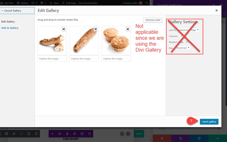
This places a gallery shortcode within the toggle module content. If you want the gallery to be displayed after the current body text, make sure to place the shortcode after the content.
Adjusting the Row Padding for Smartphone
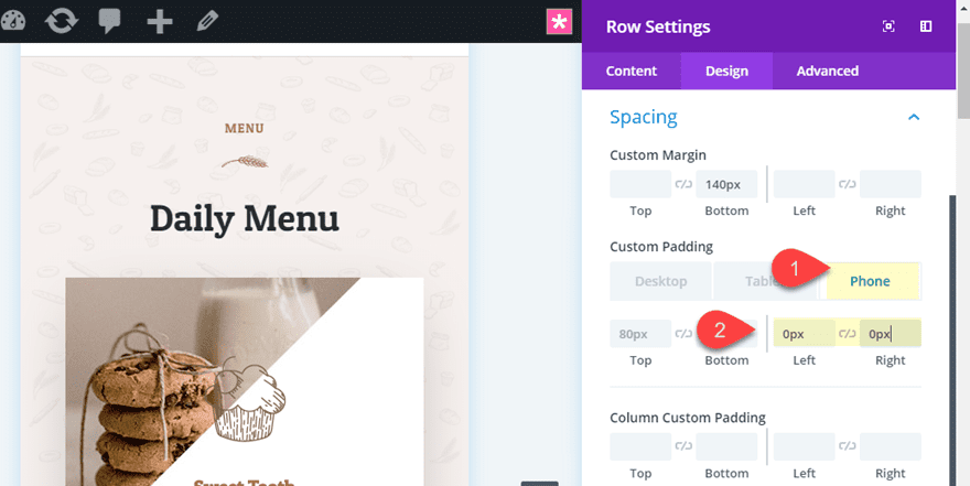
The content will get pretty tight with the current spacing of the premade layout. We need to update the row settings to create more space on smartphone. To do this, open the settings of the row containing your restaurant menu toggles and update the following:
- Custom Padding (phone): 0px left, 0px right
Duplicate the Toggle as Needed
To add more Menu Items, simply duplicate the Toggle module and update the content with new text and image galleries as needed. After that, you can delete the original menu items that came with the premade layout.
Final Result
Now Let’s check out the final result of the design.


Changing the Number of Columns in the Gallery
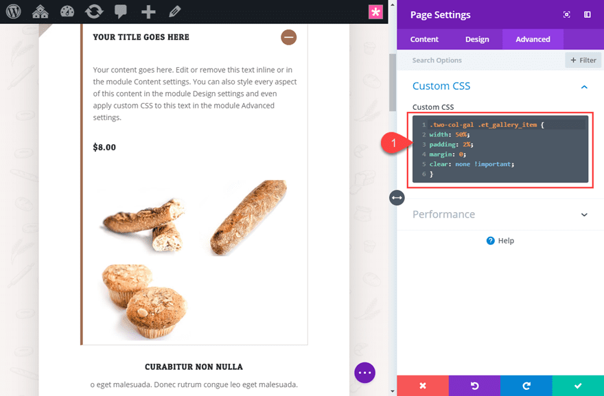
By default, the gallery have a layout that remains three columns on all browser widths and devices. However, with the lightbox effect, users will be able to see a larger version when clicking on the gallery item. So, the smaller images can still work. But, if you want to change the number of columns, you can always add a small snippet of CSS. For this example, I’m going to change the gallery to display images into two columns. To do this, first open the toggle settings and add a custom CSS Class as follows:
CSS Class: 2-col-gal
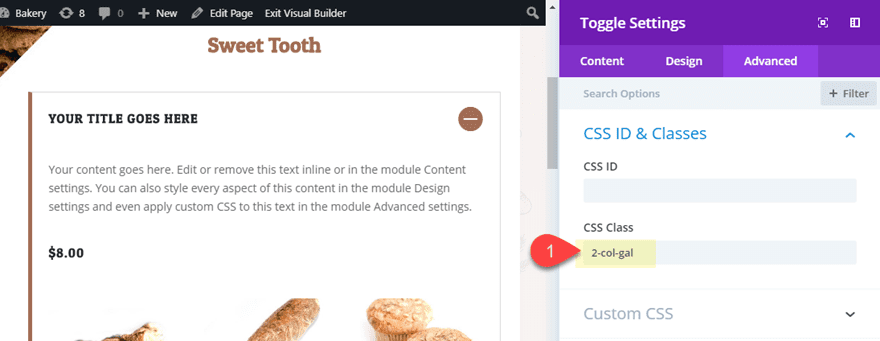
Then open page settings and add the following Custom CSS:
.two-col-gal .et_gallery_item {
width: 50%;
padding: 2%;
margin: 0;
clear: none !important;
}
Changing the Image Gallery overlay color in the Module Customizer
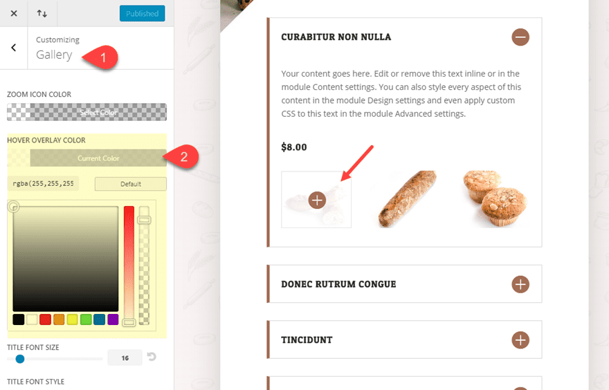
If you want to change the color of your gallery item hover overlay without having to use custom CSS, you can change the default settings for the Gallery Module in the Module Customizer. To do this, navigate to Divi > Module Customizer. Then click the Gallery Module and change the hover overlay color to whatever you want.
Final Thoughts
Hopefully, this tutorial sparks some inspiration for how to use the Divi Toggle Module to create some awesome restaurant menus. As a bonus, you may have learned a new trick to embed some Divi galleries into any module you want (not just toggles). The only limitation is customizing the number of columns your want display in your gallery embed. However, you can add a small snippet of custom CSS to put you on the right track.
I look forward to hearing from you in the comments.
Cheers!
The post How to Embed Divi Galleries into Toggles to Create a Custom Restaurant Menu appeared first on Elegant Themes Blog.
