If you’re familiar with e-commerce websites, you’re undoubtedly familiar with product categories as well. Product categories can be some of the most powerful pages on your website. That’s why it’s important to make them easy to find and highlight them in a straightforward and elegant way. With Divi’s built-in options, you can take your design in many directions. In this tutorial, we’re going to show you how to highlight product categories in your hero section. We’ll create the design example from scratch and hopefully, it will inspire you to highlight product categories in your own creative way as well!
Let’s get to it.
Preview
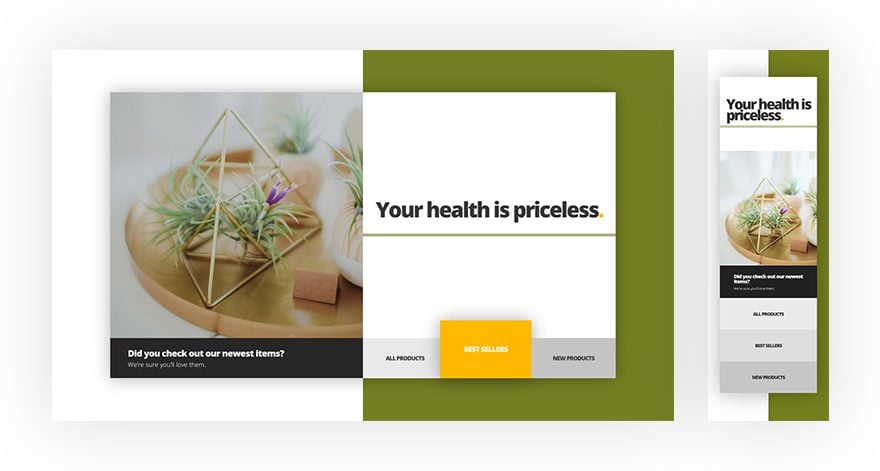
Before we dive into the tutorial, let’s take a quick look at the outcome on different screen sizes.
Let’s Start Creating!
Add New Section
Gradient Background
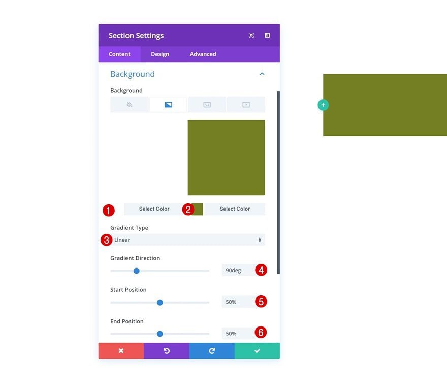
Start by adding a new section to your page. Open the settings of this section and add a gradient background to it.
- Color 1: #ffffff
- Color 2: #757f1e
- Gradient Type: Linear
- Gradient Direction: 90deg
- Start Position: 50%
- End Position: 50%
Spacing
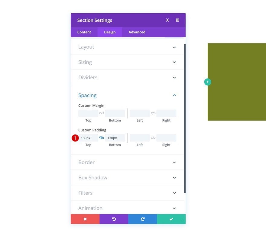
Then, go to the design tab and add some custom top and bottom padding to the section.
- Top Padding: 130px
- Bottom Padding: 130px
Add Row #1
Column Structure
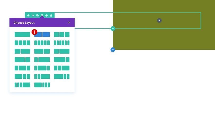
Continue by adding a new row using the following column structure:
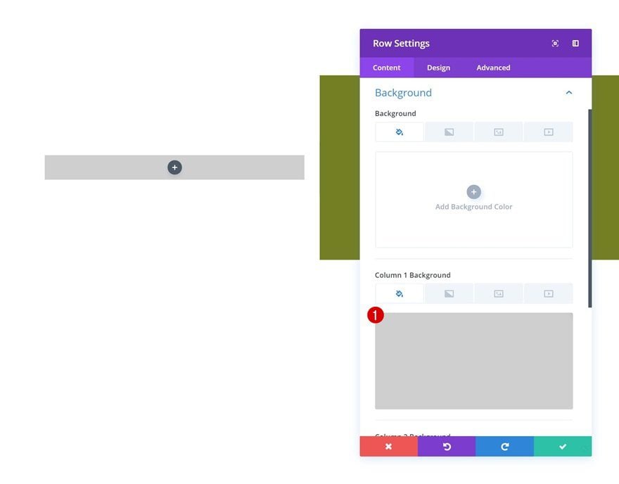
Column 1 Background Color
Without adding any modules yet, open the row settings and add a background color to the first column.
- Column 1 Background Color: rgba(0,0,0,0.19)
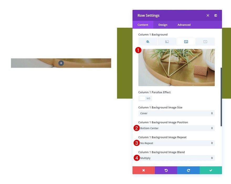
Column 1 Background Image
Add a background image to the first column as well along with a blend mode.
- Column 1 Background Image Position: Bottom Center
- Column 1 Background Image Repeat: No Repeat
- Column 1 Background Image Blend: Multiply
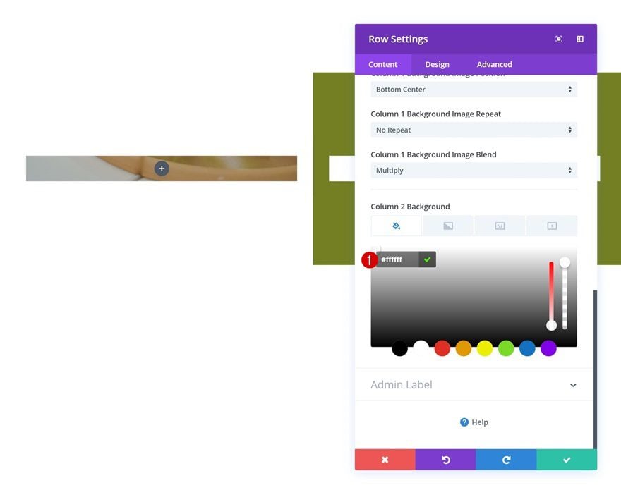
Column 2 Background Color
The second column will only need a white background color.
- Column 2 Background Color: #ffffff
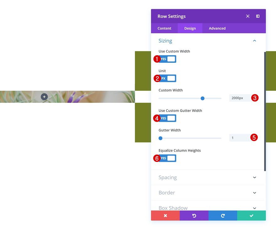
Sizing
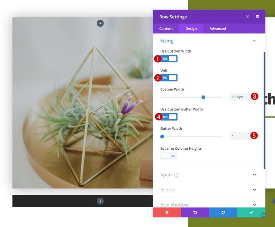
Continue by going to the design tab of the row settings and change the sizing settings.
- Use Custom Width: Yes
- Unit: PX
- Custom Width: 2000px
- Use Custom Gutter Width: Yes
- Gutter Width: 1
- Equalize Column Heights: Yes
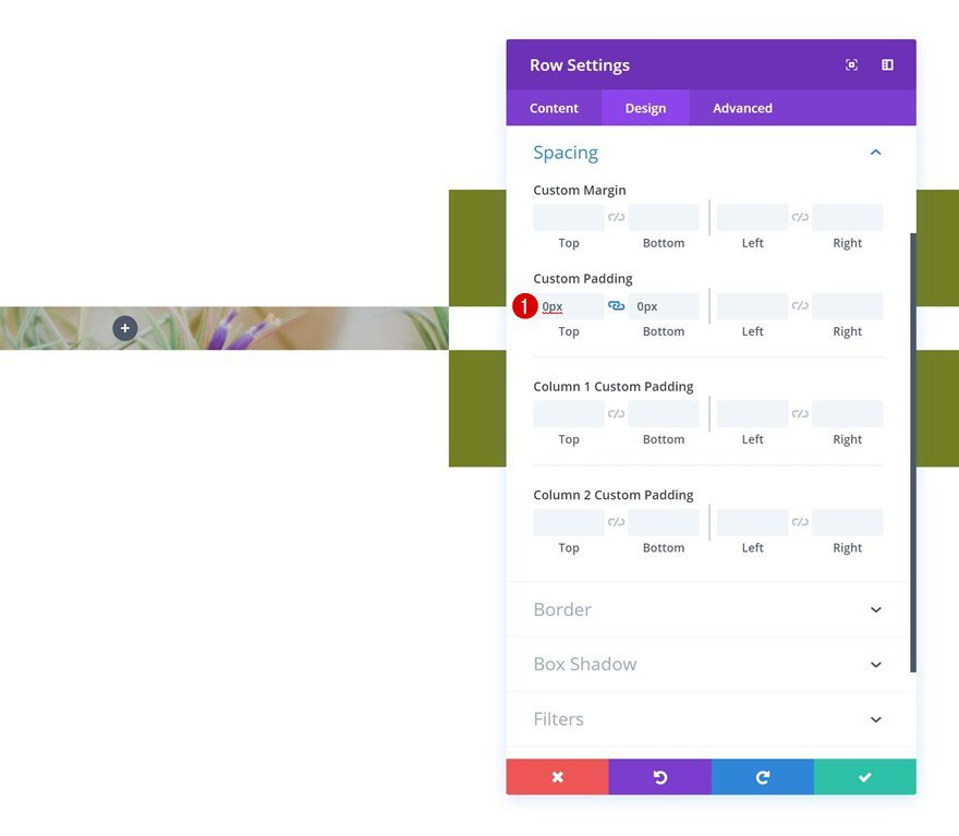
Spacing
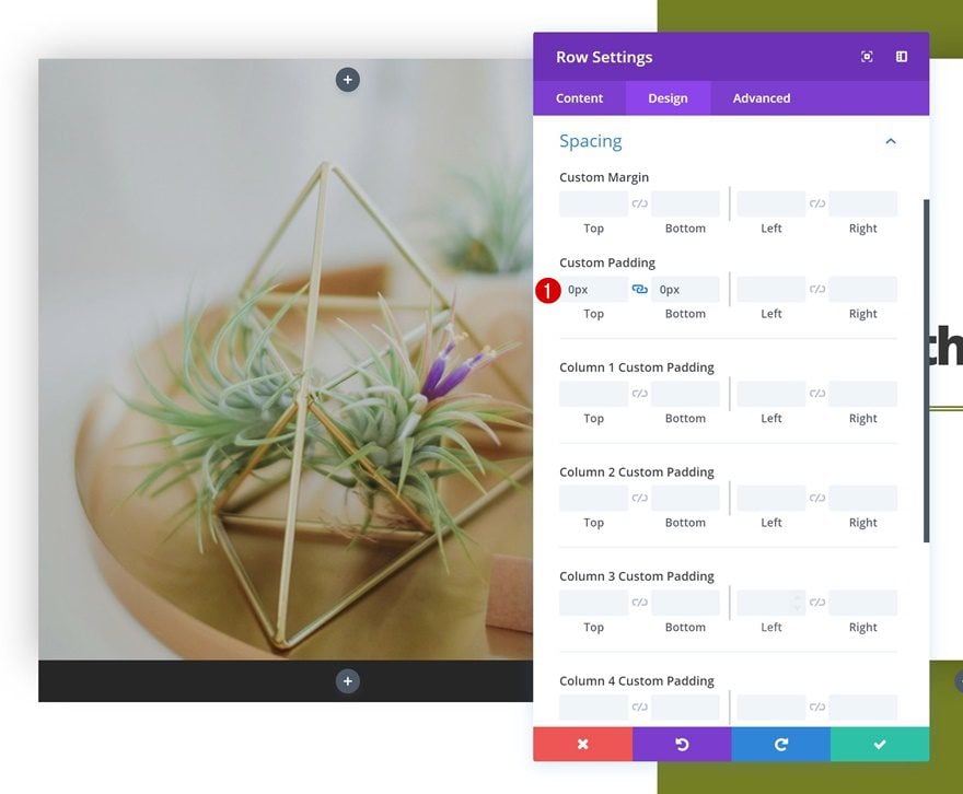
Remove all the default custom padding of the row as well.
- Top Padding: 0px
- Bottom Padding: 0px
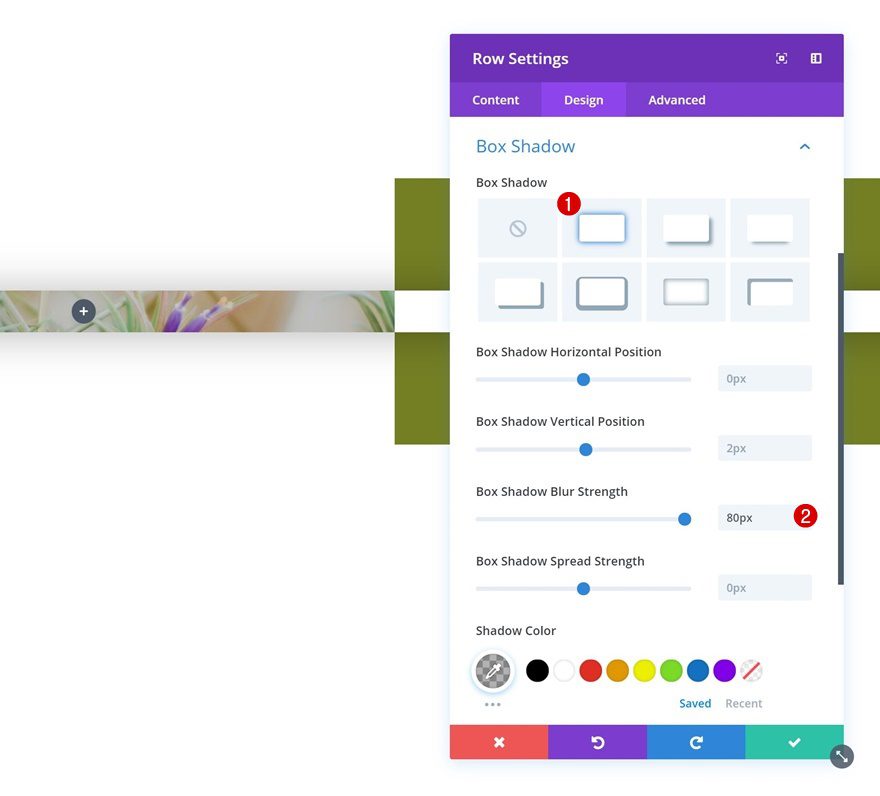
Box Shadow
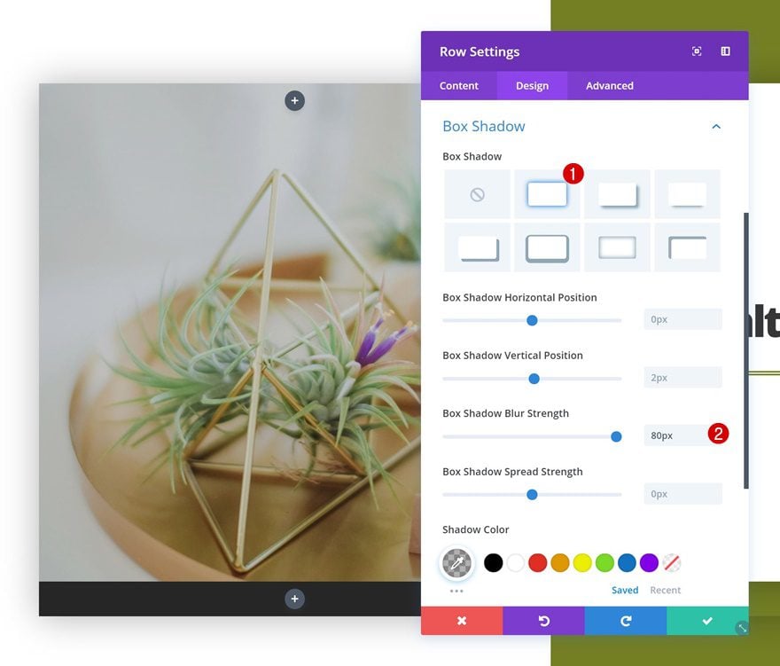
And add a subtle box shadow.
- Box Shadow Blur Strength: 80px
Add Text Module to Column 2
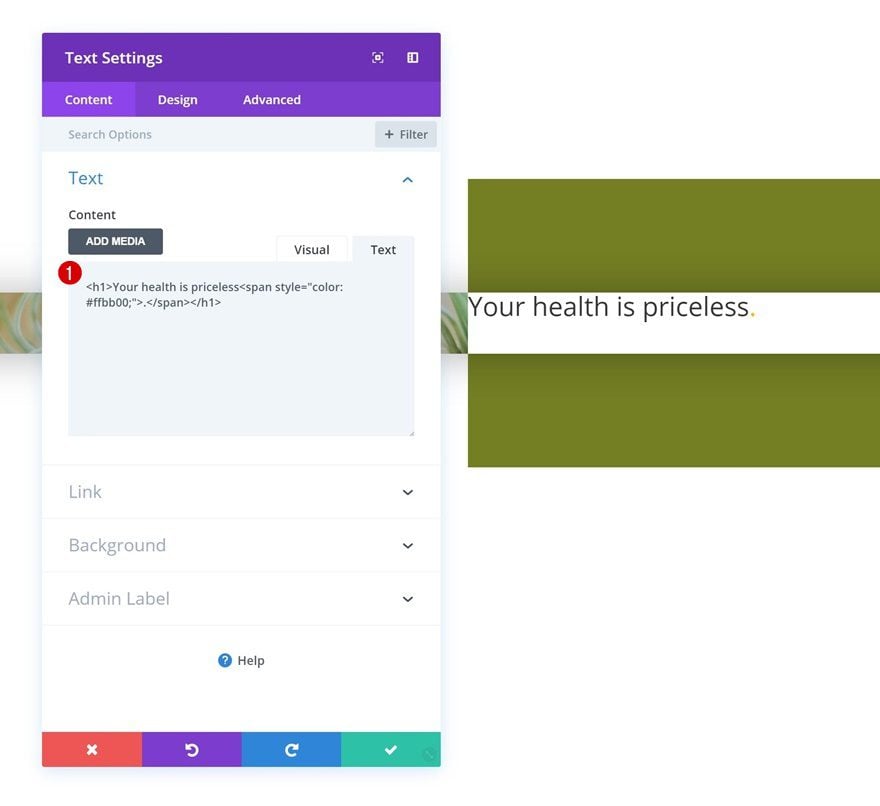
Add Content
Time to start adding modules! The first module we’ll need in the second column is a title Text Module. Add some content of choice.
Heading Text Settings
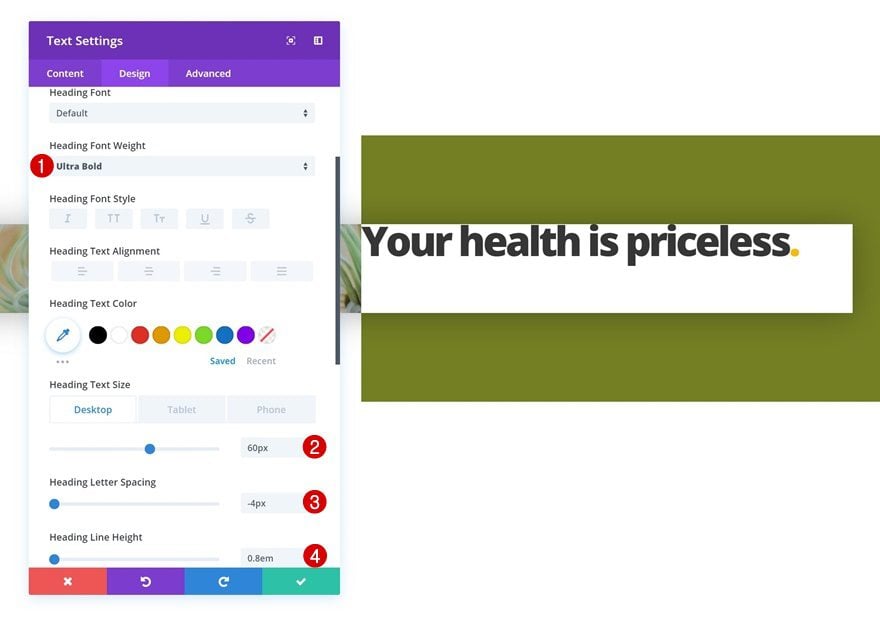
Next, go to the heading text settings and make some changes.
- Heading Font Weight: Ultra Bold
- Heading Text Size: 60px (Desktop & Tablet), 50px (Phone)
- Heading Letter Spacing: -4px
- Heading Line Height: 0.8em
Spacing
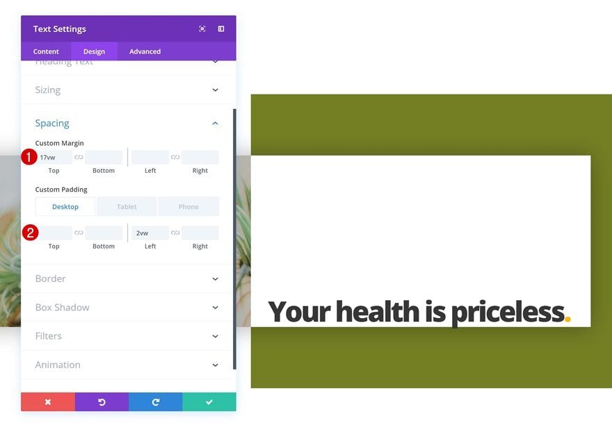
Add some custom margin and padding values as well.
- Top Margin: 17vw
- Left Padding: 2vw (Desktop), 4vw (Tablet), 5vw (Phone)
Add Divider Module to Column 2
Visibility
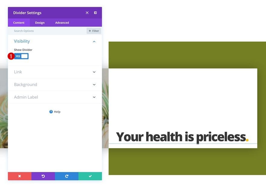
The second and last module needed in the second column is a Divider Module. Make sure the Show Divider option is enabled.
- Show Divider: Yes
Color
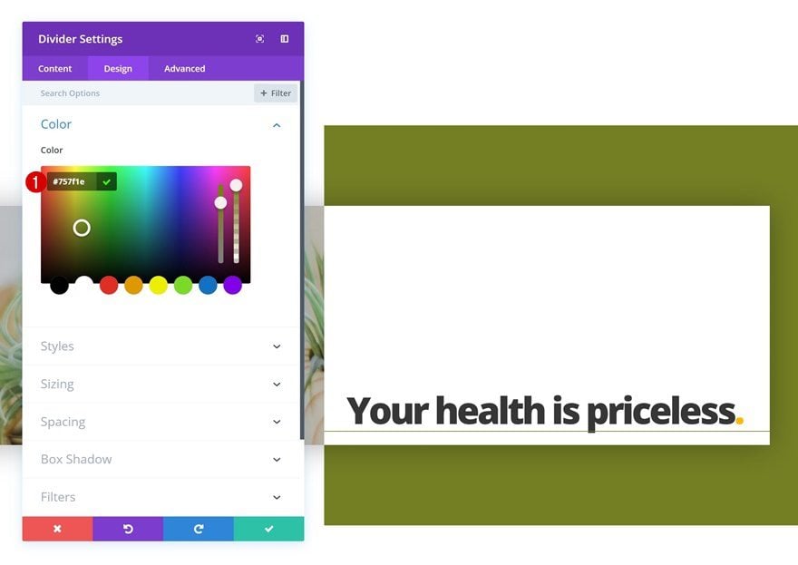
Change the color of the divider next.
- Color: #757f1e
Styles
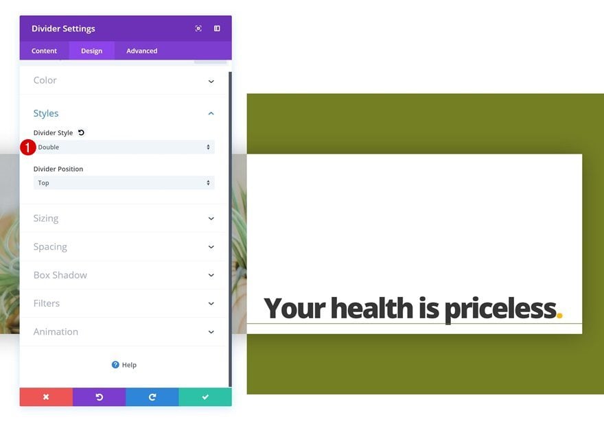
Modify the divider style in the styles settings too.
- Divider Style: Double
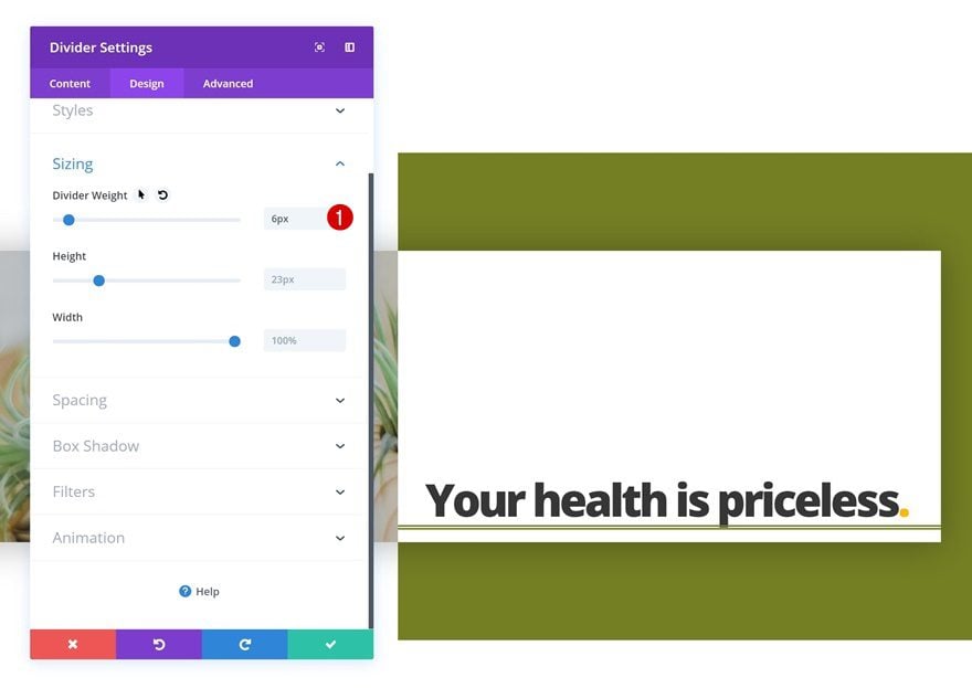
Sizing
And increase the Divider Weight in the sizing settings of the module.
- Divider Weight: 6px
Spacing
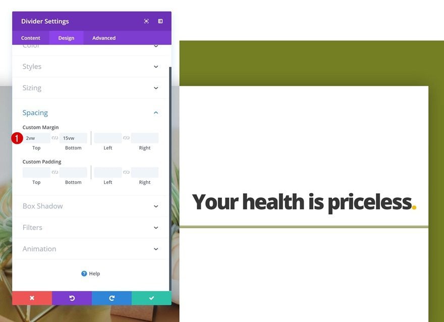
Lastly, add some custom top and bottom margin to the Divider Module.
- Top Margin: 2vw
- Bottom Margin: 15vw
Add Row #2
Column Structure
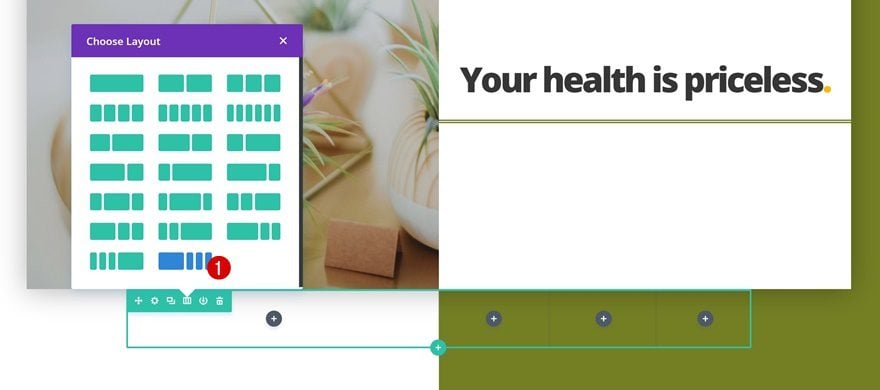
On to the second row! Choose the following column structure for it:
Column 1 Background Color
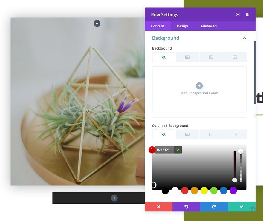
Open the row settings and add a background color to the first column.
- Column 1 Background Color: #212121
Sizing
Next, go to the design tab and play around with the sizing of the row.
- Use Custom Width: Yes
- Unit: PX
- Custom Width: 2000px
- Use Custom Gutter Width: Yes
- Gutter Width: 1
Spacing
Remove all the custom padding of the row as well by adding ‘0px’ to the top and bottom padding.
- Top Padding: 0px
- Bottom Padding: 0px
Box Shadow
Last but not least, give the row a subtle box shadow.
- Box Shadow Blur Strength: 80px
Add Text Module #1 to Column 1
Add Content
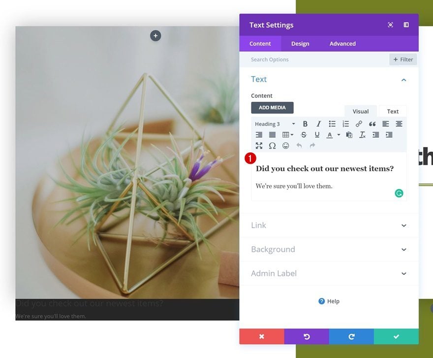
The first module we’ll need is a Text Module. Add one to the first column with some content of choice.
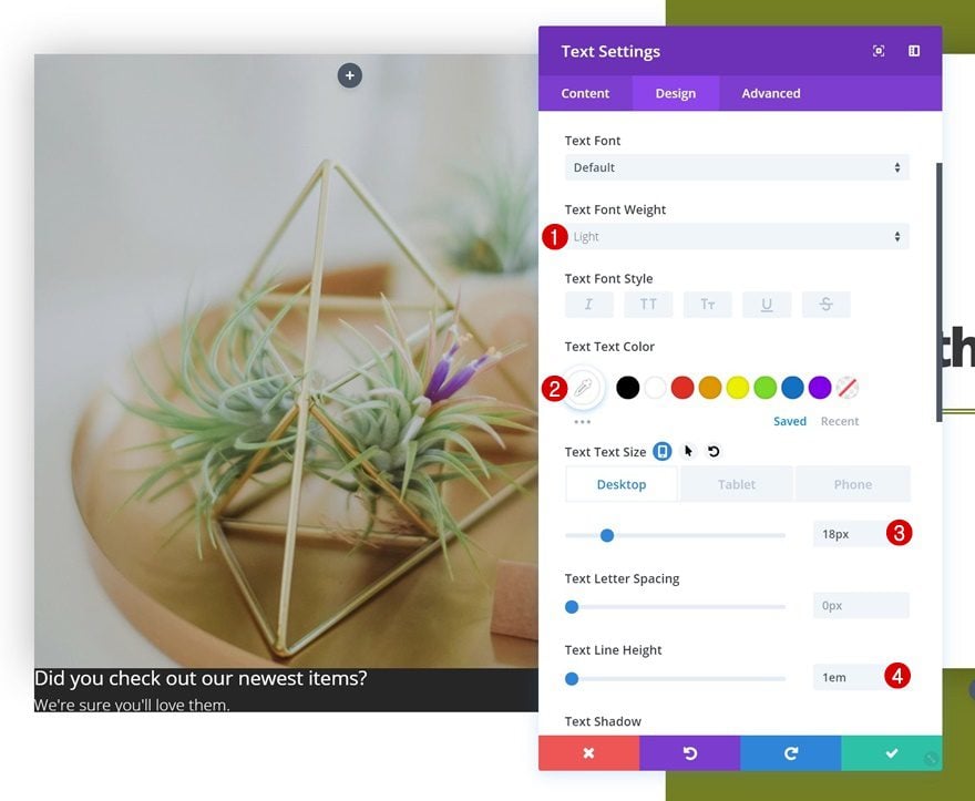
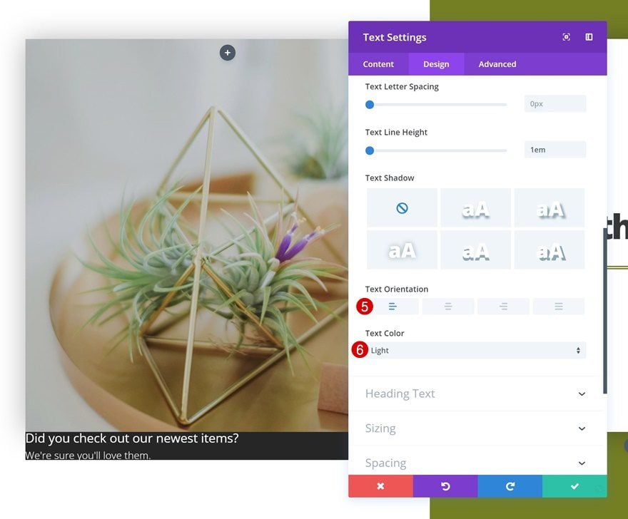
Text Settings
Continue by going to the design tab and changing the text settings.
- Text Font Weight: Light
- Text color: #ffffff
- Text Size: 18px (Desktop), 15px (Tablet), 12px (Phone)
- Text Line Height: 1em
- Text Orientation: Left
- Text Color: Light
Heading Text Settings
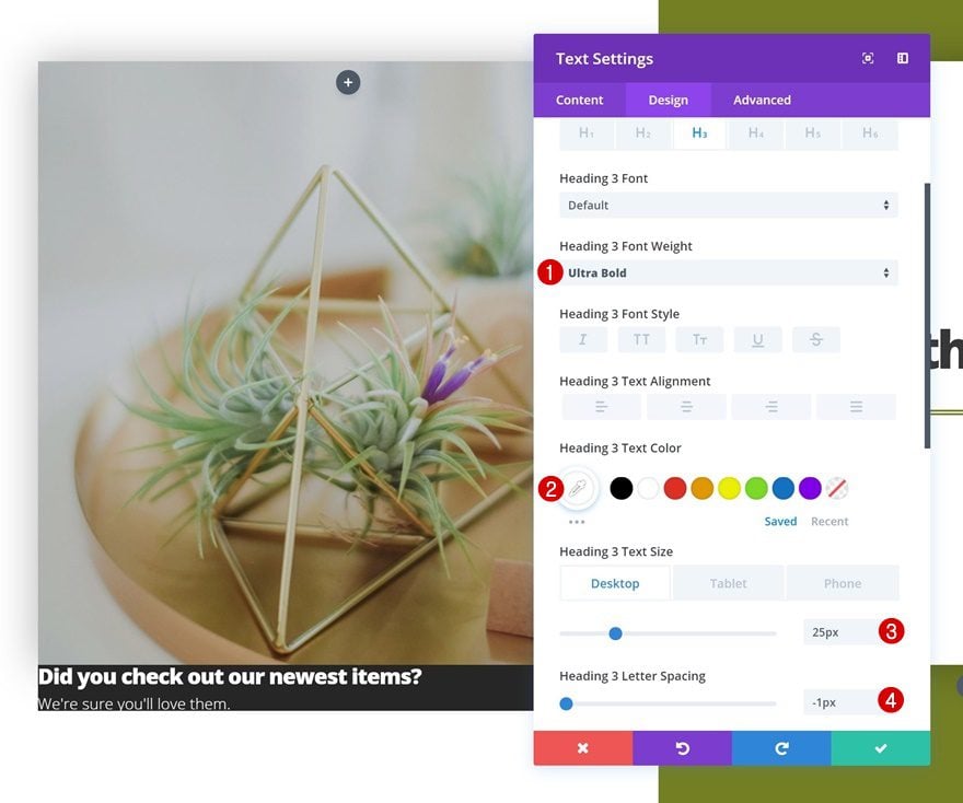
Modify the heading text settings as well.
- Heading 3 Text color: #ffffff
- Heading 3 Text Size: 25px (Desktop), 20px (Tablet), 18px (Phone)
- Heading 3 Letter Spacing: -1px
Spacing
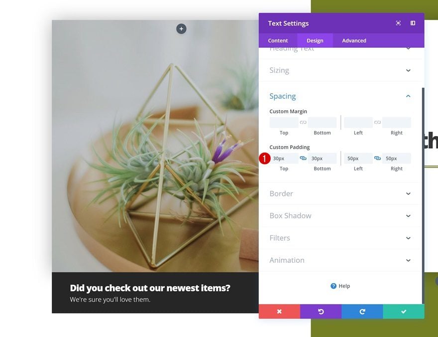
Add some custom padding values in the spacing settings too.
- Top Padding: 30px
- Bottom Padding: 30px
- Left Padding: 50px
- Right Padding: 50px
Add Text Module #2 to Column 2
Add Content
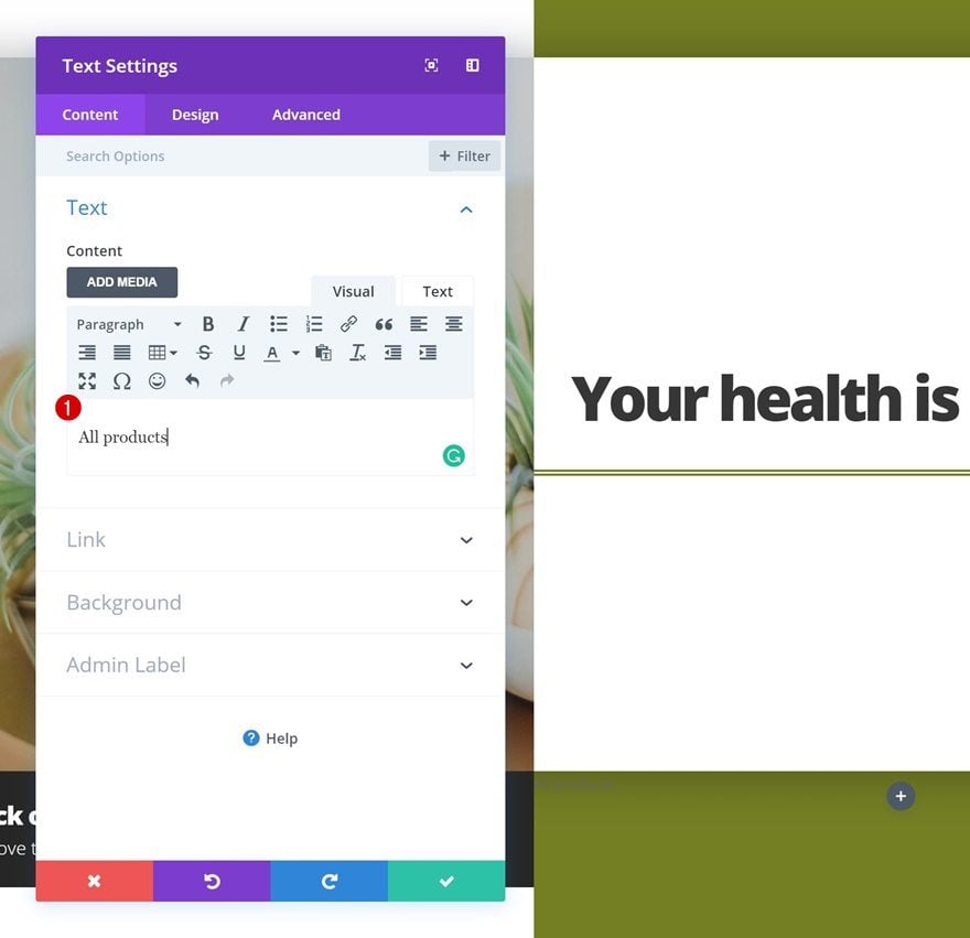
Continue by adding another Text Module to the second column. Add some content of choice and link the product category page in the link settings as well.
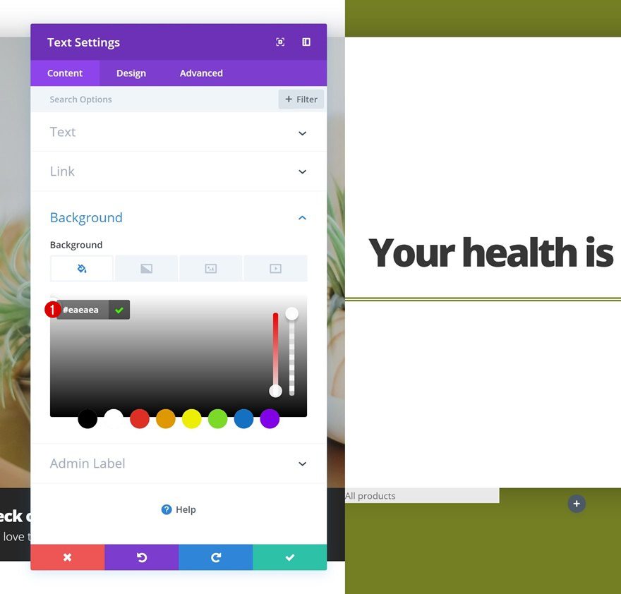
Default Background Color
Then, go to the background settings and add a background color.
- Background Color: #eaeaea
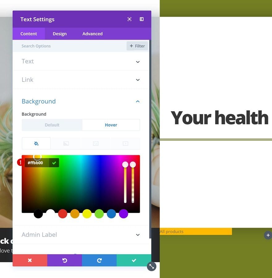
Hover Background Color
Change this background color on hover.
- Background Color: #ffbb00
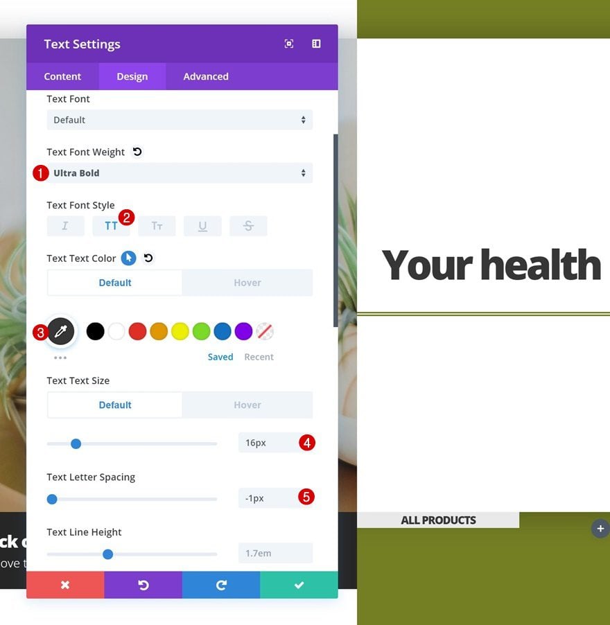
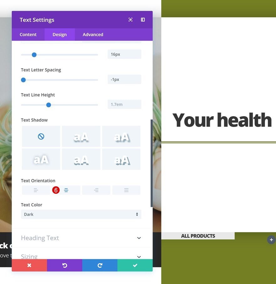
Default Text Settings
Change around the text settings in the design tab next.
- Text Font Weight: Ultra Bold
- Text Font Style: Uppercase
- Text Color: #333333
- Text Size: 16px
- Text Letter Spacing: -1px
- Text Orientation: Center
Hover Text Settings
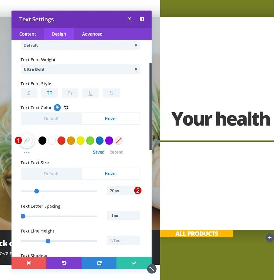
And modify these settings on hover.
- Text Color: #ffffff
- Text Size: 20px
Default Spacing
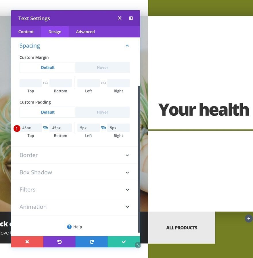
We’re also applying some default spacing values.
- Top Padding: 45px
- Bottom Padding: 45px
- Left Padding: 5px
- Right Padding: 5px
Hover Spacing
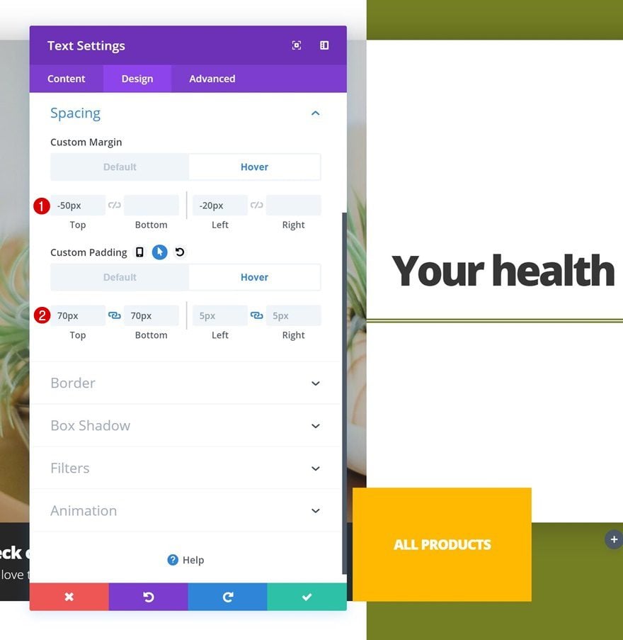
Which we’ll change on hover.
- Top Margin: -50px
- Left Margin: -20px
- Top Padding: 70px
- Bottom Padding: 70px
- Left Padding: 5px
- Right Padding: 5px
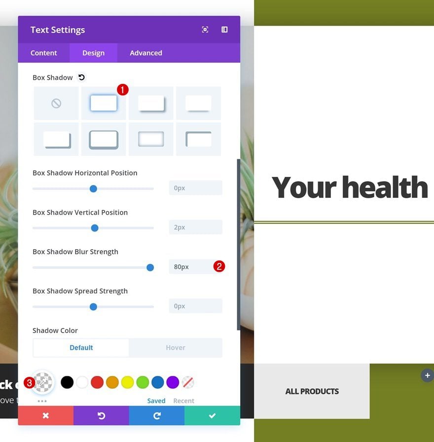
Default Box Shadow
Continue by opening the box shadow settings and add a completely transparent box shadow.
- Box Shadow Blur Strength: 80px
- Shadow Color: rgba(255,255,255,0)
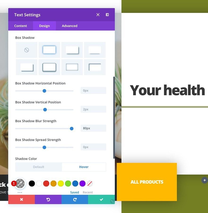
Hover Box Shadow
Change the completely transparent box shadow color on hover for it to show up.
- Shadow Color: rgba(0,0,0,0.34)
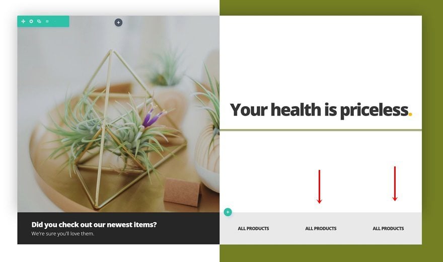
Clone Text Module #2 Twice & Place in Remaining Columns
Once you’ve finished modifying the Text Module in column 2, you can go ahead and clone the module twice and place the duplicates in the two remaining columns of the row.
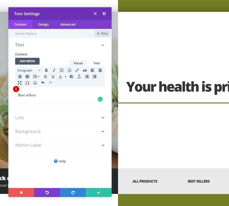
Change First Duplicate
Change Content
Open the first duplicate in the third column and change the content and link of the product category.
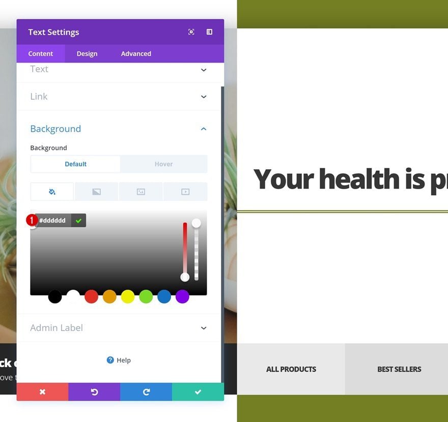
Change Background Color
Change the background color of this module as well.
- Background Color: #dddddd
Change Second Duplicate
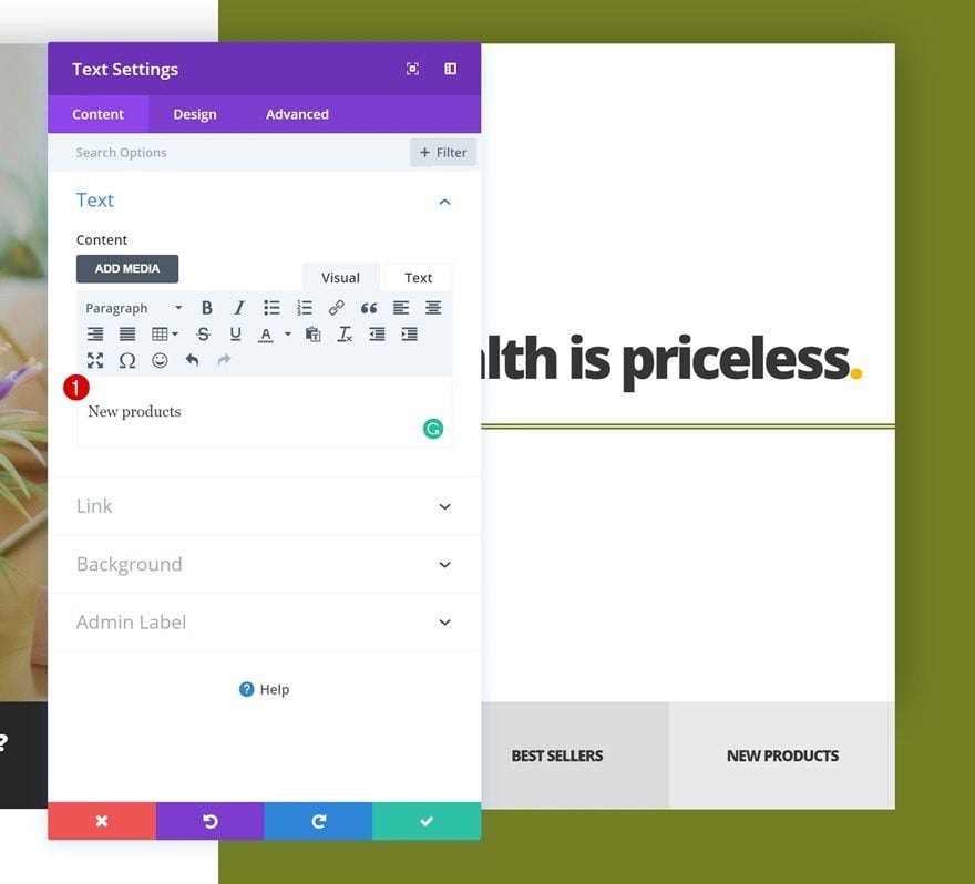
Change Content
Change the content of the second duplicate in column 4 too.
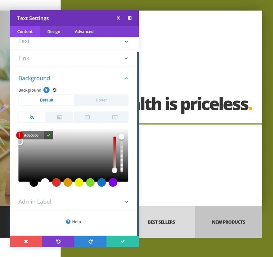
Change Background Color
Along with the background color.
- Background Color: #c6c6c6
Add Image Module for Smaller Screen Sizes to Column 2 of Row #1
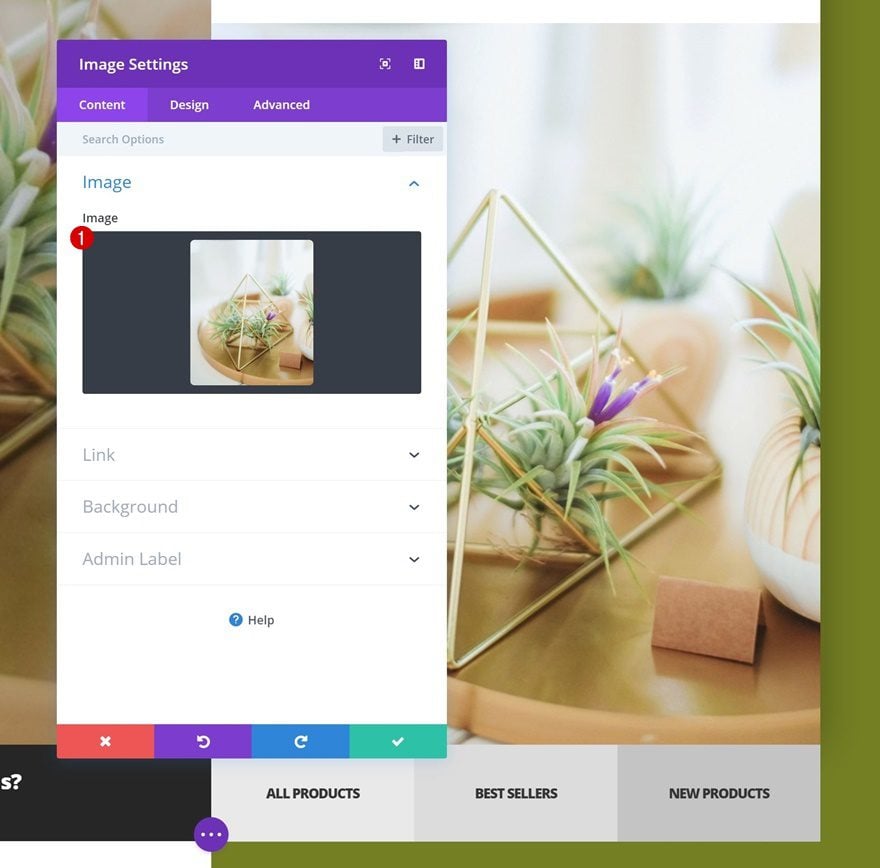
Upload Image
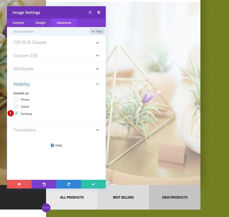
Last but not least, we’re also going to add an Image Module to the second column of the first row to optimize everything for smaller screen sizes.
Visibility
Make sure this module only appears on smaller screen sizes by hiding it on desktop in the advanced tab of the module.
Preview
Now that we’ve gone through all the steps, let’s’ take a final look at the outcome on different screen sizes.

Final Thoughts
In this post, we’ve recreated a stunning design example that puts the main product categories of your website in the spotlight. We hope this tutorial inspires you to create your own kinds of designs as well. If you have any questions or suggestions, make sure you leave a comment in the comment section below!
The post How to Highlight Product Categories in a Stunning Divi Website Hero Section appeared first on Elegant Themes Blog.
