Divi’s Fullwidth Header Module includes a button that indicates to the user they can scroll down. Once they click it, they automatically get redirected to the next section. This is a simple button with several icons to choose from and its color and size are fully customizable. In this post, we’ll look at how to customize it and see four Scroll Down Buttons you can include in your Divi Fullwidth Header Module. We’ll also see how to style it with CSS for even more design options.
Let’s get started!
Scroll Down Buttons Preview
First, let’s look at the designs we’ll create in this post.
Desktop Scroll Down Buttons Example One

Phone Scroll Down Buttons Example One
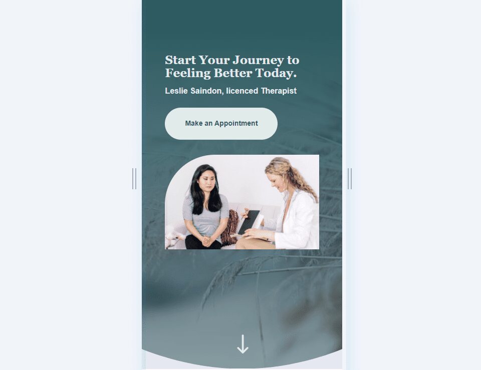
Desktop Scroll Down Buttons Example Two

Phone Scroll Down Buttons Example Two

Desktop Scroll Down Buttons Example Three

Phone Scroll Down Buttons Example Three
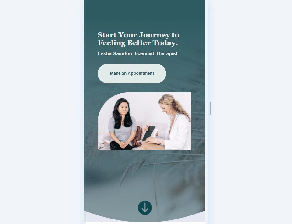
Desktop Scroll Down Buttons Example Four

Phone Scroll Down Buttons Example Four

Scroll Down Buttons Fullwidth Header Design
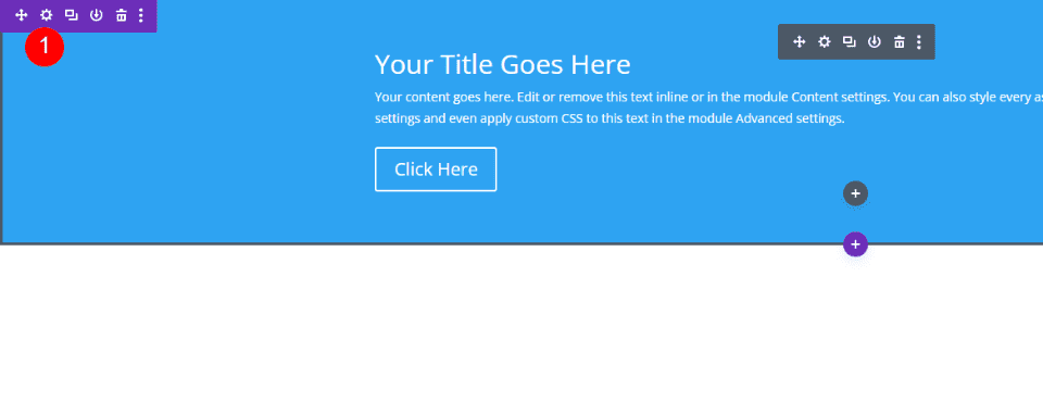
First, we’ll create our Fullwidth Header design. I’m building it from scratch using designs from the free Therapy Layout Pack that’s available within Divi. Create a new page and add a Fullwidth Header Module to a new fullwidth section.
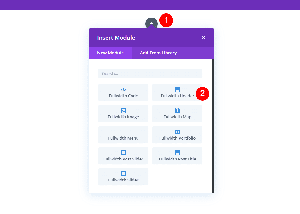
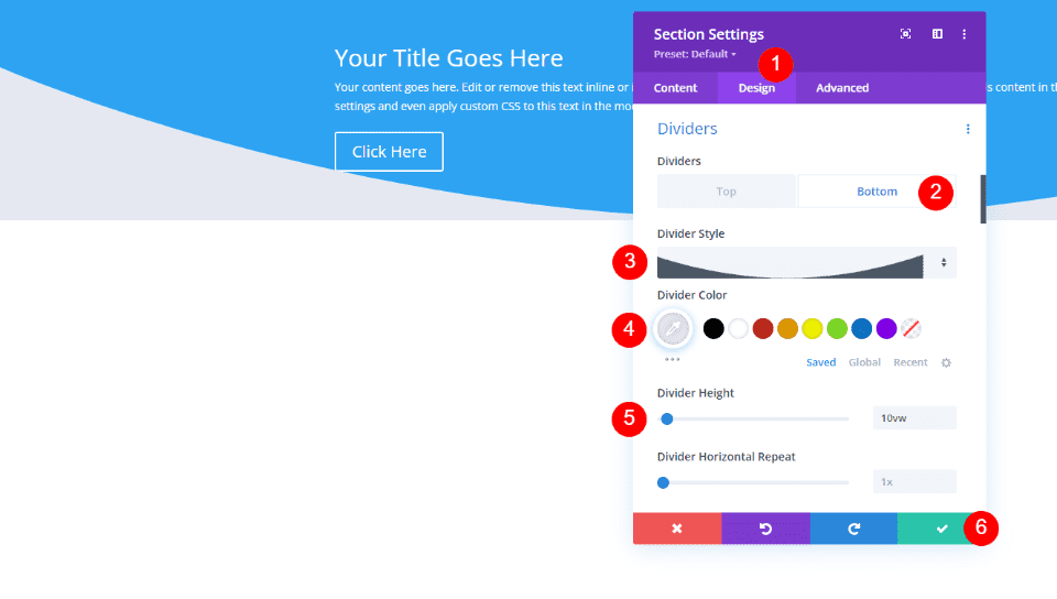
Fullwidth Section Divider
We’ll add a Divider for this fullwidth header. Open the settings for the Fullwidth Section.
Next, scroll to Dividers. Click the Bottom tab and choose the 8th Divider Style. Set the Color to #e5e8f0 and enter 10vw for the Height. Close the section’s settings.
- Dividers: Bottom
- Divider Style: 8th style
- Color: #e5e8f0
- Height: 10vw
Fullwidth Header Text
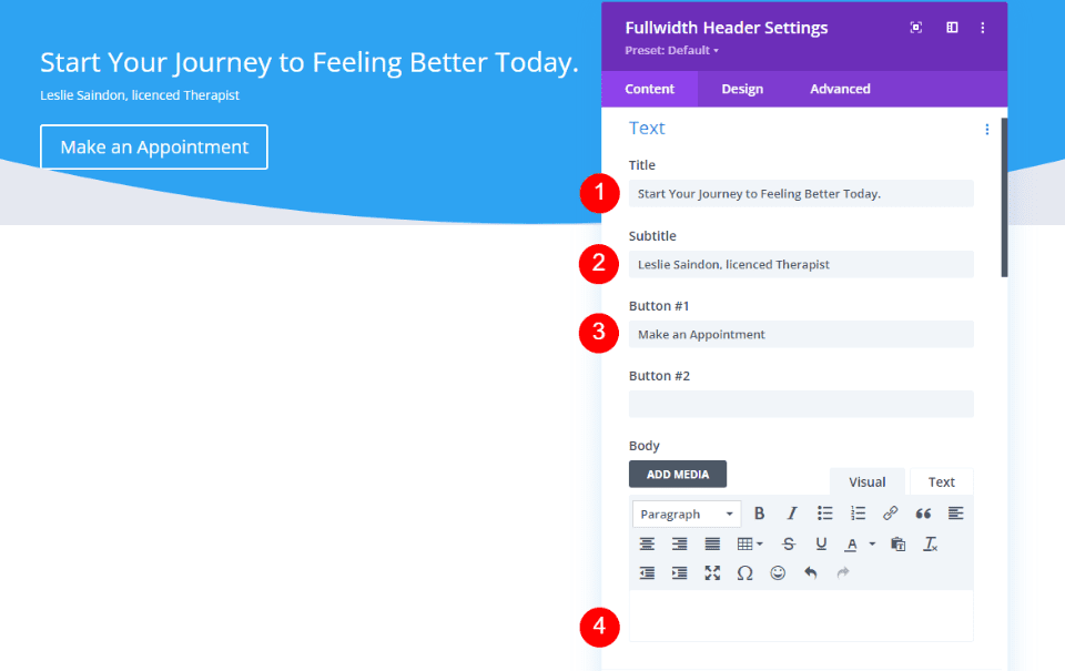
Next, open the Fullwidth Header Module and add your Title, Subtitle, and Button Text. Delete the dummy text for the Body Content and leave it empty.
- Title: Start Your Journey to Feeling Better Today.
- Subtitle: Name, licensed therapist
- Button One Text: make an Appointment
- Body Content: None
Fullwidth Header Images
Scroll down to Images and choose a wide Header Image. I’m choosing an image that comes with the Therapy Layout Pack. You can find the image by scrolling down that post and downloading the image assets.

Fullwidth Header Background
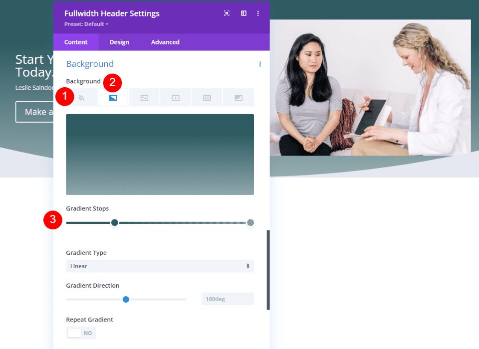
Scroll down to Background. Delete the Background Color and select the Gradient tab. Change the first Gradient Stop’s Color to #2e5b61 and set the position to 25%. Leave the second Gradient Stop at 100% and change the Color to rgba(46,91,97,0.5).
- Gradient Stop One: #2e5b61, 25%
- Gradient Stop Two: rgba(46,91,97,0.5), 100%
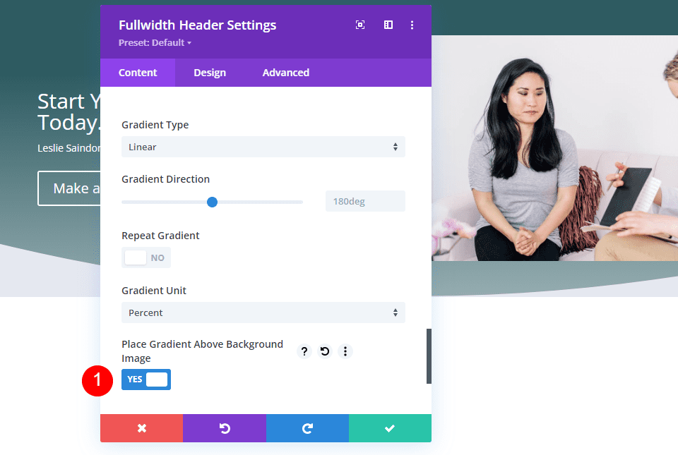
Enable Place Gradient Above Background Image.
- Place Gradient Above Background Image: Yes
Fullwidth Header Background Image
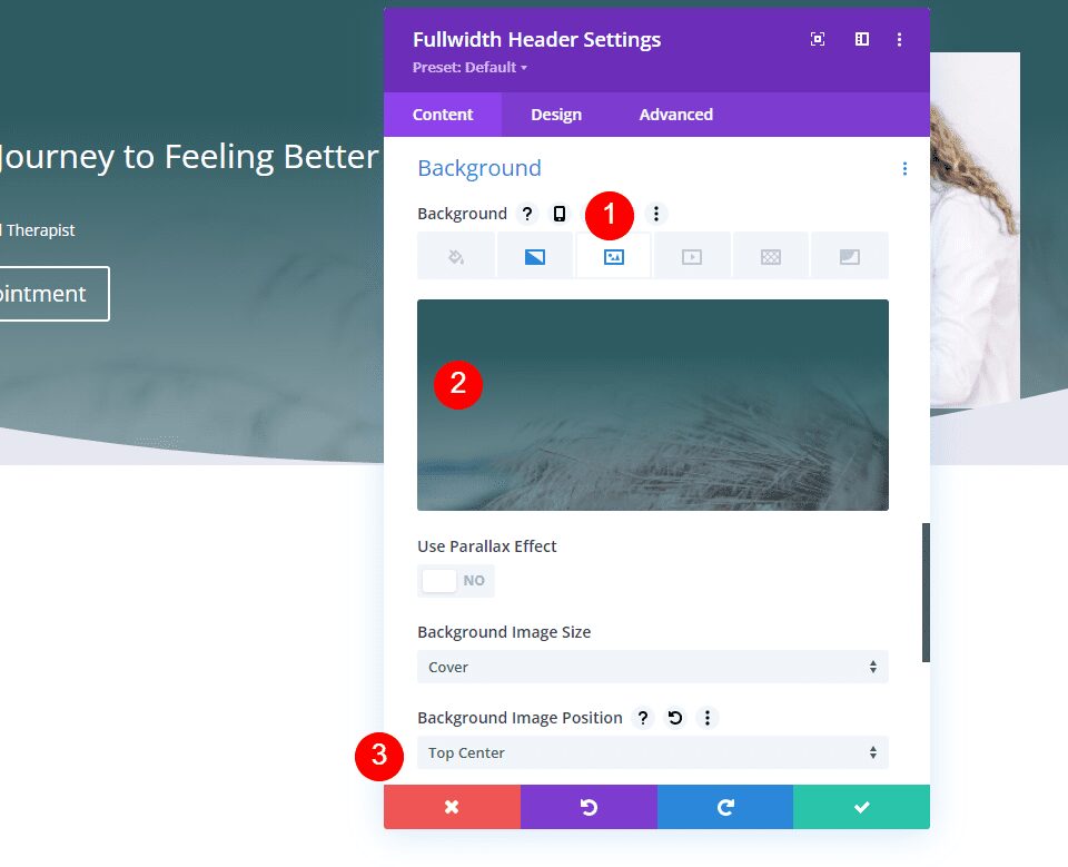
Next, select the Background Image tab and choose a full-screen image. I’m using another image from the Therapy Layout Pack.
- Position: Top Center
Fullwidth Header Layout
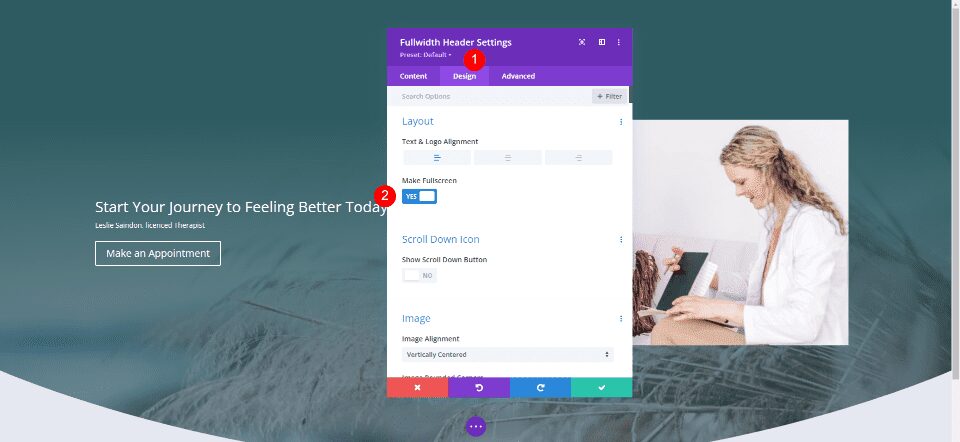
Next, select the Design tab and enable Make Fullscreen.
- Make Fullscreen: Yes
Fullwidth Header Scroll Down Icon
Next, enable Show Scroll Down Button. We’ll style this button in our examples, so we’ll leave it in the default settings for now.
- Show Scroll Down Button: Yes
![]()
Fullwidth Header Image
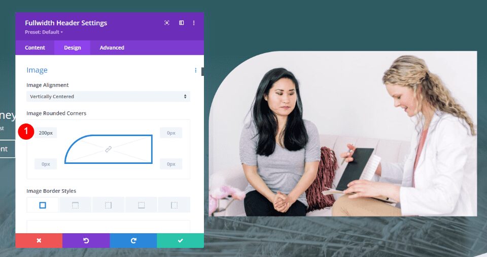
Next, scroll to Image and change the Top Left Rounded Corners to 200px for desktops. Set the rest of the Rounded Corners to 0px. Change the Rounded Corners to 100px for tablets and phones.
- Rounded Corners desktops: 200px Top Left, 0px all others
- Rounded Corners tablets and phones: 200px Top Left, 0px all others
Fullwidth Header Title Text
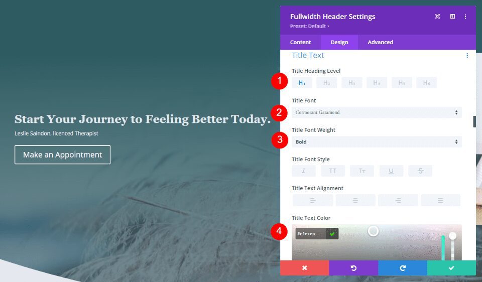
Next, scroll to Title Text. Use H1 for the Heading Level. Choose Cormorant Garamond for the Title Font, set the Weight to Bold, and the Color to #e1ecea.
- Heading Level: H1
- Font: Cormorant Garamond
- Weight: Bold
- Color: #e1ecea
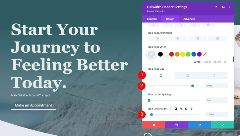
Next, set the Size for all three screen sizes. Use 90px for desktops, 40px for tablets, and 24px for phones. Change the Line Height to 1.1em.
- Size: 90px, 40px, 24px
- Line Height: 1.1em
Fullwidth Header Subtitle Text
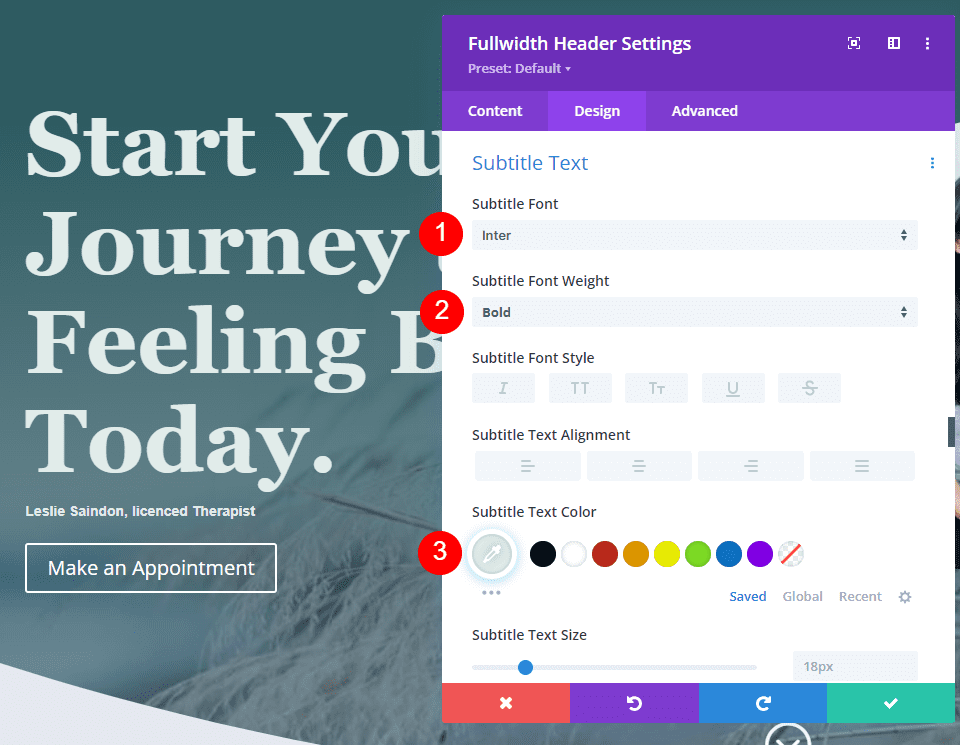
Next, scroll to Subtitle Text. Change the Font to Inter, the Weight to Bold, and the Color to #e1ecea.
- Font: Inter
- Weight: Bold
- Color: #e1ecea
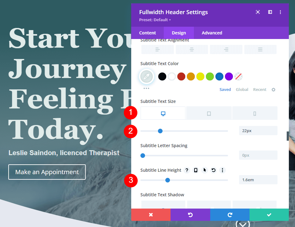
Set the Size to 22px for desktops, 20px for tablets, and 16px for phones. Change the Line Height to 1.6em.
- Size: 22px, 20px, 16px
- Line Height: 1.6em
Fullwidth Header Button
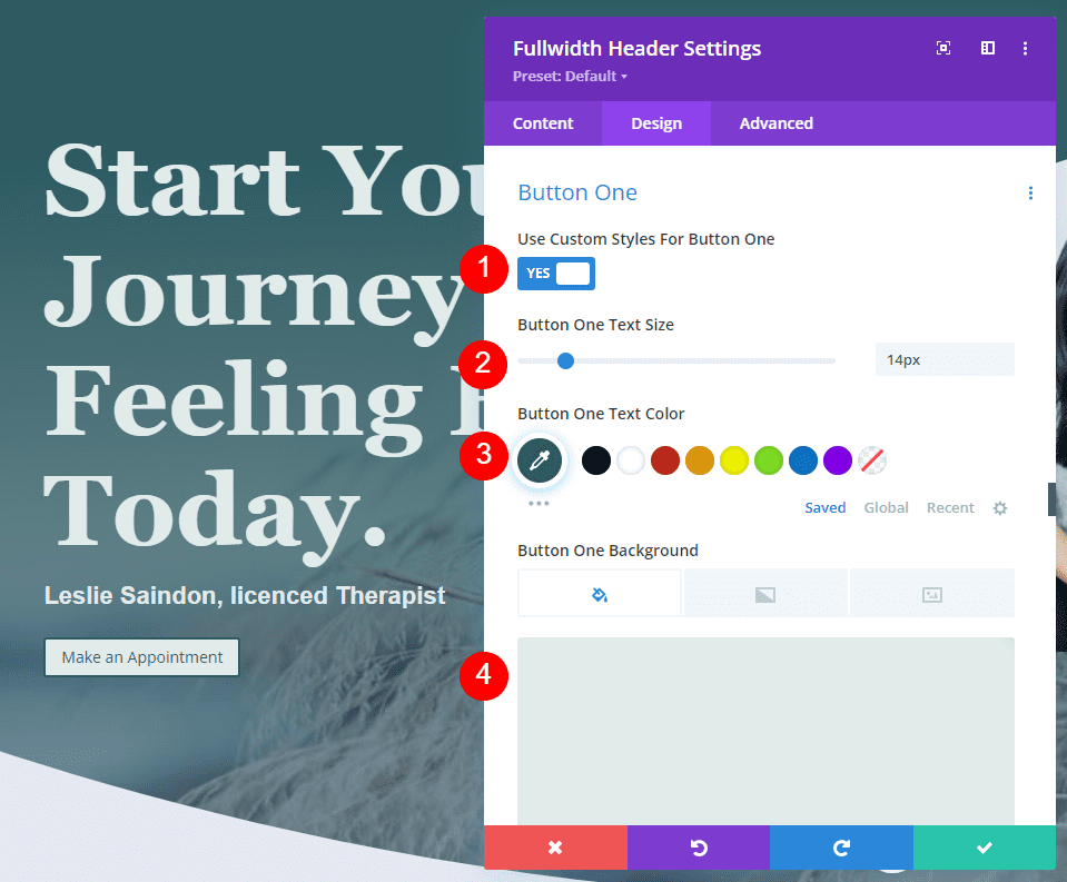
Scroll down to the settings for Button One and enable Use Custom Styles for Button One. Change the Size to 14px, the Text Color to #2e5b61, and the Background Color to #e1ecea.
- Use Custom Styles for Button One: Yes
- Text Size: 14px
- Text Color: #2e5b61
- Button Background: #e1ecea
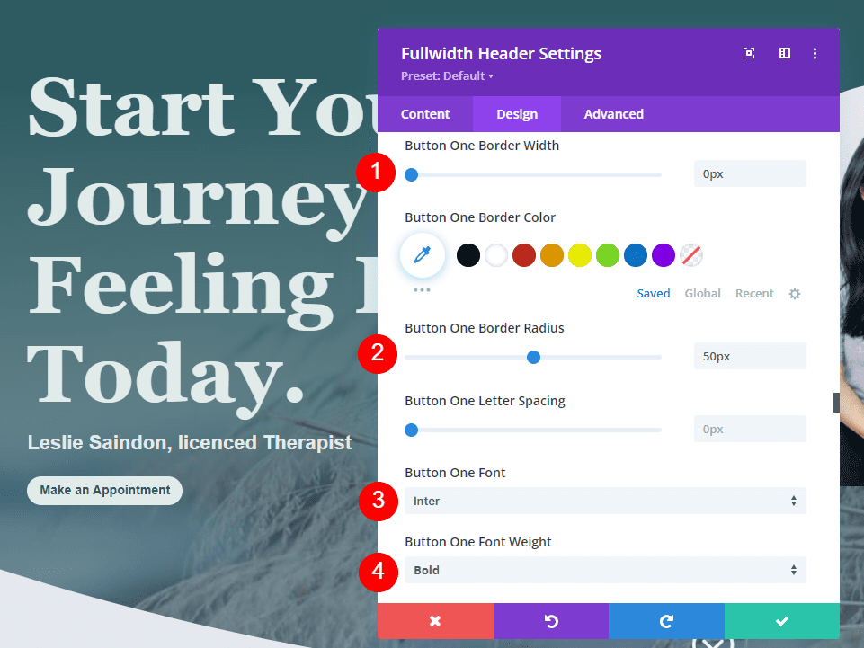
Change the Border Width to 0px and the Border Radius to 50px. Use Inter for the Font and change the Weight to Semi Bold.
- Border Width: 0px
- Border Radius: 50px
- Font: Inter
- Weight: Semi Bold
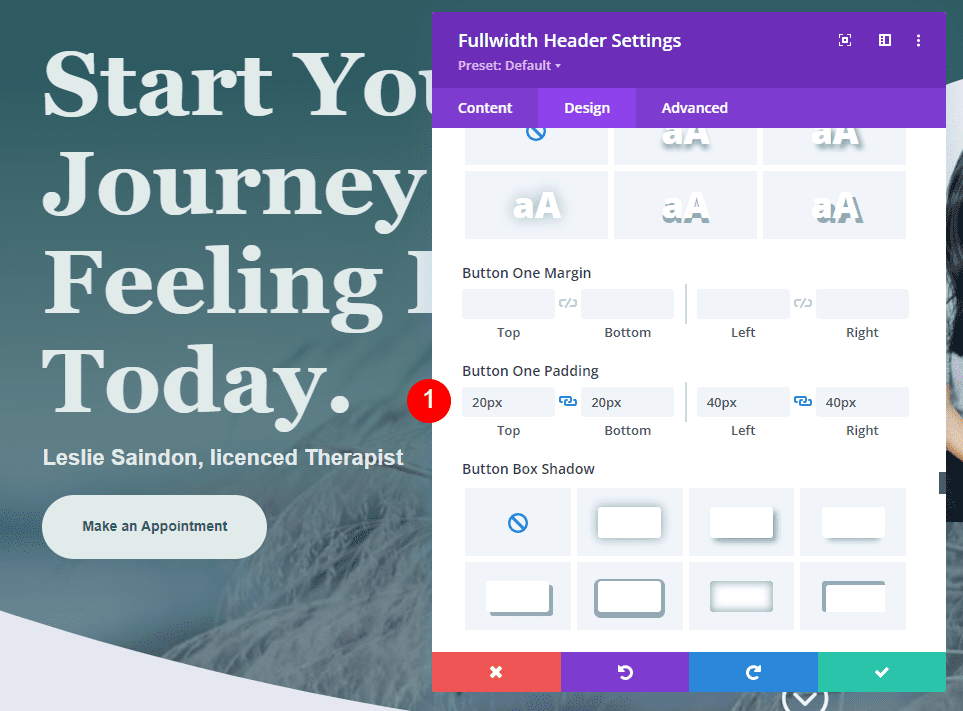
For the Button Padding, use 20px for the Top and Bottom and 40px for the Left and Right.
- Padding: 20px Top and Bottom, 40px Left and Right
Fullwidth Header Scroll Down Buttons Examples
Now that we have our Fullwidth Header, let’s see how to style the Scroll Down Buttons. We’ll look at four examples with various combinations of icons, colors, and sizes.
The Scroll Down Buttons include three settings. Each setting can be adjusted for each screen size independently. Settings include:
- Icon selection – choose from 11 icons. They include various arrow designs with or without background including non-circled, circled, and solid.
- Color – the standard Divi color selector.
- Size – the standard Divi size adjustment.
![]()
It also includes a CSS field in the Advanced tab. We’ll use all these settings.
Scroll Down Button Example One
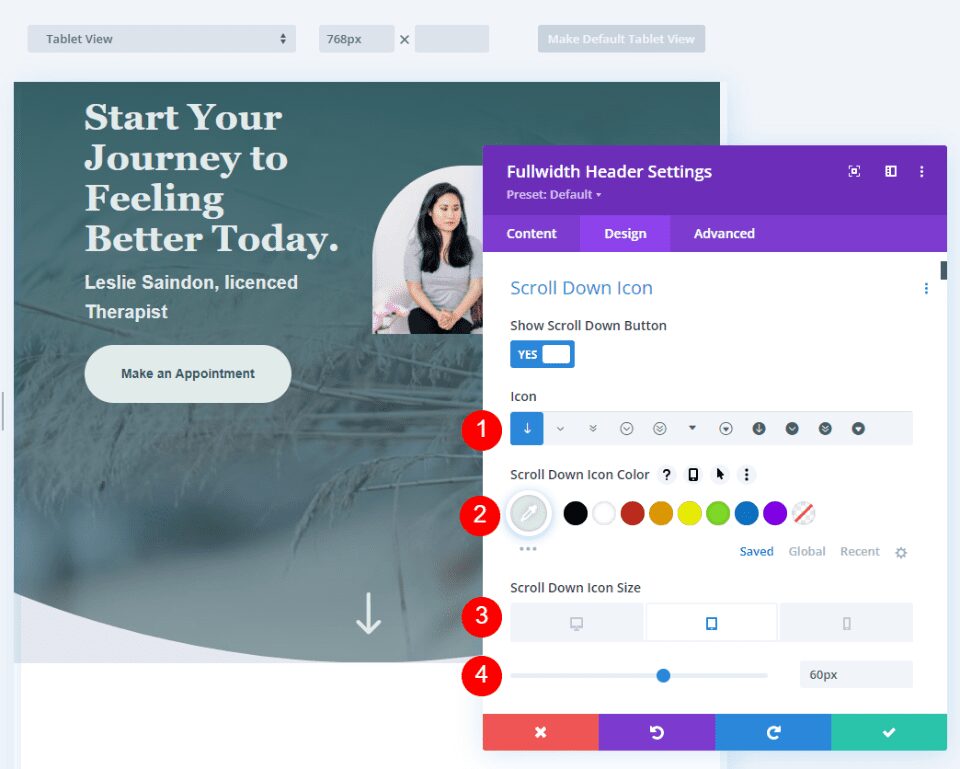
For our first example, we’ll use a non-circled icon without a background. Select the first icon, change the Color to #e1ecea, and change the Size to 66px for desktops, 60px for tablets, and 50px for phones.
- Icon: 1st icon
- Color: #e1ecea
- Size: 66px for desktops, 60px for tablets, 50px for phones
This creates a light green down arrow that works well with the rest of the design and stands out enough to inform the user.
Scroll Down Button Example Two
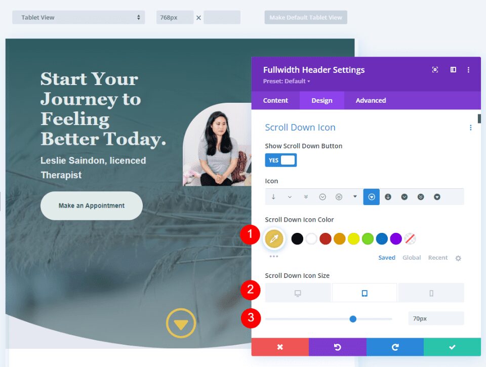
For our second example, we’ll use a circled icon. Select the seventh icon and change the Color to #e8c553. We’ll set the icon larger for this one. Change the Size to 78px for desktops, 70px for tablets, and 60px for phones.
- Icon: 7th icon
- Color: #e8c553
- Size: 78px for desktops, 70px for tablets, 60px for phones
This color is a variation of the yellow in the layout pack, but it’s lighter which works better over the green background. The icon has sharp corners, but the circle matches the rounded design of the layout.
Scroll Down Button Example Three
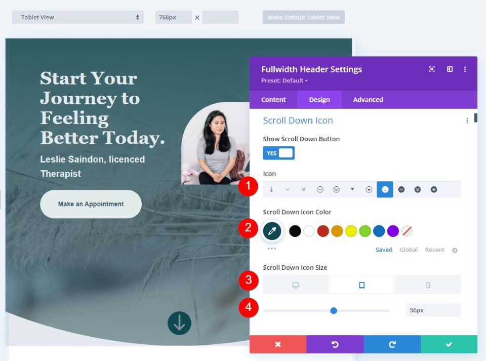
For our third example, we’ll use an icon that’s circled and has a background. This colors the background and creates the icon with an opening that allows the background image of the website to show through. For the best results, we’ll need to pay close attention to the icon’s size and the color of the button’s background.
Select the eighth icon and change its Color to #0e4951. Set the Size to 60px for desktops, 56pc for tablets, and 50px for phones.
- Icon: 8th icon
- Color: #0e4951
- Size: 60px for desktops, 56px for tablets, 50px for phones
The green is a darker shade of the green in the background. The darker shade stands out over the green and still matches the rest of the layout.
Scroll Down Button Example Four
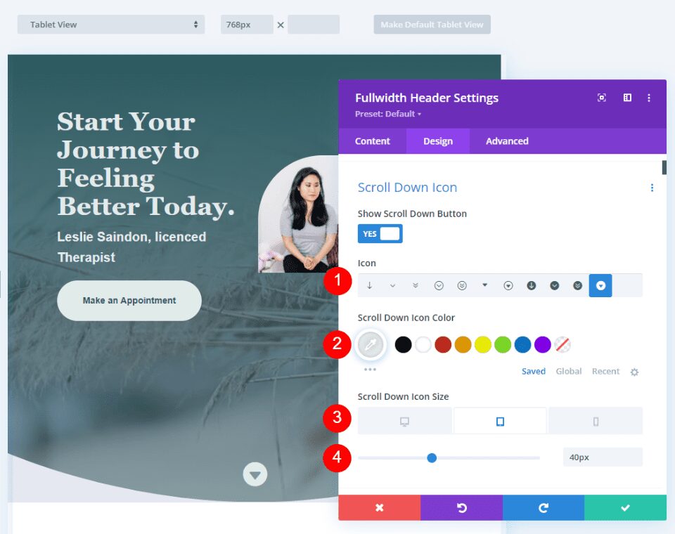
What if you want to combine colors, so you have a background color behind the cutout icon? We can do this with CSS. For this example, we’ll use CSS to create a background shape behind the icon that will show through the cutout icon. The icon itself will use the standard settings.
Select the eleventh icon and change the Color to #e1ecea. We’ll set the icon smaller for this one and create a large background shape. Change the Size to 50px for desktops, 40px for tablets, and 30px for phones.
- Icon: 11th
- Icon Color: #e1ecea
- Size: 50px for desktops, 40px for tablets, 30px for phones
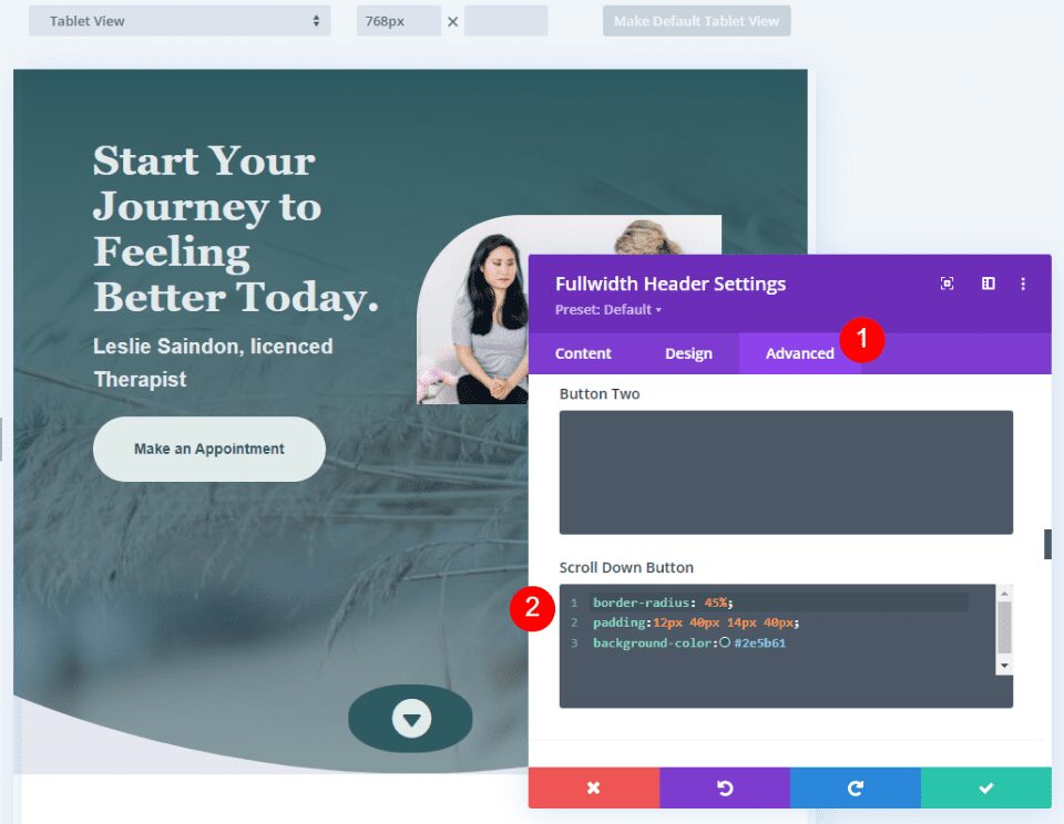
Next, go to the Advanced tab and scroll down to the Scroll Down Button’s CSS field and enter this CSS:
border-radius: 45%;
padding:12px 40px 14px 40px;
background-color:#2e5b61
This CSS format adds padding to the Top, Right, Bottom, and Left. I’ve used this padding to create a background oval that goes well with the design of the header using design cues from the layout.
Scroll Down Buttons Results
Desktop Scroll Down Button Example One

Phone Scroll Down Button Example One

Desktop Scroll Down Button Example Two

Phone Scroll Down Button Example Two

Desktop Scroll Down Button Example Three

Phone Scroll Down Button Example Three

Desktop Scroll Down Button Example Four

Phone Scroll Down Button Example Four

Ending Thoughts
That’s our look at four Scroll Down Buttons you can include in your Divi Fullwidth Header Module. The scroll button includes several icons to choose from and you can style its color and size. Using the CSS field, you can style the button even further. The combinations of the button’s styling options and CSS give you lots of design possibilities with your Scroll Down Buttons.
We want to hear from you. Do you style the Scroll Down Buttons in your Divi Fullwidth Header Module? Let us know in the comments.
The post How to Include a Scroll Down Button in Your Divi Fullwidth Header Module appeared first on Elegant Themes Blog.
