Divi’s Filterable Portfolio Module contains many elements, and each can be styled individually. The filter is one of the most useful elements, but it’s sometimes overlooked. In this post, we’ll see how to style the category filter in Divi’s Filterable Portfolio Module. We’ll see what can be done with the standard settings, and we’ll dig into CSS to see how to style it even further.
Let’s get started!
Preview
First, let’s see what we’ll build in this tutorial.
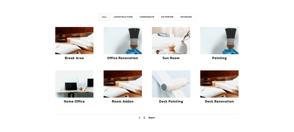
Desktop Category Filter Example One
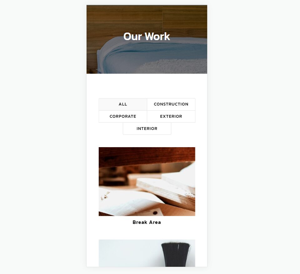
Phone Category Filter Example One
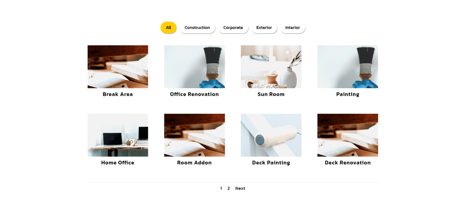
Desktop Category Filter Example Two
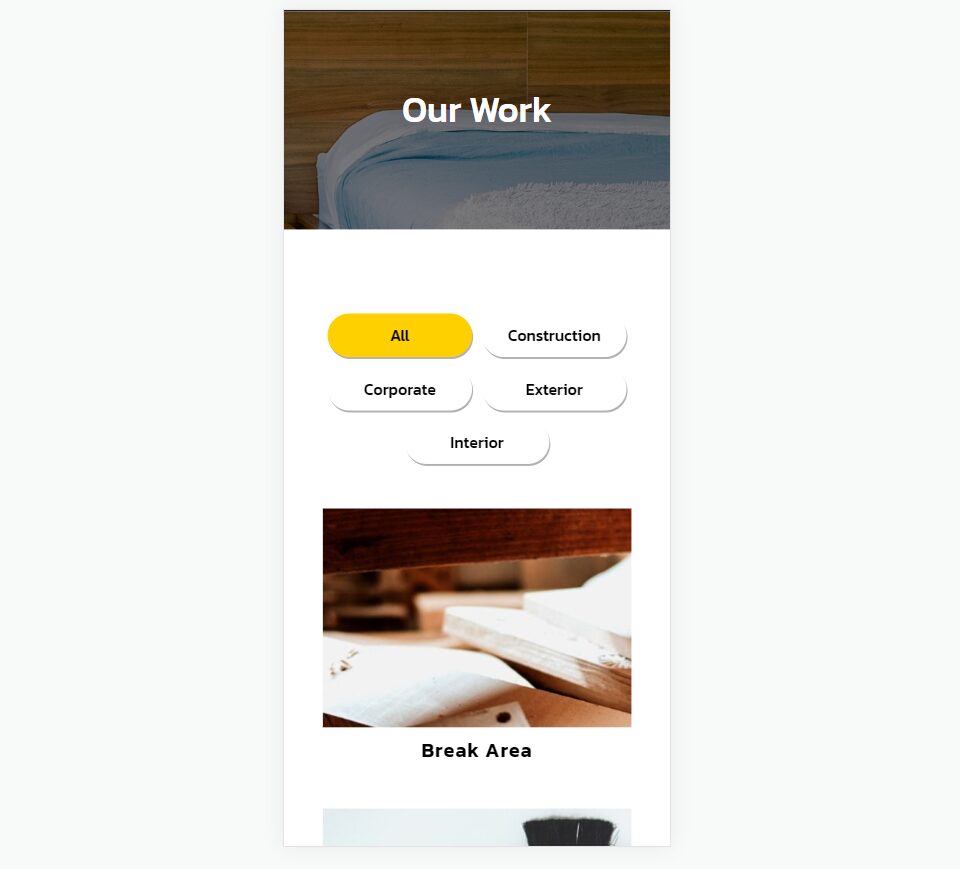
Phone Category Filter Example Two
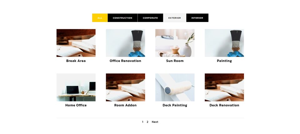
Desktop Category Filter Example Three
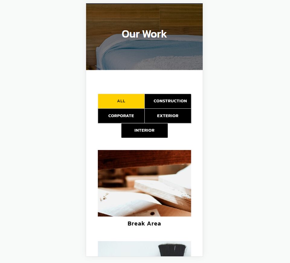
Phone Category Filter Example Three
Splitting Projects into Categories
To make the best use of the category filter, you’ll need to split your projects up into categories that make the most sense to your readers. To create your categories, go to Projects > Categories in the WordPress dashboard.
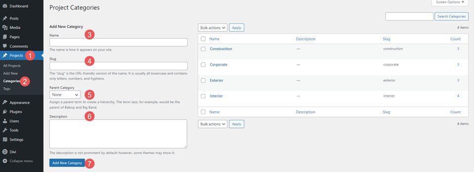
Here, you’ll see fields to add the name, slug, parent category, and description. You’ll also see your list of categories in a list where you can edit them.
Once you’ve created your categories, be sure to choose those for each of your projects that make the most sense to the reader. To create your projects, go to Projects and click Add New in the menu or at the top of the page.
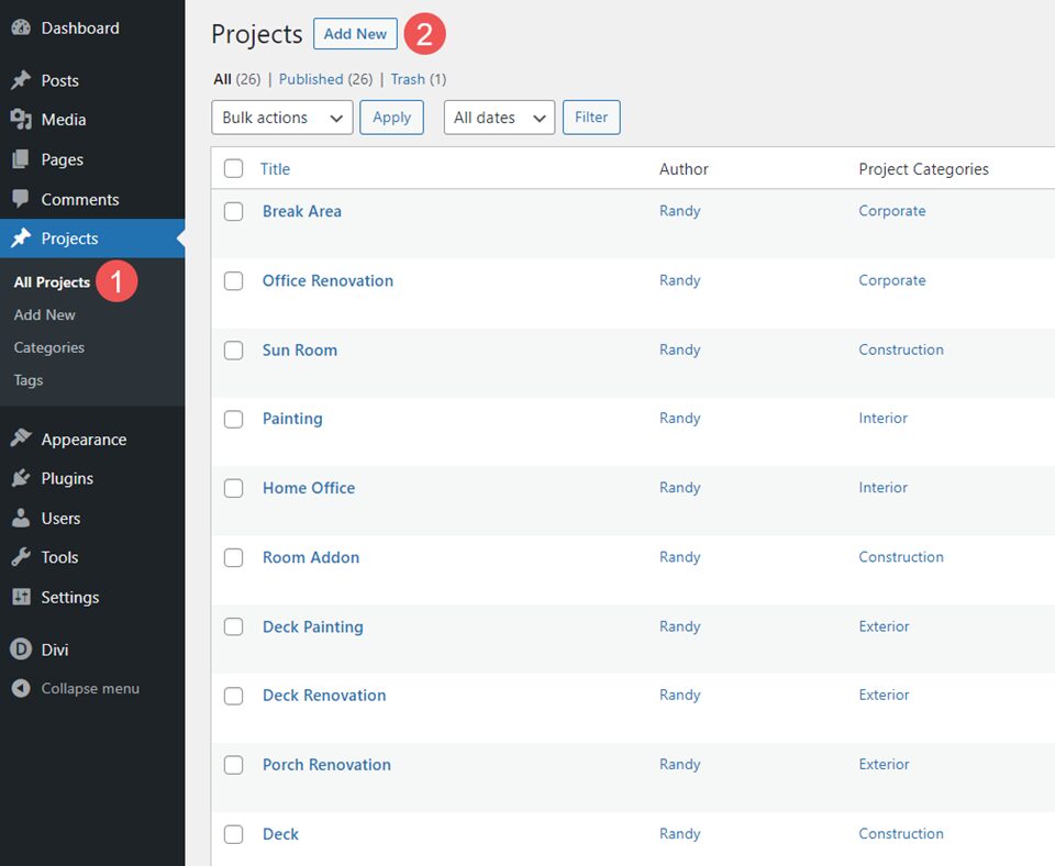
For my examples, I’ve created projects for a home renovation company. The company would focus on home renovations, but also include similar work for corporate and they could build from the ground up. For homes, I’m using Interior and Exterior categories. For all other work, I’ve added Corporate and Construction.
Filterable Portfolio Module Settings
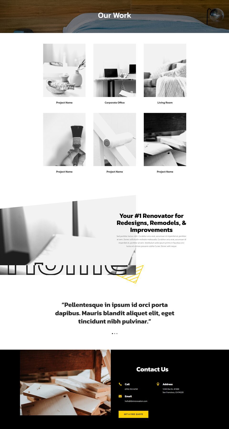
In our example, I’ll replace the portfolio section of the Portfolio page from the free Renovation Layout Pack with a Filterable Portfolio Module. First, let’s see how to style the module. Then, we’ll style the filter in three different ways. Here’s the page before I make the changes.
Here’s the page after adding the Filterable Portfolio Module in place of the images.
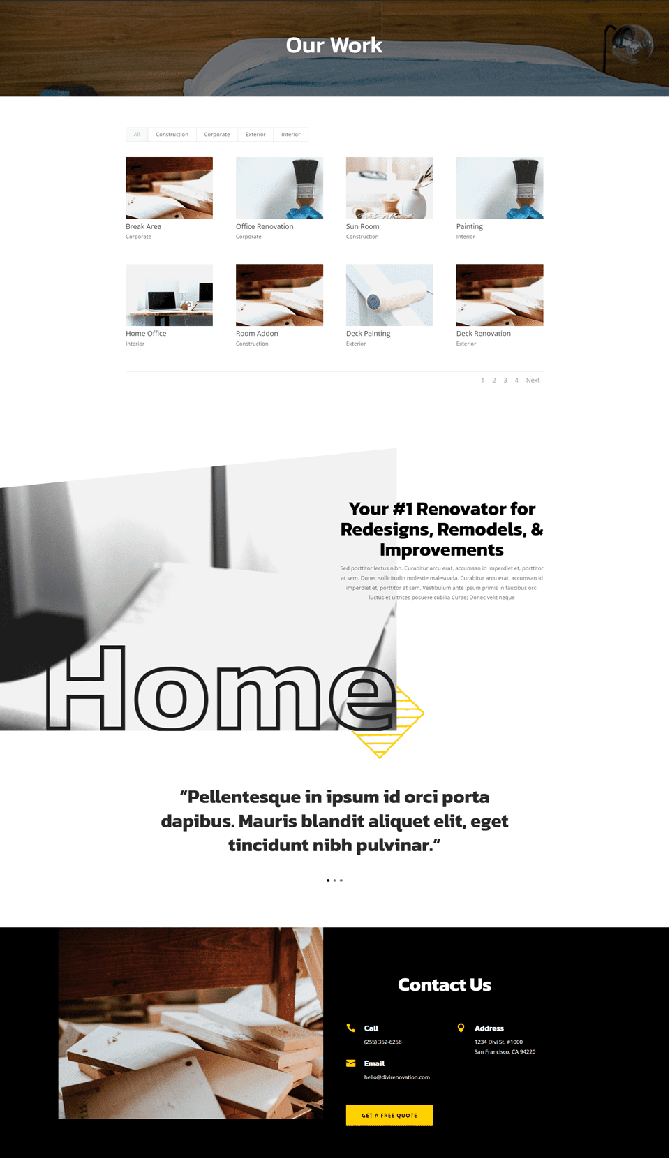
First, we’ll style the module. We’ll use these same settings for all three examples.
Content
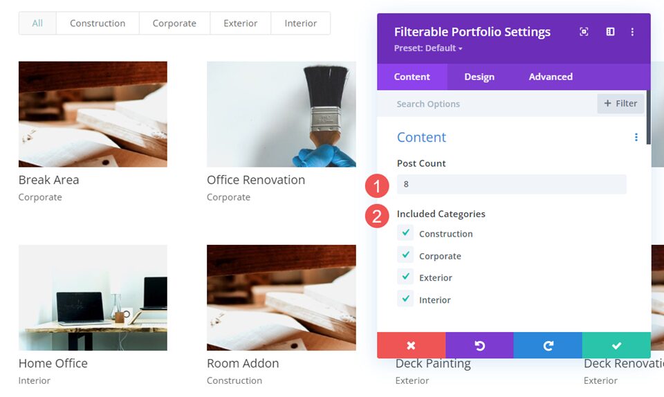
In the Content tab, set the Post Count to 8 and select the Categories from the list of Included Categories.
- Post Count: 8
- Included Categories: your choice
Elements
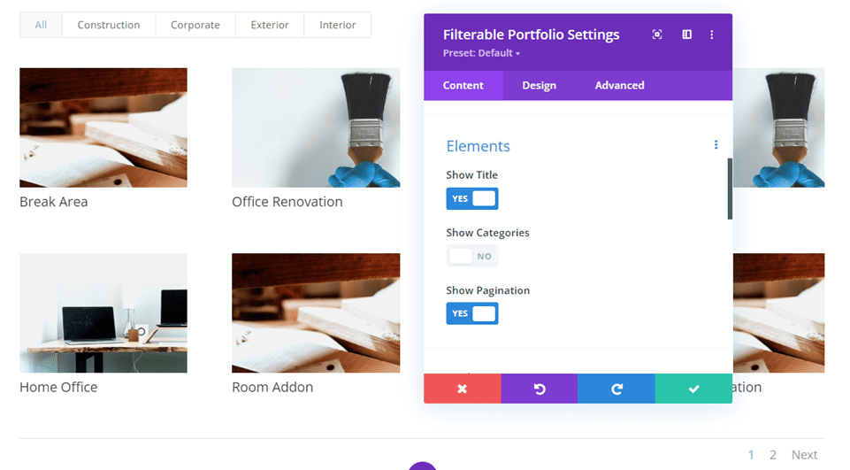
Scroll down to Elements and disable Show Categories. We’ll just use the titles and allow the filter to display the categories.
- Show Categories: No
Layout
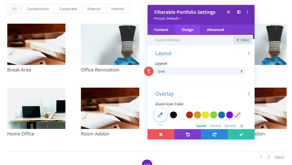
Next, go to the Design tab and select Grid under Layout. I had already selected it for the previous images, but the module does display fullwidth by default.
- Layout: Grid
Text
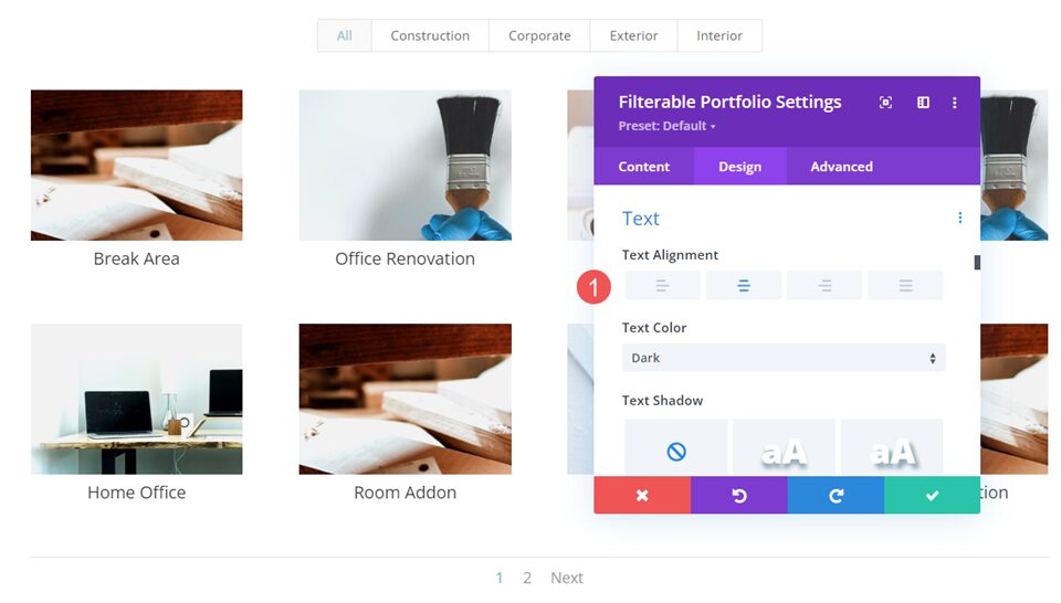
Next, scroll to Text and set the Text Alignment to Center. This centers the filter and pagination with the module and the titles with the project images.
- Text Alignment: Center
Title Text
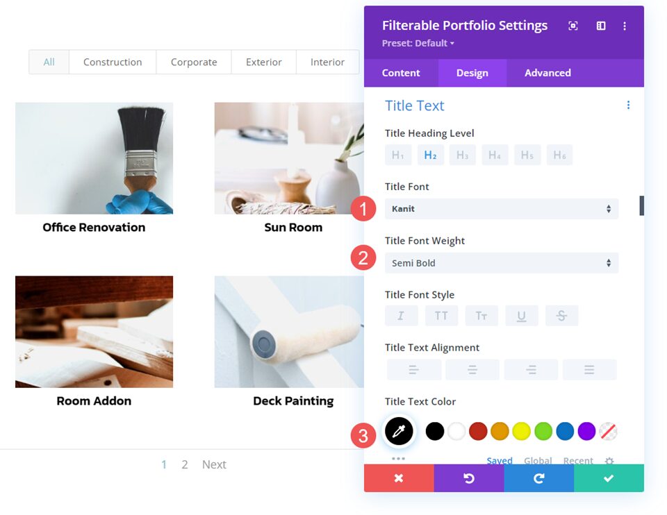
Next, scroll to Title Text. Change the Font to Kanit and set the Weight to Semi Bold. Set the Color to black.
- Font: Kanit
- Weight: Semi Bold
- Color: #000000
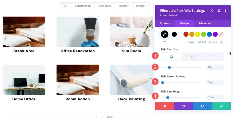
Change the Font Size to 20px for desktops, 18px for tablets, and 16px for phones. Set the Line Spacing to 1px and the Line Height to 1.3em.
- Size: 20px desktop, 18px tablet, 16px phone
- Letter Spacing: 1px
- Line Height: 1.3em
Pagination Text
Next, scroll down to Pagination Text and change the Font to Kanit. Change the Color to black.
- Font: Kanit
- Color: #000000
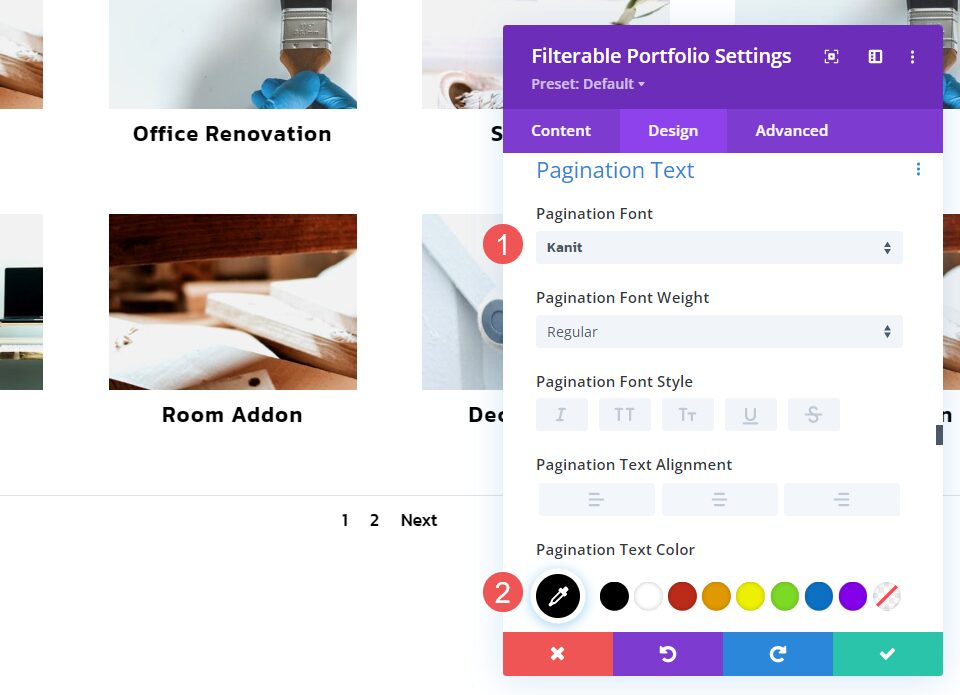
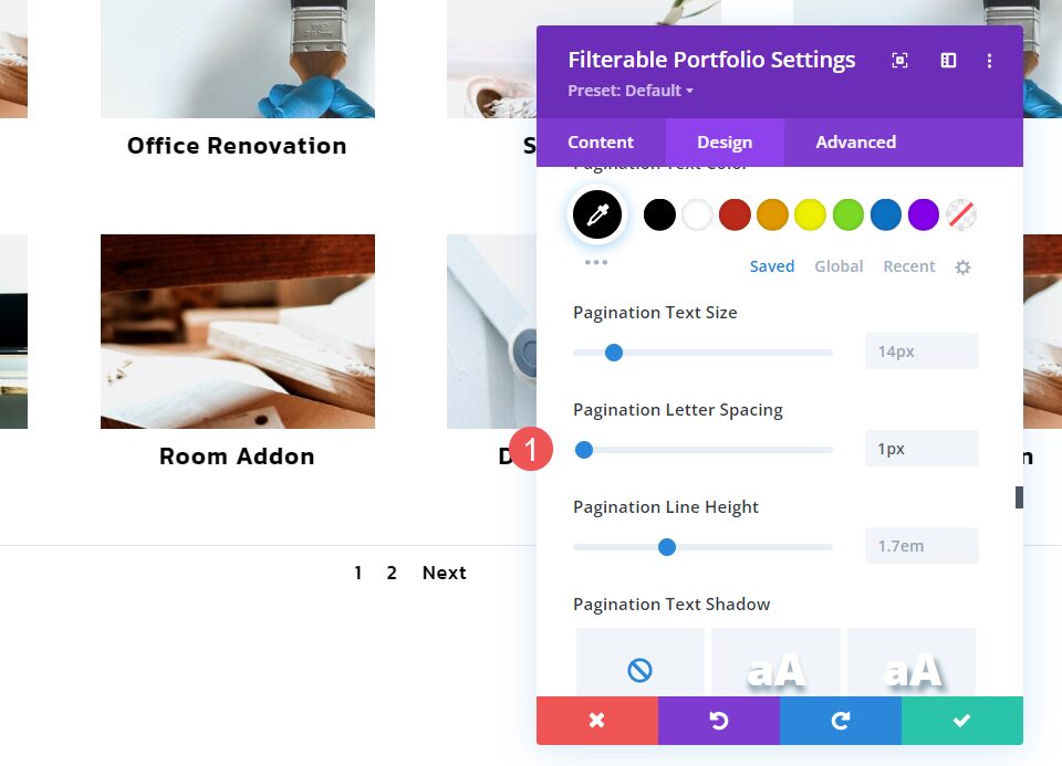
Change the Line Spacing to 1px. Save your work. We can now style the category filter for our examples.
- Letter Spacing: 1px
Category Filter Examples
Now, we can move on to our Category Filter examples. I’m using design cues from the layout pack.
Category Filter Example One
Our first example is the simplest of the three. It uses the basic settings and doesn’t do anything fancy. It works well with the layout design.
Filter Criteria Text
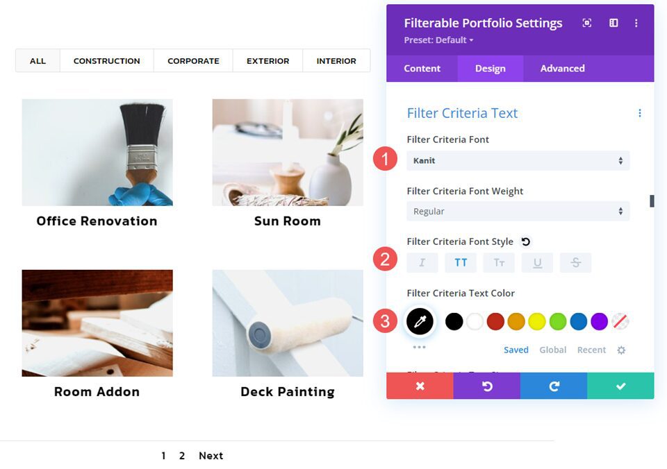
In the Design tab, scroll down to Criteria Text. Change the Font to Kanit. Change the Style to TT and the Color to black.
- Font: Kanit
- Style: TT
- Color: #000000
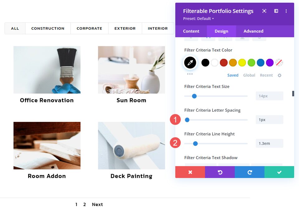
Set the Line Spacing to 1px and set the Line Height to 1.3em. That’s it for the first one. Now, save your settings and close the module.
- Letter Spacing: 1px
- Line Height: 1.3em
Category Filter Example Two
Our second example will use some simple CSS for the module and the page to create rounded corners and a box shadow. This one looks the most different.
Filter Criteria Text
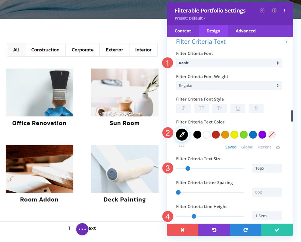
Go to the Design tab and scroll down to Filter Criteria Text. Change the Font to Kanit. Set the Color to black, the Size to 16px, and the Line Height to 1.5em. The Font Size works well on all screen sizes, so we won’t need to adjust it for tablets or phones.
- Font: Kanit
- Color: #000000
- Size: 16px
- Line Height: 1.5em
Module CSS
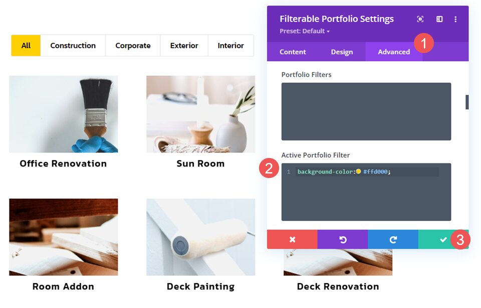
Next, go to the Advanced tab. Scroll down to Active Portfolio Filter and add CSS for the Background Color and close the module. This changes the background color of the active filter. Any filter the user clicks changes to this background color and the previous filter reverts to the regular color.
- Active Portfolio Filter CSS:
background-color:#ffd000;
Page Settings CSS
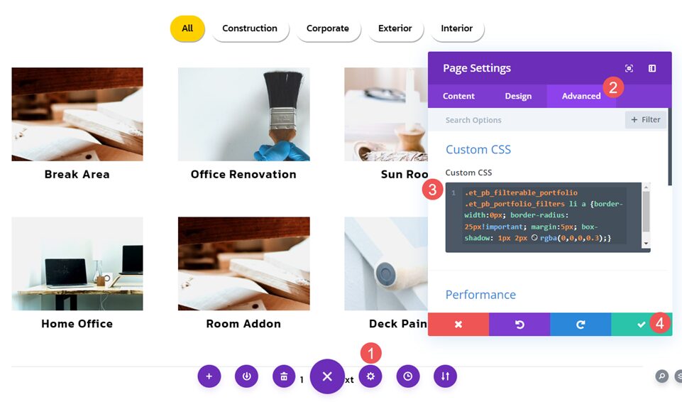
Next, open the Page Settings in the page menu. In the Page Settings modal, select the Advanced tab and paste the Custom CSS into the field. This CSS removes the border from the filter items, creates a border-radius of 25px, and adds 5px of margin between the items. It also adds a small box-shadow at the bottom of the items and changes the color of the shadow. Close the module and save your settings.
- Custom CSS:
.et_pb_filterable_portfolio .et_pb_portfolio_filters li a {border-width:0px; border-radius: 25px!important; margin:5px; box-shadow: 1px 2px rgba(0,0,0,0.3);}
Category Filter Example Three
Our third example follows similar CSS design ideas from the previous example. It doesn’t include rounded corners, and it changes the font and background colors on hover. It also uses CSS for both the module and the page.
Filter Criteria Text
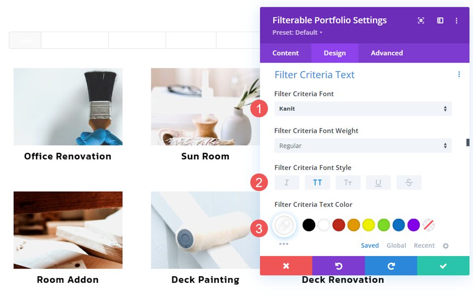
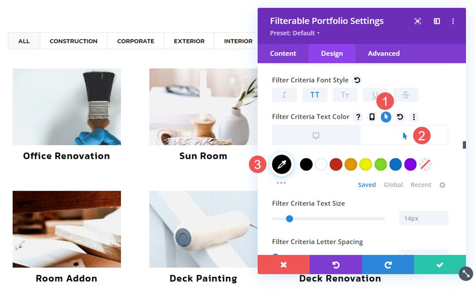
Go to the Design tab and scroll down to Filter Criteria Text. Choose Kanit for the Font, set the Style to TT, and the Color to white.
- Font: Kanit
- Style: TT
- Color: #ffffff
Next, select the Hover option for the Text Color and change the Color to black. This takes care of the fonts on hover. We’ll handle the backgrounds with CSS. Change the Letter Spacing to 1px and the Line Height to 1.3em.
- Hover Color: #000000
- Letter Spacing: 1px
- Line Height: 1.3em
Module CSS
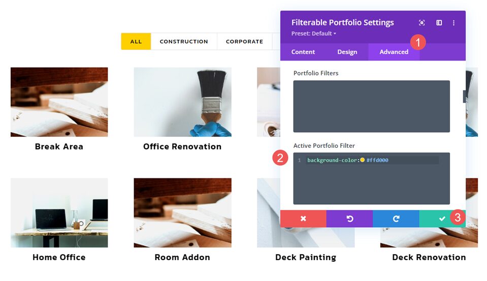
Next, go to the Advanced tab and scroll down to Active Portfolio Filter. Add the following CSS to change the background of the active filter. Close the module.
- Active Portfolio Filter CSS:
background-color:#ffd000
Page Settings CSS
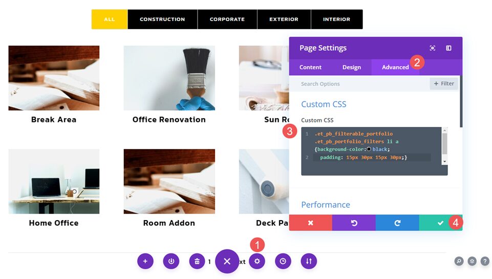
Finally, open the Page Settings. go to the Advanced tab and enter the following Custom CSS. Close the module and save your settings. This changes the Background to black, adds 15px of padding to the top and bottom, and 30px Padding to the Left and Right. This resizes the filter items to closely match the buttons within the layout and helps create the color change for the hover effect. The background will change to white on hover.
- Custom CSS:
.et_pb_filterable_portfolio .et_pb_portfolio_filters li a {background-color:black; padding: 15px 30px 15px 30px;}
Results
Desktop Category Filter Example One

Phone Category Filter Example One

Desktop Category Filter Example Two

Phone Category Filter Example Two

Desktop Category Filter Example Three

Phone Category Filter Example Three

Ending Thoughts
That’s our look at how to style the category filter in Divi’s Filterable Portfolio Module. The category filter includes the same styling tools as the other elements, so it can easily be styled to work with any Divi layout. Adding CSS to both the module and the page, we can style the category filter in lots of unique ways to stand out from the crowd.
We want to hear from you. Have you styled your category filter in Divi’s Filterable Portfolio Module? Let us know about it in the comments.
The post How to Style the Category Filter in Divi’s Filterable Portfolio Module appeared first on Elegant Themes Blog.
