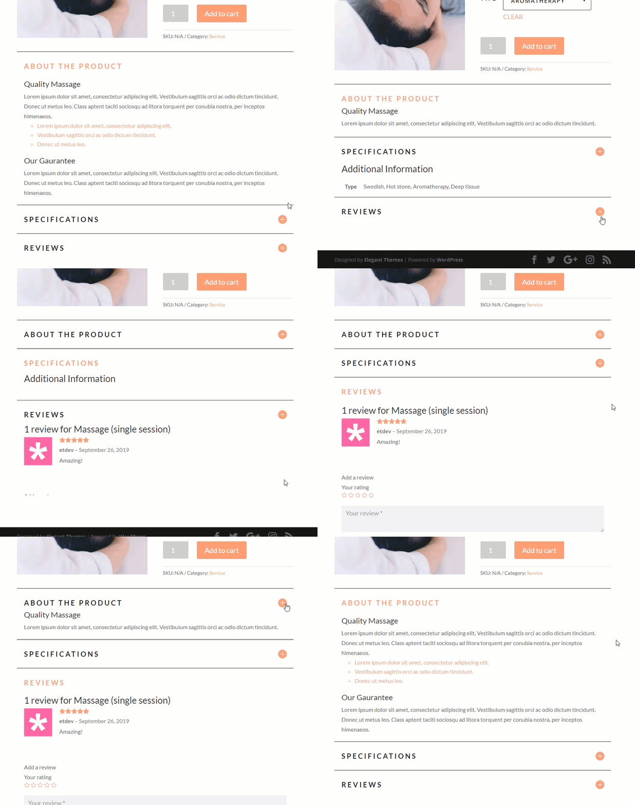
When building a product page in Divi, we can utilize the accordion module to display product info using dynamic content. This will give you product pages a unique design as well preserve valuable space on the page.
In this tutorial, we will show you how to use Divi’s dynamic content functionality to create a product info accordion and also how to design the accordion (and its content) using the Divi Visual Builder.
Let’s get started.
Sneak Peek
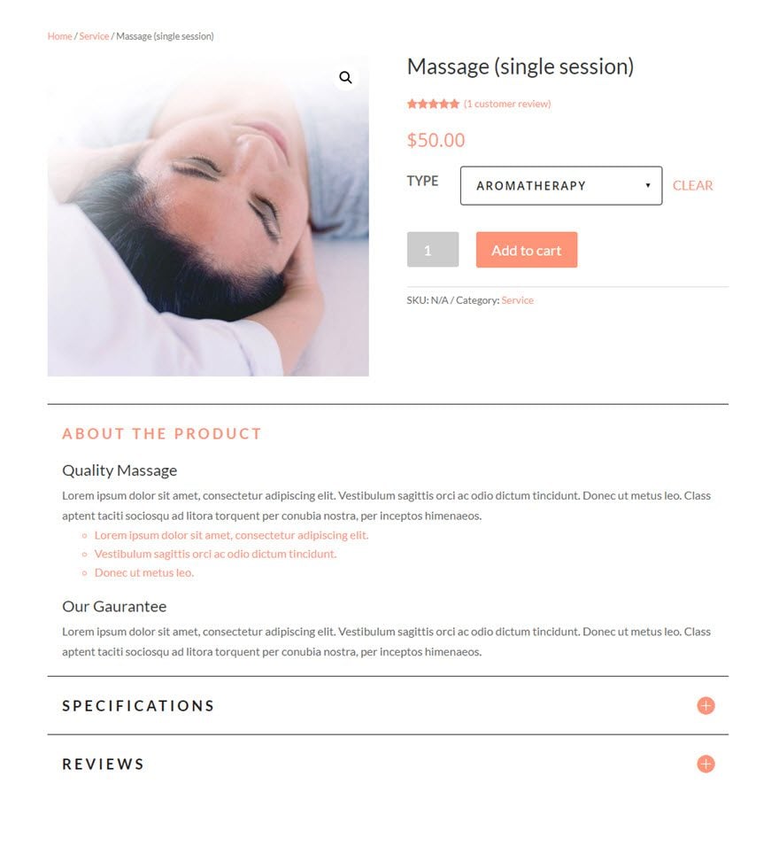
Here is a quick peek at the design we will build in this tutorial.
Download the Product Info Accordion Layout for FREE
To lay your hands on the layout design from this tutorial, you will first need to download it using the button below. To gain access to the download you will need to subscribe to our Divi Daily email list by using the form below. As a new subscriber, you will receive even more Divi goodness and a free Divi Layout pack every Monday! If you’re already on the list, simply enter your email address below and click download. You will not be “resubscribed” or receive extra emails.
@media only screen and ( max-width: 767px ) {.et_bloom .et_bloom_optin_1 .carrot_edge.et_bloom_form_right .et_bloom_form_content:before, .et_bloom .et_bloom_optin_1 .carrot_edge.et_bloom_form_left .et_bloom_form_content:before { border-top-color: #ffffff !important; border-left-color: transparent !important; }
}.et_bloom .et_bloom_optin_1 .et_bloom_form_content button { background-color: #f92c8b !important; } .et_bloom .et_bloom_optin_1 .et_bloom_form_content .et_bloom_fields i { color: #f92c8b !important; } .et_bloom .et_bloom_optin_1 .et_bloom_form_content .et_bloom_custom_field_radio i:before { background: #f92c8b !important; } .et_bloom .et_bloom_optin_1 .et_bloom_border_solid { border-color: #f7f9fb !important } .et_bloom .et_bloom_optin_1 .et_bloom_form_content button { background-color: #f92c8b !important; } .et_bloom .et_bloom_optin_1 .et_bloom_form_container h2, .et_bloom .et_bloom_optin_1 .et_bloom_form_container h2 span, .et_bloom .et_bloom_optin_1 .et_bloom_form_container h2 strong { font-family: “Open Sans”, Helvetica, Arial, Lucida, sans-serif; }.et_bloom .et_bloom_optin_1 .et_bloom_form_container p, .et_bloom .et_bloom_optin_1 .et_bloom_form_container p span, .et_bloom .et_bloom_optin_1 .et_bloom_form_container p strong, .et_bloom .et_bloom_optin_1 .et_bloom_form_container form input, .et_bloom .et_bloom_optin_1 .et_bloom_form_container form button span { font-family: “Open Sans”, Helvetica, Arial, Lucida, sans-serif; } p.et_bloom_popup_input { padding-bottom: 0 !important;}

Download For Free
Join the Divi Newlsetter and we will email you a copy of the ultimate Divi Landing Page Layout Pack, plus tons of other amazing and free Divi resources, tips and tricks. Follow along and you will be a Divi master in no time. If you are already subscribed simply type in your email address below and click download to access the layout pack.
You have successfully subscribed. Please check your email address to confirm your subscription and get access to free weekly Divi layout packs!
To import the layout to your page, simply extract the zip file and drag the json file into the Divi Builder.
Bear in mind that you must have a product setup as described in this tutorial to see the same results.
Let’s get to the tutorial shall we?
Getting Started
To get started, you will need to do the following:
Setting up the Example Product
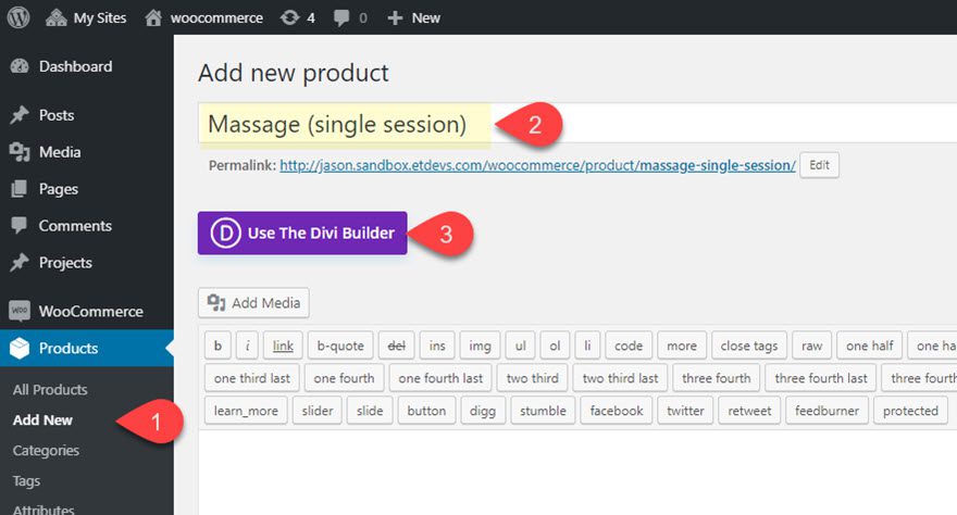
To set up the example product for this tutorial, navigate to Products > Add New. Give the product the title, “Massage (single session)”, and click to use the Divi Builder.
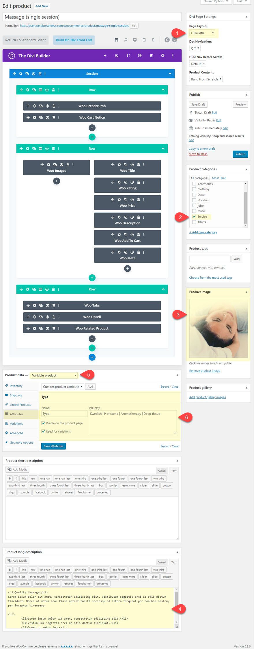
Next, update the following Product page settings and product information:
1. Under Divi Page Settings, select the No Sidebar Page layout.
2. Add/select a Product Category
3. Add the Product Image
4. Add the following product long description content:
<h3>Quality Massage</h3>

Lorem ipsum dolor sit amet, consectetur adipiscing elit. Vestibulum sagittis orci ac odio dictum tincidunt. Donec ut metus leo. Class aptent taciti sociosqu ad litora torquent per conubia nostra, per inceptos himenaeos.

<ul>
 	<li>Lorem ipsum dolor sit amet, consectetur adipiscing elit.</li>
 	<li>Vestibulum sagittis orci ac odio dictum tincidunt.</li>
 	<li>Donec ut metus leo.</li>
</ul>

<h3>Our Guarantee</h3>

Lorem ipsum dolor sit amet, consectetur adipiscing elit. Vestibulum sagittis orci ac odio dictum tincidunt. Donec ut metus leo. Class aptent taciti sociosqu ad litora torquent per conubia nostra, per inceptos himenaeos.
5. Under the Product Data, change the product type to Variable Product.
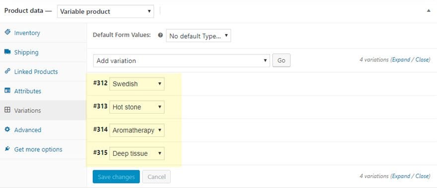
6. Add an Attribute named “Type” with the following Values: Swedish | Hot stone | Aromatherapy | Deep tissue. Make sure to select “Used for variations”.
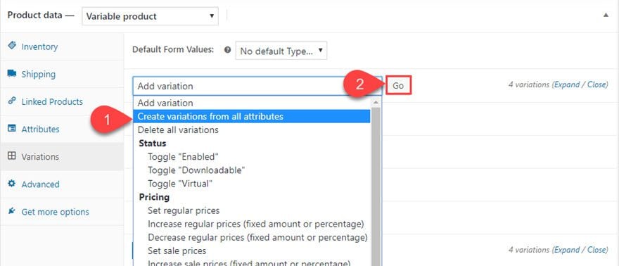
7. Then in the variations tab under the product data toggle, use the dropdown input to create variations from all attributes.
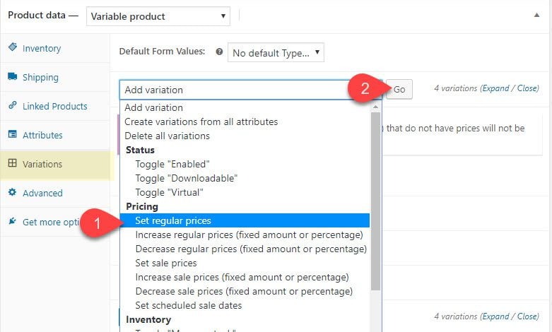
8. Select “Set regular prices” from the dropdown to set the regular price for all three variables.
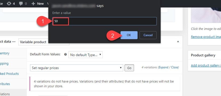
9. In the popup box, enter the value “50” and select OK.
10. After you are finished, save or publish the product.
Now you are ready to start designing your layout with a custom product info Accordion.
Creating the Product Info Accordion with Dynamic Content in Divi
The default product layout displays product info using various Woo Modules throughout. For this example, we want to use the accordion to display three main pieces of product info: product description, product additional information, and product reviews. All three of these pieces of content are currently being displayed inside the woo tabs module. All we need to do is delete the woo tabs module and replace it with an accordion module with the same info pulled in via dynamic content.
Here’s how to do it.
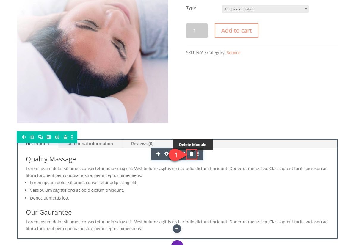
First, click to use Divi on the front end to deploy the visual builder. Then delete the Woo Tabs Module.
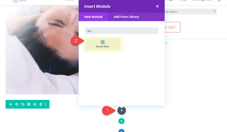
Then add a new Accordion Module to replace the tabs.
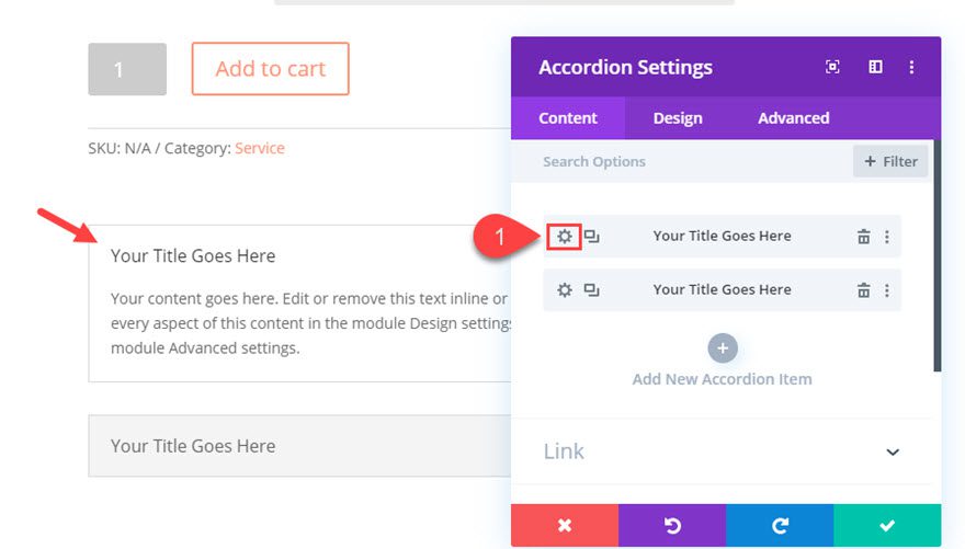
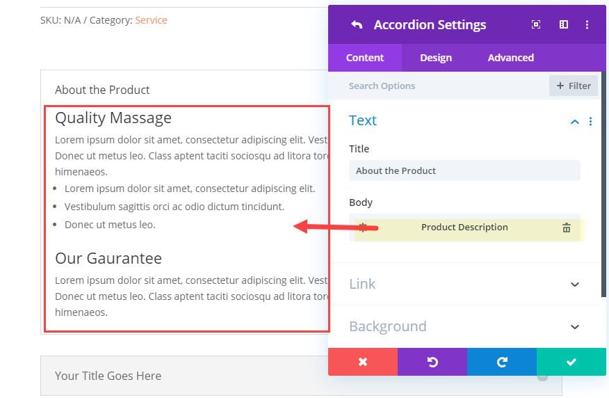
In the Accordion Settings popup, click the gear icon on the first accordion open the individual accordion settings.
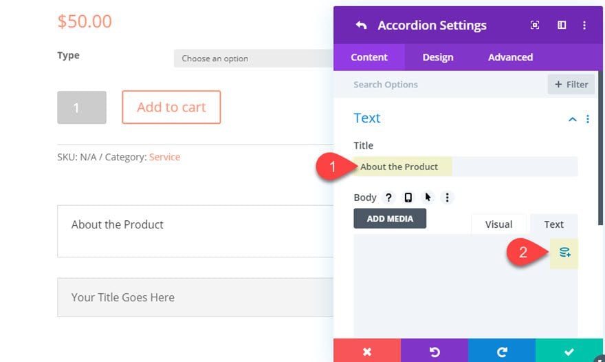
Enter the title, “About the Product”.
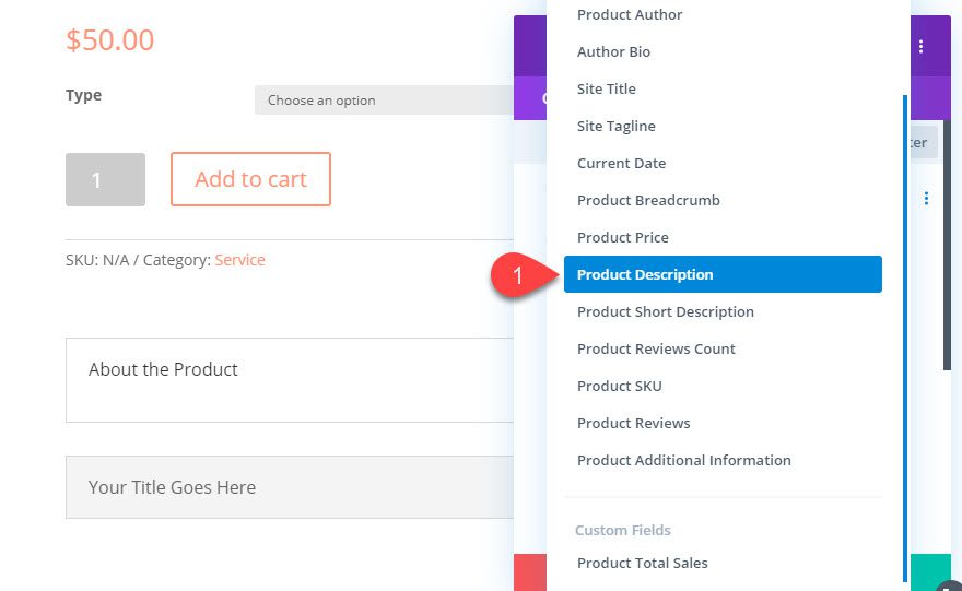
Then hover over the body content input box and click the dynamic content icon.
Select “Product Description” from the list of dynamic content.
This will pull in the product long description we have set for the product on the backend.
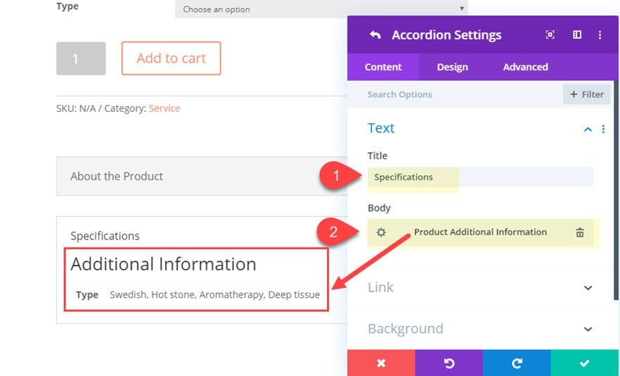
After you have the first accordion content in place, open the settings for the second accordion and update the following:
- Title: Specifications
Then add the “Product Additional Information” dynamic content to the body.
After the second accordion content is ready, add a new accordion item and update the settings for that accordion as follows:
- Title: Reviews
Then add the “Product Reviews” dynamic content to the body to pull in the product review element/content.
NOTE: Make sure you have added at least one review to the product in order to see the content on the live page.
Designing the Product Info Accordion and Content with Divi
Now that our product info accordion has the dynamic content needed to display the product information, we are ready to style the accordion using the built-in accordion module settings.
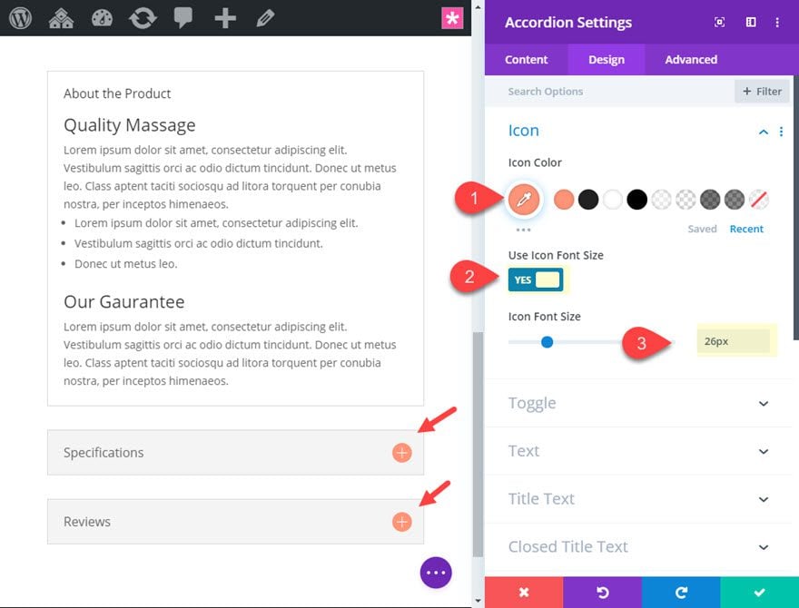
Open the Accordion Module settings, and update the following:
- Icon Color: #ff9375
- Use Icon Font Size: YES
- Icon Font Size: 26px
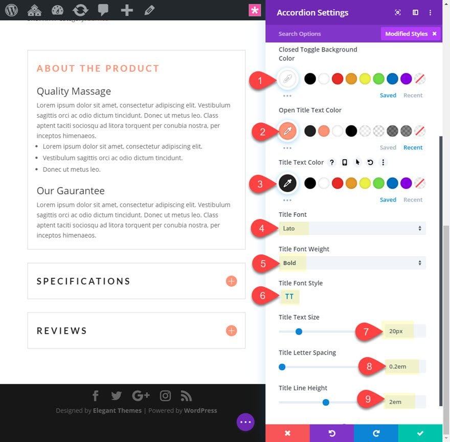
- Closed Toggle Background Color: #ffffff
- Open Title Text Color: #ff9375
- Title Text Color: #222222
- Title Font: Lato
- Title Font Weight: Bold
- Title Font Style: TT
- Title Text Size: 20px
- Title Letter Spacing: 0.2em
- Title Line Height: 2em
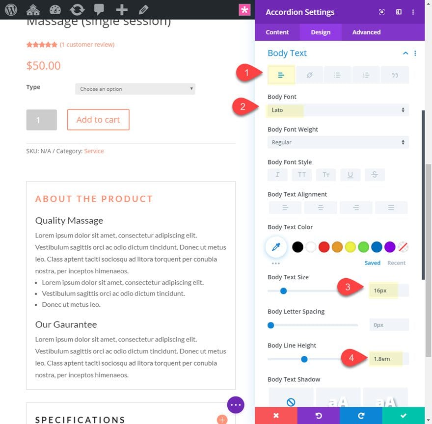
- Body Font: Lato
- Body Text Size: 16px
- Body Line Height: 1.8em
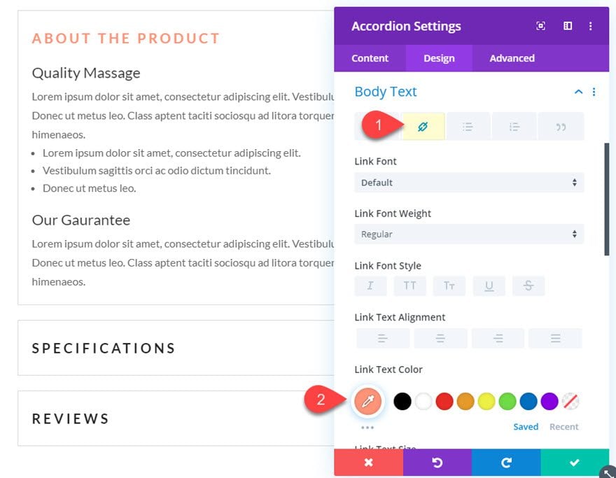
- Link Text Color: #ff9375
This will target any links you have inside the dynamic content for each accordion included things like the review star rating.
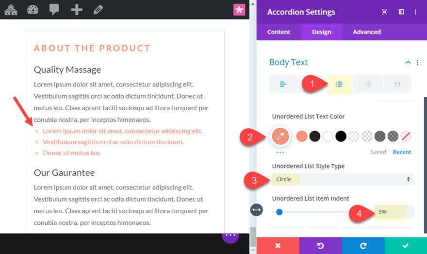
- Unordered list text color: #ff9375
- Unordered List Style Type: Circle
- Unordered List Item Indent: 5%
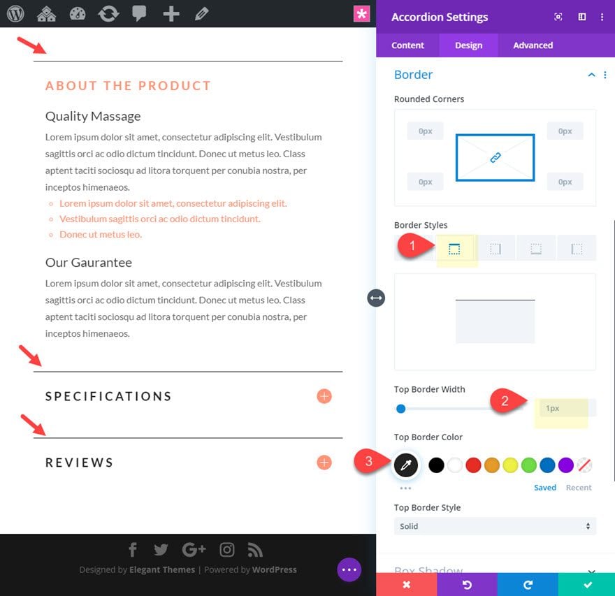
- Border Width: 0px
- Top Border Width: 1px
- Top Border Color: #222222
And for one final step, let’s add a small snippet of css to take out the default margin between the accordion toggles.
Under the advanced tab, add the following CSS to the Toggle element:
margin-bottom: 0px;
Now let’s check out the final design of the product info accordion.
Final Adjustments to the Layout
There are a few adjustments that we can make to the layout to match the design of the accordion. For example, we can adjust the font for each of the modules to Lato, add a custom border and border radius around the variable dropdown, and update the add to cart button with a solid background color to match.
Once done, here is the final result.
I’ve included this layout design as a free download above. Feel free to check it out for yourself. Bear in mind that you must have the product setup as described in this tutorial to see the same results.
NOTE: The default color for many of the WooCommerce elements for a product in Divi is inherited from the secondary color value from the Theme Customizer Settings. It might be easier to update this secondary color once instead of updating the colors per woo module.
Final Thoughts
As we’ve learned, Woo Modules are not the only elements that can be used to pull in dynamic product info. The product info accordion is a great example of how you can use any Divi module to display product info in a unique and concise way. Feel free to explore new and exciting accordion designs for your product pages. And, of course, you can use multiple toggle modules instead of an accordion to achieve similar results.
I look forward to hearing from you in the comments.
Cheers!
.inline-code{padding: 0px 4px; color: crimson; font-family: Monaco,consolas,bitstream vera sans mono,courier new,Courier,monospace!important}
The post How to Use Dynamic Content to Create a WooCommerce Product Info Accordion in Divi appeared first on Elegant Themes Blog.


