Divi’s new Gradient Builder is a powerful tool that creates any type of gradient background you want. It’s easy to use and you can add multiple colors to create gradients that are interesting and unique. However, adding more colors can take more thought in the design process. In this post, we’ll see how to use the Divi Gradient Builder to blend multiple gradient colors effortlessly to help you get started on creating your own multi-color gradients.
Multiple Gradient Colors Preview
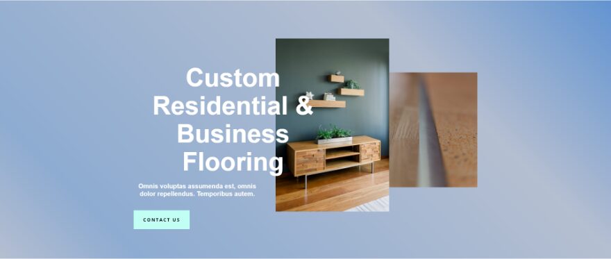
First, let’s take a look at what we’ll build in this tutorial. We’ll create four different gradients using the same layout.
First Example Results
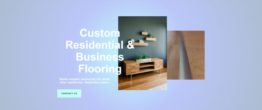
Second Example Results
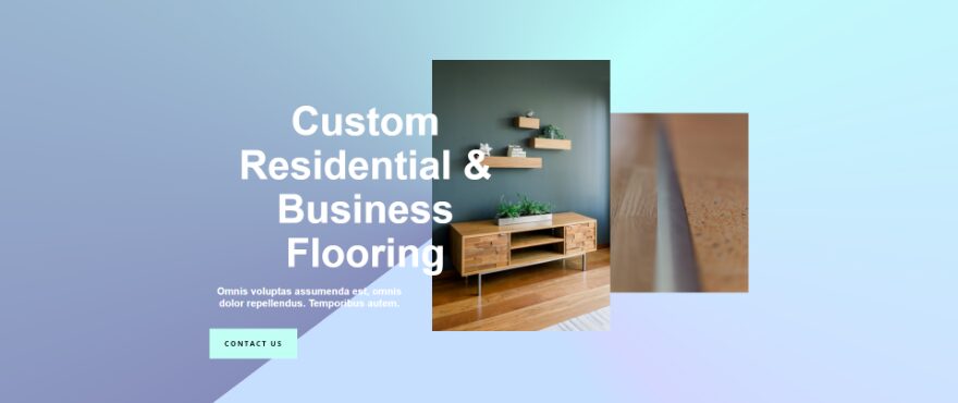
Third Example Results

Fourth Example Results
Best Practices for Combining Multiple Gradient Colors
Like all design principles, there are a few things to keep in mind when combining multiple gradient colors. Here are a few things to keep in mind when combining multiple gradient colors to get the best look and feel for your website.
Focus on Color Families
Stay within the same color family while using different shades of the same color. This keeps a lower contrast between background colors, which keeps the background from becoming too distracting. We’ll use this technique for our first example.
Try Toned-Down Colors
Try various shades of toned-down colors with the same level. This gives you more color while keeping the contrast between them low. Pastels are a good example of this. This gives your background multiple shades of color without it distracting from the foreground. We’ll use this method in our second example.
Prioritize Legibility
Always prioritize legibility in your design. When designing colors and patterns with your gradients, make sure your content is always legible. One way to do this is to push the gradient to one side of the screen. This allows you to design a gradient that stands out without getting in the way of the content. We’ll use this method for our third example.
Use Intersecting and Blended Gradients
Combine intersecting gradients with blended gradients to create hard lines and soft tones. This can create interesting patterns without getting in the way of your content. Try different directions and gradient stop points to see what works best for your layout. Use these settings to create circles, hard lines, and more. We’ll also use this method for our third example.
Use Different Gradient Types
Experiment with different gradient types to get unique results. For example, conical is a great gradient type to create a unique look and feel with different gradient colors. We’ll use conical in our fourth example.
Don’t Use Too Many Colors
Don’t use more colors just for the sake of having more colors. Two to three colors are usually ideal, but you can use more if you’re careful. When using even more colors, keep them as similar as possible so they become shades rather than stark contrasts.
Don’t Choose Colors Randomly
Use colors that work well with your content and website. Not only does this keep your content legible, but it also looks like it belongs on the website.
Remember UX
Always consider the user experience. Check the gradient with content over it to see how well it works. Have several users look at the content and gradient to make sure it works well for them.
Test Your Gradients
Try multiple types and colors of gradients with a/b testing to see what gets the best results.
Multiple Gradient Colors Examples
Now, let’s look at a few Gradient Builder examples. For these examples, I’ve tweaked the hero from the About Page from the free Flooring Layout Pack that’s available within Divi. I’ve given it a new background color, #6294d1, and a new button color, #c1fff4.
- Background Color: #6294d1
- Button Color: #c1fff4

How to Create Multiple Gradient Colors with the Divi Gradient Builder
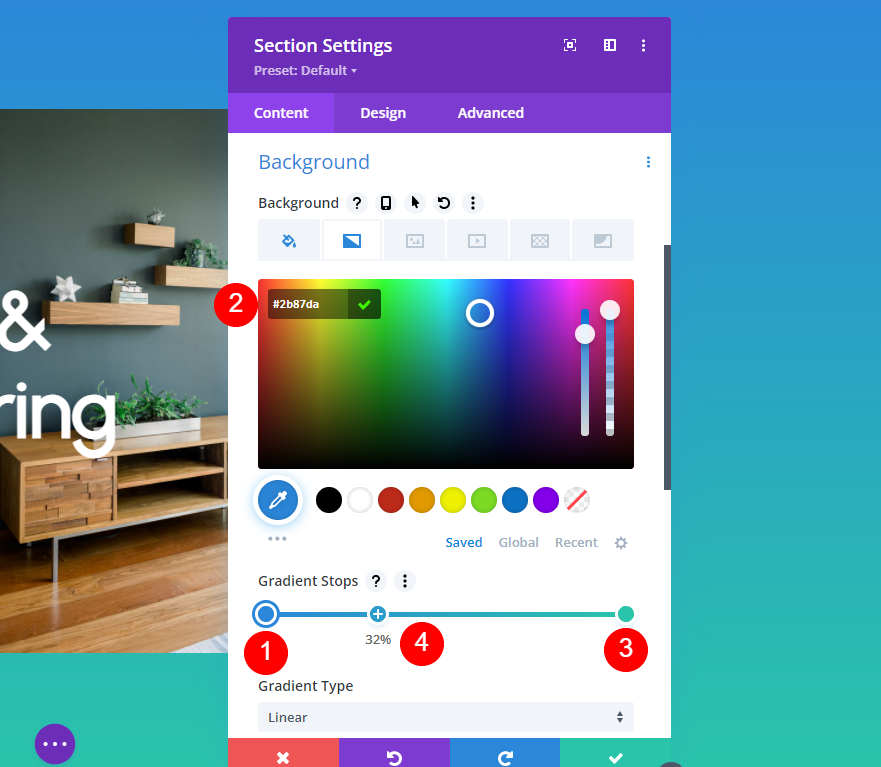
First, let’s see how to make the adjustments within the Divi Gradient Builder. We’ll add the gradient to the background of a section. To get started, click on the section’s settings icon.

Next, scroll down to Background. Select the Background Gradient tab and click Add Background Gradient.
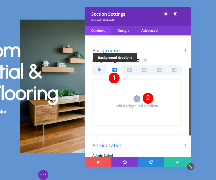
The gradient starts with two colors. Select the gradients on the Gradient Stops bar to change their colors and drag them to a new starting position. Add as many gradients as you want. You can add more, delete them, edit them, etc.
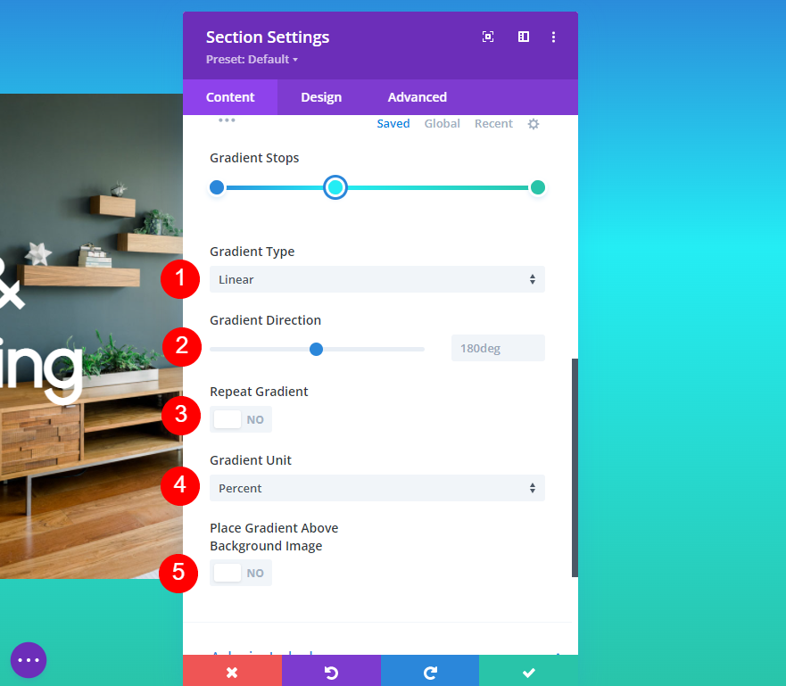
Adjust the Type, Direction, Repeat, Unit, and whether or not you want it over the background image to get the design you want.
For a detailed overview of the Divi Gradient Builder, see the article Introducing The Advanced Gradient Builder For Divi.
Multiple Gradient Colors Example One
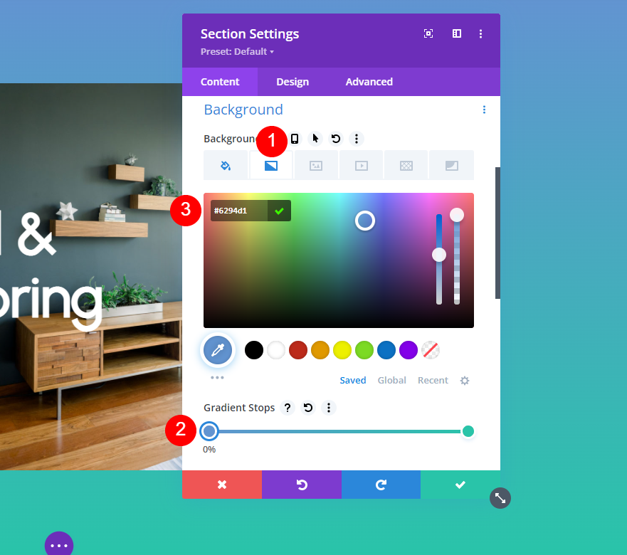
For our first example, we’ll create four gradient stops. Open the Background Gradient tab and select the first gradient. Leave the Gradient Position at 0% and change the Gradient Color to #6294d1.
- Gradient Stops First Point Position: 0%
- Color: #6294d1
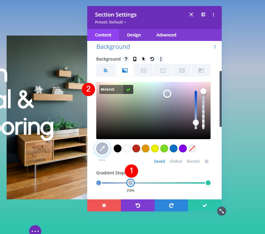
Next, add a new color stop by clicking on the Gradient Stop bar. Move its Gradient Position to 29% and change its Color to #b5bfd1,
- Gradient Stops Second Point Position: 29%
- Color: #b5bfd1
Next, add the third Gradient Stop and move its Position to 84%. Change its Color to #8eacd1.
- Gradient Stops Third Point Position: 84%
- Color: #8eacd1
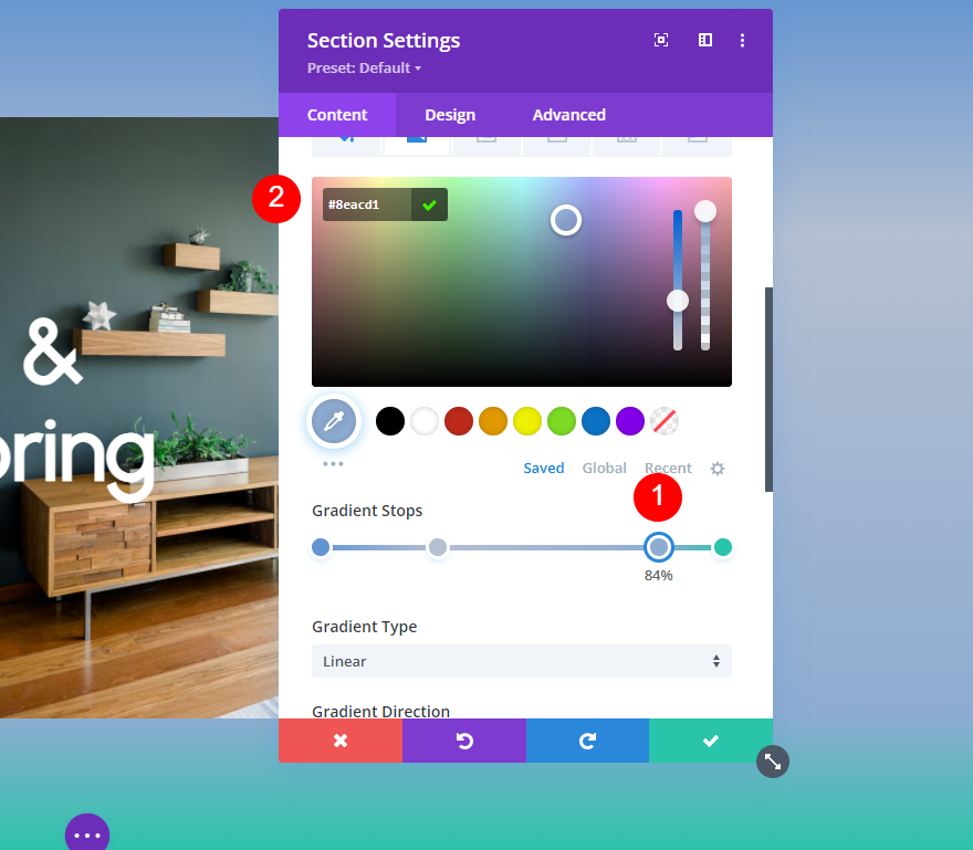
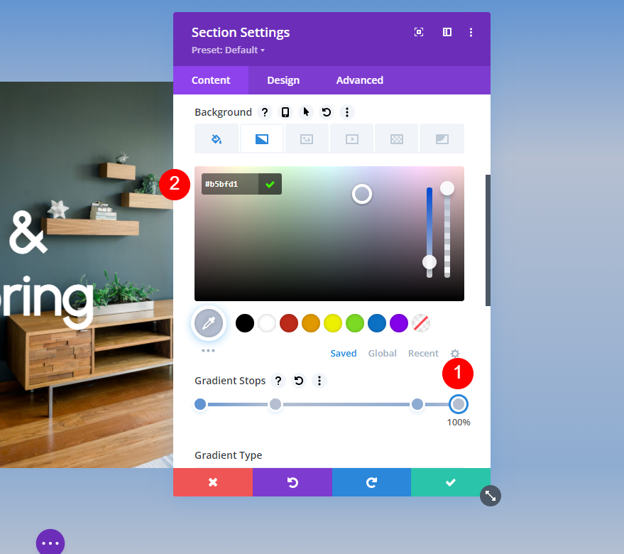
Lastly, change the color of the fourth Gradient Stop to #b5bfd1. We’ll leave this Gradient Position at 100%.
- Gradient Stops Fourth Point Position: 100%
- Color: #b5bfd1
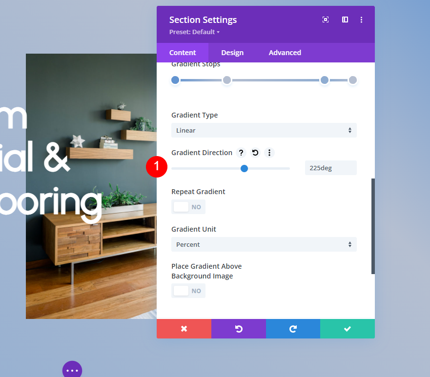
Next, we’ll adjust the gradient’s settings. Change the Direction to 225deg. Leave the rest of the settings at their defaults. I’ll include those settings here so you can see them. You can now close the module’s settings and save your work.
- Type: Linear
- Direction: 225deg
- Repeat Gradient: No
- Gradient Unit: Percent
- Place Gradient Above Background Image: No
Multiple Gradient Colors Example Two
For our second example, we’ll create three gradient stops. Open the Background Gradient settings and change the Color of the first gradient stop to #bffffc. Leave its Position at 0%.
- First Gradient Stop Position: 0%
- Color: #bffffc
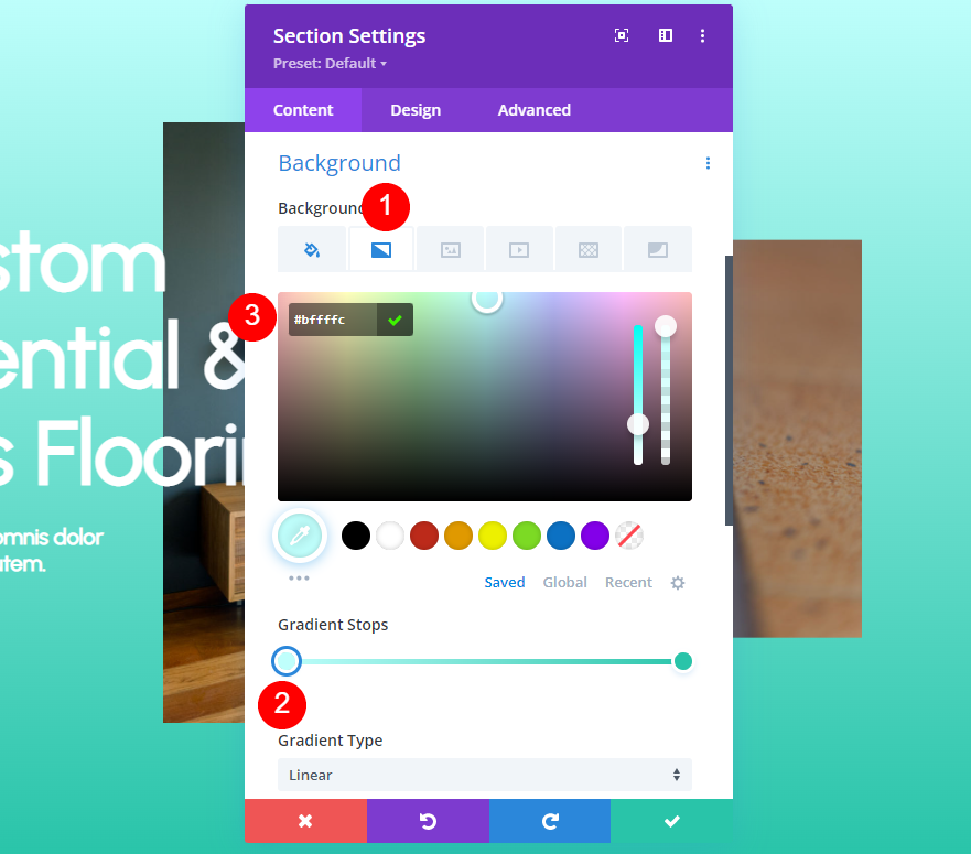
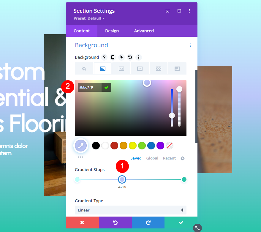
Add a new gradient stop and move its Position to 42%. Change its Color to #bbc7f9.
- Second Gradient Stop Position: 42%
- Color: #bbc7f9
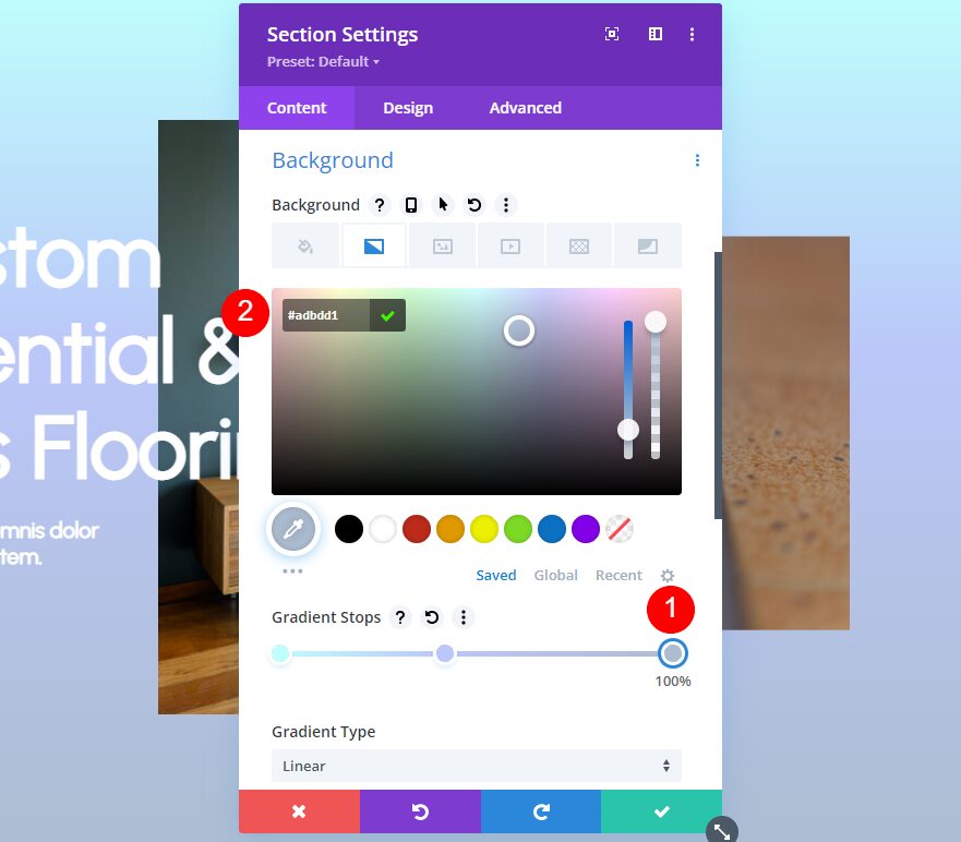
Next, change the Color of the third gradient stop to #adbdd1. We’ll leave its Gradient Position at 100%.
- Third Gradient Stop Position: 100%
- Color: #adbdd1
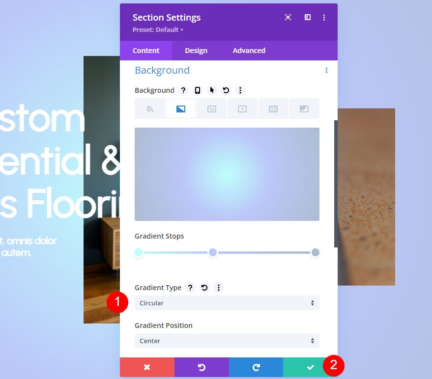
Next, change the Gradient Type to Circular. Leave the rest of the settings at their defaults. This creates a hot spot in the center of the section. Close your settings and save your work.
- Gradient Type: Circular
Multiple Gradient Colors Example Three
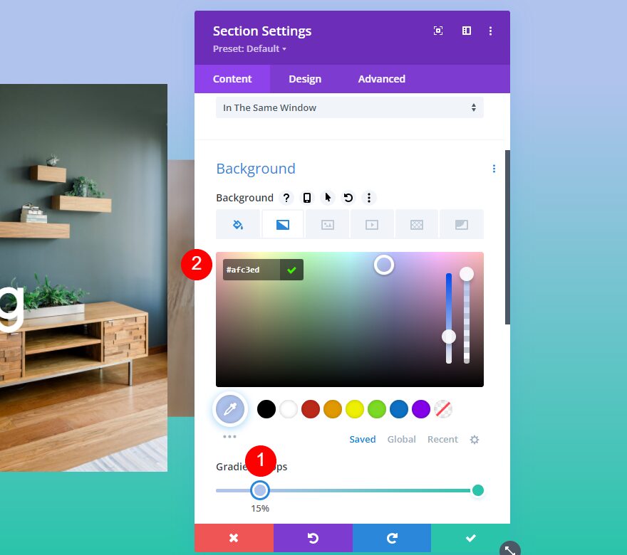
For our third example, we’ll use three gradient stops to build our gradient. Move the Position for the first gradient to 15% and change its Color to #afc3ed.
- First Gradient Stop Position: 15%
- Color: #afc3ed
Next, move the second gradient stop to 33% and change its Color to #adbdd1.
- Second Gradient Stop Position: 33%
- Color: #bffffc
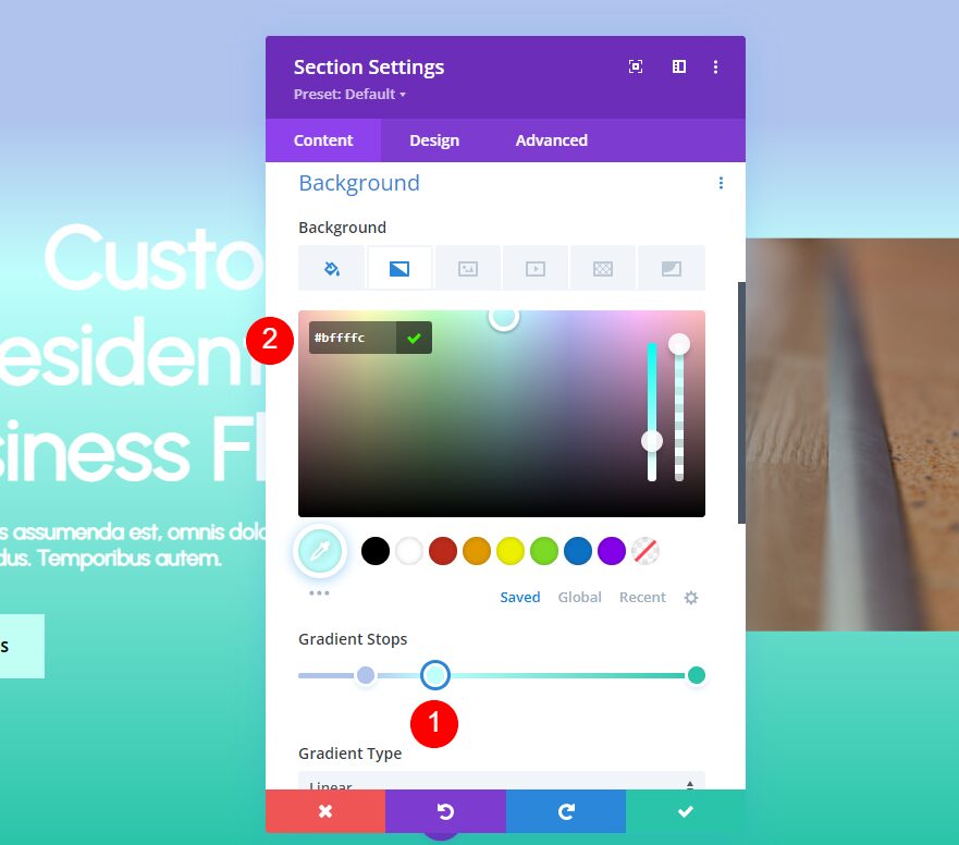
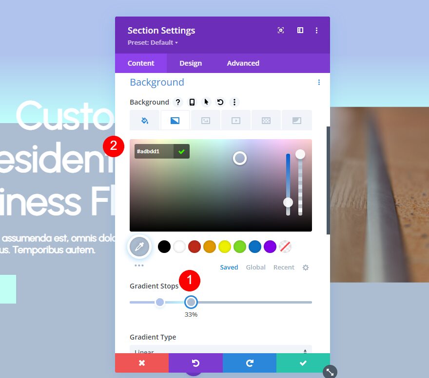
Next, move the third gradient stop to 33%, directly above the second gradient stop, and change its Color to #adbdd1. It will look like you have two gradients on the Gradient Stop bar.
- Third Gradient Stop Position: 33%
- Color: #adbdd1
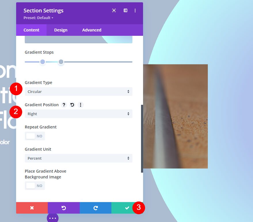
This one will have an interesting arch that we’ll create with the settings. Change the Gradient Type to Circular and the Gradient Position to Right. Close the settings and save your work.
- Type: Circular
- Position: Right
Multiple Gradient Colors Example Four
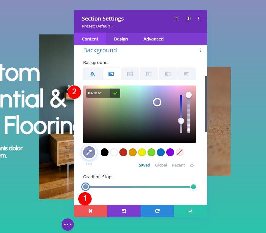
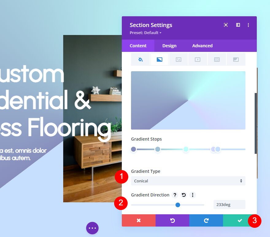
Our fourth example includes five gradient stops. For the first gradient stop, change the Color to #878ebc. Leave this one at 0% for the Position.
- First Gradient Stop Position: 0%
- Color: #878ebc
Add the second gradient stop at a Position of 22%. Change its Color to #a0c1d6.
- Second Gradient Stop Position: 22%
- Color: #a0c1d6
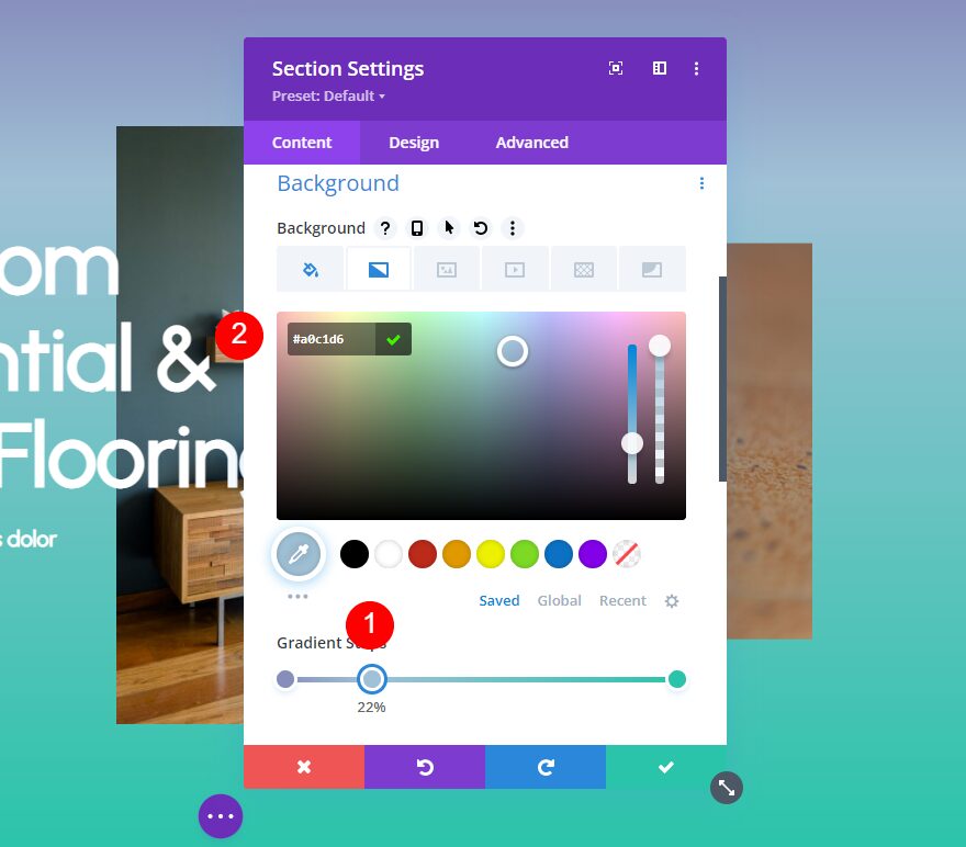
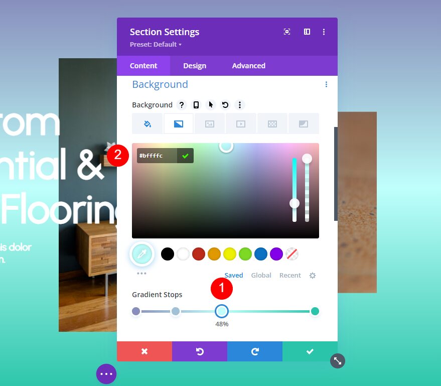
Next, add the third gradient stop at a Position of 48%. Change its Color to #bffffc.
- Third Gradient Stop Position: 48%
- Color: #bffffc
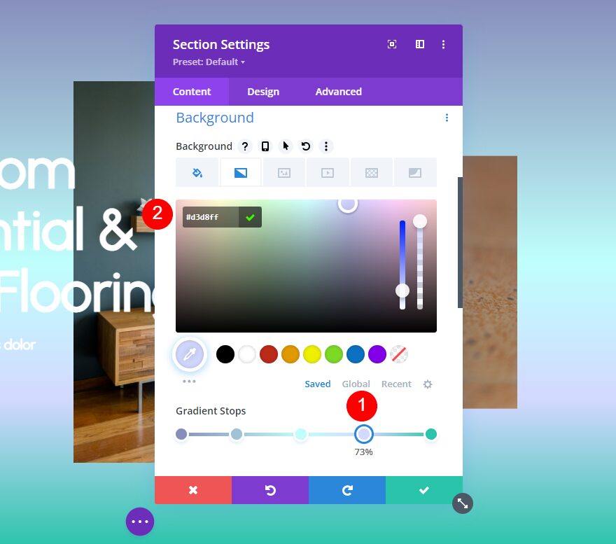
For our fourth gradient stop, place it at the 73% Position and change its Color to #d3d8ff.
- Fourth Gradient Stop Position: 73%
- Color: #d3d8ff
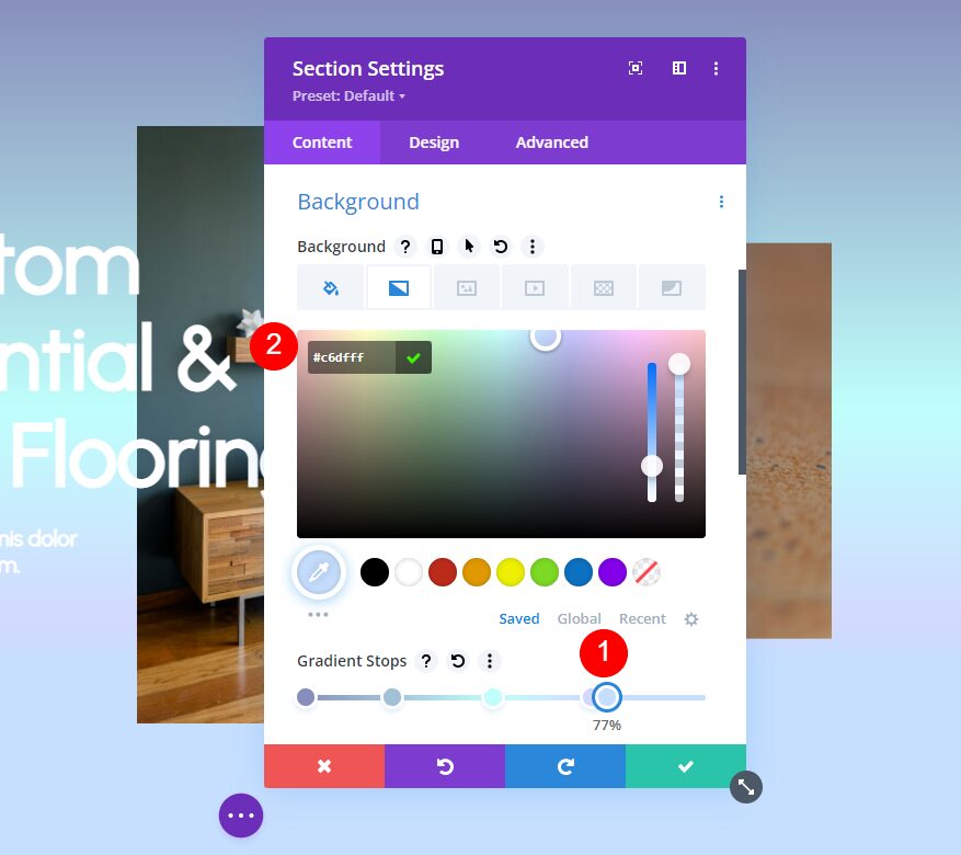
For the fifth gradient stop, move it to the 77% Position and change the Color to #c6dfff.
- Fifth Gradient Stop Position: 77%
- Color: #c6dfff
Finally, change the Gradient Type to Conical and change the Gradient Direction to 233deg. Close the settings and save your work.
- Type: Conical
- Direction: 233deg
Multiple Gradient Colors Results
First Example Results

Second Example Results

Third Example Results

Fourth Example Results

Ending Thoughts on Multiple Gradient Colors
That’s our look at how to use the Divi Gradient Builder to blend multiple gradient colors effortlessly. The Gradient Builder is fun to play with. You can add as many colors as you want, but you’ll need to follow a few simple design principles to make them look great together. These examples show how easy it is to use three to five colors to build your gradient while making them work well with your website’s design.
We want to hear from you. Have you used these methods to create multiple gradient colors with Divi’s new Gradient Builder? Let us know about your experience in the comments.
The post How to Use The Divi Gradient Builder to Blend Multiple Gradient Colors Effortlessly appeared first on Elegant Themes Blog.
