“If we’re gonna be friends, you should know that I re-heat my coffee as many times as it takes to burn my tongue, I only watch horror movies through my fingers and I seriously dislike elephants, although I wish them all the best.”
That’s the most-commented-on line from my About Me page. It’s the very last sentence and the sixth paragraph of 275 words, which means that people read all the way down to it, including one scroll. They then feel compelled to email me to ask about it. (“You reheat your coffee? Like, in the microwave? And what’s with the elephant thing??? Who doesn’t love elephants!”) In a world where it’s hard to keep anyone’s attention for more than a second, I say that’s a success.
As far as About Me examples go, though, I make a lot of mistakes on my page. I focus too little on the business of my business, I haven’t added any testimonials and I don’t have a CTA at the end. While it’s engaging enough for strangers to contact me, it’s unfinished. I know how many people I’ve caught with it, but I’ll never know how many people I lost because it’s missing some must-have points.
Don’t be me. Be you, the person with the high-performing, perfectly-executed About page. Here’s how.
Do I need an About page?
Yes. Next question?
The About page is essential to any and every website, whether you’re an individual sharing your personal thoughts or a full-blown business with countless landing pages. Your About page isn’t necessarily what gets people to your website, but it is where a number of visitors are going to click over to.
Okay, but does the writing actually matter?
Yup. A well-designed website will attract people, but the content is what keeps them there. Having a poorly-written About page is worse than not having one at all. Keep it simple, even if your industry is jargon-filled. Use the Hemingway app if you’re wordy, and check out our article about creating content with high readability.
Also, name your About page something obvious: About, About Me, About Us. Don’t get creative here – people are going to look for an About page, and they need to find it without trying to figure out what the “Our Essence” page could be about.
Look, this is hard!
There’s a reason businesses hire writers: writing is hard. Writing an About page is particularly hard because you have to give people enough information to maintain their interest, but you can’t get longwinded. I limit About pages to 500 words, and Moz’s About page, one of the best About Me examples I’ve seen, is right around there. That word count may not sound intimidating, but writing 500 excellent words is a lot more difficult than writing a 1,000-word blog post. You have to squeeze a lot of information into an About page, which means every sentence counts. It’s sort of like an elongated elevator pitch.
What an About Page is Not
1. An autobiography.
2. The best outlet for sharing a long brand story or company history, even if it’s wildly interesting. Write a blog post about it instead.
3. Boring. You may be enthralled by the backstory of how your company was founded a century ago, but if it’s going to make your reader fall asleep, leave it out. Cherry pick the most relevant and interesting information that enhances your brand image.
4. About you. It may say “About Me” or “About Us,” but it’s really “About the Reader.” What you’re saying about yourself is for the purpose of relating to the reader; it’s not for an ego boost. Unless you’re already a celebrity or an influencer, people don’t really care about your story unless it improves their life.
Elements of a Great “About” Page
I listed these elements in a way that makes the most sense to me, but you can absolutely play with the layout to determine the right flow for your About page.
The Hook
Just like with a blog post, you have to hook the reader. Start with something odd or unusual, something most other people don’t say or are afraid to say. If you want to make it stand out more, bold it to turn it into a headline.
In this section, and throughout your About page, you have to keep three things in mind:
- Who you are
- What you do
- Why you do it
Whatever you do, don’t reiterate that this is your About page. The reader already knows that – they clicked on the link.
The Basics
Start with your name, job title and location, and maybe add in your “thing.”
Hey, I’m Lindsay, a freelance writer in New York. And I’m totally obsessed with true crime podcasts.
Brag a Little
Give yourself some props, but relate it to the person you’re speaking to. What is it about your experience that connects with your visitor’s biggest concern? What’s keep them up at night, and how has that same thing kept you up at night?
I’ve been a full-time freelancer for 10 years, and I’ve talked to a lot of marketing agencies during that time. I know how tough it can be to hire freelancers – they don’t know what you want and you don’t know what they need.
Help Some More
They know what you’re able to help with, but not how you do it. Don’t go into crazy detail here. People are still mostly concerned with results – your process can be completely pared down and still effective.
I act as the middleman between agencies and writers so that you can both get what you need without any delays, surprises or unexpected expenses.
Testimonials
You can put testimonials at the beginning or end of the About page, but I placed them here in this outline because it feels like the natural best place – you’ve told the reader how you can help them and now you’re showing how you’ve helped others. If possible, include testimonials from influencers and impressive publications as well as real people.
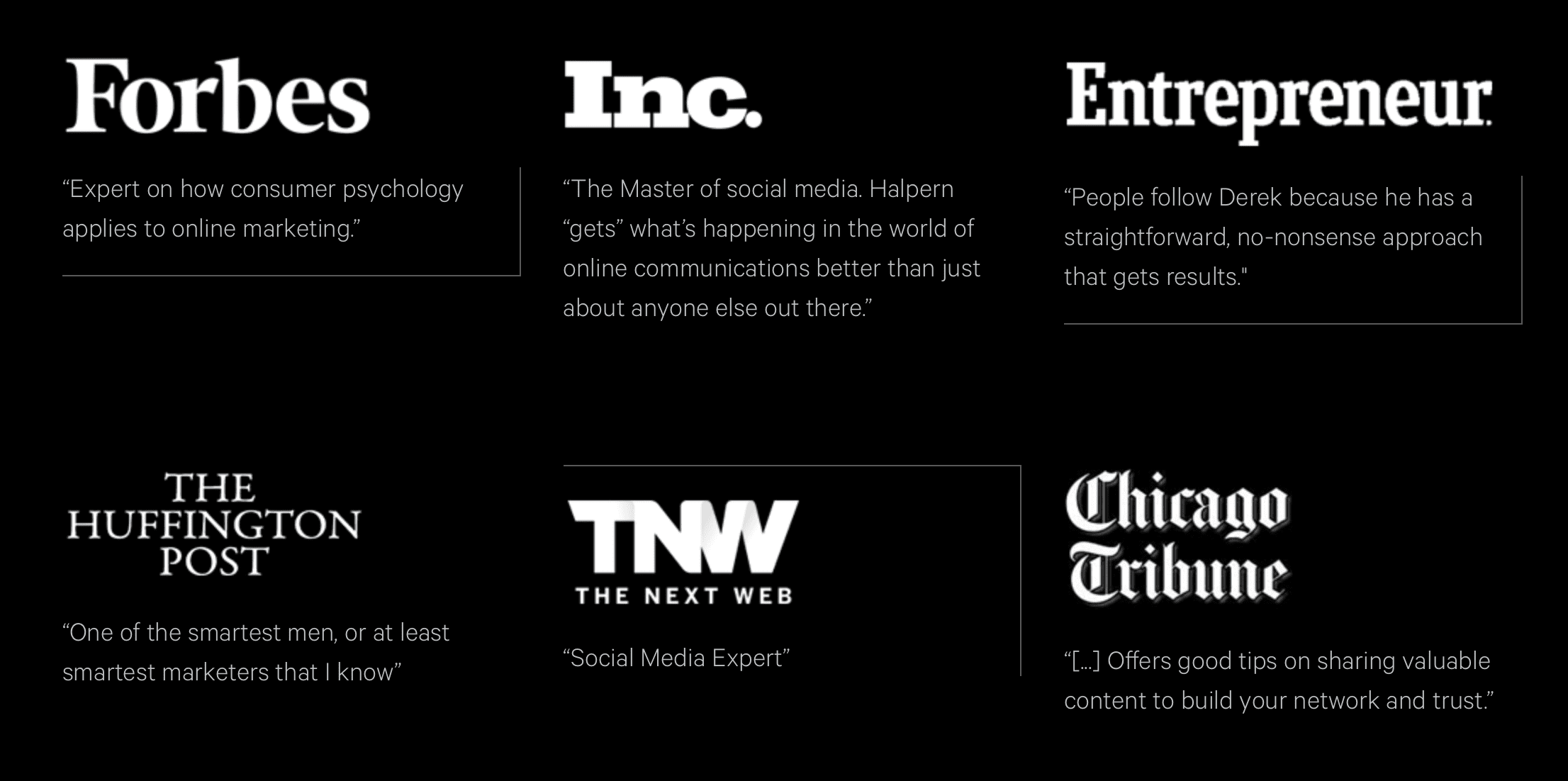
Source: SocialTriggers.com
Give Some Background
You’ve got their interest, so there’s some leeway to talk about how you got started or how your company was founded. Include this information:
- Founding year
- Location
- Number of employees
- Why you started the business
- Business vision and goals
- Most impressive achievement(s)
This is your chance to empathize some more. Let them know you shared the same struggles or questions they’re experiencing. Put into words what’s going through their head.
Additional Media
Always include one picture of yourself – recent, crisp and inoffensive. A photo of your face will make you more likable and trustworthy.
Consider adding a video, especially if you want to explain a process or product. You can also embed one of your popular YouTube videos, which will link to your account and help drive traffic there.
Be Human
What makes you offbeat, interesting, different from the rest? What makes you human? List three things.
You can either do a brief “look, I’m just a weird human section” at the end like I did, or you can scatter humanized details throughout – your choice.
Call-to-Action
If people are heading over to your About page often, then there should be a CTA there. This should be one of your more broad offerings – the About page isn’t about one specific part of your business, and the CTA doesn’t need to be, either. What action should people take next in order to reap the biggest benefit from your website?
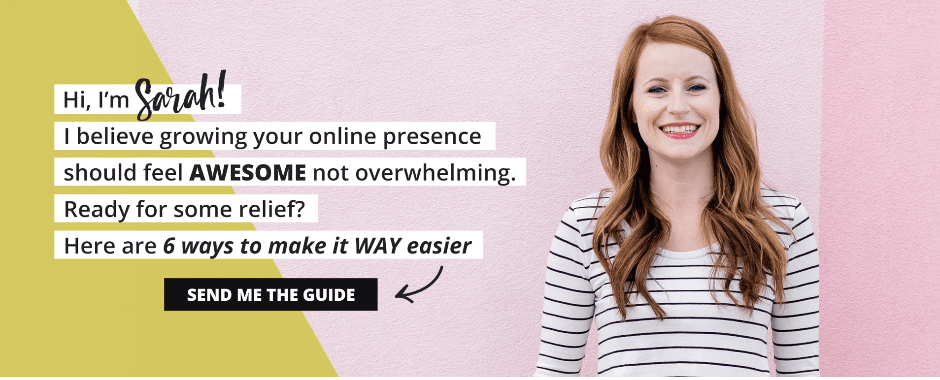
Check out the rest of Sarah’s About page, too. In terms of About Me examples, this is one of my favorites – the content flows naturally, like you’re having a conversation with her. Sarah speaks right to you and manages to tell you what she does while still making it all about you.
Contact Information
Give the visitor ways to connect with you – email address and phone number, your address if you have a physical store or office, and your social media links. While this should be at the end of the page, experiment with placing it in the center of your page as well, right after the most actionable paragraph, like the “Help Some More” section.
There’s an exception to this, though. If you’re growing quickly and getting inundated with emails and calls, you can remove your personal contact information. Keep your social media links, of course, and consider if and how you want people to be able to get in touch, like live chat on your website or Facebook Messenger.
3 About Me Examples
Let’s go over three popular About Me examples to explore what they did right and where they went wrong.
Mirasee
What They Got Wrong
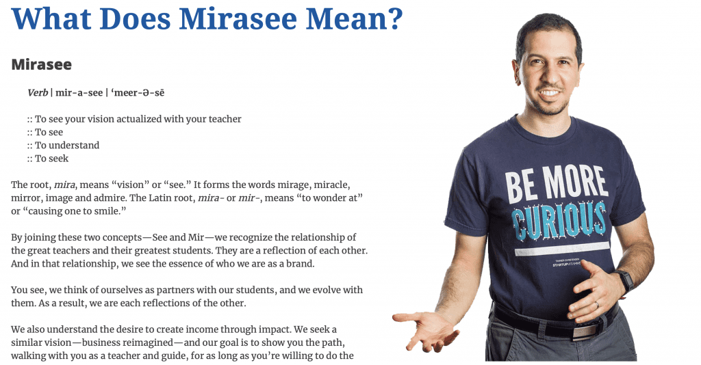
The About Us page for Mirasee doesn’t immediately convey what this company does. There’s a guy wearing a “Be More Curious” shirt, a tagline that says “Reimagine Business” and a buzzword-heavy description of what Mirasee means, but what do they do? I have no idea.
What They Got Right
Everything is on one page. There’s no reason to keep your About Us information separate from your vision or your team. It all falls under the “About” umbrella, and you’ll get more traction out of the page if it’s all nestled together.
Moz
What They Got Wrong
Nothing.
What They Got Right
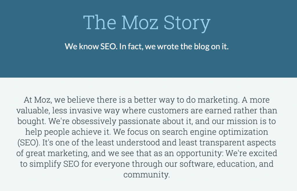
- Moz’s About page gets right to it. Their copy is equal parts straightforward and punchy, and you know exactly what their expertise is from the get-go: SEO.
- Moz puts their “where the name comes from” section at the end – it’s there, but they know it’s the least important part of their About story.
- They keep everything on one page, and the copy is short overall despite there being seven sections.
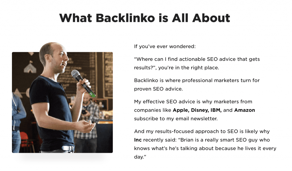
P.S. Backlinko is another website that hits all the right marks with their about page: clarity, social proof, CTA.
Niche Hacks
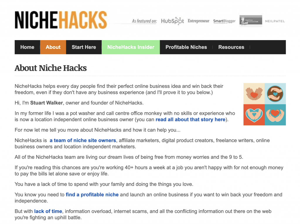
Okay. You’ll need a fresh cup of coffee for this one. There’s a lot going on with the Niche Hacks About Me page.
What They Got Wrong
There’s a ton of text, and splitting it up into mini-paragraphs isn’t helping. That first above-the-fold section is an eyesore. This could all be condensed into one or two great paragraphs that strongly convey who they are and how they can help you. Shorter content is confident content.
They’ve also buried the lead. The “How This Blog Will Help You Succeed Online” section has one bit of information that should be at the top of the page: “I publish epic resources, give away trade secrets, and post information for free that most other internet marketers charge big bucks for.”
What They Got Right
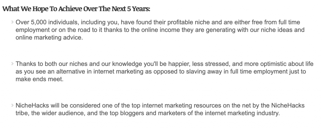
If you continue scrolling, you’ll come to a “What We Hope To Achieve Over The Next 5 Years” section. Whether or not you think this information is important enough to include here, it’s broken down much better than the copy above. It’s neatly sorted into three bullet points and easier on the eyes.
There are also links to “awesome content” on the bottom. Having the links here gives the reader somewhere else to go when they’re done with this page. You’re more likely to click on a link here than go back up to the top, find the blog, etc.
What They Got Sorta Right
They’ve included testimonials from real readers as well as industry influencers. Unfortunately, they have a ton of testimonials, and some are stronger than others. I’d pick the top five, put them closer to the top of the page and let them work their social proof magic. You can always include more on a dedicated testimonials page.
Wrapping Up
There’s a lot to think about here, and it didn’t help that I stressed that these 500 words will be the most important of your website. Here’s the good news: you already know all of this information. All of it. You know who you are, what your business is about, who you serve, why you do it… Take your time to put it together in a way that’s clear. Don’t worry about being creative, just be honest and transparent – readers will respect you for that while learning about what’s in it for them.
Rocked your About page? Now create a cool Twitter bio to land more clients.
The post How to Write the Best About Me Page Possible appeared first on Elegant Themes Blog.

