How do you know an idea is great or terrible without testing it?
Wireframing, mockups and prototyping are necessary parts of digital design. Visualizing your concepts lets you simulate your designs, try out different user experiences and test various user journeys and flows before making anything live.
In the past, designers would have to print their designs and present the client with a PDF. Today, there are tools to help you find and solve design challenges before a design goes public; work out the aesthetic and technical components of a design; and test the experience before anyone else.
You’ll also smooth out your relationship with the client – if they assume something (which they will), you can deal with that in the early stages instead of hearing, “Oh, I thought that…” later on, when it’s too late.
Moqups is a web-based design tool that can help you build wireframes, mockups and prototypes all within one environment. You can navigate between projects and take your design from low fidelity (beginning stages and rough sketches) to high fidelity (more thorough and detailed). In this post I take it for a spin and show you what that process is like each step of the way, including my final thoughts at the end of the post.
What Can You Make with Moqups?

There are a number of designs you can make with Moqups: diagrams, flowcharts, sitemaps, wireframes, mockups, charts and graphs. Let’s go over them.
You’ll notice that I don’t talk specifically about prototyping here. There’s a reason for that, and I touch on it later.
Diagrams and Flowcharts
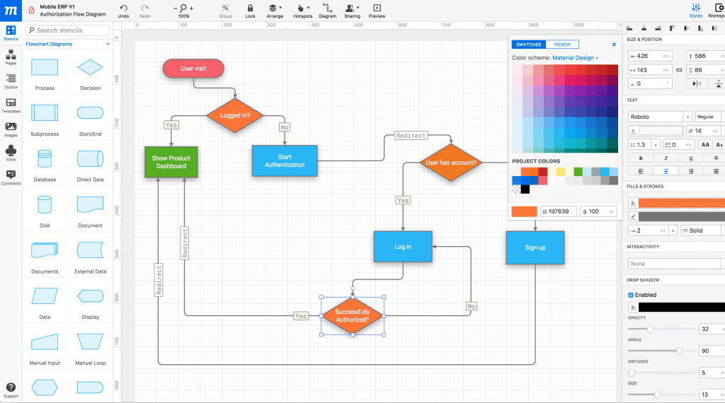
Just about every web design project starts with a diagram, flowchart or sitemap, and team members tend to go back to it for reference along the way. With Moqups, you can create all sorts of diagrams:
- Concept diagrams
- Decision trees
- Flowcharts with user interactions
- Flowcharts for software workflows
- Mind maps
- Sitemaps
- Use case diagrams
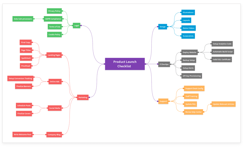
With flowchart stencils, you can get a head start on all sorts of diagrams. You can also use a Diagram Extender to evolve a flow however you need. Additionally, you can change the look of the diagram to customize it.
Wireframes and Mockups
With wireframes, your team can figure out things like information hierarchy, page density and user flow at the start of a project. Simple shapes and placeholder text stand in for the more advanced design elements you’ll add in the future. You don’t have to worry about branding or design yet; instead, you just have to worry about the structure and key requirements of the website.
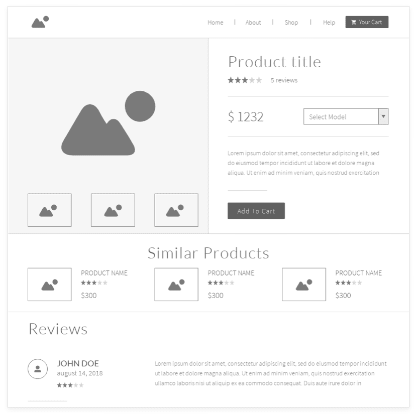
With mockups, your team can get feedback in the first stages of design. You’ll build on the wireframe’s sketch to visualize content and demonstrate how it’ll function in a very basic way. The design is put into context to make it look better and to visualize the end result. Instead of seeing a design on a page, clients can see what the design will look like on their website or app.
Create in Whatever Order Suits You
The beauty of Moqups is that you can bounce back and forth between your wireframes and mockups however you want – and you don’t necessarily have to create one before the other. For example, you can start the traditional way, with a wireframe and then a mockup. You can then go back to the wireframe to make tweaks you realized you needed when assessing the mockup. Or, you can create a mockup first, then move to the wireframing stage to figure out the details. You can also skip the mockup completely and create a low fidelity prototype from a wireframe.
Charts and Graphs
If you need to present information visually to your team, clients or investors, Moqups lets you create all sorts of charts and graphs:
- Area charts
- Bar charts
- Column charts
- Donut charts
- Line charts
- Pie charts
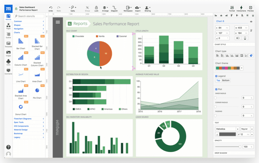
Moqups Features
Here are Moqups’ main features, followed by a brief list of additional benefits.
Built-In Library with Graphics and Fonts
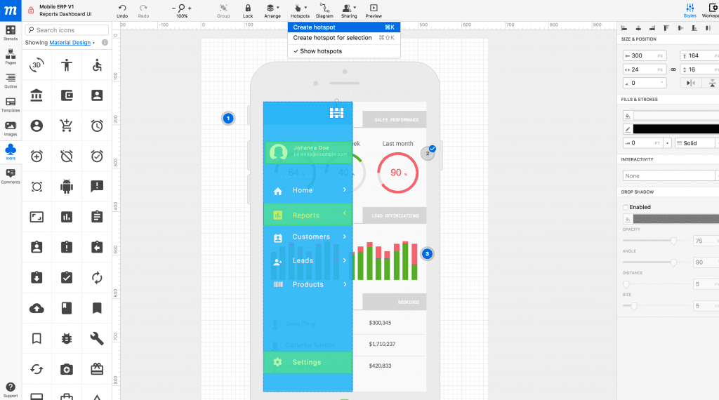
- The built-in library includes thousands of icon sets. There are also ready-to-use stencils that have been designed for popular use cases, plus custom stencil kits for Android and iOS mobile app design.
- Align, resize, rotate or style objects. You can also bulk-edit, group, lock and rename elements. Precise adjustments can be made with custom guides, grids and rulers.
- Google Fonts is integrated so that you can choose from hundreds of fonts. Advanced controls let you tweak the text to match your designs. (Want to learn How to Choose the Best Fonts for Logos? We have an article for that.)
Organize Your Projects
- Drag-and-drop your pages to reorder or organize them in folders.
- The Pages Panel makes it easy to search and navigate through your folders.
- With Master Pages, you can auto-apply changes to all associated pages.
Integrations and Collaboration
- Moqups has integrations with tools like Dropbox, Google Drive and Slack.
- Your team can collaborate while working remotely thanks to the cloud (and here are more ways for your team to chat, too).
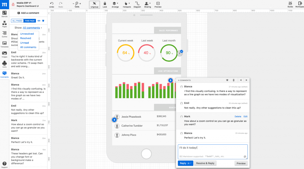
- Get feedback right on the design itself and make edits without having to send various versions to one another.
More Features
- Easy to use drag-and-drop editor (beginners may experience a learning curve, but it’s not major)
- Upload your own images
- Snap-in alignment when lining up elements
- Scale without losing quality
- Export your work as a PDF or PNG
Using Moqups
I’m just going to jump right in to tell you about my experience with Moqups. There’s a lot going on – it’s not confusing, there’s just a lot there – so I’m going to talk about the features I played with that I thought were cool or useful. At the end of the article, I’m going to give you my overall thoughts and feelings about Moqups, including common drawbacks and who it’s best for.
Getting Started with Moqups
Getting set up with Moqups is super easy, and I suggest you start with the free account (I talk about what’s included about that in the Pricing section later on).
Creating a Design
I really like the drag-and-drop editor. In some editors, you click an element and it immediately appears on the project, and then it can be a nuisance to get rid of it. Moqups makes me feel like I have a little more control over what I add and lets me explore the options without worrying I’m going to accidentally click something and add it without realizing. Also, as you drag an element to your project, you can see what it’ll look like, and then put it right back if you decide you don’t want it.
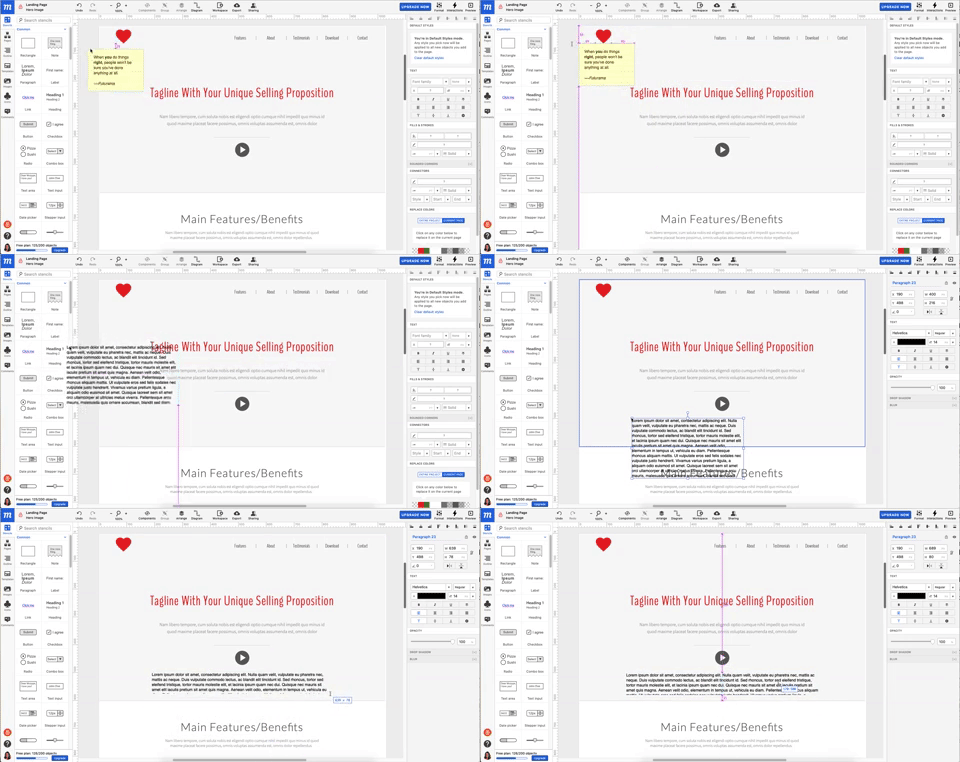
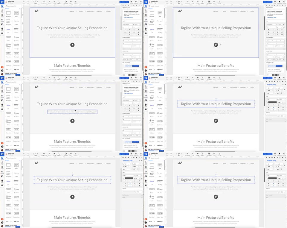
Working with a Design
As you hover over the different elements in your design, a blue outline appears to show you the different page elements. To work with an element, click to select it. A menu will open on the right with custom options.
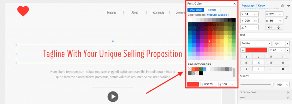
Project Colors
I like the “Project Colors” part of the color picker. This made it easy to match the color of the heart in the upper-left corner with the color of the text.
Saving Elements as Templates
A helpful feature of Moqups is that you can save elements as templates, then easily add them to other pages as-is. The original design will be retained – color, size, etc. This helps create continuity in your design.
Collaboration Features
If you’re a Google Drive user, commenting will look and behave in a way you’re familiar with. Adding a comment is super easy, and you can move the comment around before or after writing it so that its placement makes sense.
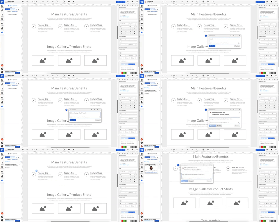
If you have a lot of collaborators and comments, though, that small comment pane can get out of hand fast. You may want to create a rule for your team that comments are marked as resolved when they’re no longer needed.
Moqups Pricing
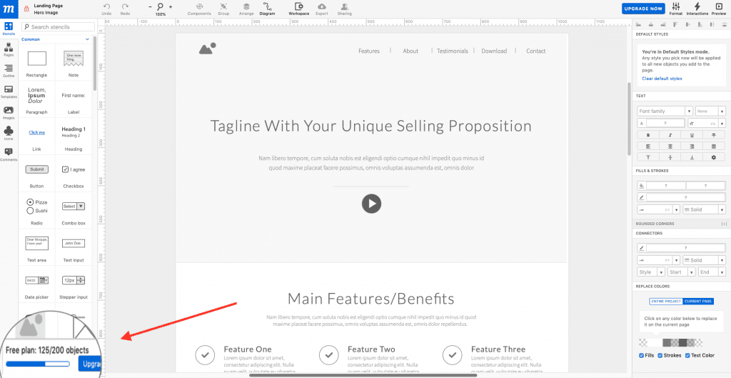
With the free plan, you can make one project that includes up to 200 objects. This is something to consider when choosing between working with a blank document and using a template. I opted for the Landing Page Wireframe template, which immediately used up 125 of the 200 objects. I can go in and delete some objects, of course, but for some people it may make more sense to start from scratch.
The only thing the free plan is good for is testing out Moqups because chances are you’re not going to have just one project to design. Pricing starts at $13 per month, paid annually. Each plan lets you create unlimited projects and use unlimited objects, so the main consideration is how many people will be using Moqups.
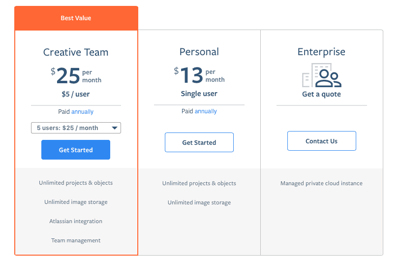
Unless you’re a design team of one, you’ll want the Creative Team package. The more people you add, the less the cost per user. For example, if you have 50 users, the cost is $3 per user for a total of $149 per month (paid annually).
Some may feel that Moqups pricing is a great deal, while others will think it’s too costly. It depends on how much you’re going to use it and the value you get out of it.
P.S. With the free plan, no credit card is necessary – if you want to test it out and then decide it’s not for you, you won’t have to remember to cancel before being charged.
Moqups Weak Spots
- The biggest drawback of Moqups is that you can’t use it offline. On the other hand, the fact that it’s browser-based is super convenient for some people.
- If you have advanced prototyping needs or you’re picky about features, this probably isn’t the tool for you.
- I’ve read reviews that say Moqups can be laggy, take a long time to load and even shut down unexpectedly, but I didn’t experience any of that. However, it’s something to keep an eye on as you add rich content and create additional pages. I didn’t have any photos or videos in my design, so that may have helped keep things speedy. If your projects are going to contain a lot of rich elements, take advantage of the free plan to test it out.
Who is Moqups Best For?
Moqups is great for non-developers to conceptualize during the first stages of project planning. For example, a business owner or project manager can convey their idea to the development and design team, who will then go on to use more advanced methods to create the actual product or a high fidelity rendering.
Moqups is especially useful for mockups and wireframing, but it’s not as strong when it comes to prototyping. Moqups doesn’t have nearly as many features as other prototyping tools, and styling elements can’t be customized in as many ways as competitive tools, either. It’s barely even mentioned on their website.
Final Thoughts
Overall, I liked using Moqups – and I wish I knew about it when I designed my website because it’s a lot more realistic than the pen and paper design I sketched out. It worked the way it says it does, and even with a lot of options, nothing was too tricky to figure out. If you’ve ever worked with any type of graphic design tool – and I’m guessing you have – this one won’t be tough to pick up. You can use it for the first time and finish a project by the end of the day (or the end of the hour), and then you can go back and explore all of the options you missed the first time around.
The point of visualization tools is to get a final product, right? Check out our Divi design showcase with work from our awesome community.
Featured image via Visual Generation / shutterstock.com
The post Moqups: An Overview and Review appeared first on Elegant Themes Blog.
