Welcome to part 4 of this 6 part series that will teach you how use Divi’s new Animation options to design awesome page sections. I’m going to be walking you through how to build the different sections of our live demo page in order to show you techniques for adding animations to your website. The Animation features truly are fun and easy to use. And with the Visual Builder, you can see your creation come to life every stage of the way. Come and join me as we explore the power of Divi animations.
In our last post, I showed you a few creative ways to design and animate 4 blurb modules orgainized for a step by step process.
Today, we are going to be building Section 6 of our animation demo page. This section showcases some great design and animation for displaying featured products or downloads. The use of color and the blooming effect of the animation on those blurb modules really make the section stand out.
Let’s dive in!
Here is a Sneak Peek of What We Will Be Building in Today’s Post

Using Divi’s Fold Animation to Make Blurbs Bloom
Subscribe To Our Youtube Channel
Building Section 6
Add and Customize Your Section
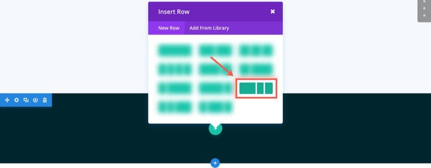
Using the Visual Builder, Let’s start by adding another regular section to our layout. Then add a three column (one-half one-fourth one-fourth) row to your section.
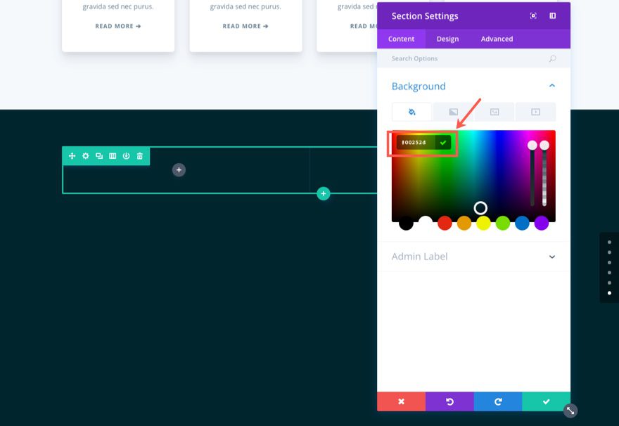
Before we add our first module, go to the section settings and update the following:
Under the Content tab…
Background Color: #00252d
Under the Design tab…
Custom Padding: 80px Top, 80px Bottom
Save Settings
Add a Header Using the Text Module
Now let’s go back to our three column row and add a Text Module in the left column. Update the Text Settings as follows:
Under the Content tab…
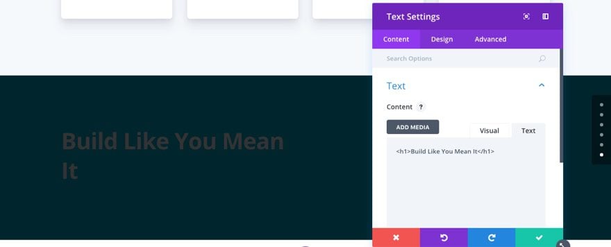
Add the following h1 header in the text tab of the content box:
<h1>Build Like You Mean It</h1>
Under the Design tab…
Header Font: Lato, Bold (B)
Header Font Size: 38px
Header Text Color: #ffffff
Header Line Height: 1.3em
Custom Margin: 20px Bottom
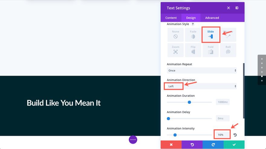
Animation Style: Slide
Animation Direction: Left
Animation Intensity: 16%
Save Settings
Add Text Using Another Text Module
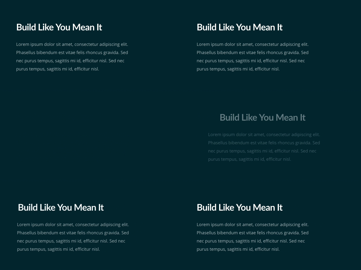
Normally, you would probably just go ahead and add the rest of your text under the h1 header in the same text module. But since we want to add a different animation effect to the h1 header and the text under it, we will need to create another text module. Go ahead and add a text module under the one you just created and update the settings as follows:
Under the Content tab…
Content: “Lorem ipsum dolor sit amet, consectetur adipiscing elit. Phasellus bibendum est vitae felis rhoncus gravida. Sed nec purus tempus, sagittis mi id, efficitur nisl. Sed nec purus tempus, sagittis mi id, efficitur nisl.”
Under the Design tab…
Text Color: Light
Text Font Size: 18px
Text Text Color: rgba(255,255,255,0.66)
Text Line Height: 1.9em
Custom Margin: 40px Bottom
Animation Style: Slide
Animation Direction: Left
Animation Intensity: 8%
Save Settings
Add a Button
Now let’s add a Button Module below the two text modules in the left column. Then update the settings as follows:
Under the Content tab…
Buttom Text: Download all
Button URL [enter url]
Under the Design tab…
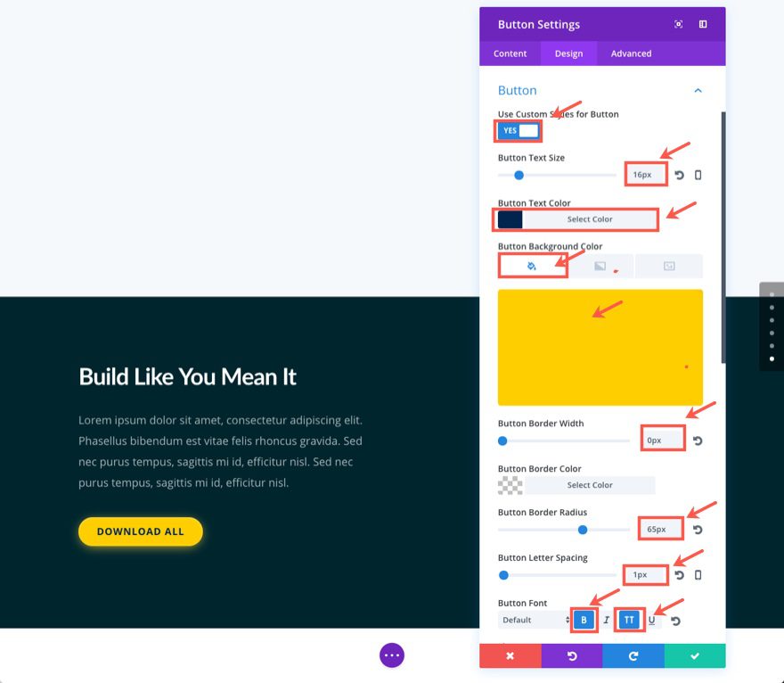
Use Custom Styles for Button: YES
Button Text Size: 15px
Button Text Color: #01254c
Button Background color: #ffcd1c
Button Border Width: 0px
Button Border Radius: 65px
Button Letter Spacing: 1px
Button Font: Bold (B), Uppercase (TT)
Custom Padding: 10px Top, 30px Right, 10px Bottom, 30px Left
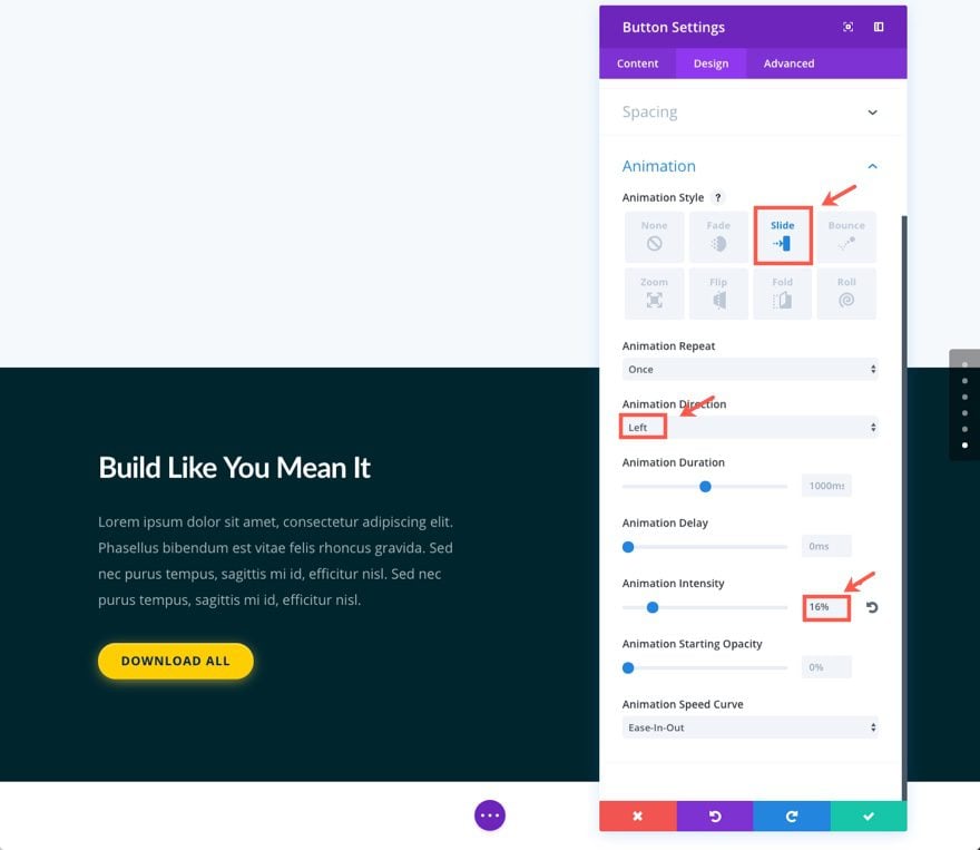
Animation Style: Slide
Animation Direction: Left
Animation Intensity: 16%
Let’s not forget to add that wonderful glow effect using the box shadow css property. Find the Main Element box under Custom CSS and add the following:
box-shadow: 0 3px 30px -5px #ffd747, inset 0 1px 3px rgba(255,255,255,0.5);
Save Settings
Add You First Blurb Module
That’s it for our left column. Now let’s add a Blurb Module to the middle column (which is the first one-fourth column).
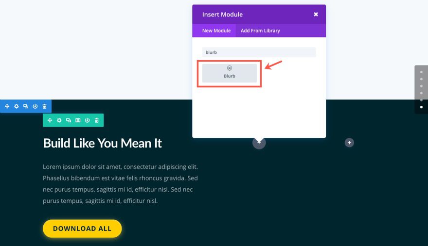
Update the settings as follows:
Under the Content tab…
Title: Divi
Use Icon: YES
Icon: [select icon]
Background Gradient Colors: #8b56ff, #5d3dff
Gradient Type: Linear
Gradient Direction: 140deg
Under the Design tab…
Icon Color: #ffffff
Text Color: Light
Text Orientation: Center
Header Font: Bold (B), Uppercase (TT)
Header Letter Spacing: 10px
Custom Margin: 12% Bottom
Custom Padding: 40px Top, 30px Right, 30px Bottom, 30px left
Animation Style: Fold
Animation Direction: Left
Animation Delay: 200ms
Under the Advanced tab…
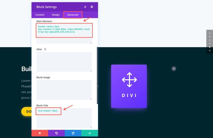
Here is where we can add that glow effect to our module and indent the header just a tad.
Add the following CSS to the Main Element box:
border-radius: 6px;
box-shadow: 0 10px 60px -10px #8b56ff, inset 0 1px 3px rgba(255,255,255,0.2);
Add the following CSS to the Blurb Title box:
text-indent: 10px;
Save Settings
Duplicate the Blurb Module to Build the Next Three Blurbs
Now that we have our first Blurb Module designed and animated, we can duplicate the module to create the remaining blurbs.
Hover over the Blurb Module and click the duplicate module icon. In the new duplicated module that appears below update the settings as follows:
Under the Content tab…
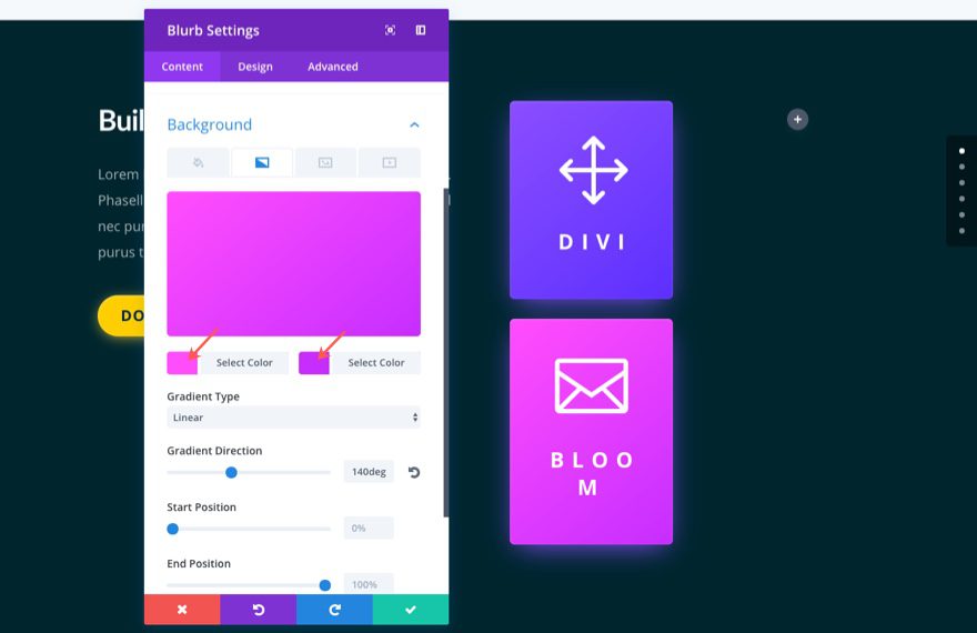
Title: Bloom
Icon: [select new icon]
Background Gradient Colors: #ff56f9, #c43dff
Under the Design tab…
Animation Direction: Down

Under the Advanced tab…
Replace the CSS in the Main Element box with the following:
border-radius: 6px;
box-shadow: 0 10px 60px -10px #ff56f9, inset 0 1px 3px rgba(255,255,255,0.2);
Save Settings
Make another duplicate of the blurb module and drag that duplicate to the far right column. Then update that Blurb Module with the following settings:
Under the Content tab…
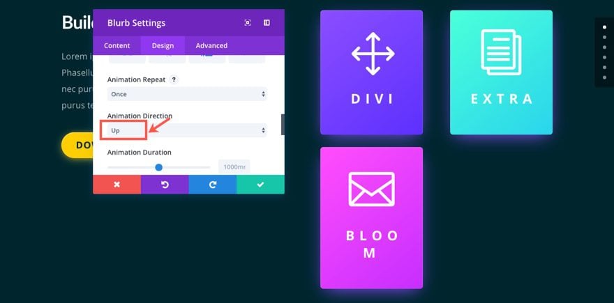
Title: Extra
Icon: [select new icon]
Background Gradient Colors: #56ffda, #38d5ea
Under the Design tab…
Animation Direction: Up
Under the Advanced tab…
Replace the CSS in the Main Element box with the following:
border-radius: 6px;
box-shadow: 0 10px 60px -10px #56ffda, inset 0 1px 3px rgba(255,255,255,0.2);
Make another duplicate of the blurb module you just updated in the right column so that it appears directly underneath. Then update that Blurb Module with the following settings:
Under the Content tab…
Title: Monarch
Icon: [select new icon]
Background Gradient Colors: #f2743a, #ff5656
Under the Design tab…
Animation Direction: Right
Under the Advanced tab…
Replace the CSS in the Main Element box with the following:
border-radius: 6px;
box-shadow: 0 10px 60px -10px #f2743a, inset 0 1px 3px rgba(255,255,255,0.2);

Save Settings
Now let’s get the spacing right by updating your row settings as follows:
Under the Design tab…
Use Custom Width: YES
Custom Width: 1366px
Use Custom Gutter Width: YES
Gutter Width: 2
Custom Padding: 80px Top, 0px Right, 160px Bottom, 0px Left
Coumn 1 Custom Padding: 140px Top
Build the Second Row
Now we are ready to create the next row for our section. To speed things up, we are going to be duplicating and copying design elements from our previously designed row and modules.
First let’s add a new one-column row to our section. Then update the row settings with the following:
Use Custom Width: YES
Custom Width: 1366px
Use Custom Gutter Width: YES
Gutter Width: 2
Save Settings
Next copy the first text module in the first row you created that contains the h1 title. Then update the settings as follows:
Under the Content tab…
Replace the current h1 tag with the following:
<h1>Don't Settle for Less</h1>
Under the Design tab…
Text Orientation: Center
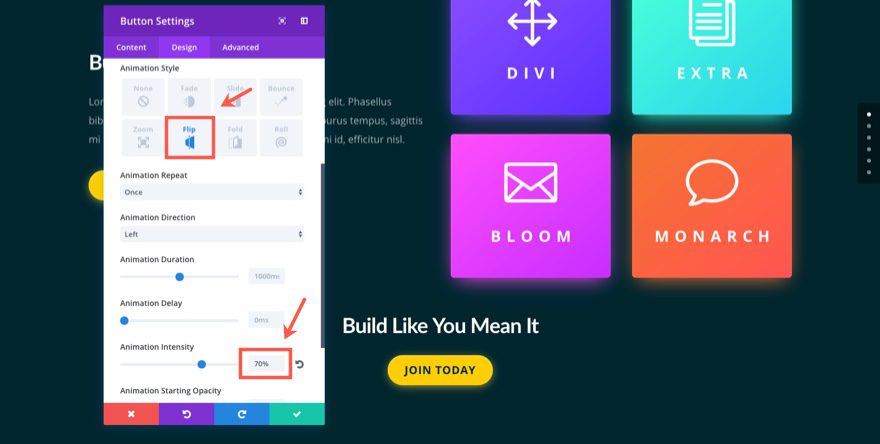
Animation Style: Flip
Animation Intensity: 70%
Save Settings
Next copy the button module from the previous row and paste it under the text module you just finished updating in the second row. Then update the button module as follows:
Under the Content tab…
Button Text: Join Today
Under the Design tab…
Button Alignment: Center
Animation Style: Flip
Animation Intensity: 70%
Save Settings
Now for our last row. Create a new row with a one-half one-half column structure. Before adding your modules, update the row settings as follows:
Under the Design tab…
Use Custom Gutter Width: YES
Gutter Width: 2
Save Settings
Next, copy the purple “Divi” Blurb module from your previous row and paste it into the left column of your new row. Then update the following settings:
Under the Content tab…
Title: Builder
Icon: [select new icon]
Background Gradient Colors: #ff568e, #ff3d5d
Under the Advanced tab…
Replace the CSS in the Main Element box with the following:
border-radius: 6px;
box-shadow: 0 10px 60px -10px #ff568e, inset 0 1px 3px rgba(255,255,255,0.2);
Save Settings
Next copy the bluegreen “Extra” blurb module at the top of the far right column in the first row you created. Then paste it in the right column of your new third row.
Then update the blurb settings as follows:
Under the Content tab…
Title: Serene
Icon: [select new icon]
Background Gradient Colors: #3da4ff, #385eea
Under the Advanced tab…
Replace the CSS in the Main Element box with the following:
border-radius: 6px;
box-shadow: 0 10px 60px -10px #3da4ff, inset 0 1px 3px rgba(255,255,255,0.2);
Save Settings
That’s it.
Bonus: Download These Sections for Easy Import
As a bonus perk we’ve packaged the sections built in today’s tutorial into a free download that you can get using the email opt-in form below. Simply enter your email and the download button will appear. Don’t worry about “re-subscribing” if you’re already part of our Divi Newsletter. Re-enter your email will not result in more emails or duplicates. It will simply reveal the download.
Enjoy!
To use these downloads, start by locating the zipped file called Animation_Effects_Part_4.zip in our downloads folder. Unzip it to reveal the following imports.
Animation Effects Part 4 (section 1).json
Animation Effects Part 4 (section 2).json
Navigate in your WordPress Admin to Divi > Divi Library > Import & Export. When the portability modal pops up, click the import tab and the button labeled choose file.
Select the json file you prefer and click “Import Divi Builder Layouts”. Once the import is complete navigate to the post or page you would like to add one of the above sections to.
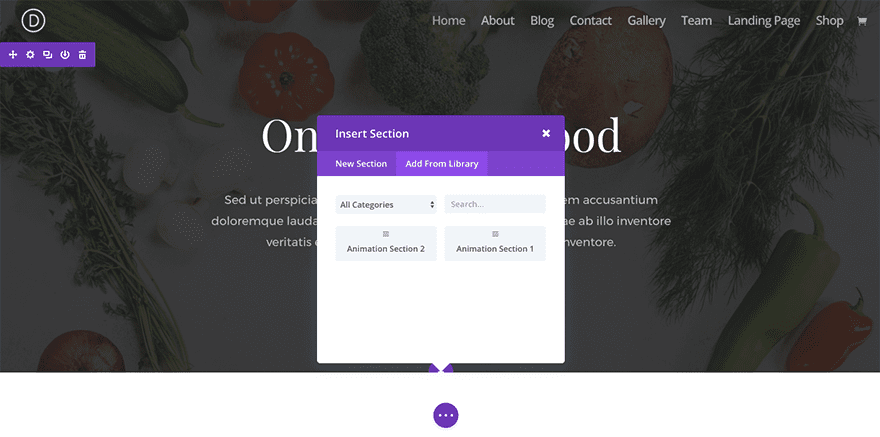
Activate the visual builder. Navigate to the part of the page you would like to add one of the above sections to. When you click the add new section icon, you will be presented with the option to “Add From Library”. Choose this option and select the layout you want.
Wrapping Up
I hope you enjoyed building this stunning section together. The combination of color, glowing shadows, and creative animation make this an outstanding layout for showcasing your own downloads or products.
Coming Up
In part 5 I’m going to be showing you how to successfully incorporate the Roll animation style to mobile phones within your sections.

I look forward to hearing from you in the comments below.
Cheers!
The post Using Divi’s Fold Animation to Make Blurbs Bloom appeared first on Elegant Themes Blog.

