Although they’re usually not the first thing visitors notice about your website, width and height CSS properties help keep your website together and looking awesome. And now, with Divi’s new draggable sizing options, you can literally control every element’s width, max width, min height, height and max height inside the builder itself. This gives you the freedom to create websites that are highly responsive across different screen sizes.
Now, all of this sounds great, but how does this translate into a beautiful website, practically speaking? That’s exactly what we’re going to talk about in this post. We’ll begin by first explaining the difference between all the height and width properties available within the Divi settings and then use them in different scenarios to make our page designs behave exactly the way we want them to.
Let’s get to it!
Understanding the Difference Between Properties
Before using width and max width in our daily design processes, it’s important to understand what they do. This is what the theoretical explanation is:
Width – The actual width of a design element. If this is 100%, it’s as wide as the container allows it to be. Width is usually expressed using %. The lower the percentage for the width, the narrower the design element will be.
Max Width – The max width has power over the width. If the width of a module is set to 100%, it’ll adhere to that value as long as it stays below the max width value. Once the max width value is reached, it won’t exceed it.
But how does that translate into responsive design? To help explain the difference, we’re going to create a visual comparison by enabling the Visual Builder on a brand new page. We’ll add a section with a one-column row. Then, insert a Text Module with some content, a background color and some custom padding.
Changing the Width
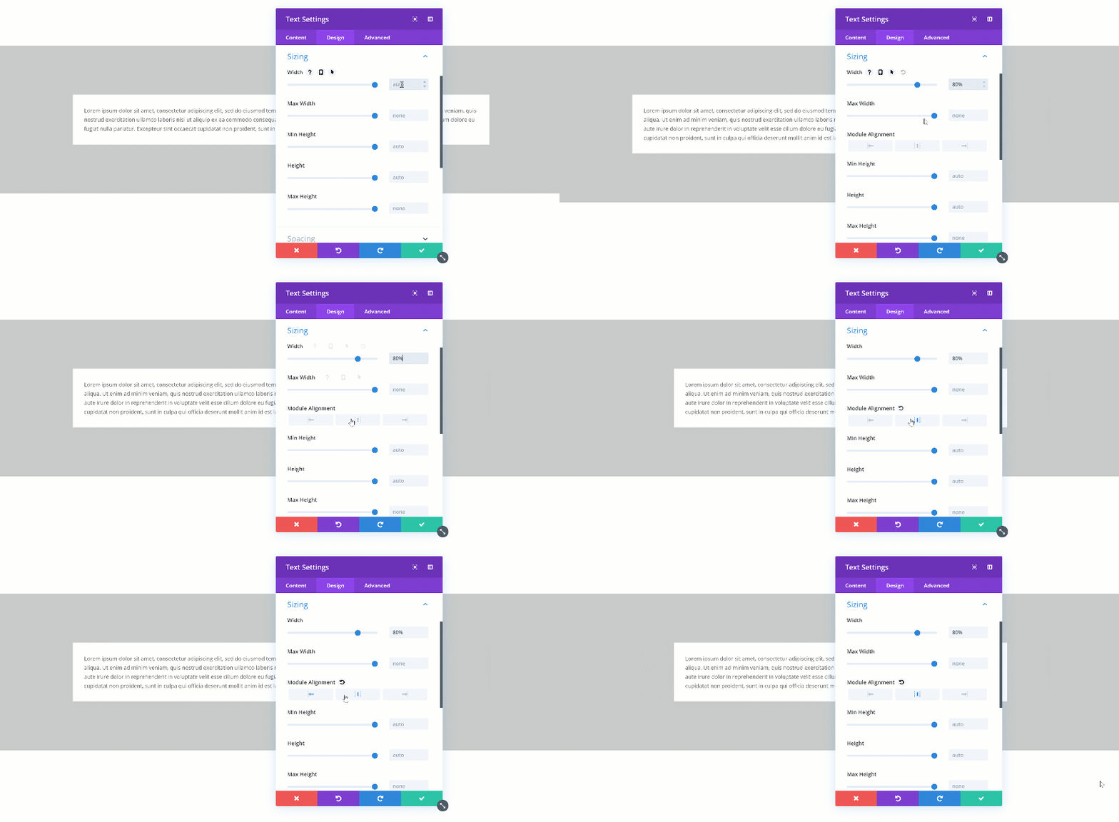
When you change the width of the Text Module to 80%, you’ll see the Text Module shrink in size. A possibility to align the module however you want shows up as well.
Changing the Max Width
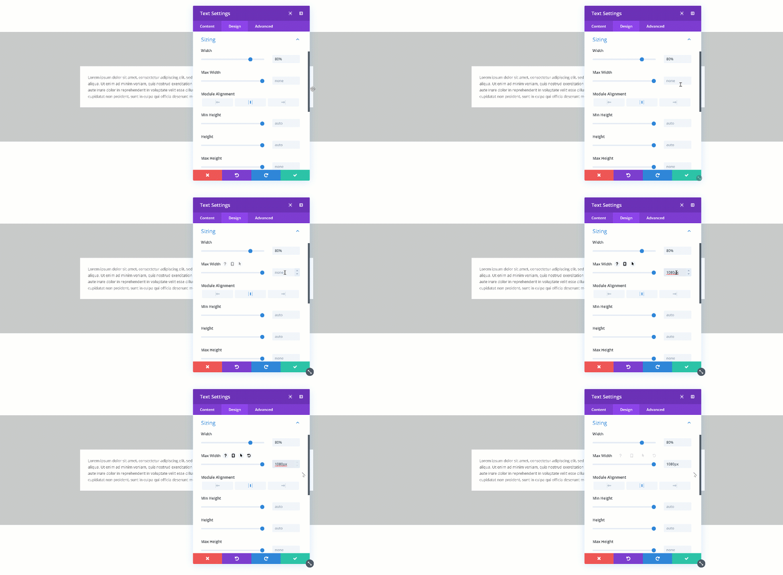
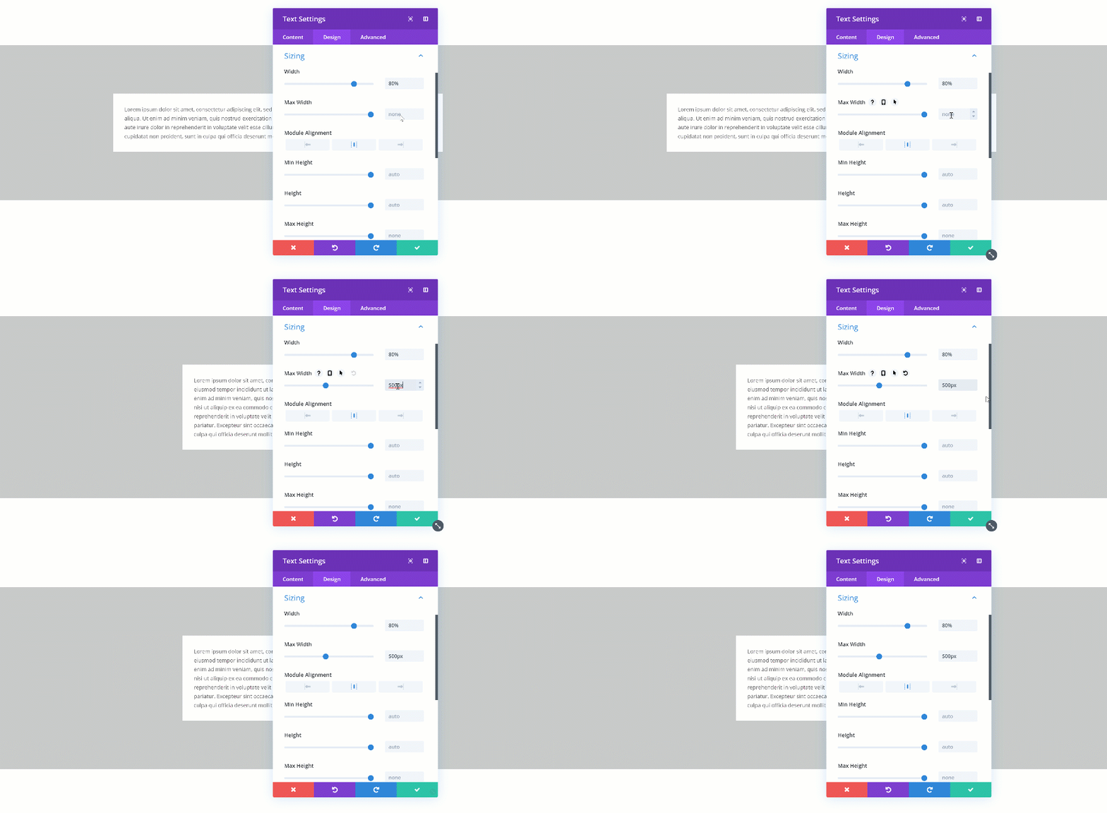
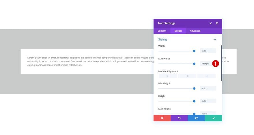
When you change the max width, the assigned value will only start applying from the moment the actual width exceeds the max width value. Let’s demonstrate that really quick:
Not Exceeded
Exceeded
Besides width and max width, you’ll also be able to find min height, height and max height in the sizing settings of each element. This is what you can theoretically understand from these terms:
Min Height – The minimum height you want to assign to an element. If this value is larger than the height input, the min height input will dominate.
Height – This defines the actual height you want to assign to the element.
Max Height – This value becomes the new height once the height exceeds the value that was assigned to the height.
Changing the Min Height
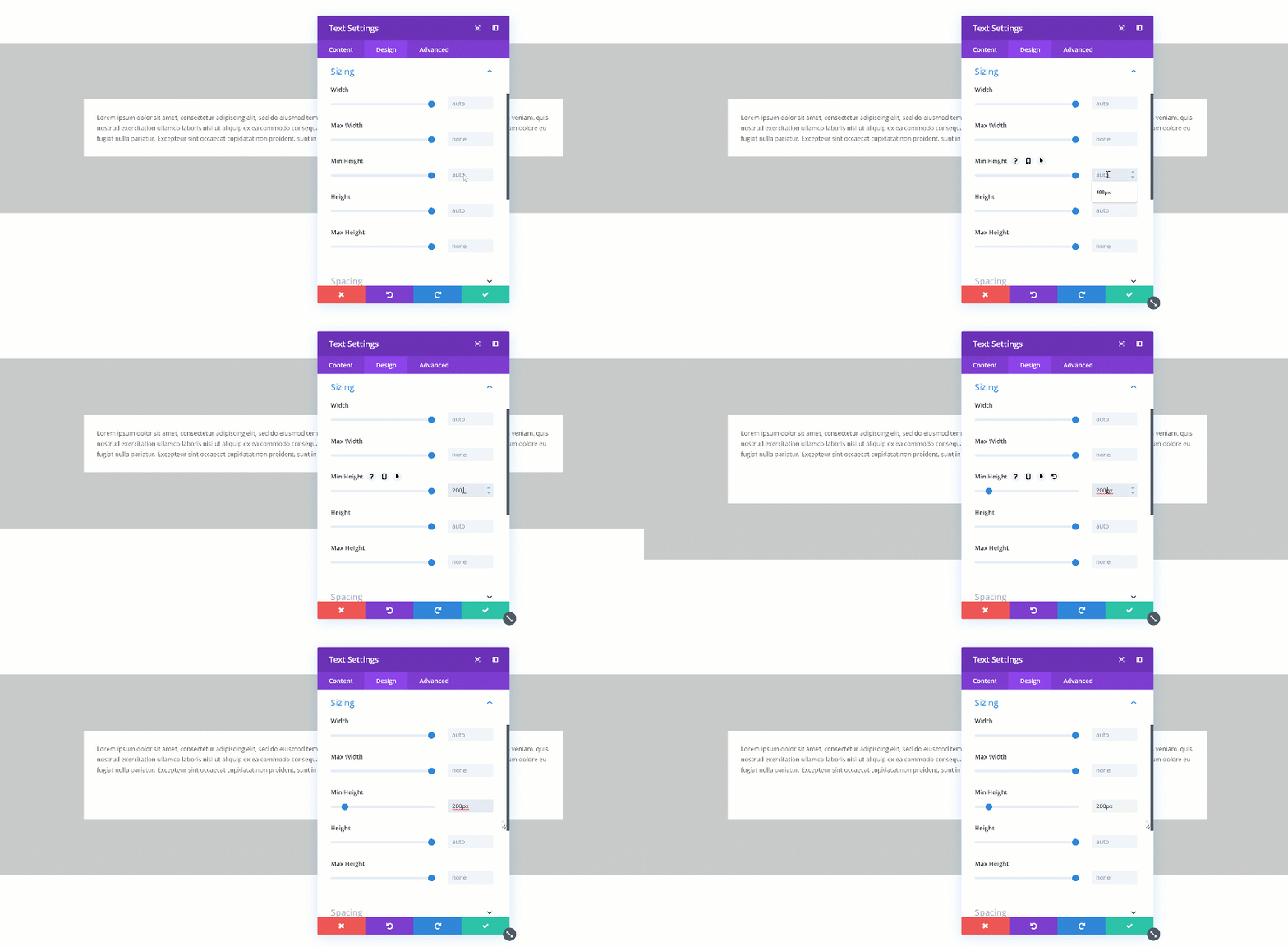
If you change the min height of an element, that value becomes the norm. When testing it out, you’ll automatically see the height of the Text Module change in real time.
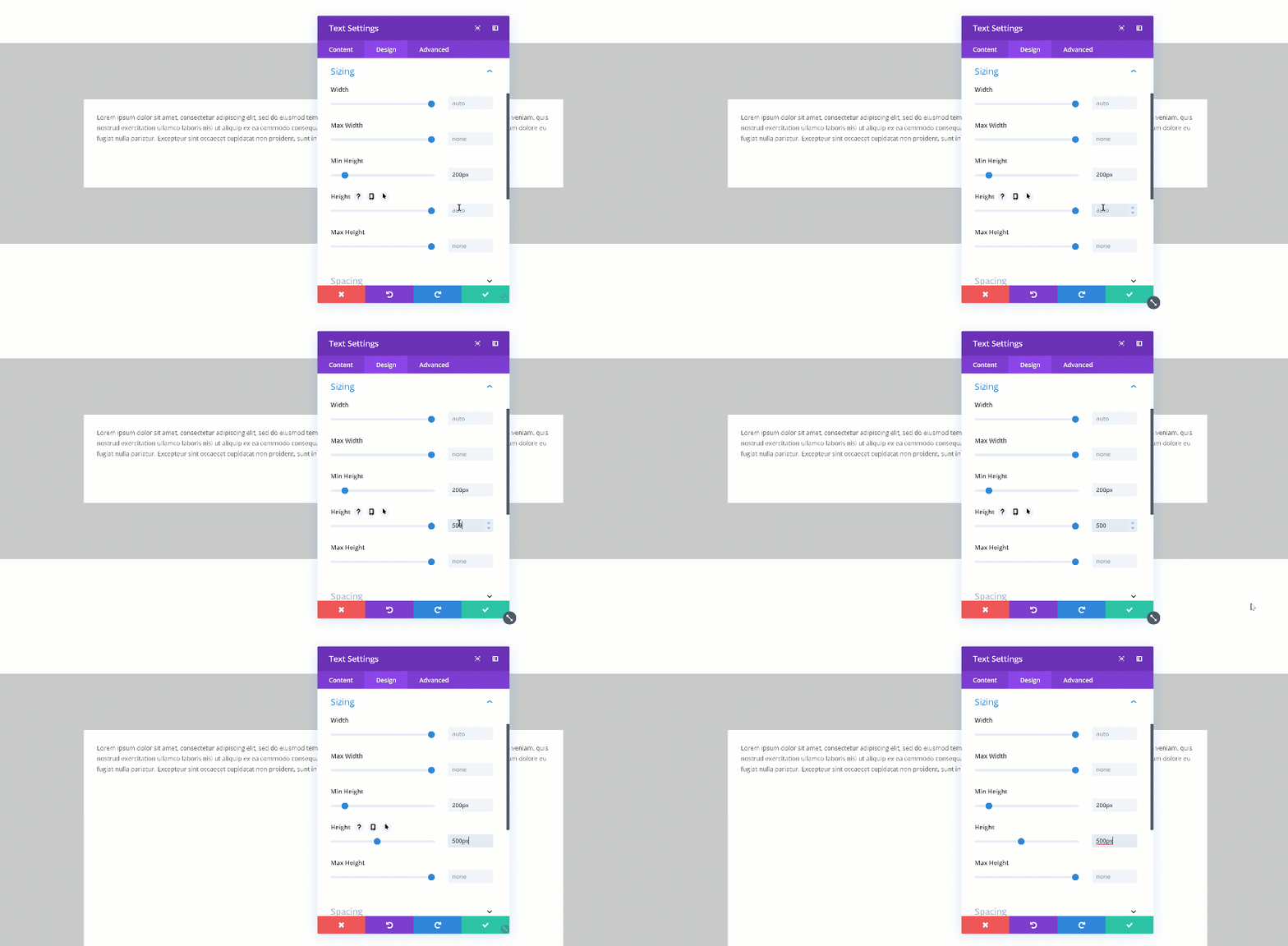
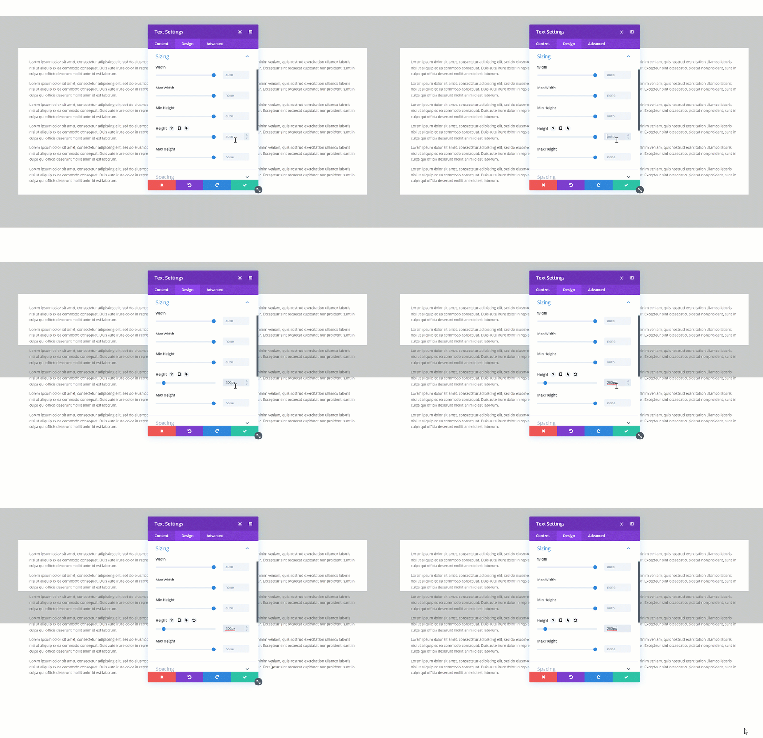
Changing the Height
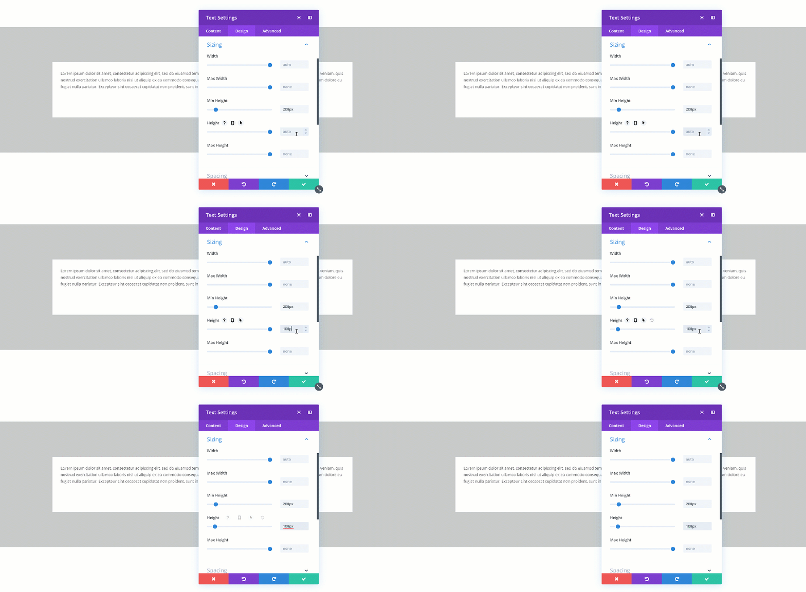
If you’re combining a min height and a height, you’ll have to make sure the height is bigger than the min height. If not, the height will be ignored. In the two GIFs below, you’ll be able to see the difference in real time.
Doesn’t Exceed
Exceeds
Changing the Max Height
The max height takes over if it exceeds the min height but is smaller than the height. If, for instance, you’d assign a higher value to the min height than to the max height, the min height would dominate.
Changing the Max Width for Rows
One of the best practices in web design is deciding on one particular max width for your entire website. This helps keep everything looking responsive across different screen sizes. It also helps designers create accurate wireframes.
Changing the Global Max Width
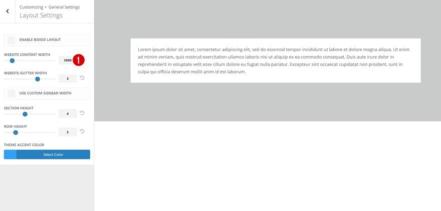
You might or might not know that you can set a certain default max width for your content in the Theme Customizer by going to the General Settings and continuing to the Layout Settings. Keeping the max width persistent helps empower responsiveness.
Change the Max Width for One Row in Particular
With the new draggable sizing update, you also get the opportunity to individually define a max width for rows. This is great for exceptions where it makes more sense to go with a higher max width.
Giving Modules The Same Height
Another technique you should keep in mind focuses on giving similar elements the same height. This is aesthetically pleasing to the eye and helps visitors scan for content easily. There are two common ways to approach this:
Using Column Equalizer
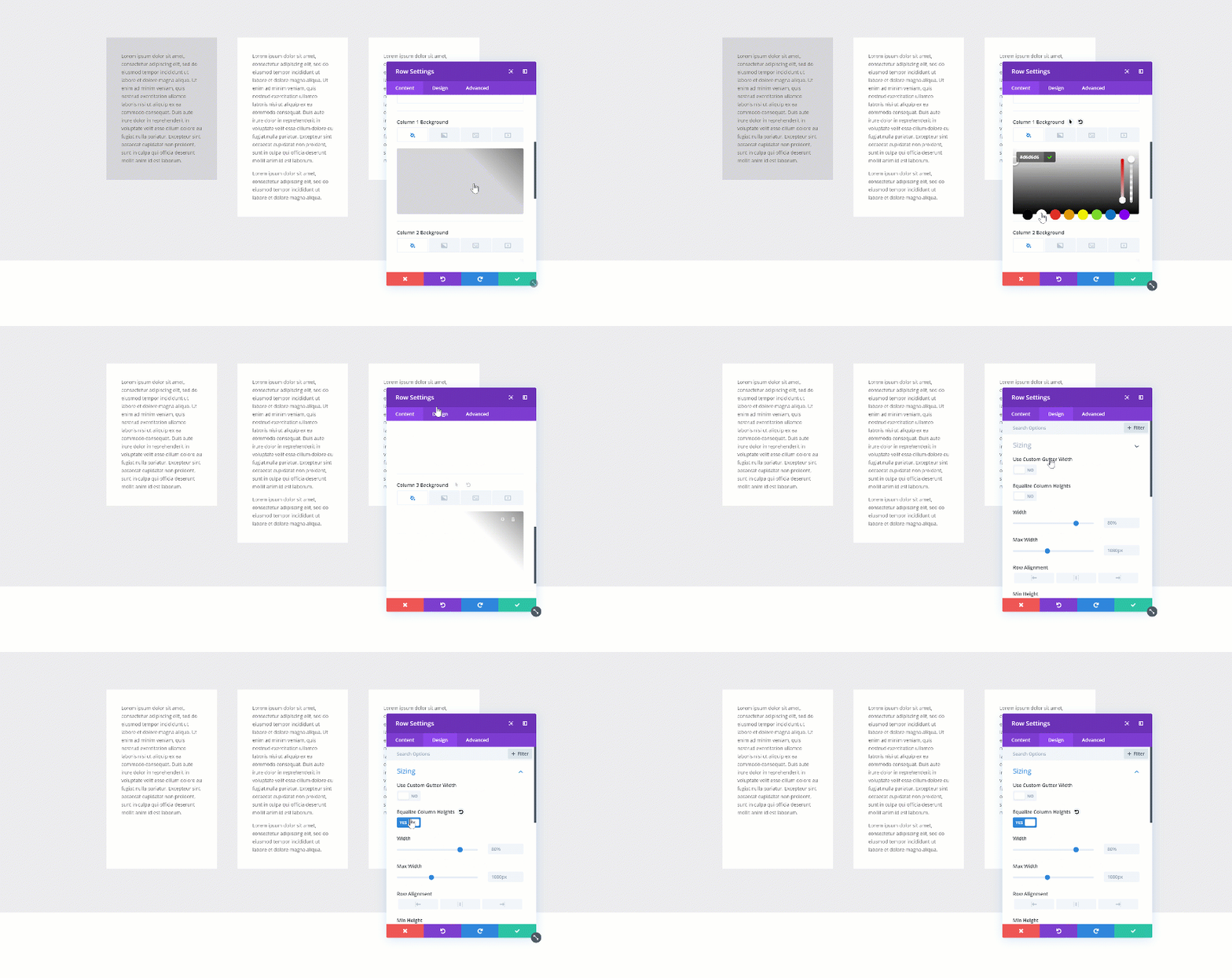
The first method is one that has been with Divi for a long time. If you want to create the same height for each one of the columns in your row, you can enable the Column Equalizer in the sizing settings of your row. If you’re using column background colors, you’ll quickly notice the difference.
Assigning Height to Each Module
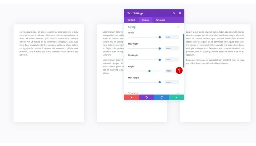
Another way to approach it is by assigning a predefined height to the modules you’re adding.
Aligning Content within a Module
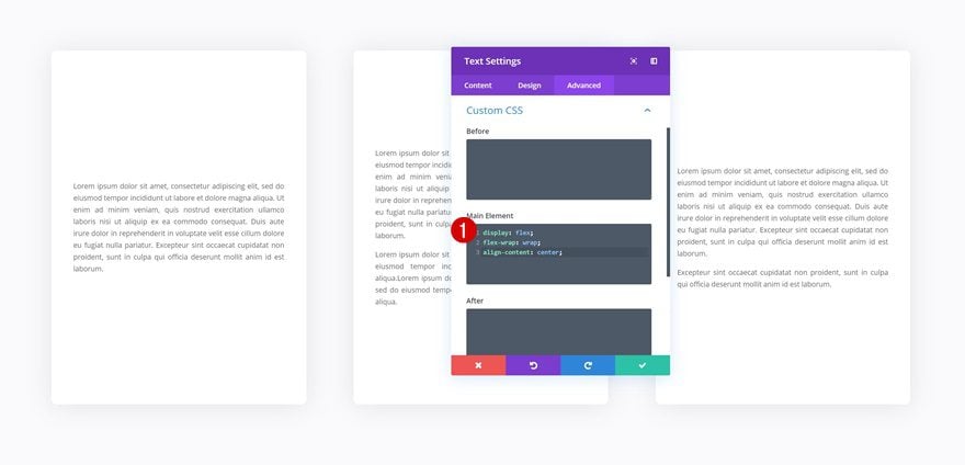
Once you’ve assigned a height to all the modules, you can play around with the alignment of the content as well. To do that, you can either use custom padding to manually determine the whitespace in a module, or use a few lines of CSS code to automatically align content.
display: flex;
flex-wrap: wrap;
align-content: center;
Choosing Design Element Height or Width & Turn Overflow into Scroll
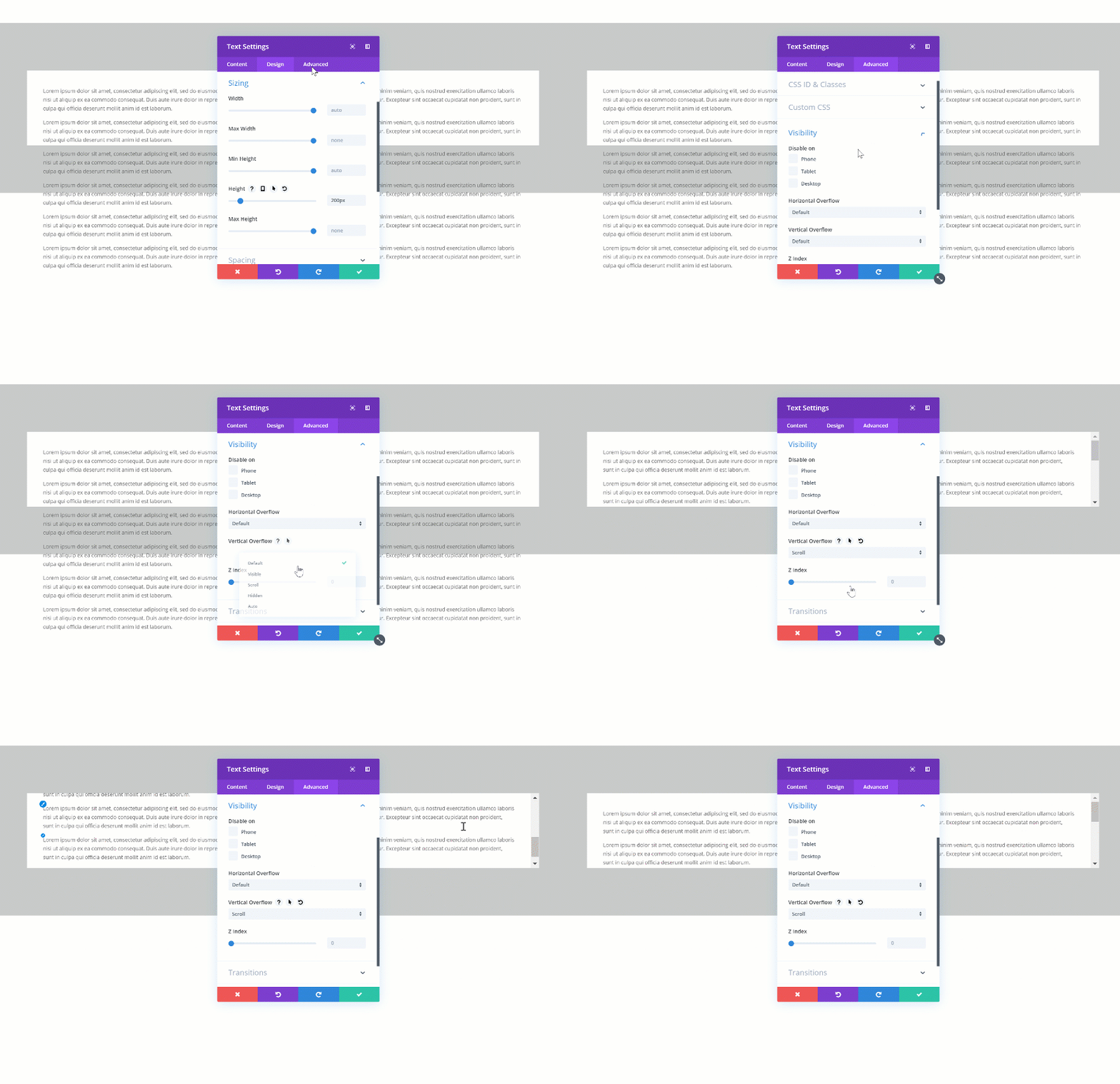
Another cool thing you can do with the new draggable sizing options is turning overflow into scroll. This will easily help you save space on your pages and add extra interaction. There are two steps to this; settings a height for your element and changing the overflow in the visibility settings. Start by changing the height of your element.
Then, go to the visibility settings of your element and change the vertical overflow into scroll.
Creating a Fullscreen Hero Section Across all Screen Sizes
On to the next and last tip! Want to create a fullscreen hero section? Open the hero section on your page, go to the sizing settings and change the height. It’s important you use the height viewport unit for this to make sure everything remains responsive across all screen sizes.
- Height: 100vh
Want to centrally align the content in your fullscreen hero section? Add the following custom CSS code lines to the main element of your section as well:
display: flex;
flex-wrap: wrap;
align-content: center;
Final Thoughts
In this post, we’ve gone over the new width an height options that come with Divi’s draggable sizing update. We’ve shown you how they work and how you can use them to create responsive page design for any kind of website you’re building. If you have any questions or suggestions, make sure you leave a comment in the comment section below!
If you’re eager to learn more about Divi and get more Divi freebies, make sure you subscribe to our email newsletter and YouTube channel so you’ll always be one of the first people to know and get benefits from this free content.
The post Using Divi’s New Height & Width Options to Create Responsive Design appeared first on Elegant Themes Blog.


